10,000 search results
(0.033 seconds)
- Ligaturess Serif by Caron twice,
$19.00 Ligaturess Serif is a modification of Textworthy Serif. This modification contains 79 uppercase ligatures. 59 lowercase ligatures. And 493 ligatures with diacritics marks. Ligatures are groups of letters joined together and usually compensate for the free space between individual letters. Ligaturess Serif, in addition to the basic ligatures - fi, fl... - also includes superstandard ones - CA, OO, ST, SS, VA... -. Text set in Ligaturess Serif has a unique and interesting look. The font works well in headings. And when using capital letters. A book cover, a chapter title, an inscription on a poster or even an interesting logo are the places for which the Ligaturess Serif font was designed.
 - Capita by Hoftype,
$49.00 Capita, a serif-dominated face in a new style. Strong in appearance, with controlled motion of the contour, vivid and warm, with gentle flow – it avoids any harshness of many slab serifs. Well-balanced proportions make it qualified as reading type, yet with its puissant qualities ideal for headlines and subheads. Capita is well equipped for ambitious typography. The Capita family consists of 12 styles, comes in OpenType format with extended language support for more than 40 languages. All weights contain small caps, proportional lining figures, tabular lining figures, proportional old style figures, lining old style figures, matching currency symbols, fractions and scientific numerals.
 - Sidney Hayden by Grezline Studio,
$15.00 Sidney Hayden is a brand new modern script font that comes with a neat and dynamic looks. Sidney Hayden is perfect use for a logotype, typography design, product packaging, quotes, t-shirt design, label poster, headings, letterhead, cutting sticker, hot stamping, signage,and anything that need modern taste. This font is very easy to use, you can even mix and pair it with other fonts to provide a fresh and authentic looks to your design projects. Feature : - A lot of Alternates ( With a Total of 540+ Glyphs ) - Multilingual Language - Works on PC & Mac - Simple installations - Accessible in the Adobe Illustrator, Adobe Photoshop, Adobe InDesign, even works on Microsoft Word.
 - TA Kenisans by Tural Alisoy,
$35.00 TA Kenisans is a combination of two fonts. You can create very good works with Geometric and Grotesque style. This typeface also equipped with useful OpenType features such as Ordinal, Superior, Stylistic Alternates, Proportional Figure, Fraction, Tabular Figure, Numerator & Denominator. Each font file covers Western & Eastern Europe Latin language, as well as other Latin based languages – over 200 languages supported! This is a new real multi-purpose typeface that will be perfect for logo, packaging, greeting cards, presentations, headlines, lettering, posters, branding, quotes, titles, magazines, headings, web layouts, mobile applications, art quote, typography, advertising, invitations, packaging design, books, book title, & nearly any other type of creative design you’re working on.
 - Steamy Miracles by Din Studio,
$29.00 Steamy Miracles is a handwritten script font which is a mixture of incredible drama and gracefulness to clearly express a modern design. Each letter’s details show some curvy, sharp strokes on the edges. Due to its great legibility, you may apply this font for either bigger- or smaller-sized texts. Features: Ligatures Stylistic Sets Swashes Multilingual Supports PUA Encoded Numerals and Punctuations Sreamy Miracles fits best for various designs, such as posters, banners, logos, book covers, headings, printed products, merchandise, social media, and more. Find out more ways to use this font by taking a look at the font preview. Thank you for purchasing our font and happy designing.
 - Neonlife by Popskraft,
$19.00 This font comes from the romance of 20th century tube signs that will likely disappear forever. But let's not be upset — the Neonlife font embodies not only the warmth and comfort of neon signs, but also the energy of a modern style. And welcome to New Neon Life! The font family contains 6 sizes to help you choose the best size for different occasions. Neonlife is a unique solution for cool typography, branding, headings, in short, everything that makes our world unique and special. Although this font is not designed for large amounts of text, all characters are perfectly balanced and can be used like any regular font.
 - Bellona by Pista Mova,
$14.00 Bellona Introducing the new vintage bold script "Bellona". Inspired by retro typography from the 80s combined with a bold typography style. Comes with an open type feature with lots of alternates and finishes, it helps you create great fonts. Bellona best use for Logotype, headings, covers, posters, logos, quotes, product packaging, headers, merchandise, social media & greeting cards and more. This font also supports multiple languages. To access alternative glyphs, you will need a program that supports OpenType features such as Adobe Illustrator CS, Adobe Photoshop CC, Adobe Indesign and Corel Draw. Equipped with features: - Uppercase - Lowercase - Alternative - Numbers, Punctuation and Symbols - Ligature - Multilingual support. Happy Creative! Thank You!
 - Wildrace by Din Studio,
$29.00 Get ready to be bold and elegant at the same time. It’s time to see Wildrace, a display font created in capital letters with the racing theme. The font’s character is the thick letters formed similar to rectangles to give strong impressions. Therefore, it will be more noticeable and match the large-sized texts. Wildrace also provides interesting features to enjoy. Features: Multilingual Supports PUA Encoded Numerals and Punctuation Use Wildrace for any design projects such as posters, banners, logos, book covers, headings, printed products, merchandise, social media, etc. Find out more ways to use this font by taking a look at the font preview. Purchase now. Happy designing.
 - Hommy Land by Alandya TypeFoundry,
$15.00 Hommy Land is a beautiful and simple handwriting script font, contemporary and fashionable. Hommy Land looks elegant for a wide variety of designs. This elegant font can be read and looks good as a title or body text. This font will be perfect for many different designs for magazine headlines, social media, branding, wedding invitations, cards, etc. Hommy Land script fonts include ligatures, stylistic sets, capital letters and lowercase letters. You need a program that supports OpenType features like Adobe Illustrator CS, Adobe Photoshop CC, Adobe Indesign and Corel Draw X6 / X7 and you can also access alternates via Font Book (Mac users) or Windows Character Map (Windows users).
 - Flinscher by Greater Albion Typefounders,
$16.00 The Flinscher family contains twenty display typefaces, in weights that vary from light to black, and widths that extend from condensed to expanded. The family’s design inspiration traces its roots to the early portion of the twentieth century. In essence, it is a calligraphic script typeface family with blackletter influences. The letter forms are decorative and distinctive, yet clear and easy to read, and in use set up a regular rhythm that leads the eye from character to character. The Flinscher typefaces are well suited to design work that needs to combine formality with fun. Just the thing for a certificate or a book cover!
 - Cristal Text by Johannes Krenner,
$5.00 »Cristal Text« has nice to read lower case letters. It contains 636 letters per font style and some Open Type features: Different stylistic alternates and different sets of numerals. It is not monospaced: Therefor it stays not true to an underlying grid like it’s bigger brother »Cristal True«. But this offers a better legibility. The basis of this font is a Union-Jack or sixteen-segment display (SISD). I have found myself in the need of a precise and well-made font, that simulates the look of such a LCD display. Also it should offer enough letters and language support for the whole European region as well as different font styles.
 - Pink Lemonade by Nicky Laatz,
$22.00 A new fresh, bold brush font from Nicky Laatz. Pink Lemonade is Sweet, Casual and curvy...with subtle brush texture left in- perfect for head-turning statements and eye-catching branding. Pink Lemonade includes 45 natural-looking Opentype ligatures - perfect for making your words look freshly lettered, and like less of a font. Try alternating between having the ligatures active and not active for an even more natural look. Pink Lemonade will work wonderfully for beauty, posters, music brands, magazines, cosmetics, cook books, culinary art, book covers, sporting brands, bold headliners, and websites. Enjoy more inspiration using all Nicky Laatz's fonts on Instagram - @nickylaatz.
 - Big Flask by Nathatype,
$29.00 Looking for a font that’ll make your branding spark? Ready to enhance your project? Something that’s versatile and a bit touch of retro vibes? Get ready to transcend to a world of magic, laughter, and butterflies. Big Flask-A Display Font Big Flask is a typeface that will make your projects elevate. An excellent choice to add the right amount of retro touch. This typeface with artistic style looks very interesting for loads of different projects and promotions. Use it to create standout headings, logo, book cover, poster, t-shirt, branding, and advertisement needs. Features: Ligatures Stylistic Set PUA Encoded Numerals and Punctuation Thank you for downloading premium fonts from Nathatype
 - Lostgun by Qaratype,
$20.00 Lostgun is a Stunning, classy upper and lowercase typeface that looks incredible in both large and small settings. Best used as a display for headings and logos, Lostgun has clean lines and smooth curves that gives any project an extra touch of class. IMPORTANT NOTE: Lostgun includes a lot of Ligatures that may show by default. If you want to use an alternate character in the place of a ligature or to use the basic characters instead, you may need to disable the OpenType Feature on your software. Main Features: Uppercase & Lowercase letters Punctuation and special characters Multilingual support OTF Format Alternate and Ligatures
 - Essonnes by James Todd,
$40.00 Made up of sixteen individual weights and spread over three different optical sizes, Essonnes is designed to bring utility back to the Didot genre. It’s a common belief among designers that Didones don’t work for text. This wasn’t true in 1819 and it isn’t true today. Like its forbearers, Essonnes is a truly optical family—not just a study in adjusting contrast. The text and display weights have been designed from the ground up for their intended roles. This means that everything from the height of the uppercase & lowercase letters have been specifically tuned for their intended purpose. Like many typefaces, Essonnes started after falling in love with a piece of history. In this case, it was the eccentric forms of Pierre Didot’s Type and the evolution of the High contrast Didone throughout the 19th century. It was out of curiosity and love for these forms that led to the first draft of what would become Essonnes back in 2011. These unique situations—screens, modern printing methods, the previous 200 years of typographic innovation since the original design, my own life experiences—have led to a typeface that, while based on history, is not stuck in it.
 - Text Tile by Tetradtype,
$25.00 TextTile is a system of heavy sans titling faces which can be utilized to carry a repeating chromatic pattern across words and letters. It stands apart from other chromatic faces, where layered effects typically interact only within each letter and do not carry through from one letter to another. The pattern repetition across letters of varying widths is achieved through OpenType substitution, using conditional alternates for each successive letter to allow for a seamless appearance across words, regardless of letter combinations. Though the pattern exists on a strict grid and the letters' widths and spacing must be highly regular in order to preserve the pattern repeat, the letterforms themselves are not rigid; rather, they appear organic, lively. The initial release includes patterns inspired by a classic buffalo plaid, separated into its horizontal and vertical components to maximize the creative possibilities for layering one-, two-, three-, and even four-color plaid patterns. Kits are available to produce the plaid pattern in detail—with overlapping diagonal hatching fully visible—or as a simplified version in which transparency can be used to simulate plaid or to create a checkered or striped effect. The TextTile family of fonts is a flexible canvas for mixing and matching a broad array of patterns to create a unique look. Check back for more pattern releases and take a look at the online specimen to see what is possible with the current offerings. Usage Notes For best results use an OpenType aware program. Enabling Contextual Alternates will ensure pattern alignment. For patterns that are made up of vertical stripes or columns using the Stylistic Alternate/Stylistic Set 1 will shift the columns. Stylistic Set 2 will change 1-0 into blocks of patterns.
 - Carrig by Monotype,
$25.99 IMPORTANT – Please consider the superior Carrig Pro before making a purchase decision. Carrig started its life in 1998. I was working for a design agency in Cork, Ireland and was given a new brand identity project for a lakeside hotel in County Kerry. While visiting the hotel I made various sketches of the surroundings and upon returning to the studio, it was clear that my strongest ideas for the identity would be based on these freehand drawings. I wanted a classic, rough, hand-drawn typeface to complement this style but at that time, the studio didn’t have anything suitable, so I decided to draw my own. I found a Trajan-esque typeface that I really liked the look of in an old calligraphy workbook. I set about drawing my own version and then digitised it. Once the client had seen and approved my design, I began working on creating a complete all caps typeface to use for the hotel’s stationery. With ‘carrig’ being the Gaelic word for ‘rock’, my new typeface was all the more appropriate as it had the appearance of letterforms that had been carved into stone and weathered by time. With the project completed and the client happy, Carrig then sat in my unused fonts folder for several years... but there was always a nagging feeling at the back of my mind that I should do something more with it. So, in the autumn of 2014, I finally set about doing just that and created the font family you now find at MyFonts. Carrig’s form and structure was influenced by a hybrid of Classic Roman and Garalde typeface designs. The original calligraphic elements from the 1998 version of Carrig have been retained to add personality—as can be seen in the serifs, strokes, spurs, terminals and open bowls. Perhaps its most distinctive trait is a high x-height combined with relatively short ascenders. I wanted Carrig to immediately resonate with the reader and have designed it to be familiar and friendly. I imagine designers might choose Carrig as an alternative to such typefaces as Trajan, Garamond and Baskerville. I see Carrig as primarily a display typeface for titles/headlines in printed materials. I would also love to see it being used for branding, packaging and promotional material and am keen to hear from designers who use it in their own work.
 - Scrapbooker by Sudtipos,
$29.00 After previously collaborating on the bestselling Distillery Set, Carolina Marando and Alejandro got together once again to create this Scrapbooker Set, a new series of fonts that multiply the possibilities. One reason scrapbookers became a kind of design demographic is the appeal of what they do. They make albums of memories, diaries composed of different elements that converge together to lead the viewer to a special moment in time. A paper, a photo, a letter, an event ticket, or a dry petal — everything ends up being part of a collage that tells a story. Words have a key role in such a collage. They use different shapes and forms and combinations to state what cannot otherwise be expressed. They make the collage stronger by clarifying a concept, defining an image, and solidifying a memory. These words for memory albums are the reason for this Scrapbooker Set, six different fonts with different impressions and different personalities — so each part of the memory can have its own identity. People tell you to write your own history. Now you can do that in style.
 - Akko Paneuropean by Linotype,
$79.00The Akko typeface family is the first new design from Akira Kobayashi in a very long time - and it is well worth the wait. Picture an industrial strength typeface like the Isonorm™ design. Now blend this with an organic design like the Cooper Black™ typeface. It was the idea of the fusion of these two design concepts that inspired Kobayashi to draw Akko. „My initial idea was to create a sanserif type with a ‚soft-focus‘ effect,“ says Kobayashi. „From here, the design evolved into two families, the robust and structured sanserif Akko and soft and friendly Akko Rounded.“ Akko has a wide range of weights, with options including complementary italics and a new Condensed range. The Akko typeface family is available as a suite of OpenType™ Pro fonts, allowing for the automatic insertion of small caps, ligatures and alternate characters. Pro fonts also offer an extended character set supporting most Central European and many Eastern European languages. And new Paneuropean versions introduce support for Cyrillic and Greek. - MGN Kinetic by Morgana Studio,
$18.00 MGN Kinetic is an innovative font iconography type product released by Morgana Studio in 2023. This unique font set offers a fresh and dynamic approach to incorporating icons into your designs. MGN Kinetic features a one-of-a-kind design that sets it apart from other font sets, making it an ideal choice for designers who want to create eye-catching and memorable designs. One of the standout features of MGN Kinetic is its ability to bring movement and energy to your designs through its dynamic icons. These icons are designed to convey a sense of motion and fluidity, adding a new dimension of interest to your work. With MGN Kinetic, you can create designs that are not only aesthetically pleasing but also convey a sense of action and movement, making your work more engaging and memorable. Whether you're designing for a website, app, or other digital media, MGN Kinetic is the perfect choice for designers who want to elevate their work and stand out from the crowd
 - EraMax Radial by Our House Graphics,
$16.00 EraMax Radial is a geometric sans serif meant to be set BIG, for big statements. It's the perfect face for signage, packaging posters, branding and so on and on, where a strong voice is needed. It has a modern look that will work in a retro setting. Or, should that be a vintage look that will work in a modern setting. This is the first of what is to be a series to typefaces inspired by the original hand painted signage found in the TH&B train station in Hamilton Ontario. This classic Art Deco, Or, more precisely, Art Moderne building designed by the New York architectural firm of Fellheimer and Wagner and completed in 1933. The original lettering included about 75% of the uppercase letters only, so the balance of the uppercase and the lowercase plus all the other glyphs were extrapolated from the look and feel of the existing uppercase letters. Figures are based on the numerals on the station clock, with adjustments made to harmonised with the letters.
 - Compita by Studio Buchanan,
$12.00 Compita is a Neo-Grotesk(ish) typeface that started life as a love-letter to Berthold's classic. But for every rigid, Neue-Haasism, there exists an equal and opposite amount of humanist attributes – along with a deliberate dose of creative license. It has some over-emphasised features and terminal endings which help to create its friendly personality, but sits them on a slightly condensed overall width. Together they help balance each other out, creating a face that feels both affable and professional. Aff-essional perhaps? The character set contains everything the modern day designer needs, including diacritic support for over 30 languages. And It’s packed full of the usual opentype features (that most will probably ignore) – Small caps, multiple number sets, and discretionary ligatures, to name just a few. Whether it’s deployed as a display face, or as the dependable choice for text, Compita is useable across multiple disciplines. Set in online, on screen or in print – it’s proof that not everything has to be Montserrat or Raleway...
 - Akko by Linotype,
$40.99 The Akko typeface family is the first new design from Akira Kobayashi in a very long time - and it is well worth the wait. Picture an industrial strength typeface like the Isonorm™ design. Now blend this with an organic design like the Cooper Black™ typeface. It was the idea of the fusion of these two design concepts that inspired Kobayashi to draw Akko. „My initial idea was to create a sanserif type with a ‚soft-focus‘ effect,“ says Kobayashi. „From here, the design evolved into two families, the robust and structured sanserif Akko and soft and friendly Akko Rounded.“ Akko has a wide range of weights, with options including complementary italics and a new Condensed range. The Akko typeface family is available as a suite of OpenType™ Pro fonts, allowing for the automatic insertion of small caps, ligatures and alternate characters. Pro fonts also offer an extended character set supporting most Central European and many Eastern European languages. And new Paneuropean versions introduce support for Cyrillic and Greek.
 - Delphi by Positype,
$22.00 Delphi grew from a logotype Lily Feinberg produced using Greek-column-inspired letterforms. As that concept expanded to include more and more letters, the typeface had its beginnings. Intertwined, kinetic, and deliberate, Delphi carves itself onto the page and screen, encouraging variation and experimentation. The letterforms’ unique construction and predispostion for experimentation inspired two varying sets: Delphi Dio, comprised of two-line strokes, and Delphi Tria, built of both 2- and 3-line strokes. With a design as elaborate, yet tightly tuned as this, the desire to add more and more was irresistible—you'll see a number of stylistic, swash, and titling alternates (and even more hidden away in further stylistic sets). Because Dio and Tria could only hold so much, alternate cuts were produced to better organize your options: the Delphi Alt fonts feature certain letter styles and stylistic alternate sets distinct from those in Delphi. Delphi’s sophisticated, striking letterforms make it an ideal display face for use at large sizes, and with so many unique details and alternate letterforms, it’s simply fun to use.
 - Rawhide by Canada Type,
$29.95 Rawhide is a fresh digitization and expansion of a very popular (yet uncredited) early 1970s film type called Yippie, which was commonly used in wild west cartoons and comics. Publishers of Lucky Luke, the famous Belgian comic by Morris, used these bouncy letters for the titling on a few of their soft cover editions, and different variations of it were used throughout the 1970s and 1980s by cartoon classic Looney Tunes and a variety of wild west animations and comics. It slowly disappeared without fanfare when desktop publishing became the norm. Here it is again now for the computer age, available as a high quality font with a complete character set that accommodates more than 20 Latin-based languages. In short, Rawhide comes with an impressive track record, and is a must for any funny cowboy design or off the wall wild west layout. This set of fonts contains a very expanded character set that includes full support for Central, Eastern and Western European languages, as well as Baltic, Turkish, Esperanto, Greek, Cyrillic and Vietnamese.
 - Scion by Type Innovations,
$39.00 ‘Scion’ is an original design by Alex Kaczun. The inspiration for the typeface came from the Toyota SCION logo, which bears its name. In Alex’s own words, "I loved the simplicity, proportions and hi-tech look of the logo and decided to create an entire new design series based on its unique look". The fonts come in five flavors: thin, light, regular, bold and black. All the font weights were designed systematically on tabular widths so that the user can make adjustments to overall type color without changing the line length. In addition, Alex Kaczun has provided us with several alternate glyph substitions to further enhance the overall appeal of this contemporary new design. The large Pro font character set, which supports most Central European and many Eastern European languages, makes this typeface series ideally suited for display copy as well as text composition. In the near future, Alex plans to include a narrow, compressed and ultra expanded, along with true-drawn italic variations to further expand the possibilities of this great new display series.
 - Candy Paint by Crumphand,
$20.00 Introducing, Candy Paint fonts. Candy Paint have a unique shape, rounded and fun. Comes with 4 style Regular, Outline and Extrude, then can mix and match with Stylistic Set. What's Included Inside The Fonts ? Uppercase Lowercase Symbols Numerals Stylistic Set 1 Stylistic Set 2 Stylistic Set 3 Stylistic Set 4 European Multilingual Thank you, Regards!
 - Michel by sugargliderz,
$20.00 The design of this typeface was influenced by the typefaces left by Firmin-Didot. There are three weights, and all weights can be used in large font sizes to create a gorgeous and attractive impression.
 - TG Hagia by Tegami Type,
$20.00 TG Hagia is contemporary serif font inspired by Modern Culture. This font is highly recommended for use as display and body text. Tg Hagia is available in three widths namely regular, semi-bold and bold.
 - Volianchy by MJType,
$25.00 Introducing Volianchy is a modern sans serif font designed for the discerning user in mind. This typeface draws inspiration from contemporary design trends, while retaining a timeless essence that ensures its relevance in any era.
 - Script Love by Okaycat,
$29.95 Script Love is a connected cursive script appearing as hand written in three weights: fine pen, pen & marker. Script Love features extended characters, containing West European diacritics & ligatures, making it suitable for international environments & publications.
 - Brown Love by sizimon,
$18.00 Introducing our latest product Bethany Script! handwritten fonts companion designed to convey elegance and style. Bethany is perfect for fashion, e-commerce brands, trend blogs, or any business that wants to appear classy and chic.
 - Glazed Donuts by DainType,
$15.00 The letters are reminiscent of shiny and tasty glazed donuts. There are three type families, and you can mix them all up to create a decently fun typography. Great for promotional material or package design.
 - Unikled by Ingrimayne Type,
$12.95 Unikled a decorative calligraphic family inspired by the uncial style. The upper and lower cases are largely different and can be treated as two separate alphabets. It is available in two weights, plain and bold.
 - FlagDay by Ingrimayne Type,
$8.00 These four variations on letters designed as flags are almost unreadable, but may be of some use as a patriotic display font. The four are all transformations of fonts from the FourJuly group. The solid and outline styles can be layered with the main fonts to easily create multiple-colored letters.
 - El Camio by Lord Typo,
$14.00 El Camio is a throwback display font paying homage to the classic automotive typography of the 50's and 60's. It is an extremely versatile display font that can be used for anything from branding, logo design, beer labels, shirt graphics, playful editorial spreads and much much more. BUY ME!
 - Strings by Bluestudio,
$18.00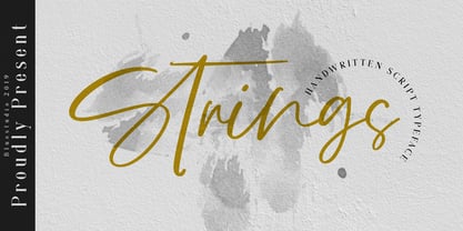 Strings is a handwritten script font that is suitable for all your design project needs such as logo design, branding, covers, posters, magazines, wedding invitations, greeting cards, quotes and more. Multilingual support - spread your message globally AÀÁÂÃÄÅCÇDÐEÈÉÌÍÎÏIÌÍÎÏNÑOØÒÓÔÕÖUÙÜÚÛWYÝŸÆßÞþ Encoded PUA Characters Fonts are fully accessible without additional design software. Happy designing!
 - Meastro by Ferry Ardana Putra,
$39.00 It's been a while... more than three months we developed our brand new font. We call them "Meastro". Fun fact though, we want to call it "Maestro", but you know... we were afraid of the copyright thing. Meastro Script is a fun, bold, luscious, retro display script font. We crafted this font very carefully and make them very smoothly attach to each other. Especially, on the script version. You can see every character's tail beautifully connected one to another without using ligatures' help. This font takes full advantage of the Open Type format with several automatic ligatures that occur as you type for your preferred design. Moreover, the manual stylistic alternates allow you to choose the letters you prefer. Alternates occur automatically as you type in supported programs when you have "Ligatures" or "Stylistic Alternates" turned on. Meastro is Created with a ton of stylistic alternates, swashes, and ligatures, and also comes with layerable fonts to recreate the effect without uncomfortable overlaps of the extruded shadow effect. On this pro pack, you will also get the Meastro Display font! On this font you will meet the unique blocky and squared design, making your design feel classic and retro-like. Combine them and “boom”, you will be the “Maestro” of the vintage design! This retro typeface is perfect for logotypes, t-shirts, vintage badges, retro quotes, branding, packaging, posters, signboards, social media needs, etc. ——— Meastro features: A full set of uppercase and lowercase characters Layered Style Numbers and punctuation Multilingual language support PUA Encoded Characters OpenType Features +553 Total Glyphs (Script) +235 Total Glyphs (Display) +238 Stylistic Alternates +30 Ligatures +69 Swashes and more (Shiny and Graffiti Spray Effect Included!) ——— ⚠️To enable the OpenType Stylistic alternates, you need a program that supports OpenType features such as Adobe Illustrator CS, Adobe InDesign & CorelDraw X6-X7, Microsoft Word 2010, or later versions. There are additional ways to access alternates/swashes, using Character Map (Windows), Nexus Font (Windows), Font Book (Mac), or a software program such as Pop Char (for Windows and Mac).
 - Coegit by insigne,
$32.00 In the world of webfonts, Condensed proportions are key to maximizing your page's premium real estate while keeping your copy clean and catchy as you cut down to the essentials. Soon after the introduction of webfonts, I began to see Insigne's Le Havre used frequently for web headlines, not so much for its Art Deco look as for its more compact proportions. There seemed to be a need for a font that was designed to be used solely for the web's unique constraints. Enter Coegit Sans. Coegit is built specifically for web applications. Its highly Condensed forms range from thin--offering the greatest number of uses--to the attractive, accenting black. With three widths--Compressed, Compact, and the widest, Condensed --the family holds a total of sixteen fonts. The typefamily has also been hinted for excellent, onscreen display quality, even at small sizes. Overall, its lighter, humanist features provide the reader a more congenial welcome than its square, sans-serif counterparts can offer. Coegit is equipped for complex professional typography with stems, small caps and plenty of alts, including titling capitals. The face includes a number of numeral sets, including fractions, old-style and lining figures with superiors and inferiors. OpenType-capable applications such as Quark or the Adobe suite can take full advantage of automatically replacing ligatures and alternates. You can find these features demonstrated in the .pdf brochure. The family also includes glyphs to support a wide range of languages, including Central, Eastern and Western European languages. In all, Coegit supports over 40 languages that use the Latin script, making the new addition a great choice for multi-lingual publications and packaging. While the advanced OpenType features of webfonts are not currently supported in many browsers, the near future promises wide support. As acceptance of these features grow, Coegit Sans will prove to be a versatile element for your wide range of web projects.
 - Antoine by Anastasia Kuznetsova,
$19.00 Introducing Antoine — is a vintage retro display typeface. The three font combinations I launched are very compatible if for the victorian classic design concept. As for if the font was worn by itself, without combinations are also brave!! In addition to many get unique character, luxury, brave and elegant. You also have a collection ornament, very suitable if in the gradient. This font is also very easy to use with other design programs or with out design program. Antoine Typeface is perfect for beverage label design project. coffee label. logotype design, badges, classic wedding concept. victorian design concept and so on. gig poster, letterhead, droop cap, titles, and any artworks. Now it’s your time to go crazy and explore the uniqueness of this typeface!! I invite you to familiarize yourself with the preliminary images and hope that you will be imbued with my vision of this creative font, which, I am sure, will be suitable for all the interesting projects you are working on. Fonts can be opened and used in any software that can read standard fonts, even in MS Word. No special software is required to get started. It is recommended to use it in Adobe Illustrator or Adobe Photoshop. Made with love and magic ♡ Thank you for reading it, and do not hesitate to send me a message if you have any questions! ~ Anastasia