10,000 search results
(0.031 seconds)
- Carbonara by Hanoded,
$20.00 Carbonara. Nope, it's not the pasta sauce, but a nice, grungy typewriter font, made using a pre-war typewriter, some oil and a stack of old-fashioned carbon paper sheets. You can use it to give your designs some oomph. Comes with a whole bunch of contextual and stylistic alternates.
 - Chase by Device,
$39.00 Type that preserves the over- and under-inked textures of true old-fashioned wood faces, now available without ink on your fingers straight from your keyboard. Based on samples taken from early and mid Nineteenth century Clarendons, the font carefully preserves all the battered idiosyncracies of vintage print shop type.
 - Mordings JNL by Jeff Levine,
$29.00Mordings JNL is an odd-lot collection of images. These assorted dingbats are leftover art that never quite made it to one particular dingbat font category, but together comprise an eclectic assortment. Topics range from weather to vintage-style restaurant menu icons to decorative embellishments to an old-fashioned telephone dial. - Designator by TEKNIKE,
$39.00 Designator is a display modular monospace font. The typeface has a distinct technical geometry using sharp angled corners. "Designator" name is derived from Latin "designare" and means to mark, point out or to indicate. Designator is great for team sports, display work, invitations, writing, architecture, fashion, posters, logos and headings.
 - Goldbrick by Sarid Ezra,
$15.00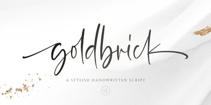 Goldbrick Script is a natural handwritten script that contains lowercase, uppercase, symbol, and also multi-lingual support. Comes with ligature, contextual alternates, stylistic alternates, also initial and terminal swash. Goldbrick Script is suitable for logo branding, beautiful fashion design, suitable for wedding invitation, or handwritten quote. It is already PUA Encoded.
 - Kokomo by Hanoded,
$20.00 Kokomo is a beautiful handmade contoured font - which was drawn with an old-fashioned steel pen and Chinese ink. The open, shadowed letters are great for posters and ads. Kokomo comes with extensive language support and has an alternative lower case a, for those who don't like the one I used.
 - Three Candy by Mazkicibe,
$11.00 Three Candy Font is Sans Serif and modern font combined with a sweet touch and beautifully curved each letter. using a touch of soft curves so that it is pleasing to the eye. Three Candy Font Spirit is great for: Wedding invitations, fashion magazines, logos, signatures, and suitable for watermark photography.
 - Chevalier LP by LetterPerfect,
$39.00 Chevalier LP is a revived decorative face with a European lineage. Its patterned and shaded 'fatface' letterforms exhibit the continent's 19th century fascination with elaborate engraving techniques, often used on currency as a deterrent against counterfeiting. It is not without reason that Chevalier conjures up images of bank notes and finance.
 - Biliner Meclan by madeDeduk,
$16.00 Biliner Meclan is a Minimalist Sans, use this font for any branding, product packaging, invitation, fashion, label, poster, logo etc. Feature Uppercase & Lowercase Number & Symbol International Glyphs Multilingual support Alternative Ligature Feel free to drop us a message any time and follow my shop for upcoming updates Hope you enjoy it.
 - Shentholla by Liartgraphic,
$23.00 Meet our newest product, we call this product Shentholla font. Shentholla font are sans serif typeface font Whit a uniqe touch and assertive. Shentholla font is very nice to use on: fashion magazine, logos, ,and photography, landing page, fliyer, What’s includes - mutilngual support - alternate - ligature Thank you, salutations Ali Sifak Muftari
 - ATF Franklin Gothic by ATF Collection,
$59.00 ATF Franklin Gothic® A new take on an old favorite Franklin Gothic has been the quintessential American sans for more than a century. Designed by Morris Fuller Benton and released in 1905 by American Type Founders, Franklin Gothic quickly stood out in the crowded field of sans-serif types, gaining an enduring popularity. Benton’s original design was a display face in a single weight. It had a bold, direct solidity, yet conveyed plenty of character. A modern typeface in the tradition of 19th-century grotesques, Franklin Gothic was drawn with a distinctive contrast in stroke weight, giving it a unique personality among the more mono-linear appearance of later geometric and neo-grotesque sans-serif types. Franklin Gothic has been interpreted into a series of weights before, most notably with ITC Franklin Gothic. But as the original type was just a bold display face (later accompanied by a few similarly bold widths and italics), how Benton’s design is expanded to multiple weights and styles as a digital type family can vary significantly. Benton designed several gothic faces that harmonize with one another, including Franklin Gothic, News Gothic, and Monotone Gothic, that can serve as models for new interpretations of his work. With ATF Franklin Gothic, Mark van Bronkhorst looked to Benton’s Monotone Gothic—originally a single typeface in a regular weight, and similar to Franklin Gothic in its forms—as the basis for lighter styles. ATF Franklin Gothic may appear familiar given its heritage, but is a new design offering a fresh take on Benton’s work. The text weights are wider and more open than some previous Franklin Gothic interpretations, and as a result are quite legible as text, at very small sizes, and on screen. ATF Franklin Gothic maintains the warmth and the spirit of a Benton classic while offering a suite of fonts tuned precisely for contemporary appeal and utility. The 18-font family offers nine weights with true italics, a Latin-extended character set, and a suite of OpenType features. Download the PDF specimen for ATF Franklin Gothic.
 - Treasury Pro by Canada Type,
$79.95 The Treasury script waited over 130 years to be digitized, and the Canada Type crew is very proud to have done the honors. And then some. After seven months of meticulous work on some of the most fascinating letter forms ever made, we can easily say that Treasury is the most ambitious, educational and enjoyable type journey we've embarked upon, and we're certain you will be quite happy with the results. Treasury goes beyond being a mere revival of a typeface. Though the original Treasury script is quite breathtaking in its own right, we decided to bring it into the computer age with much more style and functionality than just another lost script becoming digital. The Treasury System is an intuitive set of fonts that takes advantage of the most commonly used feature of today's design software: Layering. Please do help yourself to the PDF and images in the MyFonts gallery for a quick look at the some of the limitless possibilities Treasury has to offer, from simple attractive elegance expressed in the main script, all the way into mysteriously magnificent calligraphic plates. To date in digital type history, this is the most comprehensive and versatile work of its kind. Every designer loves many options to experiment. Experimentation has never been as much fun and productive as it is with Treasury. If you're "compudling" your initial ideas for a layout, or you're just an alphabet fan who loves spending time with letters, working with Treasury is very inspiring and fulfilling. Some of Treasury's features are: - No more endless searching for initial caps that fit your project. The Treasury System lets you build your own initial caps, in any combination of colors, fills, linings or dimensions you like, with a few simple clicks of the mouse. - With two base styles and nine layer fonts, the Treasury System set helps you produce endless possibilities of alternation and variation in dimension, color, and calligraphic combinations to fit your layout's exact needs, down to the very last detail. - 12 pre-combined Treasury fonts are also there to help and inspire layout artists who love shortcuts and don't want to fiddle with too many layers in their layout. Available in small packages on their own, or as part of the complete Treasury package, these 12 fonts can start you up on your way to discovering the perfect fit for your layout. - Every single letter in the Treasury System comes with at least one alternative. Some characters have even three or four alternates. Although the main character set is an authentic rendition of Ihlenburg's 1874 classic, we made sure to include a treasure trove of alternates for maximum usability. - The most gorgeous set of numerals we have seen in a long, long time. The Treasury numbers are what really turned us onto this project in the first place. - Treasury Pro, the incredibly sophisticated OpenType version, combines the complete Treasury System into a single font, programmed for compatibility with Adobe's latest CS and CS2 software programs. Over 2000 characters in one font, for thousands of possibilities. Setting the ideal elegant wordmark, logotype, intitial cap, or headline, no matter how simple or complex, is as easy as taking a minute or two to push a few buttons in Illustrator, Photoshop, or InDesign. We can go on endlessly about the beauty and functionality of this Treasury set, but we really cannot do it justice with words. So try Treasury for yourself and see the amazing possibilities of fun and creativity it has. It can be used pretty much anywhere - signs, book covers, certificates, music inserts, movie posters, greeting cards, invitations, etc. Much thanks are due to the generous and considerable help Canada Type received from the Harvard Library in Boston, Klingspor Museum in Frankfurt, and many type hobbyists and researchers in Canada, England, Germany, the Netherlands, and the United States. Without them it would was near-impossible to track down the lost history of Hermann Ihlenburg, the most prolific German/American type designer and punch cutter of the 19th century. We hope Mr. Ihlenburg is proudly smiling down on us from type designer heaven.
 - Andale Teletext by Monotype,
$41.99Teletext fonts have a defined character set comprising alphanumeric and graphics characters. The Andale Teletext fonts also include G3 Smooth Mosaics and Line Drawing Set support as defined in ETSI EN 300 706, for Teletext 2. Andale Teletext includes the following character sets: Latin G0 and G2 sets, Latin National Option Sub-Sets, Cyrillic set, Greek set. Andale Teletext family includes 3 fonts: Andale Telext regular, Andale Telext 43 and Andale Teletext 83. - Geomatrix by Type Innovations,
$39.00 The font Geomatrix is an original design by Alex Kaczun. It is a dynamic stencil interpretation based on his extremely successful Contax Pro family of geometric sans typefaces. Geomatrix is a contemporary stencil typeface based on generous proportions and clean, crisp lines.The stencil treatment is balanced visually with the stem weight of the font which creates a uniformity and harmony within the design. Geomatrix makes for easy reading and is ideal for long lines of copy. It exudes a strong sense of sophistication for a true stencil design. However, this is no ordinary stencil typeface. That's putting it mildly. Geomatrix is a font on STEROIDS! This unique OpenType font incorporates hundreds of CAPITAL alternate letter forms and glyph substitutions, automatically and on the fly, within InDesign and other Open Type applications. To turn this feature on, just typeset ALL CAPS and go into InDesign's OpenType>Stylistic Sets and select Set 1 from the menu. Turn character kerning from Metrics to Optical, adjust tracking to minus 20-30, and start typing to create some visually interesting letter substitutions and unique word combinations. Geomatrix was specifically designed to take advantage of the OpenType format, allowing the Graphic Designer a unique tool to achieve the desired degree of possible visual typographic effects. And finally, the character sets in Geomatrix have been expanded to include old-style figures and all Eastern European accented glyphs. Strap in and hold on to your seats. A revolution in new font technologies has begun! GEOMATRIX IMPORTANT PLEASE READ HOW TO ACCESS "ALTERNATE" STYLISTIC "SET 1" LETTER FORMS: Geomatrix is a unique OpenType font which incorporates hundreds of CAPITAL alternate letter forms and glyph substitutions, automatically and on the fly, within InDesign and other OpenType applications. To turn this feature on, just typeset ALL CAPS and go into InDesign\'d5s OpenType>Stylistic Sets and select "Set 1" from the menu. Turn character kerning from Metrics to Optical, adjust tracking to minus 20-30, and start typing to create some visually interesting letter substitutions and unique word combinations. This feature "stylistic set 1" can be toggled "on" or "off" anytime, allowing you to go back and forth, or select only the letters that you want to change. Geomatrix was specifically designed to take advantage of the OpenType format, allowing the Graphic Designer a unique tool to achieve the desired degree of possible visual typographic effects. And finally, the character sets in Geomatrix have been expanded to include old-style figures and all Eastern European accented glyphs. Strap in and hold on to your seats. A revolution in new font technologies has begun!
 - Tokyo Olive by Dharma Type,
$14.99 Tokyo Olive was designed as an homage to nostalgic display types and advertisements in the mid-late 80s. The mid-late 80s was the era of the post-modernism and fancy-decorative design especially in Japan In other words, it was the mixture of superficial form-operation and girly taste. This curious design movement vanished without a trace in the 90s, but it had its moments. Tokyo Olive has voluminous and simple geometric skeleton (for post-modern) with rounded and craft-style stencil joints (for fancy decoration). We added a classic open style as a little spice. The mixture of those essences makes new impression we have never seen before. Tokyo Olive family consists of 5 styles for stacking color font. Please use Photoshop or Illustrator, or your favorite graphic design apps that can handle layers. Layers are the printing plates of wood type. You should be able to change text color for each layer. Tokyo Olive "Standard" style is the base of this font family. You can add open effect by stacking "Fill" layers over the Standard layer. Instruction 1. Type your text as you like. 2. Set font-name "Tokyo Olive" and font-style "Standard". 3. Set color of "Standard" layer. 4. Duplicate the "Standard" layer to make "Fill" layer. 5. Set font-style "Half Fill" or "Full Fill" and new color of upper layer. Tokyo Olive Standard, Half Open, and Full Open style can be used solely.
 - Heathen by Canada Type,
$24.95A few emails sent to Canada Type have asked for more “bad scripts”. A few others asked for "more Mascara-like treatments". And some asked for more fonts of “distressed elegance”. Whatever you like to call this style of doubled-script font, sightings of designs using it have become common within the last few years. Such fonts have become the standard in expressing elegant confusion, old chaos in modern settings, recycled histories, and rebellious ideas. This style is quite often seen on chic clothing, music packaging, some sports paraphernalia, surfer and skateboarder gear, even book covers. That said, the Heathen font was made to include an advantageous feature that other distressed scripts do not normally have: More intertwined over-swashing in the majuscules. This over-swashing is quite useful in settings where the stroke and fill colors differ, or complement each other. It is also quite the point of emphasis where the idea is to show elegance gone ancient, old thoughts in a modern wrapper, rust never sleeping, or the very basic limits of the world’s nature. The original Heathen was made by redrawing Phil Martin’s Polonaise majuscules and superposing them over the majuscules of Scroll, another Canada Type font. The lowercase is a superposition of Scroll’s lowercase atop a pre-release version of Sterling Script, yet another Canada Type font. Heathen Two was made in a similar way, by combining two pre-release Canada Type scripts. - Breathe Neue by Lián Types,
$37.00 Breathe Neue is not just an update of my renowned Breathe of 2010, this is something else... Many times I find myself looking for inspiration in my previous creations. The original Breathe has something on its essence: Something that almost 10 years later still caught my attention. Like its name suggests, letters seem to be breathing, moving, alive. Many years passed so I asked myself if there was still something I could do for it, something to get the most of that beautiful essence... Suddenly, I was already working on its curves: Many new loops, more polished, more refined. Also the proportion and spacing were altered to embellish the font. Breathe Neue’s swashes are addictive. I couldn't find another word. Irresistible? Maybe. Once you see some of its loops you want to see more. I believe this might be due to its very geometrical feel, which match well with the bodonian curves of the font. See also how well it works with Breathe Caps. And what if you combine them with Breathe Special? wow. I'm still young (yeah, sure) and I believe there're still many years ahead to enjoy this great profession, and to make many new (and astonishing, I hope) fonts. But I also think, it’s time to pamper my first creations. They deserve the best treatment, after all, they were once a success! This is what I did with my lovely Breathe. I hope you like it.
 - Storyville by Canada Type,
$29.95 This is the redrawn and expanded version of an alphabet Rebecca Alaccari made back in 2009 as a bespoke font for a tourism agency looking to recapture the appeal of New Orleans after the hurricane Katrina disaster robbed it of its core industries. The brief back then was to "revive the unique spirit of what always made Nola great for new adults, which is the excellent combination of history, romance, food and music." No word of a lie, the brief actually contained "new adults." Storyville contains two interchangeable sets of forms drawn in the doodly, loose and organic way now conspicuously popular with today's young designers, almost every one of whom thinks they will get to design something for a boutique coffee bar somewhere. Well, this whole thing perhaps means freedom, youth, fun, happiness, good stuff like that. But just in case, a little caution doesn't hurt: Use this font only if you know what you're doing. We don't want to go back to the 1990s. Please. We were nearly done for by that exposure the first time around. The ligatures feature in this font does some pseudo-randomization, so the forms in doubled letters don't repeat. Serious fun can be had by also applying the stylistic alternates feature, or picking a letter in the middle of a setting and disabling the ligatures feature. Or various sequences of all that. If you don't like any of that stuff, just forget about it. Uh, wutever.
 - Basilio by Canada Type,
$29.95 In the late 1930s, old Egyptiennes (or Italiennes) returned to the collective consciousness of European printers and type houses — perhaps because political news were front a centre, especially in France where Le Figaro newspaper was seeing record circulation numbers. In 1939 both Monotype and Lettergieterij Amsterdam thought of the same idea: Make a new typeface similar to the reverse stress slab shapes that make up the titles of newspapers like Le Figaro and Le Frondeur. Both foundries intended to call their new type Figaro. Monotype finished theirs first, so they ended up with the name, and their type was already published when Stefan Schlesinger finished his take for the Amsterdam foundry. Schlesinger’s type was renamed Hidalgo (Spanish for a lower nobleman, ‘son of something’) and published in 1940 as ‘a very happy variation on an old motif’. Although it wasn’t a commercial success at the time, it was well received and considered subtler and more refined than the similar types available, Figaro and Playbill. In the Second World War, the Germans banned the use of the type, and Hidalgo never really recovered. Upon closer inspection, Schlesinger’s work on Hidalgo was much more Euro-sophisticated and ahead of its time than the too-wooden cut of Figaro and the thick tightness of Playbill. It has a modern high contrast, a squarer skeleton, contour cuts that work similarly outside and inside, and airy and minimal solutions to the more complicated shapes like G, K, M, N, Q and W. It is also much more aware of, and more accommodating to, the picket-fence effect the thick top slabs create in setting. Basilio (named after the signing teacher in Mozart’s Figaro) is the digital revival and major expansion of Hidalgo. With nearly 600 glyphs, it boasts Pan-European language support (most Latin languages, as well as Cyrillic and Greek), and a few OpenType tricks that gel it all together to make a very useful design tool. Stefan Schlesigner was born in Vienna in 1896. He moved to the Netherlands in 1925, where he worked for Van Houten’s chocolate, Metz department store, printing firm Trio and many other clients. He died in the gas chambers of Auschwitz in 1944. Digital revivals and expansions of two of his other designs, Minuet and Serena, have also been published by Canada Type.
 - Centennial Script by Canada Type,
$24.95 Centennial Script was designed and cut by Hermann Ihlenburg in 1876 (the centennial of American independence, hence the typeface's name) for the MacKellar, Smiths & Jordan foundry in Philadelphia. Ihlenburg was then only 33 years old, and these beautiful forms put him on his way to become the most prolific and innovative deco, ornamental and script typeface designer and punch cutter of the nineteenth century. In trying to be a true homage to the history of the new world, Centennial Script transcends its then-contemporary deco fashion to embrace script elements historically similar to lettering found on maps or political documents of the 18th century. Letters like the p and s extend themselves high and mighty to accentuate words and lines of text in a fancy hand-drawn manner. The dots on the i and j are those of a careful scribe who acknowledges the importance of the document being lettered. The lowercase letters connect with two slight angular motions of the hand, also very carefully and elegantly. Even the ligatures and ending swashes Ihlenburg made for this face were reminiscent of a mapmaker's patient hand, though Ihlenburg's elegant touch in them cannot be mistaken. Although Centennial Script was one of the few Ihlenburg faces to make it to film type technology, the transition was neither credited nor faultless. The film type version was a bit sloppy in the way the connectors were made, so the lowercase needed a lot of manual work to typeset properly. To alleviate such waste of time for the user of this digital version, the connectors were redrawn according to the original metal ones made by Ihlenburg himself, and tested thoroughly in print to ensure the quality of the typeface's flowing cursive nature. This wasn't an easy task, and very time-consuming, since the changing angles on both ends of the connection made it impossible to escape from having to build every lowercase letter with both left and right connectors that would fit with the rest of the letters. This is one typeface that couldn't be revived in any other manner than the way it was originally made, regardless of more than 130 years of technological advances since the face was designed. Centennial Script comes in all popular font formats, and supports most Latin-based languages. Also included is an Alts fonts that contains alternates, ligatures, snap-on swash endings, some ornaments, as well as a complete set of the lowercase without left side connectors, for a more natural combination when following a majuscule, or just in case the user finds it fit to set the copy in a non-connecting script instead of the face's original connected flow. Centennial Script Pro, the OpenType version, combines the main font with the Alts font in a feature-packed single font. Use the ligature feature to set wordmarks like Mr, Ms, Mrs, Dr, and &Co, the stylistic alternates feature to replace some letters with their alternative forms, the contextual alternates feature for better uppercase-lowercase sequences, and the titling feature to set your text in a disconnected script. Centennial Script is the only script we currently know of that can be set connected or disconnected simultaneously, either using the titling feature in the OpenType Pro version, or manually in the other formats.
 - Open Book ING by Ingrimayne Type,
$9.00 OpenBookING is a gimmick or novelty font that has letters on pages of a book. It is caps only and monospaced. The letters on the upper-case keys are on the left-handed pages of an open book and the letters on the lower-case keys are the same letters but on the right-handed pages of an open book. One could alternate upper and lower case keys to get letters on complete books, but the Opentype feature of contextual alternatives (calt) does this automatically. Several previous typefaces from IngrimayneType used the calt feature to alternate shapes that fit together in an interlocking pattern, such as alternating concave and convex shapes. OpenBookING uses the calt feature in a different way, to alternate two halves of a symmetrical shape. To provide two copies of numbers and common symbols, some non-alphabetical characters are unavailable because their slots were taken by the second form of the number or common symbol. If stylistic set one (ss01) is turned on, spaces are replaced with empty pages. This may leave you with unwanted spaces at the end of lines, and to eliminate them, turn off the feature (or change the font) for these spaces. The empty pages can be used in a layer to add color to the text. There is also a second set of empty pages with a filled page that can also be used in layers. (See poster for examples.) These pages are on the (logicalnot multiply) and (register divide) characters for the first set and on the (ordmasculine ellipsis) and (macron trademark) keys for the second set. Finally, OpenBookING has a large set of accented characters if anyone should need them. The letters used on the books were derived from the font Myhota-Bold. For a related typeface of letters on book covers, see NewLibrary. OpenBookING has limited uses and is priced accordingly.
 - LiebeRobots by LiebeFonts,
$19.90 LiebeRobots is not your average collection of mean termination machines. LiebeRobots are friendly and polite. Some are from Mars, some from Venus, and some are probably from Germany. Most are from the future, some are from the past. And a handful are even from the 60s. LiebeRobots probably is the most comprehensive collection of hand-drawn robots ever. They look great on almost any greeting card, birthday card or invitation. LiebeRobots also serve as a perfect companion to any informal graphic design that needs a personal, handmade touch.
 - Steampipe by Just My Type,
$25.00 Jules Verne. Wild, Wild West. Tomorrowland. The Past’s extrapolation of the Future. So it was wrong, it’s still romantic. Steampipe is a font constructed of bits and pieces, reminiscent of the ironwork construction of the Crystal Palace or the inner workings of The Time Machine. Although it works fine as is, it comes alive with some Photoshop Layer Styles. Steampipe has the most extensive kerning of any font I've designed, just so (most) letters fit together as if they were constructed as a unit; use them in a program that supports special kerning.
 - Cheltenham by Bitstream,
$29.99 Daniel Berkeley Updike seems to have stimulated the architect Bertram G. Goodhue to design the prototype in 1896 for Ingalls Kimball at the Cheltenham Press. Six years later Morris Fuller Benton at ATF developed it into the design and then the series that we know today. “Owing to certain eccentricities of form,” writes Updike, “it cannot be read comfortably for any length of time.” But he concludes: “It is, however, an exceedingly handsome letter for ephemeral printing.” Mergenthaler bought composing machine rights to the original design c. 1896, but bought the Benton design in 1904.
 - Resnick by Letterfreshstudio,
$12.00 Resnick is a Display typeface that is luxuriously bold and bold in style specifically for strong use, with a versatile touch. Consists of 3 styles, Regular, Outline, Extrude, and Outline Extrude and is very suitable for all medium or large uses because of the exact line shape, which made by flying machines. It is suitable for graphic design and screen use whatever your project is like branding, magazines, editorials, wedding invitations, logo design, posters, social media, and more! Also supports multilingual and PUA encoded! Feature UPPERCASE lowercase Number & Symbol International Glyphs Ligatures
 - Barbedor by Linotype,
$29.99The Swiss designer, Hans Eduard Meier, originally designed Barbedor for the Hell Digiset machine. Barbedor is based on handwritten humanist book scripts of the 15th century, and its chracters are typical of the style of those made by broad tipped pens. Tiny serif-like elements reveal the line of the writing utensil and emphasize the nature of this typeface. Classic and legible, Barbedor is a clear, harmonious typeface and an excellent choice for longer body texts. Its large choice of weights offers variety, which makes the typeface suitable for multiple design applications. - Roughgates by Mozatype,
$15.00 Roughgates Display Font is a bold and chunky lettered display typeface. It’s a versatile serif typeface that gives a vintage aesthetic. Roughgates has multi-language support with western characters included. Roughgates include 2 font , clean version and rough version Add this font to your creative ideas and notice how it will make them stand out! What’s Included : – Works on PC & Mac – Easy to use ( Installations ) – Easy Convert to webfont – Compabilty Windows, Apple, Linux, Cricut, Silhouette and Other cutting machines Thanks for downloading, and I hope you enjoy it!
 - Mynor by The Northern Block,
$49.50 A modern squarish sans inspired by machine-readable typefaces of the 1950s, including OCR-A and B. Smooth curved contours with a humanist touch sit in harmony alongside pure straight lines. Contrasting shapes create a modern aesthetic pleasing to the eye and pixel perfect execution for modern-day scenarios. Details include seven weights with matching italics, six variable widths and 445 characters per style. Opentype features consist of five variations of numerals with stylistic zero’s, inferiors, superiors, fractions, case sensitive forms, ligatures, arrows and language support covering Western, South and Central Europe.
 - Malikon by Alcode,
$20.00 Malikon is a classic script, with each letter having been carefully made to make your text look beautiful. This font is perfect for logos, badges, shirts, labels, clothing designs, etc. Try Malikon and enjoy the richness of OpenType features and let the fun and elegant fun make you happy and increase your creativity! You can use this font very easily. If you do not have programs that support OpenType features like Adobe Illustrator and CorelDraw X Versions, you can access all alternative flying machines using Font Book (Mac) or Character Map (Windows).
 - Franklin Gothic by URW Type Foundry,
$39.99 By 1915, all the major foundries offered families of sans serifs, sometimes called Gothic in the USA. Franklin was a response suitable for countries in the vanguard of the machine age. Designed by Morris Benton in 1903-1912, Franklin has preserved its own personality ever since. The ITC Franklin Gothic font family is a redrawing by ITC that keeps the original strength intact, meeting the demand for a strong typeface. ITC Franklin Gothic is better read in display sizes and considered a standard in the newspaper and advertising fields.
 - Embassy by Bitstream,
$29.99The English roundhand has always occupied the central position in the group of faces appropriate to the social printing handled by engravers, and their contemporary imitators, thermographers. At the end of the nineteenth century when engraving was mechanised by the pantographic engraving machine, the traditional roundhands found their way onto pantographic pattern plates. Embassy is a traditional roundhand of vigorous contrast with straightforward capitals with ball terminals; it was transferred from such an engravers’ pattern plate to the Fotosetter at Intertype about 1955. Alphatype’s Yorktown is similar, but appears to have less contrast. - Wilke Kursiv by Canada Type,
$24.95 Martin Wilke’s underrated yet influential deco classic from 1932 has both feet firmly planted in the high traditions of Western European calligraphy while carefully and subtly introducing some traits from the sweeping geometric/minimalist vision of the time. In a way, it was one of the representatives of the European anti-type typefaces of that era, when print media was searching for the elusive aesthetic balance between humanism and geometry. This typeface enjoyed some popularity in Germany for a few years, and went on to influence further type designs in Holland and Italy. After the second World War, the black hole that swallowed a big chunk of Europe’s print culture, new influences and technologies overtook the scene, and selective historical emphasis ensued, highlighting some of the era’s designs and overlooking others. Further selective picking in the digital era all but buried Wilke’s body of work - unfairly so, because he was just as important in German type history as Bernhard, Post, Schneidler, Tiemann and Trump. The original metal Wilke Kursiv came in one weight. This digital version goes a long way in expanding on that original offering. Now Wilke’s masterpiece comes in three weights, and with a full Pro treatment including swash caps, small capitals, five types of figures, automatic fractions, and plenty of other OpenType niceties. Each of the Wilke Kursiv Pro fonts comes with over 700 characters, and contains support for most Latin-based languages. Also available are three non-Pro fonts in each weight.
 - Stoilen by Mercurial,
$22.00 Stoilen is font duo family serif typeface made with the desire for a quality, elegant, classy font that can still be used for all design needs. Wrapped with a modern yet unique character with a style. with so many alternate variations that are so unique but still elegant, it will add to the impression that this font is so luxurious for your design. Stoilen is ideal for design, logo design, blog graphics, style quotes, wedding stationery, art prints, additional design, packaging, social media, magazines, fashion, creative branding, editorial design and web designing. Features a Latin character set of more than 500 glyphs covering various languages, and includes advanced open type features such as standard and discretionary ligatures, positional numbers, style alternatives, and so on. The Open Type features can be accessed by using Open Type savvy programs such as Adobe Illustrator, Adobe InDesign, Adobe Photoshop Corel Draw X version, and Microsoft Word. And this has given PUA Unicode Fonts (specially coded fonts). so that all the alternate characters can easily be accessed in full by a craftsman or designer. Features : Lowercase and Uppercase Stylistic Alternates & Discretionary Ligatures Numerals & Punctuations Accented characters Multilingual support Don't forget to check out other cool fonts in our store and wait for new fonts. Follow our shop for upcoming updates including additional glyphs and language support. feel free to send me a message, comment, like and share. Thanks
 - Sincerely by Canada Type,
$24.95Whether with pen on paper, or in digital, realistically connecting vertical handwriting is never an easy task to accomplish. After working with many handwriting fonts, and after intently dissecting so many different handwritings, one tends to expect such things to be quirky, disconnected, and almost never upright. In fact, in spite of vertical handwriting’s academically-sung virtues of rationality, efficiency, clarity and logic, very few people manage to deviate from the natural slant when writing. Even fewer manage to make the vertical handwriting connect and keep its natural flow. Calligraphy and upright cursive aside, it is almost impossible to make a vertical letters connect and maintain a real handwriting appearance. This is where the genius of this design comes in to bridge the gap between upright handwriting and calligraphy. Sincerely is based on one of the most fascinating handwriting designs to ever come out of Germany: Karlgeorg Hoefer’s 1968 Elegance for the Ludwig & Mayer foundry. It is a handwriting with the full meaning of the word, yet it possesses the rare, very commanding and appealing trait of being both vertical and connected while managing to remain realistic. It is the ultimate branding iron of handwriting fonts. When set and printed, Sincerely simply cannot be ignored. Ideal for humanity-asserting poster designs, lettering of short wording with plenty of space, poetry, notes, greeting cards, craft literature, book covers, history-related designs, and a whole range of other applications. - Edison by HiH,
$12.00 Edison, is it Victorian or is it Art Nouveau? While this typeface may be found in Petzendorfer’s Treasury of Art Nouveau Alphabets, I believe the decorative spirals are more Victorian than “New Art.” To me, they looked tacked on, rather than organic -- with the industrial mechanics of a coiled spring, rather than the tendrils of a growing plant as the philosophical wellspring. Originally released by ATF in 1894 as Houghton, this typeface was re-released shortly thereafter by Bauer and Berthold in Germany as EDISON. Please do not make the mistake of thinking the font we offer here is no better than freeware fonts in cheap rip-off collections. This font has a set 218 characters and represents many hours manipulating the bezier curves to produce acceptable results. Available freeware fonts are often little more than raw scans with little accuracy of letterform. The muddy line intersections are a dead give-away. Frequently all you get is the alphabet itself. No numbers, no punctuation and don't even think about diacriticals. The font we offer represents a tremendous value. Considering the hours of work involved, I have no business charging so little. I could make better money cooking hamburgers or bagging groceries. But we want very much to encourage you to purchase and enjoy these fascinating historical typefaces and are making it as easy as possible for you to do so. So please encourage us and order Edison today.
 - P22 Operina by IHOF,
$24.95 Operina is based on a 16th-century lettering model of the scribe Ludovico degli Arrighi (Vicentino Ludovico degli Arrighi) used in his 1522 instructional lettering book, "La Operina da Imparare di scrivere littera Cancellarescha." This book contains what is considered to be the earliest printed examples of Chancery Cursive. Rather than try to reproduce a perfect, smooth, type-like version of Ludovico's hand, which has been attempted in the past, the designer opted to leave in some rough edges and, thereby, create a look that mimics the endearing artifacts of quill and ink lettering on parchment. When reviving an old style, a designer is faced with many challenging decisions, such as whether to aim for ultimate authenticity or to modify the alphabet for modern use. The decision here was to create a font that resembles the 16th-century Italian hand-lettering master's, but is also useful to the contemporary user. Because the letters U u W w J j and our modern Arabic numerals were not in use during the advent of these original letterforms, these had to be interpolated. To make a complete and useable font set, we also had to fashion many of the extra and diacritical characters to match the look of the alphabet. There are three fonts in this set: Romano(simple), Corsivo(more complex), and Fiore(swash). Romano is the most subdued, it contains Roman looking caps and has lining figures. Corsivo is more elaborate, it has more decorative capital letters and an alternate version of the lowercase with longer ascenders and descenders, and old style figures. Fiore, the swash font, is the most elaborate with the longest ascenders and descenders. You may not wish to use the Fiore version on its own, especially as all caps; it is meant to enhance the other two alphabets because it contains the most elaborate capitals and has many extra ligatures. P22 Operina Pro is an OpenType version that contains over 1200 characters. It features Small Caps, Old Style Figures, full European, Cyrillic and Greek character sets and a new OpenType first with automatic Roman Numerals. Just type any number and with the feature, it will convert to Roman Numerals!
 - ITC Franklin by ITC,
$40.99 The ITC Franklin™ typeface design marks the next phase in the evolution of one of the most important American gothic typefaces. Morris Fuller Benton drew the original design in 1902 for American Type Founders (ATF); it was the first significant modernization of a nineteenth-century grotesque. Named in honor of Benjamin Franklin, the design not only became a best seller, it also served as a model for several other sans serif typefaces that followed it. Originally issued in just one weight, the ATF Franklin Gothic family was expanded over several years to include an italic, a condensed, a condensed shaded, an extra condensed and, finally, a wide. No light or intermediate weights were ever created for the metal type family. In 1980, under license from American Type Founders, ITC commissioned Victor Caruso to create four new weights in roman and italic - book, medium, demi and heavy - while preserving the characteristics of the original ATF design. This series was followed in 1991 by a suite of twelve condensed and compressed designs drawn by David Berlow. ITC Franklin Gothic was originally released as two designs: one for display type and one for text. However, in early digital interpretations, a combined text and display solution meant the same fonts were used to set type in any size, from tiny six-point text to billboard-size letters. The problem was that the typeface design was almost always compromised and this hampered its performance at any size. David Berlow, president of Font Bureau, approached ITC with a proposal to solve this problem that would be mutually beneficial. Font Bureau would rework the ITC Franklin Gothic family, enlarge and separate it into distinct text and display designs, then offer it as part of its library as well. ITC saw the obvious value in the collaboration, and work began in early 2004. The project was supposed to end with the release of new text and display designs the following year. But, like so many design projects, the ITC Franklin venture became more extensive, more complicated and more time consuming than originally intended. The 22-font ITC Franklin Gothic family has now grown to 48 designs and is called simply ITC Franklin. The new designs range from the very willowy Thin to the robust Ultra -- with Light, Medium, Bold and Black weights in between. Each weight is also available in Narrow, Condensed and Compressed variants, and each design has a complementary Italic. In addition to a suite of new biform characters (lowercase characters drawn with the height and weight of capitals), the new ITC Franklin Pro fonts also offer an extended character set that supports most Central European and many Eastern European languages. ITC Franklin Text is currently under development.
 - Telder HT Pro by Huerta Tipográfica,
$45.00 Telder HT Pro is a humanist sans serif family with 10 weights, conceived as a web font with nice legibility at normal text sizes. Originally based on grid fitting shapes it became a multi-purpose typeface with low contrast, open counter forms, wide proportions and a touch of freshness. It is ideal for paragraph text on websites as blogs and news sites and works great for printed text. Its extreme weights are suitable for display sizes. This PRO version contains 10 weights and 2 styles. All the fonts contain small caps, alternate glyphs in stylistic sets (such as B, P, R, a, f, g, w, x, y & z), four number sets (lining and old style, proportional and tabular), ordinals, superiors, inferiors, fractions, disctretionary ligatures, arrows and more. Each font contains +1000 glyphs.
 - Planc by Taner Ardali,
$39.00 Planc has emerged as an approach to reconsider the grotesque font anatomy in a contemporary way. It is a new grotesque family with its subtle touches of details. Its relaxed proportional structure differentiates Planc from the usual grotesque anatomy, meeting the grotesque font requirement that can keep up with today. In addition to the solid grid structure on the horizontal axis, with its smoothed curves, Planc provides a comfortable reading flow and avoids being dull with its details. Its minimalist approach comes from Planc's reduced dysfunctional details. As a clean design principle, it contains innovative letterforms. Planc font family consists of 10 weights including matching italics with extended Latin character set. It is a designer-friendly typeface with extra symbols, standard-old style,tabular-proportional numbers, arrow sets, and stylistic alternates.
 - Arabilla Signature by Ardyanatypes,
$19.00 Welcoming Arabilla, a Natural Signature Font for this blooming season Arabilla step out with natural gesture and supple line make it looks more elegant in cheerful beauty Arabilla is stunning for wedding designs, engagement invitations, flirty business cards, attractive logos, photo illustrating, social media posts, advertisements, product packaging, product designs, label, photography, watermark, invitation, stationery, and any projects that need handwriting taste made Arabilla will easy to use complete with numbers and punctuations also more attractive and gentle with more ligatures and alternates. It also fit to combine with Sans, Serif or another straight gentle font to serve tons beauty impression Fly up to give a try your words and see how beautiful and gentle it is Features: A-Z Character Set a-z Characters set Numerals & Punctuations (OpenType Standard) Multilingual