10,000 search results
(0.026 seconds)
- Fran Hand by Signs of Gold,
$25.00 The "Architect's Font" for Everyone! Having taught Mechanical Drawing - BC (before computers), I have always wanted to digitize my every day lettering as I have previously done with my calligraphic lettering. Based on my own daily lettering style, which in turn is modeled after the hand lettering of draftsmen and architects, Fran Hand comes with Regular and Italic versions each for the same low price. Use "Fran Hand" for writing letters, fax cover sheets, invoices, spec drawings, or for enjoying a change from the prosaic and commonplace.
 - NoExit by muccaTypo,
$39.00 NoExit is an industrial vernacular type system with multiple widths. Originally designed for the Chicago Athletic Association Hotel, its inspiration was an old sign that said “STAIRWAY” found the hotel’s old building. A pointed uppercase letter A stood up against the mechanic aspect of the rest of the letters, and that discrepancy was love at first sight. From that, we developed a type system in multiple widths and weights that looks best at large sizes. It’s an ideal typeface for signage systems, magazine headlines, posters and packaging.
 - Riva by ITC,
$29.00ITC Riva is the work of English designer Martin Wait and appeared with ITC in 1994. Its letters form gently flowing words and sentences and the light stroke contrast makes the font stable yet lively. The contemporary typefaces of the 18th century influenced the forms of ITC Riva and its overall image brings to mind flowing white sundresses, fields of flowers and tea parties. Perfect for invitations and greeting cards, the capitals of ITC Riva can also be used as initials and combined with other alphabets. - Tritura by estudioCrop,
$19.90 Tritura is my personal take on textura fonts. Several methods of drawing were used, both analog and digital, to bring its overall rough feel. Each and every character was designed not from historical references, but from my view on this very peculiar typographic style. Instead of following established rules of character construction, I preferred to just keep in mind the mechanics of the pens used in textura drawings, as well as the little I already knew from the style, to create my own characters from there.
 - Basati by Blancoletters,
$33.00 Basati is a display typeface designed for headlines and hard-hitting messages. It is sharp, heavy, and hard as an axe. But don’t be fooled by its rough look or the impression of having been carved with a machete. Each character is precise and sharp as a scalpel, and in that perfectly cut informality lies her deliberately wild temperament. Perhaps because its design was conceived during a severe bout of lumbago, its strokes are heavy and provocative, as if trying to defy logic and gravity alike.
 - Times Eighteen by Linotype,
$29.00In 1931, The Times of London commissioned a new text type design from Stanley Morison and the Monotype Corporation, after Morison had written an article criticizing The Times for being badly printed and typographically behind the times. The new design was supervised by Stanley Morison and drawn by Victor Lardent, an artist from the advertising department of The Times. Morison used an older typeface, Plantin, as the basis for his design, but made revisions for legibility and economy of space (always important concerns for newspapers). As the old type used by the newspaper had been called Times Old Roman," Morison's revision became "Times New Roman." The Times of London debuted the new typeface in October 1932, and after one year the design was released for commercial sale. The Linotype version, called simply "Times," was optimized for line-casting technology, though the differences in the basic design are subtle. The typeface was very successful for the Times of London, which used a higher grade of newsprint than most newspapers. The better, whiter paper enhanced the new typeface's high degree of contrast and sharp serifs, and created a sparkling, modern look. In 1972, Walter Tracy designed Times Europa for The Times of London. This was a sturdier version, and it was needed to hold up to the newest demands of newspaper printing: faster presses and cheaper paper. In the United States, the Times font family has enjoyed popularity as a magazine and book type since the 1940s. Times continues to be very popular around the world because of its versatility and readability. And because it is a standard font on most computers and digital printers, it has become universally familiar as the office workhorse. Times™, Times™ Europa, and Times New Roman™ are sure bets for proposals, annual reports, office correspondence, magazines, and newspapers. Linotype offers many versions of this font: Times™ is the universal version of Times, used formerly as the matrices for the Linotype hot metal line-casting machines. The basic four weights of roman, italic, bold and bold italic are standard fonts on most printers. There are also small caps, Old style Figures, phonetic characters, and Central European characters. Times™ Ten is the version specially designed for smaller text (12 point and below); its characters are wider and the hairlines are a little stronger. Times Ten has many weights for Latin typography, as well as several weights for Central European, Cyrillic, and Greek typesetting. Times™ Eighteen is the headline version, ideal for point sizes of 18 and larger. The characters are subtly condensed and the hairlines are finer. Times™ Europa is the Walter Tracy re-design of 1972, its sturdier characters and open counterspaces maintain readability in rougher printing conditions. Times New Roman™ is the historic font version first drawn by Victor Lardent and Stanley Morison for the Monotype hot metal caster." - Times Europa LT by Linotype,
$29.99In 1931, The Times of London commissioned a new text type design from Stanley Morison and the Monotype Corporation, after Morison had written an article criticizing The Times for being badly printed and typographically behind the times. The new design was supervised by Stanley Morison and drawn by Victor Lardent, an artist from the advertising department of The Times. Morison used an older typeface, Plantin, as the basis for his design, but made revisions for legibility and economy of space (always important concerns for newspapers). As the old type used by the newspaper had been called Times Old Roman," Morison's revision became "Times New Roman." The Times of London debuted the new typeface in October 1932, and after one year the design was released for commercial sale. The Linotype version, called simply "Times," was optimized for line-casting technology, though the differences in the basic design are subtle. The typeface was very successful for the Times of London, which used a higher grade of newsprint than most newspapers. The better, whiter paper enhanced the new typeface's high degree of contrast and sharp serifs, and created a sparkling, modern look. In 1972, Walter Tracy designed Times Europa for The Times of London. This was a sturdier version, and it was needed to hold up to the newest demands of newspaper printing: faster presses and cheaper paper. In the United States, the Times font family has enjoyed popularity as a magazine and book type since the 1940s. Times continues to be very popular around the world because of its versatility and readability. And because it is a standard font on most computers and digital printers, it has become universally familiar as the office workhorse. Times™, Times™ Europa, and Times New Roman™ are sure bets for proposals, annual reports, office correspondence, magazines, and newspapers. Linotype offers many versions of this font: Times™ is the universal version of Times, used formerly as the matrices for the Linotype hot metal line-casting machines. The basic four weights of roman, italic, bold and bold italic are standard fonts on most printers. There are also small caps, Old style Figures, phonetic characters, and Central European characters. Times™ Ten is the version specially designed for smaller text (12 point and below); its characters are wider and the hairlines are a little stronger. Times Ten has many weights for Latin typography, as well as several weights for Central European, Cyrillic, and Greek typesetting. Times™ Eighteen is the headline version, ideal for point sizes of 18 and larger. The characters are subtly condensed and the hairlines are finer. Times™ Europa is the Walter Tracy re-design of 1972, its sturdier characters and open counterspaces maintain readability in rougher printing conditions. Times New Roman™ is the historic font version first drawn by Victor Lardent and Stanley Morison for the Monotype hot metal caster." - Times Ten by Linotype,
$40.99In 1931, The Times of London commissioned a new text type design from Stanley Morison and the Monotype Corporation, after Morison had written an article criticizing The Times for being badly printed and typographically behind the times. The new design was supervised by Stanley Morison and drawn by Victor Lardent, an artist from the advertising department of The Times. Morison used an older typeface, Plantin, as the basis for his design, but made revisions for legibility and economy of space (always important concerns for newspapers). As the old type used by the newspaper had been called Times Old Roman," Morison's revision became "Times New Roman." The Times of London debuted the new typeface in October 1932, and after one year the design was released for commercial sale. The Linotype version, called simply "Times," was optimized for line-casting technology, though the differences in the basic design are subtle. The typeface was very successful for the Times of London, which used a higher grade of newsprint than most newspapers. The better, whiter paper enhanced the new typeface's high degree of contrast and sharp serifs, and created a sparkling, modern look. In 1972, Walter Tracy designed Times Europa for The Times of London. This was a sturdier version, and it was needed to hold up to the newest demands of newspaper printing: faster presses and cheaper paper. In the United States, the Times font family has enjoyed popularity as a magazine and book type since the 1940s. Times continues to be very popular around the world because of its versatility and readability. And because it is a standard font on most computers and digital printers, it has become universally familiar as the office workhorse. Times™, Times™ Europa, and Times New Roman™ are sure bets for proposals, annual reports, office correspondence, magazines, and newspapers. Linotype offers many versions of this font: Times™ is the universal version of Times, used formerly as the matrices for the Linotype hot metal line-casting machines. The basic four weights of roman, italic, bold and bold italic are standard fonts on most printers. There are also small caps, Old style Figures, phonetic characters, and Central European characters. Times™ Ten is the version specially designed for smaller text (12 point and below); its characters are wider and the hairlines are a little stronger. Times Ten has many weights for Latin typography, as well as several weights for Central European, Cyrillic, and Greek typesetting. Times™ Eighteen is the headline version, ideal for point sizes of 18 and larger. The characters are subtly condensed and the hairlines are finer. Times™ Europa is the Walter Tracy re-design of 1972, its sturdier characters and open counterspaces maintain readability in rougher printing conditions. Times New Roman™ is the historic font version first drawn by Victor Lardent and Stanley Morison for the Monotype hot metal caster." - Times Ten Paneuropean by Linotype,
$92.99In 1931, The Times of London commissioned a new text type design from Stanley Morison and the Monotype Corporation, after Morison had written an article criticizing The Times for being badly printed and typographically behind the times. The new design was supervised by Stanley Morison and drawn by Victor Lardent, an artist from the advertising department of The Times. Morison used an older typeface, Plantin, as the basis for his design, but made revisions for legibility and economy of space (always important concerns for newspapers). As the old type used by the newspaper had been called Times Old Roman," Morison's revision became "Times New Roman." The Times of London debuted the new typeface in October 1932, and after one year the design was released for commercial sale. The Linotype version, called simply "Times," was optimized for line-casting technology, though the differences in the basic design are subtle. The typeface was very successful for the Times of London, which used a higher grade of newsprint than most newspapers. The better, whiter paper enhanced the new typeface's high degree of contrast and sharp serifs, and created a sparkling, modern look. In 1972, Walter Tracy designed Times Europa for The Times of London. This was a sturdier version, and it was needed to hold up to the newest demands of newspaper printing: faster presses and cheaper paper. In the United States, the Times font family has enjoyed popularity as a magazine and book type since the 1940s. Times continues to be very popular around the world because of its versatility and readability. And because it is a standard font on most computers and digital printers, it has become universally familiar as the office workhorse. Times™, Times™ Europa, and Times New Roman™ are sure bets for proposals, annual reports, office correspondence, magazines, and newspapers. Linotype offers many versions of this font: Times™ is the universal version of Times, used formerly as the matrices for the Linotype hot metal line-casting machines. The basic four weights of roman, italic, bold and bold italic are standard fonts on most printers. There are also small caps, Old style Figures, phonetic characters, and Central European characters. Times™ Ten is the version specially designed for smaller text (12 point and below); its characters are wider and the hairlines are a little stronger. Times Ten has many weights for Latin typography, as well as several weights for Central European, Cyrillic, and Greek typesetting. Times™ Eighteen is the headline version, ideal for point sizes of 18 and larger. The characters are subtly condensed and the hairlines are finer. Times™ Europa is the Walter Tracy re-design of 1972, its sturdier characters and open counterspaces maintain readability in rougher printing conditions. Times New Roman™ is the historic font version first drawn by Victor Lardent and Stanley Morison for the Monotype hot metal caster." - Times by Linotype,
$40.99In 1931, The Times of London commissioned a new text type design from Stanley Morison and the Monotype Corporation, after Morison had written an article criticizing The Times for being badly printed and typographically behind the times. The new design was supervised by Stanley Morison and drawn by Victor Lardent, an artist from the advertising department of The Times. Morison used an older typeface, Plantin, as the basis for his design, but made revisions for legibility and economy of space (always important concerns for newspapers). As the old type used by the newspaper had been called Times Old Roman," Morison's revision became "Times New Roman." The Times of London debuted the new typeface in October 1932, and after one year the design was released for commercial sale. The Linotype version, called simply "Times," was optimized for line-casting technology, though the differences in the basic design are subtle. The typeface was very successful for the Times of London, which used a higher grade of newsprint than most newspapers. The better, whiter paper enhanced the new typeface's high degree of contrast and sharp serifs, and created a sparkling, modern look. In 1972, Walter Tracy designed Times Europa for The Times of London. This was a sturdier version, and it was needed to hold up to the newest demands of newspaper printing: faster presses and cheaper paper. In the United States, the Times font family has enjoyed popularity as a magazine and book type since the 1940s. Times continues to be very popular around the world because of its versatility and readability. And because it is a standard font on most computers and digital printers, it has become universally familiar as the office workhorse. Times™, Times™ Europa, and Times New Roman™ are sure bets for proposals, annual reports, office correspondence, magazines, and newspapers. Linotype offers many versions of this font: Times™ is the universal version of Times, used formerly as the matrices for the Linotype hot metal line-casting machines. The basic four weights of roman, italic, bold and bold italic are standard fonts on most printers. There are also small caps, Old style Figures, phonetic characters, and Central European characters. Times™ Ten is the version specially designed for smaller text (12 point and below); its characters are wider and the hairlines are a little stronger. Times Ten has many weights for Latin typography, as well as several weights for Central European, Cyrillic, and Greek typesetting. Times™ Eighteen is the headline version, ideal for point sizes of 18 and larger. The characters are subtly condensed and the hairlines are finer. Times™ Europa is the Walter Tracy re-design of 1972, its sturdier characters and open counterspaces maintain readability in rougher printing conditions. Times New Roman™ is the historic font version first drawn by Victor Lardent and Stanley Morison for the Monotype hot metal caster." - Linefeed by Typodermic,
$11.95 Introducing Linefeed, the retro-inspired monospaced typeface that transports you back to the 1960s and 1970s era of computer band printers. Drawing inspiration from the revolutionary technology of the time, Linefeed captures the essence of the clunky yet iconic machines that were responsible for producing some of the most important documents of the time. Imagine a row of hammers, one for each column, smacking the paper against the ribbon and raised characters embossed on a constantly revolving steel band. This is the heart of the Linefeed font, paying homage to the technology that paved the way for the digital age. Most band printers of the time were restricted to uppercase, digits, and a little punctuation to ensure maximum efficiency, but Linefeed brings this beloved typeface to life with added lowercase letters, extra punctuation, and accents. Linefeed was once one of the most widely used computer fonts during the 1960s and 1970s. It could be found on a plethora of documents, including driver’s licenses, magazine subscription labels, report cards, invoices, and auto dealership window stickers, among other things. In a world where sleek and modern designs dominate, Linefeed offers a refreshing throwback to the golden age of computing. Its technical design, inspired by the machines of yesteryear, is a testament to the ingenuity and creativity of early computer designers. With its monospaced layout and vintage charm, Linefeed is sure to bring a touch of nostalgia to any design project. Most Latin-based European writing systems are supported, including the following languages. Afaan Oromo, Afar, Afrikaans, Albanian, Alsatian, Aromanian, Aymara, Bashkir (Latin), Basque, Belarusian (Latin), Bemba, Bikol, Bosnian, Breton, Cape Verdean, Creole, Catalan, Cebuano, Chamorro, Chavacano, Chichewa, Crimean Tatar (Latin), Croatian, Czech, Danish, Dawan, Dholuo, Dutch, English, Estonian, Faroese, Fijian, Filipino, Finnish, French, Frisian, Friulian, Gagauz (Latin), Galician, Ganda, Genoese, German, Greenlandic, Guadeloupean Creole, Haitian Creole, Hawaiian, Hiligaynon, Hungarian, Icelandic, Ilocano, Indonesian, Irish, Italian, Jamaican, Kaqchikel, Karakalpak (Latin), Kashubian, Kikongo, Kinyarwanda, Kirundi, Kurdish (Latin), Latvian, Lithuanian, Lombard, Low Saxon, Luxembourgish, Maasai, Makhuwa, Malay, Maltese, Māori, Moldovan, Montenegrin, Ndebele, Neapolitan, Norwegian, Novial, Occitan, Ossetian (Latin), Papiamento, Piedmontese, Polish, Portuguese, Quechua, Rarotongan, Romanian, Romansh, Sami, Sango, Saramaccan, Sardinian, Scottish Gaelic, Serbian (Latin), Shona, Sicilian, Silesian, Slovak, Slovenian, Somali, Sorbian, Sotho, Spanish, Swahili, Swazi, Swedish, Tagalog, Tahitian, Tetum, Tongan, Tshiluba, Tsonga, Tswana, Tumbuka, Turkish, Turkmen (Latin), Tuvaluan, Uzbek (Latin), Venetian, Vepsian, Võro, Walloon, Waray-Waray, Wayuu, Welsh, Wolof, Xhosa, Yapese, Zapotec Zulu and Zuni.
 - Uniform Pro by Miller Type Foundry,
$29.00 THE SPARK Uniform started as a spark of inspiration one day while I was shopping at the store. I was looking at some typography on a can of dog food and the idea popped into my head, “What if there was a geometric typeface with a circular O that when condensed, the O became straight sided, instead of becoming an oval?” I quickly sketched out the concept of Uniform and liked what I saw, the only problem was I was working full time as a graphic designer, and as a newly married husband, I didn’t have any time to make the extensive typeface. LETDOWN A year and a half later, shortly after the birth of my first child, my boss cut my hours in half. Although stressful, I saw this event as an opportunity to finally have time to complete the typeface I had in my head. I spent a couple months putting together a Kickstarter campaign, thinking it would be a smashing success, and I would be able to live off the donations long enough to complete the typeface. Wrong! The campaign was a flop and I was left discouraged and dejected, thinking that the great idea I had in my head would never become a reality... PERSEVERANCE At the end of the year, in December 2013, I decided to go for it and make this new type family no matter what it took. I began waking up a few hours before work each morning (getting only four hours of sleep each night) carefully crafting each individual glyph day by day. After nine months of hard work (and just about killing myself in the process!) in October 2014, I finally had a finished product ready to be released to the public! THE PINNACLE Fast forward a few years and now Uniform has reached it's pinnacle, Uniform Pro. Uniform Pro now offers extended language support including Cyrillic and Greek character sets, integrated italic styles, additional weights, and additional OpenType features.
 - Cargo TRF by TipografiaRamis,
$29.00 Cargo TRF is a revision of existing Cargo typeface dated 2001. The new version of Cargo consists of three styles—A (plain), B (punch-out holes) and C (screw heads). Cargo TRF is recommended for use in big sizes as a display typeface. It is available in OpenType format with Western CP1252 character set.
 - Belle Epoque Stencil JNL by Jeff Levine,
$29.00 An old ad for Cointreau Triple Sec Liquor featured a bolder variant of the lettering style found in a set of vintage tin stencils that were the model for French Stencil JNL. This is now available as Belle Epoque Stencil JNL, in both regular and oblique versions. “Belle Epoque” means “beautiful era” in French.
 - Odorless by RagamKata,
$14.00 Say hello to Odorless - An inky and imperfect handwriting script font with 54 extra Opentype ligatures to add to its naturally handwritten look. Make sure you have your ligatures set to on to see the magic as you type. Great for handwritten quotes, notes, labels, branding or any project that needs an authentic handwritten touch.
 - Apprentice Signwriter JNL by Jeff Levine,
$29.00 Inside the book “New Zanerian Alphabets” (1900) by C.P. Zaner is a set of thin monoline letters and numbers along with many chamfered characters offered as alternates to the main design. This simple, but effective type style has been redrawn digitally and is now available as Apprentice Signwriter JNL in both regular and oblique versions.
 - Hello baby by Letterfreshstudio,
$13.00 Hello baby! A new fresh an modern hand lettered font with decorative characters and a dancing baseline. So beautiful on invitation like handicraft, greeting cards, branding materials, business cards, quotes, posters, and more design concepts. Features : Ligatures Stylistic sets Basic Latin A-Z and a-z Numbers International Symbols included Punctuation Ligature Thank You.
 - Best Bet JNL by Jeff Levine,
$29.00 Best Bet JNL is a hybrid approach in reinterpreting the classic display font Beton. Using examples of the condensed version found on old sheet music, redesigning a few additional characters and melding them with slightly condensed versions of numbers from the standard weight, Best Bet JNL offers an interesting new version to an old favorite.
 - Varial Two Rounded by Paavola Type Studio,
$21.00 Varial Two typefaces are new and updated versions of Varial family created 2014: Extra-condensed Opentype™ sans-serifs with small caps, extended character set (european languages support) and extra features (fractions, ligatures and alternatives). Varial Two Rounded family is versatile in all design applications, for example all headlines, display use, infographics and more!
 - Meritage by Aerotype,
$29.00 OpenType users benefit from alternate lowercase characters, crossbar ligatures for common letter pairings, case sensitive quotes and smart apostrophes. Other goodies include optional old style numerals and a few clip-on swash elements, accessible by keyboard or supporting application’s OpenType glyph menu. Meritage Pro extends the character set to support Eastern European and Baltic languages.
 - Oh Lady Script by Letterfreshstudio,
$12.00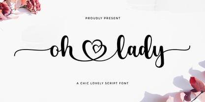 Oh Lady ! A new fresh an modern hand lettered font with decorative characters and a dancing baseline. So beautiful on invitation like handicraft, greeting cards, branding materials, business cards, quotes, posters, and more design concepts. Features : Ligatures Stylistic sets Basic Latin A-Z and a-z Numbers International Symbols included Punctuation Ligature Thank You.
 - Stone by Tipos do aCASO,
$14.95Let your mind wander, think about new cultures, missing links. After discovering a bamboo pen, the founder of the first digital type foundry in the northeast of Brazil proposed a set of graphic signs for a fictional civilization. Stone, established in 1999, is the only record of a mystical culture from the age of rocks. - MVB Pedestria by MVB,
$39.00 Lettering on a vintage bottle cap served as inspiration for MVB Pedestria. Akemi Aoki’s design is simple and legible, yet full of life, thanks to its loose, casual forms. Two sets of irreverent Pict fonts take characters from ubiquitous public restroom door symbology to a new level, providing playful pictograms for invitations, advertising, and infographics.
 - Rosalinde by Scriptorium,
$18.00Rosalinde is an original font based on rough hand-lettering reminiscent of 1960s era protest poster lettering. It's the kind of lettering you'd expect to see used for a snippet of anti-war poetry set against a red-white-and-blue striped background, or perhaps accompanied by a fat dove with an olive-branch. - Kudryashev by ParaType,
$30.00 The typeface (formerly known as Kudryashevskaya Entsiklopedicheskaya) was designed in 1960-1974 by Nikolay Kudryashev and Zinaida Maslennikova at Polygraphmash type design bureau for the Bol'shaya Sovetskaya Entsiklopedia (the Large Soviet Encyclopaedia) publishing house. New improved digital design and extention of character set was done by Natalia Vasilyeva and released by ParaType in 2008
 - Ascender Serif by Ascender,
$92.99 Ascender Serif was designed by Steve Matteson as an originative, unique serif design that is metrically compatible with Times New Roman. Ascender Serif offers refined on-screen readability characteristics and the pan-European WGL character set and solves the needs of developers searching for width-compatible fonts to address document portability across various platforms.
 - Fello by Australian Type Foundry,
$23.99 Fello is a geometric sans-serif with a university pedigree. Featuring some of the quirkiest alternates you will ever see, Fello is designed with a modernist tone of voice. Fello is great for display use but also has a large character set and includes many Opentype features, which makes it suitable for text use too.
 - LA QATRIE by Hishand Studio,
$15.00 Experience refined design with La Qatrie, a display font that boasts an elegant look and a touch of luxury, setting a new standard for sophistication in typography. Perfect for those needing a touch of elegance, classy, stylish, beautiful bold type, and modernity for their design. Complete with ligatures alternates regular hollow icon kerning multilingual support
 - Megaphone by Red Rooster Collection,
$60.00 It was our initial intention to develop a suitable lowercase for Les Usherwood's Elston typeface, based on a few characters from an old German typeface called Hermes Grotesque (Woellmer, Berlin). The new design became Creighton. Then, for good measure we decided to experiment with a 'crisper version' of this design; the result is 'Megaphone'.
 - Mesa Verde NF by Nick's Fonts,
$10.00A travel poster from the 1940s for Mexican tourism provided the inspiration for this voluptuous font with a strong architectural feel. A few unexpected idiosynracies in the letterforms add to its charm. Both versions of this font contain the Unicode 1252 Latin and Unicode 1250 Central European character sets, with localization for Romanian and Moldovan. - Brownstone Sans by Sudtipos,
$59.00 One design sparks another. As Alejandro Paul experimented with the strokes and curves of the monoline script Business Penmanship, he discovered interesting new forms and shapes that didn't fit the Spencerian theme of that typeface. These forms simmered in Ale’s subconscious over the next three years, during which time he visited New York City, pored over rare type specimen books in the New York Public Library, and explored Brooklyn’s neighborhoods. Brownstone, the face born from these explorations, is an original 21st-century design, yet one subtly infused with historical and cultural references -- keen observers might spot influences from decorative typefaces of 19th-century foundries. And just as faces from that era were influenced by contemporary architecture, the frames included with Brownstone echo the ornate iron railings of Park Slope’s row houses. (There’s also a slight 1960s vibe to Brownstone, of novelty swash-sans photocompositing faces, that can be played up at your discretion.) Influences aside, Brownstone has broad appeal to modern audiences. A soft, monoline sans-serif, with elements of Swiss geometry (see the ‘k’ and ‘x’), its marriage of highly legible, draftsman-like letterforms with decorative swashes and ornaments reflects the old-meets-new aesthetic of the DIY craft culture seen in Brooklyn and other urban centers. It’s ornamental but unfussy, romantic but understated. Brownstone includes character sets for Latin-based languages, including Western and Eastern European, Baltic, Turkish, Maltese, Celtic and Welsh. Over 1500 glyphs, including small capitals, swash characters, alternates, and ligatures, in both Light and Thin weights. Ornamental frames are also included in both weights. The Brownstone Frames fonts are available as separate fonts in the new Brownstone Slab family.
 - Zarlino by Patricia Lillie,
$29.00 Zarlino is an original typeface in the Blackletter style. It does not solidly adhere to any of the historical Blackletter classifications, but draws from all of them, with some characters owing more to the Roman than the Fraktur. Zarlino Delux includes three complete sets of upper case, ranging from the simple to the embellished to the even more embellished, two complete sets of lower case, and two more sets of embellished alternates for selected lower case characters. These alternates are available through Stylisitic Sets in OpenType aware applications. For use in non-OpenType aware applications, Zarlino Delux comes with a set of separate, standard fonts, one for each style. These standard fonts are also available for individual purchase. Zarlino was named by my cousin, a musician. Gioseffo Zarlino was a sixteenth century composer and musical theorist. Among other things, he offered detailed advice on the setting of words to music. With its blends of the old and the new, the simple and the ornate, Zarlino is suitable for many uses, from the elegant to the aggressive.
 - Colamine by Gatype,
$12.00 Introducing Colamine, a modern, free-flowing, hand-drawn font. Colamine has THREE COMPLETE CHARACTER SETS including uppercase and lowercase letters with full initial and final swash sets, binders, and a Stylistic Set. Characters were hand-drawn and then carefully digitized to create this modern script. Use character sets as they are, or mix them up and use additional options to create authentic-looking handwritten masterpieces. There's one amazing set of capitals that's perfect for monograms and another set of capitals that looks more like block letters. Check out the preview to see what you can do. This script is perfect for wedding suites, social media, blogs, titles, magazine layouts, monograms, businesses and anywhere else you need a script that looks modern and free flowing. To access alternative glyphs, you'll need a program that supports OpenType features such as Adobe Illustrator CS, Adobe Photoshop CC, Adobe Indesign, and Corel Draw. Thank you Gatype Adobe Photoshop : https://helpx.adobe.com/photoshop/using/glyph-panel.html Adobe Illustrator : https://helpx.adobe.com/illustrator/using/special-characters.html
 - Ginza Display Inline by Positype,
$22.00Sometimes you get an idea stuck in your head and the only way to get rid of that demon is to put something down on paper. A year later the doodles became a skeleton, and then the skeleton had a body, then the body had a name, then the name got a personality. What was left was a clean set of ten fonts that encompass a very simple skeleton with a lot of visual appeal. During the process, I saw ways to expand the typeface's display capabilities by producing inline styles as well as a down-and-dirty rough set. Each font has a full set of glyphs that include Central European and Small Cap characters. - Kapra Neue by Typoforge Studio,
$29.00 Kapra Neue was the #1 bestselling Grotesque Sans released in 2017 on MyFonts. Kapra Neue is a younger brother of Kapra. This new family has refreshed proportions, rounded corners, and a new shape of glyphs. It is characterised by a wide range of instances – 24 new weights, from Thin Condensed to Black Expanded, allowing use of the family in complex ways, depending on the user’s needs. Every instance comes with its italic version. The font has a glyph set for latin script and old-style figures. Kapra Neue is inspired by a “You And Me Monthly” magazine, published by National Magazines Publisher RSW "Prasa” in Poland, from May 1960 till December 1973.
 - XXII Grober Pinsel by Doubletwo Studios,
$29.99 XXII Grober Pinsel - Rough brush capitals The Grober Pinsel is simply what it’s called - a rough brush ("Grober Pinsel“ in german). Handwritten Capitals from A - Z and 0 - 9 in three character sets, upper-, lowercase and an alternates set. In addition comes a set of 10 line strokes and a couple of ligatures and alternates. On the whole this font gives you the possibility to make your design look very unique and handmade. The Pinsel is awesome on shirts, posters and stickers, your stylish fashion blog or cookbook, and everything that needs a bold lettered message. It loves big headlines and gives its best in dynamic logos and also he speaks a well central european. Also see: Behance-Project.
 - Pasarela by Los Andes,
$26.00 The street is the new runway. Pasarela is a display typeface inspired by the new culture of fashion in the streets. A global phenomenon across continents, traveling through social networks, fashion bloggers and street style. Everything is possible, everything is combined. The new culture of fashion is eclectic with hints of each culture at miles away. The complexity generated by the start page of this mix styles is solved perfectly with his neutral and clean tone, streamlined structure and thin strokes. It has been designed in two weights plus a set of borders that can generate graphic compositions for application in blogs, magazines, posters and tv. No one needs to be a fashion victim to cross the pasarela.
 - Ginza by Positype,
$22.00Sometimes you get an idea stuck in your head and the only way to get rid of that demon is to put something down on paper. A year later the doodles became a skeleton, and then the skeleton had a body, then the body had a name, then the name got a personality. What was left was a clean set of ten fonts that encompass a very simple skeleton with a lot of visual appeal. During the process, I saw ways to expand the typeface’s display capabilities by producing inline styles as well as a down-and-dirty rough set. Each font has a full set of glyphs that include Central European and Small Cap characters. - Torus Variations by Monotype,
$25.99 Torus Variations are an addition to the original monoline Torus family from 2017. The four new styles are Biline, Outline, Inline and Notched. The Torus family has been designed specifically for use in logo design, headlines and for branding purposes. While the default character sets are distinctive in their own right, graphic designers will love playing with the numerous alternate glyphs that will help them create unique wordmarks and logo designs. Torus’ simplistic forms and soft terminals make this a lovely, warm typeface perfect for a multitude of typographic applications. Key features: • 4 styles • 6 weights • 49 Alternates (via 2 Stylistic Sets) • Full European character set (Latin only) • 550+ glyphs per font.
 - Ginza Display Rough by Positype,
$22.00Sometimes you get an idea stuck in your head and the only way to get rid of that demon is to put something down on paper. A year later the doodles became a skeleton, and then the skeleton had a body, then the body had a name, then the name got a personality. What was left was a clean set of ten fonts that encompass a very simple skeleton with a lot of visual appeal. During the process, I saw ways to expand the typeface's display capabilities by producing inline styles as well as a down-and-dirty rough set. Each font has a full set of glyphs that include Central European and Small Cap characters.