10,000 search results
(0.013 seconds)
- Dosty by Dhan Studio,
$18.00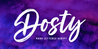 Dosty is a unique textured brush font because this brush font is made digitally. It's a contemporary approach to design, and has underlines and also several ligatures. Suitable for use in title designs such as book tittles, stationery designs, quotes, branding, logos, clothing, invitations, greeting cards, t-shirts, packaging designs, posters and more.
 - Awesome Brush by Gatype,
$10.00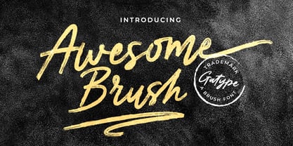 Awesome Brush is a unique textured brush font, because this brush font is made digitally. contemporary approach to design, and has underlines and also has several ligatures. Suitable for use in title designs such as tittle books, stationery designs, quotes, branding, logos, clothing, invitations, greeting cards, t-shirts, packaging designs, posters and more.
 - Fleischmann Gotisch PT by preussTYPE,
$29.00 Johann Michael Fleischmann was born June 15th, 1707 in Wöhrd near Nuremberg. After attending Latinschool he started an apprenticeship as punchcutter in the crafts enterprise of Konstantin Hartwig in Nuremberg, which ought to last six years. For his extraordinary talent Fleischmann completed his apprenticeship after four and a half years, which was very unusual. 1727 his years of travel (very common in these days) began, during which he perfected his handcraft by working in different enterprises as journeyman. First location was Frankfurt/Main where he worked for nearly a year at the renowned type foundery of Luther and Egenolff. Passing Mainz he continued to Holland, where he arrived in November 1728 and stayed till he died in 1768. In Amsterdam he worked for several type founderies, among others some weeks for Izaak van der Putte; in The Hague for Hermanus Uytwerf. Between 1729 and 1732 he created several exquisite alphabets for Uytwerf, which were published under his own name (after his move to Holland Fleischmann abandoned the second n in his name), apparently following the stream of the time. After the two years with Uytwerf, Fleischmann returned to Amsterdam, where he established his own buiseness as punchcutter; following an advice of the bookkeeper and printer from Basel Rudolf Wetstein he opened his own type foundery 1732, which he sold in 1735 to Wetstein for financial reasons. In the following Fleischmann created several types and matrices exclusively for Wetstein. In 1743 after the type foundery was sold by Wetstein’s son Hendrik Floris to the upcoming enterprise of Izaak and Johannes Enschedé, Fleischmann worked as independent punchcutter mostly for this house in Haarlem. Recognizing his exceptional skills soon Fleischmann was consigned to cutting the difficult small-sized font types. The corresponding titling alphabets were mostly done by Jaques-Francois Rosart, who also cut the main part of the ornaments and borders used in the font examples of Enschedé. Fleischmann created for Enschedé numerous fonts. The font example published 1768 by Enschedé contains 3 titling alphabets, 16 antiquacuts, 14 italic cuts, 13 textura- and 2 scriptcuts, 2 greek typesets (upper cases and ligatures), 1 arabic, 1 malayan and 7 armenian font systems, 5 sets of musicnotes and the poliphonian musicnotesystem by Fleischmann. In total he brought into being about 100 alphabets - the fruits of fourty years of creative work as a punchcutter. Fleischmann died May 27th, 1768 at the age of 61. For a long time he was thought one of the leading punchcutters in Europe. A tragedy, that his creating fell into the turning of baroque to classicism. The following generations could not take much pleasure in his imaginative fonts, which were more connected to the sensuous baroque than to the bare rationalism of the upcoming industrialisation. Unfortunately therefore his masterpieces did not survive the 19th century and person and work of Fleischmann sank into oblivion. The impressive re-interpretation of the Fleischmann Antiqua and the corresponding italics by Erhard Kaiser from Leipzig, which were done for the Dutch Type Library from 1993 to 1997, snatched Fleischmann away from being forgotten by history. Therefore we want to place strong emphasis on this beautiful font. Fleischman Gotisch The other fonts by Fleischmann are only known to a small circle of connoisseurs and enthusiasts. So far they are not available in adequat quality for modern systems. Same applies the "Fleischman Gotisch", which has been made available cross platform to modern typeset-systems as CFF Open Type font through the presented sample. The Fleischman Gotisch has been proved to be one of the fonts, on which Fleischmann spent a good deal of his best effort; this font simply was near to his heart. Between 1744 and 1762 he created 13 different sizes of this font. All follow the same principles of forms, but their richness of details has been adapted to the particular sizes. In later times the font was modified more or less sensitive by various type founderies; letters were added, changed to current taste or replaced by others; so that nowadays a unique and binding mastercopy of this font is missing. Likewise the name of the font underwent several changes. Fleischmann himself probably never named his font, as he did with none of his fonts. By Enschedé this textura was named Nederduits, later on Nederduitsch. When the font was offered by the german type foundery Flinsch in Frankfurt/Main, the more convenient name of Fleischmann-Gotisch was chosen. In his "Masterbook of the font" and his "Abstract about the Et-character" Jan Tschichold refered to it as "Duyts" again. To honour the genious of Johann Michael Fleischmann we decided to name the writing "Fleischmann Gotisch PT" (unhyphenated). Developing the digital Fleischman Gotisch I decided not to use one of the thirteen sizes as binding mastercopy, but corresponding to the typical ductus of the font to re-create an independent use of forms strongly based on Fleischmann´s language of forms. All ascenders and descenders were standardised. Some characters, identified as added later on, were eliminated (especially the round lower case-R and several versions of longs- respectively f-ligatures) and others were adjusted to the principles of Fleischmann. Where indicated the diverse characters were integrated as alternative. They can be selected in the corresponding menu. All for the correct german black letter necessary longs and other ligatures were generated. Through the according integration into the feature-code about 85% of all ligatures in the type can be generated automatically. Problematic combinations (Fl, Fk, Fh, ll, lh, lk, lb) were created as ligatures and are likewise constructed automatically. A historically interesting letter is the "round r", which was already designated by Fleischmann; it is used after preceding round letters. Likewise interesting is the inventive form of the &-character, which is mentioned by Tschichold in his corresponding abstract. Nevertheless despite all interpretation it was very important to me to maintain the utmost fidelity to the original. With this digital version of a phantastic texturfont of the late baroque I hope to contribute to a blossoming of interest for this genious master of his kind: Johann Michel Fleischmann. OpenType features: - Unicode (ISO 10646-2) - contains 520 glyphes - Basic Latin - Latin-1 Supplement - Latin Extended-A - Latin Extended-B - Central European Glyhps - Ornaments - Fractions - Standard ligatures - Discretionary ligatures - Historical ligatures - Kerning-Table
 - Univers by Linotype,
$42.99 The font family Univers? is one of the greatest typographic achievements of the second half of the 20th century. The family has the advantage of having a variety of weights and styles, which, even when combined, give an impression of steadiness and homogeneity. The clear, objective forms of Univers make this a legible font suitable for almost any typographic need. In 1954 the French type foundry Deberny & Peignot wanted to add a linear sans serif type in several weights to the range of the Lumitype fonts. Adrian Frutiger, the foundry's art director, suggested refraining from adapting an existing alphabet. He wanted to instead make a new font that would, above all, be suitable for the typesetting of longer texts - quite an exciting challenge for a sans-serif font at that time. Starting with his old sketches from his student days at the School for the Applied Arts in Zurich, he created the Univers type family. In 1957, the family was released by Deberny & Piegnot, and afterwards, it was produced by Linotype. The Deberny & Peignot type library was acquired in 1972 by Haas, and the Haas'sche Schriftgiesserei (Haas Type Foundry) was folded into the D. Stempel AG/Linotype collection in 1985/1989. Adrian Frutiger continues to do design work with Linotype right up to the present day. In 1997, Frutiger and the design staff at Linotype completed a large joint project of completely re-designing and updating the Univers family. The result: Univers Next - available with 59 weights and 4 Linotype Univers Typewriter weights. With its sturdy, clean forms Univers can facilitate an expression of cool elegance and rational competence. Univers has the uncanny ability to combine well with fonts of many different styles and origins: Old style fonts such as: Janson Text, Meridien, Sabon, Wilke. Modern-stressed fonts such as: Linotype Centennial, Walbaum. Slab serif fonts such as Egyptienne F, Serifa. Script and brush fonts such as: Brush Script, Mistral, Ruling Script. Blackletter fonts such as: Duc De Berry, Grace, San Marco. Even fun fonts such as F2F OCRAlexczyk, Linotype Red Babe, Linotype Seven."
 - Middle Ages by Mans Greback,
$49.00 Middle Ages is a hand-drawn medieval type, designed by Måns Grebäck during 2019. With its blackletter style it works great in many historical context typesettings, as well as for traditional Christmas projects. It has a Gothic style that also works well for rock music genres, or for tattoos and other rough graphics. The font is multilingual and supports all Latin-based European languages, contains numbers and all symbols you'll ever need.
 - Blahh - Unknown license

- Alonzo by Fenotype,
$25.00 Alonzo is a modern cosmopolitan who speaks several languages fluently. Alonzo comes in six weights and two widths, as well as corresponding italics, making a total 24 styles. Alonzo is an elegant, simplistic, high-contrast sans that is at home in high-end fashion and cultural environments, as well as in the world of restaurants and nightclubs. While Alonzo Condensed is more illustrative and works best in display use, headlines, logotypes, labels and all that, Alonzo Regular works in a wider range of contexts, from body text to editorial and catalogs and more. Alonzo is equipped with several OpenType features such as oldstyle figures, small caps, Standard Ligatures, Superior and Inferior Figures. In addition Alonzo has Stylistic Alternate lowercase "a" with round Bowl. Me llamo Alonzo. Mucho gusto, piacere di conoscerti, nice to meet you!
 - Slik by Trine Rask,
$40.00 Slik is a type family developed with packaging in mind. It started as one word in the boldest weight while working on an update of the Swedish liquorice brand »Läkerol« , a rejected proposal with the logotype in all upper case letters. It has very characteristic elements and is still simple and consistent in a way that is suitable in packaging design. The family consists of seven weights from Ultralight to Extrabold. It contains some alternative characters more suitable for text & numbers for pricing.
 - Inicia by Storm Type Foundry,
$39.00 A retro-style can be regarded as lack of original contemporary ideas. But also as passion for nostalgic time-traveling. Everyone wants to return to their youth at least for a moment. Inicia was one of my first designs (hence the name) from the mid-eighties. The original drawing was never finished because there were too many similar typefaces around. After three decades the shapes of the old designs suddenly became tempting to finish. Now restored and completed at Storm Type Foundry.
 - Random Thoughts by PizzaDude.dk,
$20.00 Random Thoughts is a selection of of quite simple handmade capital letters. They are legible, almost mono-lined, handmade and they are a bit jumpy - but never the less, they suit a headline that needs a catchy look very fine! I've included 4 different versions of each letter. One lowercase, one uppercase and two contextual alternates. These 4 different versions automatically cycle as you type, leaving your text quite random - but still very clear and legible! And, of course, there is multilingual support!
 - Mariken by Hanoded,
$15.00 Mariken van Nieumeghen is a late medieval Dutch text from the early 16th century. The protagonist of the play (a young maid called Mariken) spends seven years with the devil (called Moenen), after which she is miraculously released. Mariken is a handmade font, which was based on the works of Robert Granjon (1545-1588), a French type designer and printer. Use it for product packaging, books and posters. Comes in 3 weights (with italics) and a hellish amount of diacritics.
 - ZT Voltra by Zeune Type Foundry,
$25.00 ZT Voltra is a stylish and charismatic serif type family that brings modern and vintage feels that allow you to make a visual journey from thinnest body slab to a very thick expanded display serif. ZT Voltra works in modern digital interfaces on mobile and web platforms also suitable in humanist serif touch for prints and any design projects. Twelve weights with seven expanded widths cover everything from an airy thin to a good looking heavyweight and support for 100+ languages.
 - Road Picture JNL by Jeff Levine,
$29.00 Road Picture JNL was modeled after the hand lettered title and credits for the 1940 Bob Hope-Bing Crosby semi-musical comedy “Road to Singapore”, and is available in both regular and oblique versions. Although the lettering design doesn’t resemble anything that was probably used in Singapore at the time, its faux “exotic” look still makes for an interesting revival. Bob Hope and Bing Crosby made a total of seven “road” pictures, hence the homage in the name of this type font.
 - FF Dirty Four by FontFont,
$41.99 British type designer Neville Brody created this display FontFont in 1994. The font is ideally suited for advertising and packaging, music and nightlife as well as poster and billboards. FF Dirty Four provides advanced typographical support with features such as ligatures, alternate characters, and case-sensitive forms. It comes with proportional lining figures. This FontFont is a member of the FF Dirty super family, which also includes FF Dirty One, FF Dirty Seven, FF Dirty Six, and FF Dirty Three.
 - TR Reqnad Display by Tondi Republk,
$17.00 Reqnad Display is part of a series of typefaces by Tondi Republk, inspired by modern industrial design and architecture. The Reqnad Display type system consists of seven typefaces with varying visual styles and weights which can be used interchangeably to create harmonious, versatile and impactful visual communication systems. Used alongside well curated imagery and grid based layouts it adds a modern appeal to written sentiments. To view more examples of layouts created with Reqnad Display search for the #ReqnadDisplay hashtag on social media.
 - Tangram by Présence Typo,
$51.00 Tangram is the famous Chinese puzzle, perhaps one of the oldest games in the world. It consists of seven pieces called Tans obtained from a square cut up in a certain way. These seven Tans (5 different-sized triangles, a square and a parallelogram) have to be used to form the figures. The Tangram collection represents 1772 different shapes spread in 15 fonts. Each font exists in 2 styles: plain & inline.
 - Aharoni MF by Masterfont,
$59.00 One of the famous Hebrew typeface ever, revived with new weight, allows lots of combinations.
 - Magneta by Volcano Type,
$19.00One of our first fonts ever. Simply made from some magnets hanging on a refrigerator. - PF Centro Slab Press by Parachute,
$75.00 Centro Slab Press: Specimen Manual PDF Ever since its first release, Centro Slab has been particularly popular with corporate applications, branding and print media. The new Centro Slab Press version was redesigned with narrower proportions which are better suited for publications such as magazines and newspapers as well as web applications. Centro Slab Press is a very clean and legible typeface even at heavier weights, a characteristic which is not often seen among slab typefaces. This is part due to the fact that Centro Slab Press is not overpowered by clumsy serifs. Instead it incorporates semi-slabs which provide comfortable reading without compromising its modern profile. The italics are narrower than the romans and incorporate beautiful cursive characteristics. Each style consists of 659 glyphs with several opentype features and an extended set of characters which support more that 100 languages such as those based on the Latin, Greek and Cyrillic alphabet. The family is composed of 16 styles from ExtraThin to UltraBlack along with their italics. All weights were meticulously hinted for excellent display performance on the web.
 - Shentox by Emtype Foundry,
$69.00 During a visit to London in 2008 I fell in love with the square font used on the British car number plates. I was immediately inspired to start working on this font and have been developing it intermittently ever since. Several more trips to London and the project evolved before it finally took off and became Shentox. Despite the starting point being inspired by simple, everyday car plates, the font soon evolved into something fine and very rich in detail. Even though the square genre is very restrictive, Shentox is a highly legible contemporary font with a full range of weights, useable not only as a display family for headlines and posters, but as a distinct, clean font family for branding and general editorial use (Especially magazines). It has been carefully drawn paying extra attention to the details, high end finishes that makes Shentox a safe font for use in large scale work. For example, the curves of every individual corner have been adjusted character by character to avoid the common problems encountered with square fonts (Eg. darker corners between weights or a visually inconsistent radius between the Upper and Lowercases as a result of copy/paste). Shentox italic, which has a 12 degree slant, has been corrected to avoid distortion when slanted. The radius of the upper-right and lower-left corners are more pronounced, giving it a more fluid Italic feel. Shentox is available in Open Type format and includes ligatures, tabular figures, fractions, numerators, denominators, superiors and inferiors. It supports Central and Eastern European languages. This type family consists of 14 styles, 7 weights (Thin, UltraLight, Light, Regular, Medium, SemiBold and Bold) plus italics. Shentox PDF
 - Thang by Fenotype,
$30.00 Aint’ nuthin but the Thang. Thang is a street cred script family with big initial caps and tight flow. Thang is great for flashy headlines or as a logotype. Thang family comes with three weights. Thang Extras is a pack of strokes and dots that can be used to decorate your texts typed with Thang. Thang Extras can also be combined with Thang letters for custom Swash. Thang is packed with several OpenType features: keep on Standard Ligatures and Contextual Alternates for smooth flow. Try Swash, Stylistic or Titling Alternates for alternate characters to create customised lettering works. Check out Glyph Palette for even more alternate characters and go wild the Thang.
 - Galleds Stars by Yukita Creative,
$14.00 Galleds Stars Display Typeface is a single font with a minimalistic but standout style for any work from movie titles, music album covers, magazines, beauty ads, and even wedding invitations. --- Minimalist type design has been a success for professional designers worldwide. - Galleds Stars Display Typeface is legible from much larger distances than typical fonts - Elegant letterforms give the feeling of luxury - Smooth curves for elegant typography This font has several alternative characters as in ( A,N,O,R,S,a,c,e,o,t,y ) Tips for using fonts in projects. Use this font with a simple background, not too busy so that you can highlight your branding This font file OTF
 - Billie Crimson by Letterhend,
$17.00 Billie Crimson is a stylish serif font that exudes class and timelessness. Its sophisticated & classic looks make it perfect for a variety of design projects, especially in logo, and the other various formal forms such as invitations, labels, logos, magazines, books, greeting / wedding cards, packaging, fashion, make up, stationery, novels, labels or any type of advertising purpose.The font comes with several alternate characters that add even more versatility and uniqueness to your designs. Features : Uppercase & lowercase Numbers and punctuation Alternares Multilingual PUA encoded We highly recommend using a program that supports OpenType features and Glyphs panels like many of Adobe apps and Corel Draw, so you can see and access all Glyph variations.
 - Batoswash by T4 Foundry,
$21.00Avantgarde fonts Batory and Batoswash are monoline sansserifs designed by Bo Berndal. The futuristic Batory (think Bladerunner and Total Recall) and the spicier relative Batoswash come in three versions: Narrow, Middle and Wide. The font family is available in Truetype and Postscript for Mac and PC. Bo Berndal, born 1924, has been designing typefaces over 56 years, for Monotype, Linotype and other foundries. "Batory is a monoline reaction to my many calligraphic fonts", says Bo Berndal. "That is also the reason I did several widths instead of weights. Batory has short stems and high x-height. Batoswash is a Batory gone wild!" The successful Batory has already been used for logotypes, vignettes in magazines and as headline type. - Figgins Sans by Shinntype,
$79.00 The first sans serif types were made in London in the early 19th century. They were severely modern, all caps and bold. The Figgins foundry, inventor of the term sans serif, showed a ?ne example in its specimen of 1836. The extra bold weight of Figgins Sans is a close revival of the original, with the addition of a lower case which retains its partly geometric, partly grotesque quality. The family is rounded out with other weights and an italic, and extended into Cyrillic and Greek, all executed in what is assumed to be as authentic a manner as possible, given the hypothetical nature of the exercise. Together with Scotch Modern, comprises The Modern Suite of matched fonts.
 - Pumpkinseed by Three Islands Press,
$19.00 The tale of Pumpkinseed began with a bit of hand-printing I noticed on the dinner menu at a local restaurant. I took a menu home for future reference. Several months later, some similar hand-lettering on another dinner menu caught my eye. I became a sort of connoisseur of hand-done menu lettering. After tweaking and adjusting a few of these menu-inspired (uppercase) characters, I placed them -- along with some other designs -- in an online Type in Progress survey. They won. So I finished the caps, drew out the lower case from scratch, created three weights and oblique styles. The result: Pumpkinseed, a full-featured casual hand-lettering face. Comes in Light, Medium, and Heavy.
 - Dueblo by alphabeet.at,
$40.00 Dueblo is a font family in serif, sans serif and semi serif with variability in weight and serifs. It's a classical antiqua with a sans serif basis, a semi serif version, two decor styles for headlines and initials and the italics in sans and in serif. The small caps, alternates as well as other useful optional and contextual open type features are included in the fonts. It has been in development since 2012 and in use for several projects and publications since 2015. It was worked on until 2020, the cyrillic and greek letters were added, and it was built up in a new and modern way. Now it's really ready for building words and paragraphs.
 - Aretha by Lafontype,
$25.00 Aretha is a classy and beautifully designed sans serif. The main idea of Arteha is to combine the sans serif humanist font style with traditional styles so as to provide a pleasant atmosphere for the reader. The horizontal side of Aretha is designed with a slightly thinner so that the counter can look wider and also looks stiff in some parts to give a firm impression on the letters. Not only for display size, Aretha also works well in text size. Represents multilingual and is equipped with several Open Type features such as tabular figures and stylistic alternates in letters a, g, t and y, so this is very suitable to complement your various design needs.
 - Rich Dingbats & Bursts by Enrich Design,
$24.95 Rich Dingbats & Bursts was created with graphic designers in mind. I worked for a weekly newspaper, and finding different bursts was a challenge. You either had to draw your own (and who has time for that under tight deadlines) or use the same dull bursts over and over. I wanted to give the people I worked with at the newspaper choices, and Rich Dingbats & Bursts was born. There are several uses for this font. It's great for adding graphic elements to your Photoshop artwork. In FreeHand, users can convert the burst and paste a photo inside the burst for an interesting effect. QuarkXPress users don't have to import or draw bursts, just type the appropriate character!
 - Guillaume by George Tulloch,
$21.00 Guillaume is a small family of text fonts with its roots in the French sixteenth century. The roman is based on the types of Guillaume Le Bé (c.1525–1598), and the italic on those of Claude Garamont (Garamond) (d. 1561). Garamont’s romans have inspired countless modern interpretations, but his italics, despite their merit, have attracted much less attention. Guillaume offers extensive support for European languages, and is best suited for use in applications that support OpenType. Among its OpenType features are ligatures, small caps, several sets of numerals, contextual alternates, intelligent implementation of long ‘s’ and other period features, and fractions. For more detail, please see the pdf available in the Gallery.
 - Batory by T4 Foundry,
$21.00Avantgarde fonts Batory and Batoswash are monoline sansserifs designed by Bo Berndal. The futuristic Batory (think Bladerunner and Total Recall) and the spicier relative Batoswash come in three versions: Narrow, Middle and Wide. The font family is available in Truetype and Postscript for Mac and PC. Bo Berndal, born 1924, has been designing typefaces over 56 years, for Monotype, Linotype and other foundries. “Batory is a monoline reaction to my many calligraphic fonts”, says Bo Berndal. "That is also the reason I did several widths instead of weights. Batory has short stems and high x-height. Batoswash is a Batory gone wild!" The successful Batory has already been used for logotypes, vignettes in magazines and as headline type. - Festabe by PizzaDude.dk,
$20.00 It's time for a party! A party with monkeys, or a party AS monkeys! :) The danish term "Festabe" is a partyanimal, and definitely in a positive way! And that's the spirit of this font! It has that happy attitude, that could boost your designs in a happy and positive way. Besides legibility, the font is superlegible, even at very small sizes. But try looking at the letters at a LARGE size, and you will notice the smoothness of each letter! To ensure the letters don't get too alike, I've added several (slightly) different versions of each letter. In fact, every letter has 5 different versions, and these automatically cycles as you type!
 - Foros by ParaType,
$30.00 Foros(tm) is a modern humanist sanserif font family of 8 styles. Each style contains beside many other alternatives of upper and lowercase letters a 'unicase' character set. Foros is a development of a modern pattern of rough geometric shapes in combination with open humanistic forms that produces a mixture of obstinacy and delicacy. Quadratic shapes of ovals bring stability and firmness, but angular terminals of diagonals in several letters together with curved junctions of bowls with verticals stems add emotions and elegance. Such variety in image make it possible to use the fonts in different kinds of display typography. Foros type family was designed by Oleg Karpinsky. Released by ParaType in 2013.
 - Inkston by Fenotype,
$35.00 Inkston is a hand drawn font collection of six different types and several versions and a set of extras. All the fonts are drawn using the same grid and scale so that they play together well. Inkston Extras is a set of pictograms, swashes, ornaments and catchwords designed to support the font. Inkston fonts work nice as they are yet they’re equipped with OpenType features to give you even more tools to customise your design. Try combining any two or more of the fonts for impressive results. Purchase the whole collection for the best price and go crazy with the possibilities! Inkston collection will go for anything from cute to artisanal to streetwise hand lettering style.
 - Ongunkan Sweden Futhark by Runic World Tamgacı,
$40.00 Prior to 500 AD the 24-rune Elder Futhark was used in Sweden. From 500 AD until 800 AD there were many Futharks which were transitions from the 24-rune Futhark to one of the 16-rune Futharks. By the end of this period the 24-rune Futhark was completely out of use , and only 16-runes Futharks were in use. By 900 AD two different types of Shorttwigs-Futharks had been born. One was popularized in Norway and the other was used in the west (the British islands). By 1000 AD the adjustment of the runes to the Latin alphabet had begun, and several versions are found up until the Dalrunes, about 1700-1800 AD.
 - GR Altosa by Garisman Studio,
$35.00 GR Altosa is a very cool typeface for headline designs with a bold and bold theme. With a strong display and clean nodes make text in the design become more character and great. Inspired by headline trends in a poster or magazine today. So that with a firm and a very modern style makes your design better! This font is formed from the headline display font of a very careful title. Suitable for all graphic design projects, prints, logos, posters, t-shirts, packaging, website, ticket and applies to several types of graphic design. Especially for the use of a title! Very suitable! GR Read is compatible with any software without pain, especially in headlines with GR Altosa pairing
 - MattsDinosaurStencils by Ingrimayne Type,
$11.95 This typeface is mostly composed of images of dinosaur skeletons drawn by Matthew Schenk and used as stencils for decoration. I thought they would also make a nice typeface. Check the key map—some of the very large critters are cut into pieces and put on several keys—this may help printing in some situations.
 - Illyrian by Solotype,
$19.95Our font of the original was only ten point, so we had to use our imagination to a great extent. As specialists in Victorian typography, we have found that many people do not like the "center alignment" idea, used on several old time faces, but we have been faithful to the original. So there! - Tasneem NF by Nick's Fonts,
$10.00The pattern for this elegant, if slightly quirky, Art Deco typeface was drawn by Gustav Jensen for the 1931 classic, American Alphabets. Perfect for suggesting the exotic, the font also includes several graphic elements in Jensen’s inimitable style. Both versions of the font include 1252 Latin, 1250 CE (with localization for Romanian and Moldovan). - Miffiest by Fridaytype,
$15.00 Miffiest - Stylish Calligraphy Fonts Miffiest is a stylish calligraphy font. Inspired by sketches, there are several characters that have unique ligatures and give a different impression from other fonts. Miffiest comes with multilingual support as well. Files Included: - Uppercase & Lowercase - Numbers & punctuation - Multilingual - Ligature - Alternative Drop any message if you have any questions, Thanks! Fridaytype
