10,000 search results
(0.05 seconds)
- Enter Sansman - Unknown license
- Radios in Motion - Unknown license
- PetitaMedium - Unknown license
- Slimania - Unknown license
- JH Noha by JH Fonts,
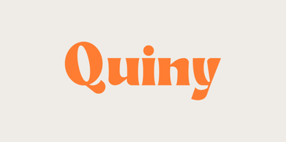
$40.00 - Quiny by Nestype,
$17.00 - Alons Classic by BA Graphics,
$45.00A spurred Roman classic design. Great Headline Font if you are looking for that Bold Statement. - Schneidler Grobe Gotisch by Intellecta Design,
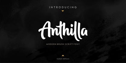
$24.90a revival of a classic bold blackletter from the great german typedesigner F. H. Ernst Schneidler - Anthilla by ARToni,
$20.00 - Skrawl by Haiku Monkey,
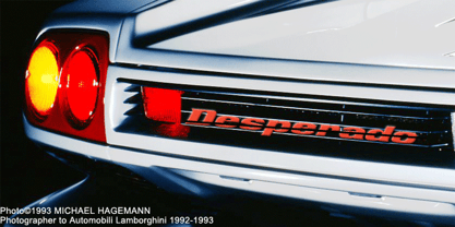
$10.00Skrawl will add some creepy boldness to your life. Just don't let it babysit your kids. - Desperado by FontMesa,
$20.00 - Goldshine by Uncurve,
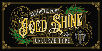
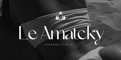
$30.00If you like old style type, ephemera or victorian era, you must be collect this font , its combination of old and modern touch ,it so adaptable and thats make an eye catching design. This unique and classic font for signage, label, poster, gold leaf, sign painting, branding and the other graphic design made. Gold shine inspired of vintage advertising and sign shop around the world. Goldshine comes with tons of alternates characters to make more eye cacthy . It is suitable for authentic logos, headings, sign painting, posters, letterhead, branding, magazines, album covers, book covers, movies, apparel design, flyers, greeting cards, product packaging, and more. To make everyone enjoyed Goldshine give you one extras font including ornament and traditional badge. If you use Goldshine with you imagination, you just combine with the another font like script , serif or san serif font and adding some effect finally BOOM..!! you get a great design for your project. - Le Amatcky by Hishand Studio,
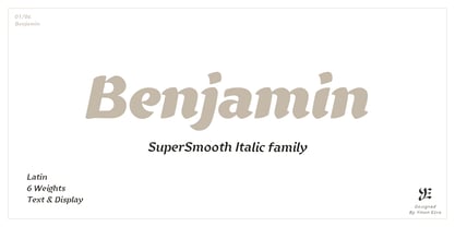
$16.00 - Ye Benjamin by Yinon Ezra,
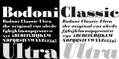
$30.00 - Bodoni Classic Ultra by Wiescher Design,
$39.50 - Refracta by ITC,
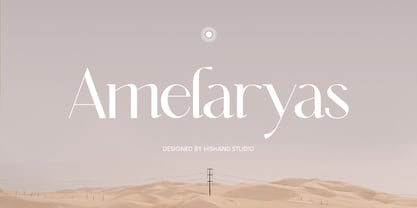
$29.00Refracta is the work of British designer Martin Wait, a simple, condensed italic sans serif capital alphabet. The letterforms were designed with a shadow effect for extra impact. Refracta is ideal for a wide variety of applications. - Amelaryas by Hishand Studio,
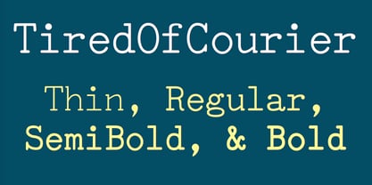
$15.00 - TiredOfCourier by Ingrimayne Type,
$14.95 - Perva by Eller Type,
$30.00Perva is a suite of three eye-catching fonts inspired by display types from the 19th century. This unconventional family has three different font styles that can be used individually or combined to build a playfulness multi-typeface design system. It is suitable for titling, posters headlines, book covers, packaging, social media, and branding. Perva brings together a Slab serif font, a.k.a Antique or Egyptian; a Reverse-contrast or Italian; and an Old English Blackletter. The design is inspired by the display types listed as “Typographic monstrosities” in Thomas C. Hansard’s book Typographia (1825). What he found absurd was understood here as interesting and enjoyable to introduce a contemporary approach of the types widely sold by foundries such as Bruce’s New York Type-Foundry and Caslon Foundry. Each of the three fonts holds around 400 glyphs, covering the languages of Northern, Western, Central, and Southern Europe. Opentype features include case-sensitive forms and a couple of alternates for the Blackletter style. - Vendetta by Emigre,
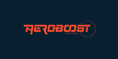
$69.00The famous roman type cut in Venice by Nicolas Jenson, and used in 1470 for his printing of the tract, De Evangelica Praeparatione, Eusebius, has usually been declared the seminal and definitive representative of a class of types known as Venetian Old Style. The Jenson type is thought to have been the primary model for types that immediately followed. Subsequent 15th-century Venetian Old Style types, cut by other punchcutters in Venice and elsewhere in Italy, are also worthy of study, but have been largely neglected by 20th-century type designers. There were many versions of Venetian Old Style types produced in the final quarter of the quattrocento. The exact number is unknown, but numerous printed examples survive, though the actual types, matrices, and punches are long gone. All these types are not, however, conspicuously Jensonian in character. Each shows a liberal amount of individuality, inconsistency, and eccentricity. My fascination with these historical types began in the 1970s and eventually led to the production of my first text typeface, Iowan Old Style (Bitstream, 1991). Sometime in the early 1990s, I started doodling letters for another Venetian typeface. The letters were pieced together from sections of circles and squares. The n, a standard lowercase control character in a text typeface, came first. Its most unusual feature was its head serif, a bisected quadrant of a circle. My aim was to see if its sharp beak would work with blunt, rectangular, foot serifs. Next, I wanted to see if I could construct a set of capital letters by following a similar design system. Rectangular serifs, or what we today call "slab serifs," were common in early roman printing types, particularly text types cut in Italy before 1500. Slab serifs are evident on both lowercase and uppercase characters in roman types of the Incunabula period, but they are seen mainly at the feet of the lowercase letters. The head serifs on lowercase letters of early roman types were usually angled. They were not arched, like mine. Oddly, there seems to be no actual historical precedent for my approach. Another characteristic of my arched serif is that the side opposite the arch is flat, not concave. Arched, concave serifs were used extensively in early italic types, a genre which first appeared more than a quarter century after roman types. Their forms followed humanistic cursive writing, common in Italy since before movable type was used there. Initially, italic characters were all lowercase, set with upright capitals (a practice I much admire and would like to see revived). Sloped italic capitals were not introduced until the middle of the sixteenth century, and they have very little to do with the evolution of humanist scripts. In contrast to the cursive writing on which italic types were based, formal book hands used by humanist scholars to transcribe classical texts served as a source of inspiration for the lowercase letters of the first roman types cut in Italy. While book hands were not as informal as cursive scripts, they still had features which could be said to be more calligraphic than geometric in detail. Over time, though, the copied vestiges of calligraphy virtually disappeared from roman fonts, and type became more rational. This profound change in the way type developed was also due in part to popular interest in the classical inscriptions of Roman antiquity. Imperial Roman letters, or majuscules, became models for the capital letters in nearly all early roman printing types. So it was, that the first letters in my typeface arose from pondering how shapes of lowercase letters and capital letters relate to one another in terms of classical ideals and geometric proportions, two pinnacles in a range of artistic notions which emerged during the Italian Renaissance. Indeed, such ideas are interesting to explore, but in the field of type design they often lead to dead ends. It is generally acknowledged, for instance, that pure geometry, as a strict approach to type design, has limitations. No roman alphabet, based solely on the circle and square, has ever been ideal for continuous reading. This much, I knew from the start. In the course of developing my typeface for text, innumerable compromises were made. Even though the finished letterforms retain a measure of geometric structure, they were modified again and again to improve their performance en masse. Each modification caused further deviation from my original scheme, and gave every font a slightly different direction. In the lower case letters especially, I made countless variations, and diverged significantly from my original plan. For example, not all the arcs remained radial, and they were designed to vary from font to font. Such variety added to the individuality of each style. The counters of many letters are described by intersecting arcs or angled facets, and the bowls are not round. In the capitals, angular bracketing was used practically everywhere stems and serifs meet, accentuating the terseness of the characters. As a result of all my tinkering, the entire family took on a kind of rich, familiar, coarseness - akin to roman types of the late 1400s. In his book, Printing Types D. B. Updike wrote: "Almost all Italian roman fonts in the last half of the fifteenth century had an air of "security" and generous ease extremely agreeable to the eye. Indeed, there is nothing better than fine Italian roman type in the whole history of typography." It does seem a shame that only in the 20th century have revivals of these beautiful types found acceptance in the English language. For four centuries (circa 1500 - circa 1900) Venetian Old Style faces were definitely not in favor in any living language. Recently, though, reinterpretations of early Italian printing types have been returning with a vengeance. The name Vendetta, which as an Italian sound I like, struck me as being a word that could be taken to signifiy a comeback of types designed in the Venetian style. In closing, I should add that a large measure of Vendetta's overall character comes from a synthesis of ideas, old and new. Hallmarks of roman type design from the Incunabula period are blended with contemporary concerns for the optimal display of letterforms on computer screens. Vendetta is thus not a historical revival. It is instead an indirect but personal digital homage to the roman types of punchcutters whose work was influenced by the example Jenson set in 1470. John Downer. - Aeroboost by Mevstory Studio,
$30.00Aeroboost is a sporty look with a strong and sporty feel, perfect for your titles, logos, typography, flyers and various design needs, making your designs more modern and professional. Aeroboost comes with these all caps making them look strong and bold, giving them a bold and modern feel, so enjoy creating any project that will showcase your main idea! - Anthemis by Blankids,
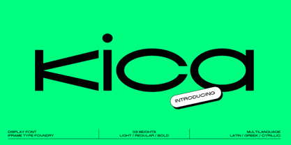
$17.00Introducing Anthemis, the bold script font inspired by Bold hand lettering style. Anthemis is good for branding logotype, Packaging, poster, headline, book cover, Flyer, t-shirt design and any more. Anthemis has many alternative character and have opentype features like a stylistic alternatives, stylistic set, ligature and swash so you can mix and match like a you want. - Kica by iframe,
$32.003 weights (Light, Regular, Bold) 613 glyphs Character set A-Z Uppercase & Lowercase Numerals & Punctuation Multilingual Language support: Latin, Greek, Cyrillic Works on PC & Mac Kica is a modern display typeface that is characterized by its clean lines, bold strokes, and geometric shapes. This typeface was designed with the intention of creating a strong visual impact and capturing attention. - Hlad by Tour De Force,
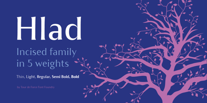
$25.00Hlad is incised sans serif family inspired by carved Roman letters. Hlad comes in 5 weights – Thin, Light, Regular, Semi Bold and Bold. It is a low contrast typeface, with asymmetric flare serifs and sharp bowl and shoulder endings. Hlad combines elegance of calligraphic endings with stable, solid constructional stems from sans serif group of typefaces. - Goldside by Balpirick,
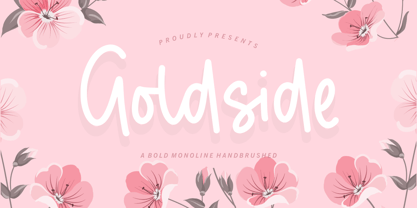
$15.00Goldside is a Bold Monoline Handbrushed Font. Goldside is a bold and elegant handwritten font. Its distinct and well rounded letters make this font a masterpiece. Fall in love with its incredibly versatile style and use it to create spectacular designs! Goldside also multilingual support. Enjoy the font, feel free to comment or feedback, send me PM or email. - Lobby Poster JNL by Jeff Levine,
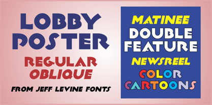
$29.00The hand lettered cast credits for the 1932 George Arliss film “The Man Who Played God” inspired Lobby Poster JNL, which is available in both regular and oblique versions. A bold and playful Art Deco poster alphabet, its nonconformist character widths and shapes are casual enough for informal designs yet bold enough to get any point across. - Wahwoh by 38-lineart,
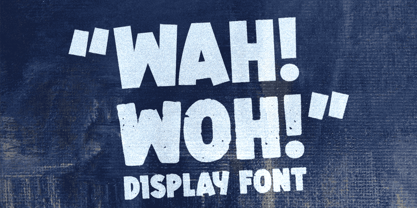
$14.00WAHWOH is a heavy allcaps font which is perfect for heavy titles and headlines. The uppercase looks rough while the lowercase looks sharp. This typeface gives the impression of street style, bold, retro, urban and modern style. Clear and bold, easy to combine with other artwork and typefaces, this is the reason why you should have this font. - MACA by Bon Bon Lab,
$11.00Maca Bold is a friendly, modern and youthful handwritten font. It's unique handwritten look is ideal for design projects such as logos, social media posts, invitations, packaging or blog headlines. It contains a full set of lower & uppercase letters, a large range of punctuation, numerals, ligatures and multilingual support. Maca Bold will definitely make your text stand out. - Wrought by Jon Cartagena,
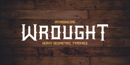
$10.00Wrought is a bold geometric display font by Jon Cartagena. It's purpose is to give a rugged, heavy feeling to your designs. Wrought is available in four weights: Thin, Light, Regular, and Bold. Each character is carefully designed to be vertically aligned at the center. This gives Wrought a unique flair, while promoting a harmonious look through each word. - Fansi Pensle by Ingrimayne Type,
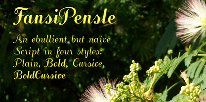
$5.00FansiPensle is a set of four decorative scripts. The capitals are fussy and ostentatious and a little weird with strange flourishes. The lower-case letters are neat and simple. Lower-case letters have the shapes of a cursive alphabet and they are connected in the cursive and cursive-bold styles but not in the plain and bold styles. - Thunderbold by Gartype Studio,
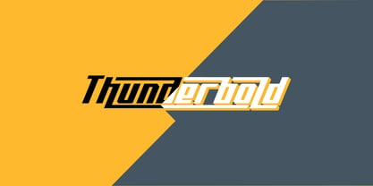
$15.00Thunderbold is inspired by "Fast & Bold character" so,this is a powerful font suitable for poster, banner, flyer, race number, logo, logotype and more.This font have an extrude style to save your time to make extruded fonts just switch to extrude style!.Not just that, Thunderbold have a lot of Alternate too. Be bold like Thunder ! - Goldie Boxing by Balpirick,
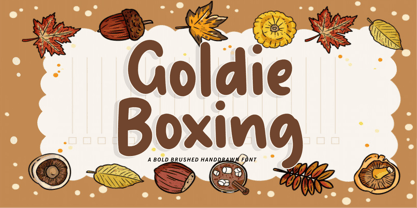
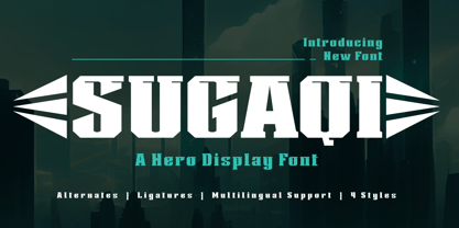
$15.00Goldie Boxing is a Bold Brushed Handdrawn Font. Goldie Boxing is a bold display font with an autumn theme. Add this chunky lettered font to your designs and notice how it makes them come alive! Goldie Boxing also multilingual support. Enjoy the font, feel free to comment or feedback, send me PM or email. Thank you! - Sugaqi by Twinletter,
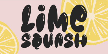
$17.00Sugaqi is a visual embodiment of courage in the form of a superhero display font. Tailor-made for projects that require a bold, bold, and punchy look like movies, games, or standout designs. What’s Included : File font All glyphs Iso Latin 1 Alternate, Ligature Simple installations PUA Encoded Characters – Fully accessible without additional design software. Fonts include Multilingual support - Lime Squash by Epiclinez,
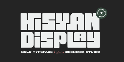
$18.00Bold, playful, and fresh - the lime squash font will make your design stand out from the rest. This fun, bold font will give your work an added creativity boost, whether for a logo, product packaging, or a headline. With its unique style that has been carefully crafted, the lime squash font is perfect for any creative project. - Hisyan by Zeenesia Studio,
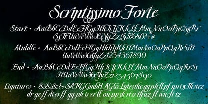
$15.00INTRODUCING HISYAM. Hisyam is a Bold style sans serif font with strong character and soft features. modern and classic sans serif font with a clear and bold look. It’s a very versatile font that works great in large. Hisyam was built with open Type features, many stylistic alternate and Ligature makes your project will be awesome - Scriptissimo Forte by Wiescher Design,
$39.50Scriptissimo-Forte is the bold version of Scriptissimo. When using the normal cut of Scriptissimo I sometimes had the feeling that I could well use a bolder cut to make a bigger impression, so I simply made that cut for myself. I think you can use it too; try it out. Yours very bold scriptissimo, Gert Wiescher - Retro Pica by Creativemedialab,
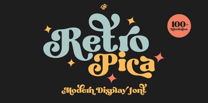
$18.00Introducing Retro Pica, a bold and fun display font. Retro Pica features a bold retro style with many alternate characters ideal for design, such as posters, t-shirts, branding, logos, etc. Retro Pica Lite, with this style, we replaced the uppercase character with the alternate version for those who use applications that do not support open-type features. - ITC Legacy Serif by ITC,
$40.99ITC Legacy¿ was designed by American Ronald Arnholm, who was first inspired to develop the typeface when he was a graduate student at Yale. In a type history class, he studied the 1470 book by Eusebius that was printed in the roman type of Nicolas Jenson. Arnholm worked for years to create his own interpretation of the Jenson roman, and he succeeded in capturing much of its beauty and character. As Jenson did not include a companion italic, Arnholm turned to the sixteenth-century types of Claude Garamond for inspiration for the italics of ITC Legacy. Arnholm was so taken by the strength and integrity of these oldstyle seriffed forms that he used their essential skeletal structures to develop a full set of sans serif faces. ITC Legacy includes a complete family of weights from book to ultra, with Old style Figures and small caps, making this a good choice for detailed book typography or multi-faceted graphic design projects. In 1458, Charles VII sent the Frenchman Nicolas Jenson to learn the craft of movable type in Mainz, the city where Gutenberg was working. Jenson was supposed to return to France with his newly learned skills, but instead he traveled to Italy, as did other itinerant printers of the time. From 1468 on, he was in Venice, where he flourished as a punchcutter, printer and publisher. He was probably the first non-German printer of movable type, and he produced about 150 editions. Though his punches have vanished, his books have not, and those produced from about 1470 until his death in 1480 have served as a source of inspiration for type designers over centuries. His Roman type is often called the first true Roman." Notable in almost all Jensonian Romans is the angled crossbar on the lowercase e, which is known as the "Venetian Oldstyle e."" Featured in: Best Fonts for Logos - ITC Legacy Sans by ITC,
$40.99ITC Legacy¿ was designed by American Ronald Arnholm, who was first inspired to develop the typeface when he was a graduate student at Yale. In a type history class, he studied the 1470 book by Eusebius that was printed in the roman type of Nicolas Jenson. Arnholm worked for years to create his own interpretation of the Jenson roman, and he succeeded in capturing much of its beauty and character. As Jenson did not include a companion italic, Arnholm turned to the sixteenth-century types of Claude Garamond for inspiration for the italics of ITC Legacy. Arnholm was so taken by the strength and integrity of these oldstyle seriffed forms that he used their essential skeletal structures to develop a full set of sans serif faces. ITC Legacy includes a complete family of weights from book to ultra, with Old style Figures and small caps, making this a good choice for detailed book typography or multi-faceted graphic design projects. In 1458, Charles VII sent the Frenchman Nicolas Jenson to learn the craft of movable type in Mainz, the city where Gutenberg was working. Jenson was supposed to return to France with his newly learned skills, but instead he traveled to Italy, as did other itinerant printers of the time. From 1468 on, he was in Venice, where he flourished as a punchcutter, printer and publisher. He was probably the first non-German printer of movable type, and he produced about 150 editions. Though his punches have vanished, his books have not, and those produced from about 1470 until his death in 1480 have served as a source of inspiration for type designers over centuries. His Roman type is often called the first true Roman." Notable in almost all Jensonian Romans is the angled crossbar on the lowercase e, which is known as the "Venetian Oldstyle e."" ITC Legacy® Sans font field guide including best practices, font pairings and alternatives. - Home Run by Doyald Young,
$50.00Home Run Script has the formality of 18th-century English roundhands, narrow, tightly fitted and drawn in a very bold weight and inspired by my ITC Eclat font. The x-height is large, and the caps are simply drawn with minimal swashes. Its companion font Home Run Sanscript, sold separately also, has sans serif caps that enable the user to combine script and sanserif caps with the same slope. It has the same lowercase as Home Run Script with a few alternate characters and sans serif lining and Oldstyle figures. Both Young Finesse and Home Run include Richard Isbell’s “interrabang,” appropriately used for statements that are both interrogative and exclamatory.


