10,000 search results
(0.042 seconds)
- Linotype Octane by Linotype,
$29.99Linotype Octane is part of the Take Type Library, selected from the contestants of Linotype’s International Digital Type Design Contests of 1994 and 1997. The font was designed by German artist Norbert Reiners, a tall, thin font with a narrow line width and marked stroke contrast. The regular and bold weights seem somewhat static while the italic cuts make a dynamic impression. Linotype Octane is available in four weights, each of which contains a number of ligatures. The cool and reserved Octane is best used for shorter texts and headlines in larger point sizes. - Augdia by Amelia Studio,
$12.00 Augdia is a script type family of four fonts. It is inspired by Elegant Fonts and has a soft and friendly look. Augdia can be used for branding, packaging and anywhere else you need a script font that is readable and smooth. Augdiahas many ties, strokes and alternate characters that will make your designs unique and beautiful. You can also purchase Augdia as a Family Font and adjust the weight of Augdia smoothly between Italic and Bold weights. Note that you need design software that supports Family Fonts.
 - Clonoid by Dharma Type,
$19.99 Inspired by and tribute to arcade game logos in 80s and 90s. Clonoid can give futuristic, sci-fi and mechanical impression by its geometric framework but its rounded bowls and semi-rounded edges can make natural and soft impression too. And its orthodox letterform make it possible to use this font for all uses. Clonoid family consists of 12 styles, 6 weights (ExtraLight, Light, Regular, SemiBold, Bold and Black) & italics and it’s available in OpenType format. We released 4 big Sci-Fi families in 2013. Check it out! Clonoid Controller Geom Graphic Space Colony
 - Gulp by Flavortype,
$18.00 GULP font is a playful and fun font inspired by pop art, hippie and comic book styles. It's groovy, funky and retro with an ultra-bold and fat appearance, making it perfect for eye-catching headers and short word texts. This font exudes modernity and fanciness, making it ideal for any purpose that requires a dominant and powerful impact. The italic style adds a touch of uniqueness, giving it a playful edge. However, GULP is not recommended for long text as it can be overpowering and may detract from the overall readability of your content.
 - Morenita by John Moore Type Foundry,
$20.00 Morenita is a script letter style, very basic geometric construction which refers to the style and the Art Deco glory, designed to provide a highly readable. It comes in two weights, Regular and Bold, italic versions both comes equipped with terminals and final words or tails in ways very easy to apply glue. Ideal for creative banner ads, versatile and readable form makes it’s ideal to creating logos or marks or create modern invitations, children’s publications or interesting or video or film credits. His look goes from vintage to contemporary.
 - Interboro JNL by Jeff Levine,
$29.00Interboro JNL is based on the serif lettering found on an old E-Z Letter lettering guide. - Balshan MF by Masterfont,
$59.00 Derived from old signage, this serif font is unique and readable in titles and text as well.
 - Tzoba MF by Masterfont,
$59.00 Inspired by old manuscript serif font, this low contrast font makes it high legible for long texts.
 - Grand Label by Gleb Guralnyk,
$14.00 Hi, presenting a bold vintage font - Grand Label. It's an old-school typeface with decorative elements, included as a separate font file for more convenient manipulating and recoloring. Grand Label font supports most of Latin European languages (check out the screenshots with available characters).
 - LeftheriaPRO by Sea Types,
$29.00 LeftheriaPRO has its structure projected from the capitals of the Greek columns of Ionian order, it is a typography condensed with vertical emphasis composed by 5 weights (light, regular, medium, semibold, bold) including ligatures, alternates, smal caps, old styles figures, fractions, superiors, inferiors. | Download Specimen
 - Haglos by Vultype Co,
$29.00 Haglos Script was inspired by Modern Vintage & Retro style in combination with old American traditional style. It's bold and has amazing swashes. In my examples I show how this script can be used. It's very well suited for logotypes, product labels, food flyer, and others.
 - Beni by Nois,
$18.00 Beni is a bold & strong sans serif font family beautifully crafted to perform in short headlines in posters or contemporary interface design. Each character has been optically adjusted for maximum effect in the space between; as such, this is a strong contender for movie posters, titling, album artwork, and any design project that needs a clean sans serif that makes an impact wherever it is applied. This type family is available in four unique weights that stand well apart from one another in visual style. Beni Light is the runway model of the family, standing with a narrow posture and towering height. It’s a fantastic choice for conveying a message in a limited horizontal space. Beni Regular and Beni Bold are shorter in stature but both pack a punch, carrying bold strokes that speak with confidence and offer great legibility. The heaviest of the heavy, Beni Black is the super-bold, go-to type design for projects that need an impossibly strong type design at the helm. Beni extends multilingual support to Basic Latin, Western European, Euro, Catalan, Baltic, Turkish, Central European, Pan African Latin, Igbo Onwu, and Basic Greek for design projects intended for an international audience.
 - Kokomo Breeze by Nicky Laatz,
$35.00 Say hello to Kokomo Breeze - A deliciously bold and nonchalant casual marker font. Kokomo Breeze was designed to keep a naturally handwritten marker-style look , while still maintaining some subtle inky marker imperfections on its edges , to keep in line with a more realistic, yet very legible look. Great for headlines, bold branding, classy packaging, eye-catching callouts and stand-out advertising, Kokomo Breeze is designed to be your jack of many trades. Be sure to turn on your OpenType features when type with Kokomo Breeze - it’s packed with natural-looking ligatures and alternate characters for both upper and lower case - all of these opentype extras make your type design look mush less mechanical, and much more like naturally formed words as you type. Pair it with a bold tall sans serif font, or a classy serif to add another whole new dimension to this very versatile marker font. Great as large and small sizes, Kokomo Breeze is perfect for any size design.
 - Doric by Linotype,
$29.99Originally released by the Stephenson Blake foundry in England, Doric is modeled on one of the sans serifs of William Caslon IV, who was the first to interpret sans serif letterforms into a typeface (1816). Doric Bold has large, heavy capitals with uniform letter widths. It is often used for classified advertising in newspapers because these qualities coupled with a large x-height allow greater legibility at small point sizes. - Gersy by Maulana Creative,
$13.00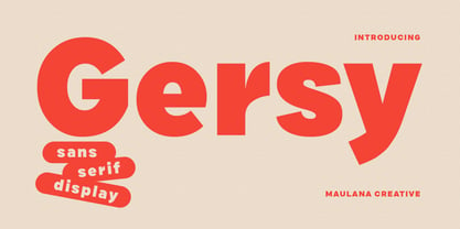 Gersy is a fancy sans serif display font. With bold stroke, fun character. To give you an extra creative work. Gersy font support multilingual more than 100+ language. This font is good for logo design, Social media, Movie Titles, Books Titles, a short text even a long text letter and good for your secondary text font with script or serif. Make a stunning work with Gersy font. Cheers, Maulana Creative
 - Lituora by Maulana Creative,
$13.00 Lituora is a condensed classic sans serif font. With bold contrast stroke, fun character. To give you an extra creative work. Lituora font support multilingual more than 100+ language. This font is good for logo design, Social media, Movie Titles, Books Titles, a short text even a long text letter and good for your secondary text font with sans or serif. Make a stunning work with Lituora font. Cheers, Maulana Creative
 - Aachen by ITC,
$39.00 Note: Neue Aachen is an updated and expanded version of Aachen featuring 18 fonts! The Aachen™ typeface design is a thick slab serif created by Alan Meeks at Letraset, type directed by Colin Brignall. Aachen only comes in two weights: medium and bold. This strong typeface features sharp outlines, stubby serifs and heavy strokes for use in headlines, posters, signage, apparel and other display uses (24 point size and above).
 - Contempora by My Creative Land,
$25.00 Contempora is a modern sophisticated font family that contains one block condensed sans serif with elegant ink traps, and a set of signature scripts in 4 different styles: Regular, 2 Rough styles (for authentic handwritten look and feel) and Bold (ideal for small text). Both Script and Sans Serif weights benefit from OpenType features. The Script fonts contain a lot of alternates, end-of-word swashes, and ligatures.
 - Conference by ITC,
$29.99Conference is a bold, playful sans serif, which was designed in 1978 by Martin Wait. Conference's letters are very curvaceous; many of them bulge lovingly outward from their centers. This typeface offers a different feeling than is available from most contemporary sans serif display faces; Conference is lively, without sacrificing readability. The type should be set in large, display sizes, where the eye can better appreciate its loving forms. - Annexia by Koshemare Studio,
$10.00 Annexia is a serif font with a several styles from Light to Bold. Serifs and stretched letters connect two times the past and the future, creating a perfect present. This font doesn't have a specific mood. Depending on the tasks, it can show itself in different ways. The font is perfect for both text, headlines, and branding. The font was designed by Pavel Bruev and released by Koshemare studio in 2021
 - Jenson Classico by Linotype,
$29.99In 1458, Charles VII sent the Frenchman Nicolas Jenson to learn the craft of movable type in Mainz, the city where Gutenberg was working. Jenson was supposed to return to France with his newly learned skills, but instead he traveled to Italy, as did other itinerant printers of the time. From 1468 on, he was in Venice, where he flourished as a punchcutter, printer and publisher. He was probably the first non-German printer of movable type, and he produced about 150 editions. Though his punches have vanished, his books have not, and those produced from about 1470 until his death in 1480 have served as a source of inspiration for type designers over centuries. His Roman type is often called the first true Roman." Notable in almost all Jensonian Romans is the angled crossbar on the lowercase e, which is known as the "Venetian Oldstyle e." In the 1990s, Robert Slimbach designed his contemporary interpretation, Adobe Jenson™. It was first released by Adobe in 1996, and re-released in 2000 as a full-featured OpenType font with extended language support and many typographic refinements. A remarkable tour de force, Adobe Jenson provides flexibility for a complete range of text and display composition; it has huge character sets in specially designed optical sizes for captions, text, subheads, and display. The weight range includes light, regular, semibold, and bold. Jenson did not design an italic type to accompany his roman, so Slimbach used the italic types cut by Ludovico degli Arrighi in 1524-27 as his models for the italics in Adobe Jenson. Use this family for book and magazine composition, or for display work when the design calls for a sense of graciousness and dignity. - Presta by Type Juice,
$19.00 Presta is a variable weight sans serif typeface made up of 12 fonts from thin and condensed to wide and bold. Included in the variable font are over 500 alternate glyphs for creative customization. 12 fonts total 5 font weights Upper / lowercase glyphs Multilingual Over 5000 glyphs
 - Thornback by Lauren Ashpole,
$15.00 Thornback is a hand-drawn font that uses quick, scribbled strokes to create it's slightly messy sans-serif characters. The detailed letters make it a good choice for headlines but it's also bold enough to add a homemade touch to smaller text blocks while keeping things legible.
 - Flighter by Mans Greback,
$59.00 Flighter is a bold sans-serif typeface, in a somewhat geometric and balanced style. It has speed and stability and should bring the thoughts to a mid 20th century traveler. Created by Måns Grebäck in 2017-2018, this high-quality font has support for hundreds of languages.
 - Verbindig by Lucywho,
$17.00 Verbindig is a modern serif style typeface. With over 45 joining ligatures and 3 different Styles it's easy to make a unique logo, headline or poster in seconds. Regular, Bold & Extreme Multilingual support Numerals & Punctuation Fun fact: Verbindig means connection in swiss german - yes I'm from Switzerland
 - VolumeFour by Ryan Corey,
$10.00 VolumeFour is a heavy, geometric sans-serif display face inspired by the custom lettering which adorns Black Sabbath's groundbreaking "Vol 4." Its bold forms and naturally tight spacing evoke the era which spawned such classics as "Snowblind" and "Supernaut", bringing this aesthetic to a contemporary audience.
 - Monotype Lightline Gothic by Monotype,
$29.99Monotype Lightline Gothic is a thin sans serif face cut by American Type Founders to work with Franklin Gothic, which had been designed as a bold face. The rather condensed nature of the Monotype Lightline Gothic font has made it popular for advertising display and newspaper work. - Bolderist by Sign Studio,
$12.00 Bolderist is a bold serif font designed for writing that needs to be read easily and clearly. However, the Bolderist still has an artistic and elegant form. Each curve is integral and has a point at extrema. You will get a smooth shape on each side.
 - Varsity Show JNL by Jeff Levine,
$29.00 In the last scene of the movie trailer for 1937’s “Varsity Show”, the movie’s title is hand lettered in a bold, condensed chamfer font with semi-serifs. This is now available digitally in the namesake font “Varsity Show JNL” – in both regular and oblique versions.
 - Avalors by Din Studio,
$29.00 Avalors is a bold and authentic sans serif font. It suitable for your any project that needs the outer space touch. This font is the best for branding project, t-shirt print and many more. Featured : Accents (Multilingual characters) PUA encoded Numerals and Punctuation (OpenType Standard)
 - Muriely by FallenGraphic,
$16.00 Muriely is a modern and bold serif with a bunch of ligatures and alternates that will make your presentation or logo even more stunning and stand out! Muriely also support Multi Language. and already PUA Encoded! FEATURES : Uppercase Number Punctuation Multilingual PUA Encode Ligature Opentype Multilingual Support
 - MPI Antique by mpressInteractive,
$5.00 Antique is a bold, classic font with high stroke contrast and no bracketing on the serifs. This letter style was hugely popular during the early 19th century and was the basis for a myriad of other designs. This version is based on wood type of unknown origin.
 - Kolkman by Ingrimayne Type,
$8.95 Kolkman is a nondescript, bold, sans-serif typeface. In addition to a standard version, there is a version with shattered letters and another with striped or grayed letters. The shattered and striped versions can be layered on the regular version to get letters with two colors.
 - Moneta by Monotype,
$35.99 Moneta is an elegant transitional serif with high contrast. Its morphology is based on the study of traditional broad-edge pen script. It comes in 4 different weights (Light, Regular, Bold and Black) and has variable features. Designed by Santi Rey and launched on January 2020.
 - Zeo xay by Saxofont,
$25.00 Zeo Xay is bold and elegant serif font. Simple and easy to use, this font will be very beautiful if you mix it with your various craft designs. This font is PUA encoded which means you can access all of the glyphs and swashes with ease!
 - Oktah by Groteskly Yours,
$15.00 Oktah is a geometric grotesk that comes both as a variable font and 22 static fonts: 11 uprights and 11 matching italics, which make it a great tool for those seeking a versatile font with a strong character and high legibility. Throw in a very pleasing look, elegant curves and a wide range of weights, and you'd get what Oktah aspires to be: a perfect typographic tool for every need.In Oktah, elegant geometric curves meet bold strokes and wide apertures. Round letters are nearly circular, but, to boost readability, slight changes were introduced for optical compensation. Oktah is also equipped with amazing OpenType features: case sensitive punctuation, ligatures, fractions, superscript and subscript figures, two kinds of circular figures, stylistic & contextual alternatives and much more! Oktah supports all major European languages, as well as Vietnamese and some dozens of foreign languages that you may encounter in your designs. We've got all that covered. The glyph count for each of the styles is 800+ characters. Two styles (Extra Light and Bold Italic) are free to try and experiment with. If you need wide language support and more extensive OpenType features, consider taking a look at Oktah Neue, a bigger version of the classic Oktah.
 - Varius by Linotype,
$29.99The shapes of the f-holes on a violin reminded German designer André Maaßen of an italic letter "f". Maaßen used these captivating contours as the theme for his type family, Varius. The name "Varius" is an homage to the manufacturer of the violin that inspired Maaßen's project, Antonio Stradivarius, the most famous manufacturer of violins in music history. Varius has three separate styles. Varius 1 and its italic are the base style of the family, and are typefaces in the baroque serif manner. Varius 2 and its italic are slab serif egyptiennes, slightly heavier than Varius 1's more classical forms. Varius 3 and its italic are semi serif faces; their characters are serifed, but some of the serifs have been cut off. The family is rounded out with two pi faces: an ornaments font (which can be used in conjunction with the text fonts, or on its own to create beautiful borders or individual decorative elements), and a font of musical symbols and notations. Each of the six text fonts has dozens of supplemental ligatures included in their character sets. When these fonts are used in an OpenType-supporting application, such as Adobe InDesign, these ligatures automatically appear in text when the "Discretionary Ligatures" feature is activated. Additionally, the character sets include added alternate glyphs, such as a swash "m" or "n" to finish off a line of text. These can be inserted manually in applications that include glyph palettes (e.g., Adobe InDesign or Illustrator CS). All of the Varius family's letterforms appear slightly narrow, and traces of the wide-nibbed pen can be seen within their forms. Additionally, the shape of a violin's f-hole is a reminiscent element within all of the family's curves. Varius is particularly suited for use many applications, such as body text, newspaper text, display text, headlines, posters, books, screen design, and corporate identity. Use in sizes ranging from body copy text to display and poster format allow the different facets of the typeface to effectively present themselves. The effects can be as versatile as the possibilities! Due to its special character, the typeface could be used in the design of a logo, or within an appropriate corporate design context, to particularly stress individuality. - Kropotkin Std by sugargliderz,
$30.00 This typeface design was influenced by the British Rail corporate type introduced in an old lettering instruction book published in Japan. Of course, the only clue to this typeface is the lettering instruction book at hand. Therefore, this typeface is based on the British Rail corporate type introduced in an old lettering instruction book published in Japan, and I have expanded the design variations. I started with the Bold design first. Then I designed Light, Regular, and Black in that order. Light and Regular are intended to be used as the text type, while Bold and Black are intended to be used as the base for logotypes, headlines, and other eye-catchers.
 - Levo Dope by Sitintahitam,
$15.00 Introducing Levo Dope Slab Serif Font a typeface that exudes boldness and confidence. With its thick, heavy serifs and rectangular shape, this font is the perfect choice for any design that needs to make a strong impact. Transport your audience to the American West with the vintage charm of the Western slab serif font. Whether you're creating posters, advertisements, or signage, this font will capture attention and convey a sense of stability and strength. Also come with FREE illustrations and editable logo to make better design.
 - Modum by The Northern Block,
$- A contemporary serif font family. The design takes influence from traditional serif forms to develop a precise, highly functional text face with a low contrast. Smooth radius details are blended with carefully drawn angles that give a crisp, distinctive aesthetic when used across body copy. Modum is a stylish modern day serif with great charm, harmony and practicality that is best suited for complex hierarchical projects, such as editorials, newspapers and text based books. Details include 8 weights and true italics, over 800 characters with alternative lowercase a, e, g and y. 7 variations of numerals, true small caps with accents, ligatures, manually edited kerning and Opentype features.