10,000 search results
(0.334 seconds)
- Rolide by Craft Supply Co,
$20.00 Introducing Rolide – Expanded Sans Serif Contemporary Charm Rolide – Expanded Sans Serif presents a unique blend of contemporary charm with its wide and boxy shape. Versatile Design Solution This font is your versatile design solution, ideal for titles and body text. Its non-bold style strikes a harmonious balance between subtlety and impact. Wide & Expanded Rolide’s wide and expanded characters add a touch of modernity to your projects. They stand out without overwhelming the content. Perfect for Titles and Body Text Whether for titles or body text, Rolide is the perfect choice. It maintains clarity and readability, making your content engaging. Elegance in Simplicity In the world of fonts, Rolide embodies elegance through simplicity. Its clean lines and non-bold form offer a contemporary feel. In Conclusion In conclusion, Rolide – Expanded Sans Serif is the font that marries wide, expanded, and non-bold characters to create a contemporary and versatile design solution. It ensures your titles and body text are engaging, clear, and subtly impactful, appealing to a broad range of readers.
 - Miranda by Tim Rolands,
$19.00A mysterious beauty hidden away on a secret island by her eccentric wizard father? No: An elegant display face influenced by Aldine old-style letterforms, Miranda brings classic sophistication to any project. The family includes regular and bold weights. - Florens LP by LetterPerfect,
$39.00 Florens is a flourished, semi-formal script that designer Garrett Boge modeled after his own italic calligraphy, which is a contemporary version of the chancery script of the Italian Renaissance. In addition to the standard character set, a Flourished font provides old-style figures, special dingbats, and swash variants for all upper and lowercase characters.
 - CloisterBlack BT - Unknown license

- Eirene Sans by Tomtype,
$4.90 Eirene Sans is a sans serif type family inspired by grotesque typefaces with some humanistic characteristics. Simple, modern, and functional are the principal features of this type family; the uppercase glyphs present a sophisticated personality. There are 5 weights available and matching italics. It is a bit more condensed than normal width and the difference between thin and thick stems and the unique terminals make the type family have this humanistic personality. It has rounded forms in some letterforms and special characters (i, j, ., :, etc.), humanistic terminals, and very thin ink traps. Eirene Sans is perfect for digital and non-digital designs; it can be used in magazine titles, logo designs, packaging designs, and web designs. Features: 5 weights and matching italics Opentype features Arrow set Stylistic alternates (ft) Stylistic changes in italics Fractions Subscripts Inferior and superior numbers Language support (Latin extended)
 - Times Eighteen by Linotype,
$29.00In 1931, The Times of London commissioned a new text type design from Stanley Morison and the Monotype Corporation, after Morison had written an article criticizing The Times for being badly printed and typographically behind the times. The new design was supervised by Stanley Morison and drawn by Victor Lardent, an artist from the advertising department of The Times. Morison used an older typeface, Plantin, as the basis for his design, but made revisions for legibility and economy of space (always important concerns for newspapers). As the old type used by the newspaper had been called Times Old Roman," Morison's revision became "Times New Roman." The Times of London debuted the new typeface in October 1932, and after one year the design was released for commercial sale. The Linotype version, called simply "Times," was optimized for line-casting technology, though the differences in the basic design are subtle. The typeface was very successful for the Times of London, which used a higher grade of newsprint than most newspapers. The better, whiter paper enhanced the new typeface's high degree of contrast and sharp serifs, and created a sparkling, modern look. In 1972, Walter Tracy designed Times Europa for The Times of London. This was a sturdier version, and it was needed to hold up to the newest demands of newspaper printing: faster presses and cheaper paper. In the United States, the Times font family has enjoyed popularity as a magazine and book type since the 1940s. Times continues to be very popular around the world because of its versatility and readability. And because it is a standard font on most computers and digital printers, it has become universally familiar as the office workhorse. Times™, Times™ Europa, and Times New Roman™ are sure bets for proposals, annual reports, office correspondence, magazines, and newspapers. Linotype offers many versions of this font: Times™ is the universal version of Times, used formerly as the matrices for the Linotype hot metal line-casting machines. The basic four weights of roman, italic, bold and bold italic are standard fonts on most printers. There are also small caps, Old style Figures, phonetic characters, and Central European characters. Times™ Ten is the version specially designed for smaller text (12 point and below); its characters are wider and the hairlines are a little stronger. Times Ten has many weights for Latin typography, as well as several weights for Central European, Cyrillic, and Greek typesetting. Times™ Eighteen is the headline version, ideal for point sizes of 18 and larger. The characters are subtly condensed and the hairlines are finer. Times™ Europa is the Walter Tracy re-design of 1972, its sturdier characters and open counterspaces maintain readability in rougher printing conditions. Times New Roman™ is the historic font version first drawn by Victor Lardent and Stanley Morison for the Monotype hot metal caster." - Times Europa LT by Linotype,
$29.99In 1931, The Times of London commissioned a new text type design from Stanley Morison and the Monotype Corporation, after Morison had written an article criticizing The Times for being badly printed and typographically behind the times. The new design was supervised by Stanley Morison and drawn by Victor Lardent, an artist from the advertising department of The Times. Morison used an older typeface, Plantin, as the basis for his design, but made revisions for legibility and economy of space (always important concerns for newspapers). As the old type used by the newspaper had been called Times Old Roman," Morison's revision became "Times New Roman." The Times of London debuted the new typeface in October 1932, and after one year the design was released for commercial sale. The Linotype version, called simply "Times," was optimized for line-casting technology, though the differences in the basic design are subtle. The typeface was very successful for the Times of London, which used a higher grade of newsprint than most newspapers. The better, whiter paper enhanced the new typeface's high degree of contrast and sharp serifs, and created a sparkling, modern look. In 1972, Walter Tracy designed Times Europa for The Times of London. This was a sturdier version, and it was needed to hold up to the newest demands of newspaper printing: faster presses and cheaper paper. In the United States, the Times font family has enjoyed popularity as a magazine and book type since the 1940s. Times continues to be very popular around the world because of its versatility and readability. And because it is a standard font on most computers and digital printers, it has become universally familiar as the office workhorse. Times™, Times™ Europa, and Times New Roman™ are sure bets for proposals, annual reports, office correspondence, magazines, and newspapers. Linotype offers many versions of this font: Times™ is the universal version of Times, used formerly as the matrices for the Linotype hot metal line-casting machines. The basic four weights of roman, italic, bold and bold italic are standard fonts on most printers. There are also small caps, Old style Figures, phonetic characters, and Central European characters. Times™ Ten is the version specially designed for smaller text (12 point and below); its characters are wider and the hairlines are a little stronger. Times Ten has many weights for Latin typography, as well as several weights for Central European, Cyrillic, and Greek typesetting. Times™ Eighteen is the headline version, ideal for point sizes of 18 and larger. The characters are subtly condensed and the hairlines are finer. Times™ Europa is the Walter Tracy re-design of 1972, its sturdier characters and open counterspaces maintain readability in rougher printing conditions. Times New Roman™ is the historic font version first drawn by Victor Lardent and Stanley Morison for the Monotype hot metal caster." - Times Ten by Linotype,
$40.99In 1931, The Times of London commissioned a new text type design from Stanley Morison and the Monotype Corporation, after Morison had written an article criticizing The Times for being badly printed and typographically behind the times. The new design was supervised by Stanley Morison and drawn by Victor Lardent, an artist from the advertising department of The Times. Morison used an older typeface, Plantin, as the basis for his design, but made revisions for legibility and economy of space (always important concerns for newspapers). As the old type used by the newspaper had been called Times Old Roman," Morison's revision became "Times New Roman." The Times of London debuted the new typeface in October 1932, and after one year the design was released for commercial sale. The Linotype version, called simply "Times," was optimized for line-casting technology, though the differences in the basic design are subtle. The typeface was very successful for the Times of London, which used a higher grade of newsprint than most newspapers. The better, whiter paper enhanced the new typeface's high degree of contrast and sharp serifs, and created a sparkling, modern look. In 1972, Walter Tracy designed Times Europa for The Times of London. This was a sturdier version, and it was needed to hold up to the newest demands of newspaper printing: faster presses and cheaper paper. In the United States, the Times font family has enjoyed popularity as a magazine and book type since the 1940s. Times continues to be very popular around the world because of its versatility and readability. And because it is a standard font on most computers and digital printers, it has become universally familiar as the office workhorse. Times™, Times™ Europa, and Times New Roman™ are sure bets for proposals, annual reports, office correspondence, magazines, and newspapers. Linotype offers many versions of this font: Times™ is the universal version of Times, used formerly as the matrices for the Linotype hot metal line-casting machines. The basic four weights of roman, italic, bold and bold italic are standard fonts on most printers. There are also small caps, Old style Figures, phonetic characters, and Central European characters. Times™ Ten is the version specially designed for smaller text (12 point and below); its characters are wider and the hairlines are a little stronger. Times Ten has many weights for Latin typography, as well as several weights for Central European, Cyrillic, and Greek typesetting. Times™ Eighteen is the headline version, ideal for point sizes of 18 and larger. The characters are subtly condensed and the hairlines are finer. Times™ Europa is the Walter Tracy re-design of 1972, its sturdier characters and open counterspaces maintain readability in rougher printing conditions. Times New Roman™ is the historic font version first drawn by Victor Lardent and Stanley Morison for the Monotype hot metal caster." - Times Ten Paneuropean by Linotype,
$92.99In 1931, The Times of London commissioned a new text type design from Stanley Morison and the Monotype Corporation, after Morison had written an article criticizing The Times for being badly printed and typographically behind the times. The new design was supervised by Stanley Morison and drawn by Victor Lardent, an artist from the advertising department of The Times. Morison used an older typeface, Plantin, as the basis for his design, but made revisions for legibility and economy of space (always important concerns for newspapers). As the old type used by the newspaper had been called Times Old Roman," Morison's revision became "Times New Roman." The Times of London debuted the new typeface in October 1932, and after one year the design was released for commercial sale. The Linotype version, called simply "Times," was optimized for line-casting technology, though the differences in the basic design are subtle. The typeface was very successful for the Times of London, which used a higher grade of newsprint than most newspapers. The better, whiter paper enhanced the new typeface's high degree of contrast and sharp serifs, and created a sparkling, modern look. In 1972, Walter Tracy designed Times Europa for The Times of London. This was a sturdier version, and it was needed to hold up to the newest demands of newspaper printing: faster presses and cheaper paper. In the United States, the Times font family has enjoyed popularity as a magazine and book type since the 1940s. Times continues to be very popular around the world because of its versatility and readability. And because it is a standard font on most computers and digital printers, it has become universally familiar as the office workhorse. Times™, Times™ Europa, and Times New Roman™ are sure bets for proposals, annual reports, office correspondence, magazines, and newspapers. Linotype offers many versions of this font: Times™ is the universal version of Times, used formerly as the matrices for the Linotype hot metal line-casting machines. The basic four weights of roman, italic, bold and bold italic are standard fonts on most printers. There are also small caps, Old style Figures, phonetic characters, and Central European characters. Times™ Ten is the version specially designed for smaller text (12 point and below); its characters are wider and the hairlines are a little stronger. Times Ten has many weights for Latin typography, as well as several weights for Central European, Cyrillic, and Greek typesetting. Times™ Eighteen is the headline version, ideal for point sizes of 18 and larger. The characters are subtly condensed and the hairlines are finer. Times™ Europa is the Walter Tracy re-design of 1972, its sturdier characters and open counterspaces maintain readability in rougher printing conditions. Times New Roman™ is the historic font version first drawn by Victor Lardent and Stanley Morison for the Monotype hot metal caster." - Times by Linotype,
$40.99In 1931, The Times of London commissioned a new text type design from Stanley Morison and the Monotype Corporation, after Morison had written an article criticizing The Times for being badly printed and typographically behind the times. The new design was supervised by Stanley Morison and drawn by Victor Lardent, an artist from the advertising department of The Times. Morison used an older typeface, Plantin, as the basis for his design, but made revisions for legibility and economy of space (always important concerns for newspapers). As the old type used by the newspaper had been called Times Old Roman," Morison's revision became "Times New Roman." The Times of London debuted the new typeface in October 1932, and after one year the design was released for commercial sale. The Linotype version, called simply "Times," was optimized for line-casting technology, though the differences in the basic design are subtle. The typeface was very successful for the Times of London, which used a higher grade of newsprint than most newspapers. The better, whiter paper enhanced the new typeface's high degree of contrast and sharp serifs, and created a sparkling, modern look. In 1972, Walter Tracy designed Times Europa for The Times of London. This was a sturdier version, and it was needed to hold up to the newest demands of newspaper printing: faster presses and cheaper paper. In the United States, the Times font family has enjoyed popularity as a magazine and book type since the 1940s. Times continues to be very popular around the world because of its versatility and readability. And because it is a standard font on most computers and digital printers, it has become universally familiar as the office workhorse. Times™, Times™ Europa, and Times New Roman™ are sure bets for proposals, annual reports, office correspondence, magazines, and newspapers. Linotype offers many versions of this font: Times™ is the universal version of Times, used formerly as the matrices for the Linotype hot metal line-casting machines. The basic four weights of roman, italic, bold and bold italic are standard fonts on most printers. There are also small caps, Old style Figures, phonetic characters, and Central European characters. Times™ Ten is the version specially designed for smaller text (12 point and below); its characters are wider and the hairlines are a little stronger. Times Ten has many weights for Latin typography, as well as several weights for Central European, Cyrillic, and Greek typesetting. Times™ Eighteen is the headline version, ideal for point sizes of 18 and larger. The characters are subtly condensed and the hairlines are finer. Times™ Europa is the Walter Tracy re-design of 1972, its sturdier characters and open counterspaces maintain readability in rougher printing conditions. Times New Roman™ is the historic font version first drawn by Victor Lardent and Stanley Morison for the Monotype hot metal caster." - VVDS Organum by Vintage Voyage Design Supply,
$10.00 Elegant and easy to use serif font family with contrast in vertical and horizontal strokes. Its variety of weights provides a range of choices that will help you to find the best typographic look. Use all caps to get the classic serif look, like Didones, or use it normally for a playful serif look. Normal and Medium widths are good for text blocks and Thin and Light, or Bold and Black are perfect for Headliners. Every letter in a word looks like as if written specially next to each other, as in hand lettering. You can use it in gentle and minimal projects, and also in projects with bold and heavy typographic base. Also, for more individuality, Organum comes with discretionary ligatures and few stylistic alternates for every caps and some lowercase letters.
 - Jacbos by Twinletter,
$14.00 Jacbos is a playful font with an abstract shape like paper folds, which is unique but elegant and attractive in its use All Capital sans is charming and brave, a font with a bold style and strong character makes your design look bold to convey a message to the audience in every design. This font is perfect for a variety of school design projects, essays, vintage, retro, and various outdoor events, storytelling, branding, banners, posters, movie titles, food and beverages, clothing, and more.
 - Poster Sans by K-Type,
$20.00 The Poster Sans display fonts have the enduring functionality of vintage condensed grotesques. They are loosely based on Ludlow 6-EC, and perfect for signs and posters. The Basic Package includes the Regular and Bold weights, and also a useful Outline version. Poster Sans Extreme may hold the record for the slimmest usable font available. The latest versions of the Regular, Bold and Extreme weights offer improved outlines and now include a full compliment of Latin Extended-A European accented characters.
 - Quitador Sans by Linotype,
$57.99 The Quitador™ Sans family is a fresh and distinctive design with roots that go back to the original Quitador typeface. Like its slab serif relative, the Quitador Sans suite of typefaces is large with several weights of roman and italic designs, making it an excellent choice for a wide variety of print and on-screen projects.
 - Freight Micro Pro by Freight Collection,
$39.00 Created for captions and similar serif situations where small type is required, Freight Micro is amazingly illustrative for large type too. This half-wedge, half-slab design provides the firmest of foundations to build your design on. The abruptness of the sharply carved italics take emphasis to a higher form. Freight Micro is an exercise in whispering very loudly.
 - Arcuata by Eko Bimantara,
$29.00 Arcuata is a serif font family inspired by 1400 classic roman typeface with soft characteristics. It's featured with some uncial letterforms as alternates, for example in 'a' and 'd' letter, it also has a set of decorative capital letters alternates and ligatures. Arcuata complete family contains 10 styles, consisting of 5 weights from Light to ExtraBold with matching italics.
 - Blicalon by Tanincreate,
$24.00 Blicalon is a geometric sans serif font with modern look and good legibility. Blicalon aims to be a universal, it works great in headlines, short and long texts, high-end branding, logo designs, magazines, product packaging & invitations. It comes in 2 different styles - regular and italic and is equipped with an extended character set, supporting most European languages.
 - FX Neofara by Differentialtype,
$10.00 FX Neofara is a sans serif font family that comes with 9 weights, 9 italics, and an outline. It’s perfect for documents, font logos, blogs, social media, marketing campaigns, and many other projects! FX Neofara masterfully designed to become a true favorite, this font has the potential to bring each of your creative ideas to the highest level!
 - Ramen Sans by Nina Belikova,
$20.00 Ramen Sans is a friendly grotesque type family with the warmth of serif types and a little bit of the edginess of geometric sans! Designed with body text in mind, it offers 5 weights (and their italics), small caps, tabular figures, fractions, numerators, denominators, and supports the Adobe Latin 3 character set (most western and central European languages).
 - Bovino by Eko Bimantara,
$21.00 Bovino is a display serif font family. It was formed in a strong and sharp characters. The moderate x height and high contrast strokes make it attractive for titles and large size usage. Bovino contain more than 400 glyphs which covered broad latin languages, its consist of 9 styles from thin to black with each matching italics.
 - Cheraty by Skypia,
$18.00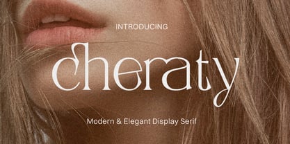 Cheraty - a sophisticated, charming serif with a fashionable touch. Specially designed for luxury, elegant, feminine projects, Cheraty is perfectly suitable for creating modern, chic design such as logos, packaging, editorial, and more. What is included: Cheraty Regular Cheraty Outline Cheraty Italic Features All Uppercase and Lowercase Number & Symbol Supported Languages Alternates and Ligatures PUA Encoded Thank you, Skypia
 - Sanstara by Prasetype,
$12.00 Sanstara is rounded, modern all caps sans serif font. This font is PUA encoded which means you can access all of the glyphs and swashes with ease! Add it confidently to your favorite creations and let yourself be amazed by the outcome generated. -Letters, numbers, punctuation, multilingual support. -Italic and regular versions Any Questions? just ask!
 - Engula by CBRTEXT Studio,
$23.00 Engula is a sans serif font family. It consists of 28 fonts. 14 upright styles and 14 matching italic styles. Engula is a nice and comfortable font for everyone to see. So that it can make your project and branding smooth. Engula supports 17 languages including Afrikaans, Albanian, Catalan, Danish, Dutch, English, etc. Engula also has several alternative letters.
 - Antartida by Latinotype,
$26.00 Antartida is a sans serif typeface, while it is monolinear simple structure give it a kind of neutral feeling, is functional, clean and minimal. Is a family of 8 fonts, 4 weights and italics. This typeface contains alternate glyphs that help to emphasize text or headlines. You can also see AntartidaEssential, a simpler and less expensive version.
 - Sumptuous by Locomotype,
$15.00 Sumptuous is a classic sans-serif family that combines geometric and humanist shapes. It comes in 14 weights, 10 uprights and 10 italics. Each weight includes OpenType features such as standard ligatures, directional ligatures, tabular figures, fractions and more and also extended language support. Suitable for magazines, headline, body text, logo, poster and other graphic design projects.
 - Regan Slab by The Northern Block,
$19.30 A precision cut slab serif typeface. Simple curves are combined with sharp angles to provide a readable font with subtle characteristics. Regan Slab is ideally suited to wide range of applications including magazines, newspapers and handheld devices. Details include 10 weights with italics, 540 characters, 5 variations of numerals, small caps, stylistic alternatives, manually edited kerning and Opentype features.
 - Vangeda by Agny Hasya Studio,
$10.00 Vangeda is a Modern & Elegant Serif Typeface Font created with 2 (two) styles (regular & italic), and glyph variations like alternates and ligatures. Perfect for your design projects like logos, branding, advertising, product designs, stationery, photography, art quotes, wedding designs, fashion designs, and more. Featured with Uppercase and Lowercase, Numeral and Punctuation, Multilingual Support, and Opentype Features.
 - Gelder Sans by The Northern Block,
$32.00 A clean modern sans serif typeface. The balanced proportions of each character demonstrate great legibility at both small and large scale. The distinctively open apertures further improves visibility when used across the web and hand held devices. Details include 9 weights with italics, 500 characters, 5 variations of numerals, stylistic alternatives, manually edited kerning and Opentype features.
 - Acherus Grotesque by Horizon Type,
$25.00 Acherus Grotesque is a rounded sans serif type family based on geometric forms. It comes in 20 styles, 10 uprights and matching italics. In this version standard greek and cyrillic scripts added plus all glyphs renewed. Each weight includes extended language support, ligatures and more. Acherus Grotesque is incredibly useful for nearly any creative design. Acherus Specimen Behance
 - Ferpa by Typeóca,
$30.00 Ferpa is Typeóca's Fierciest Font Family. Drawn using only straight lines, Ferpa uses every kink, every kink and every serif as an opportunity for expressivity. From Thin to Black in both Roman and Italic constructions, Ferpa is available as 18 otf static font files, with a character set that goes a little beyond Latin Extended A.
 - COCOTA by Top Type,
$9.00 Cocota is a sans serif/display font. This font has a gentle and authoritative character. You can use this font to make banners, advertisements, websites, business cards, quotes, and more. The advantages of this font include features such as : Regular, Italic, All Caps, Stylistic Alternate. Cocota is the best choice for you. Don't hesitate to own it.
 - Creata by Ivan Petrov,
$25.00 Creata is a sans serif typeface with a wide range of application. The font family contains 14 weights (7 straight with match italics). The overall design is neutral but some letters has pretty unusual appearance (for example @, &). Creata has its own personality, its own integrity and a unique voice. Recommended for corporate branding and editorial exercises.
 - Skorid by Totem,
$20.00 Skorid is a geometric condensed sans serif font family, constructed only out of straight lines. Coming in 7 weights, regular and italic, from thin to black, you have a wide array of possibilities of using Skorid for any purpose you need. Skorid speaks around 70 languages, including Cyrillic. Contains a lot of alternative letters to boost your creativity.
 - Codeworld by Par Défaut,
$49.00 Codeworld is a geometrical sans serif font family (5 weight, italic and variable) It contains more than 800 characters including the Latin, Cyrillic and Greek alphabet. There are also 13 OpenType features (Superior; Inferior; Numerator; Denominator; Fraction ; Small Capital; Small Capitals from Capitals; Contextual Alternate; Case Sensitive; Access All Alternates; Stylistic Set; Standard Ligature; Discretionary Ligature).
 - Parkson by Rook Supply,
$18.00 Inspired by the grotesque fonts of the 19th century, Parkson is a tall sans serif typeface of 7 weights along with italic and several outline versions. The contemporary typeface aims to be one of the world's best condensed collection of fonts. Designed for optimum legibility, its clean, geometric look is perfect for logotypes, headers, titles and brochures.
 - Futo Sans by HB Font,
$25.00 Futo Sans family is a modern & soft sans-serif family has 8 weights upright with matching italics. Its corners and shape give a soft feeling but straight strokes and solid structure make it strong. Each font includes opentype features such as Proportional Figures, Tabular Figures, Numerator, Superscript, Subscript, Case-Sensitive, Denominators, Scientific Inferiors, Ordinals, Ligatures and Fractions.
 - Codeworld Mono by Par Défaut,
$49.00 Codeworld Mono is geometrical and monospaced sans serif font family (include 5 weight, italic and variable) It contains more than 800 characters including the Latin, Cyrillic and Greek alphabet There are also 11 OpenType features (Superior; Inferior; Numerator; Denominator; Fraction; Small Capital; Small Capitals from Capitals; Contextual Alternate; Case Sensitive; Access All Alternates; Stylistic Set; Standard Ligature; Discretionary Ligature).
 - Schuss News Poster by typic schuss,
$10.00 Schuss News Poster ist the very heavy headline font (titling/display/poster) of Schuss News. (No italic, no additional figures, no tabular figures, no small Caps, slyghtly different heights as the other font of the Schuss superfamily (Sans, Slab, News and Serif). The character set is different to the other styles. It is not developed for small text sizes.)
 - Pragnea by Hazztype,
$20.00 Introducing Pragnea, a modern sans serif font with a unique touch. It had many unique quirks such as its distinctive e, curved stroke on R, K, V, W, and many others. The type family consists of three weights plus matching italics. Packed with 300+ glyphs, it works well both for impactful headlines and for reading sizes.
 - Modal by Schriftlabor,
$42.00 Modal is a sans serif type family intended for corporate, editorial and web design. Each weight comes with around 800 glyphs and supports a large variety of features such as ligatures, small caps, figure sets, case sensitive glyphs and so on. With its two italics, Modal offers new possibilities for designers and creates an additional tool for distinct typography.
