10,000 search results
(0.169 seconds)
- Equilla by Heyfonts,
$15.00 Equilla is a versatile, bold and unique serif font. Combination between high contrast and Brutalism style, Equilla has a unique style with stylistic, alternates, and supports multilingual languages
 - Device by Hanken Design Co.,
$45.00 Device™ display typeface is inspired by industrial type used for decals and signage. This typeface pairs nicely with geometric sans serifs like Cerebri Sans and HK Grotesk.
 - Niks by dooType,
$20.00 Niks is the first sans serif created by dooType. It has 4 weights with corresponding italics. The character set supports more than 30 languages and some Opentype Features.
 - Rotunde by Gerald Gallo,
$20.00 Rotunde is a very bold contemporary sans serif font. It is ideal for headlines, titles, branding, small blocks of text or wherever a fresh new look is desired.
 - Pleinair by Gaslight,
$15.00 Pleinair - all caps serif font with alternatives on lower case. Besides Pleinair have two Stylistic sets for two-tier typesetting. Also Pleinair have some decoratives and swashes characters.
 - Robuck by Martype co,
$15.00 ROBUCK is a family Sans Serif font designed with carefully handcrafted. Also suitable for branding, T-shirt, Wedding Invitation, Classic Design, Logotype, and any project. All caps fonnts.
 - BD Westwork by Typedifferent,
$15.00 BD Westwork is a very condensed, bold and distinctive display typeface – great in combination and in contrast with delicate illustrations, photos and body text with and without serifes.
 - Argaka Fashion by Nirmana Visual,
$24.00 Argaka Fashion, contemporary of Serif Display font, Argaka Fashion offers beautiful typographic harmony for a diversity of design projects, including logos & branding, social media posts, advertisements & product designs.
 - Nostrand JNL by Jeff Levine,
$29.00Based on vintage wood type, Nostrand JNL is a tall, condensed serif face - named for an avenue in font designer Jeff Levine's home town of Brooklyn, New York. - Mansard by Wooden Type Fonts,
$15.00 A revival of one of the popular wooden type fonts of the 19th century, suitable for display. It has curved sides, very short descenders, and curved, blocky serifs.
 - Holly Groove by Beary,
$15.00 Holly Groove is a sans serif font with beautifull swashes, masterfully designed to become a true favorite. It maintains its classy calligraphic influences while feeling modern and fresh.
 - Tooned Out JNL by Jeff Levine,
$29.00Tooned Out JNL gives a serif treatment to the cartoon-inspired lettering of Toon-In JNL. Both fonts are great for any casual or fun messages or themes. - Ducktail by Tour De Force,
$30.00 Ducktail is font family that combine elements from display and sans serif categories. Comes in 7 styles with OpenType features: Small Caps, Fractions, 2x Stylistic Sets and Ligatures.
 - TC Jasper by Monotype,
$40.99TC Jasper is a headline face with oblongated characters, suitable for letterheads and packaging. The serifs have an engraver's influence, making the TC Jasper font crisp in appearance. - Rounded Block Display by NDS Fonts,
$15.00 Rounded Block Display is a blocky san serif font perfect for headlines. Its clean facade and easy readability make this a great font to get your message across.
 - Antman by Lebbad Design,
$24.95 Antman is a bold serif font consisting of caps and smallcaps. Wide letterforms taper toward the bottom of each character to give this font a retro vintage feel.
 - La Barokah by Nirmana Visual,
$19.00 La Barokah , Contemporary of Bold Serif Typeface, La Barokah offers beautiful typographic harmony for a diversity of design projects, including logos & branding, social media posts, advertisements & product designs.
 - Zeppelin by Monotype,
$29.99Rudolph Koch designed Zeppelin between 1927 and 1929. This geometric sans serif headline face jumps off the page. Use the Zeppelin font for impact in packaging and posters. - Formal Invite JNL by Jeff Levine,
$29.00 The thin, condensed serif lettering found in a 1937 magazine ad for Chris Craft boats inspired Formal Invite JNL, which is available in both regular and oblique versions.
 - Dillario by Arunatype,
$18.00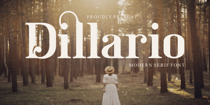 Dillario is a sophisticated, charming serif font with a fashionable touch. Specially designed for luxury, elegant, feminine projects, this font is perfectly suitable for creating modern, chic designs.
 - Song ASC Simplified by Ascender,
$523.99Song ASC is a Simplified Chinese font. Song ASC features a serif stroke style. The Song ASC font character set supports Latin-1, Simplified Chinese (code page 936). - EgyptianTwo by Wooden Type Fonts,
$15.00 A revival of one of the popular wooden type fonts of the 19th century, with classic flat slab serifs, unbracketed, short descenders. Very popular in the 19th century.
 - Soul Lotion by TypoGraphicDesign,
$19.00 CONCEPT/CHARACTERISTICS The typeface “Soul Lotion” is a sans serif font for display sizes. Constructed, clear and simply with monoline character. The round and unadorned look is modern & simple. APPLICATION AREA The modern, clear and simply sans serif font “Soul lotion” would be happy as a display typeface in headline size on the following areas and there simply feel good: Logos/Wordmarks, party flyer, album covers, CD covers, Poster design, video game design, and much more as display typeface for print and digital magazines, books and websites. TECHNICAL SPECIFICATIONS Headline Font | Display Font | Sans Serif Font “Soul Lotion” OpenType Font (Mac + Win) with 6 styles (regular, bold, light + 3x italic) & 354 glyphs. Incl. accents, alternative letters, ligatures & €. Desktop Font (.otf) + Web Font (.svg, .eot, .woff) KONZEPT/BESONDERHEITEN Die Schrift »Soul Lotion« ist ein serifenloser Font für Headlinegrößen. Konstruiert, klar und einfach mit gleichbleibender Strichstärke. Die runden und schnörkellosen Formen wirken modern & schlicht. EINSATZGEBIETE Die moderne, klare und einfache Sans Serif Schrift »Soul Lotion«, würde sich als Auszeichnungsschrift in Headlinegröße über folgende Einsatzgebiete sehr freuen und sich dort schlicht wohlfühlen: Logos/Wortmarken, Flyer für fast jede Party, PlattenCover, CD-Cover, PlakatDesign, Videospiel Design, als Headlineschrift für print und digitale Magazine, Bücher und Webseiten u.v.m. TECHNISCHE INFORMATIONEN Headline Font | Display Font | Sans Serif Font »Soul Lotion« OpenType Font (Mac + Win) mit 6 Schriftschnitten (regular, bold, light + 3x italic) & 354 Glyphen. Inkl. diakritisches Zeichen, alternative Buchstaben, Ligaturen & €. Desktop Font (.otf) + Web Font (.svg, .eot, .woff)
 - Boardwalk Avenue by Fenotype,
$30.00 Boardwalk Avenue is an elegant type collection of three styles and two weights of each. It’s divided into Boardwalk Pen, Boardwalk Antiqua and Boardwalk Serif. Boardwalk Avenue’s core is a connected mono linear script that works fantastic when paired with either of the impressive serif styles. All the fonts work great on their own but try putting them all together for a complete display font setup for a project. Here’s a short introduction on what’s included: Boardwalk Avenue Pen is a connected Script. It’s great for headlines, quotes or in packaging. It has a casual hand drawn vibe to it but it’s clean and legible. It’s equipped with automatic Contextual Alternates that keep the connections smooth and versatile. For instance when you type double letter another of them will automatically change to add variation. Or if you type “i” for example, as a first letter after space or after capital letter the code will add starting point to the letter to keep the letterforms more balanced. If you need more ambitious letterforms you can try Swash or Titling Alternates -there’s alternates for every standard letter and seek for even more alternates from the glyph palette. Boardwalk Avenue Antiqua is a high contrast serif with strong character. It’s great for glamorous headlines or as a logotype. Boardwalk Avenue Serif is a low contrast serif with bulky character. It’s great for strong and sturdy headlines or as a logotype.
 - AZN Knuckles Varsity by AthayaDZN,
$10.00 Introducing "AZN Knuckles Varsity" font by AthayaDZN. Revolutionizing a varsity slab serif, combining sharp and rounded edges, angled serif, and a variety of weights, fitting it into the modern scene. Equipped with 3 styles ( Defined, Regular, Stencil ) Use the Defined version if you are aiming for that slab serif look, just like the name suggested, it defines the modernized slab serif on each letter, giving it that retro look yet still in the modern scene. Especially on the light weight of this version, the slab serif is really prominent. Use the Regular Version if you are aiming for any type of design that you see this font fits especially the modern scene, just like how it's advertised. Use the Stencil version if you are aiming to make a statement, my favorite one is the Bold and Italic version of the Stencil if I was to make a statement, just like the preview where it says "Anarchy", the separated shapes of the letter combined with it's bold and slanted shape is perfect to make a strong statement. Language Support : Afrikaans, Albanian, Danish, Dutch, English, Estonian, Filipino, Finnish, French, Galician, Indonesian, Irish, Italian, Luxembourgish, Norwegian, Portuguese, Romansh, Scottish Gaelic, Spanish, Swedish, Swiss German, Uzbek (Latin). And that's it for this font, thank you for purchasing the product, I wish you success on your projects. Please enjoy the font and let me know if you needed any help or if you have any questions -Athaya twitter.com/Athaya_DZN behance.net/athayadzn
 - Disruptor's Script by Piñata,
$15.00 Disruptor's Script is the alter ego of our previous project Gentlemen's Script. Unlike the Gentlemen's Script, the new font is an elegant rebel and defies traditions. The font is painted with a brush pen, which is especially noticeable in the characteristic shabbiness and different thicknesses of the strokes. While the Gentlemen's Script is an embodiment of a classic costume, dress shoes and an expensive watch, Disruptor's Script is a fashionable suit, sneakers, an iWatch and a tattoo that peeks from under the shirt. The font retained the incline, speed and overall sense of dynamics inherent in Gentlemen's Script, but got a bit more chaotic and unpredictable. This is especially noticeable in the newly added shabbiness, elongated extenders, a large number of contextual alternates and different ligatures. For some high-frequency letters (10 for the Latin alphabet and 10 for the Cyrillic alphabet), we painted alternative versions that are substituted in the word instead of the standard characters when following our preceding certain groups of letters. In addition, in the Disruptor's Script you can find functional ligatures, including some of the frequently occurring two- and three-letter combinations. All these solutions dilute the monotonous line of the set, add a bit of unpredictability to the font and a touch of chaos to inscriptions. To fully enjoy usage of the font, we recommend that you always keep the features contextual alternates (calt) and standard ligatures (liga) turned on. If you do not have access to applications that support OpenType features, it does not matter—even without these features you can use and enjoy our font!
 - Haboro by insigne,
$- Haboro is a powerful workhorse. It’s a neoclassical font developed for numerous uses, ranging from editorial and corporate to web pages and apps. This new face from insigne Design takes a modern twist on the high-contrast typeface genre known as the Didone. Recognized for their ability to convey clarity, the geometric simplification of the Didone genre adds a level-headed rationality to whichever work it’s applied. Didones are used to lend style and sophistication to a wide number of applications—everything from style or cosmetic labels to annual reports. With its unique take on this classic genre, Haboro—with its slight wedge-shaped serifs and unique terminals—is still defined by elegance, tradition and timelessness. Even more to its versatility, this multi-purpose text face features whimsical terminals, which liven up even the most serious texts. If you desire, you can also opt for the more usual ball terminals by activating OpenType alternates. The Haboro family consists of seven weights from a Thin to a Black along with matching italics. The contrast from the letters’ thick strokes and thin strokes draws the eye to your design, making Haboro a powerful visual tool for communicating your message. The typeface also contains numerous ligatures and alternates. Choose between serif variants such as ball terminals or standard serifs by utilizing OpenType alternates. We recommend using the default contextual alternates and discretionary ligatures in order to benefit from all members of this fantastic font family. In addition, Haboro has a sizable set of option glyphs and numerous other OpenType variables to give your text the unique touches it needs. Haboro has all of the attributes you need to undertake your next project. Use its modified elegance to shape and mold your next design, whether a web site, app, branding package, or magazine. You’ll find there’s no job Haboro can’t take on.
 - DejaVu Sans - Unknown license

- TT Tsars by TypeType,
$39.00 TT Tsars useful links: Specimen | Graphic presentation | Customization options The TT Tsars font family is a collection of serif display titling fonts that are stylized to resemble the fonts of the beginning, the middle and the end of the XVIII century. The project is based on title fonts, that is, the fonts that were used to design book title pages. The idea for the project TT Tsars was born after a small study of the historical development of the Cyrillic type and is also based on Abram Shchitsgal’s book "Russian Civil Type". At the very beginning of the project, we had developed a basic universal skeleton for the forms of all characters in all subfamilies of the family, and later on, we added styles, visual features, artifacts and other nuances typical of the given period onto the skeleton. Yes, from the historical accuracy point of view it might be that such an approach is not always justified, but we have achieved our goal and as a result, we have created perfectly combinable serifs that can be used to style an inscription for a certain time period. The TT Tsars font family consists of 20 fonts: 5 separate subfamilies, each of which consists of 4 fonts. Each font contains 580 glyphs, except for the TT Tsars E subfamily, in which each font consists of 464 characters. Instead of lowercase characters in the typeface, small capitals are used, which also suggests that the typeface is rather a display than text one. In TT Tsars you can find a large number of ligatures (for Latin and Cyrillic alphabets), arrows and many useful OpenType features, such as: frac, ordn, sinf, sups, numr, dnom, case, onum, tnum, pnum, lnum, salt (ss01), dlig. Time-related characteristics of the subfamilies are distributed as follows: • TT Tsars A—the beginning of the 18th century (Latin and Cyrillic) • TT Tsars B—the beginning of the 18th century (Latin and Cyrillic) • TT Tsars C—the middle of the 18th century (Latin and Cyrillic) • TT Tsars D—the end of the 18th century (Latin and Cyrillic) • TT Tsars E—conditionally the beginning of the 18th century (only Latin) TT Tsars A and TT Tsars B families (both the beginning of the 18th century) have different starting points: for TT Tsars A it is Latin, for TT Tsars B it is Cyrillic. The development of the TT Tsars A family began in Latin, the font is based on the royal serif Romain du Roi. The Cyrillic alphabet is harmoniously matched to the Latin. The development of the TT Tsars B family began in Cyrillic, which is based on a Russian civil type. Characteristic elements are the curved one-sided serifs of triangular characters (A, X, Y), drops appear in the letter ?, the middle strokes ? and P are adjacent to the main stroke. Latin was drawn to pair with Cyrillic. It is still based on the royal serif, but somewhat changed: the letters B and P are closed and the upper bar of the letter A rose. This was done for the visual combination of Cyrillic and Latin and at the same time to make a distinction between TT Tsars A and TT Tsars B. TT Tsars C is now the middle of the 18th century. Cyrillic alphabet itself did not stand still and evolved, and by the middle of the 18th century, its forms have changed and become to look the way they are shown in this font family. Latin forms are following the Cyrillic. The figures are also slightly modified and adapted to the type design. In TT Tsars C, Cyrillic and Latin characters are created in parallel. A distinctive feature of the Cyrillic alphabet in TT Tsars C is the residual influence of the flat pen. This is noticeable in such signs as ?, ?, K. The shape of the letters ?, ?, ?, ? is very characteristic of the period. In the Latin alphabet, a characteristic leg appears at the letter R. For both languages, there is a typical C characterized by an upper serif and the appearance of large, even somewhat bolding serifs on horizontals (T, E, ?, L). TT Tsars D is already the end of the 18th century when with the development of printing, the forms of some Cyrillic characters had changed and turned into new skeletons of letters that we transposed into Latin. The figures were also stylized. In this font, both Cyrillic and Latin are stylistically executed with different serifs and are thus logically separated. The end of the century is characterized by the reduction of decorative elements. Straight, blueprint-like legs of the letters ?, R, K, ?. Serifs are very pronounced and triangular. E and ? are one-sided on the middle horizontal line. A very characteristic C with two serifs appears in the Latin alphabet. TT Tsars E is a steampunk fantasy typeface, its theme is a Latinized Russian ?ivil type (also referred to as Grazhdansky type which emerged after Peter the Great’s language reform), which includes only the Latin alphabet. There is no historical analog to this typeface, it is exclusively our reflections on the topic of what would have happened if the civil font had developed further and received a Latin counterpart. We imagined such a situation in which the civil type was exported to Europe and began to live its own life.
 - Banknote 1948 by Ingo,
$39.00 A very expanded sans serif font in capital letters inspired by the inscription on a bank note Old bank notes tend to have a very typical typography. Usually they carry decorative and elaborately designed markings. For one thing, they must be practically impossible to forge and for another, they should make a respectable and legitimate impression. And in the days of copper and steel engravings, that meant nothing less than creating ornate, shaded or otherwise complicated scripts. Designing the appropriate script was literally in the hands of the engraver. That’s why I noticed this bank note from 1948. It is the first 20 mark bill in the then newly created currency ”Deutsche Mark.“ All other bank notes of the 1948 series show daintier forms of typography with an obvious tendency toward modern face. The 1949 series which followed shortly thereafter reveals the more complicated script as well. For whatever reason, only this 20 mark bill displays this extremely expanded sans serif variation of the otherwise Roman form applied. This peculiarity led me in the year 2010 to create a complete font from the single word ”Banknote.“ Back to those days in the 40’s, the initial edition of DM bank notes was carried out by a special US-American printer who was under pressure of completing on time and whose engravers not only engraved but also designed. So that’s why the bank notes resemble dollars and don’t even look like European currency. That also explains some of the uniquely designed characters when looked at in detail. Especially the almost serif type form on the letters C, G, S and Z, but also L and T owe their look to the ”American touch.“ The ingoFont Banknote 1948 comprises all characters of the Latin typeface according to ISO 8859 for all European languages including Turkish and Baltic languages. In order to maintain the character of the original, the ”creation“ of lower case letters was waived. This factor doesn’t contribute to legibility, but this kind of type is not intended for long texts anyway; rather, it unfolds its entire attraction when used as a display font, for example on posters. Banknote 1948 is also very suitable for distortion and other alien techniques, without too much harm being done to the characteristic forms. With Banknote 1948 ingoFonts discloses a font like scripts which were used in advertising of the 1940’s and 50’s and were popular around the world. But even today the use of this kind of font can be expedient, especially considering how Banknote 1948, for its time of origin, impresses with amazingly modern detail.
 - Belinda New by Melvastype,
$29.00 Belinda New is an updated version of the original Belinda which I designed in 2011. Belinda New is a smooth and lining brush script font with a vintage and retro feel. It has two sets of uppercase and many alternates for lowercase letters. It is a good choice to use in logos, headlines and packages. You can also match it with a serif or sans serif fonts and use it as a secondary font in web design, magazines and branding.
 - PiS VinoZupa by PiS,
$28.00 PiS VinoZupa is based on a logo found on an old Serbian bottle of brandy. The vintage 1971 plum fuel burns down your throat and blinds your eyes, the serifs you draw grow bigger and bigger with every sip you take. A Western-style slab serif font, coming from the finest distilleries in an Eastern European village. Features heavy caps with a few alternating glyphs in the lowercase letters and all the nice diacritics you need for super-drunk Serbian babble.
 - Ace Sans by Factory738,
$15.00 Ace Sans is a modern and minimalist sans serif font family. The combination of minimal and geometric elements renders a modern design. Ace Sans family includes 8 fonts, clean and modern caps, thereby creating more variability. This is irreproachable sans serif to diversify your headlines, branding visual identity, poster, logo, magazines and etc. 8 Weights (Thin, Extralight, Light, Regular, Medium, Bold, Extrabold, Black) Oblique font is available Numbers & Punctuation Extensive Language Support Thanks for looking, and I hope you enjoy it.
 - MC Rocket Stars by Maulana Creative,
$12.00 Rocket Stars is a classic display serif font. With medium low contrast stroke, fun character with a bit of ligatures and alternates. To give you an extra creative work. Rocket Stars font support multilingual more than 100+ language. This font is good for logo design, Social media, Movie Titles, Books Titles, a short text even a long text letter and good for your secondary text font with script or serif. Make a stunning work with Rocket Stars font. Cheers, Maulana Creative
 - Novus by Sixty8seventy,
$25.00 Novus, meaning new, is a contemporary slab serif that introduces soft curves throughout, creating a typeface that conveys a softer tone while retaining the robust feel of a great slab serif. Novus is an ideal choice for headlines, branding, advertising, websites, social media and packaging. It also works well for short and medium-length text. Novus supports Central, Eastern as well as Western European languages and comes in seven weights. Opentype features include; ligatures, subscript, superscript, numerators, denominators and fractions.
 - MC Monndy by Maulana Creative,
$16.00 Monndy is a rough stamp style fun sans serif font. With semi bold stroke and slant, fun character with a bit of ligatures and alternates. To give you an extra creative work. Monndy font support multilingual more than 100+ language. This font is good for logo design, Social media, Movie Titles, Books Titles, a short text even a long text letter and good for your secondary text font with script or serif. Make a stunning work with Monndy font. Cheers, Maulana Creative
 - Avram Sans by Tour De Force,
$25.00 Avram Sans is modern, legible and universal sans serif family designed to accomplish best performances in very wide range of situations. By it's design, it flirts with traditional Geometrical and Humanist typefaces, but also contain contemporary characteristics that joined together results simple, elegant, unique sans serif family in 5 weights. Avram Sans performs well in very small sizes. Beside Tabular Lining Numerals, contains SmallCap letters for basic Latin characters. All together, Avram Sans comes with 425 glyphs, fully covering Latin written languages.
 - Waika by Hazztype,
$16.00 Waika is a modern sans serif font that seamlessly blends a rounded aesthetic with condensed proportions, resulting in a contemporary and versatile typeface. Its smooth curves and absence of serifs contribute to a clean and friendly appearance, making it suitable for a wide range of applications. The deep inktrap adds a touch of sophistication and uniqueness to each character, ensuring legibility and visual appeal in various design contexts. Waika is a dynamic choice for projects seeking a balance between modernity and approachability.
 - Summer Surfing by Edignwn Type,
$16.00 Introducing "Summer Surfing", a font duo - serif and sans serif designed to bring the energy of the waves to your designs! With three styles - regular, rough, and texture - you can create a range of effects, from clean and modern to weathered and rustic. Each style of the font features bold, rounded letters that evoke the movement and curves of the ocean. But that's not all! Summer Surfing also includes 13 beach-themed illustrations as dingbats, including surfboards, waves, and palm trees.
 - Half Blvd by Maulana Creative,
$15.00 Half Blvd is an industrial genre display sans serif font. With bold soft round edge stroke, fun character with a bit of ligatures. To give you an extra creative work. Half Blvd font support multilingual more than 100+ language. This font is good for logo design, Social media, Movie Titles, Books Titles, a short text even a long text letter and good for your secondary text font with sans or serif. Make a stunning work with Half Blvd font. Cheers, Maulana Creative
