10,000 search results
(0.023 seconds)
- Gizbarut Serif MF by Masterfont,
$59.00
- Media Serif EF by Elsner+Flake,
$35.00 - Carole Serif Variable by Schriftlabor,
$120.00 Carole is an interpretation by Matz Gasser of the old-style serif model. It explores the early serif typefaces and how handwriting still had a significant influence on the shapes. The result is a dynamic serif text font to use in small sizes and make reading comfortable. It was designed to work for text sizes, but you might find it in packaging or food brands because of its robust design features.
 - Ante Cf Serif by Creative17studio,
$8.00 Ante Cf serif is an modern and elegant serif font family. This font is still included in the Ante Cf Family, created with a modern and vintage feel A very versatile font in a variety of designs you want. It is also suitable to be paired with Script / Handwritten / Minimalist Sans Serif Fonts for your project. We recommend that you have all types of Ante Cf Family Fonts (Serif / Sans Serif) to make your project even more amazing with a large selection from this Ante Cf Font Family. With Ante Cf Serif which has a large selection of alternative letters and ligatures, combined with Ante Cf Sans Serif which has a lot of weight, makes all your design projects seem complete and perfect, whether it’s for tagline, branding, editorial, magazine titles, poster design, logotypes, wedding invitations and other creative design projects.
 - Sans Serif Inline by ARTypes,
$35.00Based on the 36-point design of the Amsterdam Nobel Inline capitals (1931), Sans Serif Inline™ is designed specially to meet the requirements of today's technology. - FF Kievit Serif by FontFont,
$68.99 FF Kievit Serif subtlety melds oldstyle design traits and a 21st century mien into a clean, straightforward suite of typefaces. As part of the FF Kievit super family it helps brands carry their voices effectively and legibly. This includes small text to display sizes, in both print and digital environments, for internal and external audiences. FF Kievit takes inspiration from classic designs like Garamond and Granjon, and is available in seven weights, plus italics. Drawn as a collaboration between Michael Abbink, Paul van der Laan, FF Kievit Serif is a natural extension to the other members of the FF Kievit super family, that also includes FF Kievit and FF Kievit Slab. FF Kievit Serif stands on its own as a multi-talented and exceptionally legible design. Large counters, a generous x-height and ample apertures ensure that FF Kievit Serif translates well to both hardcopy and interactive environments. FF Kievit Serif is available in carefully defined weights, ranging from Light to Black. The Regular, Book and Bold weights are ideally suited to long form text copy. Ligatures, several suites of numbers and small caps are also available. In addition, FF Kievit Serif benefits from the same extensive language support of the other designs in the family.
 - EF Serpentine Serif by Elsner+Flake,
$35.00 - Saturator Serif FA by Fontarte,
$39.00 Saturator Serif FA is a younger brother of Saturator FA. It comes with upper and lower case letters and with diacritic characters for many Latin languages. Its informal and cheerful character allows for different creative ways of usage. This slab serif typeface is designed to accompany sans serif version. It has three variants: Regular, Italic and Shadow.
 - Gleams Serif Playful by Alandya TypeFoundry,
$19.00 The Gleams serif playful display is unique, this font and is equipped with multilingual to be able to handle most typographic applications ranging. will be perfect and look luxurious for many projects such as fashion, magazines, logos, branding, photography, invitations, quotes, blog headings, posters, advertisements, postcards, etc. The Gleams serif playful include ligatures, capital letters and lowercase alternate letters. You need a program that supports OpenType features like Adobe Illustrator, Adobe Photoshop CC, Adobe Indesign and Corel Draw. and you can also access alternative flying machines via Font Book (Mac users) or Windows Character Map (Windows users). For sans style please check at https://www.myfonts.com/fonts/alandya-typefoundry/gleams-sans-display Happy Designing . . .
 - Linotype Syntax Serif by Linotype,
$29.00Linotype Syntax™ Serif is the serif typeface that complements Linotype Syntax™, both created by Swiss type designer Hans Eduard Meier in 2000. With this new design, Meier has at last given shape and structure to the invisible muse that inspired him in the 1950s when he conceived his monoline sans serif based on humanist or Oldstyle letterforms. The calm legibility of this workhorse text family is accented by Meier’s signature of subtle dynamic movement, making it ideal for longer texts in books and magazines. It combines harmoniously with the other Syntax typefaces, Linotype Syntax™ and Linotype Syntax™ Letter. - Legal Obligation Serif by Wing's Art Studio,
$4.00 Legal Obligation - Serif Version A dedicated compressed Serif font for movie poster credit blocks and cinematic title designs. A workmanlike tool for adding extensive cast and crew information to movie posters without dominating the overall layout. Supplied with lowercase characters and three weights. Contents: - Legal Obligation (Serif Version) - Light, Regular and Bold Weights
 - PF Diplomat Serif by Parachute,
$45.00 Diplomat Serif is a modern serif typeface with Didone characteristics, quite useful for intense editorial jobs. Its open character shapes, low contrast and discreet serifs enhance legibility and provide a fresh, clean and contemporary look. Its matching sans-serif version Diplomat Sans was designed to complement it for demanding publishing and corporate applications. Supports Latin and Greek.
 - FS Split Serif by Fontsmith,
$80.00 Quirky and irregular FS Split is no ordinary typeface. Its irregular proportions make it unique, with round letters appearing wide, and straight letters narrow. Other quirks include its eclectic crossbars – the uppercase ‘A’ has an unusually low bar, while the bar on ‘G’ is particularly long. The uppercase has many interesting features in fact, including large counters, closed terminals on certain letters like ‘J’, and a cap-height that lines up with ascenders. The lowercase also holds surprises – the dots on ‘i’ and ‘j’ are unusually large, and some characters, such as ‘g’, feature double-storey counters. An extreme but stylish italic The italic versions of FS Split Sans and Serif are particularly striking. While similar in style to their upright, Roman versions, they take on a larger-than-usual 18-degree angle, making the forward-slant more dramatic. Although the main purpose of any italic is to help words and phrases stand out, this unique execution helps to make the italic variants of FS Split stylish fonts in their own right – they would work brilliantly on magazine covers, in titles and headlines, pull quotes, and even used commercially in logos and corporate branding. Serif and sans: a split personality FS Split Sans and Serif have their differences but also their similarities, contrasting and complementing each other perfectly. This ‘love hate’ relationship inspired the name of the typeface family, and means the two variants provide a versatile, typographic palette for use in graphics and branding. While its proportions are similar to the sans, the serif has a bigger contrast between its weights of bold, regular and light, bracketed serifs, and different styles of terminals, some being straight and others ball-shaped. FS Split Sans has more subtlety and simplicity, with a smaller weight contrast, less flamboyant terminals, and more consistent counter sizes. The two variants are distinct yet alike, so can be used successfully either in isolation or together.
 - PT Serif Pro by ParaType,
$50.00PT Serif Pro is an universal type family designed for use together with PT Sans Pro family released earlier. PT Serif Pro coordinates with PT Sans Pro on metrics, proportions, weights and design. It consists of 38 styles: 6 weights (from light to black) with corresponding italics of normal proportions; 6 weights (from light to black) with corresponding italics of narrow proportions; 6 weights (from light to black) with corresponding italics of extended proportions; and 2 caption styles (regular and italic) are for texts of small point sizes. The letterforms are distinguished by large x-height, modest stroke contrast, robust wedge-like serifs, and triangular terminals. Due to these features the face can be qualified as matched to modern trends of type design and of enhanced legibility. Mentioned characteristics beside conventional use in business applications and printed stuff made the fonts quite useable for advertising and display typography. Each font next to standard Latin and Cyrillic character sets contain alphabet glyphs of title languages of the national republics of Russian Federation and support the most of the languages of neighboring countries. The fonts were developed and released by ParaType in 2011 with financial support from Federal Agency of Print and Mass Communications of Russian Federation. PT Serif family together with PT Sans won the bronze in Original Typeface category of ED-Awards 2011. Design – Alexandra Korolkova with assistance of Olga Umpeleva and supervision of Vladimir Yefimov - Velo Serif Text by House Industries,
$33.00 Velo leads layouts with a grand tour champion’s panache but is also a hard-working design domestique for text-heavy applications. Superelliptical shapes and sturdy serifs will keep pace with contemporary culture with an aesthetic agility that will never go out of style. Velo Serif includes sixteen fonts: Twelve display styles ranging from thin to black with complementary italics and four text styles designed for longer settings. Velo Serif Display features an increased x-height for more illustrative headlines while Velo Serif Text maintains a readable cadence in high word count environments. Designed by House Industries, Christian Schwartz, Mitja Miklavčič and Ben Kiel. FEATURES Text vs Display: Velo Text maintains the distinctive style of its Display siblings, but is enhanced for optimum legibility in running text settings. Key ligature combinations keep headlines and running text flowing smoothly. Velo Serif Text includes a complete small cap alphabet to add another typographic dimension to your layouts. Select Velo Serif figures include illustrative alternates to display numerical superiority. Like all good subversives, House Industries hides in plain sight while amplifying the look, feel and style of the world’s most interesting brands, products and people. Based in Delaware, visually influencing the world.
 - Biblia Serif Display by Hackberry Font Foundry,
$12.95 What I needed in my projects was a solid oldstyle serif typeface with impact for heads. I had an old engraving font, which I’d never really finished. It happened to be built on the Minister/Diaconia base drawings I used to create Biblia Serif, so I took a shot at it. It’s wide enough to minimize the large solid ink shapes of many of the bolder display headline faces. It’s not readable, but it’s very legible. This is exactly what I needed for headlines, callouts, and special subheads. It uses the same vertical metrics of the Biblia Serif book Production Group It helps keep fiction designs comfortable
 - Spaziel Serif Round by Maulana Creative,
$12.00 Spaziel Round serif is a modern serif font. With regular round stroke, and fun character. To give you an extra creative work. Spaziel font support multilingual more than 100+ language. This font is good for logo design, Social media, Movie Titles, Books Titles, a short text even a long text letter and good for your secondary text font with Script typeface. Make a stunning work with Spaziel font. Cheers, MaulanaCreative
 - Sregs Serif Display by Propertype,
$18.00 Sregs Serif Display Family A Serif family inspired by popular 1960s-80s typography. Combined with modern nuances that are much in vogue in now days. Reflexive serifs with soft transitions make the letters easy to read and recognize. Its 7 weight with 2 style (Standard and Italic) variations provide several options that will help you find the ideal typographic feel for your project. Made for use in branding projects, large-scale printing such as billboards, signboards, titles, headlines, writing on short paragraphs, books title, page titles, taglines, websites, apps, logos, etc. Several Alternatives letters can be used to create a variety of design style or to make changed some letter in text.
 - Janda Snickerdoodle Serif by Kimberly Geswein,
$5.00 This font is a tall, slim handwritten serif. Happily, it has less calories than a real snickerdoodle, too!
 - PF DIN Serif by Parachute,
$36.00 DIN Serif: Specimen Manual PDF The DIN Type System: A Comparison Table This is the first ever release of a true serif companion for the popular DIN typeface. DIN Serif originated in a custom project for a watchmaking journal which required a modern serif to work in unison and match the inherent simplicity of DIN. As a result, a solid, confident and well-balanced typeface was developed which is simple and neutral enough when set at small sizes, but sturdy and powerful when set at heavier weights and bigger sizes. It utilizes the skeleton of the original DIN and retains its basic proportions such as x-height, caps height and descenders, whereas ascenders were slightly increased. DIN Serif makes no attempt to impress with ephemeral nifty details on individual letters, but instead it concentrates on a few modern, functional and everlasting novelties which express an overall distinct quality on the page and set it apart from most classic romans. This is a low contrast typeface with vertical axis and squarish form which brings out a balance between simplicity and legibility. Its narrow proportions offer economy of space which is critical for newspaper body text and headlines. At small sizes the text has an even texture, it is comfortable and highly readable. The serifs are narrow at heavy weights and when tight typesetting is applied at large sizes, the heavier weights become ideal for headlines. DIN Serif was inspired by late 19th century Egyptian and earlier transitional roman faces. Bracketed serifs were placed on the upper part of the letterforms (this is where we mostly concentrate our attention when we read) whereas small clean square serifs were placed on and under the baseline to simplify the letterforms. In order to reduce visual tension at the joins and make reading smooth and comfortable, a slight hint of bracketed serif was added at the joins in the form of a subtle angular tapered serif, which softens the harsh angularity. These angular tapered serifs tend to disappear at smaller sizes (or smooth out the joins) but stand out at bigger sizes exuding a strong, modern and energetic personality. What started out as a custom 2 weight family, it has developed into a full scale superfamily with 10 styles from Regular to ExtraBlack along with their italics. Additional features were added such as small caps, alternate letters and numbers as well as numerous symbols for branding, signage and publishing. All weights were meticulously hinted for excellent display performance on the web. Finally, DIN Serif supports more that 100 languages such as those based on the Latin, Greek and Cyrillic alphabet.
 - Serif Nouveau JNL by Jeff Levine,
$29.00 Serif Nouveau JNL is a condensed type face based on the hand lettered title of a 1920s-era piece of sheet music for the song "Naturally".
 - Sweet Gothic Serif by Sweet,
$39.00Sweet Gothic Serif is a 2009 addition to the Sweet Collection of engraved lettering styles from the 20th Century. It is a serif variant of Sweet Gothic. Sweet Gothic Light (without serifs) is closely based on lettering from an engravers pattern from the early 1900s that was used for tracing letterforms with the engraving machine (pantograph) to make steel engraving plates. The design is related to many similar engravers gothics developed in the early 1900s, but as each engraving house created by hand their own patterns for popular styles of the time, there is variation among the models. Sweet Gothic offers contrast in stroke weight and its unique personality. The bolder weights are new designs, based on the characteristics of the Light. Sweet Gothic Serif has been developed to expand the usefulness of the Sweet Gothics, offering an alternative to Copperplate Gothic. As such, most of the fonts are new designs, yet may seem familiar and ubiquitous given their model. The fonts offer two sizes of figures and monetary symbols: one set is intended for use with upper- and lowercase settings; the second set is the same height as the small caps. - Domosed Slab Serif by Etewut,
$29.00 Domosed Slab Serif typeface was build during lockdown. As a result of home sitting it appears in two weights. It refers to Italian futurism when all generation understand global changes of industrial revolution. The forth industrial revolution appears with new rules but the main idea is the same – simplifying the processes. Causing the vibe of a bright phenomenon I want you to use my font to match to zeitgeist.
 - Suomi Slab Serif by Suomi,
$19.00 All typewriter types are rounded and especially American Typewriter has an almost too-slick appearance. Suomi Slab Serif has the glyph shapes similar to typewriting, but the serifs, terminals and connections are crisp and sharp.
 - Comenia Serif Pro by Storm Type Foundry,
$69.00Comenia was developed as typographic system for use on all levels of schools and universities. It introduces new aesthetic standards aimed at improving reading and writing skills and the perception of texts for pupils, students, teachers, office and IT staff at schools. It offers a clear, intelligible and universal graphic tool for layout of primers, textbooks, educational texts and materials, for electronic typography and for the information systems. - OASE DESERT Serif by WAP Type,
$19.00 "Oase desert" is an old-style serif font, perfect for traditional themes, headlines, etc. Features: Uppercase, Lowercase Punctuation & Number, Support in Mac and Windows OS Multilingual Support ÀÁÂÃÄÅÆÇÈÉÊËÌÍÎÏÐÑÒÓÔÕÖØÙÚÛÜÝ
 - Fou Serif CN by URW Type Foundry,
$49.99 The "Fou" typeface family was designed as an alternative to "Trade Gothic condensed bold". During the design process of a normally wide font variant a system developed that responds to white space and changing proportions. Thus, round transitions become rectangular and vice versa, space is made and space is taken away. This system and the associated changes are continued on a model with semi-serifs. "Fou" can also be used as an alternative to Din or the wider Q-Type, but in comparison offers more room for emphasis with its italics and condensed styles, expert sets and numerous special characters.
 - Vallejo Serif Rounded by Estudio Calderon,
$30.00 The new version of Vallejo Serif includes rounded corners.
 - FF Amman Serif by FontFont,
$79.99 German type designer Yanone created this serif FontFont in 2010. The family has 8 weights, ranging from Regular to Extra Bold (including italics) and is ideally suited for advertising and packaging, editorial and publishing as well as logo, branding and creative industries. FF Amman Serif provides advanced typographical support with features such as ligatures, small capitals, alternate characters, case-sensitive forms, fractions, and super- and subscript characters. It comes with a complete range of figure set options – oldstyle and lining figures, each in tabular and proportional widths. As well as Latin-based languages, the typeface family also supports the Arabic writing system. This FontFont is a member of the FF Amman super family, which also includes FF Amman Sans.
 - FF Signa Serif by FontFont,
$68.99 Danish type designer Ole Søndergaard created this serif FontFont in 2005. The family has 10 weights, ranging from Light to Black (including italics) and is ideally suited for advertising and packaging, film and tv, editorial and publishing as well as logo, branding and creative industries. FF Signa Serif provides advanced typographical support with features such as ligatures, small capitals, alternate characters, case-sensitive forms, fractions, and super- and subscript characters. It comes with a complete range of figure set options – oldstyle and lining figures, each in tabular and proportional widths. This FontFont is a member of the FF Signa super family, which also includes FF Signa, FF Signa Correspondence, FF Signa Serif Stencil, and FF Signa Stencil.
 - LT Superior Serif - 100% free

- Tovana MF by Masterfont,
$59.00 - Rosiana Script by Arterfak Project,
$24.00 Say hello to “Rosiana Script”. This font is bold, fun, and cheerful which visualizes slightly bouncy and elegant looks that are sure to bring your design projects to life. This font is designed with a fun, exciting, and dynamic shape, so it is perfect for use on headlines, storefronts, flyers, stickers, logotypes, storefronts, merchandise, quotes, and more! This font is the perfect choice for you. With so many unique options available, such as stylistic alternates, ligatures & multilingual support. This is the right style that will give your project a professional look and feel. Font featured : Uppercase Lowercase Numbers & symbols Stylistic alternates Stylistic set Ligatures Accented characters Thanks for supporting us!
 - Linotype Rowena by Linotype,
$29.99Linotype Rowena is part of the Take Type Library, selected from the contestants of Linotype’s International Digital Type Design Contests of 1994 and 1997. This text font was designed by the Latvian artist Gustavs A. Grinbergs and is available in six weights, from light to black. The font has a light stroke contrast and its basic forms are the circle, rectangle and triangle, making it a constructed face. The impression of the font on the reader is elegant and cool, very like poster fonts of the 1930s. Linotype Rowena is suitable for headlines and shorter texts with point sizes 12 and larger. - Domani CP by CounterPoint Type Studio,
$29.99 Domani from CounterPoint is a faithful digital revival of an old photo-typositing face called ITC Didi. Originally designed by Herb Lubalin and Tom Carnase, Domani brings to life a font that has been somewhat neglected by the digital era until now. Brought to the attention of Jason Walcott by graphic designer Rob King, this font immediately captured Jason with its 1970s high contrast Didone style, typical of that time period. It has some unique design details that set it apart from other didone style typefaces. “Domani” is the Italian word for “tomorrow”. The name was suggested by Rob King, and Jason felt it was perfect for this revitalized design. Walcott has created a professional quality digital version that is both faithful to the original design while expanding the character set to make use of OpenType features. A full set of swash capitals and several swash lowercase, designed by Walcott, has been added, as well as support for Latin-based and Eastern European languages.
 - Roland Bryon by Luhop Creative,
$16.00 Roland Bryon Display Ligature Fashion Serif There's beauty in the plain version Roland Bryon, even without all the extras, for a clean and elegant minimal serif. Any version Roland Bryon brings a touch of luxury and bespoke custom typography to modern logos, websites, social media quotes, wedding branding, and more. Thank you so much for checking out my shop, and please get in touch if you have any questions! Roland Bryon Features Full Set of standard alphabet and punctuation Serif Ligatures alternates PUA Encoded Glyph Chart for easy access Multilingual Characters Luhop creative
 - Romantis Scene by Lemonthe,
$15.00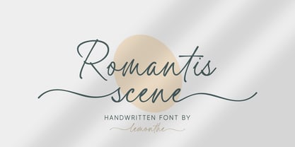 Romantis Scene is a beautiful and flowing script font with a modern style. This gentle font will look gorgeous on a variety of design ideas. It is perfect for many different projects such as logos & branding, invitation, stationery, wedding designs, signature, product designs, labels, photography, and much more!
 - Baby Rihana by Strong,
$19.00 Baby Rihana is a smooth, elegant and flowing handwritten font. It has a very well balanced character and as a result it fits into a wide range of designs. Blushing's history features varied baselines, smooth lines, beautiful glyphs and stunning alternatives. Add to your most creative ideas and see how they make it happen! Baby Rihana has 387 Alternatives, including multi-language support. With OpenType features with alternative styles and elegant binding. The OpenType feature works automatically, but you can access it manually and for the best results necessary for your creativity in combining these Glyph variations.
 - Domina Urbanite by UICreative,
$23.00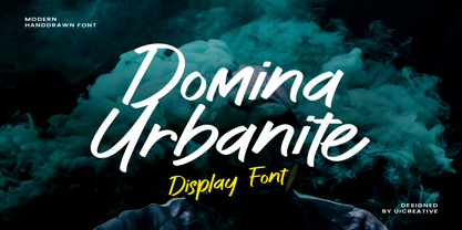 Introducing our new product the name Domina Urbanite Modern Handwritten Display Font. Modern Handwritting font that feels beautiful classy, elegant, and modern. This font is perfectly suited for a wide variety of projects, such as signature, stationery, logo, wedding, typography quotes, magazine or book covers, website headers, clothing, branding, packaging design, and more. Also for fashion-related branding or editorial design and displays both masculine and feminine qualities.
 - Bomanda Signature by Febri Creative,
$12.00 Bomanda Signature is a handwritten signature font. This font has 2 stylistic forms, namely regular and italic. Also added is a bonus 1 font, a floral element font that can be used for: logos, writing ornaments, making frames, and much more. You can create the perfect signature or logo with this font. What's Included? - Bomanda Signature Regular OTF - Bomanda Signature Italic OTF - Bomanda Floral Elements OTF - More than 598 of glyphs - Works on PC & Mac Simple Installations Accessible in the Adobe Illustrator, Adobe Photoshop, Adobe InDesign, CorelDraw, even work on Microsoft Word. Multilingual Support Thanks and have a wonderful day.
