10,000 search results
(0.034 seconds)
- Doublewide by Betatype,
$40.00There are many wide types that look sci-fi or super chic, but where is the personality? Doublewide brings its loud and fun loving character to the wide types party. Featuring light to black weights and a true italic, Doublewide can bring a boring page to life with lively headlines and compelling call-outs. - SailorsTattoo Waves by Otto Maurer,
$19.00 Sailors Tattoo Waves is a modifikation of my Font Sailors Tattoo. This Fonts are made for best oldschool or traditional Tattoodesigns. You can color the half-version with the full-version. Take a graphic app like Affinity Photo or Affinity Designer and use the layers. Drop the colored full-version under the black half-version.
 - Arya by TipoType,
$19.90 Arya is a display typeface, based on Roman proportions. It has three versions, differentiated by the amount of the drawn lines. Single is solid. Double is sturdy but light. Triple is versatile and includes alternatives. They can be combined in layers. Capsule versions (White and Black) are designed to do quick, simple and elegant labels.
 - Deathmetal by Madhaline Studio,
$29.00 Tutorial : https://www.youtube.com/@madhalinestudio Deathmetal is a carefully crafted font, which features a very heavy black metal feel. This letter combines graffiti style and blackmetal style, giving a unique and cool new impression. Deathmetal suitable for metal band logos, merchandise, clothing, apparel, or anything that needs a black metal feel.
 - Brozo by Creaditive Design,
$19.00 Brozo typeface is a versatile font with 18 styles, ranging from thin to black, thin italic to black italic. Its captivating and elegant look, complemented by multilingual support and a standard character set, caters to diverse designs. Brozo's minimalist yet sophisticated appeal ensures comfortable readability. Elevate your designs with Brozo's perfection.
 - Price Tags JNL by Jeff Levine,
$29.00 Price Tags JNL is a multi-use dingbat font. Along with over twenty nostalgic price tags, there is a set of individual numbers [1 thru 0 keys] and number pairs [A-T and a-i keys] for creating old-style white-on-black price tags. Blank end caps are available on the parenthesis keys, the decimal point is on the period key, catch words FOR, DOZEN and EACH are on the left and right arrows and right brace respectively, and the dollars and cents marks are on the dollar and hyphen keys. You'll even find a few extras placed upon the bracket and left brace keys.
 - Monopol by Suitcase Type Foundry,
$39.00 The type family consists of six well-distinguished weights, from hair-thin all the way to the one black as the deepest night. In line with the current trend, it touches all boundaries, it stretches beyond technical possibilities and in extremes, it is almost illegible – the counters are reduced to a hairline. All italics have the same proportions as their corresponding regular styles, which emphasises the block-like appearance of the set text. Monopol was designed to thrive on posters, exhibit stands, book covers, magazines, and in complex visual styles. Its twelve styles make it an ideal tool for creating a dynamic composition using solely typographic means.
 - Basic Nouveau JNL by Jeff Levine,
$29.00 The 1913 sheet music for "You’ll Be Welcome When You Get Back Home" had its title hand lettered in a simple, yet attractive Art Nouveau sans serif design which has been preserved as digital type. Basic Nouveau JNL is available in both regular and oblique versions.
 - Ondemande by Stefani Letter,
$14.00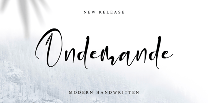 Ondemande feels equally charming and elegant. It looks stunning on wedding invitations, thank you cards, quotes, greeting cards, logos, business cards, and every other design which needs a handwritten touch. This font is PUA encoded which means you can access all of the glyphs.
 - Planks - Unknown license

- Abecedarian - Unknown license

- II Vorkurs by Increments,
$19.00 A functional, constructive sans-serif with universal, geometric forms. Dedicated to the life and work of Bauhaus pioneer Josef Albers, the typeface follows a disciplined approach to composition using a limited palette of modular blocks. II Vorkurs has 3 weights and 6 styles with extensive latin language support and squared, stylistic alternates.
 - Zin Display by CarnokyType,
$46.00 Zin Display is a contemporary typeface designed for various situations of typographic usage. Characteristic feature is a large x-height and balance between neutral construction of letters (strictly vertical axis), dynamic open forms (opened terminals) and sharp instrokes, outstrokes and serifs. Another typical feature is a visually narrower connection between stems and strokes. The complete font family consist of three width proportions (Normal, Condensed and Extended). Every sub-family has 5 weights, ranging from Light to Black with matching Italics. Zin Display can be effectively used especially for display typesetting but works for longer text as well. It can be used especialy in magazine layouts and editorial design, as well in advertising typography, orientation systems, corporate identities and many other situations. Zin Display is a member of the Zin super family, which also includes Zin Sans, Zin Slab and Zin Serif fonts.
 - Brushability by My Creative Land,
$29.00The Brushability is a brush-written font family that contains 9 fonts, all united by a brushy look. All fonts compliment each other perfectly and can be used either together or with many other brush-looking fonts on the market. The script contains a lot of alternates, swashes, ligatures, arrows etc. while the Extras font has quite a few design elements with the same brush look - such as arrows, frames and swashes - to add more personality to the design. The 5 sans serif fonts (ranging from Light to Black) also contain alternate glyphs for certain letters - just to make your design process even more fun. All fonts, as usual, are fully unicode mapped so you can use them in any application. Just be aware that if your application doesn’t support OpenType features, you’ll have to choose the glyphs you need manually. - MC Milesheart by Maulana Creative,
$13.00 Milesheart is a decorative handwritten sans display font. With bold block stroke, fun character with a bit of ligatures and alternates. To give you an extra creative work. Milesheart font support multilingual more than 100+ language. This font is good for logo design, Social media, Movie Titles, Books Titles, a short text even a long text letter and good for your secondary text font with sans or serif. Make a stunning work with Milesheart font. Cheers, Maulana Creative
 - Vlakshore by Maulana Creative,
$13.00 Vlakshore is a decorative handwritten sans display font. With bold block stroke, fun character with a bit of ligatures and alternates. To give you an extra creative work. Vlakshore font support multilingual more than 100+ language. This font is good for logo design, Social media, Movie Titles, Books Titles, a short text even a long text letter and good for your secondary text font with sans or serif. Make a stunning work with Vlakshore font. Cheers, Maulana Creative
 - Salda Soft by Hurufatfont,
$19.00 Salda Soft; It is a modern sans serif family that blends old and new generation sans serif fonts in the same body. It has a wide usage area with its light narrow structure, soft and clean lines, humanist touches. It provides clean and smooth visuals in vertical screens, mobile applications and block texts. It consists of a total of 20 styles. Ideal for all kinds of editorial design, packaging, corporate identity, brand, application, web and desktop.
 - Nerone by The Ampersand Forest,
$20.00 Nerone is a quasi-unicase display type family in four weights, from light to black. In its lighter versions, it's reminiscent of dignified flared serifs like Albertus. In its black version, it's comparable to display faces like Serif Gothic, with a hint of Mostra-like despotism... Inspired by ancient Roman capitals, Nerone takes a whimsical look at how they might turn into a black fatface, and how a matching lowercase might give the whole affair a whimsical feel — specifically when applied to fun branding and marketing uses. Part of The Ampersand Forest's Sondheim Series.
 - Basic Pixel by Mandarin,
$12.00 Basic Pixel is the right font to have fun with. With 15 different styles you can combine styles and color like building blocks to create endless new combinations and intriguing visual outputs.
 - Hexa by Hexa,
$19.00 The font HEXA is inspired by the Hexagon. The HEXA fonts are dynamically and uniquely designed typefaces based on the grid systems of the hexagon that extends infinitely. From this image, we have created the HEXA font. Hexa is Latin-based and a completely crafted font that consists of 3 typefaces. Each typeface contains 190 sets of characters. This font family is in all-caps fonts, and we provide different styles of uppercase and lowercase glyphs with the exception of letters c, ç, and comma/ single low-9 quotation mark. In lowercase glyphs, we emphasize the image, character, and identities of Hexa. The font family includes regular, black, and thin. We created the witty expression with Hexa’s regular identity; thin emphasizes the lines; black fills in the blanks. Hexa is a monospaced fonts. So kerning is not applied. We recommend using our fonts for big-sized uses. This typeface is a display font and looks more attractive in larger formats than on main texts. Features: -190 characters -Monospaced fonts -All-caps fonts (different styles provide uppercase and lowercase)
 - Megatropolis by Just My Type,
$35.00 Introducing Megatropolis : intellectual, architectural, urban and urbane. What started as an idea where the counters would be letters (3 scribbled glyphs on a piece of scrap paper), has grown into a mighty font family of eight stackable fonts. First came Megatropolis itself, a Deco font within a Deco font; Double Deco, you might say. In Illustrator, you can deconstruct it to make solid letters, outline letters or just the inset letters on their own, and you can stack them how you wish. Or you can get the whole Megatropolis family with Black , Outline , Inset , Smog , Shade and Shade with Inset and keep them all separate stackable, editable fonts. In addition, there’s Megatropolis Benday (available in TT only), with its fabulous stackable comic dots. Megatropolis is a typographer’s playground.
 - Pleasure by ITC,
$29.99Pleasure is the work of German designer Holger Seeling, a condensed open sans serif typeface featuring a shadow behind each character. Its geometric forms are flexible and best used closely spaced. Pleasure reflects no particular time or setting and is therefore ideal for a wide variety of headline applications. - Storyville by Canada Type,
$29.95 This is the redrawn and expanded version of an alphabet Rebecca Alaccari made back in 2009 as a bespoke font for a tourism agency looking to recapture the appeal of New Orleans after the hurricane Katrina disaster robbed it of its core industries. The brief back then was to "revive the unique spirit of what always made Nola great for new adults, which is the excellent combination of history, romance, food and music." No word of a lie, the brief actually contained "new adults." Storyville contains two interchangeable sets of forms drawn in the doodly, loose and organic way now conspicuously popular with today's young designers, almost every one of whom thinks they will get to design something for a boutique coffee bar somewhere. Well, this whole thing perhaps means freedom, youth, fun, happiness, good stuff like that. But just in case, a little caution doesn't hurt: Use this font only if you know what you're doing. We don't want to go back to the 1990s. Please. We were nearly done for by that exposure the first time around. The ligatures feature in this font does some pseudo-randomization, so the forms in doubled letters don't repeat. Serious fun can be had by also applying the stylistic alternates feature, or picking a letter in the middle of a setting and disabling the ligatures feature. Or various sequences of all that. If you don't like any of that stuff, just forget about it. Uh, wutever.
 - Europa Grotesque by Red Rooster Collection,
$49.00 Europa Grotesque is a condensed sans serif font family that was originally designed by Sam Ardell (TP) in the 1950’s for the Techni-Process Collection. Steve Jackaman (ITF) acquired the rights to the TP Collection in 1991 and produced Europa Grotesque in its digital form in 1994. Europa Grotesque has impressive impact at display and subhead sizes, and its geometric forms sustain that distinctiveness in both all-caps and lowercase. The family is flexible and freeform enough to support both a laid-back feel while still feeling tight and controlled.
 - ION A by Setup,
$19.95 ION A is a part of the ION superfamily, which consists of 3 families: condensed (ION A), normal (ION B) and wide (ION C), each having a compelling range of 10 weights. Styles Thin to Black have 436 glyphs supporting more than 70 Latin-based languages and the three heaviest weights, named U1, U2 and U3 have 94 basic glyphs. ION glyphs are based on the classic 7-segment display, but for readability and aesthetic reasons, some alphabetic characters don't follow this matrix strictly. In case you like things in order, don't worry, there's a stylistic set that replaces all characters with their strict alternatives. The special characters, such as #, @ or % are composed of special segments, but are designed to fit seamlessly within the whole character set. ION was designed with the needs of contemporary graphic design in mind. There are alternative characters, discretionary ligatures, slashed zero, superior & inferior numbers, fractions, ordinals and three handy stylistic sets. The ten styles of ION A are accompanied with a special 11th style called Cells, allowing you to design a special underlying layer of black or outlined cells. This way you can create various containers and boxes for your text, highlight what's important or go wild and draw a space invader, using the cells as building blocks. Learn more about the OpenType features and Cells at www.urtd.net/ion.
 - ION C by Setup,
$19.95 ION C is a part of the ION superfamily, which consists of 3 families: condensed (ION A), normal (ION B) and wide (ION C), each having a compelling range of 10 weights. Styles Thin to Black have 436 glyphs supporting more than 70 Latin-based languages and the three heaviest weights, named U1, U2 and U3 have 94 basic glyphs. ION glyphs are based on the classic 7-segment display, but for readability and aesthetic reasons, some alphabetic characters don't follow this matrix strictly. In case you like things in order, don't worry, there's a stylistic set that replaces all characters with their strict alternatives. The special characters, such as #, @ or % are composed of special segments, but are designed to fit seamlessly within the whole character set. ION was designed with the needs of contemporary graphic design in mind. There are alternative characters, discretionary ligatures, slashed zero, superior & inferior numbers, fractions, ordinals and three handy stylistic sets. The ten styles of ION C are accompanied with a special 11th style called Cells, allowing you to design a special underlying layer of black or outlined cells. This way you can create various containers and boxes for your text, highlight what's important or go wild and draw a space invader, using the cells as building blocks. Learn more about the OpenType features and Cells at www.urtd.net/ion.
 - ION B by Setup,
$19.95 ION B is a part of the ION superfamily, which consists of 3 families: condensed (ION A), normal (ION B) and wide (ION C), each having a compelling range of 10 weights. Styles Thin to Black have 436 glyphs supporting more than 70 Latin-based languages and the three heaviest weights, named U1, U2 and U3 have 94 basic glyphs. ION glyphs are based on the classic 7-segment display, but for readability and aesthetic reasons, some alphabetic characters don't follow this matrix strictly. In case you like things in order, don't worry, there’s a stylistic set that replaces all characters with their strict alternatives. The special characters, such as #, @ or % are composed of special segments, but are designed to fit seamlessly within the whole character set. ION was designed with the needs of contemporary graphic design in mind. There are alternative characters, discretionary ligatures, slashed zero, superior & inferior numbers, fractions, ordinals and three handy stylistic sets. The ten styles of ION B are accompanied with a special 11th style called Cells, allowing you to design a special underlying layer of black or outlined cells. This way you can create various containers and boxes for your text, highlight what’s important or go wild and draw a space invader, using the cells as building blocks. Learn more about the OpenType features and Cells at www.urtd.net/ion.
 - Be My Valentine by One Line Design,
$6.00 Spread a little love with the Be My Valentine display font. These capital letters are filled with love. 82 Glyphs. Letters A-Z, Numbers 0-9, Punctuation!?.’ In both Black & transparent (white) and black with colored heart. A-Z glyphs with colored heart are in lower case, check compatibility for colored fonts.
 - Oxtail by MAC Rhino Fonts,
$36.00 This typeface has its roots in the Egyptienne-family which became popular in the beginning of the 19th Century. To make the family more unique and personal, ”twists” have been crafted throughout the design. All together a family of 6 weights, including: Medium, Medium Italic, Bold, Bold Italic, Black and Black Italic.
 - RussianQuality - Unknown license

- Denso Serif by DSType,
$40.00 An eye-catching and practical type family that doesn't intend to be retro or evoke any geometrical cliché. Ranging from a low contrasted thin to a vigorous black, Denso is available in both low and high contrast versions. All consistently developed across two styles, Serif and Sans. Marked by the vertical rhythm, enhanced by the enormous x-height, Denso has the typographic qualities that will allow the design to be highly readable, with a strong stylish statement.
 - Quanta by Alphabets,
$17.95Quanta was designed without reference to existing sansserif faces. As an original design, Quanta draws on principles of letterform developed during my studies of lettercarving (in Wales with Ieuan Rees) and Roman proportion. My intention was to produce a highly legible and adaptable sans-serif, initially intended to be a TrueType GX font, then as a Multiple Master font, later as a five weight range from extremely thin to extra black. A related uncial design will be released shortly. - Soliden by Eko Bimantara,
$29.00 Soliden is a neo grotesk san serif font family with solid letterforms. Designed and published by Eko Bimantara in 2022, Soliden became a suitable choice for large display and functional purposes. The letterforms are built in large x-height with spacious counters. It consists of 8 weight from Thin to Black and 3 width; Condensed, Normal and Expanded, which make it a large font family with 48 styles. Soliden has 394 glyphs which cover broad latin languages.
 - Dexa Pro by Artegra,
$29.00 Dexa Pro was designed by Ceyhun Birinci in 2020 with an inspiration to create a contemporary super family with inspiration from classic sans serif families. It's a workhorse family consisting of 72 fonts in condensed, narrow, normal and expanded widths. Each width has 18 fonts in thin to black weights, along with their true italic counterparts. With more than 770 glyphs per font, It offers a ton of language support from all the Latin languages to Cyrillic.
 - Denso Serif High by DSType,
$40.00 An eye-catching and practical type family that doesn't intend to be retro or evoke any geometrical cliché. Ranging from a low contrasted thin to a vigorous black, Denso is available in both low and high contrast versions. All consistently developed across two styles, Serif and Sans. Marked by the vertical rhythm, enhanced by the enormous x-height, Denso has the typographic qualities that will allow the design to be highly readable, with a strong stylish statement.
 - Regon by Dicubit,
$9.00 Regon is a modern sans serif typeface/font family (18 fonts) designed with carefully handcrafted. This perfectly made to be applied in logo or branding, stationery, books, packaging, fashion, magazines, t-shirt, novels, labels and many advertising purposes. Styles: Thin, Extra Light, Light, Regular, Medium, Semi Bold, Bold, Extra Bold, Black (All with Italic). Features: Uppercase, Lowercase, Number, Punctuation, Symbol, Multilingual. All the pictures used in the preview are not included. They are intended only for illustration purpose.
 - Puck by Type.p,
$28.00 Puck is a Rounded Sans Serif font that comes in 20 styles from Thin to Black, including italics. Its design, which features rounded edges, open terminals, and extended width, along with generous negative space, ensures easy readability across different sizes. It's a versatile choice for various applications like print, banners, and branding. Plus, it maintains its adorable appeal on social media platforms like Instagram. Puck's design brings a blend of elegance and cuteness to any project.
 - Tazugane Gothic Variable by Monotype,
$1,049.99 Tazugane Gothic is a Japanese typeface family developed by the Monotype Studio. The project began as a companion Japanese typeface for the famous Neue Frutiger. The goal for Tazugane Gothic was a humanist sans serif face with a clear and legible forms, and nearly unlimited applicability in a broad range of uses, from signage and publishing to advertising and websites. The Tazugane Gothic font family is extremely versatile with ten different weights from Ultra Light to Extra Black.
 - Cedora by Lafontype,
$19.00 Cedora is a humanist sans serif designed with a playful appearance. Cedora comes in 14 styles with 7 weights ranging from thin to black each of which represents multiple languages allowing you to do editorial activities. In the terminal section the size is made a little thinner so that the shape doesn't look so sharp and the x-height and open counter have been taken into account so that it is good enough for a small text size.
 - KhaoSans by TypeK,
$35.00 KhaoSans is a Rounded typeface. The latin was inspired from Thai woodtype used as headline in old day Thai newspaper. The refined curve with some sharp end add uniquely beautiful touch to the typeface. In Thai language, ‘Khao’ (ข่าว) means ‘news’ and ‘Sans’ (สาร) means ‘message’. The font comes in 8 weights, ranging from a delicate ExtraLight to Black, with 3 widths (Normal, Wide, and Expanded). Matching italics are provided, resulting in a total of 48 styles family.


