10,000 search results
(0.023 seconds)
- FF Stamp Gothic by FontFont,
$62.99 Dutch type designer Just van Rossum created this display FontFont in 1992. The font is ideally suited for advertising and packaging, film and tv, editorial and publishing, music and nightlife as well as software and gaming. FF Stamp Gothic provides advanced typographical support with features such as ligatures, alternate characters, case-sensitive forms, and stylistic alternates. It comes with proportional lining figures. As well as Latin-based languages, the typeface family also supports the Greek writing system.
 - Ando by JCFonts,
$30.00 Ando is a condensed sans serif typeface available in seven styles. Built on a simple geometric structure, this family packs a lot of elegance with its super smooth curves and unique details. Designed for headlines, Ando really shines when used big, specially in the lighter weights. Initially released in 2011, the family was extended and updated in 2020. OpenType features include standard and discretionary ligatures, stylistic alternates, tabular figures, localized forms, case-sensitive punctuation, and more.
 - FF Merlin by FontFont,
$47.99 Canadian type designer Nick Shinn created this display FontFont in 1997. The family contains 3 weights: Regular, Italic, and Bold and is ideally suited for advertising and packaging, festive occasions as well as poster and billboards. FF Merlin provides advanced typographical support with features such as ligatures, small capitals, titling alternates, alternate characters, and case-sensitive forms. It comes with a complete range of figure set options – oldstyle and lining figures, each in tabular and proportional widths.
 - Carisma by CastleType,
$59.00 If you're in need of a sophisticated sans serif font, look no further than type designer Jason Castle’s Carisma (Paul Shaw in HOW magazine). Carisma, a CastleType Original, combines the elegance of classic capitals, the simplicity of clean-cut, geometric lowercase letters and the warmth of sensuous curves, subtle contrasts and sensitively tapered terminals, making it the perfect typeface for an understated, modern, sophisticated look. Available in two styles: Carisma Classic (the original), and Carisma Gothic, plus Carisma Inline.
 - FF Elegie by FontFont,
$68.99 French type designer Albert Boton created this script FontFont in 2002. The family contains 2 weights: Regular and Italic and is ideally suited for advertising and packaging, festive occasions, film and tv as well as poster and billboards. FF Elegie provides advanced typographical support with features such as swashes, ligatures, alternate characters, and case-sensitive forms. It comes with a complete range of figure set options – oldstyle and lining figures, each in tabular and proportional widths.
 - Code Saver by Dharma Type,
$9.99 Code Saver — Next-generation monospaced font — 1. Code Saver is a monospaced font family for coding and tabular layout. 2. Code Saver is a clean, natural and simple monospaced font family. 3. Code Saver consists of 6 style, Regular, Medium, Bold and their 11° Italic. 4. Code Saver has 93.33% condensed width for more usable space. 5. Code Saver has good distinguishability and legibility especially numerals. 6. Code Saver brings a fresh sensitivity to boring old existing monospaced fonts.
 - FF Schulbuch by FontFont,
$68.99 Dutch type designer Just van Rossum created this sans FontFont in 1991. The family has 6 weights, ranging from Regular to Bold and is ideally suited for advertising and packaging, book text, film and tv, editorial and publishing as well as logo, branding and creative industries. FF Schulbuch provides advanced typographical support with features such as ligatures, alternate characters, case-sensitive forms, fractions, super- and subscript characters, and stylistic alternates. It comes with tabular lining and proportional lining figures.
 - FF Parango by FontFont,
$47.99 French type designer Xavier Dupré created this serif FontFont in 2001. The family contains 3 weights: Regular, Italic, and Bold and is ideally suited for advertising and packaging, book text, film and tv as well as small text. FF Parango provides advanced typographical support with features such as ligatures, small capitals, alternate characters, case-sensitive forms, and stylistic alternates. It comes with a complete range of figure set options – oldstyle and lining figures, each in tabular and proportional widths.
 - BR Firma by Brink,
$30.00 BR Firma is a geometric sans serif consisting of 8 weights ranging from Thin to Black with matching italics. It supports an ‘Extended Latin’ character set that covers over 200 latin based languages. BR Firma provides advanced typographic support with features such as case sensitive forms, fractions and slashed zeros. It comes with multiple figure sets and is ideal for print, advertising, publishing, branding, software and gaming as well as being optimised for web and screen design.
 - Kernel by JCFonts,
$19.00 Kernel is a square geometric type family in six weights with matching obliques and small caps. The design mixes slightly rounded terminals and shoulders with square counterforms, giving the shapes a strong masculine and futuristic look, great for applications like innovation, technology, sports and of course, sci-fi ! The fonts, delivered in Opentype format, include diacritics for most European languages and come with a variety of Opentype features : two stylistic sets, tabular figures, case-sensitive forms, fractions and more.
 - Glimp by OneSevenPointFive,
$15.00 Glimp, is a new versatile modern geometric font family, offering 3 widths, 9 weights and corresponding italics. It features rich set of opentype features such as stylist sets, contextual alternates, case sensitive forms, superscripts, subscripts, fractions, and more. Glimp is expertly crafted to be your top choice across a diverse array of projects, be it branding, web design, print materials, or presentations. It seamlessly enhances your designs, embracing your unique creative vision. Note: Also available in Variable version
 - Winooski by Oddsorts,
$29.00 A little goofy, a little nerdy, Winooski mixes loose pen-drawn gestures with legible forms to deliver a playful workhorse. It’s packed with goodies like small caps, ligatures, case-sensitive alternates, and broad linguistic support. It also sports extras like two styles of catchwords that can be fired up by flanking the desired word with either asterisks or underscores and discretionary ligatures for pricing. There are even easter eggs in the OpenType features for the scavenger hunters among us.
 - Menco by Kvant,
$59.00 Menco was inspired by the lettering of engineering, found on blueprints, mechanical drawings, stencils and templates. The family has 5 weights, ranging from Thin to Black (including italics) and is ideally suited for advertising and packaging, editorial and publishing, logo, branding and creative industries as well as small text. Menco provides advanced typographical support with features such as case-sensitive forms, fractions, super- and subscript characters, and stylistic alternates. It also comes with tabular lining and proportional lining figures.
 - Titillation by Suomi,
$30.00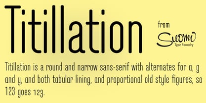 A font to titillate your senses.
 - Portiere by Cititype,
$14.00 "Portiere" is a natural handwritten font, we created this font using a marker pen, the natural emphasis of the pen makes the round size random. We write one by one on the paper and then we select each glyph to be the font. This is how we get a natural impression. To sharpen the natural impression we made several ligatures because in natural writing you will not find the same composition. Activate the ligature and feel a natural writing sensation. This font is very suitable for writing quotes and short sentences. Even more so for text animations such as on YouTube and other social media. Its unique shape also allows it to be used for logos.
 - Auster by Resistenza,
$39.00 Auster, A Sans with Flair! Auster packs sensational personality in its fine-tuned forms. Confident and quirky, yet comfortable to read, this distinctive san serif family stands out from the crowd. The curves cinch and strokes flair in unconventional places making Auster an unashamed rebel sure to turn heads. Originally designed during the TipoBrda Workshop in Slovenia. Resistenza spent 3 years developing this 2 style (roman & Italic), 20 weight family. The subtle reverse contrast characters were first painted with a flat brush, then polished in pencil on tracing paper before being carefully digitized, to include language support and all the opentype features you expect in a quality contemporary font. More About Opentype Features: https://bit.ly/opentype-rsz
 - BENTO - 100% free

- Marcione by Eko Bimantara,
$24.00 Marcione is the real deal, a contemporary and dynamic condensed display font family that blends the classic Deco and Grotesk styles in a playful and modern way. This font family got personality, you can see it right away in the lowercase letters, with a diagonal stem in characters like “a”, “h”, “m”, and “n” that gives it that extra kick. You can use Marcione to create some killer designs in editorial, branding, or advertising. This font family packs a punch with six distinct styles, ranging from Light to ExtraBold, and it’s got you covered with broad Latin language support. That means no matter where you’re from, Marcione can help you make a statement. This font is highly versatile and visually engaging, a true boss. With its condensed design, it takes up minimal space while still commanding attention and conveying a sense of sophistication. Trust me, you won’t regret having Marcione in your font library, it’s the real deal.
 - Cowboy Funk by PizzaDude.dk,
$18.00 Howdy partner! In need of a comic inspired cowboy font? Then Cowboy Funk is ready to ride with you into the sunset! :) Dusty edges, thrilling spurs and shooting ornaments - the main ingredients of Cowboy Funk! Multilingual support for all yall cowboys and gals! :)
 - Larken by EllenLuff,
$42.00 Larken is a confident serif. Designed to reflect nature, it creates a sense of natural softness and expressiveness. We pushed the concept into a usability focused direction, to work as a bold tool and beautiful communicator. Larken variable allows fluid design across 7 weights, italics and major latin based languages. True italics advance the aesthetics, bringing energy and making it suitable for modern design. The type family melds organic curves and gentle repetition into powerful and harmonious type. At large point sizes you can appreciate the letter shapes, whilst the same restraint and focus creates an even texture for small point sizes and long reading. The font broadens its use by supplying weights all the way from thin to black. The natural curves, swells and sloping trunks, grow in character as the font gains weight. Whilst the thinner weights have lowered contrast and optical corrections to create a warm and gentle appearance. The Larken character set incorporates additional symbols, stylistic alternates, unique ligatures and case sensitive punctuation - producing a stable workhorse family ready to tackle projects of any size.Check out Jeko which is a great pair for Larken.
 - Kolorans by Ronny Studio,
$19.00 Kolorans is a cute comic display font. Funny comic fonts are characterized by their whimsical and playful designs, which are meant to evoke a sense of lightness and humor. It features bold, slightly exaggerated letterforms that have a cartoonish feel to them. The letters are cute and quirky, giving off a friendly and approachable look. This font is perfect for comic books, titles, poster designs, and more. Features : - All Caps - Alternate & Ligature - numbers & punctuation - Multilingual - PUA encoded Please contact us if you have any questions. Enjoy Crafting and thanks for supporting us! :) Thank you
 - Adorn Garland Smooth by Laura Worthington,
$29.00 Adorn Garland is a script face that runs along a somewhat “vintage” direction. Rather than deriving its strength from a heavy skeleton or structure, it uses its sense of contrast, its light touch upon the page, and its elongation to provide a visual break – it can function as a long string, rule, or dividing line. With 166 swashes. See what's included! http://bit.ly/1rYDcmQ This font has been specially coded for access of all the swashes, alternates and ornaments without the need for professional design software! Info and instructions here: http://lauraworthingtontype.com/faqs/
 - Tevegraphy - Personal use only

- Cobbler Sans by Juri Zaech,
$30.00 Cobbler Sans is a friendly type family in six weights and the humble cousin to Cobbler. With its rounded aspect and proportions of geometric type Cobbler Sans is expressively soft and contemporary. All terminals are shaped organically and even inner corners are rounded. The few remaining straight lines give the typeface the stability of a workhorse while keeping the playfulness that characterizes the entire Cobbler family so much. Additionally there is a pile of OpenType features built in. For example loads of discretionary ligatures that make capital letters interlock left and right. Other features include automatic fractions, case sensitive punctuation and contextual alternates. Cobbler Sans works great for branding, packaging, editorial or any display application – and it comes with an expansive character set that covers over 200 languages. Furthermore Cobbler Sans is manually kerned and auto-hinted for crisp display on screen also in small sizes.
 - Gerlach Sans by Juraj Chrastina,
$29.00 As the foundry’s top–of–the–line family, Gerlach Sans was named after the highest peak in Slovakia. Its functional design is enhanced by a few subtle ingredients, adding life and giving words a more playful voice. The family has eight weights ranging from delicate hairline to the super thick black. Each of them includes a genuine italic companion with variant shapes. The large character set accessible through OpenType features provides the designer with a wealth of opportunities and supports a wide range of Latin-based languages. It is stuffed up with tabular and proportional figures, old-style and lining figures, fractions, superscripts and subscripts, ordinals, case-sensitive forms, circled numbers, arrows, icons and many more. Combining legibility and usability of its grotesque style with cool elegance, Gerlach Sans provides a strong partner for your print and web project. You can download the instruction PDF here.
 - Galix by Eclectotype,
$40.00 Galix is a technical sans designed to look futuristic without any of the retro appearance often found in this genre. It has a squarish, slightly condensed anatomy, and is characterized by thin joints and deep ink traps that add a sparkle to the otherwise monoline typeface. In the italic styles, these cuts are accentuated even more which creates a feeling of speed in the letterforms. Galix is optimized for display typography (the ascender height is the same as the cap height, and the spacing is somewhat tight) but the middle weights are very readable at smaller sizes, where I'd recommend adding a little tracking. OpenType features include ft and tt ligatures, stylistic sets/alternates, automatic fractions, tabular, superscript and subscript figures, case sensitive forms. Perfect for websites, apps, infographics, magazines and logotypes, Galix is technical but with a warmth and personality that is often missing from this genre.
 - Saigon by The Paper Town,
$25.00 Saigon is a minimalist condensed serif family. With clean lines and tight curves, its personality dwells in its simplicity making it a timeless editorial typeface. As the italic breaks with the traditional strokes and embrace a more modest yet modern look, it blends in nicely with its upright sister, thus creating an harmonious rhythm which emphasis the minimalist approach of Saigon. The low contrast serif is created to look great in both display and text. Whether it’s bold headlines of descriptive paragraphs, Saigon aims to be as versatile and functional as possible. It supplies 6 weights from thin to bold allowing you to elevate your typography designs in a minute while keeping it simple. Cause great design should be simple. The type family supports major Latin-based languages along with opentype features such as fractions, old style numerals, ligatures, case sensitive punctuation, stylistic alternates symbols and more.
 - Ata Rounded by Bülent Yüksel,
$19.00 My son’s name is Ata Caner Yüksel. After building this character, I wanted to honor him by using his name for this font. I think it fully reflects the character I created in my mind. Ata Rounded, only one of the four other deep end with rounded corners consist of sharpened flat plate. Matched to one another and are optimized for screen. The family, with eight weights plus matching italics, was designed by Bülent Yüksel in 2016. Ideally suited for advertising and packaging, editorial and publishing, logo, branding and creative industries, poster and billboards, small text, way-finding, and signage, as well as web and screen design. ATA provides advanced typographical support for Latin-based languages. Case-sensitive forms, classes and features, small caps from letter cases, fractions, superior, inferior, denominator, numerator, old-style figures, stylistic alternates; just one touch easy In all graphic programs. You can enjoy using it.
 - Ata by Bülent Yüksel,
$19.00 My son’s name is Ata Caner Yüksel. After building this typeface, I decided to honor it with my son’s name. I think I fully reflects the character I created in my mind. Ata typefamily, only one of the four other deep end with rounded corners consist of sharpened flat plate. Matched to one another and are optimized for screen. The family has eight weights plus matching italics was designed by Bülent Yüksel in 2016. Ideally suited for advertising and packaging, editorial and publishing, logo, branding and creative industries, poster and billboards, small text, way-finding and signage as well as web and screen design. ATA provides advanced typographical support for Latin-based languages. Case-Sensitive Forms, Classes and Features, Small Caps from Letter Cases, Fractions, Superior, Inferior, Denominator, Numerator, Old Style Figures, Stylistic Alternates in just one touch easy In all graphic programs. You will enjoy using it.
 - Leroy by Andinistas,
$39.95 Leroy is a font family of 5 members designed from geometrizing Roman and Gothic skeletons. Its purpose is to provide optimal reading of titles and paragraphs with strong mechanical flavor. Because of this, its variables are designed to sort information in media such as labels, signs and industrial atmosphere packaging related with the Soviet Union’s fonts in 1920. This idea matured white horizontal lines superimposed on alphabets drawn with an ancient architectural team known as “Leroy K & E Controlled Lettering System”. Then that evolved into a family concept unifying its proportion to the same X height for its members, resulting in a versatile type system. Therefore, Regular and Bold variables have low contrast between thick and thin strokes. Its upstream and downstream are extremely short, generating a suitable interline that clogs the vertical area. Its overall width equal to its X height, supports its tight spacing that compacts the horizontal area. Therefore, the variant with black caliber has plenty of contrast between thick and thin strokes. The light variable has a “blind” effect radiating light halos, ideal to propose hierarchies and combinations with orthogonal projection. In that sense, Leroy’s modular character reminds constructivist ideology merged with typographical variants suitable for graphic design with geometric look. To achieve this, I studied the softening of forms and counter blocks into a typographical system specially designed for composing useful information to attract attention. In that sense, the dingbats were obtained through a careful process of research and testings done with drawings that provided full and empty visual strategies that with the passage of time helped to forge the major decisions of a metamorphosis from industrial tools, birds and humans from pictogram mixing various genres.
 - HU Mois KR by Heummdesign,
$25.00 HU Mois KR is a calligraphy typeface with a sense of speed and a naturally slanted feel as if writing. It also gave a sense of free rhythm of handwriting. Includes Korean from the existing 'HU Mois' font.
 - Optima Cyrillic by Linotype,
$65.00Many typefaces are distinctive or attractive at the expense of legibility and versatility. Not so the Optima® family. Simultaneously standing out and fitting in, there are few projects or imaging environments outside of its range. Although Optima is almost always grouped with sans serif typefaces, it should be considered a serifless roman. True to its Roman heritage, Optima has wide, full-bodied characters – especially in the capitals. Only the E, F and L deviate with narrow forms. Consistent with other Zapf designs, the cap S in Optima appears slightly top-heavy with a slight tilt to the right. The M is splayed, and the N, like a serif design, has light vertical strokes. The lowercase a and g in Optima are high-legibility two-storied designs. Optima can be set within a wide choice of line spacing values – from very tight to very open. In fact, there are few limits to the amount of white space that can be added between lines of text. Optima also benefits from a wide range of letter spacing capability. It can be set quite tight, or even slightly open – especially the capitals. If there are any guidelines, Optima should be set more open than tight. It’s not that readability is affected that much when Optima is set on the snug side; it’s just that the unhurried elegance and light gray typographic color created by the face are disrupted when letters are set too tight. Optima is also about as gregarious as a typeface can be. It mixes well with virtually any serif design and a surprisingly large number of sans serif faces. The Optima family is available in six weights, from roman to extra black, each with an italic counterpart. In addition, the family is available as a suite of OpenType® Pro fonts, providing for the automatic insertion of small caps, ligatures and alternate characters, in addition to offering an extended character set supporting most Central European and many Eastern European languages. When you’re ready to find its perfect pairing, browse these fantastic matches: Monotype Century Old Style™, Dante®, Frutiger® Serif, Joanna® Nova, Malabar™, and Soho®. - Optima by Linotype,
$45.99 Many typefaces are distinctive or attractive at the expense of legibility and versatility. Not so the Optima® family. Simultaneously standing out and fitting in, there are few projects or imaging environments outside of its range. Although Optima is almost always grouped with sans serif typefaces, it should be considered a serifless roman. True to its Roman heritage, Optima has wide, full-bodied characters – especially in the capitals. Only the E, F and L deviate with narrow forms. Consistent with other Zapf designs, the cap S in Optima appears slightly top-heavy with a slight tilt to the right. The M is splayed, and the N, like a serif design, has light vertical strokes. The lowercase a and g in Optima are high-legibility two-storied designs. Optima can be set within a wide choice of line spacing values – from very tight to very open. In fact, there are few limits to the amount of white space that can be added between lines of text. Optima also benefits from a wide range of letter spacing capability. It can be set quite tight, or even slightly open – especially the capitals. If there are any guidelines, Optima should be set more open than tight. It’s not that readability is affected that much when Optima is set on the snug side; it’s just that the unhurried elegance and light gray typographic color created by the face are disrupted when letters are set too tight. Optima is also about as gregarious as a typeface can be. It mixes well with virtually any serif design and a surprisingly large number of sans serif faces. The Optima family is available in six weights, from roman to extra black, each with an italic counterpart. In addition, the family is available as a suite of OpenType® Pro fonts, providing for the automatic insertion of small caps, ligatures and alternate characters, in addition to offering an extended character set supporting most Central European and many Eastern European languages. When you’re ready to find its perfect pairing, browse these fantastic matches: Monotype Century Old Style™, Dante®, Frutiger® Serif, Joanna® Nova, Malabar™ and Soho®.
 - Gibralt by NamelaType,
$19.00 Designed with high contrast. The stems are not completely straight, slightly narrow in the middle, combining rounded and right angle at the terminals and serif ends. Gibralt consists of 8 styles from Extra light to Black, each matching with italics version. Suitable for Headlines, paragraph, text, printing and more.
 - Western Suburbs JNL by Jeff Levine,
$29.00 The cover of a 1932 edition of “Sunset magazine” (a publication for homeowners living in the west and southwest area of the United States) featured a lovely Art Deco serif alphabet that is now available as Western Suburbs JNL in both regular and oblique versions.
 - Sebino Soft by Nine Font,
$25.00 Sebino Soft family is a rounded version of Sebino. It is a neutral sans-serif type family with 9 weights, from thin to black, with corresponding italics. Sebino Soft has a large x-height with open apertures which make texts more legible at small sizes. Each font includes OpenType Features such as Proportional Figures, Tabular Figures, Numerator, Superscript, Subscript, Case-Sensitive, Denominators, Scientific Inferiors, Ordinals, Ligatures and Fractions. Sebino Soft will make your artworks better with its clean & clear shapes.
 - FF Holmen by FontFont,
$41.99 Danish type designer Per Jørgensen created this serif FontFont in 2007. The family has 5 weights, ranging from Regular to Bold (including italics) and is ideally suited for book text, festive occasions as well as editorial and publishing. FF Holmen provides advanced typographical support with features such as ligatures, small capitals, case-sensitive forms, fractions, and super- and subscript characters. It comes with a complete range of figure set options – oldstyle and lining figures, each in tabular and proportional widths.
 - Symbah by Hashtag Type,
$19.00 Symbah is fun, a carefree hand drawn typeface with a child-like spirit. Made with a brush and ink, and then converted into a digital format for you to enjoy. The design is fresh, organic and produced purely by hand and brush, a technique not replicated by digital methods alone. Symbah is full of personality and is ideal for projects that need creativity with an imaginative, and unique feel. Details include manual edited kerning and spacing, ligatures and case-sensitive punctuation.
 - Kontras by Hurufatfont,
$29.00 Kontras has high contrast at vertical and horizontal emphasis. When analyzing characters as a whole, it has contrast at style and practice too. Although has not much alternative characters, it provides decorative and grift effects because of this characteristic. Kontras is ideal for brand building, packet designs, decorative titles and so on. However it contains standard ligatures, contextual alternates (R, a, &), discretionary ligatures and case-sensitive forms. “Kontras” has been derived from “kontrast” which means contrast and opposition in Turkish.
 - Biofolio Ultimate by Formatype Foundry,
$30.00 Behance Biofolio Ultimate is geometric Grotesk typeface exploration proportion and simplicity in typeface, Inspired by the elegant plainness seen in many of the less common 20th centuries sans Comes in 10 weights matching Italics —20 fonts in all, Biofolio Ultimate supports around 150 languages in the Latin based languages, Designed with multiple OpenType features, such as powerful stylistic alternates, case-sensitive forms, contextual and stylistic alternates. The standard numerals set encompasses tabular figures and symbols, superiors and inferiors, numerators and denominators, plus fractions.

