10,000 search results
(0.051 seconds)
- The Mix Office by LucasFonts,
$59.00"TheMix" is a semi-serif typeface with low-contrast – i.e., the differences between thin and thick strokes are not very pronounced. Yet the reference to writing with the broad-nibbed pen is still present, giving the letters a diagonal stress and a forward flow that facilitates reading. - LGF Besitos Square by LGF Fonts,
$18.00 BESITOS is a deconstruction INSPIRED on a sans serif type, in which the weights of the source did not mark the width of the letter but the lines that compose it is made in two variants according to their lines end up at right angles or curves.
 - Wildstreet by Runsell Type,
$18.00 Wildstreet – Script Urban Street Style A natural script textured brush, matching for urban street themes. The features uppercase, lowercase, numeral, punctuation & symbol, ligatures, alternates, multilingual support, PUA encoded (fully accessible without additional design software). It inspires a handcrafted aesthetic that pairs so well with san serif display.
 - Gorgone by Letterhend,
$14.00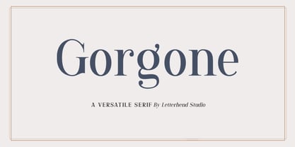 Gorgone, a versatile serif that brings the luxury feel. Gorgone is suitable for headlines, logotypes, apparel, invitations, branding, packaging, advertising and more. This typeface is comes in uppercase, lowercase, punctuations, symbols & numerals, stylistic set alternate, ligatures, and also multi-lingual support and is already PUA encoded.
 - VolumeFour by Ryan Corey,
$10.00 VolumeFour is a heavy, geometric sans-serif display face inspired by the custom lettering which adorns Black Sabbath's groundbreaking "Vol 4." Its bold forms and naturally tight spacing evoke the era which spawned such classics as "Snowblind" and "Supernaut", bringing this aesthetic to a contemporary audience.
 - Ruberoid by Pepper Type,
$30.00 Ruberoid is a squarish geometric sans-serif family reminiscent of Italian designs of 1950s and 1960s, but featuring considerably rounder shapes to give it a more contemporary feel. The typeface comes in 9 weights with companion oblique styles and contains support for Latin, Greek, and Cyrillic scripts.
 - LGF Besitos Round by LGF Fonts,
$18.00BESITOS is a deconstruction INSPIRED on a sans serif type, in which the weights of the source did not mark the width of the letter but the lines that compose it is made in two variants according to their lines end up at right angles or curves. - Beckson by Valentino Vergan,
$12.00 Beckson is a futuristic unique sans serif typeface, which comes with creative alternative letters. Beckson is designed with minimalist distinctive shapes that make it very eye catching. Beckson is a fantastic typeface for modern and futuristic designs, you can use it for a wide range of projects.
 - PeterPierre by Ingrimayne Type,
$6.95 PeterPierre is a stiff, awkward sans serif face. It has little variation in stroke width and the vertical and horizontal elements are connected with short, sharp curves. The condensed style was developed first and then, in a quest for legibility, it was widened into the regular style.
 - Athan by Thinkdust,
$10.00 Athan is an uppercase geometric sans-serif typeface designed by Dani Montesinos in 2009. Inspired by one piece of lettering from the 1970s, Athan offers something a little different in terms of typography. With strong geometric forms, and highly distinctive characters, it's sure to catch your eye.
 - Little Bosquee by Doehantz Studio,
$12.00 Little Bossque is a modern sans serif family. Its variety of weights provide a range of choices that will help you find the best typographic color for your project. Lighter weights are well-suited for body text while heavier ones are ideal for high impact headlines
 - Britannic by Linotype,
$40.99Britannic is a sans serif face with a vertical axis and a high degree of stroke contrast, especially in the heavier weights. This typeface exudes a degree of elegance that has not often been matched during the Century that has passed since it was first drawn. - TheMix by LucasFonts,
$59.00 "TheMix" is a semi-serif typeface with low-contrast – i.e., the differences between thin and thick strokes are not very pronounced. Yet the reference to writing with the broad-nibbed pen is still present, giving the letters a diagonal stress and a forward flow that facilitates reading.
 - Antebas by Lafontype,
$35.00 Antebas is a sans serif family with a geometric touch. Available in 16 styles from Thin to Heavy and it's matching italics. OpenType features such as fractions, ordinal, superscript, subscript, numerators, denominators and tabular figures are available. besides Latin letters, Antebas also supports Cyrillic and Greek letters.
 - Kolkman by Ingrimayne Type,
$8.95 Kolkman is a nondescript, bold, sans-serif typeface. In addition to a standard version, there is a version with shattered letters and another with striped or grayed letters. The shattered and striped versions can be layered on the regular version to get letters with two colors.
 - Ovalime by Sayurihuynh,
$7.00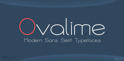 Ovalime, a modern and minimalistic sans serif typeface was designed by Ngoc Huynh. It looks stunning in every context and perfect for branding, stationery, social media posts, advertisements, product packaging, label, photography, watermark, special events, and more. Includes: - Uppercase and lowercase letters; - Multilingual symbols, numerals, and punctuation.
 - Musthyka by Raditya Type,
$15.00 Musthyka is a sans serif typeface in an elegant & modern style with special alternate ligatures and glyphs. Musthyka is ideal for headlines, headlines, logos, labels, packaging, postcards, presentations, magazines, invitations, etc. Features: Basic Latin alphabet A-Z Ligature & Alternatives Numbers, Punctuation, Currency, Symbols, Mathematical Symbols & Diacritics
 - Ruddy by Inhouse Type,
$33.32 Ruddy is a display sans serif type family. It has a playful and mischievous presence. Exaggerated geometry and varied vertical character stem placement contribute to its animated appearance. Ruddy comes in 4 weights with matching italics. OpenType features include Contextual Alternates, Tabular Figures, Fractions, Numerators and Denominators.
 - Elite Resort JNL by Jeff Levine,
$29.00 A 1940s sheet music edition of an early 1900s song entitled "You Taught Me How to Love You, Now Teach Me to Forget" was set in a popular metal type slab serif face. It is presented digitally as Elite Resort JNL, in both regular and oblique versions.
 - Woodpecker by profonts,
$41.99 Woodpecker is a self-confident, sturdy caps-only sans serif design imitating grained wood created and digitized by German type designer Ralph M. Unger for the profonts library. Woodpecker is perfectly suited for any graphic work around timber, lumber, prperty markets, carpenter, furniture and so on.
 - Egosta by skillyas studio,
$15.00 EGOSTA is a complete sans serif family. The letterform and sharp variations characterize a bold and playful typeface in a graphic layout, making it perfect for modern and futuristic visual needs, EGOSTA complete family contains 10 styles with two axes; Weight and Width, from Thin to Bold.
 - Cordillera by Latinotype,
$39.00 Clear, simple and multipurpose. We present Cordillera, a new sans serif designed for corporate use, which mixes classic proportions, geometric and neo-grotesque characters. Its alternative characters will allow you to go from expressive titles to neutral texts easily while maintaining the harmony of the system.
 - Reveler JNL by Jeff Levine,
$29.00 The sheet music for "Good Night Angel" from the 1937 motion picture "Radio City Revels", had the movie's title hand lettered in a free form Art Deco sans serif design. This has been recreated digitally as Reveler JNL, which is available in both regular and oblique versions.
 - Tannhaeuser by ITC,
$29.99 Tannhaeuser is the work of British designer Alan Meeks, a sans serif typeface with conventional capitals letter complemented by an unusual lowercase alphabet. It looks best when close letter spaced, especially the lowercase, whose lower right extensions are designed to overlap or join in a script fashion.
 - Atophuzomekosou by Meyerfonts,
$15.00 Atophuzomekosou is a sans serif typeface that can be used for a lot of purposes, including: signage, posters, campaigns, videos, artworks, billboards, games, and many more. The 7-segment and Arbitrary fraction characters are located in the Private Use Area at U+E000 and U+E100 respectively.
 - Huai Thai by Positype,
$49.00 หวยและหวยไทย ฟอนต์ที่ออกแบบโดยพชร์ เอื้อเชิดกุล ผลงานการออกแบบที่แสดงให้เห็นถึงการค้นคว้าใน 2 พื้นที่ที่ส่งผลซึ่งกันและกัน ระหว่างลายมือแบบตัวไทยที่เขียนกันทั่วไปและตัวละติน ผลที่ได้คือแบบตัวอักษร ‘หวย’ ที่ให้ความรู้สึกเป็นกันเองแต่มีความโดดเด่นชัดเจน มีลักษณะที่ไม่ขัดกับวิธีการเขียนที่คุ้นเคยและภาษาไทยที่เป็นต้นทางของแบบ สำหรับตัวอักษรไทย ลักษณะของหัวสามารถแบ่งได้เป็น 2 ประเภท คือแบบมีหัวและแบบไม่มีหัว แบบมีหัวนั้นมีที่มาจากลักษณะการเขียนดั้งเดิมของตัวอักษรไทย ส่วนแบบไม่มีหัวนั้นเป็นการพัฒนาขึ้นมาใหม่เพื่อให้สอดคล้องกับแบบตัวละตินไม่มีเชิงฐาน (Latin sans serif typefaces) โดยในช่วงหลายปีที่ผ่านมา แบบตัวไทยไม่มีหัวนั้นได้รับอิทธิพลและค่อยๆ ปรับให้มีสไตล์สอดคล้องกับลักษณะของตัวละตินมากขึ้น มากจนถึงจุดที่เราสามารถนิยามแบบตัวไทยที่ได้รับอิทธิพลมานี้ว่า Thai Latinized ได้ ซึ่งความสงสัยต่ออิทธิพลที่เปลี่ยนแปลงไปนี้ เป็นเหตุของไอเดียในการพลิกมุมมองว่าอะไรจะเกิดขึ้นถ้าหากลายมือตัวไทยนั้นเป็นฝ่ายไปมีอิทธิพลกับแบบตัวละตินแทน ผลลัพธ์ที่ได้ก็คือ โลกด้านกลับของแบบตัวไทยที่ถูกทำให้เป็นละติน ไม่ว่าจะเป็นป้ายหน้าร้านต่างๆ หรือริมถนนในกรุงเทพฯ การเขียนทั่วไปในชีวิตประจำวันที่เขียนอย่างเร็วๆ เป็นเส้นลายมือที่ลื่นไหล ทัังหมดนี้ส่งอิทธิพลให้เกิดรูปทรงของแบบที่เป็น DNA ของฟอนต์หวยชุดนี้ พัฒนาแบบด้วยการเก็บรายละเอียดและปรับธรรมชาติที่เป็นอยู่ของลายมือให้มีระบบมากขึ้น และต่อยอดขึ้นมาเป็นสัดส่วนต้นแบบของการพัฒนาฟอนต์ละตินที่เข้าคู่กับชุดฟอนต์หวยไทย ฟอนต์หวยนี้ได้นำส่วนสำคัญของตัวอักษรภาษาไทยถ่ายทอดไปสู่ตัวละติน พร้อมกับนำวิธีการ (ตลอดจนจิตวิญญาณ) ของการเขียนในช่วงเวลาปัจจุบันของคนไทยให้เข้ามาอยู่ในรูปทรงของตัวอักษรด้วย
 - Basic Nouveau JNL by Jeff Levine,
$29.00 The 1913 sheet music for "You’ll Be Welcome When You Get Back Home" had its title hand lettered in a simple, yet attractive Art Nouveau sans serif design which has been preserved as digital type. Basic Nouveau JNL is available in both regular and oblique versions.
 - Fruitella by Zamjump,
$17.00 Fruitella is a geometric sans serif look. Designed with powerful opentype features in mind. equipped with ligature standards that are different from ligatures in general. Perfect for graphic design and any display use. It can easily work for web, signage, corporate, and also for editorial design.
 - Volante by Hindia Studio,
$12.00 Volante is a gorgeous condensed sans serif typeface that comes with various stylistic alternates and discretionary ligatures. It comes with multiple weights, from thin to heavy, with 3 extra outline styles. This is perfect to sweeten up your headlines, branding visual identity, editorial, poster, and etc.
 - Moneta by Monotype,
$35.99 Moneta is an elegant transitional serif with high contrast. Its morphology is based on the study of traditional broad-edge pen script. It comes in 4 different weights (Light, Regular, Bold and Black) and has variable features. Designed by Santi Rey and launched on January 2020.
 - Zimric by Ingrimayne Type,
$5.00 Zimric is a family with 28 styles. It has the look of neat hand printing. It is monoline and sans-serif, friendly and legible. The Zimric family has three widths, each width has four or five weights, and each weight comes in both upright and italic styles.
 - Concord by Soneri Type,
$39.00 Yet another typeface with simplicity as its core element. Concord is derived from a successful type family ‘Accord Alternate’ with an added geometric touch. Concord is a geometric sans serif. It has large counters which enhance readability. It is available in seven different weights for emphasis.
 - Show Card Elite JNL by Jeff Levine,
$29.00 One example in the 1919 instructional book “One Hundred Alphabets for the Show Card Writer” was for an elegant sans serif with a subtle Art Nouveau style to the letter forms. This is now available digitally as Show Card Elite JNL in both regular and oblique versions.
 - RBNo2.1 by René Bieder,
$25.00 RBNo2.1 is a condensed sans serif typeface with a technical and geometric appearance. The family includes 2 versions (RBNo2.1a and RBNo2.1b) and has 7 weights with matching italics. RBNo2.1 feels comfortable in technical surroundings with short text passages, in brochures, catalogs, magazines, posters, websites headlines and logos.
 - Soleil by TypeTogether,
$49.00 Soleil, designed by Wolfgang Homola, is a geometric sans serif typeface. Unlike most existing geometric sans serif typefaces, it has asymmetrical counters, making it look fresher, more dynamic and more contemporary. Simple geometric forms – such as the circle or the square – played a certain role in the design of the letterforms, but in order to introduce more fluidity into the rather stiff and rigid concept of geometric sans serif typefaces, a lot of optical corrections were necessary. Soleil is based on the modernist ideas of simplicity, clarity and reduction to essential forms. Yet its letter shapes are not the result of geometric construction, but of a design process that brings together simplicity and fluidity, clarity and rhythm. Soleil has a rather large x-height, making it legible also in small sizes or from a bigger distance. The typeface family consists of six weights. The Opentype version also allows for the implementation of typographic features such as Small Caps, lining and old-style figures, both tabular and proportional, ligatures, alternate characters, case-sensitive variants and fractions. Soleil offers a wide range of potential applications: signage and wayfinding systems, book and magazine design, branding and corporate publications.
 - Feruka by Twinletter,
$10.00 Introducing the Feruka sanserif font. All Capital sans is charming and valiant in its application, a font with a bold style and strong character that makes your design look bold and bold to convey messages to consumers in every design, this font is equipped with regular and bold thin variations to simplify and meet project needs you. We designed this san serif family font by paying attention to the combination of each letter to create a beautiful impression and appearance, making it easier to answer your needs, both formal and non-formal needs. This font is perfect for a wide variety of design projects, sporting events, branding, banners, posters, movie titles, food and beverage, technology, quotes, clothing, logotypes, and more. Of course, by using this font your various design projects will be perfect and amazing, because this font comes with a family of fonts, both for titles and subtitles and sentence text, start using our fonts for your amazing projects.
 - Belmanthor by Scratch Design,
$14.00 Belmanthor is an urban street marker and brush display font, with a bold style. This was made by real marker and you will get the sense of adventure, manly, and strong. This font is perfect for logos, advertising, branding, urban-style posters, social media graphics, invitations, header text, album covers, packaging, product designs, merchandise, etc. This font is full of sets such as uppercase, lowercase, alternates, ligatures, and support for multi-language. So, download this Belmanthor and make your perfect design!
 - Valhala by Mevstory Studio,
$20.00 Valhala is an urban street marker and brush display font, with a bold style. This was made by real marker and you will get the sense of adventure, manly, and strong. This font is perfect for logos, advertising, branding, urban-style posters, social media graphics, invitations, header text, album covers, packaging, product designs, merchandise, etc. This font is full of sets such as uppercase, lowercase, alternates, ligatures, and support for multi-language. So, download this Valhala and make your perfect design!
 - Spiraling Down by Hanoded,
$15.00 I was listening to an Opeth album called Blackwater Park. By the time I had decided that this font needed some swirls, the band was playing a song called The Drapery Falls - which has the word ‘spiraling’ in it (see poster 2) - and the name was born. Spiraling down is a surprisingly elegant font (given its roughness). I probably wouldn’t set a whole text in it, but it will really stand out as a titling font for packaging or book covers.
 - Captain Shipwreck by Alphabet Agency,
$20.00 Outlaw marauders! Stand in awe of the magnificent Captain Shipwreck! Works excellent in all caps, and has a great set of lowercase to match. Capture this treasure of the high seas for a steal of only $20