10,000 search results
(0.03 seconds)
- Madurai Slab by insigne,
$24.00 Chennai’s market-tested type styles have taken new form once again. The geometric forms of Chennai and its derivant Madurai, both successful in web-based applications and logotypes, have now been adapted for the superfamily Madurai Slab, a potent, square slab serif ideal for headlines and posters. Under the surface of Madurai Slab’s straightforward geometric structure, the font’s exaggerated vertical serifs provide the face with an extra chunk that commands the reader’s attention and gives the font more impact in its heavier styles. The extra-fortified forms are anything but monotonous, though. The bolder structure of the slab is instead rational, diligently thought-out, with minimally contrasting strokes, making the sturdier look particularly legible in shorter textual content blocks. This child of Madurai contains a comprehensive range of nine weights--slender to black--and features condensed and extender selections for a complete set of fifty-four fonts. All users of the Madurai Slab collection can access numerous OpenType alternates. Madurai Slab is furnished for experienced typographers, together with alternates, compact caps and many alts like “normalized” capitals and lowercase letters that come with stems. The typeface also contains a range of numeral sets, together with fractions, old-style and lining figures with superiors and inferiors. OpenType-capable programs including Quark or the Adobe suite allow quick changes to ligatures and alternates. Previews of these options can be found in the .pdf brochure. Madurai Slab also features the glyphs to enable all Central, Eastern and Western European languages. In all, Madurai Slab supports around forty languages that utilize the prolonged Latin script, making it an excellent option for multi-lingual publications and packaging. This richness of options makes this the best slab serif family for websites as well as for print, motion graphics, logos, t-shirts and the like. Madurai Slab is a great choice when looking for a Neo-Grotesque slab serif font. In the hands of a learned designer, this new slab offers the potential for beautiful and well-blended layouts. With its widths adjusting to compact and extended content blocks, this typeface is perfect for the headings, captions and other brief, immediate messages that you need to drive your message home.
 - Savigny by insigne,
$22.00 Savigny began as an offshoot of Le Havre. Le Havre met my design objective of a geometric sans serif with a strong art deco touch. Le Havre’s primary inspiration came from the art deco titling of the 1930’s, and the lower case was just icing. The art of the 1930’s is of particular interest to me, and I love the art deco era and its art, and the simplicity of geometric shapes. I am mostly interested in designing display typefaces. In many ways Le Havre was the exact opposite of another popular insigne offering, Aviano Sans. Le Havre has very high ascenders, a lower case and is very condensed. Aviano Sans has no lowercase and extremely extended capitals. With the rise of webfonts I began to see Le Havre being used frequently online. It’s short x-height and very tall ascenders made it difficult to read in on screen text settings as it was intended as display type. With this observation, I felt that there is more room for a geometric sans in the insigne catalog. So I set about to design a new geometric sans using the successful skeleton of the Le Havre family. Although I planned to extend the Le Havre line, the new family is so drastically different I decided on a new name: Savigny. The face evolved and began to take on a few humanist touches. Designed from the very beginning as a webfont, the design is open and pleasing to the eye, with a tall x-height. To optimize it for onscreen settings, the spacing is generous. In addition, it includes extended and condensed members, making it insigne’s first superfamily. The family includes over 100 OpenType alternate characters. These include several style sets. Some are stemless, others are purely geometric, and in a nod to Savigny’s origins, Art Deco titling alternates. Please see the informative .pdf brochure to see these features in action. OpenType capable applications such as Quark or the Adobe suite can take full advantage of the automatically replacing ligatures and alternates. This family also includes the glyphs to support a wide range of languages. Savigny is a great choice for a professional designer who wants a well rounded typeface family that is ready for the web.
 - PMN Caecilia Sans by Monotype,
$50.99 Few projects are outside the range of PMN Caecilia® Sans. Drawn specifically for on-screen imaging, the family benefits from a large suite of weights, each with several stylistic variations. This is a design ideally suited to building digital interfaces, complex websites, apps, games, kiosks, HTML ads and large-scale brand identities. “My goal was to create a, friendly, versatile, ageless, yet discerning typeface family that will serve the needs of many users,” says Peter Matthias Noordzij. the typeface’s designer. “It is not intended to be eye-catching, but generous: enabling numerous visual and typographical expressions.” The use of Noordzij’s earlier design, PMN Caecilia, in Amazon’s Kindle® wireless reading devices, gave him the opportunity to study the behavior of the slab serif typeface in an on-screen environment. Although based on his earlier design, Noordzij incorporated fundamental changes to optimize PMN Caecilia® Sans’ digital performance. While PMN Caecilia has proven to be a steadfast serif typeface in print and on screen, the addition of a sans serif counterpart gives designers more flexibility when creating complex hierarchies. The combination of serif and sans serif makes the PMN Caecilia family a good choice for everything from print editorial projects to complicated web sites. A broad range of typefaces pair well with PMN Caecilia Sans. Humanist serif typefaces, such as Agmena™, Dante®, and Frutiger® Serif, set up dynamic typographic harmony, while designs like ITC New Veljovic™ Masqualero™ and Perpetua®, will create a striking counterpoint. And, of course, PMN Caecilia is a natural design partner – as are other slab serif typefaces, like the Aptifer™ Slab, Joanna® Nova and Soho® families.
 - Sister Pamella Font Cyrillic Duo by Ira Dvilyuk,
$18.00 Sister Pamella font duo Cyrillic is a pair of script and sans serif fonts, which perfectly complement one another. With a handwritten script font and a modern sans serif Sister Pamella font duo Cyrillic will be perfect for use in all your design projects be it logos, signatures, labels, packaging design, blog headlines. Also, it will look great on mugs, cards, gorgeous typographic designs, wedding stationery and much more. The Cyrillic part of the font contains the uppercase letters and lowercase letters and 17 ligatures, giving a realistic hand-lettered style. Sister Pamella script Cyrillic includes a full set of uppercase 2 sets of lowercase letters, numerals, a large range of punctuation and 38 ligatures, giving a realistic hand-lettered style. Sister Pamella sans serif containing uppercase only characters, numerals and a large range of punctuation. Creates a perfect contrast with the Sister Pamella script font. Multilingual Support for 32 languages: Afrikaans, Albanian, Basque, Bosnian, Catalan, Danish, Dutch, English, Estonian, Faroese, Filipino, Finnish, French, Galician, Indonesian, Irish, Italian, Malay, Norwegian Bokmål, Portuguese, Slovenian, Spanish, Swahili, Swedish, Turkish, Welsh, Zulu. And Cyrillic glyphs support for Russian, Belorussian, Bulgarian, Ukrainian and Kazakh languages. Works perfectly on the Canva platform. For Cricut & Silhouette recommended.
 - Mandrel Didone by insigne,
$24.00 A new family has sprung from the world of insigne. Mandrel Didone is his name. The face is well-liked by those with whom it seeks an audience because of its courtly demeanor and exquisite look. Mandrel Didone conducts itself beautifully in front of each set of eyes with a confident attitude, never wavering or tripping in its polished step. But, despite it’s gentility, this exquisite family is not weak in the face of adversity. Mandrel Didone is a powerful and conspicuous typeface that has towering x-heights, great contrast, confident bends, and sharp serifs. It is well-crafted for high-impact resistance. It uses its sharp serif ends deftly, cutting through opponents' clumsy clutter in the battle for the reader's attention. This noble family consists of nine weights and their matching italics, ranging from Thin to Black. Mandrel Didone also comes with a plethora of OpenType options to let you embellish your text. The family's 500 glyphs and support for more than 70 languages are accompanied with ligatures, old-style figures, and stylistic sets. Raise your glass in honor of the new Mandrel Didone! This champion, with its powerful serifs and great contrast, is ready to take on your challenge in many tests to come.
 - Duwal Pro by Volcano Type,
$76.00 The careful balance between the emotional swings and shapes set in strong contrast such as the burly serifs, or generally vertical and orderly appearance within the Duwal Pro determine the special look of this Antiqua typeface. All characters of the Duwal Pro are designed to be open and accessible. The lowercase letters are designed with a large x-height, which is why they are ideal for small font sizes. Many striking details give Duwal Pro a defined and firmer appearance with increasing font size so it is also suitable for use in headlines and work marks. The deliberately constructed and emphasized design of the serifs give the font a strong position and at the same time force the reading direction. Using Duwal Pro in Bold weight, the serifs look clearly striking, the design language is concise and the typeface receives an additional sympathetic force. The Italic weight draws on the expressive but not intrusive design of the Regular, but appears sharper and is ideal for text passages. The font family contains italics, small caps, lots of ligatures, swashes, another format set, contextual alternatives and special characters as well as other open-type features which allow the use of Duwal Pro in 48 languages.
 - Astoria Sans by Alan Meeks,
$45.00 The Sans serif companion to Astoria. Based heavily on Gill especially in the mid weights and with a consistant series of condensed weights. Designed specifically as a text face it still works very well as a headline font. There are 6 weights with accompanying Italics.
 - Liaisons by The Ampersand Forest,
$35.00 A Belle Époque humanist serif in two styles: crisp, high-contrast Haut-Monde and soft, low-contrast Demimonde… When you design a lot of display pieces, you’re often in need of tall, slim type. Liaisons provides that, in a distinct fin-de-siècle style inspired by the great posters of the Gilded Age from Sweden, Denmark, France, and Scotland. (The ampersand alone is a bit of a love letter to Charles Rennie Mackintosh!) Both styles use the same slim skeleton, and are named after the stratum of society where one might find… a “dancing partner.” HAUT-MONDE is a high contrast face of the sort that says “High Society.” Elegant and sleek, it speaks to the refinement of the moneyed classes of a bygone era. Great for high-end products, too! DEMIMONDE is soft and low-contrast — more reminiscent of hand-lettering on Art Nouveau/Jugendstil/Wiener Werkstätte advertisements and posters. A comfortably chic display face all around! Both typefaces feature full Western and Eastern Latin character sets, as well as full Cyrillic/Slavic ones. And, perhaps best of all, both typefaces feature capitals with high, middle, and low waists, so you can change up the look as you see fit! Part of The Ampersand Forest's Sondheim Series
 - La Belle Zabriella by Julia Visht,
$19.00 “La Belle Zabriella” - new elegant luxury font family from Julia Visht. Classical font collection: luxury modern Serif (Bold, Regular, Light) with stylish decorative elements and classy authentic Script! La Belle Zabriella is a must-have for your collection of fonts. Main features: -Ligatures. Set of opentype ligatures allows to make your design truly unique. -Alternates. Set of lowercase alternates allows you to create even more authentic custom-feel text. - OpenType Style Set. Open Type Style Sets allow to create many perfect styles of your text. -Multyfunctionality. It's perfect for: elegant modern branding, web-design, logo creating, posters, headers, advertising, wedding stationery, book cover designs, classy packaging, album covers, handwritten quotes, greeting cards, wall art, websites, photos, and so much more. -Multylangual support. English, German, Italian, French, Danish, Norwegian, Swedish, Italian, Spanish, Filipino, Scottish Gaelic, Indonesian, Irish, Swiss German, Portuguese. Stylish font family for stylish projects! Happy creating! Designers: Julia Kruk Publisher: Julia Visht
 - MVB Dovetail by MVB,
$79.00 MVB Dovetail is an editorially focused text serif designed by David Sudweeks. The working idea for the typeface came from a design school letter-making exercise: Take a pair of scissors and a few large sheets of paper, and start cutting. The resulting letters and the action itself of cutting them out of paper informed the type design process, producing strong, simple shapes and an open, inviting texture. Dovetail’s tone is crisp and straightforward. Its classic letterforms, set off with a touch of playfulness, give the design both a practical and spontaneous personality. The text weights capably set copy at a variety of sizes for print and render crisply on screen. Its lightest and heaviest weights perform best at display sizes. Care has been taken to save the typographer’s time with OpenType features including contextual punctuation and symbols to fit mixed-case, small-caps, and all-caps settings, as well as figure sets tuned to each use.
 - Fontazia Chateaux Deux by Deniart Systems,
$15.00 for all your royal invitations: The Fontazia Chateaux series features a unique assortment of characters inspired by some of the great castles and chateaus of Europe and beyond. These simple yet elegant symbols are delivered to you in both silhouette and outline format. For more in the Chateaux series, see also Fontazia Chateaux.
 - Mantika Sans Paneuropean by Linotype,
$67.99With its well-defined characters that are readily legible even in the small font sizes, Mantika Sans by Jürgen Weltin is ideal for typesetting. The elaborately designed and highly individual set of italics enhances the attractiveness of the font.Jürgen Weltin developed the Mantika™ Sans sans serif font using older designs for an serif font as his inspiration. Nothing more than the merest suggestion of the original serifs has survived. Bevelled line endings and the slight variation in thickness of verticals, in particular, provide Mantika Sans with a very dynamic character that evokes manuscript. Short ascenders and descenders give the font a compact appearance that is also underscored by its condensed proportions. Weltin has achieved his aim of producing a typeface with excellent legibility even in small sizes not just by means of the x-height, which is tall in comparison with the capital letters, but also by using clearly defined and well differentiated designs for critical letters, such as i", "I" and "l". Lower case "i", for example, has a serif while the "l" has a curved base.In addition to uppercase numerals, Mantika Sans also has lowercase or old style numerals that have been designed so that they can be used in both tabular and proportional settings. The uppercase numerals are slightly shorter than the uppercase letters, ensuring that the latter can be sympathetically incorporated within continuous text.The Mantika Sans italics are very unusual. They are inclined at only 4.5° (the usual angle for italics is 10 - 12°) and so appear to be almost upright. In addition, they also have quite distinctive forms. The overall effect calls attention to their curvilinear, manuscript character, enhances contrasts and further emphasizes the terminals. Weltin explains: "Within the variety of forms of the italics there are many contrasting terminal elements that create dynamism. The result is a diversity of interaction between the rounded and angular forms". Mantika Sans Italic thus has all the features of a display typeface, but can also be happily used on its own to set longer text passages. Mantika Sans is available in two weights; Regular and Bold, both of which have corresponding italics sets. Mantika Sans has been designed so that the widths of the four related cuts are identical, meaning that a change of font within a single layout will have no effect on justification. In addition, the members of the Mantika Informal font family, designed by Jürgen Weltin in 2010, also have the same thickness. Other font families having weights with equal thickness can be found in the "Linotype Office Alliance series".The Mantika Sans character sets are paneuropean. There are characters for setting texts in Eastern European languages, Greek and Cyrillic. There is also a range of special symbols, including right-angled brackets, subscript and superscript lower case letters, together with numerals, arrows and many different bullet points.As a vibrant and highly legible text font, Mantika Sans has a broad spectrum of potential applications. Its unusual italics are not just perfect for use in display text. The fact that it has only four cuts means that Mantika Sans is particularly suitable for office use or for the setting of business reports. Its excellent legibility even in the small font sizes also makes it ideal as a text for electronic reading devices; this also applies to Mantika Informal.At the 3rd International Eastern Type Design Competition Granshan 2010, Mantika Sans was awarded in the category Greek text typefaces." - Mantika Sans by Linotype,
$50.99 With its well-defined characters that are readily legible even in the small font sizes, Mantika Sans by Jürgen Weltin is ideal for typesetting. The elaborately designed and highly individual set of italics enhances the attractiveness of the font.Jürgen Weltin developed the Mantika™ Sans sans serif font using older designs for an serif font as his inspiration. Nothing more than the merest suggestion of the original serifs has survived. Bevelled line endings and the slight variation in thickness of verticals, in particular, provide Mantika Sans with a very dynamic character that evokes manuscript. Short ascenders and descenders give the font a compact appearance that is also underscored by its condensed proportions. Weltin has achieved his aim of producing a typeface with excellent legibility even in small sizes not just by means of the x-height, which is tall in comparison with the capital letters, but also by using clearly defined and well differentiated designs for critical letters, such as i", "I" and "l". Lower case "i", for example, has a serif while the "l" has a curved base.In addition to uppercase numerals, Mantika Sans also has lowercase or old style numerals that have been designed so that they can be used in both tabular and proportional settings. The uppercase numerals are slightly shorter than the uppercase letters, ensuring that the latter can be sympathetically incorporated within continuous text.The Mantika Sans italics are very unusual. They are inclined at only 4.5° (the usual angle for italics is 10 - 12°) and so appear to be almost upright. In addition, they also have quite distinctive forms. The overall effect calls attention to their curvilinear, manuscript character, enhances contrasts and further emphasizes the terminals. Weltin explains: "Within the variety of forms of the italics there are many contrasting terminal elements that create dynamism. The result is a diversity of interaction between the rounded and angular forms". Mantika Sans Italic thus has all the features of a display typeface, but can also be happily used on its own to set longer text passages. Mantika Sans is available in two weights; Regular and Bold, both of which have corresponding italics sets. Mantika Sans has been designed so that the widths of the four related cuts are identical, meaning that a change of font within a single layout will have no effect on justification. In addition, the members of the Mantika Informal font family, designed by Jürgen Weltin in 2010, also have the same thickness. Other font families having weights with equal thickness can be found in the "Linotype Office Alliance series".The Mantika Sans character sets are paneuropean. There are characters for setting texts in Eastern European languages, Greek and Cyrillic. There is also a range of special symbols, including right-angled brackets, subscript and superscript lower case letters, together with numerals, arrows and many different bullet points.As a vibrant and highly legible text font, Mantika Sans has a broad spectrum of potential applications. Its unusual italics are not just perfect for use in display text. The fact that it has only four cuts means that Mantika Sans is particularly suitable for office use or for the setting of business reports. Its excellent legibility even in the small font sizes also makes it ideal as a text for electronic reading devices; this also applies to Mantika Informal.At the 3rd International Eastern Type Design Competition Granshan 2010, Mantika Sans was awarded in the category Greek text typefaces."
 - Graviola Soft by Harbor Type,
$30.00 🏆 Selected for the 12th Biennial of Brazilian Graphic Design. Graviola Soft is a juicy type family. It is based on our Graviola typeface, but we didn’t just round its corners. We redrew every stem and terminal so they would look just right. Combined with curved diagonal strokes and alternate glyphs, Graviola Soft makes for a super friendly typeface. The family consists of 16 fonts, from Thin to Black and matching italics. While the intermediate ones work for body text, the extreme weights look specially beautiful at display sizes. Each font contains 530+ glyphs, supporting more than 90 languages. Stylistic sets provide alternates in two groupings (a, v, w, y and G, g, &). We think Graviola Soft works best on packaging, logotypes and headlines, but we’re eager to see what else you can do with it.
 - Quasar by VP Creative Shop,
$12.00 Introducing the delightful Quasar sans serif font – a true gem in the world of typography! With its clean and modern design, Quasar brings a touch of elegance to any project. This font family consists of not one, but six distinct weights, offering you a versatile range of options to choose from. Whether you're aiming for a bold and impactful statement or a more subtle and refined look, Quasar has you covered.
 - Slantinel by Illunatic,
$9.95 Slantinel is a versatile sans-serif type family with lots of personality! It consists of 9 fonts coming with 3 weights in 3 versions each and supports many international languages. Slantinel works best in small to medium sizes and is useful in a wide variety of settings such as childrens books, packaging designs, greeting cards and much more due to its handwritten feel and its many distinct details.
 - Magnetica by Galaxa,
$10.00 Magnetica font family combines design simplicity of modern sans serifs with a futuristic feel based on semi-rounded concept. Its fluent lines can bring unusual spark to logo designs, headlines, magazine designs, quotes, documentaries, advertisements or similar projects. This font, especially its Italic variation, will find its use also in larger text blocks where simplicity, clean lines and well applied kerning is a must. Create something spectacular with Magnetica.
 - Addington CF by Connary Fagen,
$35.00 Addington CF is a graceful and reliable serif, useful in any application. Beautiful and practical, Addington is designed for excellence at small point sizes, while doubling as a capable, bold display typeface. Includes roman and italic sets across seven weights. Addington CF pairs nicely with simple, bold headline typefaces, like Greycliff CF and Articulat CF. All typefaces from Connary Fagen include free updates, including new features, and free technical support.
 - JetJaneMono by Ingrimayne Type,
$9.00 JetJaneMono is a large family of sans-serif faces which are monospaced. It is very plain (plain=plane=jet). The font family has two widths and three weights, with each upright style paired with an italics style. These twelve fonts are then duplicated with another set in which small caps replace the lower-case letters. The typeface was created in 1994 and in 2021 the condensed widths were added.
 - Knuckleball by Bebop Font Foundry,
$25.00 Knuckleball is a wonky, octagonal sans-serif typeface produced by Bebop Font Foundry in 2023. The font shares its name with the elusive knuckleball - a baseball term for a pitch that is thrown without spin. The throw is erratic and unpredictable due to the airflow over the motionless seams. The strange and unexpected letterforms of the font represent the pitch's movement. Knuckleball is ideal for logos, branding, and merchandise.
 - Lucky Fellas by Nicky Laatz,
$10.00 A rough-and-ready hand-brushed script, with edgy lines and awesome character! It includes opentype features - stylistic alternates for the lowercase letters, and a comprehensive set of natural looking Ligatures to add to the realistic nature of the typeface. Lucky Fellas font family includes a complimentary textured titling sans serif font, and some super sexy swashes and splatters font to add some finishing touches to your designs.
 - ALS Bingley by Art. Lebedev Studio,
$63.00 Bingley is a beautifully old-fashioned, proper, and full of class body typeface. The British feel of this face comes from its inspirational source—a tombstone script from Oxford. The characters are squat and nearly square in proportions, even cursive comes with a pronounced breadth. Generous counters and pleasant stroke weight contrast ensure high legibility of any text set in Bingley. Pronounced serifs and drop-shaped terminals further enrich the experience.
 - Koliba JY by JY&A,
$39.00Inspired by architecture and hand-lettered posters of the 1940s, JY Koliba makes a statement that is very 21st century. With an ultra-light weight plus an elegant book and bold, Koliba was designed to be flexible. Fine-tuned with a full Latin glyph complement, and Windows kerning support for designer Jure Stojan’s Slovenian mother tongue, Koliba is set to be one of the foundry’s best-loved sans serifs. - Good Grief PB by Pink Broccoli,
$14.00 An ever so slightly off kilter sans-serif, Good Grief started as a digitization of a film typeface called Carmel by LetterGraphics. From there, this fun and friendly typeface was taken from its limited character set and fleshed out to a fully functional typeface. With the legibility of a text typeface, yet the personality of a display type, Good Grief - why haven't you gotten this fantastic font yet?
 - Normative Lt by Green Type,
$19.00 Normative Lt is a sans serif type family by Green Type, a low cost version of Normative Pro, includes only a Unicode Latin 1252 character set. Normative Lt is a font with wide sphere of application, legible from very small size to very large ones. Can be used both in technical documentation, office work, business communication, as well as in advertising, visual communication, magazines and posters, in branding and packaging.
 - Singo Sans by Ferry Ardana Putra,
$10.00 Singo Sans is a valiant font family and extraordinary sans serif. Singo itself literally means Lion in Indonesia, which is the the strong and gallant animal just like this typeface. It has proportion of hard lines and smooth curves. Singo works great in any branding, logos, magazines, films, posters, websites, etc. Singo features: A full set of uppercase characters Numbers & punctuation Multilingual language support PUA Encoded Characters 2360 Total glyphs
 - Lamphier by Juliawan90,
$15.00 Introducing our new product called Lamphier a Spooky Playful Serif Font, Lamphier inspired by Playful style with spooky style typography theme. This font is suitable for book covers, children's books, comics, posters, packaging, merchandise, logotypes and much more. We highly recommend using a program that supports OpenType features and Glyphs panels like many of Adobe apps and Corel Draw, so you can see and access all Glyph variations. Happy Designing!
 - Ordina by Schriftlabor,
$39.00 Developed by Indonesian designer Fadhl Haqq, Ordina is a grotesque-style superfamily with no less than 90 styles to choose from. It supports Latin including Pinyin and Vietnamese, Greek and Cyrillic, complete with Bulgarian alternates. Choose from Ordina’s eight figure sets, fine-tune its appearance with stylistic alternates for key lowercase letters, and put the reliable yet stylish sans-serif workhorse to good use in virtually any typographic application.
 - Calder by Inhouse Type,
$27.26 Calder is a display typeface collection. It incorporates 10 styles and offers two distinctive voices: a playful semi-connected script and a selection of subtle yet authentic sans serifs. Designed to complement each other, they offer a unique and engaging visual tool. Inspired by the pursuit of the outdoors, Calder began as a personal experience and endeavor to express and share the spirit of adventure connected with this renewed, growing movement.
 - Hancock Pro by Red Rooster Collection,
$60.00 Hancock Bold Condensed is slab serif typeface. The original Hancock design was produced by the Keystone Type Foundry, circa 1903; a condensed version was added circa 1917 by Lanston Monotype. Steve Jackaman (ITF) designed and produced a digital version of Hancock in 1994, and completely redrew the typeface for its 2017 release. The new version has a 40% larger glyph set, and supports Latin 1 plus Central/Eastern European languages.
 - Essay by Noem9 Studio,
$5.00 Essay was born from an afternoon in Berlin in September 2013, looking at old book covers. Inspired by Herb Lubalin, Athletics & Rock music. Its details relate with speed & punk styles but keeping the main structure intact. Works perfectly as main/bold typography combined with some serif typefaces. - More than 250 Glyphs - Full Accented Character Set - Numbers + Punctuation Marks - International Characters - 8 Different Styles (Normal, Display, Poster, Poster Heavy, and Oblique versions)
 - Migoan by Surotype,
$20.00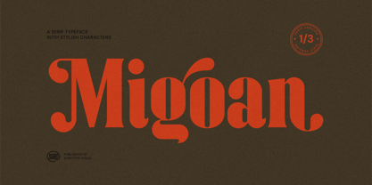 Migoan Serif is a display typeface with dynamic curve ,very suitable as to make a design choice for Headline, Movie Title, packaging, branding and more other creative project. Migoan's also has alternative characters such as Stylistic Alternates, Stylistic Set, and Swash variant. To enable the OpenType Stylistic alternates, you need a program that supports OpenType features such as Adobe Illustrator CS, Adobe Indesign & CorelDraw X6-X7. and more
 - Quarry by A New Machine,
$19.00 Quarry is a beefy slab-serif display font. It is all hand drawn and will give your designs a unique handmade feel. Two complete sets of letter glyphs give a more natural random feel. Contextual alternates will switch out letters automatically in open type-friendly programs. Also included are a number of ligatures for an even greater feel of hand made-ness. Great for use on posters and in headline copy.
 - Equalis by Eurotypo,
$44.00 From Latin aequālis (equal). The case conveying an equality with another noun. Equalis, sets its sights on applied mathematics. Equalis is a slab-serif typeface characterized by a tall x-height and very short ascenders / descenders. This OpenType font family comes in two weights and italics, with support for CE languages. Equalis can be used as display type. Suitable for body text, headlines, package & a wide range of projects.
 - Thorowgood Wide by Wooden Type Fonts,
$20.00 One of the original Clarendon types, an English design, here derived from a specimen taken from an American foundry, no identifying marks. With a tall x-height, wide version, unlike more traditional Clarendons, not a square serif but bracketed. Unique to this Clarendon are the rounded openings at the points where the horizontal and vertical stems meet in the capital B, D, P and R, not common in other Clarendons.
 - Identidad by Punchform,
$39.00 Identidad v1.02 2023, Sep 22 Identidad is a sans-serif type family designed to offer support for most Latin script languages. Identidad has nine weights, each with corresponding italics, 710 glyphs, and 17 OpenType features (aalt, calt, case, ccmp, dnom, frac, locl, numr, ordn, pnum, sinf, ss01, ss02, subs, sups, tnum, zero). Identidad supports 377 languages and covers 3 Unicode blocks (Basic Latin, Latin-1 Supplement, Latin Extended-A).
 - Darklord by Invasi Studio,
$17.00 Darkloard is inspired by the old-fashioned era. The Darkloard font is a heavy-weight semi-serif font from the vintage style. Four varieties are available: Regular, Stamp, Spurs, and Spurs Stamp. The use of this font results in carefully-crafted styles. Darkloard font is ideal for branding projects, posters, or packaging that need a vintage feel. Features: Uppercase & Lowercase Numerals & Punctuation Multilanguage Supports 60+ Latin based languages Alternates and Ligatures
 - Liferdas by Sealoung,
$20.00 Liferdas is a mix of Old Style Roman Serif styles. The glyphs are formed in extended width, smooth strokes, moderate stem contrast, and soft edges to pursuing clarity, quick recognizable text, and a warm personality. The italics style is 13 degrees low slanted with redrawn lowercase which has shown in more organic and flowy forms. This font contains 9 weights with more than 245 glyphs that support extended multilingual.
 - Camijo by Kavoon,
$15.00 Camijo is a contemporary serif typeface with characteristic and defined features. This font was inspired by the idea of mixing different types of terminals in order to give the font a singular appearance. Its design is composed of diverse styles such as Didone and contemporary faces. Camijo comes with a set of 352 characters. This font was specially designed for branding, advertising, editorial design, and use on Tv and social media.
 - Earmark NF by Nick's Fonts,
$10.00This extra stout slab serif derives its inspiration from two Vincent Pacella designs: Pacella Barrel and Pacella Colossus. Essentially it’s an all-caps font, but there are biform variants of a, e, m, n and u, so you can mix things up to create more interesting headlines. This font contains the complete Latin language character set (Unicode 1252) plus support for Central European (Unicode 1250) languages as well.