10,000 search results
(0.039 seconds)
- Bibalgo by Mchcrafter,
$18.00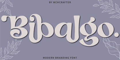 Bibalgo font is a Modern Stylistic Serif typeface A new serif that we created specially for branding needs, with extra ligatures and alternates in a unique shape just to add value to your brand. It is so nice to leverage designers or product owners who need solutions to make their designs look more stylish and modern. And specially for Bibalgo font, We prepared all the ligatures, and the alternate characters to help you create unlimited variations for your creative needs. Bibalgo font includes: - All uppercase & lowercase letters - All numbers 0-9 & Punctuation - Ligatures & Alternates - Symbols - Multiligual Letters
 - Agradable Sans by Mchcrafter,
$18.00 Agradable Sans is a Modern Stylistic Sans Serif typeface A new sans serif that we created specially for branding needs, with extra ligatures and alternates in a unique shape just to add value to your brand. It so nice to leverage designer or product owner that need solutions to make their design look more stylish and modern. And specially for agradable sans font, We prepared all the ligatures, and the alternates characters to help you create unlimited variations for your creative needs. Agradable Sans includes: All uppercase & lowercase letters All numbers 0-9 & Punctuation Ligatures & Alternates Symbols Multiligual Letters
 - Demiella by Keristyper Studio,
$14.00 Demiella is an elegant beauty sans serif. Simple letter shapes with playful swash & stylistic, keeping its legibility high. This font is good for logo design, Social media, Movie Titles, Books Titles, short text even long text letters, and good for your secondary text font with sans or serif. Featured: Standard Uppercase & Lowercase Numeral & Punctuation Multilingual : ä ö ü Ä Ö Ü ß ¿ ¡ Alternate & Ligature PUA encoded We recommend programs that support the OpenType feature and the Glyphs panel such as Adobe applications or Corel Draw. so you can use all the variations of the glyphs. Hope you enjoy our fonts!
 - Black Engine by Linecreative,
$14.00 The Black Engine condensed slab serif font is vintage-inspired with a touch of classic style but gives it a tough feel. This font is built on a solid foundation, strong visuals, vintage motion, and a modern minimalist style. Black Engine is perfect for Jersey, athletics, posters, branding projects, Logo design, Clothing Branding, product packaging, for magazine titles. for something sports themed, album title, etc What you get dear, you will get : Black Engine- A clean Slab serif font including Upper & Lowercase characters(ALL CAPS), Numbers and Punctuation Supports Multi linguage (Latin Western Europe), Numbers and Punctuation
 - Bookkeeper JNL by Jeff Levine,
$29.00 Bookkeeper JNL is based on the lighter weight version of R. Hunter Middleton's 'Karnak', produced in 1936 for Ludlow. "Karnak" itself was based on the geometric slab-serif "Memphis", designed in 1929 by Dr. Rudolf Wolf and released originally by the Stempel Type Foundry of Germany. According to Wikipedia, "Karnak" "was named after the Karnak Temple Complex in Egypt, in reference to the fact that early slab serifs were often called "Egyptians" as an exoticism by nineteenth-century type founders." Available in both regular and oblique versions, Bookkeeper JNL serves well as both a headline and text type face.
 - Holkent by Keristyper Studio,
$14.00 Proudly presenting Holkent, a unique fancy, modern, vintage & decorative font. This font is good for logo design, social media, movie titles, book titles, short text even long text. It will also look great when combined with any other sans serif, serif or handwritten typeface. Featured: Standard Uppercase & Lowercase Numeral & Punctuation Multilingual : ä ö ü Ä Ö Ü ß ¿ ¡ Alternate characters & ligatures PUA encoded We recommend using applications which support OpenType features and have a Glyphs panel like e.g. Adobe applications or Corel Draw to allow full access to all the glyph variations included in our fonts. Hope you enjoy our fonts!
 - Voger by Jafar07,
$14.00 VOGER is a work of art in the form of a modern serif font, with a design that exudes a clean, timeless elegance. With its upright and meaningful serif lines, "Voger" combines classic elements with a subtly refreshing modern aesthetic. Its enduring beauty meets a gentle touch of luxury, making "Voger" an ideal choice for various exclusive design projects. The simplicity and clarity in its design ensure that your message always appears clearly, regardless of size or medium. Moreover, "Voger" comes with a variety of unique alternate letters and ligatures, providing richness and creative flexibility in all your design creations.
 - Harmonis Style by Sensatype Studio,
$15.00 A Serif font that we created special for beauty branding needs, with extra ligatures in unique shape will be ready to add value of your brand. It so nice to leverage designer or product owner that need solutions to make their design look more beauty and modern. And specially for Harmonis font, We prepared any ligatures characters to help you create unlimited variations for your creative needs. Harmonis Serif font ready with: Any options to get creative variations (combination of Ligatures) Preview as a inspirations that you can do with Harmonis font Ready with Lowercase and Uppercase characters Wish you enjoy our font. :)
 - Dirty Steven by Flawlessandco,
$9.00 Introducing "Dirty Seven" - A Retro Serif Font. Step into the nostalgia of yesteryear with "Dirty Seven," a retro serif font that pays homage to the timeless charm of vintage typography. There's some connected letters and some alternates that suitable for any graphic designs such as branding materials, t-shirt, print, business cards, logo, poster, t-shirt, photography, quotes, etc. This font support for some multilingual. Also contains uppercase A-Z and lowercase a-z, alternate character, numbers 0-9, and some punctuation. If you need help, just write me! Thanks so much for checking out my shop!
 - Bibalgoski Pro by Mchcrafter,
$18.00 Bibalgoski Pro is a Modern Stylistic Serif typeface A new serif that we created specially for branding needs, with extra ligatures and alternates in a unique shape just to add value to your brand. It so nice to leverage designer or product owner that need solutions to make their design look more stylish and modern. And specially for Bibalgoski Pro font, We prepared all the ligatures, and the alternates characters to help you create unlimited variations for your creative needs. Bibalgoski Pro includes: All uppercase & lowercase letters All numbers 0-9 & Punctuation Ligatures & Alternates Symbols Multiligual Letters
 - Mogicka by Keristyper Studio,
$14.00 Mogicka is a classic bold serif font with a stylish shape, It has both a modern and retro look. This font is good for logo design, Social media, Movie Titles, Books Titles, short text even long text letters, and good for your secondary text font with sans or serif. Featured: Standard Uppercase & Lowercase Numeral & Punctuation Multilingual : ä ö ü Ä Ö Ü ß ¿ ¡ Alternate & Ligature PUA encoded We recommend programs that support the OpenType feature and the Glyphs panel such as Adobe applications or Corel Draw. so you can use all the variations of the glyphs. Hope you enjoy our fonts!
 - FP København Sans by Fontpartners,
$35.00 Copenhagen has been in need of a typeface that unites the city’s many visual expressions. The three designers Morten Rostgaard Olsen, Henrik Birkvig and Ole Søndergaard have designed and developed the typeface FP København. Now available from MyFonts in 44 styles: Serif & sans serif, uprights & italics, small caps, pictos-characters, stencils, sprayed style, OT-features, ligatures, contextual alternates etc. The shapes of the letters are inspired by the city’s culture and the visual environment and design in Denmark in the 20th century. It is relatively low and wide as the city itself and with rounded corners that give it a warm visual mood.
 - Monabelia by Arterfak Project,
$12.00 Greetings. Introducing our new font "Monabelia". The elegant playfully font which made with a combination of sans serif and brush script style. Almost all of the letters have sans serif taste at the top and script taste at the bottom of the shapes, also the tails/flourishing. You can feel the freestyle with combine the stylistic, contextual alternate and the ligatures but still elegant with the neat layout of the shapes. There are 100+ additional glyphs in this font that you can use it for your design, especially for your headline, display (recommended), subheadline and quotes!
 - Helvegen by Ironbird Creative,
$15.00 Helvegen is a Super Sans Serif designed with carefully crafted. Comes with 6 Styles, Regular, Inky, Rough, Rounded, Outline and Stamp. Helvegen is a simple yet refined All-Caps sans serif. Also suitable for Branding, T-shirt, Vintage Design, Logotype, and any project. This font also support multilingual, number and symbol, alternates, and already PUA Encoded. What's inculded? Helvegen Regular Helvegen Inky Helvegen Outline Helvegen Rounded Helvegen Rough Helvegen Stamp Multilingual Support support many different languages. Included AÀÁÂÃÄÅCÇDÐEÈÉÊËIÌÍÎÏNÑOØÒÓÔÕÖUÙÜÚÛWYÝiŸỲŸÆŒßÞþ We hope you enjoy the font, please feel free to comment if you have any thoughts or feedback.
 - Miegha by Dora Typefoundry,
$18.00 Miegha is a serif typeface inspired by the beauty of classic serif and calligraphy styles, Both upright and italic fonts blend with modern appeal and unique binding, high contrast and light weight font perfect for feminine logo signs, fashion heads & editorial designs, branding projects , Apparel Branding, packaging, magazine titles, advertisements, T-shirts, postcards and more. Here's what's included: · Alternates & Ligatures · Numbers & punctuation · Characters with accents · Supports Multiple Languages · PUA Encoded This type of family has become the work of true love, making it as easy and fun as possible. I really hope you enjoy it! Thank You!
 - Dauntea by IKIIKOWRK,
$17.00 Introducing Dauntea - Modern Serif Typeface, created by ikiiko. Dauntea is a bold serif typeface with a unique decorative shape. The form is inspired by the shape of leaf with the unique tail character on uppercase. Dauntea is a simple font with calm impression. This typeface is perfect for an elegant logo, branding, layout magazine, home & decor layout, beauty product, packaging product, quotes, or simply as a stylish text overlay to any background image. What's included? Uppercase & Lowercase Number & Punctuation Multilingual Support Works on PC & Mac Enjoy our font and if you have any questions, you can contact us by email : ikiikowrk@gmail.com
 - Smooth Soul by Get Studio,
$15.00 SmoothSoul is a display sans-serif font with a smooth shape and a retro style characterized by its lack of decorative lines, which gives it a clean and modern-retro appearance. The smooth curves of this font create a sense of fluidity and ease, while the lack of serifs makes it feel relaxed and informal. The retro style of this font is evocative of the 1960s and 70s, with a nod to the playful and carefree design sensibilities of that era. Overall, this font is perfect for conveying a sense of fun and approachability, while still maintaining a sense of professionalism and modernity.
 - Rhiffiral by Dora Typefoundry,
$19.00 Introducing - Modern elegant serif font branding. Rhiffiral is a modern serif font to apply to many graphic design projects or a classy editorial, a unique high contrast and light binding style for your upcoming projects. for feminine logo signs, fashion & editorial design heads, branding projects, Apparel Branding, packaging, titles magazines, advertisements, T-shirts, postcards and other special occasions. Here's what's included: · Alternates & Ligatures · Numbers & punctuation · Characters with accents · Supports Multiple Languages · PUA Encoded This type of family has become the work of true love, making it as easy and fun as possible. I really hope you enjoy it! Thank You.
 - Audela by Fontfabric,
$40.00 Surpassing traditional Antiqua, our new collaborative font family Audela emerges after overcoming time, national borders, language differences, cultural gaps, and professional challenges. Starting off as an exercise project of our very first intern Léa Bruneau in 2018, Audela slowly shaped into a full-fledged elegant serif typeface of 14 styles under the watchful eye of Plamen Motev, Fontfabric’s Type Director. Three years later, Audela is internally regarded as a breaker of limits earning its name from the French “au-delà,” meaning “beyond.” This new rising star features sharp serifs, flowing letterforms, advanced OpenType features, Extended Latin and Cyrillic support, to name a few.
 - Clephons by Zamjump,
$13.00 Introducing, Clephons is a captivating serif display font that exudes timeless elegance. Crafted as an all-capital typeface, this font is a homage to vintage letterforms, blending classic charm with a touch of modern sophistication. Perfectly tailored for branding, headlines, logos, and designs with a classic or vintage theme, Clephons effortlessly captures the essence of a bygone era. Its distinctive serifs and refined details make it a versatile choice for projects that demand a touch of retro flair. Elevate your designs with Clephons, where every character tells a story of refined aesthetics and enduring style. **Uppercase
 - Montage by House Industries,
$33.00 Montage has played a weighty role in some of the most influential and enduring typography of the past few decades, from book jackets and album covers, to posters and logos…you name it. Exhibiting an uncommon ability to wield immense power while demonstrating extraordinary finesse, Montage’s commanding profile packs a hefty punch which is softened only by its lithe yet durable serifs. Originally designed for Photo-Lettering in the mid-1960s by type legend, Ed Benguiat, the fonts were given a jump start by Jess Collins before ultimately being shaped into five compatible widths by longtime House co-conspirator, Mitja Miklavčič. Under the guidance of Ben Kiel, along with some additional chin-stroking by Ken Barber, Montage has been fully developed into a robust family ready to tackle any challenge you can throw at it. FEATURES LIGATURES: In order to ensure that Montage maintains its bold presence in tricky text settings, we’ve added a handy set of pre-drawn letter combinations. When enabled, the Ligature feature identifies problem pairs like—fl, fi, ff, ffl, and of course, fyi—and substitutes them with glyphs optimized to enhance font performance. ALTERNATES: For fickle typographers, we’ve also added a handful of alternate characters to allow Montage to suit any number of mood Like all good subversives, House Industries hides in plain sight while amplifying the look, feel and style of the world’s most interesting brands, products and people. Based in Delaware, visually influencing the world.
 - Identa by Sudtipos,
$39.00 Because we know that you will never get tired of using them and that you will always need a new tool for Identity Design, we created Identa. Conceived to translate corporate and humanist ideals in its typographic form, it seeks a dialogue between neutrality and contemporaneity. With a pragmatic attention to functionality that does not forget aesthetics. It is a Sans serif model, accessible and well-founded. All-terrain, workhorse that seeks to be reliable and durable. It solves any type of content with efficiency, intelligence and professionalism. Its clean forms and x-height make it a very competent face for both short identifiers and long text bodies, ideal for display use where legibility and personality must match new design needs within a company. It is available in eight styles, ranging from its White version to the darker Vantablack, each optimally set with its respective italic variables, and a Dingbats font designed to solve everyday cases. Each font contains 737 glyphs, macro and micro aesthetic details inspired by current visual communication systems and trends. The dingbats font includes 303 signs and is a set of icons and symbols that can be used in multiple environments, both for print and digital media. This typeface family seeks to meet the needs of brand designers looking to create an assertive appearance, whatever the case. It is a solid and self-confident typeface, without appearing overly constructed; on the contrary, its nuance makes it look fresh.
 - Crabs by Ardyanatypes,
$10.00 Crabs Slab Comes with a Slab Serif style typical of sturdy and elegant typography, which gives a modern, retro, and classic style but has a unique and elegant style that gives an extraordinary impression. Crabs Slab also comes with multiple languages enabling Crabs Slab to be used in all your projects. Crabs Slab is very suitable for use in various purposes or projects, including Sports, Posters, Products, Logos, Branding, and many more that you can apply with this Crabs Slab Typeface. Supports languages: Afrikaans, Albanian, Asu, Azerbaijani, Basque, Bemba, Bena, Bosnian, Breton, Catalan, Chiga, Colognian, Cornish, Croatian, Czech, Danish, Dutch, Embu, English, Estonian, Faroese, Filipino, Finnish, French, Friulian, Galician, Ganda, German, Gusii, Hungarian, Icelandic, Igbo, Inari Sami, Indonesian, Irish, Italian, Jola-Fonyi, Kabuverdianu, Kalaallisut, Kalenjin, Kamba, Kikuyu, Kinyarwanda, Latvian, Lithuanian, Low German, Lower Sorbian, Luo, Luxembourgish, Luyia, Machame, Makhuwa-Meetto, Makonde, Malagasy, Malay, Maltese, Manx, Meru, Metaʼ, Morisyen, North Ndebele, Northern Sami, Norwegian Bokmål, Norwegian Nynorsk, Nyankole, Oromo, Polish, Portuguese, Quechua, Romanian, Romansh, Rombo, Rundi, Rwa, Samburu, Sango, Sangu, Scottish Gaelic, Sena, Shambala, Shona, Slovak, Slovenian, Soga, Somali, Spanish, Swahili, Swedish, Swiss German, Taita, Teso, Thai, Turkish, Turkmen, Upper Sorbian, Vietnamese, Vunjo, Walser, Welsh, Western Frisian, Wolof, Yoruba, Zulu A guide to accessing all alternatives can be read at http://adobe.ly/1m1fn4Y Adobe Photoshop go to Window – glyphs Adobe Illustrator go to Type – glyphs Features: A – Z Character Set a – z Characters set Numerals & Punctuations (OpenType Standard) Multilingual Thank you and have a nice day
 - Orto by LetterPalette,
$20.00 Orto is a type family of sans serif fonts in eight weights. It's a humanist typeface with real cursive, containing both Roman and Italic styles. The letters are designed to look good on screen, they have a bit narrower proportions and simple shapes. Their structure is based on flat horizontal and vertical strokes, which are emphasized wherever possible. That’s where the name comes from: Orto is an abbreviation of the word orthogonal. Thanks to its narrow width, the typeface is less space-consuming and adapts well to the screens of smaller devices. It is legible in small sizes, thanks to the larger x-height. The characteristic details, like bent ends of diagonal strokes, stand out when used in larger sizes. Orto can be used equally good in print and its overall neutral look fits different contexts. However, its character is pretty recognizable. Orto contains Latin and Cyrillic script and covers six codepages: Latin 1, Latin 2, Cyrillic, Turkish, Windows Baltic and MacOS Roman. It has basic OpenType features like ligatures, oldstyle numerals, proportional and tabular lining figures, fractions, superiors, etc. Capital German sharp S shows up when the lowercase is typed between two uppercase letters, and the Contextual Alternates feature is turned on. The Stylistic Set 01 changes the shape of the Cyrillic b. The Stylistic Set 02 is a shortcut for using Serban Cyrillic alternatives that differ from Russian in cursive.
 - LunchBox Slab by Kimmy Design,
$25.00 LunchBox Slab is the pair of LunchBox, a uniquely hand-drawn typeface that gives numerous customizable options and a fully authentic look. The serifs in LunchBox Slab are simple blocks, with bulbous terminals on curved letters, which creates a unique effect. Identical to its pair behind the scenes, LunchBox Slab’s OpenType features allow access to over 1,500 different characters. Contextual alternatives give each letter 4 different character styles, all cycling through each other to ensure that no two letters ever show up together. There is also a custom set of small caps, each with 4 style variations as well. Stylistic alternatives give an extra hand-drawn flourish, loop and slight variation, also with 4 different styles per letter. Discretionary ligatures pertain to both regular all caps LunchBox as well as stylistic alternatives. It gives special letter combinations a unique interaction, giving your design a unique and personalized look without spending hours creating it and outlining your text. Included are also a set of swashes that also have four style variations to both the regular and stylistic alternatives, as well as lowercase letters with ascenders and descenders. All of these options are available in Light, Regular and Bold. LunchBox Slab Ornaments includes nearly 200 different graphics, flourishes, frames, catchwords, text breaks and arrows. If you do not use OpenType but are using a program that includes a full glyph panel, you will be able to manually access each of the style variations you want. Enjoy!
 - Floro by Andinistas,
$29.95 Floro is a typographic family with 3 members designed by Carlos Fabian Camargo. Its idea combines medieval ideas, grotesque, stencil and grunge for T-shirts, stickers, advertising material design. More specifically the concept of Floro join several DNAís coordinating X height, ascendant, descendant and wide, in which proportions and adaptive optics were determined to inject great visual impact when composing titles. Its forms and counter forms have imperfections controlled with vitality and consistency. Floro is useful for ranking words and phrases with corroded edges and creases between the lines of his letters. In that vein, Floro refers to improvised design, deletion and copying. For that reason, its determinants seem stencil patterns that attract the attention of the reader. Its inaccurate decisions were planned that way, in which the type of contrast seems made with a flat tip and the amount of contrast between thick and thin is medium. Its sizes, regular and italic shine by their systematic wear and terminations sometimes in pointed forms resembling medieval darkness. In short, we can say that Floro comes from the miscegenation of Gothic calligraphy texture, foundational calligraphy and some refinements of gothic writings with italic sans-serif ideas of late 19th century. Even with the blur appearance, floro has ideal proportions to pile for horizontal and vertical areas when composing titles with striking looks and robust. And finally, floro dingbats are related shields and stamps, to accompany the written resulting useful at the level of visual support and hierarchical.
 - Frescito Variable by Mans Greback,
$69.00 Frescito is a modern sans-serif typeface that embodies a fresh, cool, and street-smart aesthetic. Designed to be both balanced and versatile, its clear and legible monoline style is designed for branding and advertising in editorial and digital design. Only one font file, but the file contains multiple styles. Use the sliders in Illustrator, Photoshop or InDesign to manually set any weight and width. This gives you not only the predefined styles, but instead more than a thousand ways to customize the type to the exact look your project requires. More info about Variable Fonts: https://mansgreback.com/variable-fonts Inspired by the energetic spirit of the city and its vibration, Mans Greback set out to create a typeface that would stand out against vivid moment; a type that would work in a traditional café just as well as for contemporary merchandise. The result is a font that combines the best of both worlds: an air of freshness and modernity with an unpretentious, timeless and classy appeal. The font is built with advanced OpenType functionality and has a guaranteed top-notch quality, containing stylistic and contextual alternates, ligatures, and more features; all to give you full control and customizability. It has extensive lingual support, covering all Latin-based languages, from Northern Europe to South Africa, from America to South-East Asia. It contains all characters and symbols you'll ever need, including all punctuation and numbers.
 - Aeonis by Linotype,
$29.99 After Generis™, Aeonis™ is the second large family of typefaces by Erik Faulhaber. The basic Aeonis sans-serif form references Ancient Greek lapidary inscriptions from the 9th century BC. Between the poles of antiquity and modernity, a deliberate contradiction of round and rectangular forms gave way to a new and energised font: Aeonis. Aeonis is available in three widths and seven weights, all of which have been carefully coordinated in terms of their proportions. The clear contrast in the bold stroke intensity emphasises the organic nature of the font and creates exciting aesthetics. In light of their open forms, the letters guarantee a good level of readability, even in small point sizes. Given that the dynamic individual forms of Aeonis also fit perfectly in a functional image, this typeface is ideal both for complex, text-heavy documents as well as for logos and display text settings. Particular attention was paid to ensuring carefully coordination proportions: all styles and weights have the same cap height, as well as identical ascender heights, x-heights, and descender lengths. The widths of all figures, currency symbols, mathematical operators, and special characters have been carefully aligned for tablular settings. Aeonis is an extremely systematic design. All of its widths and weights may be combined with one another, without restrictions. For users who do not like the open A, an alternate A with a crossbar is included in each font as well.
 - Inka by CarnokyType,
$49.00 Inka is the name by which the closest-ones called my partner. Inka is also the name of a text typeface – in its form very friendly and welcoming. The same way as relationships develop through the life, text typefaces develop, too. I had started the work on this typeface about the same time as I met Inka, while reaching the final output has been a long and progressive process. Inka is a modern serif typeface with wide universality in functions (various editorial usages as books, magazines, annual reports…). The concept and the scope of the complete type family are based on the principle of optical sizes of the typeface designed for the particular use of the size of typesetting. Inka consists of several drawing variations for the typesetting of small sizes (Small), text typesetting (Text), larger typesetting sizes (Title), and headlines sizes (Display). Two constructive alternatives, differing in the height of the construction of the font signs, further extend the variability of the usage of the typeface. Inka A has classical proportions ideal for book typesetting. Inka B has lower ascenders and descenders, lower uppercase glyphs and numbers. Typeface with such construction allows us to use the typesetting efficiently while using tighter leading and still looking more contemporary. Each of the font set (Display, Title, Text, Small) consists of four weights (Regular, Medium, Bold, Black), each has wide character set and a lot of OpenType features. “Inka is dedicated to Inka.”
 - Mi Negra by Letritas,
$25.00 Mi negra is a funny and hilarious typography designed especially for children, thought and created by Isabel de Gregorio. It could be described as an original combination between a semi-handwright and semi sans-serif font. Thanks to its structure and nice endings "Mi Negra" is recommended for composing short texts (logotypes, packing, posters, etc.). It may similarly be used for illustrations and comics, as well as in printing press works for children from 6 to 13 years old for instance. Mi Negra has been conceived to be a useful support in all kinds of illustrations works (please note that Isabel, the type designer, considers herself primarily an illustrator). The font designer of Mi Negra tells that every time she needed to provide some text data (i.e. in children infographies) and needed to make them more understandable and suitable for children, she used this typography. The former idea was than to create a font who could be a second option to comic sans, but as the project started to reveal its forms, it was clear that it was revealing another connotation and its own character. In this way, Mi Negra went on modifying its forms and the more it developed, the more it was showing its new characteristics and concepts. The family is composed of three weighs: Light, regular and black. It provides also interesting functional ligatures. It also includes a dingbat with nice doggies. It has 434 characters and can work with 208 languages.
 - Planetype by CozyFonts,
$20.00 The Planetype Font Family is Modern. It has 6 Font Styles: X-Light, Light, Medium, Inline, Bold, & X-Bold. Each style has a consistent weight with a square serif of equal weight to its vertical and horizontal strokes. Planetype™ for short or Planet-Type font styles all have extremely clean edges and are sharply defined. There is a standard kerning applied, however evenly letter-spacing these family members give a distinct personality and continues to command the negative space just as in tight kerned examples. The compatible relationship of these font family members, weight to weight, and X-Light to X-Bold is seamless and the overall design coloring of words and sentences is well balanced and extremely legible. The Planetype Family fonts are matching members glyph to glyph. This family works in modern, contemporary and vintage settings. The Planetype Medium matches the outer weight of Planetype Inline. Their are several unique Glyphs that set the character of this family, such as: Caps B, M, Q, R, X and Lower Case a, e, k, r, z to begin with. The numerals and dingbats also have several unique glyphs that flow with the family Style in every matching weight. These characteristics lend well in designing logos, brands, and even monograms. Starting with Planetype X-Light the designer has a command of the clean lines yet expressing Modernism and a touch of Architectural structure. Planetype Medium & Planetype Inline are a dynamic duo giving a positive/negative readability.
 - Montez Pro by Stiggy & Sands,
$39.00 Straight from the beauty product ads of the 1960's comes Montez Pro, full of sweeping strokes which lend to a feeling of joy and elegance throughout its letterforms. It is the ideal font for display uses that require a little drama, "joie de vivre" or Joy of Life. The stylings of the standard typeset Montez Pro lend itself to holiday and celebration designs most effectively. And while it is usually a typographic no-no to set a script in all capitals, Montez Pro contains a small caps feature that has specially redesigned capitals that allow an appealing all capitals setting. Montez Pro is loaded with features to give you plenty of customisation options: - Stylistic Alternates offer variations of the L, t, and w-smallcap characters - Small Caps offer tailored back and normalized short capitals - 44 Ligatures to make typesetting more interesting - A Full set of Inferiors and Superiors for Limitless Fractions - Proportional and Oldstyle numeral sets
 - Guess by DearType,
$59.00 Guess is a versatile, connecting script, designed to convey elegance and style. It is slender, feminine and friendly, let alone sexy. Guess will work perfectly for fashion, e-commerce brands, trend blogs, or any business that wants to appear classy and chic. The font is ideal for high-end logotypes and magazine headlines, but let’s not forget greeting cards, invitations, posters, ads and the various web usages. When it comes to the glyph set, well, Guess Pro has quite a lot of that (2500+ glyphs) - think multiple languages and tons of swashes and stylistic alternates to unleash your creativity. For all pragmatists out there, there is also a basic version of the font with an extended latin glyph set (no swashes, contextual alternates or stylistic sets). Last, but not least, Guess comes with a neat geometric sans in capital letters, which makes a great addition to the script, and a set of beautiful ornaments and borders that complete the whole look with a bang.
 - Marlin Soft by FontMesa,
$25.00 Marlin Soft is a rounded corner version of our Marlin Geo font family and like its parent font also includes two sets of italics. The standard italic is set at twelve degrees and the slant version set at six degrees, the slant version is perfect for signage and headlines where you may want the look of an italic but are limited on horizontal space. Marlin Soft includes many alternates which may be accessed using opentype aware applications, with over three hundred alternates to choose from your creative possibilities are great. Whether you're looking for a round dot or a square dot Marlin Soft is one font family that delivers both set up as two separate fonts so you may change a whole page of text at one time. Your projects are sure to look nice and cozy with the warm feeling Marlin Soft will bring to your product label or page design. Three free sample basic fonts are available which are fully functional minus the alternates.
 - Sales Pitch JNL by Jeff Levine,
$29.00 Have you ever wanted to set a headline within a burst, but found the drawing of all of those angles was a bit too tedious? Sales Pitch JNL solves that problem by setting letters, numbers and punctuation inside individual sections which, when typed out, generates an extended burst pattern. For a flat sided pair of end caps, use the left or right bracket keys. For burst ends, use the left or right brace keys. A blank space is located on the equal sign keystroke, and a wider blank space is on the plus sign. Keep in mind the optical illusion in some program that shows line gaps between characters on the screen. All characters have equal sidebar settings, and are flush with each other. Sales Pitch JNL contains the basic A-Z and 0-9 characters as well as numerous punctuation. For a companion font with a more complete character set, use Prankster JNL, the same type design, but without the burst pattern.
 - Sassoon Infant Pro by Sassoon-Williams,
$66.00 An upright typeface family developed to meet the demand for letters to produce pupil material for handwriting as well as for reading. Upright letters with extended ascenders and descenders are ideal on screen. They facilitate word recognition. The exit strokes link words together visually, and in handwriting they lead to spontaneous joins along the baseline leading logically to a joined-up hand. Teachers can print desk strips, charts of letter families and alphabet friezes, as well as consistent material across the curriculum. Together these typefaces provide a valuable resource for special needs teachers. Typefaces developed to meet demand for letters that can be used to produce pupil material for reading as well as handwriting. Regular and Bold typefaces covering pan-European languages: 9 Latin, 6 Cyrillic, Greek, Turkish, 13 Baltic, 8 Rusyn, 6 Nordic, Vietnamese. How to access Stylistic Sets of alternative letters in these fonts Cyrillic Stylistic Sets examples Greek Stylistic Sets examples Vietnamese Stylistic Sets examples
 - Publica Play by FaceType,
$- Publica Play is Publica Sans’ and Publica Slab’s playful sister. It comes with loads of subtle open type features, tabular options, rare currencies signs and symbols and arrows – ‘Publica Play’ has everything you need for playful design tasks. Take a close look at our gallery (especially ‘OpenType Features 1–7’) to discover the versatility of Publica Play. Alternates and Stylistic Sets Give your typography a certain spin with the variety of alternate letters provided. Explore the Stylistic Sets provided. Currency You need to set prices in exotic countries? No problem: Publica Play gives you loads of rare currency symbols. Case Sensitive Forms Sometimes you write in all caps and there are some symbols (e.g. brackets) that need some extra treatment to make it look perfect – that’s what case sensitive forms are for. Figures Publica Play provides 6 sets of figures, like lining, tabular, oldstyle, numerators ... Discretionary Ligatures Ligatures can make your logo or headline look spicy. So there are plenty of them.
 - Lafemme Vibe by Jolicia Type,
$27.00 LaFemme Vibe is a conceptual serif font that exudes a modern and elegant aesthetic, tailored specifically for women. Featuring uppercase characters with distinctive curly signatures, LaFemme Vibe combines the following elements to create a unique visual experience: Classy Serifs: LaFemme Vibe boasts serif characters with soft, graceful serifs that add an element of sophistication to each letterform. Asymmetrical Charm: This font is intentionally imperfect in its symmetry, as if crafted by a gentle, artistic hand. It radiates an inviting and charming quality. Curly Signature Flourish: The curly, signature-like embellishments that adorn the letterforms in LaFemme Vibe infuse a personal and artistic touch. This imparts the sense that each word written with this font is a unique work of art. Modern Harmony: Despite its classical elements, LaFemme Vibe maintains a modern sense of harmony. The letters appear assertive yet gentle, making it perfectly suited for contemporary women seeking timeless elegance. Elegance and Chic: LaFemme Vibe embraces an elegant and chic aesthetic that is particularly fitting for products or designs targeted towards women who aspire to exude luxury and style. LaFemme Vibe is a typographic masterpiece created to bring a modern and elegant sensibility to women who appreciate beauty in every detail. It’s a font that effortlessly blends classic charm with contemporary allure, making it an ideal choice for a wide range of design projects aimed at celebrating the essence of femininity.
 - Kangoro by Shakira Studio,
$15.00 Say hello to new Modern Luxury Serif Font, Kangoro! Introducing Kangoro, an exquisite modern luxury serif font that embodies timeless elegance and aesthetic appeal. This typeface is designed to elevate your designs with a touch of sophistication, making it the perfect choice for projects that require a blend of contemporary luxury and classic charm. Kangoro features gracefully crafted letterforms with clean lines and delicate serifs, exuding a sense of refinement and opulence. Its sleek design captures the essence of modern luxury, while the carefully designed serifs add a touch of traditional beauty, creating a harmonious and captivating visual experience. Versatility is another hallmark of Kangoro, as it complements a wide range of design applications. Whether you're working on high-end branding, editorial layouts, invitations, or any project that requires an aura of luxury, Kangoro will deliver unparalleled elegance. Here's what you get: Kangoro Regular Kangoro Italic All Multilingual symbol Opentype features ( ligature, alternate ) Accessible in the Adobe Illustrator, Adobe Photoshop, Adobe InDesign, even work on Microsoft Word. PUA Encoded Characters - Fully accessible without additional design software. Multilingual character supports : (Afrikaans, Albanian, Catalan, Croatian, Czech, Danish, Dutch, English, Estonian, Finnish, French, German, Hungarian, Icelandic, Italian, Lithuanian, Maltese, Norwegian, Polish, Portuguese, Slovenian, Spanish, Swedish, Turkish, Zulu) Follow my shop for upcoming updates, and for more of my work, Thank you!
 - Tandelle by Typodermic,
$11.95 Welcome to the world of Tandelle—a sans-serif typeface with a unique flavor that will make your designs stand out. Tandelle was designed with a specific purpose in mind: to operate efficiently when there is a limited amount of horizontal space available. Its narrow letterforms are perfect for headlines, captions, and other types of text where space is at a premium. What sets Tandelle apart from other sans-serif typefaces is its flat points on verticals such as “A” and sharp points on horizontals such as “Z”. These distinctive features add a touch of sophistication and elegance to your designs, making them visually appealing and easy to read. Tandelle’s spacious shapes and minimal detail make it simple to read despite its narrowness. The typeface’s clean lines and modern design lend themselves to a wide range of applications, from branding and advertising to packaging and web design. Tandelle comes in four styles: Regular, Italic, Bold, and Bold-Italic. Whether you’re looking for a subtle accent or a bold statement, Tandelle has you covered. With its narrow letterforms and unique flavor, Tandelle is the perfect choice for any project that requires a touch of sophistication and style. So why settle for ordinary when you can have extraordinary? Try Tandelle today and see the difference for yourself. Most Latin-based European writing systems are supported, including the following languages. Afaan Oromo, Afar, Afrikaans, Albanian, Alsatian, Aromanian, Aymara, Bashkir (Latin), Basque, Belarusian (Latin), Bemba, Bikol, Bosnian, Breton, Cape Verdean, Creole, Catalan, Cebuano, Chamorro, Chavacano, Chichewa, Crimean Tatar (Latin), Croatian, Czech, Danish, Dawan, Dholuo, Dutch, English, Estonian, Faroese, Fijian, Filipino, Finnish, French, Frisian, Friulian, Gagauz (Latin), Galician, Ganda, Genoese, German, Greenlandic, Guadeloupean Creole, Haitian Creole, Hawaiian, Hiligaynon, Hungarian, Icelandic, Ilocano, Indonesian, Irish, Italian, Jamaican, Kaqchikel, Karakalpak (Latin), Kashubian, Kikongo, Kinyarwanda, Kirundi, Kurdish (Latin), Latvian, Lithuanian, Lombard, Low Saxon, Luxembourgish, Maasai, Makhuwa, Malay, Maltese, Māori, Moldovan, Montenegrin, Ndebele, Neapolitan, Norwegian, Novial, Occitan, Ossetian (Latin), Papiamento, Piedmontese, Polish, Portuguese, Quechua, Rarotongan, Romanian, Romansh, Sami, Sango, Saramaccan, Sardinian, Scottish Gaelic, Serbian (Latin), Shona, Sicilian, Silesian, Slovak, Slovenian, Somali, Sorbian, Sotho, Spanish, Swahili, Swazi, Swedish, Tagalog, Tahitian, Tetum, Tongan, Tshiluba, Tsonga, Tswana, Tumbuka, Turkish, Turkmen (Latin), Tuvaluan, Uzbek (Latin), Venetian, Vepsian, Võro, Walloon, Waray-Waray, Wayuu, Welsh, Wolof, Xhosa, Yapese, Zapotec Zulu and Zuni.