10,000 search results
(0.075 seconds)
- Posterizer KG Inline by Posterizer KG,
$40.00 Posterizer Kg Inline, is basically the Inline version of Egyptian Slab Serif font Posterizer KG. Posterizer KG Inline is useful for diplomas, magazines, headlines and many other things.
 - Amati Pro by RMU,
$40.00 A revived and updated version of Georg Trump's Amati which was first released by C. Weber Foundry, Stuttgart, in 1951. A compressed multilingual serif font for many purposes.
 - Cattleprod PB by Pink Broccoli,
$14.00 Cattleprod is an offbeat slab serif font full of swagger. It was created without any reference, but just the idea of a playful somewhat stumbling stance in mind.
 - Bagife by Letterena Studios,
$17.00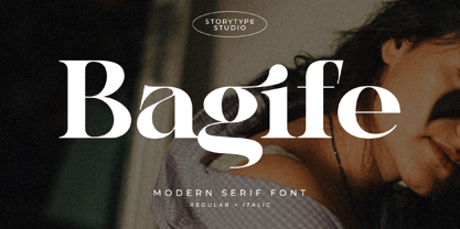 Bagife is a sophisticated, charming serif font with a fashionable touch. Specially designed for luxury, elegant, feminine projects, this font is perfectly suitable for creating modern, chic designs.
 - Kaila by ArimaType,
$18.00 Kaila is a bold but elegant serif font. Its elegance and simplicity make this font look absolutely stunning on a variety of design ideas, both formal and informal.
 - Classy by Typefactory,
$14.00 Classy is a modern serif font, that features a simple and minimalist feel. This font will brighten up each of your designs. The only limit is your imagination!
 - Equilla by Heyfonts,
$15.00 Equilla is a versatile, bold and unique serif font. Combination between high contrast and Brutalism style, Equilla has a unique style with stylistic, alternates, and supports multilingual languages
 - Device by Hanken Design Co.,
$45.00 Device™ display typeface is inspired by industrial type used for decals and signage. This typeface pairs nicely with geometric sans serifs like Cerebri Sans and HK Grotesk.
 - Rotunde by Gerald Gallo,
$20.00 Rotunde is a very bold contemporary sans serif font. It is ideal for headlines, titles, branding, small blocks of text or wherever a fresh new look is desired.
 - Robuck by Martype co,
$15.00 ROBUCK is a family Sans Serif font designed with carefully handcrafted. Also suitable for branding, T-shirt, Wedding Invitation, Classic Design, Logotype, and any project. All caps fonnts.
 - BD Westwork by Typedifferent,
$15.00 BD Westwork is a very condensed, bold and distinctive display typeface – great in combination and in contrast with delicate illustrations, photos and body text with and without serifes.
 - Argaka Fashion by Nirmana Visual,
$24.00 Argaka Fashion, contemporary of Serif Display font, Argaka Fashion offers beautiful typographic harmony for a diversity of design projects, including logos & branding, social media posts, advertisements & product designs.
 - Nostrand JNL by Jeff Levine,
$29.00Based on vintage wood type, Nostrand JNL is a tall, condensed serif face - named for an avenue in font designer Jeff Levine's home town of Brooklyn, New York. - Mansard by Wooden Type Fonts,
$15.00 A revival of one of the popular wooden type fonts of the 19th century, suitable for display. It has curved sides, very short descenders, and curved, blocky serifs.
 - Holly Groove by Beary,
$15.00 Holly Groove is a sans serif font with beautifull swashes, masterfully designed to become a true favorite. It maintains its classy calligraphic influences while feeling modern and fresh.
 - Tooned Out JNL by Jeff Levine,
$29.00Tooned Out JNL gives a serif treatment to the cartoon-inspired lettering of Toon-In JNL. Both fonts are great for any casual or fun messages or themes. - TC Jasper by Monotype,
$40.99TC Jasper is a headline face with oblongated characters, suitable for letterheads and packaging. The serifs have an engraver's influence, making the TC Jasper font crisp in appearance. - Rounded Block Display by NDS Fonts,
$15.00 Rounded Block Display is a blocky san serif font perfect for headlines. Its clean facade and easy readability make this a great font to get your message across.
 - Antman by Lebbad Design,
$24.95 Antman is a bold serif font consisting of caps and smallcaps. Wide letterforms taper toward the bottom of each character to give this font a retro vintage feel.
 - La Barokah by Nirmana Visual,
$19.00 La Barokah , Contemporary of Bold Serif Typeface, La Barokah offers beautiful typographic harmony for a diversity of design projects, including logos & branding, social media posts, advertisements & product designs.
 - Zeppelin by Monotype,
$29.99Rudolph Koch designed Zeppelin between 1927 and 1929. This geometric sans serif headline face jumps off the page. Use the Zeppelin font for impact in packaging and posters. - Formal Invite JNL by Jeff Levine,
$29.00 The thin, condensed serif lettering found in a 1937 magazine ad for Chris Craft boats inspired Formal Invite JNL, which is available in both regular and oblique versions.
 - Dillario by Arunatype,
$18.00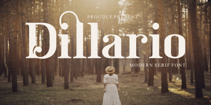 Dillario is a sophisticated, charming serif font with a fashionable touch. Specially designed for luxury, elegant, feminine projects, this font is perfectly suitable for creating modern, chic designs.
 - EgyptianTwo by Wooden Type Fonts,
$15.00 A revival of one of the popular wooden type fonts of the 19th century, with classic flat slab serifs, unbracketed, short descenders. Very popular in the 19th century.
 - Soul Lotion by TypoGraphicDesign,
$19.00 CONCEPT/CHARACTERISTICS The typeface “Soul Lotion” is a sans serif font for display sizes. Constructed, clear and simply with monoline character. The round and unadorned look is modern & simple. APPLICATION AREA The modern, clear and simply sans serif font “Soul lotion” would be happy as a display typeface in headline size on the following areas and there simply feel good: Logos/Wordmarks, party flyer, album covers, CD covers, Poster design, video game design, and much more as display typeface for print and digital magazines, books and websites. TECHNICAL SPECIFICATIONS Headline Font | Display Font | Sans Serif Font “Soul Lotion” OpenType Font (Mac + Win) with 6 styles (regular, bold, light + 3x italic) & 354 glyphs. Incl. accents, alternative letters, ligatures & €. Desktop Font (.otf) + Web Font (.svg, .eot, .woff) KONZEPT/BESONDERHEITEN Die Schrift »Soul Lotion« ist ein serifenloser Font für Headlinegrößen. Konstruiert, klar und einfach mit gleichbleibender Strichstärke. Die runden und schnörkellosen Formen wirken modern & schlicht. EINSATZGEBIETE Die moderne, klare und einfache Sans Serif Schrift »Soul Lotion«, würde sich als Auszeichnungsschrift in Headlinegröße über folgende Einsatzgebiete sehr freuen und sich dort schlicht wohlfühlen: Logos/Wortmarken, Flyer für fast jede Party, PlattenCover, CD-Cover, PlakatDesign, Videospiel Design, als Headlineschrift für print und digitale Magazine, Bücher und Webseiten u.v.m. TECHNISCHE INFORMATIONEN Headline Font | Display Font | Sans Serif Font »Soul Lotion« OpenType Font (Mac + Win) mit 6 Schriftschnitten (regular, bold, light + 3x italic) & 354 Glyphen. Inkl. diakritisches Zeichen, alternative Buchstaben, Ligaturen & €. Desktop Font (.otf) + Web Font (.svg, .eot, .woff)
 - Boardwalk Avenue by Fenotype,
$30.00 Boardwalk Avenue is an elegant type collection of three styles and two weights of each. It’s divided into Boardwalk Pen, Boardwalk Antiqua and Boardwalk Serif. Boardwalk Avenue’s core is a connected mono linear script that works fantastic when paired with either of the impressive serif styles. All the fonts work great on their own but try putting them all together for a complete display font setup for a project. Here’s a short introduction on what’s included: Boardwalk Avenue Pen is a connected Script. It’s great for headlines, quotes or in packaging. It has a casual hand drawn vibe to it but it’s clean and legible. It’s equipped with automatic Contextual Alternates that keep the connections smooth and versatile. For instance when you type double letter another of them will automatically change to add variation. Or if you type “i” for example, as a first letter after space or after capital letter the code will add starting point to the letter to keep the letterforms more balanced. If you need more ambitious letterforms you can try Swash or Titling Alternates -there’s alternates for every standard letter and seek for even more alternates from the glyph palette. Boardwalk Avenue Antiqua is a high contrast serif with strong character. It’s great for glamorous headlines or as a logotype. Boardwalk Avenue Serif is a low contrast serif with bulky character. It’s great for strong and sturdy headlines or as a logotype.
 - Adelle Sans by TypeTogether,
$45.00 The Adelle Sans font family by José Scaglione and Veronika Burian provides a more clean and spirited take on the traditional grotesque sans. As is typical with TypeTogether typefaces, the most demanding editorial design problems were taken into consideration during its creation. The combination of lively character and unobtrusive appearance inherent to grotesque sans serifs make it an utterly versatile tool for every imaginable situation. Whether for global branding, screens, signage and advertising, or UI, the keyword behind Adelle Sans’s use is flexibility. To save space and keep legibility high, Adelle Sans is available in eight weights with matching italics and includes a condensed width of seven weights with their matching italics. Each of these 30 styles hits the perfect tone as a headline punch or subdued background hum, and the condensed widths are adept at setting short texts while retaining the expected personality. Rooted in the belief that broad language support is crucial to modern global type design, the Latin-matching variants are yet another push in TypeTogether’s ongoing multilingual efforts. The Latin script may have been first, but Adelle Sans has thus far been expanded into an exhaustive nine script family with extensive language support. Careful research and close collaboration with type experts yielded typographic consistency, legibility, and cultural awareness among all scripts, as well as filling the need for quality editorial typefaces in Arabic, Armenian, Chinese, Cyrillic, Devanagari, Latin Extended, Greek, and Thai, with more planned for the future. In addition to the 30 Latin styles, all other scripts have between seven and fourteen styles, each of which has been engineered to optically match the proportions of its counterparts. And each script comes bundled with the Latin script to ensure an harmonious fit amongst any two or more Adelle Sans families in the same block of text. The full Adelle Sans family delivers consistent, flexible, and personable results in multilingual documents, in apps, and multicultural branding worldwide. Its wide character set includes typographic niceties, small caps, several sets of figures, icons, and support for over 245 Latin-based languages. Be sure to check out the companions for Adelle Sans: Adelle, for a versatile and authoritative slab serif with no shortage of personality; and Adelle Mono, a two-width family flexible enough for developers and graphic designers alike.
 - Roundabout by URW Type Foundry,
$35.99 Roundabout is a typeface that is extracted from an ellipse shape. Each and every character started at the same geometrical figure. By cutting it up in sections, twist and rotate the separate characters could be build. The ellipse provides this typeface with evident and smooth looking features. The name Roundabout is misleading, an ellipse is not round. But the word Roundabout has a nice ring to it and it seems to fit this typeface perfectly. The Roundabout as we know it is a place where the traffic circles. Sometimes in the greater metropoles it jams like clotting veins. Various exits are presented for those who know which way to go, for those who don’t it seems an eternal treadmill. Unlike my typeface, that seems rather careless, light weighted and knows her way around. A roundabout in a child’s mind is a playful carrousel or a merry go round. Merry go round has the sweetest sound and a match is found. My Roundabout is a joyful, optimistic and open typeface, which can be used over and over and over again for many or any purposes. ----- Roundabout ist eine Schrift die aus der Form einer Ellipse entstand. So teilen alle einzelnen Zeichen denselben geometrischen Ursprung. Durch das zerteilen, verdrehen und verflechten der elliptischen Grundform konnten die separaten Zeichen so geformt werden, dass sie einen klaren und weichen Charakter erhielten. Der Name Roundabout scheint auf den ersten Blick etwas irreleitend - ist eine Ellipse ja nicht wirklich rund. Er hat aber einen schönen Klang und doch eine tiefe Verbindung zu dieser Schrift. In unseren Gedanken ist Roundabout ein Kreisverkehr: Manchmal, in großen Städten, kann er blockieren, so wie eine verstopfte Ader. Verschiedenste Auswege zeigen sich denen, die ihr Ziel kennen; für alle anderen erscheint dieser Ort wie eine endlose Schlaufe. Dieses Bild widerspricht dem Auftreten meiner Schrift, welche eher sorglos und leichtfüßig ist; sie kennt ihren Weg. In dem Kopf eines Kindes jedoch ist ein Roundabout ein verspieltes Karussell, ein „merry go round“. ,,Merry go round“ klingt bezaubernd und so fiel die Entscheidung. Meine Roundabout ist eine fröhliche, optimistische und offene Schrift, die immer und immer wieder genutzt werden kann, zu jedem erdenklichen Zweck.
 - Garcon Grotesque by Thomas Jockin,
$50.00 From pastiche to sophistication, Garçon Grotesque improves on a classic for today's designer. Designed in a multitude of weights, extended latin character set, small capitals and a working lowercase, Garçon is built for any situation that calls for sophistication, elegance and culture. Built in five weights, Garçon Grotesque allows for great flexibility. Use the Bold weight for beefy headlines. Use the the medium and regular weights for subheads and decks. Use the Light and Thin weights for a softer, more delicate tone. All weights have the same size spurs, so you can mix and match! Right out of the box, Garçon Grotesque offers full language support to most eastern european speaking territories. Most foundries release these accent characters as a "pro" release at an additional fee. Just because you speak Turkish or Croatian, shouldn't mean you have to pay more than a designer who speaks English. Please see the Specimen PDF for more information about languages supported. Accessible as an OpenType Feature, Garçon Grotesque offers alternate forms of the uppercase "J", and the lowercase "a" and "g". Use Stylistic Set 01 for the alternate form capital J. Use Stylistic Set 02 for the alternate form of the lowercase a. Use Stylistic Set 03 for the alternate form of the lowercase g. Also accessible as an OpenType Feature, Garçon Grotesque offers tabular figures in all five weights. Perfect for menus, tabular figures allow for number listings to align easily and without shifting if a different font weight is selected for emphasis.
 - Bex Script by The Ampersand Forest,
$35.00 Bex Script is a riff on traditional French script forms: the Bâtarde, the Ronde, and the Coulée. It has two versions: First, there’s La Belle, a straightforward, lovely interpretation of the script form, suitable for things like invitations, poetry and branding. La Belle’s evil twin is La Bête, a more whimsical (and considerably more hairy) version, great for anything that requires an elegant-but-beastly feel. Bex is surprisingly versatile! With three optional capital forms (Swash, Caps, and Small Caps) all taller than the x-height, Bex has a variety of voices. A full small cap set and a full set of Swash Caps, plus a large complement of alternates, initial forms, terminal forms, and ligatures makes it customizable and… well, FANCY! Additionally, both versions of Bex Script have a set of ten ornament glyphs. La Belle has a combination of fleurons on a culinary theme and symbols of France. La Bête has ten pseudoheraldic beasts that would feel at home at the top center of any whimsical letterhead. NOTE: A few years ago in Paris, I was lucky enough to stop at the Librairie Paul Jammes in St Germain-des-Prés, where I bought a turn-of-the-19th-century signature from a Type Specimen of the printer Joseph Gaspard Gillé. The irregularity of his script types — particularly the ones at smaller sizes, like the Cicéro — was very intriguing. They seemed to blend the Ronde with some elements of the Bâtarde and Coulée. And they, along with the work of French master penman Louis Rossignol, gave Bex Script its initial form.
 - Soho Gothic by Monotype,
$29.99 “There is just something magical about type design,” says Sebastian Lester. “If you draw a successful typeface it can travel the world, taking a part of you with it.” If this is true, his Soho® Gothic family has taken him far and wide. Understated, modern and exceptionally versatile, the family has been put to good use in just about every application imaginable. A good choice for virtually any type of project, The Soho Gothic family performs equally well as the backbone of a global brand as it would in an edgy fashion magazine. Versatile, extensive, customizable, and multilingual – the Soho Gothic typeface family has it all.With the same proportions as Soho, its slab serif cousin, Soho Gothic ranges across seven weights, from a willowy hairline to a brawny ultra – each with a complementary italic.Lester took care to ensure that the Soho and Soho Gothic designs work in perfect harmony. According to him, “The typefaces were developed alongside each other so that I could consider every aspect of each design and be certain that they would be absolutely compatible.”Soho Gothic is a more understated and more subtle design than Soho. Features that give the design its distinctive tone are the flat, crisp apexes of the diagonal characters like the A and V, and the marked horizontal stress in the a, g and s. “I wanted the family as a whole to radiate effortless modernity,” recalls Lester, “to be a master communicator that works in all conditions and at all sizes.” A collection of alternate and “semi-slab” characters were also part of Lester’s plan. “I like to develop alternate characters for all my type designs,” he says. “I believe they give graphic designers greater flexibility and make a typeface more valuable.” Soho Gothic is available as OpenType® Pro fonts that have an extended character set which supports most Central European and many Eastern European languages. If you’re looking to complete your designs, consider pairing it with Bembo® Book,Joanna® Nova,Neue Frutiger®,PMN Caecilia®,or ITC Stone® Serif.
 - Dupla by Tipo Pèpel,
$22.00 When Dupla was designed, its DNA shown the best of the typographic heritage from the XIX century types, the oldest san serif known, also named as “Grotesk”, a soft synonym for bizarre, unnatural weird. XIX century Germans' eyes were surprised, astonished by the formal strangeness that provoked the mutilation of the well known serifed types. But the skeleton and DNA are barely perceptible, an invisible part of the nature of objects. We are interested in the epidermis, the outer, the visible, which directly speak to the eyes, and Dupla tells us with overwhelming presence, that is a formal, traditional type, covered with a childlike sweetness, with slight curves, epidermic, sweetening even ink’s traps up. Frutiger said that Latin alphabet letter’s minimum skeleton is like a lock where you should fit all the letters you see, but that skeleton allows many skins. We use a different skin for every specific use. And Dupla’s skin points to how generous, how friendly it is; the sweetness of the big and good-natured. They do not feel very comfortable in low-cost airplanes company’s seats, but in the proper location with enough room, they'll fill the atmosphere with kindness. Do not ask for narrow columns, or terse captions in squalid sizes; do not ask for ridiculous “small print” in dark contracts where «The party of the first part shall be known in this contract as the party of the first part …» That’s not for Dupla. Large headlines, generous width columns to cover, rude pullquotes half-breaking columns, loud exclamations, great sizes, with black weights. It’s in the insultingly generous, almost obscene use where Dupla is felt. And if you consider this a obscene, gargantuan, typographical feast, Dupla brings you everything to demonstrate that quantity does not mean less quality. Multi-language support, Latin plus full coverage, complete sets of small caps, fractions, old numerals, modern, tabular, bonds and all the “gourmet” paraphernalia that Patau has accustomed us, after many years of work. If you want to be obscene and pass the censorship, use Dupla. Hedonism is just a venial sin.
 - PiS VinoZupa by PiS,
$28.00 PiS VinoZupa is based on a logo found on an old Serbian bottle of brandy. The vintage 1971 plum fuel burns down your throat and blinds your eyes, the serifs you draw grow bigger and bigger with every sip you take. A Western-style slab serif font, coming from the finest distilleries in an Eastern European village. Features heavy caps with a few alternating glyphs in the lowercase letters and all the nice diacritics you need for super-drunk Serbian babble.
 - Ace Sans by Factory738,
$15.00 Ace Sans is a modern and minimalist sans serif font family. The combination of minimal and geometric elements renders a modern design. Ace Sans family includes 8 fonts, clean and modern caps, thereby creating more variability. This is irreproachable sans serif to diversify your headlines, branding visual identity, poster, logo, magazines and etc. 8 Weights (Thin, Extralight, Light, Regular, Medium, Bold, Extrabold, Black) Oblique font is available Numbers & Punctuation Extensive Language Support Thanks for looking, and I hope you enjoy it.
 - MC Rocket Stars by Maulana Creative,
$12.00 Rocket Stars is a classic display serif font. With medium low contrast stroke, fun character with a bit of ligatures and alternates. To give you an extra creative work. Rocket Stars font support multilingual more than 100+ language. This font is good for logo design, Social media, Movie Titles, Books Titles, a short text even a long text letter and good for your secondary text font with script or serif. Make a stunning work with Rocket Stars font. Cheers, Maulana Creative
 - Novus by Sixty8seventy,
$25.00 Novus, meaning new, is a contemporary slab serif that introduces soft curves throughout, creating a typeface that conveys a softer tone while retaining the robust feel of a great slab serif. Novus is an ideal choice for headlines, branding, advertising, websites, social media and packaging. It also works well for short and medium-length text. Novus supports Central, Eastern as well as Western European languages and comes in seven weights. Opentype features include; ligatures, subscript, superscript, numerators, denominators and fractions.
 - Avram Sans by Tour De Force,
$25.00 Avram Sans is modern, legible and universal sans serif family designed to accomplish best performances in very wide range of situations. By it's design, it flirts with traditional Geometrical and Humanist typefaces, but also contain contemporary characteristics that joined together results simple, elegant, unique sans serif family in 5 weights. Avram Sans performs well in very small sizes. Beside Tabular Lining Numerals, contains SmallCap letters for basic Latin characters. All together, Avram Sans comes with 425 glyphs, fully covering Latin written languages.
 - Waika by Hazztype,
$16.00 Waika is a modern sans serif font that seamlessly blends a rounded aesthetic with condensed proportions, resulting in a contemporary and versatile typeface. Its smooth curves and absence of serifs contribute to a clean and friendly appearance, making it suitable for a wide range of applications. The deep inktrap adds a touch of sophistication and uniqueness to each character, ensuring legibility and visual appeal in various design contexts. Waika is a dynamic choice for projects seeking a balance between modernity and approachability.
 - Summer Surfing by Edignwn Type,
$16.00 Introducing "Summer Surfing", a font duo - serif and sans serif designed to bring the energy of the waves to your designs! With three styles - regular, rough, and texture - you can create a range of effects, from clean and modern to weathered and rustic. Each style of the font features bold, rounded letters that evoke the movement and curves of the ocean. But that's not all! Summer Surfing also includes 13 beach-themed illustrations as dingbats, including surfboards, waves, and palm trees.
 - Half Blvd by Maulana Creative,
$15.00 Half Blvd is an industrial genre display sans serif font. With bold soft round edge stroke, fun character with a bit of ligatures. To give you an extra creative work. Half Blvd font support multilingual more than 100+ language. This font is good for logo design, Social media, Movie Titles, Books Titles, a short text even a long text letter and good for your secondary text font with sans or serif. Make a stunning work with Half Blvd font. Cheers, Maulana Creative