10,000 search results
(0.058 seconds)
- Cowhand by Monotype,
$9.99 Cowhand is a display typeface designed by Toshi Omagari to keep words at one specific width. Words of one letter will have one very wide character, words of two letters will have characters of half that width and so forth. At the maximum of 20-letter words, characters become very tightly compressed. The design of the Cowhand typeface is inspired by western style block printing with reverse stress that is characterised by chunky slab serifs. This Lite version of the typeface was designed as part of a font marathon over the course of 3.5 days in Monotype’s NY office. Please Note: these "Lite" fonts are offered with a limited character set. Monotype is proud to support Room to Read’s work in literacy and girls’ education through our font marathon initiative.
 - Miguity by Nathatype,
$29.00 Miguity is a display serif font in thick volumes designed to leave professional, formal, lovely impressions. This font’s character is the hook on the final corners of each letter. Plus, some of the letters show swinging wipes on their edges. It surely eases the eyes to explore the text to add its readability. Features: Ligatures Stylistic Sets Multilingual Supports PUA Encoded Numerals and Punctuations You can use Miguity on various designs, for example the posters, banners, logos, magazine covers, quotes, name cards, headings, printed products, merchandises: social media, and so on. Find out how to use this font by watching the font preview. Hopefully you have great experience using this font. Feel free to contact us if you require more information when you are experiencing a problem. Thank you. Happy designing.
 - Balboa Plus by Parkinson,
$20.00 Balboa Plus is a condensed sans serif display family. It was originally conceived as a simple black and white typeface. But it seemed unfinished, begging for something more. I decided to try adding a couple layers of fill and detail to try and make it interesting. The result is this four-layer chromatic font family. The Primary Font is the Main Font. The other fonts ( Fill, Inline, and Gradient) only exist to support the Primary Font. The Fill font should sit behind the Primary font (there is a little color trapping going on). The rest is even easier. There is a free downloadable PDF Balboa User Manual in the Gallery section for this family. It has samples and some backstory. Balboa™ is a trademark of Parkinson Type Design.
 - Celion by Dora Typefoundry,
$19.00 Celion is a serif display type with a nonsensical feel. modern high contrast with a bright positive character. The clean shapes and slightly conical edges of the letters create a welcoming atmosphere in any design. Including ligatures and custom alternative glyphs, the Celion font is perfect for headlines, magazines, logotypes, food packages, advertisements, and many others. Features: All Caps Font with different uppercase and lowercase Number & Symbol Supported Languages Alternates and Ligatures PUA Encoded We highly recommend using a program that supports OpenType features and Glyphs panels like Adobe apps and Corel Draw, so you can see and access all Glyph variations. This type of family has become the work of true love, making it as easy and fun as possible.I really hope you enjoy it! Thank you Enjoy the font and go get creative :)
 - Araside by Arendxstudio,
$15.00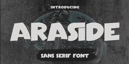 Araside - Sans Serif Font is a font with distinctive handwritten characters perfect for branding projects, logos, wedding designs, media posts, advertisements, product packaging, product designs, labels, photography, watermarks, invitations, stationery, and any project who need handwritten dishes. Features : • Character Set A-Z • Numerals & Punctuations (OpenType Standard) • Accents (Multilingual characters) • Ligature Multilingual Support : Afrikaans, Albanian, Asu, Basque, Bemba, Bena, Catalan, Chiga, Cornish, Danish, English, Estonian, Faroese, Filipino, Finnish, French, Friulian, Galician, German, Gusii, Icelandic, Indonesian, Irish, Italian, Kabuverdianu, Kalenjin, Kinyarwanda, Low German, Luo, Luxembourgish, Luyia, Machame, Makhuwa-Meetto, Makonde, Malagasy, Malay, Manx, Morisyen, North Ndebele, Norwegian Bokmål, Norwegian Nynorsk, Nyankole, Oromo, Portuguese, Romansh, Rombo, Rundi, Rwa, Samburu, Sango, Sangu, Scottish Gaelic, Sena, Shambala, Shona, Soga, Somali, Spanish, Swahili, Swedish, Swiss German, Taita, Teso, Vunjo, Zulu There it is! I really hope you enjoy it
 - Branding by Latinotype,
$39.00 Branding, a modern typeface for modern needs! Branding, especially designed for meeting contemporary aesthetic and functional needs, is the interpretation of a modern typeface from the designer’s own perspective. This typeface encapsulates a wide range of nuances and combines, seemingly, opposite elements such as technology and friendly rounded shapes. In addition, alternative characters make Branding an ideal tool for both graphics designers and art directors. Branding is a sans-serif spurless typeface with a medium-large x-height, slightly wider horizontal proportions, straight curves and convex terminals. This font is well-suited for logotypes, isotypes, short text, etc. Branding comes in 7 weights—ranging from Thin to Black—with matching italics and includes a set of 544 characters that supports 128 different languages. European accents, old style numbers and multiple alternates are also included.
 - Marlino by Nathatype,
$25.00 Do you want to achieve more? Marlino makes your work got even easier. Marlino is a sans serif font family. It's simple, modern yet purposely function and definitely helps you achieve favorable design results. There are 8 different styles in this family. This variety in styles and character availability gives you some flexibility in terms of where and when you decide to use it. Features: Multilingual Supports Numerals and Punctuations PUA Encoded It can be used for many design projects, such as poster, logo, book cover, branding, heading, printed product, merchandise, quotes, social media campaign, etc. Learn more about how to use it by seeing the font preview. Thank you for purchasing our fonts. Please don’t hesitate to contact us, if you have any further question or issues. We’re happy to help. Happy Designing.
 - Bandshell JNL by Jeff Levine,
$29.00 Anyone old enough to remember either the radio or television version of “The Adventures of Ozzie and Harriet” pictures Ozzie Nelson as the easygoing father figure who never seemed to have a real job – he was always hanging around the house. In truth, the handsome young Ozzie was a bandleader in the 1930s and 1940s and ended up marrying his ‘girl singer’, Harriet Hilliard. A piece of sheet music from 1933 for “You Have Taken My Heart” was one of the songs Nelson featured with his Columbia Broadcasting System Orchestra. The title was hand lettered in what can only be described as a slightly eccentric Art Deco Sans serif. Redrawn and cleaned up to reflect more uniform stroke weights, Bandshell JNL is now available in both regular and oblique versions.
 - Bommer Sans by dooType,
$30.00Bommer Sans is a warm and friendly type with a distinguishable look. It has been designed to add our twist to the flavour of English humanistic sans serif typefaces. Bommer Sans works like a charm for editorial, headlining, exhibition, signage and wayfinding projects. The big x-height and ascenders close to cap height favor tighter interlinear spacing. The ‘Q’ tail, resting on the baseline, is an invitation to play vertical, stacking lines of caps. Curved strokes on the ‘i’, ‘k’, ‘l’, ‘K’ and ‘R’ bring a friendly touch without compromising the sturdy structure, a marked characteristic of the design of the figure set. With seven weights in the upright and its matching italics, Bommer Sans has 14 styles and is part of the Bommer family. Check Bommer Slab for a great companion! - Corporative Slab by Latinotype,
$26.00 This family is the slab serif version of Corporative https://latinotype.com/display-weights?font=56. The thick terminals give it a strong personality and distinctive traits. Original main strokes and rounded edges have been kept untouched in order to find a balance between both versions. Corporative Slab is the perfect choice for large-scale display use and it is also suitable for use at small sizes. This font works well for logos, posters, signage, packaging, branding, etc. As you would expect from Latinotype, this typeface comes with a standard set of 350 characters that support over 200 Latin-based languages. Corporative Slab provides users with a wide range of glyphs and weights for every project—from branding and advertising to editorial designs. The family comes in 8 weights plus matching italics.
 - Hideout by Monotype,
$50.99 Jim Ford's Hideout typeface is definitely walking on the wrong side of the law. Inspired by the flared serif lettering of antique tobacco tins, its sturdy shapes are confident, eye-catching, and hark back to the Wild West. Large sizes bring Hideout's details to life, emphasising the delicate nicks in its Ks and Rs. For designers that need to soften some of its swagger, a set of decorative alternatives offer a little Art Deco elegance, adding some refinement to its chunky letterforms. With its 14 weights, Hideout is an adaptable design that works especially well when used for display – for example in book covers, packaging, posters, restaurant menus, or editorial. Don't miss the ghost weights, which hint at the kinds of weathered lettering found on faded and peeling Wanted posters.
 - Rig Sans by Jamie Clarke Type,
$25.00 Rig Sans is a streamlined geometric typeface, that speaks in a confident, affable tone. Its open, clean structure lends text a neutral, transparent quality. Distinct features enable Rig Sans to thrive, both in print and on screen: Minimalist Design Terminals clipped at 90º Generous x-height Wide apertures Distinct I,l,1 (uppercase i, lowercase L, Number 1) Rig Sans’ sturdy characters produce text settings with excellent clarity and readability. Their shape has been adapted from robust letterforms originally designed to withstand 3D distortions. This unique approach has resulted in an original sans serif rendition and an adaptive, durable type family. Rig Sans is comprised of eight weights and accompanying italics. Each weight contains 514 glyphs. OpenType features include: Alternate characters Three figure styles All caps punctuation Fractions Ordinals Superscript Subscript
 - Romanovsky by ParaType,
$30.00 Romanovsky is the font developed on the base of samples from the catalogue of Osip Lehman foundry in Sankt Petersburg. Original Latin design that was used for Romanovsky can be found in Feder Grotesk by Jacob Erbar. The current digital font is not a scanned version of Lehman’s samples but a newly drawn typeface that differs from the original in many details. Romanovsky is a sans serif typeface with narrow proportions and noticeable contrast. It will be good for headings and display matters. Character set covers languages of Western and Central Europe and Cyrillic-based languages. It also contains around 20 ligatures of uppercase letters for the most frequent combinations. Designed by Vasily Biryukov. The bold weight was developed together with Olexa Volochay. Released by ParaType in 2013.
 - Sajola by Twinletter,
$14.00 The Sajola font is a contemporary sans-serif designed in four variants. Font designs range from formal and non-formal modern styles with a coherent typography system that has the same amount of weight, identical character sets, and vertical dimensions. Professional typography that supports using individual variants as main headings, sub-headings, sentence and paragraph texts, making this font complete as your choice. This font is designed with space-sensitive environments in mind. Environments such as interfaces, forms, and pathfinding applications. Font spacing is adjusted in a way that allows switching of weight and style without having a significant impact on overall space consumption. No matter the topic, this font will be an incredible asset to your fonts' library, as it has the potential to elevate any creation.
 - Rosabelia Script by Solidtype,
$16.00 A new modern script font with elegant touch, casual and lovely. It comes with a handy set of opentype stylistic, use the beautiful ligatures, alternates and swashes. You need a program that supports OpenType features such as Adobe Illustrator CS, Adobe Photoshop CC, Adobe Indesign, Microsoft Word 2010. It is perfect for logo, greetings, branding, quotes, prints, invitations and crafting. All lowercase letters include alternates, beginning & end swashes, that makes the font look fabulous! These are all coded with PUA Unicode. Mac users can use Font Book and Windows users can use Character Map to view and copy any of the extra characters to paste into your favourite text editor/app. For sans serif only available for uppercase letters, numbers, punctuation and all fonts are available in multilingual support. Thanks and have a wonderful day :)
 - Melian Kingsley by Kulokale,
$21.00 Melian Kingsley is a modern and elegant serif font. Melian Kingsley is well-suited for advertising, branding, logotypes, packaging, titles, headlines and editorial design. This font comes in two styles, Regular and Oblique Version. This font is encoded with Unicode PUA, which allows full access to all additional characters without having special design software. Mac users can use Font Book, and Windows users can use Character Map to view and copy one of the extra characters to paste into your favorite text editor / application. We highly recommend using a program that supports OpenType features and Glyphs panels such as Adobe Illustrator, Adobe Photoshop CC, Adobe InDesign, or CorelDraw, so you can see and access all Glyph variations. We hope you enjoy the font. Thanks for purchasing and have fun!
 - Regista Grande by Kulokale,
$22.00 Regista Grande is a modern and elegant serif font. Regista Grande is well-suited for advertising, branding, logotypes, packaging, titles, headlines and editorial design. This font comes in two styles, Regular and Italic Version. This font is encoded with Unicode PUA, which allows full access to all additional characters without having special design software. Mac users can use Font Book, and Windows users can use Character Map to view and copy one of the extra characters to paste into your favorite text editor / application. We highly recommend using a program that supports OpenType features and Glyphs panels such as Adobe Illustrator, Adobe Photoshop CC, Adobe InDesign, or CorelDraw, so you can see and access all Glyph variations. We hope you enjoy the font. Thanks for purchasing and have fun!
 - Homura by Arterfak Project,
$18.00 Homura is a sans-serif display font that is inspired by newspaper headlines and modern typography. It comes in four styles: regular, rounded, slanted, and slanted rounded. This font is condensed, bold, and elegant, with a tight design that includes ink-traps in some sharp corners, giving it a fancy, fun, and minimalist impression. Flexible for various design themes. With its condensed and elegant look, Homura is perfect for creating high impact logos, headlines, and quotes. Homura's versatility makes it a great choice for any project. This font is perfect for large displays or headlines, such as logos, short quotes, stickers, label and posters. What you'll get : Uppercase & lowercase Numbers & punctuation Symbols & multilingual Stylistic alternates Give it a try today and see the difference it can make! Thanks!
 - Tanglewoods by Nicky Laatz,
$10.00 A romantic little modern calligraphy font duo that will all whisk you off your feet! It comes with an extra dingbat font with oodles of sweet little flourishes and embellishments too! Tanglewoods Script has a lovely whimsical character with the natural organic flow from a real calligraphy pen. It’s perfect for weddings, feminine logos, branding, invitations, quotes, social media, websites, and well....just about anything pretty! :) It includes opentype features - stylistic alternates for the lowercase letters, and a comprehensive set of natural looking Ligatures to add to the natural nature of the typeface. The Complimentary sans serif font, Tanglewoods Sans, is a whimsical and light-hearted uppercase font. The extra dingbat font, Tanglewoods Extras, has 62 beautiful flourishes and embellishments, all available by hitting the keystrokes A-Z, a-z and 0-9.
 - Androneida by Absonstype,
$19.00 ANDRONEIDA is the display serif style with combine uppercase and lowercase looks and feel nice balanced. Provide with alternates and ligatures font in variant style make the design letter looks nice. Honestly it works perfectly for headlines, logos, posters, packaging, T-shirts and much more. Recommended to use in Adobe Illustrator or Adobe Photoshop with opentype feature. Ligatures feature is default setting in Adobe Illustrator or Adobe Photoshop in Uppercase character. So when you want not to use the ligatures. Open glyphs panel : In Adobe Photoshop choose tool Window Character and then please click fi symbol In Adobe Illustrator choose tool Window Type Open Type and then please click fi symbol How to access Alternates Character? Open glyphs panel : In Adobe Photoshop choose tool Window glyphs In Adobe Illustrator choose tool Type glyphs
 - Alurea by Storictype,
$19.00 Alurea is a feminine and girly font with delicate serifs that add a touch of elegance . Unique ligatures the graceful lines and curves evoke a sense of beauty and romance. This is a font for love letters, cover novel, magazine, coffee shop, wedding invitations, and feminine branding. It whispers sweet nothings in your ear with its delicate and intimate forms. The sensual contours beckon with a coy wink and a bashful smile. Like a graceful ballerina effortlessly dancing across the page, this font brings a soft, romantic air to any design. Use it to make a statement with its delicate femininity and inner poise. This is a font that celebrates the beauty, charm, and tenderness Features : Character Set A-Z Numerals & Punctuations (OpenType Standard) Disrectionary Ligatures Accents (Multilingual characters) Thank You
 - Safira March by Din Studio,
$25.00 Hoping to make bold and statement projects? Trying to impress your audiences or costumers? How about a mix of tropical, style, and elegance? Then check this one out. Introducing Safira March- A Serif Font Family This gorgeous font will engage your audience and make your promotions and projects stand out. It comes with 9 different weights fonts. Bring your branding to life and add a touch of modernity and style with Safira March. Use it for headings, logos, business cards, printed quotes, invitations of all sorts, cards, packaging, and your website or social media branding. Our font always includes Multilingual option to make your branding globally recognized. Features: Standard Ligatures Stylistic Sets Multilingual Support (91 languages) PUA Encoded Numerals and Punctuation Thank you for downloading premium fonts from Din Studio
 - Vendura by Marc Lohner,
$- Meet Vendura, an elegant serif-family with a modern touch. While being a homage to the beloved high-contrast didone typefaces from the 18th and 19th century, Vendura comes up with some unique design details, giving this family a modern twist. It adds a lot of personality to any Editorial Design, Branding Project or User Interface. The seven weights of Vendura have lots of crisp sharp edges, while its matching italics create a slightly softer and warmer look. Vendura has an extensive character set to offer, covering more than 200 languages. Plus, there are ligatures, stylistic alternates, numerical variations, automatic arrows and so much more to find, making sure it can catch up with all your typographic demands. Offering 625 glyphs per font, Vendura is a truly versatile companion for your next design project.
 - Rescueton by Absonstype,
$15.00 RESCUETO is the sporty sans serif style with all caps but different looks and feel nice balanced. Provide ligatures font in uppercase variant style make the design letter looks nice. Honestly it works perfectly for headlines, logos, posters, packaging, T-shirts and much more. Recommended to use in Adobe Illustrator or Adobe Photoshop with opentype feature. Ligatures feature is default setting in Adobe Illustrator or Adobe Photoshop in Uppercase character. So when you want not to use the ligatures. Open glyphs panel : In Adobe Photoshop choose tool Window Character and then please click fi symbol In Adobe Illustrator choose tool Window Type Open Type and then please click fi symbol If you have questions, just send me a message and I’m glad to help. Have a great day, Absonstype
 - Fabrikat Mono by HVD Fonts,
$40.00 Fabrikat Mono is a type family designed by Christoph Koeberlin. The monospaced Sans Serif family is published by HVD Fonts and consists of seven weights plus matching italics. It is an addition to the popular Fabrikat type family that emphasises its engineering roots. Compared to Fabrikat, the Mono version evens out not only the characters’ variable widths but also its more subtle characteristics: Letters like B and R are counterbalanced, the height difference between caps, ascenders and even “t” are eliminated, while characters like the percent sign together with the stressed punctuation give a nod to typewriter typefaces. The type family is equipped for complex, professional typography with OpenType Features like alternate letters, arrows and an extended character set to support Central and Eastern European as well as Western European Languages.
 - Logtown by Jinan Studio,
$12.00 Logtown Duo is a hand-drawn font that blends vintage charm with a rugged edge. It's the perfect choice for your vintage-themed logos, branding, and adventurous designs. This font combo combines both elegant Script and Slab Serif styles, giving you options from solid to textured looks. Plus, it's got your back with support for multiple languages, making sure your message reaches everyone. Whether you're aiming for nostalgia or a modern twist on the classics, Logtown Duo has you covered for stylish and impactful designs. Features A set of uppercase and lowercase glyphs Number, symbol, and punctuation Multilingual Support Alternates, ligatures, and swashes (script version) Type j_1 until j_9 to features swash, ligatures will automatically replace the standard letter pairs whenever available, when using any OpenType capable software (script version).
 - Jiho Soft by cretype,
$20.00 Jiho Soft Family is a modern & soft sans-serif typeface that is clean, simple and highly readable. It is the rounded version of Jiho Family. Letters in this type family are designed with minimal & modern shapes without any decorative distractions. The spaces between individual letter forms are precisely adjusted to create the perfect typesetting. Jiho Soft is versatile type family of 18 fonts. Jiho Soft family consists of 9 weights (Thin, ExtraLight, Light, Regular, Medium, Bold, ExtraBold, Heavy & Black) with their corresponding italics. The Open Type fonts contain complete Latin 1252, Cyrillic, Central European 1250, Turkish 1254 character sets. Each font includes proportional figures, tabular figures, numerators, denominators, superscript, scientific inferiors, subscript, fractions, old style-figures and case features. We highly recommend it for use in signage, books, web pages, screen displays, and so on.
 - Suffix by Obelisk Gestalt,
$34.00 Suffix Mono is a monospaced sans-serif family that offers an extensive range of weights and styles. Additionally, it provides numerous OpenType features, including 16 distinct stylistic sets for users to experiment with. The core concept behind Suffix Mono is to explore the distinctive textures often associated with monospace fonts, which are primarily characterized by their "fixed width" nature. Suffix Mono enhances these textures by introducing various stylistic features that enable users to replace closed glyph contours, such as those found in characters like 'f,' 'r,' 'i,' and 'j,' with more open and airy alternatives. Enabling these alternates results in an overall transformation of the textural appearance of Suffix Mono. Furthermore, Suffix Mono boasts one of the hallmark features of modern typefaces: extensive language support, encompassing nearly the entire Latin script.
 - ALS Meringue by Art. Lebedev Studio,
$63.00 Meringue, a transitional serif face, is designed specially for modern glossy magazines. It is ideal for fashion photography, fashion publications and mag covers, and can be used for headings and captions, as well as for body copy. The italic version, with its wave-like vertical strokes, creates yet more stylishly expressive feel. Text set in Meringue has an elegant weightless look, and the strongest effect can be achieved with high-quality printing. The typeface includes old style figures, ligatures, and alternative characters that allow creating truly versatile design by means of typography. Designers may also find Meringue perfect for beautiful presentations, invitations and other special occasion papers. Meringue was designed during the Type and Typography course at the British Higher School of Art and Design, supervised by Ilya Ruderman.
 - Claudium NB by No Bodoni,
$35.00Claudium started as an attempt to create a sans serif version of Garamond. As time went on it gradually became a meditation on the nature of French typography from Garamond to Excoffon. It was especially influenced by Cassandre's type for the Orly airport which seems to epitomize certain aspects of the French character�at least in typography. Attempts to create an italic met with disaster. Gradually, after lots of Cotes du Rhone, a cursive, based on Garamond�s Greek forms, emerged. It came at a time when I was looking at lot at Victor Hammer�s uncial and Andromaque cursive. So Claudium Cursive was developed as a lower case only and mated to the Claudium Regular caps ala Griffo�s original italic type. In keeping with the cursive lowercase there are cursive oldstyle numbers. - Rhodes by Eurotypo,
$19.00 Rhodes is a modern geometric sans serif consisting of 5 weights ranging from Extra Light to Bold with matching true italics. Its variety of weights provide a range of choices that will help you find the best typographic color for your project. Lighter weights are well-suited for body text while heavier ones are ideal for high impact headlines. Rhodes has been designed purposely to enable brands to appeal more emotionally to modern consumers. The balanced characteristic of Rhodes with unique details, such as the geometric form and the prominent x-height makes it perfect for strong headlines and outstanding logos, but also suitable for long text. Rhodes includes a set of ornaments in regular and italic to be able to combine it with the glyphs and thus, to give your designs more exclusivity.
 - Storica by Arkitype,
$15.00 Storica is a display typeface with roman style serifs that create a sense of history and culture. The Storica family has 7 weights as well as a Heavy Rough and Heavy Hand version that give you an option for a more rustic or hand style approach to you projects. The character set is expansive and has a wide range of language support. Storica has a great selection of Stylistic alternates, ligatures, small-caps, old-style numbers and more packed into the opentype features. This typeface is an excellent choice for branding, particularly in the beverage industry, it is also perfect for typographic layouts for magazines, poster, books etc. Storica has been designed to make it easy for a designer to create beautiful typography with creative flair quickly and easily.
 - Pompeian Cursive by Wordshape,
$30.00 Pompeian Cursive is a calligraphically-inspired display typeface featuring a limited number of alternate characters and a handful of graceful ligatures. A lively set of non-lining numerals accompanies, as well as a few calligraphically-inspired flourishes for ornament. The history of this typeface: Oswald Cooper’s relationship with the Barnhart Brothers & Spindler foundry was one instigated under the auspices of creating new styles of type in lieu of following stylistic trends. In 1927, BB&S requested that Cooper create a script-like cursive typeface design in step with Lucien Bernhard’s Schoenschrift and ATF’s similarly-styled Liberty typeface. In response to BB&S’s desire to emulate instead of innovate, Cooper wrote to Mcarthur, “I am desolated to see Barnhart’s hoist the black flag. Your own efforts through the years to boost the foundry into a place in the sun as an originator seem wasted.” Still, Cooper took up the task at hand, creating a delicate, sophisticated type design which he named Pompeian Cursive. The typeface featured a limited number of alternate characters and a handful of graceful ligatures. A lively set of non-lining numerals accompanied, as well as a few calligraphically-inspired flourishes for ornamenting the end of lines of type accompanied the typeface, as well. By reviewing the few remaining original drawings for the type, as well as copious samples of Pompeian Cursive from both Cooper & BB&S' proofing process and period-specific type specimens, Wordshape presents the first digital version of this classic hybrid script/sans typeface, complete with all original alternate characters and ornaments. Pompeian Cursive has been intensively spaced and kerned for the finest setting for weddings, announcements, and general display work. - What was the inspiration for designing the font? While researching a biographic essay for Japan’s IDEA Magazine, I came across the original proofs and drawings for Pompeian Cursive. While a number of foundries have released interpretations of Cooper’s assorted typefaces, they stray from the original rather dramatically in parts. Cooper is without a doubt my favorite type and lettering designer, and to bring a refined return to his original intentions is an immense gift. - What are its main characteristics and features? Pompeian Cursive is a typeface which functions as both a display face and a limited text face. It features classy, thoughtful, and delicate swash capitals and rugged lowercase characters with a low x-height and gracefully long ascenders and descenders. - Usage recommendations: Display type or text-setting. Perfect for newspaper work, editorial design, materials intended to invoke an "old-timey" flavor, or just about anything in need of personality.
 - Kate Slab Pro Ultra Expanded by Monday Type,
$19.00 Kate Slab Pro Ultra Expanded is a sophisticated and robust modern Slab Serif Typeface that works in a variety of design scenarios. It is designed to work in big attention grabbing headlines as well as in smaller text and even body text. The recognition value of Kate Slab Pro Ultra Expanded is its biggest asset in world of uniformity. Ranging from “100 Thin” all the way to “900 Black” makes Kate Slab Pro Ultra Expanded such an amazing and versatile font family that stands out. Kate Slab Pro Ultra Expanded doesn’t only work great in lifestyle and fashion related contexts but will also look amazing for restaurants, coffee shops or and other use cases that ask for character and identity. To fill all the gaps of a designer’s needs, Kate Slab Pro Ultra Expanded comes with an italic style with every weight. Those italics are equipped with unique and real italic characters and will make you love it. Being a Slab Serif Kate Slab Pro Ultra Expanded manages to remind you of a classic Font Family with a modern and timeless approach that will make you happy for decades. Monday Type can’t wait to see the beautiful designs you are going to create with our Kate Slab Pro Ultra Expanded.
 - Raylig by Khaiuns,
$16.00 Raylig is a graceful serif but full of energy, Raylig is an experimental project full of selfishness in it, this project was designed by khaiuns in May 2021, he made it himself so it took about 4 months. Raylig is a desire to present the perfect font for your wide variety of projects so that this type of font can be selected for branding, especially in the UI / UX industry, also suitable for typographic layout for magazines, posters, books, etc. With hard work and spending a lot of time, comes the Raylig Serif font that has interesting things, such as: 10 styles: 5 Original, 5 Alternative 650 glyphs in each style Support for more than 190+ languages: Expanded Latin, and many other languages Each style has 33 really cool alternatives, and find something interesting Raylig also has classic characters, but it is also perfect for your modern design, you can see it on display, such as in thin body size (light), Raylig makes a neutral impression, but when the size is getting bigger (Bold), users are taken on a fun search to find interesting movements, graphic peculiarities, and unusual solutions. All letter patterns are perfectly adjusted. I hope you have a blast using Raylig. Thanks for use this font ~ Khaiuns X zelowtype
 - Golften by Craft Supply Co,
$20.00 In the world of typography, Golften – Art Nouveau Serif Font stands as an epitome of elegance. It gracefully channels the beautiful and harmonious flow, drawing inspiration from the Art Nouveau style. Let’s delve into why Golften is an exceptional choice for those seeking refined and graceful design. Elegance at Its Core First and foremost, Golften exudes elegance through its graceful serifs and harmonious lines. It encapsulates the very essence of Art Nouveau. Moreover, its flowing curves and intricate details create a captivating visual experience, making it the ideal choice for designers aiming to create visually stunning projects. Versatile Beauty What sets Golften apart is its versatility, which knows no bounds. It seamlessly adapts to various design projects. Whether you’re crafting wedding invitations, establishing elegant branding, or designing artistic posters, Golften adds an exquisite touch that elevates your work. Furthermore, this font’s adaptability makes it suitable for a wide range of creative endeavors. Inspired by Art Nouveau Golften draws inspiration from the Art Nouveau movement, celebrated for its organic forms and ornate aesthetics. This font mirrors those principles, making it a perfect choice for projects aiming to capture the timeless allure of this influential style. With Golften, you can effortlessly infuse your designs with the spirit of Art Nouveau.
 - Different Cultures by Shakira Studio,
$19.00 Introducing "Different Cultures," a font that effortlessly embodies the latest design trends. This modern serif display font transcends conventional styles, offering a perfect fusion of bold and thin strokes that create a visually stunning balance. Immerse your designs in the contemporary allure of "Different Cultures," where every curve and detail is meticulously crafted for maximum impact. Explore the font's diverse array of alternates and ligatures, providing you with a stylish toolkit to customize and enhance your typographic creations. "Different Cultures" is more than just a font; it's a visual journey that seamlessly blends modernity with timeless elegance. Elevate your projects with the unique and captivating aesthetics of "Different Cultures," setting a new standard for stylish and versatile modern serif display fonts in today's design landscape. Here's what you get: Regular & Italic All Multilingual symbol Opentype features ( ligature, alternate ) Accessible in the Adobe Illustrator, Adobe Photoshop, Adobe InDesign, even work on Microsoft Word. PUA Encoded Characters - Fully accessible without additional design software. Multilingual character supports : (Afrikaans, Albanian, Catalan, Croatian, Czech, Danish, Dutch, English, Estonian, Finnish, French, German, Hungarian, Icelandic, Italian, Lithuanian, Maltese, Norwegian, Polish, Portuguese, Slovenian, Spanish, Swedish, Turkish, Zulu) Follow my shop for upcoming updates, and for more of my work, Thank you!
 - Malden Sans by Monotype,
$49.00 Malden Sans is a mischievous grotesque sans serif with charming details that gives designers a solid typographic voice. It was created by Michele Patanè with regular and condensed widths, as a utilitarian typeface family for print and digital environments. It was originally designed as part of a type system for cinema magazines, and embodies the devil-may care attitude of the silver screen. Designer Michele Patanè looked back to an earlier era of typography to create the typeface, embracing unusual details, rather than ironing them out. “There is a very naive way of using typography in the 30s and 40s, something not as clean as how it’s used in the late 50s and 60s when everything passed through a rationalisation of the typographic palette,” he explains. “In film magazines you can still see a bit of roughness, and I like that.” This is a design that’s desperate to be used in editorial environments, and has been created to stand up to lower quality paper. It would be equally at home on posters, packaging, and even in digital environments where designers are looking for something more expressive than another geometric sans serif. Malden Sans includes a Normal and Condensed range, with 7 weights in the normal and 6 in the Condensed, both including italics.
 - Pollen by TypeTogether,
$49.00 This typeface finds a perfect balance between technical excellence, careful design of letter forms for extended reading, and a measured dose of charm and personality. Its informal feel allows for successfully typesetting a wide range of applications, from magazines and fiction books to advertising and websites. Calligraphy, be it done with the broad-edge pen, brush, or other tools, has been fundamental in the development of Pollen. Its influence is clearly visible in the construction of the top serifs contrasting the curved bottom serifs and the fluid aspect of terminals and tails, such as on “g” and “r”. The shapes of the diagonal letters are based on a less formal calligraphic model, but still uses the broad edge pen. The letters were then subject to a further process of pencil drawing and digital re-interpretation, which gave them the final shape. The designs of “e” and “c” are derived from drawings made with only one continuous line, with the pencil always touching the paper. The letters “g” and “y” express the intention to bring informal elements to a typeface intended for long text reading, usually characteristic of casual writing. Pollen consists of 3 basic styles with an extended OpenType Pro character set and large language support, perfectly serving the most common typographic needs.
 - Resting by Nathatype,
$29.00 Font is the most important design element to increase your branding. However, it may be tricky and take quite a while to figure out the perfect font for your design. Resting is a perfect display serif font for any of your design projects. Serif font is a font type with sticky small lines on the letters’ edges expressing formal, classic nuances and more aesthetic, creative touches due to the display font combinations. This display font has thick, high contrast lines perfect for catching attention and creating firm impressions. In addition, use this font for big text sizes for a legibility reason and make use of the other interesting features to beautify your designs. Features: Stylistic Sets Ligatures Multilingual Supports PUA Encoded Numerals and Punctuations Resting fits best for various design projects, such as brandings, posters, banners, logos, magazine covers, quotes, headings, printed products, invitations, name cards, merchandise, social media, etc. Find out more ways to use this font by taking a look at the font preview. Thanks for purchasing our fonts. Hopefully, you have a great time using our font. Feel free to contact us anytime for further information or when you have trouble with the font. Thanks a lot and happy designing.