8,563 search results
(0.012 seconds)
- Rabbits by Piñata,
$9.00 Rabbits is a super emotional hand-written font family that unites 10 different fonts. We’ve united these fonts with one common theme - childhood. Use these fonts to create any products for kids — children’s books layouts, mobile applications for children, as well as nursery interior design. We’ve given each rabbit a unique name. The names are arranged as the first 10 letters of the Latin alphabet: A — April, B — Bro, C — Chili, D — Dummy, E — Elf, F — Fatso, G— Goody, H — Hyper, I — Idol, J — Junior. Each rabbit has its own character, and you’ll definitely like Rabbits because of that. We’ve used an individual writing tool for every font. All the fonts were created on paper first and then digitized. Now, what’s your favorite rabbit?
 - ITC Luna by ITC,
$40.99 ITC Luna is the work of Japanese designer Akira Kobayashi. He turned to the designs of the 1930s for his inspiration for both ITC Luna and ITC Silvermoon. Luna is designed to fill the gap between a pure Art Deco display face and an ordinary text face," says Kobayashi. "It has an Art Deco style but is still fairly easy to read. It can be used in short passages of text. As for individual characters, I especially liked the distinctive O, shaded only on one side. Lowercase a and g are also unusual, but they are somehow legible enough in text matter." And for a finishing touch on his Luna, Kobayashi added the charming moon face as an extra character.
 - PF Fusion Sans Pro by Parachute,
$79.00 Fusion Sans is an amalgamation of traditional early nineteenth-century sans-serif letters. Despite its monotone structure it retains certain features common to roman. For instance lowercase ‘a’ and the two-storey ‘g’ are normal roman characters, while most letters are designed with a thinning of stroke at the junction of rounds to stems. Other letters are borrowed from earlier gothics, like lowercase ‘t’ which was first seen on a typeface that was developed by Paul Rand for Westinghouse in 1960. Fusion Sans is a tall family of 4 weights which is suitable for long headlines. The new ‘Pro’ version developed in 2006, provides support for all European languages including Greek and Cyrillic while it comes loaded with 19 special OpenType features.
 - Heather Flourish by Krntype Studio,
$18.00 Introducing Heather Flourish font Heather Flourish is a signature font created to impress an elegant and luxurious look Heather Flourish is perfect font for branding & logo projects, such a photography studio, clothing/fashion studio, also suitable for Product Packaging, Title on your article or book cover, Stationary, and many more. this font has a ligature and swash which you can access by typing the letters a-g You can try it first by typing the name you want below, I hope you can create amazing custom personal signature or logo with this font you can buy this font at https://www.myfonts.com/foundry/krntype-studio/ Enjoy the font, feel free to comment or feedback, send me PM or email at krntype@gmail.com. Thank you!
 - Core Sans R by S-Core,
$20.00 The Core Sans R Family is a part of the Core Sans Series, such as N, NR, N SC, M, E, A, D. and G. This font family has closed and square letter shapes, and overall rounded finishes provide a soft and friendly appearance. Simple shapes with a tall x-height make the text legible and the spaces between individual letter forms are precisely adjusted to create the perfect typesetting. The Core Sans R Family consists of 7 weights (Thin, Light, Regular, Medium, Bold, Heavy, Black) and Italics for each format. Core Sans R supports complete Basic Latin, Cyrillic, Central European, Turkish, Baltic character sets. Each font includes proportional figures, tabular figures, oldstyle figures, numerators, denominators, superscript, scientific inferiors, subscript, fractions and case features.
 - Grange Rough by Device,
$39.00 Grange Rough is an inky, distressed version of Grange that mimics the effects of vintage hot-metal type on rougher paper. Grange is the Device interpretation of the classic “Grot” thick/thin sans style. Unlike the traditional models on which it is based, Grange takes a rational, consistent approach across wide range of weights and widths for contemporary use. The font includes alternative curved and straighter versions of key characters, most obviously the lower-case ‘g' and capital ‘R', allowing the font to take on either a sharper or warmer, more playful appearance. These can be toggled on or off using the ‘Alts' feature in Illustrator, or ‘Stylistc Sets’ in Indesign. Contains proportional, lining and tabular numerals. Perfect for both headline and text.
 - Solen by Larin Type Co,
$15.00 Solen this is a modern sans-serif font that includes nine weights from thin to black and nine weights in Italic style. This multi-purpose font captures a huge range for the design and creation of your project. Solen family will perfectly cope with a variety of tasks and he will always look stylish and modern. With it, you can create logos, labels, use in advertising, packaging, branding, book covers and magazines, cosmetics, banners, posters, headings, descriptions and much more. This font is easy to use has OpenType features. Full alphabet with Uppercase and Lowercase A-z Numbers, fractions Punctuation and symbols Alternates for Uppercase "A, E, K, M, N, U" Alternates for Lowercase "a, g, k, t, y" Multilingual support
 - Parliament by Hoefler & Co.,
$49.99 The Parliament typeface was designed by Jonathan Hoefler beginning in 1995. A burlesque typeface in the Regency Blackletter style, Parliament was inspired by the ‘Four-line Pica Black No. 1’ typeface of William Caslon Jr (1821), whose enigmatic design for the letters E, G, I, N, V and Y hinted at a broader ambition to modernize the arcane shapes of the gothic alphabet’s capital letters. Parliament completes this project for the first time by including two sets of alphabets, one archaic and one modern, along with a third set of ‘small caps’ that restores to the blackletter the versatility of Roman type. Parliament was first used for the 1998 ATypI Conference in Lyon, and was published by Hoefler&Co in 2022.
 - Dharma Slab by Dharma Type,
$19.99 Dharma Slab is an antiqued slab serif designed inspired by 1800s-style wood type. All glyphs had been designed carefully to be retro-looking of the old time and to fill all with nostalgia. This condensed font family with 42 styles will be the best solution for posters, titles and anywhere you need impact. To complete your work perfectly, Gothic Extras family is ready for free. They include borders, ornaments and frames designed using vintage catalog of Hamilton in 1800s as a model. Incidentally, g, r and y has their alternative glyphs that can be available with OpenType salt feature and tabular figures can be available with tnum feature. Be sure to check out the sans serif style of this Dharma series named Dharma Gothic.
 - Diagram Display by Makes Type,
$50.00 The distinctive design of the "Diagram Display" comes from the Venn diagram. It is a common statement and it is a spatial illusion. The delicately differentiated curves balance the technical, geometrically constructed shaping. The graceful character comes with All caps or Small caps typesetting in lighter weights when the font takes on a classicist character due to its proportions. It appears best in headlines and larger sizes, in all applications and themes where its elemental design resonates. Each of the six weights contains an extensive character set, including small caps, uppercase, lowercase and tabular numbers, mathematical symbols, standard and discretionary ligatures, or arrows and other special characters. The stylistic set SS01 contains alternations (a, g, t, u, y) that support its geometrically constructed appearance.
 - Mangueira by Latinotype,
$29.00 Mangueira is a sans-serif geometric typeface that is made up of 2 sub-families: one standard more contemporary family perfectly suited for display use and one alternative version for short blocks of text and more neutral titles. Each subfamily comes in 9 weights and includes swashes, which can be easily accessed from the OpenType menu. One of its main features is the combination of geometric shapes and vertical terminals that resemble Humanist sans typefaces. A generous number of swashes along with unique details in some glyphs such as "g" and "k" make Mangueira a versatile font well-suited for editorial design, branding, packaging, web and broadcast use, etc. Mangueira contains a set of 502 characters, supporting over 200 Latin-based languages.
 - MartiniThai Neue Slab V2 by Deltatype,
$39.00 Award winning 2017 font from Demark (Thailand) and G-Mark (Japan) in Graphic Design, MartiniThai Neue Slab is now available with better taste. Deltatype created a better version of MartiniThai Neue Slab V2: refined for better outline, we fine-tuned all outlines for better letterforms. Proportion were adjusted for better consistent. Metrics got new values for increased readability. Kerning, fine-tuned kerning pair for better spacing between the letters. MartiniThai Neue Slab V2 comes in six weights: Thin, Light, Regular, Bold, Extra Bold, Black. Thai Language is included in this package. MartiniThai Neue Slab is a unique slab serif in Thai Script that creates a sense of timeless and contemporary feel and is used by a media provider and nationwide in Thailand.
 - Southern Nights by Breauhare,
$35.00 Based on the hit album by Glen Campbell, Southern Nights is the font with a style that’s “free as a breeze,” as the song says. It’s fun and casual, yet it has a flair for fashion and elegance. It also has an art nouveau look which lends itself to greeting cards as well as the branding of perfume, clothing, retailing, dining, and other luxury/high-end uses. This font includes alternate characters for the upper R, S, and T, the lower g and z, plus ligatures that include a double lower t and double lower l (L). As the song might say, I apologize to anyone who can truly say that they have found a better font! Digitized by John Bomparte.
 - Mrs Bathhurst by Nick's Fonts,
$10.00One in the series of fonts celebrating the halcyon days of handlettering. Mrs. Bathhurst is based on an alphabet from 1916, prepared by Fred G. Cooper. Warm, endearing, and a little quirky, Mrs. B will brighten up any occasion. Both versions of this font contain the complete Unicode Latin A character complement, with support for the Afrikaans, Albanian, Basque, Bosnian, Breton, Catalan, Croatian, Czech, Danish, Dutch, English, Esperanto, Estonian, Faroese, Fijian, Finnish, Flemish, French, Frisian, German, Greenlandic, Hawaiian, Hungarian, Icelandic, Indonesian, Irish, Italian, Latin, Latvian, Lithuanian, Malay, Maltese, Maori, Moldavan, Norwegian, Polish, Portuguese, Provençal, Rhaeto-Romanic, Romanian, Romany, Sámi, Samoan, Scottish Gaelic, Serbian, Slovak, Slovenian, Spanish, Swahili, Swedish, Tagalog, Turkish and Welsh languages, as well as discretionary ligatures and extended fractions. - Fontology by FSD,
$2.46 Fontology-E is an experimental font designed by Fabrizio Schiavi. It was created for the cover of the Fontology catalogue. Schiavi's need was to build an optical false modulation effect with versions of the logotype and typical rectangles of an empty font chart. The basic idea was to create a page that contained many rectangles in order to demonstrate the modulation. At the same time, it was important to understand that Schiavi inserted 8 versions of the same logotype each time the corresponding letter is digitized in e, a, d, f, g, h, c and b. The inside of the catalogue has the same layout and text, which is revealed by fanning the pages. Schiavi confess that Fontology-E is a highly experimental typefont.
 - Platypus by Elemeno,
$15.00The sort of thing you used to see on hand painted signs. - Quercus 10 by Storm Type Foundry,
$69.00 Quercus is characterised by open, yet a little bit condensed drawing with sufficient spacing so that the neighbouring letters never touch. It has eight interpolated weights with respective italics. Their fine gradation allows to find an exact valeur for any kind of design, especially on the web. Quercus serif styles took inspiration from classicistic typefaces with vertical shadows, ball terminals and thin serifs. The italics have the same width proportion as upright styles. This “modern” attitude is applied to both families and calls for use on the same page, e g in dictionaries and cultural programmes. Serif styles marked by “10” are dedicated to textual point sizes and long reading. The sans-serif principle is rather minimalistic, with subtle shadows and thinned joints between curved shapes and stems. Quercus family comprises of the usual functionality such as Small Caps, Cyrillics, diacritics, ligatures, scientific and aesthetic variants, swashes, and other bells & whistles. It excels in informational and magazine design, corporate identity and branding, but it’s very well suited for book covers, catalogues and posters as well. When choosing a name for this typeface I've been staring out from my studio window, thinking helplessly without any idea in sight. Suddenly I realised that all I can see is a spectacular alley of oaks (Quercus in Latin) surrounding my house. These oaks were planted by the builders of local ponds under the leadership of Jakub Krčín in the fifteenth century.
 - Quercus Whiteline by Storm Type Foundry,
$69.00 Quercus is characterised by open, yet a little bit condensed drawing with sufficient spacing so that the neighbouring letters never touch. It has eight interpolated weights with respective italics. Their fine gradation allows to find an exact valeur for any kind of design, especially on the web. Quercus serif styles took inspiration from classicistic typefaces with vertical shadows, ball terminals and thin serifs. The italics have the same width proportion as upright styles. This “modern” attitude is applied to both families and calls for use on the same page, e g in dictionaries and cultural programmes. Serif styles marked by “10” are dedicated to textual point sizes and long reading. The sans-serif principle is rather minimalistic, with subtle shadows and thinned joints between curved shapes and stems. Quercus family comprises of the usual functionality such as Small Caps, Cyrillics, diacritics, ligatures, scientific and aesthetic variants, swashes, and other bells & whistles. It excels in informational and magazine design, corporate identity and branding, but it’s very well suited for book covers, catalogues and posters as well. When choosing a name for this typeface I've been staring out from my studio window, thinking helplessly without any idea in sight. Suddenly I realised that all I can see is a spectacular alley of oaks (Quercus in Latin) surrounding my house. These oaks were planted by the builders of local ponds under the leadership of Jakub Krčín in the fifteenth century.
 - Quercus Serif by Storm Type Foundry,
$69.00 Quercus is characterised by open, yet a little bit condensed drawing with sufficient spacing so that the neighbouring letters never touch. It has eight interpolated weights with respective italics. Their fine gradation allows to find an exact valeur for any kind of design, especially on the web. Quercus serif styles took inspiration from classicistic typefaces with vertical shadows, ball terminals and thin serifs. The italics have the same width proportion as upright styles. This “modern” attitude is applied to both families and calls for use on the same page, e g in dictionaries and cultural programmes. Serif styles marked by “10” are dedicated to textual point sizes and long reading. The sans-serif principle is rather minimalistic, with subtle shadows and thinned joints between curved shapes and stems. Quercus family comprises of the usual functionality such as Small Caps, Cyrillics, diacritics, ligatures, scientific and aesthetic variants, swashes, and other bells & whistles. It excels in informational and magazine design, corporate identity and branding, but it’s very well suited for book covers, catalogues and posters as well. When choosing a name for this typeface I've been staring out from my studio window, thinking helplessly without any idea in sight. Suddenly I realised that all I can see is a spectacular alley of oaks (Quercus in Latin) surrounding my house. These oaks were planted by the builders of local ponds under the leadership of Jakub Krčín in the fifteenth century.
 - Full Sans by Bülent Yüksel,
$19.00 Full Sans is a geometric sans in the tradition of Futura, Avant Garde and the like. It has a modern streak which is the result of a harmonization of width and height especially in the lowercase letters to support legibility. Full Sans is the younger brother of original Full Neue, Full Slab and Full Tools. Ideally suited for advertising and packaging, editorial and publishing, logo, branding and creative industries, poster and billboards, small text, wayfinding and signage as well as web and screen design. Full Sans provides advanced typographical support for Latin-based languages. An extended character set, supporting Central, Western and Eastern European languages, rounds up the family. The designation “Full Sans LC 50 Book” forms the central point. The first figure of the number describes the stroke thickness: 10 Thin to 90 Bold. Full Sans LC comes 5 weights and italics also Full Sans SC comes 5 weights and italics total 20 types. The family contains a set of 485 characters. Case-Sensitive Forms, Classes and Features, Small Caps from Letter Cases, Fractions, Superior, Inferior, Denominator, Numerator, Old Style Figures just one touch easy In all graphic programs. Full Sans is the perfect font for web use. You can enjoy using it. UPDATE: 08 March 2019 - Fixed extension of glyhps "y" and "g". - "LineGap" error has been fixed. - Fixed bug in "onum", "pnum", "tnum" and "tnum" software in OpenType feature.
 - Quercus Sans by Storm Type Foundry,
$69.00 “Quercus” is characterised by open, yet a little bit condensed drawing with sufficient spacing so that the neighbouring letters never touch. It has eight interpolated weights with respective italics. Their fine gradation allows to find an exact valeur for any kind of design, especially on the web. Quercus serif styles took inspiration from classicistic typefaces with vertical shadows, ball terminals and thin serifs. The italics have the same width proportion as upright styles. This “modern” attitude is applied to both families and calls for use on the same page, e g in dictionaries and cultural programmes. Serif styles marked by “10” are dedicated to textual point sizes and long reading. The sans-serif principle is rather minimalistic, with subtle shadows and thinned joints between curved shapes and stems. Quercus family comprises of the usual functionality such as Small Caps, Cyrillics, diacritics, ligatures, scientific and aesthetic variants, swashes, and other bells & whistles. It excels in informational and magazine design, corporate identity and branding, but it’s very well suited for book covers, catalogues and posters as well. When choosing a name for this typeface I've been staring out from my studio window, thinking helplessly without any idea in sight. Suddenly I realised that all I can see is a spectacular alley of oaks (Quercus in Latin) surrounding my house. These oaks were planted by the builders of local ponds under the leadership of Jakub Krčín in the fifteenth century.
 - Fantastic ML by HiH,
$12.00 Fantastic ML is an exuberant Art Nouveau font. It was originally released as “Modern Style” by Fonderie G. Peignot & Fils, Paris, France sometime before 1903. Since “Le style moderne” was the generic French name for Art Nouveau, it is possible that someone decided a less generic name was needed. The typeface became known as Fantastic. Compared to conventional text letters, it is just that. Fantastic has a whimsical, architectural feel. The typeface reminds me of a cross between Hoffmann’s Palais Stoclet in Brussels and Gaudi’s Sagrada Familia church in Barcelona. The letterforms themselves are similar to those by Ludwig von Zumbusch on the cover of “Jugend” in March, 1896, but with the addition of serifs. Fantastic ML is a decorative, all-cap font intended for display use and functions best at 18 points or larger. There are a total of 306 glyphs. In addition to the standard 1252 Western Europe Code Page with character slots up to decimal position 255, there are glyphs for the 1250 Central Europe, the 1252 Turkish and the 1257 Baltic Code Pages. However, some older applications may only be able to access the Western Europe character set (1252). The zip package includes two versions of the font at no extra charge. There is an OTF version which is in Open PS format and a TTF version which is in Open TT format. Use whichever works best for your applications.
 - Astrid Grotesk by Eclectotype,
$40.00 Astrid Grotesk is a normalized version of Schizotype Grotesk. Normalized; not neutralized. Where many neo-grotesks appear cold with their harsh neutrality, Astrid has a warmth, eminating from its (for want of a better word) clunkiness. With the latest update, it becomes a true workhorse, with a range of widths and italics for the normal widths. Astrid Grotesk, while being clearly a neo-grotesk in appearance, has a personality all of its own. Standout characters include the f and t, and the default binocular g, unusual in neo-grotesks. And the right angled terminals on c, e and s. Stylistic sets offer up alternate forms of a, g, y, I, @, dutch IJ, german eszett and l. A full complement of numerals is included: proportional and tabular, lining and oldstyle, plus fractions, subscript and superscript. Note also that the tabular figures are duplexed across weights - very useful when highlighting specific entries in tables. The tabular figures feature also substitutes in fixed width (across all weights) comma and period, so your decimals line up perfectly always. Lastly, case sensitive forms of certain glyphs are included for all-cap settings. This typeface will be useful for corporate identities and branding work. It’s spaced more for text settings in the normal width, and gets more display-optimized as the width decreases, but with careful tracking, all styles can sing at display sizes. Bored of those other Swiss style typefaces? Astrid Grotesk could be the face you need to breathe new life into your designs. Coupled with Schizotype Grotesk, its more eccentric cousin, you've got an unorthodox branding system ready to use straight out of the box.
 - European Soft Pro by Bülent Yüksel,
$19.00 EUROPEAN SOFT PRO ABOUT FAMILY: What makes "European Soft Pro" elegant, friendly and contemporary is its very rounded curves with very open terminals. "European Soft Pro" has been designed with a higher "x-height" than other fonts in its class to make tiny readability more obvious in any use situation. It will be ideal for use in small sizes such as business cards or mobile applications. This typeface is also equipped with powerful OpenType features to satisfy the most demanding professionals. It has solid features like case sensitivity, small, true capitals, full ligatures, tabular figures for tables, old style figures to elegantly insert numbers into your sentences and more alternative characters to give personality to your projects. The extended, "European Soft Pro" supports around 85 languages in the Latin, Cyrillic and Greek scripts, and its non-Latin components were developed with native consultants. With over 1200+ glyphs per style, "European Soft Pro" cares about localised letterforms and has the OpenType features to match. FEATURE SUMMARY: - 9 weights: Thin, ExtraLight, Light, Book, Regular, Medium, Bold, ExtraBold, and Black. - 4 widths: Normal, Narrow, Condensed, and Extra Condensed. - Matching italics (12º) for all weights and widths . - Matching small caps for all weights and widths. - Lining and old style figures (proportional and tabular). - Alternate characters (A, G, M, N, R, U, a, g, l, m, n, u, y). - Unlimited fractions. - Automatic ordinals (1st, 2nd, 3rd, etc.). - 24 Dingbats + 19 Social Media and Block Chain icons. - Extended language support: Most Latin-based scripts (including Vietnamese), Cyrillic, and Greek. - Extended currency support. You can contact me at buyuksel@hotmail.com, pre-purchase and post-purchase with questions and for technical support. You can enjoy using it.
 - European Sans Pro by Bülent Yüksel,
$19.00 EUROPEAN SANS PRO ABOUT FAMILY: What makes "European Sans Pro" elegant, friendly and contemporary is its very rounded curves with very open terminals. "European Sans Pro" has been designed with a higher "x-height" than other fonts in its class to make tiny readability more obvious in any use situation. It will be ideal for use in small sizes such as business cards or mobile applications. This typeface is also equipped with powerful OpenType features to satisfy the most demanding professionals. It has solid features like case sensitivity, small, true capitals, full ligatures, tabular figures for tables, old style figures to elegantly insert numbers into your sentences and more alternative characters to give personality to your projects. The extended, "European Sans Pro" supports around 85 languages in the Latin, Cyrillic and Greek scripts, and its non-Latin components were developed with native consultants. With over 1200+ glyphs per style, "European Sans Pro" cares about localised letterforms and has the OpenType features to match. FEATURE SUMMARY: - 9 weights: Thin, ExtraLight, Light, Book, Regular, Medium, Bold, ExtraBold, and Black. - 4 widths: Normal, Narrow, Condensed, and Extra Condensed. - Matching italics (12º) for all weights and widths . - Matching small caps for all weights and widths. - Lining and old style figures (proportional and tabular). - Alternate characters (A, G, M, N, R, U, a, g, l, m, n, u, y). - Unlimeted fractions. - Automatic ordinals (1st, 2nd, 3rd, etc.). - 24 Dingbats + 19 Social Media and Block Chain icons. - Extended language support: Most Latin-based scripts (including Vietnamese), Cyrillic, and Greek. - Extended currency support. You can contact me at buyuksel@hotmail.com, pre-purchase and post-purchase with questions and for technical support. You can enjoy using it.
 - SwissCheese - Unknown license

- Nemade by Lemonthe,
$16.00 Nemade is a modern and elegant display font. Its unique, clean, and flowing letterforms add a luxurious and striking impression to every design project. The perfect choice for logos, branding, posters, magazines, printing, advertising, packaging, headlines, titles, web design, etc.
 - Tropicollo by OzType.,
$16.00 Tropicollo is a handwritten mono weight cursive font. Its super clean and tidy design will turn any idea into a true standout end result! Works great applied to logos, prints, quotes, magazine headers, clothing, advertisements, product designs, labels, and much more!
 - Editorial Comment JNL by Jeff Levine,
$29.00Editorial Comment JNL is another wood type in the Grotesk (also spelled Grotesque) style of sans serif faces. Popular in newspaper headlines as well as posters, the slightly irregular stroke widths add an old-fashioned charm to any print project. - Goodbees by ZetDesign,
$15.00 Goodbees is built from a bold base, unique combinations, smooth curves, and sharp edges. Goodbees is best uses for headings, Logo types, quotes, apparel design, invitations, flyers, posters, greeting cards, product packaging, book covers, printed quotes, album covers, movies and more.
 - Quintton by TypoBureau Studio,
$15.00 Quintton script is a casual clean brush stroke font, perfect for logo design, branding, invitations, t-shirts print, mock up, magazines, signage and so much more. With its handmade feel, Quintton is perfect for your upcoming projects so don't miss out.
 - Stange by Vultype Co,
$29.00 Stange is a font with a futuristic edge, geometric corners, perfect for technology theme. As with its Stange, Stange makes a strong impression in print, headlines, video, and social media – whether paired with a contrasting typeface or on its own.
 - PUJI by pororoca,
$25.00 PUJI is an experimental sans serif perfectly suited for graphic design and any display use. It could work for web, print, motion graphics etc. PUJI has the other version "PUJI narrow" which has different letter's width in "A","V","W".
 - Ft Thyson by Fateh.Lab,
$30.00 FT Thyson is a powerful and elegant display typeface. can be used to present your ideas in sports/fitness or editorials, Its weight is superior in posters, social media, headlines, titles, large format print - and wherever you want to be noticed.
 - Auther by Seniors Studio,
$21.00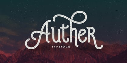 Auther is a modern design with a vintage feel. A monoline display font that combines classic & modern styles. Includes OpenType features with Stylistic Alternates and ligatures. Auther is suited for various print and digital designs, including logos, stationery, posters and more.
 - The Heista Killer by Almarkha Type,
$29.00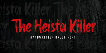 The Heista Killer – Handwritten Brush font with a clear style and dramatic movement this font is great for your next creative project such as logos, printed quotes, invitations, cards, product packaging, headers, Logotype, Letterhead, Poster, Apparel Design, Label, and etc.
 - Buttercell Script by Wacaksara co,
$16.00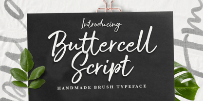 Buttercell Script is a hand brush script available in clean and rough edge versions. This font is great for your next creative project such as Logotype, printed quotes, invitations, cards, product packaging, headers, Letterhead, Poster, Apparel Design, Label, and etc.
 - Fayte by That That Creative,
$15.00 Fayte is a modern blackletter font that gives focus on contemporary display type. This vintage-made new typeface is unmistakably blackletter, However, it is accessible enough to be used across many projects, for branding, Instagram, print posters, magazines, Fashion, whatever.
 - Franie by That That Creative,
$50.00 Franie is a variable geometric sans serif font family with 72 styles. Fully customize the width, weight and italic angle. This modern clean typeface is perfect for contemporary layouts for print, magazines, posters, web, social media, branding logos, or whatever.
 - Cachiyuyo by MendozaVergara,
$9.99 Cachiyuyo is a bitmap font designed for screen titles and to be printed, has a large x height, is very tight and orthogonal. Cachiyuyo is meant for short texts and simple layouts. Is optimized for screen at 8px, 16px, 32px etc.
