8,409 search results
(0.034 seconds)
- Contigo Vintage by Resistenza,
$29.00 This new brushy script screams Summer! Make any layout look refreshing with Contigo Vintage. Designed with pointed brush and indian ink, this script has a lot of contrast thanks to 'pressure and release' technique. Perfect for food and restauration industry, packaging, illustration, greeting cards...
 - Max Stitch by Aboutype,
$24.99Similar to Erasurehead. Redrawn as in line, outline font for embroidery application. Works well with layers, colors, gradients and filters. Max was designed for all media and can be used in a wide range of point sizes. Max requires subjective display kerning and compensation. - Garcia by Identitype Co,
$25.00 Garcia is a modern take on a Serif-style typeface. I created a serif style but with added contrast and make a contemporary and memorable font. Sharp points mix with smooth curves creating unique glyphs that are perfect for interesting wordmarks and typographic posters.
 - Corrida by ParaType,
$25.00Designed for ParaType (ParaGraph) in 1989 by Elvira Slysh. Based on Slogan of Ludwig & Mayer type foundry, 1959, by Helmut Matheis. An informal flowing script simulating pointed brush calligraphy. A style of medium weight and coherent lowercase. For use in advertising and display typography. - Rase Nicolous by Graffiti Fonts,
$24.99 Rase Nicolous is a tall, handwritten graffiti font built to emulate a particular category of modern American, west coast graffiti styles. The varied stroke width & rough edges can produce the look of a number of different writing implements, paint brush, pencil, marker, chalk etc.
 - Viva Beautiful by Cultivated Mind,
$19.00 Viva Beautiful is a lovely hand painted brush script. Viva Beautiful includes two script styles (Regular or B) and an all caps font. Both scripts come in a basic or pro version. Viva Beautiful Pro and Viva Beautiful Pro B include opentype alternates and common ligatures. Try the alternates and ligatures to give your designs a realistic hand painted look. Viva Beautiful and Viva Beautiful B include opentype ligatures. The all caps font is a basic version and pairs beautifully with any Viva script. This brush script family works best for fashion, beauty products, food, apparel and magazines. Viva Beautiful could also be used for film, television, marketing, advertising and websites. Bring beauty to your designs with Viva Beautiful!
 - YLab Variable by Par Défaut,
$40.00 yLab is geometric typeface compose of 10 fonts (5 weights and oblique declination) Perfect for titles and text, yLab supports many languages (Latin pro..). 11 OpenType Features (Alternative; Fraction; Numerator; Denominator; Superior; Inferior; Tabular figure; Ordinals; Discretionary Ligature; Stylistic Set; Case Sensitive Forms). • Ordinal feature includes the Latin alphabet (Uppercase & Lowercase). • Five Stylistic set for “a”, “g”, "i" and "l", includes accents. • Discretionary Ligature includes “AE”, “IJ”, “OE”, available in lowercase. • Contextual Alternate includes ligatures for arrows : <- -> ^| v| <-> v^| Add parentheses around period, numbers or arrows, add n or d for numerator, denominator. Add n, d or +, for numerator, denominator or case arrows. All Case sensitive characters become after the uppercase and number.
 - TF Hustler Blood by Teenage Foundry,
$19.00 TF Hustler Blood Graffiti Font - a unique and exciting design that is sure to add a splash of creativity to your projects! Our font features a monoline style that is complemented by a vibrant splash of paint, giving your designs a unique and eye-catching look. we've also included several alternative that are perfect for supporting the graffiti style. These alternative give you even more flexibility and allow you to create designs that are truly unique and individual. The monoline style gives the font a clean and modern look, while the splash of paint adds a touch of creativity and spontaneity. Features: Uppercase, Lowercase, Numeral, Punctuation & Multilingual. For any questions please contact me 🙂 Thanks!
 - Rens Gazet by Ingrimayne Type,
$9.50 RensGazet is a decorative blackletter typeface with elaborate upper-case letters and condensed lower-case characters. It was inspired by the masthead of a short-lived weekly newspaper, The Rensselaer Gazette, which was published from 1857 until 1860. I could not find any existing digitized fonts that replicated this old typeface, so I decided to create an interpretation of it. I had samples of few letters in large point sizes and a number of others at a small point size, though these were blurry and not sharply defined. As a result, this typeface is undoubtedly considerably different from the original. Also, my spacing is much tighter than that in the source samples.
 - Vasetters by Ingrimayne Type,
$9.00 In Vasetters the letters are cut from the shape of a tessellating vase. To get the tessellating effect, the two sets of letters (and numbers and some symbols) must alternate, and this is done automatically in applications that support the OpenType feature of Contextual Alternatives (calt). Vasetters is monospaced and comes in two weights. The regular weight is tightly spaced, which should not be a problem at large point sizes. At small point sizes adjacent letters can be colored differently or the character spacing can be increased. The lighter weight can be used alone or layered above the regular weight to create the effect of hollow lettering. Vasetters is is fun, bizarre, weird, and obviously a decorative display font.
 - Linotype Sansara by Linotype,
$29.99Linotype Sansara, from Swiss designer Grégoire Poget, is part of the TakeType Library, chosen from the entries of the Linotype-sponsored International Digital Type Design Contest 1999 for inclusion on the TakeType 3 CD. This fun font is a type experiment behind whose oriental facade hide Arabic letters, recognizable only at second glance. This font displays generous, pointed ascenders and descenders as well as a bar-like emphasis on the upper third of the figures which connects lines and words and gives them a decorative look. Linotype Sansara reveals an astounding variety of details which bring to mind 1001 Arabian Nights, flowing gowns and snake charmers. This font is best for display in point sizes of 14 or larger. - Skagwae by Ingrimayne Type,
$7.95 The characters of Skagwae have no curves, just straight line segments. The letter shapes themselves are fairly standard, but the choppy line segments used to construct them give the fonts a crude, unfinished look that is highlighted at large point sizes. At small point sizes the fonts are surprisingly legible. The family has nine styles. The regular, bold, italic, bold italic, shadow, and shadow inside styles are proportionally spaced. Shadowinside is very similar to regular but is spaced to be used in a layer with the shadow style. SkagwaeMono-Regular and SkagwaeMono-Bold are monospaced versions of the family. A third monospaced style, SkagwaeMono-Rippled, is a distorted version with squiggly lines full of curves.
 - Arestons by Uncurve,
$25.00 Arestons is an aesthetic vintage typography font, inspired from the past, elegant signage, gold leaf , sign painting and old label product. Arestons comes with tons of alternates characters to make more eye cacthy . It is suitable for authentic logos, headings, sign painting, posters,letterhead, branding, magazines, album covers, book covers, movies, apparel design, flyers, greeting cards, product packaging, and more. To make everyone enjoyed Arestons give you one extras font including ornament , catch word and some traditional badge. If you use Areston with you imagination, you just cobine with the another font like script , serif or san serif font and adding some effect finally.. BOOM..!! you get a great design for your project.
 - Eclectic Pixel Web by Altered Ego,
$45.00Eclectic PixelWeb is a collection of three sizes of popular web icons in the pixel aesthetic. With 80+ icons designed for creating e-commerce, navigation, and interface designs. Use it as a starting point in your favorite vector program, or use the icons as is - they are optimized for sizes at 20 point and will work in Flash and other web graphics programs. Shopping carts, directional arrows, buttons galore! It's like a pinata in font format, surprises for everyone! This font includes: a new and search buttons, home, security, email, search, and a host of other icons and images to make designing your next website a breeze!. Available in Mac and PC formats, in TrueType, PostScript and OpenType formats. - Material by Rocket Type,
$20.00 Who made this mess! Material is quintessential paint brush font fun. A little bit grunge, little bit 80s chic. Material is rated R for adult content and violence, violence to the american alphabet. This font soars just like KITT in Knight Rider. Part virtuoso part New Kid On The Block. Feels like you’re painting those letters on yr’ own self! Anytime you need to make a little mess and really express yourself choose Material. This font will really give your designs some distressed authenticity. Material is great for billboards, t shirts or video productions. It’s full of smudgy love, it’s loud and is likely to offend but what better way to give your designs that highly sought after ‘edge’.
 - AI Wood by Alphabets,
$17.95These six faces are interpreted from examples shown in Rob Roy Kelly's "American Wood Types" They are not merely scanned copies, but have been redrawn from scratch with various optical adjustments. Kelly points out that the true glory of the American Wood Types are the negative spaces, which are, in their dynamic active forms, the antithesis of the anemic flimsy letters produced by type foundries in the 19th century. The Alphabets Wood Types are designed with digital manipulation in mind. Stretch, curve and distort at will! These designs were released prior to similar revivals from Adobe. Each font has two full alphabets (one full height, one smaller) and numerals. However, certain points and accents will not be found. - YLab by Par Défaut,
$30.00 yLab is geometric typeface compose of 10 fonts (5 weights and oblique declination) Perfect for titles and text, yLab supports many languages (Latin pro..). 11 OpenType Features (Alternative; Fraction; Numerator; Denominator; Superior; Inferior; Tabular figure; Ordinals; Discretionary Ligature; Stylistic Set; Case Sensitive Forms). • Ordinal feature includes the Latin alphabet (Uppercase & Lowercase). • Five Stylistic set for “a”, “g”, "i" and "l", includes accents. • Discretionary Ligature includes “AE”, “IJ”, “OE”, available in lowercase. • Contextual Alternate includes ligatures for arrows : <- -> ^| v| <-> v^| Add parentheses around period, numbers or arrows, add n or d for numerator, denominator. Add n, d or +, for numerator, denominator or case arrows. All Case sensitive characters become after the uppercase and number.
 - Kis Antiqua Now TH Pro by Elsner+Flake,
$99.00 In the course of the re-vitalization of its Typoart typeface inventory, Elsner+Flake decided in 2006 to offer the “Kis Antiqua” by Hildegard Korger, in a re-worked form and with an extended sortiment, as an OpenType Pro-version. After consultation with Hildegard Korger, Elsner+Flake tasked the Leipzig type designer Erhard Kaiser with the execution of the re-design and expansion of the sortiment. Detlef Schäfer writes in “Fotosatzschriften Type-Design+Schrifthersteller”, VEB Fachbuchverlag Leipzig, 1989: No other printing type has ever generated as far-reaching a controversy as this typeface which Jan Tschichold called the most beautiful of all the old Antiqua types. For a long time, it was thought to have been designed by Anton Janson. In 1720 a large number of the original types were displayed in the catalog of the „Ehrhardische Gycery“ (Ehrhardt Typefoundry) in Leipzig. Recently, thanks to the research performed by Beatrice Warde and especially György Haimann, it has been proven unambiguously that the originator of this typeface was Miklós (Nicholas) Tótfalusi Kis (pronounced Kisch) who was born in 1650 in the Hungarian town of Tótfal. His calvinistic church had sent him to the Netherlands to oversee the printing of a Hungarian language bible. He studied printing and punch cutting and earned special recognition for his Armenian and Hebrew types. Upon his return to Hungary, an emergency situation forced him to sell several of his matrice sets to the Ehrhardt Typefoundry in Leipzig. In Hungary he printed from his own typefaces, but religious tensions arose between him and one of his church elders. He died at an early age in 1702. The significant characteristics of the “Dutch Antiqua” by Kis are the larger body size, relatively small lower case letters and strong upper case letters, which show clearly defined contrasts in the stroke widths. The “Kis Antiqua” is less elegant than the Garamond, rather somewhat austere in a calvinistic way, but its expression is unique and full of tension. The upper and lower case serifs are only slightly concave, and the upper case O as well as the lower case o have, for the first time, a vertical axis. In the replica, sensitively and respectfully (responsibly) drawn by Hildegard Korger, these characteristics of this pleasantly readable and beautiful face have been well met. For Typoart it was clear that this typeface has to appear under its only true name “Kis Antiqua.” It will be used primarily in book design. Elsner+Flake added these two headline weights, which are available besides a separate font family Kis Antiqua Now TB Pro. Designer: Miklós (Nicholas) Tótfalusi Kis, 1686 Hildegard Korger, 1986-1988 Erhard Kaiser, 2008
 - Cat Blvck by The Design Speak,
$100.00 Another experimental typeface by Marshall. This typeface is almost difficult to read but that is almost the point. It features words or almost enclosed circles as well as thick strokes around the letter forms. The font has an mysterious edge while providing shock to whomever views it.
 - Eyebel by Ingrimayne Type,
$6.95 Eyebel was an attempt to form letters as simply as possible using only straight lines but still have them legible. The family is low contrast and has a boxy look. Eyebel-Ruff was formed by randomly moving control points. None of these faces have any curves.
 - Cuckoo Fat by Very Good Fonts,
$19.00Cuckoo Fat was first seen in 1988 when I painted it on a record shop's window. Since then this hand lettered font has been there and done that. Cuckoo Fat is a loud and proud, classic and informal display font designed to work well on any job. - RM Opensans by Ray Meadows,
$19.00 This delightful new design has a friendly, open face and will be useful for many display purposes. Due to the modular nature of this design there may be a very slight lack of smoothness to the curves at extremely large point sizes (around 200 pt and above).
 - Agedage Simple Versal by Dharma Type,
$14.99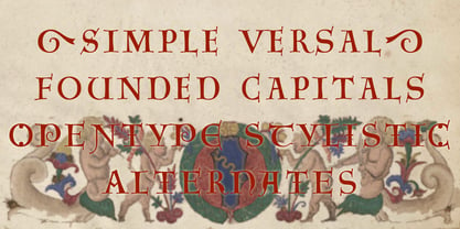 Agedage SimpleVersal is a Opentype font supporting some opentype layout features. To use these functions, you need to use an application which supports OpenType advanced features such as Adobe InDesign CS, Illustrator CS and Photoshop CS. The font includes: Stylistic Alternates Ordinals Numerators, Denominators and Fractions
 - RM Slabb by Ray Meadows,
$19.00 This bold display font has considerable strength and will grace any design that requires extra impact. Due to the modular nature of this design there may be a very slight lack of smoothness to the curves at extremely large point sizes (around 100 pt and above).
 - High Castle by Par Défaut,
$40.00 High Castle is a serif family fonts with baroque aspects. Composed of more than 500 glyphs, inculing many Latin accents for as many languages. With also 9 OpenType Features (Fractions, Numerator, Denominator, OldStyle Figure, Ordinal, Case Sensitive, Contextual Alternate, Liguature, All Access Alternate) and arrows support.
 - Bolderist by Sign Studio,
$12.00 Bolderist is a bold serif font designed for writing that needs to be read easily and clearly. However, the Bolderist still has an artistic and elegant form. Each curve is integral and has a point at extrema. You will get a smooth shape on each side.
 - Horse Thief JNL by Jeff Levine,
$29.00 The 1957 French publication “La Letra Dans La Peinture et la Publicite” (“The Letter tn the Painting and Advertising”) had an illustration of split-serif letters and numbers with a decidedly Western feel. This is now available as Horse Thief JNL in both regular and oblique versions.
 - Vanities by Solotype,
$19.95A Victorian type which, like so many others, was originally offered without a lowercase. As we do so often, we designed a matching lowercase for it. We also added a shaded version of the caps, figures and points of our earlier Vanities font. A nice companion face. - Visual Fantasy by Kitchen Table Type Foundry,
$15.00 Visual Fantasy is a great, all caps display font. It was based on an old font of mine called Plakkaat, which was made using a flat brush and acrylic paint. Visual Fantasy is great for poster work, book covers and product packaging. Comes with extensive language support.
 - HT Motel by Dharma Type,
$19.99 A handsome font, perhaps a little classical. Regularly-connected script, so it’s legible but also memorable font. Holiday Type Project offers retro hand drawing scripts. Inspired by retro script on shopfront lettering, wall paint advertisements in Italy around 1950s. Check out the script fonts from Holiday Type!
 - Rollman by Par Défaut,
$9.00 Rollman is a Diplay font family containing 16 Fonts (5 Weight; Left; Right; Straight and Variable), covering many languages using latin and cyrillic alphabet. It's a perfect font for titles. There are also 7 OpenType features (Numerator; Denominator; Fraction; Ordinals; Small Capital; All Access Alternate; Ligature).
 - Antebas by Lafontype,
$35.00 Antebas is a sans serif family with a geometric touch. Available in 16 styles from Thin to Heavy and it's matching italics. OpenType features such as fractions, ordinal, superscript, subscript, numerators, denominators and tabular figures are available. besides Latin letters, Antebas also supports Cyrillic and Greek letters.
 - Maybelle by Monotype,
$15.99 Designed by calligrapher Rachel Yallop, Maybelle is pretty and proudly romantic, with delicate flourishes and a superbly handwritten, calligraphic sensibility. Drawn with a pointed pen and ink, this script boasts dainty loops and high contrast letterforms. Maybelle is available with some ligatures and alternate glyph shapes.
 - Zagora by CastleType,
$19.00 Based on an art deco design, with alternate characters and numerals. Named for a little town in Morocco on the border of the Sahara desert, with a billboard at the edge of a great expanse of sand that points the way to Timbuktu (several days by camel).
 - Chunder by Chank,
$49.00Created in Minneapolis in 1996, Chunder is inspired by the hand-painted cursive signage of urban boutiques where a shopkeeper can't afford to hire a very good sign painter. Kinda clunky, kinda flowery. Like beer spilled on a daffodil. "It's not pretty, but it's mine," says Chank. - Verismo by Martin Verstraaten,
$20.00 Verismo (Italian for ‘realism’, from vero, meaning ‘true’) is a genre of operas with scenarios based on contemporary everyday life. This font is inspired by old school sign painting techniques. In addition, the font has a contemporary look and can therefore be used in many different designs.
 - Autocrat by Coniglio Type,
$19.95A full character set derived from an enamel hand painted sign on the Whitehouse lawn that contained the magic set of 9 characters or enough rudimentray styles elements to derive a complete character set. It's very round and boxy and is great for display and signage. - Azteria by ARToni,
$17.00 Azteria is a modern display font with a dashing appearance, bold, strong and powerfull. the luxury can be seen from each point. with a retro and classic style to keep it dashing all the time. This font is perfect for logos, t-shirts, decals, stickers and more
 - MHeiSung HKS by Monotype HK,
$523.99 M Hei Sung PRC is a monolinear style Simplified Chinese typeface. Monolinear font designs have little or no thick-thin contrast in the strokes, and modest design characteristics at entry, finial and transitional points of the strokes. The Monolinear category includes Hei (or Gothic) and Yuen typefaces.
 - Summertime Breeze JNL by Jeff Levine,
$29.00 The opening title sequence for the 1958 film “The Long, Hot Summer” was hand lettered in a free-form style as if painted with loose paintbrush strokes. This served as the model and inspiration for Summertime Breeze JNL, which is available in both regular and oblique versions.