8,409 search results
(0.137 seconds)
- Khonsong Rounded by Jipatype,
$27.00 Introducing "Khonsong Rounded" a rounded semi-condensed sans serif font that embodies a harmonious blend of modernity, futurism and softness. With its sleek and contemporary appearance, Its semi-condensed proportions strike a perfect balance between space-saving efficiency and legibility, making it an ideal choice for various applications, from online media to print media.
 - P22 Il Futurismo by P22 Type Foundry,
$24.95 Italian Futurism (1908-43) was one of the 20th century's first and most influential avant garde art movements. Futurist typography sought to disrupt traditional notions of harmony, space and composition on the printed page. The bold and jarring shapes of this set faithfully recall a tumultuous era in both Italian history and Italian graphic design.
 - Rettrama by Gassstype,
$23.00 Hello Everyone, introduce our new product Font Rettrama This Is Simple Script Display Font .This is a Textured Natural Style and classy style with a clear style and dramatic movement. This font Rettrama is great for your next creative project such as logos, printed quotes, invitations, cards, You can activate 16 Ligatures glyphs OpenType panel.
 - White Glory by Yumna Type,
$16.00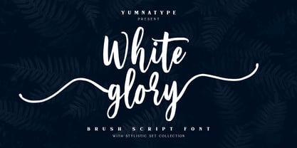 White Glory is a beautiful brush font. The texture from this natural brush font will make your design more beautiful and powerful. This font is suitable for any design like branding, quotes, t-shirt printing and more. Features: Accents (Multilingual Characters) 104 beautiful stylistic alternates PUA encoded Numerals and punctuations (OpenType standard) Design by yumnatype
 - Meltinghones by Prioritype,
$15.00 An elegant and beautiful looking font that is perfect for your project and supports multilingualism. Can be applied to various kinds of print and digital media such as boutiques and salons, women's jewelry, wedding invitations, business cards, photographer watermarks, clothing, creative posts and more. For reference, see preview. Features: -Uppercase -Lowercase -Numeral -Punctuation -Ligature -Multilingual
 - De Hyang Script by Wacaksara co,
$16.00 De Hyang Script is a hand lettering script font. Perfect for adding a unique impression that looks natural like manual handwriting when opentype is active. This font is great for your next creative project such as Logotype, printed quotes, invitations, cards, product packaging, headers, letterhead, poster, apparel design, label, book cover and etc ~ Wacaksara Co
 - Wolfram by Scriptorium,
$18.00Wolfram is a bold display font based on an Art Nouveau type design from Germany. It features very thick letter forms with gnarled edges simulating antique printing, though the letter forms are stylish and rather modern looking. It's a striking font - excellent for buttons and other places you want to provide some strong emphasis. - WL Dot Matrix by Writ Large,
$5.00 WL Dot Matrix is another typographic flashback to computing of the mid 1980s, when 9-pin dot-matrix printers were the state of the art. Compatible with the cleaner WL Rasteroids family, WL Dot Matrix explores some of the common failure modes of old printers: smudging ribbons, slipped tractor feeds, and gummed up print heads.
 - Kyrial Display Pro by Mostardesign,
$29.00 Designed in 2011 by Olivier Gourvat, this font family has generous proportions with a range of weights make it a versatile family for print and web design work. Kyrial Display Pro is also a practical typographic choice to express strength, elegance, and conceptual clarity. Kyrial offers lots of OpenType goodness and broad language support.
 - Violet by Doffdog,
$19.00 Violet is a bold modern calligraphy font. Every single letters have been carefully crafted to make your text looks beautiful. This font is perfect for all your design projects like wedding logos, signatures, packaging design, stationary, modern websites and print projects. Violet comes with upper and lowercase characters, numbers, marks and punctuation. Enjoy Violet font!
 - Celtic Lines by Kaer,
$21.00 Happy to introduce you Medieval initials set made of twisted beast, lions, birds and spiral pattern. Ornamental type for history identity, ethnic prints, tribal posters, etc. It's not a color font! You can color glyphs yourself and use bright version. If you have any questions or issues, please contact me: kaer.pro@gmail.com Best, Roman.
 - Magical Smiles by Tlatous Type,
$19.00 Introducing Magical Smiles by Tlatoustype A fancy and fun handcrafted font that create to impress your audience and make your branding shine. Make your projects dance with this elegant and wonderful font wherever you use it. Use it for your headings, logos, ads, printed quotes, packaging, and even your website or social media branding.
 - ProtoFet by The Northern Block,
$16.70 A precise legible typeface inspired by the classic font Eurostile. The idea was to produce a functional text based font that would demonstrate technical interest at a variety of sizes. The typeface is ideal for use on print, web, motion, t-shirts and apparel. Details include 250 characters, manually edited kerning and Euro symbol.
 - Buttoneer by DonkeyWorx,
$20.00Buttoneer is a specialist symbol font for representing media controls such as play, stop, fast forward, and so on as well as other icons useful in developing multimedia or interactive applications. Also useful in printed materials for representing these items - for example software or hardware manuals. Layout optimised for use with codepage utilities e.g: CharMap. - Las Valles Textured by Kaligra.co,
$29.00 Las Valles Textured is a tall, ultra-condensed sans serif font offered in 4 styles. Combining vintage charm with modern appeal, it boasts unique ligatures and versatile choices. The mix of rounded and regular styles adds a fresh touch. Particularly suitable for headlines, quotes, logos, web, and print design, including magazine covers, posters, and signage.
 - MPI Aldine Extended by mpressInteractive,
$5.00 Based on wood type designed by William H. Page & Company in 1872, Aldine Extended is one of many variations within the Aldine family. The characters are extremely wide relative to their height, and have heavy, thick serifs. Aldine was extremely popular in broadside printing during the late 19th century and conveys America’s enthusiastic westward expansion.
 - Monsal Gothic by The Northern Block,
$32.00 A contemporary gothic sans font family with simple and condensed proportions. The design pays close attention towards balance and expression of form, creating a functional yet elegant typeface suitable for extensive text-based publications in print and screen. Details include 680 characters, seven weights with true italics, small caps, manually edited kerning and Opentype features.
 - Pista by Typedepot,
$14.00 Pista is a unique decorative typeface which is applicable for web, print especially for magazines, brochures, posters, flyers and motion graphics. Pista has six weights - regular, bold, outline, rounded, rounded bold and rounded outline. The weights are perfect for logos - regular size has an elegant look, the bold and outline gives a unique feel.
 - Imperial Quortex by PizzaDude.dk,
$20.00 Imperial Quortex came to life during many processes. Including a bad copymachine, a wet cloth and multiple prints and scans. The result is Imperial Quortex: a unique eroded font! Comes with unique accented letters, alternate upper- and lowercase, smart ligatures and alternate letters. You will need to use OpenType supporting applications to use the ligatures.
 - Quickstep Sans by Holland Fonts,
$30.00A 'quick' font, originally made for the 25th anniversary of SSP Printing Co. in Amsterdam. First used for an intro spread in Wired Magazine (#3.05, May 1995): "The problem with computers is that they don't have enough Africa in them. What's pissing me off is that they use so little of my body" (Brian Eno). - Manifest by Yasin Yalcin,
$12.00 Manifest is a geometric typeface family based on the principles of simplicity, modernity and functionality. With a low-contrast design approach, it performs excellently in any project from print to digital. It comes in five weights with an extended character set including 240+ glyphs per typeface which supports Western and some Central European languages.
 - Blackside by Din Studio,
$29.00 Blackside is a bold and authentic blackletter font. The font is suitable for any branding project like logo, t-shirt printing and many more. Outstanding in a wide range of contexts. Includes: Blackside (OTF) Featured : Alternates Accents (Multilingual characters) PUA encoded Numerals and Punctuation (OpenType Standard) Thanks for downloading premium font from Din Studio
 - Beach Lombok by Letterena Studios,
$10.00 Beach Lombok is a modern and clean display (Serif) font create from our talented font designer. The design of Bogota will make your design more beautiful and inspiring. This font will suitable for any project, like branding, print template, logo and etc. Features: Accents (Multilingual characters) Alternates Ligatures PUA encoded Numerals and Punctuation (OpenType Standard)
 - Ptilia MF by Masterfont,
$59.00 This font family, of 3 weights, was inspired by old hand painted signs in Tel Aviv.
 - Revoluzia MF by Masterfont,
$59.00 A revival of old hand painted sign in Old Jaffa, from the mid of 20th century.
 - Ransahoff CT by CastleType,
$19.00 A very light, elegant, condensed typeface, which must be used very large (at least 100 points).
 - DB Once Upon A Time by Illustration Ink,
$3.00The classic story of princes and princesses is represented here in DoodleBat Once Upon A Time. - Atlantic Avenue by Fonts of Chaos,
$10.00 Atlantic Avenue is an experimental font made with paint brush on wood, large scan and vectorized.
 - Anthilla by ARToni,
$20.00 Anthilla is a modern and bold paint brushed script font, featuring a smooth and dynamic feel.
 - Thigles by Abbasy Studio,
$15.00 Thigles, is a font inspired by Signs Painting, these pretty hand painted letters that you can see on buildings, billboards and signboards. Thigles font comes with some alternates and ligature as well to create your design more unique. With additional shadow font you will be able to create the beautiful combination and bring retro touch to your artworks!
 - PR Mysticon 01 by PR Fonts,
$5.00 There has long been interest in the talismanic value of different numbers and their varied many - pointed stars or patterns. This font presents star designs with points numbering between five and twelve, in solid form, outlined, interlaced, and placed within a circle. Whether your interest is mathematical or mystical, We hope you will enjoy this collection of forms.
 - Bellis by Nine Font,
$25.00 Bellis is a hand painted brush font. Painted on absorbent paper with a chinese brush to make the ink spreading texture. The original texture was a little bit messy but we translated into a more clean textured font. Bellis is a very easy to read brush font and it can be used for posters, magazines or graphic artworks.
 - Times Eighteen by Linotype,
$29.00In 1931, The Times of London commissioned a new text type design from Stanley Morison and the Monotype Corporation, after Morison had written an article criticizing The Times for being badly printed and typographically behind the times. The new design was supervised by Stanley Morison and drawn by Victor Lardent, an artist from the advertising department of The Times. Morison used an older typeface, Plantin, as the basis for his design, but made revisions for legibility and economy of space (always important concerns for newspapers). As the old type used by the newspaper had been called Times Old Roman," Morison's revision became "Times New Roman." The Times of London debuted the new typeface in October 1932, and after one year the design was released for commercial sale. The Linotype version, called simply "Times," was optimized for line-casting technology, though the differences in the basic design are subtle. The typeface was very successful for the Times of London, which used a higher grade of newsprint than most newspapers. The better, whiter paper enhanced the new typeface's high degree of contrast and sharp serifs, and created a sparkling, modern look. In 1972, Walter Tracy designed Times Europa for The Times of London. This was a sturdier version, and it was needed to hold up to the newest demands of newspaper printing: faster presses and cheaper paper. In the United States, the Times font family has enjoyed popularity as a magazine and book type since the 1940s. Times continues to be very popular around the world because of its versatility and readability. And because it is a standard font on most computers and digital printers, it has become universally familiar as the office workhorse. Times™, Times™ Europa, and Times New Roman™ are sure bets for proposals, annual reports, office correspondence, magazines, and newspapers. Linotype offers many versions of this font: Times™ is the universal version of Times, used formerly as the matrices for the Linotype hot metal line-casting machines. The basic four weights of roman, italic, bold and bold italic are standard fonts on most printers. There are also small caps, Old style Figures, phonetic characters, and Central European characters. Times™ Ten is the version specially designed for smaller text (12 point and below); its characters are wider and the hairlines are a little stronger. Times Ten has many weights for Latin typography, as well as several weights for Central European, Cyrillic, and Greek typesetting. Times™ Eighteen is the headline version, ideal for point sizes of 18 and larger. The characters are subtly condensed and the hairlines are finer. Times™ Europa is the Walter Tracy re-design of 1972, its sturdier characters and open counterspaces maintain readability in rougher printing conditions. Times New Roman™ is the historic font version first drawn by Victor Lardent and Stanley Morison for the Monotype hot metal caster." - Times Europa LT by Linotype,
$29.99In 1931, The Times of London commissioned a new text type design from Stanley Morison and the Monotype Corporation, after Morison had written an article criticizing The Times for being badly printed and typographically behind the times. The new design was supervised by Stanley Morison and drawn by Victor Lardent, an artist from the advertising department of The Times. Morison used an older typeface, Plantin, as the basis for his design, but made revisions for legibility and economy of space (always important concerns for newspapers). As the old type used by the newspaper had been called Times Old Roman," Morison's revision became "Times New Roman." The Times of London debuted the new typeface in October 1932, and after one year the design was released for commercial sale. The Linotype version, called simply "Times," was optimized for line-casting technology, though the differences in the basic design are subtle. The typeface was very successful for the Times of London, which used a higher grade of newsprint than most newspapers. The better, whiter paper enhanced the new typeface's high degree of contrast and sharp serifs, and created a sparkling, modern look. In 1972, Walter Tracy designed Times Europa for The Times of London. This was a sturdier version, and it was needed to hold up to the newest demands of newspaper printing: faster presses and cheaper paper. In the United States, the Times font family has enjoyed popularity as a magazine and book type since the 1940s. Times continues to be very popular around the world because of its versatility and readability. And because it is a standard font on most computers and digital printers, it has become universally familiar as the office workhorse. Times™, Times™ Europa, and Times New Roman™ are sure bets for proposals, annual reports, office correspondence, magazines, and newspapers. Linotype offers many versions of this font: Times™ is the universal version of Times, used formerly as the matrices for the Linotype hot metal line-casting machines. The basic four weights of roman, italic, bold and bold italic are standard fonts on most printers. There are also small caps, Old style Figures, phonetic characters, and Central European characters. Times™ Ten is the version specially designed for smaller text (12 point and below); its characters are wider and the hairlines are a little stronger. Times Ten has many weights for Latin typography, as well as several weights for Central European, Cyrillic, and Greek typesetting. Times™ Eighteen is the headline version, ideal for point sizes of 18 and larger. The characters are subtly condensed and the hairlines are finer. Times™ Europa is the Walter Tracy re-design of 1972, its sturdier characters and open counterspaces maintain readability in rougher printing conditions. Times New Roman™ is the historic font version first drawn by Victor Lardent and Stanley Morison for the Monotype hot metal caster." - Times Ten by Linotype,
$40.99In 1931, The Times of London commissioned a new text type design from Stanley Morison and the Monotype Corporation, after Morison had written an article criticizing The Times for being badly printed and typographically behind the times. The new design was supervised by Stanley Morison and drawn by Victor Lardent, an artist from the advertising department of The Times. Morison used an older typeface, Plantin, as the basis for his design, but made revisions for legibility and economy of space (always important concerns for newspapers). As the old type used by the newspaper had been called Times Old Roman," Morison's revision became "Times New Roman." The Times of London debuted the new typeface in October 1932, and after one year the design was released for commercial sale. The Linotype version, called simply "Times," was optimized for line-casting technology, though the differences in the basic design are subtle. The typeface was very successful for the Times of London, which used a higher grade of newsprint than most newspapers. The better, whiter paper enhanced the new typeface's high degree of contrast and sharp serifs, and created a sparkling, modern look. In 1972, Walter Tracy designed Times Europa for The Times of London. This was a sturdier version, and it was needed to hold up to the newest demands of newspaper printing: faster presses and cheaper paper. In the United States, the Times font family has enjoyed popularity as a magazine and book type since the 1940s. Times continues to be very popular around the world because of its versatility and readability. And because it is a standard font on most computers and digital printers, it has become universally familiar as the office workhorse. Times™, Times™ Europa, and Times New Roman™ are sure bets for proposals, annual reports, office correspondence, magazines, and newspapers. Linotype offers many versions of this font: Times™ is the universal version of Times, used formerly as the matrices for the Linotype hot metal line-casting machines. The basic four weights of roman, italic, bold and bold italic are standard fonts on most printers. There are also small caps, Old style Figures, phonetic characters, and Central European characters. Times™ Ten is the version specially designed for smaller text (12 point and below); its characters are wider and the hairlines are a little stronger. Times Ten has many weights for Latin typography, as well as several weights for Central European, Cyrillic, and Greek typesetting. Times™ Eighteen is the headline version, ideal for point sizes of 18 and larger. The characters are subtly condensed and the hairlines are finer. Times™ Europa is the Walter Tracy re-design of 1972, its sturdier characters and open counterspaces maintain readability in rougher printing conditions. Times New Roman™ is the historic font version first drawn by Victor Lardent and Stanley Morison for the Monotype hot metal caster." - Times Ten Paneuropean by Linotype,
$92.99In 1931, The Times of London commissioned a new text type design from Stanley Morison and the Monotype Corporation, after Morison had written an article criticizing The Times for being badly printed and typographically behind the times. The new design was supervised by Stanley Morison and drawn by Victor Lardent, an artist from the advertising department of The Times. Morison used an older typeface, Plantin, as the basis for his design, but made revisions for legibility and economy of space (always important concerns for newspapers). As the old type used by the newspaper had been called Times Old Roman," Morison's revision became "Times New Roman." The Times of London debuted the new typeface in October 1932, and after one year the design was released for commercial sale. The Linotype version, called simply "Times," was optimized for line-casting technology, though the differences in the basic design are subtle. The typeface was very successful for the Times of London, which used a higher grade of newsprint than most newspapers. The better, whiter paper enhanced the new typeface's high degree of contrast and sharp serifs, and created a sparkling, modern look. In 1972, Walter Tracy designed Times Europa for The Times of London. This was a sturdier version, and it was needed to hold up to the newest demands of newspaper printing: faster presses and cheaper paper. In the United States, the Times font family has enjoyed popularity as a magazine and book type since the 1940s. Times continues to be very popular around the world because of its versatility and readability. And because it is a standard font on most computers and digital printers, it has become universally familiar as the office workhorse. Times™, Times™ Europa, and Times New Roman™ are sure bets for proposals, annual reports, office correspondence, magazines, and newspapers. Linotype offers many versions of this font: Times™ is the universal version of Times, used formerly as the matrices for the Linotype hot metal line-casting machines. The basic four weights of roman, italic, bold and bold italic are standard fonts on most printers. There are also small caps, Old style Figures, phonetic characters, and Central European characters. Times™ Ten is the version specially designed for smaller text (12 point and below); its characters are wider and the hairlines are a little stronger. Times Ten has many weights for Latin typography, as well as several weights for Central European, Cyrillic, and Greek typesetting. Times™ Eighteen is the headline version, ideal for point sizes of 18 and larger. The characters are subtly condensed and the hairlines are finer. Times™ Europa is the Walter Tracy re-design of 1972, its sturdier characters and open counterspaces maintain readability in rougher printing conditions. Times New Roman™ is the historic font version first drawn by Victor Lardent and Stanley Morison for the Monotype hot metal caster." - Times by Linotype,
$40.99In 1931, The Times of London commissioned a new text type design from Stanley Morison and the Monotype Corporation, after Morison had written an article criticizing The Times for being badly printed and typographically behind the times. The new design was supervised by Stanley Morison and drawn by Victor Lardent, an artist from the advertising department of The Times. Morison used an older typeface, Plantin, as the basis for his design, but made revisions for legibility and economy of space (always important concerns for newspapers). As the old type used by the newspaper had been called Times Old Roman," Morison's revision became "Times New Roman." The Times of London debuted the new typeface in October 1932, and after one year the design was released for commercial sale. The Linotype version, called simply "Times," was optimized for line-casting technology, though the differences in the basic design are subtle. The typeface was very successful for the Times of London, which used a higher grade of newsprint than most newspapers. The better, whiter paper enhanced the new typeface's high degree of contrast and sharp serifs, and created a sparkling, modern look. In 1972, Walter Tracy designed Times Europa for The Times of London. This was a sturdier version, and it was needed to hold up to the newest demands of newspaper printing: faster presses and cheaper paper. In the United States, the Times font family has enjoyed popularity as a magazine and book type since the 1940s. Times continues to be very popular around the world because of its versatility and readability. And because it is a standard font on most computers and digital printers, it has become universally familiar as the office workhorse. Times™, Times™ Europa, and Times New Roman™ are sure bets for proposals, annual reports, office correspondence, magazines, and newspapers. Linotype offers many versions of this font: Times™ is the universal version of Times, used formerly as the matrices for the Linotype hot metal line-casting machines. The basic four weights of roman, italic, bold and bold italic are standard fonts on most printers. There are also small caps, Old style Figures, phonetic characters, and Central European characters. Times™ Ten is the version specially designed for smaller text (12 point and below); its characters are wider and the hairlines are a little stronger. Times Ten has many weights for Latin typography, as well as several weights for Central European, Cyrillic, and Greek typesetting. Times™ Eighteen is the headline version, ideal for point sizes of 18 and larger. The characters are subtly condensed and the hairlines are finer. Times™ Europa is the Walter Tracy re-design of 1972, its sturdier characters and open counterspaces maintain readability in rougher printing conditions. Times New Roman™ is the historic font version first drawn by Victor Lardent and Stanley Morison for the Monotype hot metal caster." - Minimalist by Ingrimayne Type,
$12.95 PostScript fonts are constructed by connecting dots, dots that have special attributes that control the shape of the connecting lines. In designing Minimalist, I wanted to see how few dots could be used to construct each letter. This is the source of the name--it is (or was) a minimum-point alphabet. I did not expect much from it, and was surprised that it turned out as well as it did. Since I originally drew it, I have added some points to some of the letters to get them to generate proper bitmaps, so it no longer has minimum points.
 - Semantica MF by Masterfont,
$59.00 Formal, yet with very high legibility even in small point sizes. Many weights gives you design alternatives
 - PR Swells 01 by PR Fonts,
$10.00 Drawn with a pointed brush, these have greater contrast and weight variation than the PR-Swirlies series.