6,226 search results
(0.012 seconds)
- #NAME? by OtherwhereCollective,
$29.00 -OC Format Sans is the third incarnation of this geometric grotesk sans serif which fuses the style of Futura with the rhythm and proportions of Akzidenz. It comes in two styles, standard and a new Print family where crisp sharp edges have been made blunt in reference to the ink spread that occurs when printing on uncoated paper stock. It can give digital media a softer more approachable analog aesthetic. Typical of both grotesk and geometric styles the design has an even weight with minimal stroke contrast and the slanted form is an oblique rather than a true italic. The default double-story �a� and �g� give an academic touch, the single story versions of Set 1 are more friendly and approachable while Set 2 changes the look into something more scientific. Made with tireless attention to detail and kerning it's perfect for logotypes and extensive text, supports multiple languages and comes with a plethora of OpenType features including standard and discretionary ligatures, social icons, symbols, and multiple figure styles including roman numerals.
 - Operetta by Synthview,
$34.00 Operetta is a neo-didone display font family inspired on Bodoni, Didot (early 18th century) and Walbaum (19th century). Despite of this heritage, Operetta’s design meets contemporary taste and typesetting needs. With five optical sizes, masterfully navigate between contrast and legibility across various dimensions. The range of eight weights, from the weightless Extralight to the robust Extrabold, let you set your tone: from delicate to exuberant. Operetta's generous character set and opentype features let you meet the most demanding layout needs. And don’t forget swashes, arrows and other extra glyphs, seldom included in a didonesque font. The number displayed in the font family name signifies the recommended minimal print size in points. In web design you should double the minimum value for a retina screen, multiply by 4 for a 72dpi screen. Of course its rendering depends on the printing support, screen resolution etc. Therefore, take it as a suggestion or a starting point; make your own trials. And now, the pièce de résistance: Operetta unveils its italics, adding yet another layer of allure and sophistication.
 - Cherry by Fenotype,
$19.00 Cherry is a bold and smooth display family with connecting script “Brush” and supporting thin marker caps “Sans”. In addition there is “Extras” which is a set of strokes and ornaments designed to go with the fonts. Cherry Print is the same set with rugged outlines and eroded print texture. Cherry Brush has clear and smooth letter shapes with lot’s of character. It’s great for Logo, Poster, Headlines, Packaging or any Display use. Cherry Brush is equipped with plenty of contextual alternates and ligatures that keep the connections smooth. This feature is set in Standard Ligatures and it’s on by default. Cherry Brush is designed so that you can also use it to writ ALL CAPS. For more flashy initials try Swash feature. Cherry Brush is PUA encoded so you can access extra characters in most graphic design softwares. Cherry Sans is an all caps thin marker font with two size of letters (uppercase & lowercase). Cherry Sans is clean and legible. It’s designed to work with Cherry Brush but works just fine on its own too.
 - Baskerville Neo by Storm Type Foundry,
$69.00 One of the most widely used typefaces in the world is actually a legacy of 18th century aesthetics, representing the spirit of late Baroque design, architecture, fashion and society. It has been created and printed for millions of readers around the world for more than two and a half centuries. It influenced many modern typographers. It shaped culture, education, entertainment and science, but also the development of typography itself. As a calligrapher and technical innovator, Baskerville invented new design, papermaking and printing methods, and his typography is very natural and legible to this day. Graphic design today calls for clean and minimalistic solutions, where the use of historical typefaces can achieve a vivid contrast with contemporary elements on the page or screen. Baskerville is undoubtedly the best choice for any kind of publishing house. In keeping with the original inventor’s spirit of excellence, we hereby offer its most advanced digital version. This is not a precise remake of rare Baskerville prints or a restoration of the original punches cut by John Handy, but rather our ideal essence of transitional typography. The old masters were limited by the technology of the time, but today we can dare to have very fine lines, unlimited ligatures, size variations and sophisticated OpenType functions. Drawing, programming, proofing and testing took us many years of development and brought thousands of new letters and dozens of language options. We are convinced that your readers will enjoy this font mainly for reading extensive works, but also for creating corporate identity, orientation systems and cultural posters. Baskerville is perfectly modern in its antiquity, striking in its modesty and timeless in its transiency.
 - Poipoi by Dharma Type,
$14.99 Extraordinary impact and visual conspicuousness. Poipoi is a super 3D sans family for posters, logos and all display. The basic idea is not a brand new. The Stacking type system has been used since before wood type age. As you imagined, colored wood type(woodcut), many other engravings and contemporary printer machine print many colors separately with different printing plates for each color. Poipoi uses the same system for 3d effect. Please use Photoshop or Illustrator, or your favorite graphic design apps that can handle layers. Layers are the printing plates of wood type. You should be able to change text color for each layer. Poipoi "Standard" style is the base of this font family. You can add effects by stacking Highlight and shadow layers. Stacked layers in different color make the text in 3D. Instruction 1. Type your text as you like. 2. Set font-name "Poipoi" and font-style "Standard" 3. Set color of "Standard" layer. 4. Duplicate the "Standard" layer twice (One for Highlight, one for Shadow). 4'. The layer order should be Highlight, Standard, and Shadow from top to bottom. 5. Set font-style and color of "Highlight" and "Shadow" layers. 6. Adjust tracking if you need. (Please use same tracking value for all 3 layers.) For further detail, https://www.dropbox.com/s/xymis7dh5hwxn9q/Poipoi.pdf Poipoi Standard, Highlighted, and shadowed style can be used solely. Rounded terminals add soft, cute, and casual impressions to your design. Spec: Over 400 glyphs! Basic Latin ✓ Western Europe ✓ Central Europe ✓ South Eastern Europe ✓ Mac Roman ✓ Windows 1252 ✓ Adobe Latin 1 ✓ Adobe Latin 2 ✓ Adobe Latin 3 ✓ Almost all Latins are covered.
 - Iranica by Naghi Naghachian,
$64.00 Iranica is a new creation of Naghi Naghashian. It is extremely legible even in very small size. "Iranica" is reminiscence to my birthplace and my cultural root. Iranica is a modern Sans Serif font family. This innovation is a contribution to modernisation of Arabic typography, gives the font design of Arabic letters real typographic arrangement und provides more typographic flexibility. Iranica supports Arabic, Persian and Urdu. The highest degree of calligraphic grace and the clarity of geometric typography. This typeface offers a fine balance between calligraphic tradition and the Roman aesthetic common in Latin typography. It also includes proportional and tabular numerals for the supported languages. Iranica design fulfills the following needs: A. Explicitly crafted for use in electronic media fulfills the demands of electronic communication. B. Suitability for multiple applications. Gives the widest potential acceptability. C. Extreme legibility not only in small sizes, but also when the type is filtered or skewed, e.g., in Photoshop or Illustrator. Iranica's simplified forms may be artificial obliqued in InDesign or Illustrator, without any loss in quality for the effected text. D. An attractive typographic image. Iranica was developed for multiple languages and writing conventions. Iranica supports Arabic, Persian and Urdu. It also includes proportional and tabular numerals for the supported languages. E. The highest degree of calligraphic grace and the clarity of geometric typography. This typeface offers a fine balance between calligraphic tradition and the Roman aesthetic common in Latin typography.
 - Jasna by Naghi Naghachian,
$95.00 Jasna is designed by Naghi Naghashian. This Font is developed on the basis of specific research and analysis on Arabic characters and definition of their structure. This innovation is a contribution to modernisation of Arabic typography, gives the font design of Arabic letters real typographic arrangement and provides more typographic flexibility. This step was necessary after more than two hundred years of relative stagnation in Arabic font design. Jasna supports Arabic, Persian, and Urdu. It also includes proportional and tabular numerals for the supported languages. Jasna Font is available in two weights, Jasna Regular and Jasna Bold. Jasna design fulfills the following needs: A Explicitly crafted for use in electronic media fulfills the demands of electronic communication. Jasna is not based on any pre-digital typefaces. It is not a revival. Rather, its forms were created with today's technology in mind. B Suitability for multiple applications. Gives the widest potential acceptability. C Extreme legibility not only in small sizes, but also when the type is filtered or skewed, e.g., in Photoshop or Illustrator. Jasna's simplified forms may be artificial obliqued in InDesign or Illustrator, without any loss in quality for the effected text. D An attractive typographic image. Jasna was developed for multiple languages and writing conventions. E The highest degree of geometric clarity and the necessary amount of calligraphic references. This typeface offers a fine balance between calligraphic tradition and the contemporary sans serif aesthetic now common in Latin typography.
 - Nimbus Sans by URW Type Foundry,
$35.00 The first versions of Nimbus Sans have been designed and digitized in the 1980s for the URW SIGNUS sign-making system. Highest precision of all characters (1/100 mm accuracy) as well as spacing and kerning were required because the fonts should be cut in any size in vinyl or other material used for sign-making. During this period three size ranges were created for text (T), the display (D) and poster (P) for small, medium and very large font sizes. In addition, we produced a so-called L-version that was compatible to Adobe’s PostScript version of Helvetica. Nimbus was also the product name of a URW-proprietary renderer for high quality and fast rasterization of outline fonts, a software provided to the developers of PostScript clone RIPs (Hyphen, Harlequin, etc.) back then. Also in the 80s, a new, improved version of the Nimbus Sans, namely Nimbus Sans Novus was designed. Nimbus Sans Novus was conceptually developed entirely with URW’s IKARUS system, i.e. all styles harmonize perfectly with each other in terms of line width, weight, proportions, etc. On top of that, Nimbus Sans Novus contains more styles than Nimbus Sans. Now, Nimbus Sans is also available as Round (like the popular URW fonts Futura Round and Eurostile Round). The Round versions are intended to facilitate the work of designers and typographers. The fonts can be used directly, without further preparatory work in graphic programs as finished, high-quality Rounds.
 - PF Stamps Pro by Parachute,
$79.00 PF Stamps covers a wide range of applications which require the stamp effect. This is a form of lettering which was very popular in the mid-twentieth century for product labeling. Special machinery was developed by mainly two companies, one in the United States and the other in Germany. This machinery produced paper die cuts which were later used as a base for the marking with a paintbrush. PF Stamps Paint was developed to simulate this type of lettering. Two other styles, Metal and Flex, have been very popular since its original release. The first one was developed from a metallic stamp imprint, whereas the second one with its slight 3-D look simulates letters stamped on plastic. To insure realistic results, uppercase letters are different from lowercase. This is very useful when two similar letters sit next to each other. There 3 more styles: Solid (the stencil in its regular clean form), Rough and the very interesting Blur. The all new “Pro” version comes to complete this series with what was missing: 93 matching frames and frames parts which will satisfy the most demanding designer. This is a bonus font which is available only with the purchase of the whole family. Use these frames “as is” at any size, or connect the frame parts to each other to create longer frames. Finally, this series supports more than hundred languages which are based on the Latin, Greek or Cyrillic scripts.
 - Fibra One by Los Andes,
$26.00 Fibra One looks like a “soft” version of the Fibra font, but it is actually more than that—the second part of its name suggests that it is a reinterpretation of the original typeface. While this new version maintains the overall structure of Fibra and influence of the Avant Garde font, its shapes are different from those found in its predecessor—Fibra One features both soft corners and smooth transition between curved and straight sections. This gives the font a more dynamic and playful personality. Fibra One keeps the original contrast between curves and straight lines in glyphs such as ’n’ and ‘h’ (not found in rounded glyphs such as ‘a’ and ‘d’); details of display characters (e.g. three upper terminals in ‘W’ and projection off the stem in ‘A’); and exaggerated terminal in ‘R’. All these features give Fibra One a strong personality—a typeface that ‘gives you the chills’. Fibra One was specially designed for display use. The font has a very generous x-height that allows for use in corporate text, thanks to its good readability. Fibra One comes with 2 subfamilies—a more ’normal’ Basic family, with a smaller amount of stylistic features, for use in subheadings or any other type of text that requires formality, and an Alt family that shows off the true potential of the font, making it the perfect choice for magazine headlines, posters and logotypes.
 - Nimbus Sans Round by URW Type Foundry,
$35.99 The first versions of Nimbus Sans have been designed and digitized in the 1980s for the URW SIGNUS sign-making system. Highest precision of all characters (1/100 mm accuracy) as well as spacing and kerning were required because the fonts should be cut in any size in vinyl or other material used for sign-making. During this period three size ranges were created for text (T), the display (D) and poster (P) for small, medium and very large font sizes. In addition, we produced a so-called L-version that was compatible to Adobe’s PostScript version of Helvetica. Nimbus was also the product name of a URW-proprietary renderer for high quality and fast rasterization of outline fonts, a software provided to the developers of PostScript clone RIPs (Hyphen, Harlequin, etc.) back then. Also in the 80s, a new, improved version of the Nimbus Sans, namely Nimbus Sans Novus was designed. Nimbus Sans Novus was conceptually developed entirely with URW’s IKARUS system, i.e. all styles harmonize perfectly with each other in terms of line width, weight, proportions, etc. On top of that, Nimbus Sans Novus contains more styles than Nimbus Sans. Now, Nimbus Sans is also available as Round (like the popular URW fonts Futura Round and Eurostile Round). The Round versions are intended to facilitate the work of designers and typographers. The fonts can be used directly, without further preparatory work in graphic programs as finished, high-quality Rounds.
 - Simple Serenity by Set Sail Studios,
$26.00 Discover an exquisitely elegant modern typography pairing with the Simple Serenity Font Duo. This beautiful set combines a contemporary take on a classic serif with a clean & modern fine calligraphy script—creating the perfect pair for stunning logos, wedding designs, quotes, display text and more. This font family includes; Simple Serenity Script • A clean, elegant hand-drawn script font containing upper & lowercase characters, all punctuation and numerals. Contains 50 ligatures to help the text flow naturally and add a custom-made feel. Includes 9 alternate characters for d,k,f,g,h,i,j,t,y which have extra flourishes. Also includes beginning and end swashes for every lowercase letter. Simple Serenity Serif • A modern take on a classic serif font. Contains uppercase-only characters, all punctuation & numerals. Includes 14 ligatures for extra flair and uniqueness, as well as 10 alternate characters for Q,A,M,E,R,K,U,F,H,W. Using Ligatures and Alternates; Both fonts contain a number of 'Standard Ligatures' (unique double-letter pairings) and 'Stylistic Alternates' (alternative letter designs) to provide you with more customisation options. Make sure these functions are switched on in your software in order to access these characters. You can also access these characters via a Glyphs panel. This is available on most Adobe software & Affinity Designer. Language Support; Both fonts support English, French, Italian, Spanish, Portuguese, German, Swedish, Norwegian, Danish, Dutch, Finnish, Indonesian, Malay, Hungarian, Polish, Turkish, Icelandic, Slovenian
 - Bauhaus Arabic by Naghi Naghachian,
$112.00 Bauhaus is celebrating its centenary in this year. For the Bauhaus's 100th anniversary year, art and design museums and galleries around the world are hosting exhibitions and events. The publication of „Bauhaus Arabic“ font family is my contribution to celebrate this event. Bauhaus Arabic is a sans-serif font family designed by Naghi Naghashian in tree weights. Bauhaus Arabic Light, Bauhaus Arabic Medium and Bauhaus Arabic Bold. It is extremely legible even in very small size. This font family is a contribution to modernisation of Arabic typography, gives the font design of Arabic letters real typographic arrangement und provides more typographic flexibility. Bauhaus Arabic supports Arabic, Persian ( Farsi ) and Urdu. It also includes proportional and tabular numerals for the supported languages. Bauhaus Arabic design fulfills the following needs: A Explicitly crafted for use in electronic media fulfills the demands of electronic communication. B Suitability for multiple applications. Gives the widest potential acceptability. C Extreme legibility not only in small sizes, but also when the type is filtered or skewed, e.g., in Photoshop or Illustrator. Bauhaus Arabic’s simplified forms may be artificial obliqued in InDesign or Illustrator, without any loss in quality for the effected text. D An attractive typographic image. Bauhaus Arabic was developed for multiple languages and writing conventions. Bauhaus Arabic supports Arabic, Persian and Urdu. It also includes proportional and tabular numerals for the supported languages. E The highest degree of calligraphic grace and the clarity of geometric typography.
 - P22 Glaser Babyfat by P22 Type Foundry,
$24.95 Milton Glaser on designing Babyfat: “This is the first alphabet I ever designed. For some inexplicable reason I called it Babyfat. Because I’m not a type designer, most of my alphabets are actually novelties or graphic ideas expressed typographically. Here the idea was to take a gothic letter and view it simultaneously from two sides. It started out as a rather esoteric letterform; it ended up being used in supermarkets for ‘Sale’ signs.” This forced perspective 3-D font has appeared on many LP covers and posters from the mid 1960s onward. This revival includes the original lowercase for the first time in digital form. Besides the three original styles (Outline, Shaded, and Black) made for photo typesetting, the new P22 Glaser Babyfat introduces six additional variations to allow the user to easily colorize the type as Glaser envisioned. The Keyline, Fill, Glyph, Left, Right, and Down font styles give the user nearly infinite options to create dynamic chromatic effects. P22 Glaser Babyfat was based on original drawings and phototype proofs from the Milton Glaser Studios archives. Typographic punctuation and sorts were imagined by James Grieshaber to work with Glaser’s design, as well as diacritics to accommodate most European languages. Over the years there have been many typefaces that borrowed heavily from the Glaser designs, but these are the only official fonts approved by Milton Glaser Studio and the Estate of Milton Glaser.
 - Parsi by Naghi Naghachian,
$105.00 Parsi Font family is designed by Naghi Naghashian. This Font is developed on the basis of specific research and analysis on Arabic characters and definition of their structure. This innovation is a contribution to modernization of Arabic typography, gives the font design of Arabic letters real typographic arrangement and provides more typographic flexibility. This step was necessary after more than two hundred years of relative stagnation in Arabic font design. Parsi supports Arabic, Persian, and Urdu. It also includes proportional and tabular numerals for the supported languages. Parsi Font is available in Light, Regular and Bold. Parsi design fulfills the following needs: A Explicitly crafted for use in electronic media fulfills the demands of electronic communication. Parsi is not based on any pre-digital typefaces. It is not a revival. Rather, its forms were created with today’s technology in mind. B Suitability for multiple applications. Gives the widest potential acceptability. C Extreme legibility not only in small sizes, but also when the type is filtered or skewed, e.g., in Photoshop or Illustrator. Parsi's simplified forms may be artificial obliqued in InDesign or Illustrator, without any loss in quality for the effected text. D An attractive typographic image. Parsi was developed for multiple languages and writing conventions. E The highest degree of geometric clarity and the necessary amount of calligraphic references. This typeface offers a fine balance between calligraphic tradition and the contemporary sans serif aesthetic now common in Latin typography.
 - LFT Iro Sans by TypeTogether,
$49.00 Milan-based Leftloft studio developed LFT Iro Sans, an expansive family that solves the significant, wide-ranging challenges of branding, wayfinding, pictographic language, and complex editorial use. LFT Iro Sans began as the clear and welcoming wayfinding project of San Siro stadium in Milan. Over time many other styles and weights have been added. LFT Iro Sans never finds itself outmatched by the task at hand. The primary aim was to design a technical typeface that was readable in any low visibility condition, for instance in a poorly lit area with awkward wall shapes and overhangs. This worked well for stadium and large lettering use, but other problems also needed to be addressed, such as complementary iconography. A location developer was left mixing — clashing, really — one type family with a different family of icons, resulting in a cobbled-together look which diluted the brand and the experience. They set out to radically simplify and clarify each shape and its meaning, accepting uniqueness as part of the final visual language. LFT Iro Sans pictograms answers the need for having a consistent and large group of icons, perfectly suited to the text typeface. As it concerns public spaces, this didn’t exist before. LFT Iro Sans incorporated a branding project too, so they decided to let LFT Iro Sans go out on a limb and created a unicase style that demands attention. Each unicase letter is a combination of the lowercase and capital form, quite noticeable in the ‘i’, ‘m’, ‘t’, and unique ‘d’ and ‘b’, balanced by more restrained forms of ‘a’, ‘s’, ‘c’, and ‘e’. LFT Iro Sans is not only a technical typeface, but, thanks to letters’ proportions, can also be used for editorial purposes. Assertive and economical in stature, the text weights are clear and assured. And a display version for headlines in Ultralight and Heavy (with italics) was developed for stunning headlines. For enthusiasts of every stripe, LFT Iro Sans can be a brand’s rallying cry with its arresting unicase, be a developer’s go-to pictogram choice, or set the most demanding editorial text in digital or print. With its many OpenType features, simplified pictogram commands (even available in Apple’s Pages and Microsoft Word), and a total of 30 targeted family members, LFT Iro Sans is a brilliant, easy choice. As with the rest of the TypeTogether catalogue, the complete LFT Iro Sans family, designed by Lefloft and developed by Octavio Pardo, has been optimised for today’s varied screen uses.
 - Joanna Nova by Monotype,
$50.99 The Joanna® Nova design, by Monotype Studio designer Ben Jones, is an extensive update to Eric Gill’s original Joanna typefaces and brings this much admired – but underused – slab serif typeface into the 21st century. Joanna Nova features 18 fonts – more than twice as many as the original Joanna – with a wide range of weights including thin and ultra black, which were not available in the original design. Every glyph has been redrawn using a variety of reference sources, including Gill’s original sketches and the copper patterns used in Joanna’s initial production. When Jones set out to design Joanna Nova, he saw that the ‘real Joanna’ was not immediately evident. “Some of Gill’s original drawings have a sloped ‘M’; there is also a ‘K’ and ‘R’ with a curled leg and a letter ‘d’ without the flat bottom,” he explained. “Is this Joanna? Or is it the version used to print Gill’s Essay on Typography? Or is it the digital version with which most people are surely more familiar than any other version? Ultimately, I think, none of these and all of these were ‘Joanna’ because, as with any typeface, it is more the idea or concept behind the typeface that makes it what it is. My approach was to create a version of Joanna that appears in your mind when you think of Joanna.” Jones noted that one of the most distinguishing aspects of Joanna is the italics; and that, for reasons unknown, many of the characters in the current versions are much more condensed than those in the hand-set fonts of metal type., The newer designs being almost unusable at small sizes. The italics in Joanna Nova have been reworked to be more legible and closer to their original widths. Joanna Nova expands the original Joanna in several ways that open up new typographic possibilities, These additions include several new weights, support for Greek and Cyrillic scripts, small caps for all scripts in both upright and italic styles, several numeral options and a host of context-sensitive ligatures. The Joanna Nova typeface family is part of the new Eric Gill Series, drawing on Monotype's heritage to remaster and expand and revitalize Eric Gill’s body of work, with more weights, more characters and more languages to meet a wide range of design requirements. The series also brings to life new elements inspired by some of Gill’s unreleased work, discovered in Monotype’s archive of original typeface drawings and materials of the last century.
 - Klang MT by Monotype,
$29.99Will Carter, well known in connection with his private press in Cambridge, has combined the skills of a calligrapher with a practical knowledge of printing. His mastery of pen-drawn letterforms was put to practical use in the design of Klang. Klang is a slightly inclined and calligraphically shaped sans serif with short ascenders and descenders. The Klang font is useful for informal applications, such as invitations, greetings cards and posters, but can also be used in advertising. - Scansky by Satori TF,
$20.80 Scansky is a carefully crafted contemporary modern sans serif typeface. It comes with 28 fonts, regular and condensed sub-families, and matching italics. Scansky was designed to give a distinct, corporative look to your artwork, suited for signage, web, and corporate print material. It is equipped with an extended character set to support Central, Eastern and Western European languages. And the good news is that the SemiBold weights are free of charge so you can try it. :)
 - Hantlay by DYSA Studio,
$18.00 Hantlay is a handwritten brush font. This another collection of script is perfect for your next personal branding project, excellent for your business. Hantlay have a smooth edges, so this font gives an authentic handcrafted feel style. Hantlay is perfect choice for people looking for clean, modern, minimalist, elegant, beauty design styles. Suitable for almost any graphic designs such as logo, branding materials, business cards, gift cards, t-shirt, cover, thumbnail, print, poster, photography, quotes .etc
 - Grafinc by PosterType,
$18.00 Grafinc is fat, black and robust. It is a geometric-based display typeface that comes in two cuts: ExtraBlack and Rounded. Grafinc can be used for all types of media – print, web, broadcasting or games. Despite its robust appearance and display character, Grafinc is very friendly typeface. It appears to be very legible in smaller sizes, too. The cuts include some very fine ligatures, making its appearance very rhythmic and smooth. Available in OpenType and western languages.
 - Stone Dense by Putracetol,
$20.00 Stone Dense is a playful display font. Stone Dense has a large number of ligatures, 160 ligatures. So that makes this display font more playful and unique. And Stone Dense has a bold body, with unequal widths for the characters. Stone Dense can suitable for your projects that require fonts with bold and strong characteristics. Such as branding, logos, titles, headlines, printing, magazines, quotes, posters, fashion, t-shirts, apparel and others. Stone Dense is also support multi language.
 - Bullterrier by Beewest Studio,
$10.00 Bullterrier is a bold type of font that has a unique character than other bold fonts, Bullterrier has a strong but soft character, with an elegant and fresh theme, Bullterrier is provide your something different unique bold font . Its weight excels in logos, posters, social media, magazine titles, clothing, large print formats – and anywhere you want to see it. Inspired by the design styles that are currently popular, let’s make your imagination come true with Bullterrier.
 - Montana by Resistenza,
$39.00 Montana is an elegantly playful handwritten font family with separate fonts for icons and illustrations included. This font is based on tight, condensed Grotesk typefaces, combining geometry and legibility with the originality of handwritten strokes. The result is a fresh font family perfect for headlines, typographic posters, t-shirts, food packaging and other print works. Its optimized legibility, simple structure and low contrast was made to perform excellently with e-books and mobile apps in mind.
 - Pantai Bali by DYSA Studio,
$19.00 Pantai Bali is a new organic siganture font. This another collection of script is perfect for your next branding project, excellent for your business. Pantai Bali have a natural edges, so this font gives an authentic handcrafted feel style. Pantai Bali is perfect choice for people looking for clean, modern, minimalist, elegant, beauty design styles. Suitable for almost any graphic designs such as logo, branding materials, business cards, gift cards, t-shirt, cover, thumbnail, print, poster, photography, quotes .etc
 - Kommon Grotesk by TypeK,
$39.00 Introducing our foundry with the new Sans Serif typeface, Kommon™Grotesk, a super family with 96 styles. Different width from Extended to Compressed, variety of weights from Thin to Super, made Kommon™Grotesk suitable for multiple usage. The typeface was crafted till clean and simple. It has high legibility with modern and clear look to be use as text or display font. Kommon™Grotesk is effective displaying on many medias, both print and on screen.
 - Billionary by Din Studio,
$25.00 If you’re looking for a gorgeous font to attract your audiences or customers then we’ve got the font for you! Introducing Billionary - A Serif Font This handmade font typeface with modern style looks very interesting for loads of different projects and promotions. It is perfect to be used on your website, for your social media branding, Pinterest banners, printed products, and more! Features: Multilingual Support PUA Encoded Numerals and Punctuation Thank you for downloading premium fonts from Din Studio
 - Rensor by Smartfont,
$25.00 Rensor is an three weight modern geometric typeface, designed to be an easy go-to for branding, web, and print design projects. Each form is pared down to its essentials, so it's extremely versatile and can blend in or stand out as much as you choose. With it, you can create logos, labels, use in advertising, branding, packaging, magazines and book covers, posters, banners, headings, descriptions and much more. This font is easy to use has OpenType features.
 - Chaviera Pro by Handpik,
$10.00 Hello, this time we would like to introduce a new product. namely "Chaviera pro ", a Sans-serif display font that has a classic, feminine, and elegant style wrapped with a beautiful Alternate stylist. The Chaviera font is perfect for various projects like logos & branding, invitations, stationery, wedding designs, social media posts, advertisements, printed quotes, product packaging, product designs, labels, photography, watermarks, special events or anything else. Feature Uppercase Lowercase Numeral Functional Ligature Stylistic Multilingual INCLUDE WITH 6 VARIATION WEIGHT
 - Mahegrena by IRF Lab Studio,
$12.00 Mahegrena is a monoline script font. This another collection of script is perfect for your next personal branding project, excellent for "Logotype". Mahegrena have a smooth edges, so this font gives an authentic handcrafted feel style. Mahegrena is perfect choice for people looking for clean, modern, minimalist, elegant, beauty design styles. Suitable for almost any graphic designs such as logo, branding materials, business cards, gift cards, t-shirt, cover, thumbnail, print, poster, photography, quotes .etc Thank You!
 - Kana Sans by GT&CANARY,
$32.00 A new modern classic. Kana Sans is a versatile sans serif font family that’s ideal for building a contemporary yet timeless brand look. Inspired by iconic typography, Kana Sans is designed to be balanced, modern and easily adaptable to web, print, and signage applications. From fashion to corporate industry, this font gives the designer full flexibility to express his/her vision. With Six different weights and matching italics, Kana Sans is a powerful communication tool for today.
 - Appetizer by Cititype,
$14.00 'Appetizer' is a casual marker font, this font is suitable for a variety of purposes, it is great for logos, craft, prints, text headers, web banners, writing quotes as well as for video editing, animation and other visual presentations. This font is equipped with ligatures and is supported by multi languages, making it worthy of your bringing to any part of the world. Fall in love with its incredibly versatile style and use it to create spectacular designs!
 - Olap Metric by S6 Foundry,
$20.00 Olap Metric is a modern, one-of-a kind font that will make your designs stand out against the competition. With 9styles and Multi-languages support, this stylistic display type has what you need for all sorts of projects! The family has been developed as a modern playing system allowing the mixing of infinite combinations. Perfectly suited for headlines, large-format prints, brand identities, social media, advertising, editorial design, posters, magazines, logos, headings, digital and more.
 - Meat And Seafood by Edyta Demurat,
$28.00 This is a modern icon set with geometric shapes. A tasty set for the creation of the visual identity of shops, restaurants or bars. Thanks to its simplicity it will be perfect for printed and online materials. Baobaby Studio prepared an entire delicious set specially for you. Apart from “Meat and Seafood”, our offer also includes Dairy, Bread and Confectionery, Vegetables and Fruits. Everything in one style. Mix and match as you see fit. Bon appetit!
 - TD Balak by Tribox Design,
$10.00 Team Tribox Design created the font to improve the old font print of Doctrina Christiana. Each letter is designed for better readability even in small sizes, particularly for books, and is designed for poets, writers, and anyone who needs a font used in publishing. The font is personally designed and is intended for use by publishers and those seeking publication. Regine Ylaya: Art Director, Research Inu Catapusan: Font/Typeface Designer, Creative Director, Copywriter Faye Penetrante: Copy Editor
 - Manekin by Say Studio,
$17.00 Manekin is Beauty Bold Script Font with a Beauty vintage style.This font is also equipped with 40+ stylistic Alternates and ligatures and also multi-language support which further adds to the creativity in using this font. This font is perfect for your creative projects such as Logotype, printed quotes, invitations, cards, product packaging, headers, Letterhead, Apparel , Web design, Magazine, Book, etc. FEATURES: - Uppercase - Lowercase - Punctuation and Marks - Symbols - 40+ stylistic Alternates & Ligatures Thanks, Have a wonderful Day, Say Studio
 - Gladies by DYSA Studio,
$25.00 Gladies is a New Modern Serif Typeface. This another collection of Serif is perfect for your next branding project, excellent for your business. Gladies have a smooth edges, so this font gives an authentic handcrafted feel style. Gladies is perfect choice for people looking for clean, modern, minimalist, elegant, beauty design styles. Suitable for almost any graphic designs such as logo, branding materials, business cards, gift cards, t-shirt, cover, thumbnail, print, poster, photography, quotes .etc
 - Wornas by Nathatype,
$29.00 Step into the world of visual grandeur with Wornas, a commanding serif display font that marries bold weight with artistic finesse. The letters are adorned with intricate artistic objects and inline details, transforming each character into a canvas of creativity. These unique style add a visual interest compared to other display fonts. The inline details in this font are a stroke of design genius. Wornas fits in headlines, logos, branding materials, print media, and many more.
 - Retro Packaging JNL by Jeff Levine,
$29.00 A vintage rubber stamp alphabet and star printing set had a package header with Art Deco-inspired lettering describing the product. Sold by a company called Elvin [circa late 50's-early 1960s], these Japanese-made sets were one of many distributed by independent toy importers and made in various configurations including [at times] tiny animal stamps. The type design on this particular item was the model for Retro Packaging JNL, available in both regular and oblique versions.
 - Laceria by DYSA Studio,
$19.00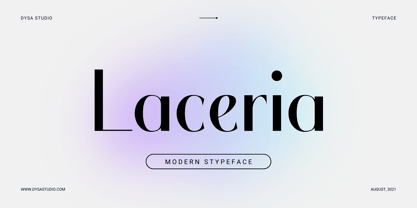 Laceria is a New Modern Serif Typeface. This another collection of Serif is perfect for your next branding project, excellent for your business. Laceria have a smooth edges, so this font gives an authentic handcrafted feel style. Laceria is perfect choice for people looking for clean, modern, minimalist, elegant, beauty design styles. Suitable for almost any graphic designs such as logo, branding materials, business cards, gift cards, t-shirt, cover, thumbnail, print, poster, photography, quotes .etc