2,952 search results
(0.011 seconds)
- Notes by Resistenza,
$39.00 Notes Is a handwritten-Italic font style, casual and fresh. Our recipe for this project is a perfect blend of typography and handwriting. Works well in small sizes and has several ligatures. Notes Family has many cuts, Pen, Pencil, Marker and Felt Tip. This font family can be used for many purposes like publishing, quick notes, adding captions, signage.
 - Calligraphia Latina Soft 4 by Intellecta Design,
$25.90 One of the most successful ornament fonts is CalligraphiaLatina . It is part of a trend that's been quite popular lately: messed-up calligraphy. CalligraphiaLatina is a worldwide best-seller from IntellectaDesign.. Besides the original CalligraphiaLatina, its family of fonts (13 different sets) represents a complete solution of intrincated fleurons and ornaments to use with several styles of artworks.
 - Diamond Cubic by Attractype,
$17.00 Diamond Cubic is a modern serif font with a geometrical and a slightly condensed design which makes it particularly effective for space economizing. It will look fantastic with short and middle length text blocks, headlines, presentations, logo, branding, poster, packaging or any other creative design. Diamond Cubic containing small caps and glyph coverage for several languages.
 - Mane by BaronWNM,
$14.00 Mane is a display font with a slant block shape. thick on the vertical line and thin on the horizontal line. have a firm and solid impression. Suitable for writing titles, posters, games, ad taglines, sports, space, etc. has an alternate start and end on each capital letter and several ligatures in order to add variations to each usage.
 - Master by Jure Kožuh,
$29.00 Master of the World was included on the front page of a novel in several parts, The Count of Monte Christo (mid 20th century). Typeface characters show design guidelines of the pre-war era (2nd world war). The idea of development origins from a wish to evolve traditional forms of typefaces which were used in Slovenia.
 - Yulia Khaira by Jehansyah,
$20.00 Yulia khaira This beautiful script font is perfect for all design needs, will keep it simple but look special, plus several alternatives that support your design, make sure you don't miss it, and it's your favorite font supported by PUA encoded, which is easy to access include : Yulia khaira latin numeric punctuation Alternate 400+ Thank you very much
 - Hollandia by Typehead Studio,
$20.00 Introducing our new exploration Hollandia, another vintage-inspired font . Collected from many references such as vintage signage, logo, badges, and old fashioned graphics. Hollandia font made carefully crafted with a high ornamental taste. Hollandia is perfect for many display purposes. You can use this font for poster, label, logo, signboard, t-shirt, book cover, decoration, merchandise, and more.
 - KG Primary Penmanship by Kimberly Geswein,
$5.00 I come from a family of educators- my mom, husband, stepmom, brother-in-law, and sister are all currently teaching and I have taught in the past. This font was created after speaking to several elementary school teachers who were struggling to find just the right font to use on worksheets and projects in their classroom. They liked many features of other fonts, but needed small things altered in order to make a "perfect fit" for their class. Hand-drawn by me, this font hopefully addresses several of those issues. As penmanship styles vary across the globe, I am sure this font will not work in every classroom. But hopefully this style will work for many teachers to give their early readers a highly legible, neat, accurate font. It is best used with kerning turned on to allow for accurate letter spacing.
 - Particela by Putracetol,
$20.00 Particela - Display Font. Particela is a display style font. The classic, fun and groovy impression is very visible. But in Particela I combine several variations such as the ligature. Particela is inspired by vintage albums and posters from 1960s music bands. It makes this font even more unique and different. Particela is also great for any kind of display purpose from album, cover,poster, label, tshirt, apparel, signage, quote, logo, greeting card,logotype and many more. Particela is also support multi language. The alternative characters were divided into several Open Type features such as Swash, Stylistic Sets, Stylistic Alternates, Contextual Alternates, and Ligature. The Open Type features can be accessed by using Open Type savvy programs such as Adobe Illustrator, Adobe InDesign, Adobe Photoshop Corel Draw X version, And Microsoft Word. This font is also support multi language.
 - Gemmadonati by Eurotypo,
$28.00 Gemmadonati Regular and Gemmadonati Italic is an organic, modern and casual calligraphy family font that has preserved in its glyphs its original textured appearance for a more personalized effect even more authentic. As an exclusively Open Type release, with 790 glyphs and 63 ornaments, it has several special alternatives for all letters with lots of possibility an an infinity of combinations. There are plenty of options to allow you to create something unique and special: standard and discretionary ligatures, several swashes and stylistics alternates for each letter, catchwords, tails that can be added to the beginning or end of each letter, ornaments, and much more. These lovely fonts have already an extended character set to support Central and Eastern as well as Western European languages. Gemmadonati was made to make your project more beautiful and attractive! Have fun with it!
 - Xunga by Huy!Fonts,
$17.00 Xunga is a cheerful display typeface. My goal was to design a font able to fit any layout with boldness and playfulness, mixing a sign painter taste in the uppercase and some of my crappy calligraphic reverse contrast explorations with the flat brush for the lowercase. I designed several of widths to fit the page, and though about a different way of expanding the family shifting the horizontal stress axis to move the letter weight in different heights, making a 15 fonts family, suitable for making bold layouts. Xunga has an extended character set for European languages as well as Vietnamese, and shows all its potential with OpenType-savvy applications. Every font includes ligatures, catchwords in discretional ligatures, contextual alternates to avoid conflictive glyph pairs and localized forms to avoid problems with several glyphs and languages.
 - Grund by SIAS,
$29.90 GRUND is a new fontographic adaption of a remarkable 1920s epigraphical find in the city of Leipsic. This old well-known European trade fair hotspot struggled with a severe shortage of exhibition space around 1920. The solution was to dig deeper into the matter – literally – and 1924 the world’s first underground trade fair exhibition hall was opened right under the city’s central market square. After several changes of use during the past decades the sophisticated Art Deco entrance structure (architect: Otto Droge) was re-opened in December 2013 as a gateway to a new subway rail track. – The original brass lettering of the UNTERGRUNDMESSHALLE MARKT has been retrieved – and served as the inspiration for this new and unique font. If you’d like to see more exceptional Art Deco type, have a look at my Arthur series. __________________________________________________________________________________________
 - Beware The Neighbors by Intellecta Design,
$23.90 Beware The Neighbors is based on “Personality Script”, a rough alphabet originally drawn by Ross F. George, and published in one of the Speedball series of lettering catalogs that ran from 1935 to 1948. The design is something of a minor classic, and several foundries have recreated digital fonts based on it. However, mostly of these interpretations are very “geometric”, formed using straight lines. Intellecta preferred to create a new interpretation using smoother, curved lines to create a creepy appearance. Also included are several ligatures and OpenType stylistic alternates. This version also has an extended character set for use in Central as well as and West European countries, plus Baltic, Turkish and Romanian. Check out Intellecta’s Clarvoyant for another creepy experience based on lettering from old Speedball catalogs. CLOSE THE DOORS AND WINDOWS AND BEWARE OF YOUR NEIGHBORS!
 - Vtg Stencil Italy No. 2 by astype,
$29.00 The Vtg Stencil fonts from astype are based on real world stencils from several countries. The Italian stencils that I chose as a model for this font are roughly based on classic French stencil letters. Please compare the figures (numbers) with their French counterparts. However, the Italian stencils are made with a different production technique. The design of the letters is clearly not punch-cut into the plates, maybe they are drilled, milled or etched. Details such as the serifs look bold and clumsy, and when using the stencils as they are meant, with viscous sign paint, smaller details easily fade away. So I took my freedom to design a font close to the original design but adding several typographic tweaks to let it shine, hoping to get closer to the intended design idea of these Italian stencils. Enjoy the vintage!
 - Otama by Tim Donaldson,
$49.00 From the dainty light weight through to the striking UltraBold, Otama raises the bar to a new level of dangerous sophistication. Although easily classified alongside Modern typefaces such as Didot and Bodoni, Otama was purposely developed with minimum reference to these two visual heavy weights. In search of something more than a mere historical revival, Otama instead draws proportional reference from popular 20th century Transitional and Garalde typefaces with visual inspiration coming from calligraphic studies. Many characteristics from Tim Donaldson’s 2010 display face Pyes Pa were directly passed on in execution of Otama — The shoelaced k, e and a being the most obvious examples of this family relation. Refined over 2 years with well over 8,000 characters over 28 styles, Otama certainly deserves its place as a comprehensive and versatile typeface in any designer’s font library.
 - Gothiks Round Compressed by Blackletra,
$50.00 Gothiks Round Compressed is the rounded version of Gothiks Compressed. It is a 6-weight display sans-serif influenced by Texturas. The rhythm and verticality of Texturas can be easily identified on the letters with diagonal strokes like A N M K k V v W w X x Y y Z z: here they are all vertical. This kind of morphology was chosen because it accepts condensation in a very natural way, giving to this sans-serif a very unique personality. It has an extensive character set—with extensive language support—and many OpenType features like fractions, small capitals and different figure sets. Default figures align with lowercase. The typeface’s name refers to the plural of the word Gothic, which in turn can refer to both sans-serifs or Blackletter, depending on geographic location. Use it BIG!
 - Gothiks Round Condensed by Blackletra,
$50.00 Gothiks Round Condensed is the rounded version of Gothiks Condensed. It is a 6-weight display sanserif influenced by Texturas. The rhythm and verticality of Texturas can be easily identified on the letters with diagonal strokes like A N M K k V v W w X x Y y Z z: here they are all vertical. This kind of morphology was chosen because it accepts condensation in a very natural way, giving to this sans-serif a very unique personality. It has an extensive character set—with extensive language support—and many OpenType features like fractions, small capitals and different figure sets. Default figures align with lowercase. The typeface’s name refers to the plural of the word Gothic, which in turn can refer to both san-serifs or Blackletter, depending on geographic location. Use it BIG!
 - Rufolo by Eurotypo,
$22.00 Rufolo is a family of fonts that can be considered both aesthetic and utilitarian. It has an apparent serif, barely hinted at, whose clear past reference is a beautiful epigraphic script on the marble plate placed at the southern entrance of the Roman amphitheatre, in Pompeii. Perhaps its origin dates back to Ugarit's cuneiform writing (as Morrison suggests as the origin of the serif in "Politics and Scripts") whose characteristic triangular-shaped incision footprint produces a powerful trait that not only gives character to the writing but also facilitates its support and visual compensation of sizes with neighboring signs. Other clear inspirational references have been Robert Hunter Middleton's Stellar (1929); Albertus (1932) by William A. Dwiggins; Optima (1952) by Hermann Zapf; And more recently RRollie (2016) by our foundry. Rufolo collects the attractive characteristic of the stroke endings but the proportions of its structure becomes much more regular, the capitals are in line with a constant square module, while the above references retain the proportions of the Roman Trajan. Some endings strokes have slightly baroque reminiscence with the intention of giving it greater plasticity and aesthetic enrichment, but absolutely controlled, taking special care of the aspects of readability and expressive neutrality. Rufolo Family comes in four weight: Light, Regular, Bold and Black, accompanied by its corresponding Italic versions.
 - Hipweee by Storictype,
$9.00 Introducing Hipweee Layered Font Hipweee, A new carefully crafted layered rounded Typeface. The Ideas of this fonts are from wide range of reference, baby, kids, school, cafe, food desert & beverages are our main focus for this fonts. So the looks of this fonts must be in the wide range of the reference above. It’s Versatile, Fun, Cute and Beauty feel that you get in Hipweee Typeface Hipweee Created with 7 Layer : Base, Extrude, Shadow, Dot, Flower, Hatch & Inline. Perfect fitted layer to give you a more contrast, more bold look of the title. Our creation on the display to give you a reference what it looks like on your project. such as Branding, Header, Logotype, Poster, and etc. It shows that Gemoy clearly can accommodate various design style. Language Support : Afrikaans, Albanian, AsuBasque, Bemba, Bena, Breton, Catalan, Chiga, Colognian, Cornish, Croatian, Czech, Danish, Dutch, English, Estonian, Faroese, Filipino, Finnish, French, Friulian, Galician, German, Gusii, Hungarian, Indonesian, IrishItalian, Kabuverdianu, Kalenjin, Kinyarwanda, Latvian, Lithuanian, Lower Sorbian, Luo, Luxembourgish, Luyia, Machame, Makhuwa, Meetto, Makonde, Malagasy, Maltese, Manx, Morisyen, North Ndebele, Norwegian , Bokmål, Norwegian Nynorsk, Nyankole, Oromo, Polish, Portuguese, Quechua, Romanian, Romansh, Rombo, Rundi, Rwa, Samburu, Sango, Sangu, Scottish Gaelic, Sena, Serbian, Shambala, Shona, Slovak, Soga, Somali, Spanish, Swahili, Swedish, Swiss, German, Taita, Teso, Turkish, Upper Sorbian, Uzbek (Latin), Volapük, Vunjo, Western, Frisian, Zulu
 - Sevigne ST by Reserves,
$39.99 Sevigne [sey-vee-nyey] is a highly refined, contemporary geometric stencil, inspired by the ambience of high-end fashion and luxury combined with the raw, utilitarian nature of the stencil. The inclusion of over 130 unique ligatures expand it’s sensibility of alluring, well-balanced letterforms and distinctive style. The stencil marks are atypically placed and vary throughout, giving it a purposely forward presence. Stylistically, as an all-caps typeface, Sevigne exudes a greater sense of harmony and polish due to it’s unicase form where the interplay of a limited amount of characters is the focus. Subtle, considered details are found within individual letters, contrasted by the complex, intersecting forms that make up the various ligatures. With multiple stylistic sets added to the expanded ligatures, individual letters and ligature pairs can be carefully exchanged to fine-tune text settings for a unique custom type solution. Features include: Precision kerning- Expanded set of over 130 Ligatures, including alternates (ae, oe, fi, fl, ffi, ffl, ffj, ff, fh, fj, ft, tt, th, ct, st, oo, og, go, ogo, gog, la, ea, ev, ew, fy, ez, et, oc, ga, do, uv, vu, yu, uy, nn, mm, xy, yx, ao, oa, ac, da, aq, nt, aa, ll, ss, ut, tu, ka, ca, ag, of, off, co, ne, nr, nl, nd, nk, hn, mn, me, mp, al, an, af, ar, ak, ah, ad, ab, and, gg, all, co, ço, he, the, tl, tn, tf, tr, tk, td, tb, te, am, ame, amb, tm, ap, tp, wu, uw, kt, tz, ra, za, mk, xx, yy, vv, ww, ky, fu, oq, cc, cq) Alternate characters (A, G, R, Q, _, $, ®, •, ¶) Slashed zero Full set of numerators/denominators Automatic fraction feature (supports any fraction combination) Extended language support (Latin-1 and Latin Extended-A) *Requires an application with OpenType and/or Unicode support.
 - Schrodingers Signature by Ferry Ardana Putra,
$12.00 Schrödinger's is a remarkable signature font which was made hand-drawn manually using Hitech-C pen, This typeface is very natural-like and make your design stand out! Schrödinger's is perfect for gorgeous logos, cards, quotes, posters, wedding invitations, blog posts, social media, and more! To keep it more natural-like, we provide you hundreds of ligature! Schrödinger's font contains following ligatures: aa ab ac ad ae af ah ak al am an ar as and ant at att all av aw ax ay az bb bl bt cc cd ce ch ck cl cm cn cr cs ct db dd dl dt ea eb ec ed ee ef eh ek el em en er es end ent est et ett ell ev ex ey ez ff fi fl fo gh ght gt he ht ib ic idd ie if ih ik il im in ir is ind int ist it itt ill iv ix iy iz kk la le ll lt mm mt ns nt oa oe of oh oi ok ol om oo or os ond ont ost ot ott oll ov ow ox oy oz pp rr sh sl ss st th the tl tt ub uc ud ue uf uh uk ul um un ur us und unt ut utt ull uv uw ux uy uz wh yy zz nn Not only that, we also include swashes and love swashes for those who interested in valentine stuff! Schrödinger's features: A full set of upper & lowercase characters Numbers & punctuation Multilingual language support PUA Encoded Characters +418 Glyph Up to 163 Ligatures Swashes OpenType Features In order to use the beautiful swashes, you need a program that supports OpenType features such as Adobe Illustrator CS, Adobe Photoshop CC, Adobe Indesign and Corel Draw. For more information about accessing alternative, you can see this link: http://adobe.ly/1m1fn4Y
 - Defense by Reserves,
$49.00 Defense is an unyielding rectangular slab-serif stencil face designed with consistently balanced letterforms and a refined finish. It’s extremely angular geometric form commands attention in display settings, yet is also legible in short text blocks. The stencil mark width varies accordingly with each weight, helping to further define each style. Numerous alternate character sets allow room for customization, while the expanded ligatures push letter combinations to the limit. Stylistically, Defense’s almost crude, sharp-cornered construction is balanced by it’s sophisticated finish and attention to detail, often unrealized in similar faces of this genre. The upright weights are complimented by pairings of true italics, completely rebuilt, slightly narrower in width with modified letterforms, increasing their contrast and flow. Features include: Precision kerning Standard Ligatures set including 'f' ligatures (fi, fl, ff, fh, fj, ffl, ffi, ffj) Discretionary Ligatures set including (ft, rt, ae, oe, st, ft, ct, oc, oo, ry, AE, OE, AL, TH, HE, AK, AN, TT, HD, AM, AP, AR, NF, NE, NH, NL, NB, FL, ND, FE, AB, OB, OD, OF, OG, OH, OK, OL, OM, ON, OO, OP, OQ, OR, OU, AH, UE, UF, UB, UD, UH, UK, UL, UM, UN, UP, UR, UU, MP, XY, YX, KY, WY, VY, AF, FF, FI) Alternate characters (O, o, S, s, a, h circumflex, @, ®, ™, ¶, $, &, _, and various ligature alternates) Case forms (shifts various punctuation marks up to a position that works better with all-capital sequences) Capital Spacing (globally adjusts inter-glyph spacing for all-capital text) Slashed zero Full set of numerators/denominators Automatic fraction feature (supports any fraction combination) Extended language support (Latin-1 and Latin Extended-A) *Requires an application with OpenType and/or Unicode support.
 - Sevigne by Reserves,
$39.99 Sevigne [sey-vee-nyey] is a highly refined, contemporary geometric sans, inspired by the ambience of high-end fashion and luxury. The inclusion of over 130 unique ligatures expand its sensibility of alluring, well-balanced letterforms and distinctive style. Stylistically, as an all-caps typeface, Sevigne exudes a greater sense of harmony and polish due to its unicase form where the interplay of a limited amount of characters is the focus. Subtle, considered details are found within individual letters, contrasted by the complex, intersecting forms that make up the various ligatures. With multiple stylistic sets added to the expanded ligatures, individual letters and ligature pairs can be carefully exchanged to fine-tune text settings for a unique custom type solution. Features include: Precision kerning- Expanded set of over 130 Ligatures, including alternates (ae, oe, fi, fl, ffi, ffl, ffj, ff, fh, fj, ft, tt, th, ct, st, oo, og, go, ogo, gog, la, ea, ev, ew, fy, ez, et, oc, ga, do, uv, vu, yu, uy, nn, mm, xy, yx, ao, oa, ac, da, aq, nt, aa, ll, ss, ut, tu, ka, ca, ag, of, off, co, ne, nr, nl, nd, nk, hn, mn, me, mp, al, an, af, ar, ak, ah, ad, ab, and, gg, all, co, ço, he, the, tl, tn, tf, tr, tk, td, tb, te, am, ame, amb, tm, ap, tp, wu, uw, kt, tz, ra, za, mk, xx, yy, vv, ww, ky, fu, oq, cc, cq) Alternate characters (A, G, R, Q, Z, _, $, ®, •, ¶) Slashed zero Full set of numerators/denominators Automatic fraction feature (supports any fraction combination) Extended language support (Latin-1 and Latin Extended-A) *Requires an application with OpenType and/or Unicode support.
 - Liturgisch - Personal use only

- 3x5 - Personal use only

- Wood Type Grotesk JNL by Jeff Levine,
$29.00 Wood Type Grotesk JNL was re-drawn from a set of vintage wood type purchased from a closed rubber stamp shop. Although the style of lettering is referred to in old type catalogs as a "grotesk" face, in truth the lettering has charm and effectively gets the printed point across to the reader. This typeface is available in both regular and oblique versions.
 - Used Cars JNL by Jeff Levine,
$29.00Used Cars JNL is based on one of the many unique alphabets created by the late Alf R. Becker for Signs of the Times magazine from the 1930s through the 1950s. Special thanks to Tod Swormstedt of ST Media (who is also the curator of the American Sign Museum in Cincinnati, Ohio) for providing the reference material for this design - Rebellious Brush by Joanne Marie,
$12.00 Rebellious Brush marker font is a hand lettered brush script. What fun I've had from the beginning using pencil on paper to practising creating the glyphs with several types of markers! You'll notice that there are a couple of swashes in the preview pictures - I haven't advertised these because they are only accessible via a glyphs panel using the OTF file supplied.
 - Milford by SparkyType,
$19.00Milford is a font with its feet planted in several styles of design. It has aspects of Art Deco shapes and proportions, but has modern additions and tweaks that make it a handsome substitute for your tired heading fonts. Because of its tight spacing and filled, super-black forms, it responds nicely to treatments such as negative letter spacing and outlining. - Dialog by Linotype,
$39.00Dialog is my first sans serif. I had made some attempts earlier, but they didn't satisfy me. Dialog was, on the contrary, so inspiring that I made 19 different fonts of it, the most complete typeface for several years. I usually prefer typefaces with serifs, but I don't miss them in Dialog. The name needs no explanation. Dialog was released in 1993. - Merilland by Prioritype,
$15.00 Hello everyone, here is a font that comes with a beautiful impression and is equipped with alternative characters that can be processed at will. You can apply this font in various print and digital media such as logos, wedding invitations, craft products, promotions on social media and many more. Lots. For reference, see preview. Features: -Uppercase -Lowercase -Numeral -Punctuation -Multilingual -Alternate -Ligature -Swash
 - Quinceanera NF by Nick's Fonts,
$10.00Here's a new take on an old dry-transfer standard from the 70s named Barrio. This unicase version features several handy ligatures not found in the original typeface, which will substitute in OpenType-savvy applications when the lowercase combos are typed. This font contains the complete Latin language character set (Unicode 1252) plus support for Central European (Unicode 1250) languages as well. - Komsomol by Hanoded,
$15.00 Komsomol (short for Kommunisticheskii Soyuz Molodyozhi) was the youth division of the Communist Party of the Soviet Union. Komsomol font was modeled on several Soviet propaganda posters which all had one thing in common: a very loud message in a very clear typeface. Komsomol is an all caps typeface which comes with extensive language support in order to educate the masses.
 - Electrica by Scannerlicker,
$33.00 Electrica is a contemporary monospaced typeface family; a tribute to classic typewriters, while designed for today’s needs and media. In spite of taking inspirations from several typefaces used in typewriters (most notably the IBM Selectric), Electrica is far from a revival: it’s a typeface on its own, winking to the past while standing its ground confidently in a contemporary environment.
 - Bizmo by Eko Bimantara,
$24.00 Bizmo font family is meant for display, it's characteristic is in it's wide letterform which is suitable for use in large or long spaces. Bizmo consist of 9 weight with each matching obliques. Several uppercase glyphs can be stretch wider by double or triple typing the letter and using discretionary ligature. It's contain 420 glyphs which covered broad latin languages.
 - Quentine by Alex Couture,
$15.00 Quentine is a script typeface with sharp and rough character. Ideal for logos, name tag, quotes, product packaging, merchandise, social media & greeting cards. It contains a full set of lower & uppercase letters, alternative characters, a large range of punctuation, numerals, and multilingual support. The alternative characters in this font were divided into several OpenType features such as Stylistic Alternates, Stylistic Sets, and Ligature.
 - Aligarh Arabic by NamelaType,
$29.00 Aligarh Arabic is new version of Aligarh with the addition of Arabic glyphs, for Arabic, Urdu, and Farsi Basic form for arabic font is refers to the arabic kufi style, semi-slab serif font formed with a smooth rounded bracket whose edges end with unique shapes, an exploration of combining unique styles in a typefaces to harmony with Latin version.
 - Anderlacht by Typehand Studio,
$12.00 Anderlacht is a vintage serif font with a stamp texture that is perfect for quotes, logos, designs, digital art and more. Also accompanied by several illustrations that make it possible to make designs very easily, and there is also a multilingual language. Anderlacht Regular & Italic Anderlacht Stamp Regular & Italic 12 illustrations in lines, solids and textures PUA Encoded Multilingual Language Support
 - Epical Comeback by Zeenesia Studio,
$15.00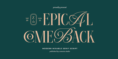 Introducing Epical Comeback Epical Comeback is a modern display font with serif with script style. It's modern and classic font with a unique and deference look . Perfect if you need a dose of fun in your project. Perfect for editorial projects, Logo design, web font, clothing branding, product packaging, magazine headers, or simply as a stylish text overlay to any background image.
 - Fenimore SRF by Stella Roberts Fonts,
$25.00 Fenimore SRF is a variation of Jeff Levine's Theater District JNL with added highlights, created especially by Jeff for Stella Roberts fonts. This Art Deco-influenced typeface typifies the streamlined style of 1930s era-influenced modernism and streamline. The net profits from my font sales help defer medical expenses for my siblings, who both suffer with Cystic Fibrosis and diabetes. Thank you.

