9,781 search results
(0.026 seconds)
- Bright Clones by Letterhend,
$17.00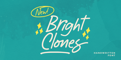 Introducing, Bright Clones! this handwritten font is perfect for branding, packaging, headline, title, etc. Features : uppercase & lowercase numbers and punctuation multilingual alternates and ligatures PUA encoded \We highly recommend using a program that supports OpenType features and Glyphs panels like many of Adobe apps and Corel Draw, so you can see and access all Glyph variations.
 - Jaggers by Victory Type,
$20.00Jaggers is a handwritten typeface based on the letterforms Caslon. It may be hard to see the resemblance between these two since Jaggers is such a unique font. Its casual appearance is charming and easy to read. Jaggers has an expanded character set including European letters and symbols! This font is definitely one of Victory"s best. - Aesthetic Notes by Letterhend,
$19.00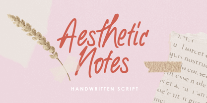 Introducing Aesthetic Notes! This font is perfect for branding, packaging, logotype, headline, wedding, invitation, quotes, etc. Features : uppercase & lowercase numbers and punctuation multilingual alternates and ligatures PUA encoded We highly recommend using a program that supports OpenType features and Glyphs panels like many of Adobe apps and Corel Draw, so you can see and access all Glyph variations.
 - Big Wave by Vozzy,
$10.00 Introducing a vintage look label font named Big Wave. This font have a lot of additional characters and multilingual support (you can see them at the screenshot) and including 7 styles - Regular, Full, Shadow, Texture, Shadow FX, Texture FX and Outline. This font will good viewed on any retro design like poster, t-shirt, label, logo etc.
 - Shaman by ITC,
$29.99 Shaman is the work of British designer Phill Grimshaw and you can almost hear the drums beating when you see it. It is a bold display typeface that features a unique, fractured effect and evokes a somehow primitive quality. Shaman is an all caps alphabet which comes complete with spot illustrations, graphic devices and a border system.
 - Nido by Latinotype,
$19.00 Nido is a cute and funny childish typeface, designed for logos, book titles, invitations, birthday cards, flyers, posters, advertising, etc. It comprises 5 styles: black, white, black italic, white italic and dingbats, which can be used nicely together. Nido is a new design by Sofía Mohr. See also Café Brasil http://www.myfonts.com/fonts/sofia-mohr/cafe-brasil/
 - Romantina Script by Jorsecreative,
$20.00 Romantina is Font Calligraphy Script, designed in modern style so that this font is beautiful and nice to see. very good to use for brand, t-shirts, packaging brand, greeting card, invitation card etc. The features of this font is: • STANDARD UPERCASE • STANDARD LOWERCASE • SWITH ALTERNATIVES UPERCASE • STYLISTIC ALTERNATIVES LOWERCASE • NITIAL & TERMINAL ALTERNATIVE • STANDARD LIGATURES • DISCRETIONARY LIGATUR
 - Vida Bandida by Vozzy,
$20.00 Introducing vintage label font named Vida Bandida. It is based on my other font, Black Widow. All available characters you can see at the screenshots. This font has six styles: Regular, Full, Shadow, Shadow FX, Texture and Texture FX. This font will look good on any vintsge styled designs like a poster, T-shirt, label, logo, etc.
 - Tacky Font by Ingrimayne Type,
$14.95 Four letters for this font came from a puzzle in a 1983 Games magazine. After seeing them, I could not resist the temptation to do a complete set of letters made from push pins or tacks, a truly tacky font. Most of the letters on the lower case keys are alternatives--choose the one works best for your purposes.
 - Nefertiti by JAB,
$12.00As you can see, Nefertiti is a font based on ancient Egyptian hieroglyphs and could be classified as a fun-font. I've always been really interested in Egyptology and a couple of years ago I thought it would be great to be able to write in hieroglyphs. I started to study them but soon realized it would take me a long time to be able to do this. Still, I was determined to find a way around this problem. At some point I came up with the idea of rearranging and reforming the hieroglyphs so as to resemble the English alphabet. During this process I tried as much as possible to preserve their ethos and appearance. However, since they are designed to write in English with, it's obvious that they are not always going to look like the real thing. Despite this, I'm really happy with the final result and I think many Pharaohphiles who just want to have some fun will be also. The only difference in this font between lower and upper case characters, is that the latter are set between two parallel, horizontal lines. These are for use with brackets (motif ends) to form cartouches - elongated ovals for names and/or titles. Try typing the following using the upper case in the sample text box. e.g. (JOHN} The zigzagged vertical lines at each end, separate the motifs from the hieroglyphs. Note the three types of ends/brackets. These lines are also used to separated words from one another and to give a more authentic appearance. So pressing the space bar gives a zigzagged line - not a space. They can also be used at any point within a cartouche to separate first and last names or titles. e.g. ; (JOHN;BROWN} walked straight home after work. Notice the eye glyph (period/full stop) at the end of the sentence. This is the only punctuation mark which can be used within a cartouche, e.g. after Mr. or to add a more Egyptian appearance to a name or title. e.g. (MR>;JOHN;BROWN} Parallel lines dividing hieroglyphical inscriptions and writing into rows or columns are very common. To incorporate these in a body of text, simple use the underline U. e.g. (OSIRUS) and {ISIS} were important gods of the ancient Egyptians. (HORUS) {HATHOR} and [RA],the sun god, were also highly revered deities. The punctuation marks available are shown below. . , " " ' ! ? "where is the king?" The font also includes the numbers 0-9, the following mathematical symbols and the hash sign(Scarab beetle). Once again, I've tried to make them look as Egyptian as possible; whether I've succeeded or not is open to debate. e.g. + - x / = # This font is named after Akhenaten's beautiful wife, Nefertiti, who's image can be seen in the graphic on this page. - TessieStandingBirds by Ingrimayne Type,
$13.95 A tessellation is a shape that can be used to completely fill the plane—simple examples are isosceles triangles, squares, and hexagons. Tessellation patterns are eye-catching and visually appealing, which is the reason that they have long been popular in a variety of decorative situations. These Tessie fonts have two family members, a solid style that must have different colors when used and an outline style. They can be used separately or they can be used in layers with the outline style on top of the solid style. For rows to align properly, leading must be the same as point size. Shapes that tessellate and also resemble real-world objects are often called Escher-like tessellations. This typeface contains Escher-like tessellations of birds. A number of years ago I decided to see how many of the 28 Heesch types of tessellations I could use to make birds standing on the backs of other birds. I found standing bird patterns for all 17 of the types that had either translated or glided edges. The TessieStandingBirds typefaces contain the standing-bird shapes that I discovered. At first glance they seem to be quite similar, but small differences matter in how they fit together. Most of the patterns require more than one character. The sample file here shows how pieces fit together to give tessellating patterns. (Earlier tessellation fonts from IngrimayneType, the TessieDingies fonts, lack a black or filled version so cannot do colored patterns.)
 - Fabiola by Lián Types,
$49.00 -Fabulous, beautiful, friendly, talkative, sweet, caring, a little on the odd side, very desirable by many, good at almost everything- That's the definition of Fabiola according to the slang dictionary of americans. If you were you looking for something delicious, a font that covers a really wide range of uses and always looks amazing, Fabiola should be your choice. Although it may look as another of my scripts with juicy swashes, this time I explored in depth the pairing and interaction with capital letters for more unique results. Why? We are going through some crazy days where the number of people interested in letters is only growing. We see lettering everywhere: I can say that finally our field is shouting out loud; letters are THE protagonist more than ever. Hence the need of combining and pairing different styles is booming. Fabiola Script and Fabiola Caps were done in a way that they seem to need each other. There's nothing better than the above images to prove this. But, how does it work? The big swashes of the Script style were designed so they can surround, wrap and mingle with the Caps styles. The smaller swashes are meant to be used when the Script is alone. Simple, right? I hope you find Fabiola useful on your projects and enjoy using it like I did when making the posters! Have a super fabulous day!
 - Ambroise Std by Typofonderie,
$59.00 An exquisite Didot font in 18 series Ambroise is a contemporary interpretation of various typefaces belonging to Didot’s late style, conceived circa 1830, including the original forms of g, y, &; and to a lesser extent, k. These unique glyphs are found in Gras Vibert, cut by Michel Vibert. Vibert was the appointed punchcutter of the Didot family during this period. It is the Heavy, whom sources were surest that Jean François Porchez has been used as the basis for the design of the typeface family. In the second half of the 19th century, it was usual to find fat Didots in several widths in the catalogs of French type foundries. These same typefaces continued to be offered until the demise of the big French foundries in the 1960s. Ambroise attempts to reproduce more of what we see printed on paper in the 19th century; a more accurate representation of Didot punches. So, the unbracketed serifs are not truly square straight-line forms but use tiny transitional curves instead. The result on the page appears softer and less straight, particularly in larger sizes. The illustrious Didot family of type founders and printers Every variation of the typeface carries a name in homage to a member of the illustrious Didot family of type founders and printers. The condensed variant is called Ambroise Firmin. The extra-condensed is called Ambroise François. Ambroise Pro brought back to life: fifteen years in the making! Club des directeurs artistiques, 48e palmarès Bukva:raz 2001
 - Aeonian by Adorae Types,
$40.00 Aeonian, designed by Emilia Adorno, was mostly inspired by the iconic morphology adopted by the arts of the 1920s. One hundred years later we can still see the resemblance between the wants and the needs of now and then to reach for the sky, to look ahead and enter the future in style. Now as then, we seek the right tools to do so, then once again, we embrace the rational, yet elegant and stylish forms of simplicity, geometry and symmetry. At the same time, there is a strong and growing need for a warmer approach to creating lovemarks. For that, Aeonian’s alternates hold attractive, soft and inviting shapes to an emotional appeal. Aeonian is a combination of all of them. A rational side entwined with an emotional one. Born a geometric sans, Aeonian ended up being a 2 in 1 font with a sans serif set and alternates reaching over 1200 glyphs. The entire family contains 6 weights, from thin to black, with its matching italics. It features a variety of ligatures to be used as connectors, specially for display. It also offers multilingual support, even for certain display ligatures. Later, Aeonian kept growing, with stylistic alternate sets of initial, mid and final glyphs. These are its arms to reach for infinity with a warm heart. The wide range of possibilities that Aeonian offers, makes it the best font for creating vast design systems with a rich visual language.
 - Caltic by Ingrimayne Type,
$12.95 Caltic-Holiday, Caltic-Festival, and Caltic-Straight are three eye-catching, very bold typefaces that are suitable for posters and signage. Caltic-Holiday and Caltic-Festival base letter shapes on trapezoids with curved sides but with curves that are reversed going from one to the other. Caltic-Straight has letters based on trapezoids with straight sides. None are suited for text and with their built-in spacing will not work as all upper-case or all lower-case. All three come in two widths, regular and wide, giving the Caltic family six members. Caltic has nothing to do with Celts. The Calt refers to the calt or contextual alternative OpenType feature that makes this typeface work. When the letters on the upper-case keys alternate with the letters on the lower-case keys, they fit snuggly together. As long as the user has a word processor that supports the contextual alternatives feature, there is no need for the user to alternate letters; the calt feature does it automatically. Although the fonts seem similar to hand-drawn lettering that was done on posters and signs during the hippie era of the 1960s and 1970s, I can find nothing quite like them. My inspiration for them is older, in a newspaper from 1932 that led to the typeface family PoultySign. Caltic (and Lentzers) are the result of seeing what else I could do with the inspiration that sprang from that 1932 newspaper.
 - Ubicada - Personal use only

- Noahs Ark by Vincenzo Crisafulli,
$29.00 Noah’s Ark was designed to combine it with the bestiary animal series I designed. A simple font, well harmonized with the highly synthesized designs of animals and insects. So, it seemed natural to use them for posters. Noah's Ark is a stylized font with a constant stroke, which stands between writing and the typeface. Its design is inspired by the fonts used in the 1940s. It is made up of linked letters, excluding numbers and other signs.
 - Tape Up by Ingrimayne Type,
$9.00 The letters in TapedUp are constructed from straight pieces of what could be masking tape. The letters have a unsophisticated or unpolished quality to them. The typeface is caps-only but many of the shapes on the lower-case keys differ from those on the upper-case keys. It was formed with a template used for several letterbat fonts and also typefaces Rumpled and Tinkerer. The family has six styles: regular, bold, shadowed, oblique. bold oblique, and shadowed oblique.
 - Neugrooms by Zamjump,
$17.00 Introducing "Neugrooms," a contemporary sans-serif display font that exudes a modern flair. Crafted for versatility, this font is ideal for a myriad of projects, including taglines, headlines, body text, logo design, and various other creative endeavors. Neugrooms combines sleek, clean lines with a touch of sophistication, making it the perfect choice for those seeking a stylish and impactful typography solution. Elevate your designs with the distinct and versatile aesthetic of Neugrooms, where modernity meets timeless elegance.
 - Grandfami by UlianaShabanova,
$10.00 Welcome to the new font! An elegant slim handwritten font created from childhood memory. This is how my grandfather wrote. He seemed very beautiful to me when he was little and I really wanted to write "when I grow up" too:) Perfect for captions in photo albums, on photos, birthday invitations, calendars, magazines, Instagram posts and more! A vector font is composed of uppercase and lowercase letters. Feel free to email me shabanovasprt@gmail.com if you have any questions. :)
 - The Shensie by Soft Creative,
$20.00 Introducing The Shensie. The Shensie Font, is a classic thin font with an italic style. Here you will get beautiful classic fonts. this font is available in several modern swirls that can make your work look elegant, sweet and perfect. With this style, this font would be perfect for logos, branding projects, household designs utensils, product packaging, mugs, quotes, posters, shopping bags, logo, t-shirt, book cover, business card, invitation card, greeting cards, and all your other beautiful projects.
 - Ye Olde Block NF by Nick's Fonts,
$10.00Lewis F. Day, in his book Alphabets Old and New, offered this typeface as an example from sixteenth-century England of lettering incised in wood. The font is essentially monocase, but there several lowercase letters are alternate letterforms. Please note that, due to the ornate nature of the letterforms, this font does not contain math operators, fractions or superior numbers. Both versions of the font include 1252 Latin and 1250 CE (with localization for Romanian and Moldovan) character sets. - Moret by The Northern Block,
$49.50 Moret is a serif display type family inspired by 20th century European sign painting. It blends several calligraphic concepts to create a unique, dynamic and emphatic typeface. Available in 5 weights and 2 styles (upright and oblique), Moret is well equipped to provide clear solutions for a variety of situations and settings such as editorials and headlines. With 466 glyphs per font, Moret supports 94 different languages. Opentype features include inferiors, superiors, fractions, tabular figures, and ligatures.
 - TD Balak by Tribox Design,
$10.00 Team Tribox Design created the font to improve the old font print of Doctrina Christiana. Each letter is designed for better readability even in small sizes, particularly for books, and is designed for poets, writers, and anyone who needs a font used in publishing. The font is personally designed and is intended for use by publishers and those seeking publication. Regine Ylaya: Art Director, Research Inu Catapusan: Font/Typeface Designer, Creative Director, Copywriter Faye Penetrante: Copy Editor
 - Mothman by Hanoded,
$15.00 In 1966 and 1967 a series of weird events spooked Point Pleasant, a small town in West Virginia. Townspeople described a creature that looked like a man, with red eyes and moth-like wings, which appeared at several locations around town. The Mothman myth was born. Mothman font is spooky as well. It is a very scratched and distorted typeface, completely hand drawn, using ink and various sharp utensils. Mothman font will surely leave a lasting impression!
 - Grandpas Typewriter by Misprinted Type,
$20.00 Granpa’s typewriter comes from an antique Olivetti Typewriter Machine I have. This font has all of the effects a typewriter machine can offer you: a regular version, a strong hit version, a light distressed version, a double-hit version and X version, which is a compilation of several typewriter mistakes, tests and stains. This font is specially handy when trying to use a typewriter effect on an edgy/grunge work, where there's no worry about perfection!
 - Graphic Stylin NF by Nick's Fonts,
$10.00The letterforms are based on Inserat Cursive, a bold script popular in the late nineteenth century; the treatment was suggested by cover artwork for Graphic Styles from Victorian to Post-Modern, written by Stephen Heller and designed by Seymour Chwast. Included in the font are several handy ink blots (section mark and superior numbers positions), a stylish tailpiece (florin position), and a couple of ink bottles patterned after those on the bookcover (bar and broken bar). - MGN Goddess by Morgana Studio,
$17.50 MGN Goddess is a serif typeface released in 2022. The liquified lines in several characters of Goddes create an exquisite, unworldly touch. To magnify its beauty, the typeface has a dissolving lobe and tapering spurs that stand out among the others. The overall feminine and exclusive impressions of the font delivers are closely related to Parisian nuances. Therefore, this magical typeface is suitable for use for posters, logos, and headlines, especially for fashion and beauty products.
 - Mancave SRF by Stella Roberts Fonts,
$25.00 Mancave SRF is the perfect font for the ultimate party Neanderthal. Holding court in his den with a case of beer, wide screen TV and all of his sports buddies, he is safe and secure in his lair. Bold, brash and angular, this typeface was designed for Stella Roberts fonts by Jeff Levine. The net profits from my font sales help defer medical expenses for my siblings, who both suffer with Cystic Fibrosis and diabetes. Thank you.
 - Kutaraja by BaronWNM,
$14.00 Kutaraja is a hand-drawn script font that gives a natural-looking impression that is perfect for those of you who want to use script-style fonts, very suitable for writing product labels, printing t-shirts, greeting cards, invitation cards, etc. Kutaraja family has 2 choice models, namely regular and italic. both have several ligatures, alternate, swash at the beginning and end of lowercase letters to give a sweet touch to the written word or sentence.
 - Sysmatic by Maulana Creative,
$15.00 Sysmatic is a suer condensed display sans font. With medium low contrast stroke, fun character with a bit of ligatures and alternates. To give you an extra creative work. Sysmatic font support multilingual more than 100+ language. This font is good for logo design, Social media, Movie Titles, Books Titles, a short text even a long text letter and good for your secondary text font with sans or serif. Make a stunning work with Sysmatic font. Cheers, Maulana Creative
 - Berrylina by Amarlettering,
$20.00 Berrylina Script come with 320+ glyphs. The alternative characters were divided into several OpenType features such as Swash, Stylistic Sets, Stylistic Alternates, Contextual Alternates. The OpenType features can be accessed by using Open Type savvy programs such as Adobe Illustrator, Adobe InDesign, Adobe Photoshop Corel Draw X version, And Microsoft Word. And this Font has given PUA unicode (specially coded fonts) so that all the alternate characters can easily be accessed in full by a craftsman or designer.
 - Hello Melodi by IRF Lab Studio,
$10.00 Hi, Introducing the latest styles Hello melodi Script with the kind of modern hand scratches, I hope you are interested in this font, if you want to use for your work this font can be used easily and simply because there are a lot of features in it to contain a complete set of letters lower and uppercase letters, assorted punctuation, numbers, and multilingual support. font also contains several ligatures and alternate style Stylistic. Thank You.
 - Freehand 471 by ParaType,
$30.00 Freehand 471 is the Bitstream version of Cascade Script by Matthew Carter. Released by Mergenthaler Linotype in 1965, this design is based on an earlier type by the Ludlow foundry. It's a dark, disconnected script with angular forms. It seems written by heavy marker and thus suitable for informal posters and signage and for advertising and display typography as well. Central European, Cyrillic, and Greek Monotonic characters were designed by Oleg Karpinsky. Released by ParaType in 2011.
 - Aliykit Open by John Moore Type Foundry,
$35.00 Aliykit Open a decorative OpenType font generated from geometry with parallel lines of open and closed forms, by the way they can fit inside the Art Deco style but is part of the design influence of Venezuela in the area of art and cinetic art, his set of characters includes letters for western and eastern European languages and Cyrillic, also provides several ligatures that link between them. It is ideal for decorative display headlines to large sizes.
 - Ashford by Fenotype,
$20.00 Ashford is a bold serif type and its matching Italic. Ashford packs plenty of timeless charm and elegance. As a display style it works best in headlines, posters and as a logotype. Ashford conveys a message of style and inner knowledge. Ashford is equipped with several OpenType features: Keep Standard Ligatures and Contextual Alternates on to prevent certain characters from colliding and spice up with Swash, Stylistic or Titling Alternates. Both styles come with more than 50 alternate characters.
 - Catalina Shiba by Suza Studio,
$13.00 Catalina Shiba with alternative characters is divided into several Open Type features such as Swash, Stylistic Sets, Stylistic Alternate, Contextual Alternate. The Open Type feature can be accessed using Open Type savvy programs such as Adobe Illustrator, Adobe InDesign, Adobe Photoshop version of Corel Draw X, and Microsoft Word. And this Font has provided PUA unicode (custom coded font). so that all alternative characters can be easily accessed in full by a craftsman or designer. Thank You.
 - Portland Grotesk by QUADRAAT,
$35.00 Portland Grotesk is a grotesque sans serif typeface with chubby proportions in 5 weights Light - Regular - Medium - SemiBold - Bold and supports all latin languages. Easy to use and easy to read. The character set contains 1109 glyphs with a wide range of alternates characters and includes: - Small Capitals - Fractions - Superiors, denominators - Open type features such as case sensitive, standard ligatures and several stylistics sets Portland Grotesk fits perfectly for all types of communication (Books, magazines, posters)
 - Bitthai Script by Amarlettering,
$15.00 Bitthai Script come with 530+ glyphs. The alternative characters were divided into several OpenType features such as Swash, Stylistic Sets, Stylistic Alternates, Contextual Alternates. The OpenType features can be accessed by using Open Type savvy programs such as Adobe Illustrator, Adobe InDesign, Adobe Photoshop Corel Draw X version, and Microsoft Word. This Font has given PUA unicode (specially coded fonts) so that all the alternate characters can easily be accessed in full by a craftsman or designer
 - HU Flatwhite KR by Heummdesign,
$25.00 This is a headline typeface for titles with a retro sensibility. The concave first projection of the vowel and the dot shape further add to the retro feel. It is characterized by the dot shape seen in the initial consonants and the thin ending strokes of 'ㄱ', 'ㅅ', and 'ㅈ' to create a flowing curve. Although it is a full module, the inner space created by the large contrast of strokes gives a cool feeling. This font contains KOREAN
