10,000 search results
(0.015 seconds)
- Scrungy Picnic by Bogstav,
$17.00 Scrungy Picnic is my handpainted all-purpose typeface with a fresh and legible feeling to it. With all-purpose, I feel that the shapes and organic feeling of each letter, suits designs such as a headline, massive text, toys for kids, candy, posters, invitations, signs...well, the list goes on and on! I've added 4 different versions of each letter, and they automatically cycle as you type - or you can pick the individual letters from the glyph menu!
 - Warheim by Ironbird Creative,
$15.00 Warheim is a organic display typeface with handdrawn feel. Comes with regular, stamp, spurs and spurs stamp styles. This typefaces is perfect for people looking for vintage aesthetic and organic feel. Suitable for any graphic designs such as branding materials, t-shirt, print, logo, poster, t-shirt, quotes .etc We hope you enjoy the font, please feel free to comment if you have any thoughts or feedback. Thanks for purchasing and have fun! Regards, Ironbird Creative
 - Road Stencil by Wundes,
$15.00Road Stencil is a font based on painted street markings. The letters are stretched roughly six times their normal height so that when viewed from an angle, the text is seen as proportional. If you're looking to Photoshop a street scene, this is your font. This is an all caps font, but the letters were copied to lower-case for convenience. In these forms, I've preferred to use horizontal and diagonal dividers instead of verticals which can weaken the fonts readability. This font embodies a pleasant aesthetic while maintaining a coherent and believable feel. Check out the 'Rough' version of this font, which has more of a 'drawn on asphalt' look. The rough version's lower case letters have eroded alternates. - Marker Note by IbraCreative,
$17.00Marker Note is a playful and vibrant marker font that brings a sense of fun and spontaneity to any design. Inspired by the cheerful strokes of a marker pen, Marker Note captures the essence of handwritten notes with its bold and slightly irregular letterforms. The ink-like texture and uneven lines give the font a whimsical and handcrafted feel, making it perfect for projects that need a touch of informality and creativity. Whether used for greeting cards, posters, or social media graphics, Marker Note adds a lively and energetic vibe, instantly drawing attention and creating a sense of joy. With its expressive and friendly style, Marker Note is a delightful choice for those seeking a font that exudes a carefree and casual charm. - Bellatrice Natural by IbraCreative,
$17.00 Bellatrice Natural is a captivating natural signature font that effortlessly combines elegance with a touch of organic charm. Its fluid strokes emulate the graceful movements of handwritten script, lending a personalized and authentic feel to any design. The gentle curves and slightly irregular lines of Bellatrice evoke the warmth and individuality of a handcrafted signature, making it an ideal choice for projects that seek a distinctive and human touch. The font’s natural flow and intricate details create a harmonious balance, resulting in a timeless and sophisticated signature style that can elevate a variety of creative endeavors, from invitations and branding to personal correspondence. Bellatrice is a testament to the artistry of a well-crafted signature font, capturing the essence of natural handwriting with grace and finesse.
 - Xmas Knitted by Beast Designer,
$15.99 Imagine a font that embodies the cozy warmth of a holiday sweater. The Xmas Knitted Font is a whimsical creation that brings to life the spirit of the season with each letter. Crafted meticulously, it mimics the intricate weave of yarn, evoking the charm of hand-knitted patterns. Each character is adorned with festive elements like snowflakes, holly leaves, or reindeer motifs, creating a delightful tapestry of holiday cheer. The font exudes a nostalgic, homemade feel, reminiscent of cherished moments by the fireplace, sipping cocoa, and sharing stories during the festive season. Its playful yet comforting design makes it perfect for adding a touch of seasonal magic to invitations, greeting cards, or any project seeking a dash of Christmas spirit.
 - Multipolar by MYSTERIAN,
$9.00 This typeface was designed as the house style by and for design studio Mysterian. It was drafted and completed during most of 2020. The intention of the design of the forms was to develop a unique signification in the mind, but one that could have potential relevant associations such as with sci-fi. The solution, brought along with a fascination with this rarely seen pattern in type, was to taper round forms. The name 'Multipolar' was inspired by the term used by game theorist Daniel Schmachtenberger, which is a kind of event that seemed relevant to the Covid-period in which the font was made. Alternate characters include: Two Ampersands Upper and Lowercase PI Upper and Lowercase Eszett Latin Characters
 - Vary by Monotype,
$50.99 Vary by Olli Meier is a geometric sans serif typeface inspired by Bulgarian Cyrillic. Vary is fun and adaptable and was built with three feelings (variations): classic, modern, and loopy, offering an opportunity for designers to be playful in their creations. The inspiration in Bulgarian Cyrillic is seen mostly in the character “g,” which was inspired by a very uncommon handwritten “?” spotted by the designer in a shop window in Sofia, Bulgaria. When he flipped this design in 180°, the Latin character ‘g’ was born for Vary Another example is the “R” in the modern stylistic set, which was inspired by the handwritten Cyrillic character “?”. Vary is available as a variable font and also comes with 10 preset instances from Hairline to ExtraBlack.
 - Farmer's Marker by Citrus Branding,
$3.99 Farmer's Marker is an ode to the hobby-farmer and their honest and hardworking (but not too serious) lifestyle. The font reflects a vision of a farmer who quickly scrawls down her produce (72 Eggs + 20L of Milk + 2kg Honey) before she heads off to the market to do her best to sell what she has farmed. It is a casual, freehand, marker script that doesn't take itself too seriously. It is hand drawn by me, then meticulously perfected in Illustrator while leaving in just enough small imperfections that the font retains it's humanistic, hand-drawn and personal feel. The font will lend itself perfectly to rustic restaurant menu's, organic branding and packaging, social media content, child-centric design, travel posters, humanitarian organisations and much more.
 - Slash Roller by Colllab Studio,
$19.00 "Hi there, thank you for passing by. Colllab Studio is here. We crafted best collection of typefaces in a variety of styles to keep you covered for any project that comes your way! Introducing, Slash Roller, it marks a new era in graffiti font. The slashing zig zag tape gives it an authentic DIY feel. The slashed tape is prominent but not overdone, adding an interesting layer to the blocky rough letters. Slash Roller is an attempt to create a lettering style that seems like it was made with a spray can and a brush, but keeps the appearance of a slightly imperfect and distorted typeface. It looks like the work of a vandal, but the slashed typography is actually intentional. A Million Thanks Colllab Studio www.colllabstudio.com
 - Good Castyll by Twinletter,
$15.00 Good Castyll is our newest display font, and it has a laid-back, unique feel to it. It was created with a genuine hand touch, so it seems natural when viewed. This font is ideal for adding a touch of class to your creative work. Start creating fantastic projects with this font, and you’ll notice a distinct difference in the way it’s used. This font is perfect for games, sporting events, branding, banners, posters, movie titles, book titles, quotes, logotypes, and more. of course, your various design projects will be perfect and extraordinary if you use this font because this font is equipped with a complimentary font family, both for titles and subtitles and sentence text, start using our fonts for your amazing projects.
 - Metteora by Haksen,
$12.00 "Metteora" is a hand lettered font style that is perfect for greeting cards, branding, stationery design, social media, packaging, magazine layouts, prints, logos and more! This unique font features complete lowercase alphabets and uppercase alphabets along with a few other ligatures and stylistic alternates to create a truly handwritten look and feel. "Metteora" has a variety of unique, coded features to create compelling, handmade outcomes. Multilingual support is included for Western European languages. OTF is included for the full, "Metteora" font. This is the personal license font that can be used for all personal needs. If you want to use this font on items you are going to sell or on anything promoting your business, please purchase the extended license version. Thanks, Haksen
 - Rotulo Variable by Huy!Fonts,
$195.00 Rotulo Variable is a contrasted sans family which combines the Thick & Thin signpainter's style and some 70s feeling in a huge font family with three axis: Width, Weight and Slant. A visit to an exhibition of Spanish movie posters by Jano was the beginning of Rótulo (Spanish for Sign) project. Classic thick & thin signpainter style was featured in many letterings of those posters, as it was a very common style in 60s and 70s Spanish design. Unfortunately, today very few Contrasted Sans are seen, something that was quite common years ago has fallen into disuse in favor of Helvetic monotony. Rótulo recapture all that personality, with an extense range of weights and widths to be used in striking headlines and short texts.
 - Mateo Unique by IbraCreative,
$14.37 Mateo is an extraordinary and unique handwritten typeface that stands out with its captivating originality. With letters that seem like hand-drawn works of art, each character in Mateo carries a distinct personality, exuding a sense of authenticity and creativity. The charmingly irregular lines and artistic flourishes lend this typeface an artistic and handcrafted feel, making it a perfect choice for projects that require a touch of individuality and unconventional style. Mateo’s versatility is showcased in its ability to seamlessly adapt to diverse design contexts, whether used for eye-catching logos, expressive quotes, or artistic illustrations. With its one-of-a-kind appearance, Mateo transcends traditional typefaces, inviting viewers to explore the world of handwritten artistry in every stroke and curve
 - Maebashi by CBRTEXT Studio,
$20.00 Maebashi is a display font in Japanese style. This font comes with a Japanese feel and you can feel it every time you use this font. It's the perfect font for multipurpose projects like logos, branding, posters, headlines, and more (especially for Asian-themed projects).
 - Redmayne by Rillatype,
$15.00 Introducing, my latest font Redmayne! Redmayne is a display font with bold and strong feels that will bring big and strong feel to your design and make your design pop eyecatching even more! Redmayne is perfect for branding, packaging, logo design, headline, and many more.
 - Qosydu by Twinletter,
$15.00 Create an elegant and exotic feel with our Arabic-style font, Qosydu. Bold fonts and extended spacing give your designs a middle eastern feel, make all your projects elegant with this font. Qosydu is the perfect choice for Arabic-themed packaging, advertising, or invitations.
 - Ballistic by Rillatype,
$15.00 Introducing, Ballistic handwritten brush. Ballistic is a font made using handwritten brush to approach the feeling of natural handwriting and have strong feeling because of its bold characteristics. This font is perfect for branding, packaging, headline, title, logo, etc. Ballistic also comes with multilingual support.
 - Galvantur by Ivangard Studios,
$12.00 Galvantur is a sans serif font, suitable for a wide range of applications. The main characteristic of this font is the slightly alien feel it can invoke, allowing it to really appear different and stand out, comparative to what other sans serifs may look like. The multiple styles included can further help customize your designs and projects, whether it's a body of text or an attention grabbing title. For example switching a block of text from regular style to oblique, can drastically change the overall appearance and feel of said text. Comes in 7 different styles - Regular, Oblique, Bold, Bold Oblique, Outlines, Bold Outlines and Oblique Outlines. To get an idea of the various styles, please check out the preview pictures or use the preview field to type in text. A full list of the glyphs included in this font can also be seen in the preview images. Galvantur supports Latin and Cyrillic based languages. The font includes a single alternative character for the letter "h". Because of the lack of ligatures and alternates, the font is rather standardized and will work with any and all software/applications.
 - Rapsed Vintage by Craft Supply Co,
$20.00 Introduction to Rapsed Vintage – Stamp Font Rapsed – Vintage Font is a unique serif font, embodying a retro and vintage feel. It features a grunge, stamped, rough appearance, ideal for nostalgic designs. This font captures the essence of a bygone era, making it perfect for projects seeking a classic display. Design and Texture Rapsed’s design boasts large, prominent serifs, giving it a bold and distinct look. Its textured, rough edges simulate a stamped effect, adding an authentic vintage character. This grunge aesthetic is not only eye-catching but also adds depth to the font, enhancing its retro appeal. Versatility in Use Rapsed is versatile for various design applications, from branding to poster creation. Its vintage style is perfect for thematic restaurants, event flyers, and historical projects. Additionally, its distinct appearance makes it suitable for book covers and merchandise that require a touch of nostalgia. Accessibility and Appeal Designed to be user-friendly, Rapsed appeals to a wide range of audiences. Its simplicity in design ensures readability, while its unique character captures interest. This font is a valuable asset for designers aiming to infuse a vintage feel in their work, bridging the gap between past and present design trends.
 - Hastings by MKGD,
$13.00 Hastings was inspired by my appreciation for old fashioned English murder mysteries set in the early part of the twentieth century. No one seems to capture the ambience of the roaring twenties or thirties better than the Brits. Everything from the clothing, to the cars, to the telephones, down to the smallest accessories like the pens, all seem to have been appropriated from the local museum. I'm hopeful that this typeface also embodies similar feelings with its sleek and streamlined Art Deco features. Hastings has a glyph count of 389 and supports the following languages; Afrikaans, Albanian, Asu, Basque, Bemba, Bena, Bosnian, Catalan, Chiga, Colognian, Cornish, Croatian, Czech, Danish, Embu, English, Esperanto, Estonian, Faroese, Filipino, Finnish, French, Friulian, Galician, German, Gusii, Hungarian, Icelandic, Indonesian, Irish, Italian, Kabuverdianu, Kalaallisut, Kalenjin, Kamba, Kikuyu, Kinyarwanda, Latvian, Lithuanian, Low German, Lower Sorbian, Luo, Luxembourgish, Luyia, Machame, Makhuwa-Meetto, Makonde, Malagasy, Malay, Maltese, Manx, Meru, Morisyen, North Ndebele, Norwegian Bokmål, Norwegian Nynorsk, Nyankole, Oromo, Polish, Portuguese, Romanian, Romansh, Rombo, Rundi, Rwa, Samburu, Sango, Sangu, Scottish Gaelic, Sena, Shambala, Shona, Slovak, Slovenian, Soga, Somali, Spanish, Swahili, Swedish, Swiss German, Taita, Teso, Turkmen, Upper Sorbian, Vunjo, Walser, Zulu
 - Dear Sarah Pro by Betatype,
$119.00 Carefully considered letters written long-hand, sealed in an envelope and sent across continents were once the only connection for distant friends and lovers. Dear Sarah is a type that evokes the emotion of those handwritten messages. Using alternates, ligatures and a complex system for randomization and natural connected characters, Dear Sarah seeks to push the boundaries of digital type. The guiding question that drove the design of Dear Sarah was whether it was possible to create a natural looking script that worked well in running text. Hand-written types often work for two or three words, but as soon you you look at them in a paragraph, their unnatural textures make them feel contrived. As one of the first serious types to explore OpenType for a connected script, Dear Sarah uses a unique system to create natural connections. Often script types rely on one connecting point to make sure that all their characters fit together properly. Characters that naturally connect much higher, such as the ‘o’ or ‘v’ are distorted to connect at the same point as an ‘a’ or a ‘c’. Dear Sarah uses multiple sets of lower-case characters to connect at multiple points, creating a much more natural looking script. OpenType is also used to create variety, by using randomization techniques to insert disconnected characters as well as alternates, ligatures, swashes and ink blots to create a natural rhythm across multiple lines.
 - Rounded Keys by Funk King,
$5.00 Rounded Keys is a type font with a smooth, modern feel.
 - Kruede by Gerald Gallo,
$20.00 Kruede is a sans serif family with an artsy informal feel.
 - Charmelade by Bogstav,
$17.00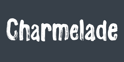 Another handmade brush font with that lovely green and organic feeling! :)
 - Black Magick Symbols by Deniart Systems,
$15.00 Contains 36 magical seals based on the Lemegeton of King Solomon
 - Junktoy by PizzaDude.dk,
$20.00Quickly scribbled grafitti font that has got that bad-boy-feeling! - Pleasure by ITC,
$29.99Pleasure is the work of German designer Holger Seeling, a condensed open sans serif typeface featuring a shadow behind each character. Its geometric forms are flexible and best used closely spaced. Pleasure reflects no particular time or setting and is therefore ideal for a wide variety of headline applications. - Paulo by Ron Nevers,
$20.00 Paulo is a versatile display font with a modern take on the classic split bifurcated design. The clean, sleek look lends itself to logos and headlines. Created to feel familiar and new simultaneously, Paulo has a versatility that can invigorate your traditional designs with a fresh spin, giving them a timeless and modern feel. Its vertical nature and clean, swooshy serifs, create a rhythm that helps draw the eye. Paulo suits various design styles, from urban to an upscale look and feel.
 - Rothe by Konstantine Studio,
$10.00 ROTHE, A luxury vintage lettering style fonts. Inspired by the branding from the vintage classic era with the full decorative feels and complex design but still get the luxury feels right away. Armed with some swash letters to expand the style like the old lettering way.
 - Rough Notes by Ana's Fonts,
$12.00 Rough Notes is a cute handwritten font with 550+ characters, including a set of small caps and tons of ligatures, for a smoother and more authentic handwritten feel. Use it in any design that needs a handwritten feel, such as signatures, notes and quotes, logos and branding.
 - Powers Of Marduk by Deniart Systems,
$15.00Based on the seals of the Fifty Names to summon the Elders. - Classi MF by Masterfont,
$59.00 High contrast serif font, so elegant, keeping the ethnic look and feel.
 - Jolly Polly by RMU,
$35.00 Jolly Polly - just to bring in a little sunshine and spring feelings.
 - Mabsut MF by Masterfont,
$59.00 Feel naughty, childish and happy - here is the perfect font for you.
 - Dexy by Zang-O-Fonts,
$25.00Dexy is an interesting font that seems reminiscent of car model brandings. - LD Castle Distressed by Illustration Ink,
$3.00LD Castle Distressed is a antique style font with a fairytale feel. - Wire Type Mono by Thomas Käding,
$9.00 A monospaced typeface meant to look and feel like an old typewriter.
 - Carrig by Monotype,
$25.99 IMPORTANT – Please consider the superior Carrig Pro before making a purchase decision. Carrig started its life in 1998. I was working for a design agency in Cork, Ireland and was given a new brand identity project for a lakeside hotel in County Kerry. While visiting the hotel I made various sketches of the surroundings and upon returning to the studio, it was clear that my strongest ideas for the identity would be based on these freehand drawings. I wanted a classic, rough, hand-drawn typeface to complement this style but at that time, the studio didn’t have anything suitable, so I decided to draw my own. I found a Trajan-esque typeface that I really liked the look of in an old calligraphy workbook. I set about drawing my own version and then digitised it. Once the client had seen and approved my design, I began working on creating a complete all caps typeface to use for the hotel’s stationery. With ‘carrig’ being the Gaelic word for ‘rock’, my new typeface was all the more appropriate as it had the appearance of letterforms that had been carved into stone and weathered by time. With the project completed and the client happy, Carrig then sat in my unused fonts folder for several years... but there was always a nagging feeling at the back of my mind that I should do something more with it. So, in the autumn of 2014, I finally set about doing just that and created the font family you now find at MyFonts. Carrig’s form and structure was influenced by a hybrid of Classic Roman and Garalde typeface designs. The original calligraphic elements from the 1998 version of Carrig have been retained to add personality—as can be seen in the serifs, strokes, spurs, terminals and open bowls. Perhaps its most distinctive trait is a high x-height combined with relatively short ascenders. I wanted Carrig to immediately resonate with the reader and have designed it to be familiar and friendly. I imagine designers might choose Carrig as an alternative to such typefaces as Trajan, Garamond and Baskerville. I see Carrig as primarily a display typeface for titles/headlines in printed materials. I would also love to see it being used for branding, packaging and promotional material and am keen to hear from designers who use it in their own work.
 - Aspen by Ludwig Type,
$39.00 Aspen is a refreshing and resilient typeface for text of any kind. Functional but not faceless, Aspen derives a very distinctive character from an unusual pedigree. It is loosely influenced by early American and European grotesques, but with more warmth and improved legibility. And where these historical models were rigid and bulky, Aspen’s curves have a gentle sway that makes for very comfortable reading. Relatively generous ascenders and descenders allow the typeface to feel spacious even when set with tight leading. These amiable qualities are matched with a lively italic based on cursive writing. The family consists of nine weights, and is intended for both text and display usage. Visit this minisite to see Aspen in action.