10,000 search results
(0.044 seconds)
- Parisine Office Std by Typofonderie,
$59.00 Humanistic sanserif in 4 fonts The Parisine Office typeface family can be considered as the text version of the Parisine. When Parisine xheight fit Helvetica large xheight, Parisine Office is more close to Gill Sans in term of proportion, as it was developed for Ratp, the public transport in Paris to allow compatibility with documents set in Gill Sans without changing the length of text. Parisine Office by default is a humanistic sanserif available in 4 fonts perfect for text setting. The design of the italic lowercases is more cursive than in Parisine. About Parisine Parisine helps Parisians catch the right bus Observateur du design star of 2007
 - Pirates Gold Pro by CheapProFonts,
$10.00 This stylish swashbuckling typeface had a very limited character set, but with the CheapProFonts treatment this buried treasure is ready to be rediscovered. Character map included. "Arrr! Shiver me timbers!" ALL fonts from CheapProFonts have very extensive language support: They contain some unusual diacritic letters (some of which are contained in the Latin Extended-B Unicode block) supporting: Cornish, Filipino (Tagalog), Guarani, Luxembourgian, Malagasy, Romanian, Ulithian and Welsh. They also contain all glyphs in the Latin Extended-A Unicode block (which among others cover the Central European and Baltic areas) supporting: Afrikaans, Belarusian (Lacinka), Bosnian, Catalan, Chichewa, Croatian, Czech, Dutch, Esperanto, Greenlandic, Hungarian, Kashubian, Kurdish (Kurmanji), Latvian, Lithuanian, Maltese, Maori, Polish, Saami (Inari), Saami (North), Serbian (latin), Slovak(ian), Slovene, Sorbian (Lower), Sorbian (Upper), Turkish and Turkmen. And they of course contain all the usual "western" glyphs supporting: Albanian, Basque, Breton, Chamorro, Danish, Estonian, Faroese, Finnish, French, Frisian, Galican, German, Icelandic, Indonesian, Irish (Gaelic), Italian, Northern Sotho, Norwegian, Occitan, Portuguese, Rhaeto-Romance, Sami (Lule), Sami (South), Scots (Gaelic), Spanish, Swedish, Tswana, Walloon and Yapese.
 - Lillie by Fikryal,
$18.00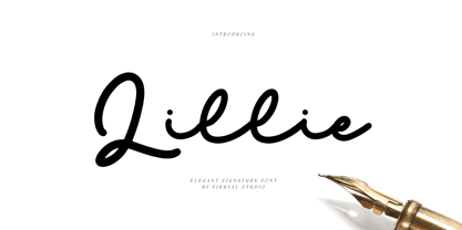 Lillie is an elegant signature font perfect for crafting, branding, invitation, stationery, wedding designs, social media posts, advertisements, product packaging, product designs, label, photography, watermark, special events, or anything. Included : Lillie multilingual support If you have any questions please don’t hesitate to contact me Thank you best regards, Fikryal Studio
 - Mere by Josh Grzybowski,
$19.99 Loosely based on a Jan Tschichold specimen, Mere is a clean geometric sans-serif with simple lines that are best viewed as larger print but still have an impact at smaller point sizes. In addition to ligatures and fractions, Mere’s other OpenType features include old style numbers and small caps.
 - Checkout by Hanoded,
$15.00 Checkout is a fat, slightly cursive, poster font. It was modeled after 'clearance sale' signs and a 1950 Mexican movie poster for Los Olvidados (directed by Luis Buñuel). Checkout can be used for headlines, posters and, of course, for your clearance sale! Comes with a hard-to-beat amount of diacritics.
 - Nexhope by Niznaztype,
$10.00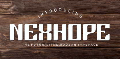 Nexhope is a modern typeface for postmodern and futuristic design. Nexhope inspired from level of needs a posmodern font is high. Nexhope is best for a variety of graphic projects, such as brochures, flyers, posters, lettering, t-shirts, editorial, postmodern design, headline, web design, minimalist design, branding, advertising and more.
 - Qundart by Tanya Savchenko,
$12.00 Qundart – simple handwritten font. Can be used in postcards, greetings, promotional banners. The font is cute and lightweight. Composition: Latin and Cyrillic (full set of symbols of the Ukrainian alphabet).
 - Latino Elongated by ITC,
$29.00Latino is the work of British designer David Quay, an unusual, condensed, wedge-serif roman typeface. The characters can be set normally or widely spaced. Latino exudes grace and elegance. - Evoque Text by Monotype,
$40.00 Evoque Text is a humanist serif type family specifically designed for a comfortable reading experience. This has been achieved by optically adjusting the regular weights from my original Evoque family (released November 2021). You will notice a significantly reduced x-height and longer ascenders and descenders, complemented by adjustments to weight and spacing. This makes Evoque Text a perfect choice for any long passages of text. All OpenType features have been retained from Evoque. A plethora of swash alternates and discretionary ligatures enhance Evoque Text, giving you the opportunity to embellish your typography. Simply activate Stylistic Sets to start adding these flourishes to your text. Other useful features include Small Caps at the click of a button, and Old Style Figures are an option to the default proportional figure style. There are 14 fonts altogether over 7 weights in roman and italic, you can also avail of two variable fonts which allow you to fine tune the weight to your exact liking. Evoque Text has an extensive character set (900+ glyphs) that covers every Latin European language. Key features: 7 weights in both roman and italic 80 Alternates 26 Ligatures Small Caps Variable fonts included with full family Full European character set (Latin only) 900+ glyphs per font.
 - Sodra by Harvester Type,
$20.00 Sodra is a wide-accented antiqua with sharp serifs and hints of futuristic forms. This typeface emerged from a passage in the Manifesto del Futurismo by Filippo Tommaso Marinetti. One short word was the inspiration and the guidance for the creation of this font. An attempt to create something unique and distinctive, an attempt to add a bit of futurism to something historical. The special aesthetics and expressiveness the type conveys will make you look closely at each letter and draw attention to your design. The font has been in development for a long time and painstaking work has been done on it. Large language support, about 470 characters and almost 4,000 kerning pairs. Hinting and testing the font itself in business and in a wide variety of applications. The uses of the type are very wide. Whether it's a branding, logo, identity or merch, a headline or product design. The nature of typeface is not limited to something rough and gloomy, on the contrary, it all depends on how you look at it. I've shown you my point of view, you in turn will see yours!
 - Thawilak Slab by Jipatype,
$27.00 ขอแนะนำ "Tawilack Slab" ฟอนต์ serif แบบ slab ที่แสดงถึงความแข็งแกร่งและความมั่นคง ทวีลักษณ์ สลับ มีรูปทรงกว้าง แข็งแรงและมั่นคง คอนทราสต์ต่ำทำให้เกิดความกลมกลืนระหว่างเส้นหนาและเส้นบาง ทำให้ได้แบบอักษรที่สวยงามและอ่านง่าย ด้วยรูปลักษณ์ที่โดดเด่น ทวีลักษณ์ สลับ จึงสมบูรณ์แบบสำหรับโปรเจ็คที่ต้องการความชัดเจนและมั่นใจ ไม่ว่าจะใช้พาดหัว หรือสร้างแบรนด์ Thawilack Slab ก็สร้างความประทับใจได้ไม่รู้ลืมด้วยรูปลักษณ์ที่แข็งแกร่งและมั่นคงดึงดูดความสนใจ แบบอักษรนี้เป็นตัวเลือกอเนกประสงค์ที่สามารถปรับเข้ากับบริบทการออกแบบต่างๆ ได้อย่างลงตัว ทำให้เป็นคู่หูที่ยอดเยี่ยมสำหรับทั้งสิ่งพิมพ์และสื่อดิจิทัล - Introducing "Thawilack Slab," a captivating slab serif font that exudes strength and stability. Thawilack Slab boasts a wide and sturdy shape, radiating strength and stability. Its low contrast creates a harmonious flow between the thick and thin strokes, resulting in a visually pleasing and easily readable typeface. With its commanding presence, Thawilack Slab is perfect for projects that require a bold and confident touch. Whether used for headlines, or branding materials, Thawilack Slab leaves a lasting impression. Its strong and stable appearance captures attention. This font is a versatile choice that adapts seamlessly to various design contexts, making it an excellent companion for both print and digital media.
 - Signature Script by Fenotype,
$25.00 Signature Script is a smooth pen script with large display capitals and small but legible lowercase letters. It’s ideal for logo, signature, poster, brochure or any display use. Signature Script is great for typing headlines or a restaurant logo - it’s stylish but legible enough due to its smooth shapes. Signature Script has at least three alternates for every basic lowercase letters that are automatically connected to next letter nicely. This feature is coded inside Standard Ligature so I recommend keeping that on. There’s also Stylistic Alternates for every standard Uppercase letter and Swash, Stylistic and Titling Alternates on certain lowercase letters that can be used to spice up your words. The font is PUA encoded so you can access extras in most graphic design softwares even without OpenType support.
 - Boyers by Craft Supply Co,
$20.00 Boyers – The Adorable Bubble Font Bubble-Inspired Cuteness Boyers radiates the delightful embodiment of bubble-inspired cuteness, making it the perfect choice for all your display needs. Its playful charm captures the essence of balloons and whimsical awn, creating a font that’s both fun and endearing. Imaginative Playfulness Going beyond mere cuteness, Boyers showcases an imaginative playfulness that makes it a versatile choice for a wide range of creative projects. Whether you’re designing greeting cards, posters, or children’s book covers, Boyers adds a touch of whimsy to your creations. Versatile for Various Creations Boyers boasts impressive versatility that seamlessly enhances designs. No matter the project, Boyers brings a playful and charming flair, making your content engaging and incredibly memorable. In Conclusion In summary, Boyers – Bubble Font, with its inspiration drawn from balloons and awn, offers endless creative possibilities. Its playful versatility guarantees that your projects stand out, accessible to a diverse audience. With Boyers, your designs come to life with a charming, bubbly flair.
 - Engel Stabenschrift NF by Nick's Fonts,
$10.00This elegant unicase uncial face is based on a work by German type designer Ernst Engel from 1927.This typeface masterfully combines Art Deco sensibilities with medieval letterforms, and is suitable for both text and headline use. Both versions of the font include 1252 Latin and 1250 CE (with localization for Romanian and Moldovan) character sets. - Well Cake by Sign Studio,
$12.00 Well Cake is a font that has a sweet, cute, warm typeface and some retro style. The body is quite thick, so this font is perfect for logo designs, posters, brochures and various other printing needs. Alternate Characters with 2 Stylistic Sets will make it easier to select long texts. Hope this font can help your design project.
 - Slapdash Deco NF by Nick's Fonts,
$10.00This casual, carefree face is based on a showcard alphabet presented by Cecil Wade in his Manual of Lettering. Its extrabold weight, sketchy styling and playful letterforms make it perfect for attention-getting headlines. Both versions of this font contain the Unicode 1252 Latin and Unicode 1250 Central European character sets, with localization for Romanian and Moldovan. - Sabrina Zaftig NF by Nick's Fonts,
$10.00This charming, disarming, roly-poly typeface is based on handlettering discovered on a Sabena Airlines travel brochure of the 1930s. Include it in your next project, and a good time will be had by all. Both versions of this font contain complete Unicode 1252 (Latin) and Unicode 1250 (Central European) character sets, with localization for Romanian and Moldovan. - Wolfsblood by Monotype,
$29.99 Wolfsblood is a new display face by Jim Ford, adapted from hand-lettered logos spawned by punk rock bands like The Misfits and Bad Brains. The style can be traced back further to Hollywood and the explosion of low-budget exploitation, horror and sci-fi films, which also had an influence in punk rock. Wolfsblood captures this bizarre dark-spirited lettering which has become a staple in the designer‘s work for bands and posters. The Wolfsblood font has an expanded character set with borders, dingbats (yes, Bats!), and contextual ligatures programmed to give the typeface a random appearance by default. As with some of Jim‘s other typographic experiments, Wolfsblood encourages the designer to play with upper and lowercase, and mixed-case settings, to replicate the decisions that a lettering artist might make. Wolfsblood is great for logos, posters, headlines and short bits of text, and will add a fun, aggressive energy to your dark and other-worldly creations.
 - Utroligt by Hanoded,
$15.00 I am (trying to) learn Danish using an app on my phone. The grammar and vocabulary are not that difficult, as the Danish language is very close to the Dutch language. The pronunciation, however, is quite tricky. Words look simple when written down, but when pronounced, they sound very different. Take ‘pige’ (‘girl’) - it reads ‘pee-guh’, right? Well, it is pronounced ‘pee-uh’. Or how about ‘brød’ (meaning bread)? If you keep in mind that the o-slash is pronounced as the ‘i’ in bird - almost like ‘uh’, it should be br-uh-d, right? Wrong again. It is pronounced br-uh-l. Aaargghh! I will succeed, hopefully! Utroligt is a Danish word meaning ‘incredible’. It is a nice, uncomplicated all caps font. I made it with a cheap rollerball pen and some nice French paper. Comes with double letter ligatures and all the diacritics you’d like - including the danish ones.
 - Renner Antiqua by Linotype,
$29.99First published in 1939 by Stempel, Renner Antiqua is a classic serif text typeface. Designed by Paul Renner, the father of Futura, this design stands out as strikingly different from his other designs. The letterforms are relatively compact and space saving and the strokes have a strong contrast to look as if made by a pen. This design is extremely distinctive and individualized, but without being overly distracting. Notice many of the small details such as the serifs on the uppercase C, E, and L and the bar at the top of the uppercase A. Also observe the special curve in the bowl of the lowercase b, the dot of the i, and the tail of the y. This design is wonderful for extended amounts of text at 10pt, but the subtle details will be fully appreciated when used larger for titles and display settings. - Robur by Canada Type,
$24.95 It shouldn't be a surprise to anyone that these letter shapes are familiar. They have the unmistakable color and weight of Cooper Black, Oswald Cooper's most famous typeface from 1921. What should be a surprise is that these letters are actually from George Auriol's Robur Noir (or Robur Black), published in France circa 1909 by the Peignot foundry as a bolder, solid counterpart to its popular Auriol typeface (1901). This face precedes Cooper Black by a dozen of years and a whole Great War. Cooper Black has always been a bit of a strange typographical apparition to anyone who tried to explain its original purpose, instant popularity in the 1920s, and major revival in the late 1960s. BB&S and Oswald Cooper PR aside, it is quite evident that the majority of Cooper Black's forms did not evolve from Cooper Old Style, as its originators claimed. And the claim that it collected various Art Nouveau elements is of course too ambiguous to be questioned. But when compared with Robur Noir, the "elements" in question can hardly be debated. The chronology of this "machine age" ad face in metal is amusing and stands as somewhat of a general index of post-Great War global industrial competition: - 1901: Peignot releases Auriol, based on the handwriting of George Auriol (the "quintessential Art Nouveau designer," according to Steven Heller and Louise Fili), and it becomes very popular. - 1909-1912: Peignot releases the Robur family of faces. The eight styles released are Robur Noir and its italic, a condensed version called Robur Noir Allongée (Elongated) and its italic, an outline version called Clair De Lune and its condensed/elongated, a lined/striped version called Robur Tigre, and its condensed/elongated counterpart. - 1914 to 1918: World War One uses up economies on both sides of the Atlantic, claims Georges Peignot with a bullet to the forehead, and non-war industry stalls for 4 years. - 1921: BB&S releases Cooper Black with a lot of hype to hungry publishing, manufacturing and advertising industries. - 1924: Robert Middleton releases Ludlow Black. - 1924: The Stevens Shanks foundry, the British successor to the Figgins legacy, releases its own exact copies of Robur Noir and Robur Noir Allongée, alongside a lined version called Royal Lining. - 1925: Oswald Cooper releases his Cooper Black Condensed, with similar math to Robur Noir Allongée (20% reduction in width and vectical stroke). - 1925: Monotype releases Frederick Goudy's Goudy Heavy, an "answer to Cooper Black". Type historians gravely note it as the "teacher steals from his student" scandal. Goudy Heavy Condensed follows a few years later. - 1928: Linotype releases Chauncey Griffith's Pabst Extra Bold. The condensed counterpart is released in 1931. When type production technologies changed and it was time to retool the old faces for the Typositor age, Cooper Black was a frontrunning candidate, while Robur Noir was all but erased from history. This was mostly due to its commercial revival by flourishing and media-driven music and advertising industries. By the late 1960s variations and spinoffs of Cooper Black were in every typesetting catalog. In the early- to mid-1970s, VGC, wanting to capitalize on the Art Nouveau onslaught, published an uncredited exact copy of Robur Black under the name Skylark. But that also went with the dust of history and PR when digital tech came around, and Cooper Black was once again a prime retooling candidate. The "old fellows stole all of our best ideas" indeed. So almost a hundred years after its initial fizz, Robur is here in digital form, to reclaim its rightful position as the inspiration for, and the best alternative to, Cooper Black. Given that its forms date back to the turn of the century, a time when foundry output had a closer relationship to calligraphic and humanist craft, its shapes are truer to brush strokes and much more idiosyncratic than Cooper Black in their totality's construct. Robur and Robur Italic come in all popular font formats. Language support includes Western, Central and Eastern European character sets, as well as Baltic, Esperanto, Maltese, Turkish, and Celtic/Welsh languages. A range of complementary f-ligatures and a few alternates letters are included within the fonts.
 - Bouteilles by Hanoded,
$16.00 Bouteilles is French for bottles. No fancy name this time, just bottles. You’re probably wondering why I chose this name… Well, I was taking out the glass (in Holland we recycle just about everything, glass, paper, plastic, metal, garden and kitchen waste, etc.), which included a number of French wine bottles. As I was throwing them into the underground container one block from where I live, I realised that the word Bouteilles actually sounds great and it would be a nice name for a font! Yes, it is that simple! Bouteilles is a nice brush font I made with my trusted Chinese ink and a really worn brush I found. It comes with all the diacritics you need plus two sets of alternates, which you can play with!
 - Wien Pro by Wannatype,
$36.00 Wien Pro, the sans serif by Ekke Wolf. Typeface lovers looking for a modern, well-developed sans serif font with a touch of retro and warm, individual lettering will get excited about a new addition to the font market. The more than complete Wien Pro front comes in three styles and four different weights. In addition to the upright Wien Pro there is the Wien Pro Oblique with a moderate 6° slant and the Wien Pro Superoblique with an 18° slant. Available weights are light, regular, medium, bold and black. These fonts are equipped with extended Latin alphabet for Central and Eastern Europe and also Cyrillic and Greek alphabet. The set of characters includes nine different sets of numbers, plus its own set for the small caps, as well as alternative characters and groovy ligatures. In addition, all Wien Pro styles are also available as unicase with upper case and lower case x-height alignment. The style, metrics and proportions of Wien Pro combine perfectly with the Liebelei Pro and the script fonts of the Calafati Pro.
 - Angelica Jealous by Jimtype Studio,
$17.00 Introducing Angelica Jealous is a monoline script font with a handwritten style an authentic and fashionable. This font is very special because it has a large selection of additional letters built in with a set of alternate uppercase and lowercase letters and the Angelica Jealous was built to match the handwriting style as closely as possible with the addition of 72 custom ligatures. This font looks very awesome for quotes, branding, logos & branding, weddings, watermark, web, crafting, social media, product design, advertisements, and much more.
 - P22 FLW Terracotta by P22 Type Foundry,
$29.95The lettering and 100 extras for this font set, the third in P22’s Frank Lloyd Wright series, are derived from letterforms and decorative embellishments found in Wright’s early work (1893–1910) and in his book, The House Beautiful (1896–97). Wright based his delicate graphic designs on stylized natural plant forms. Users go this font can adorn their graphics with these beautiful motifs. Terracotta Regular and Terracotta Alt have been remastered and now contain almost 400 characters including support for Western and Central European languages. - Inklination by Emtype Foundry,
$69.00 Inklination is a new grotesque that goes against the 'genre rules' and has a low x-height. It breathes quite better than larger x-height typefaces, with the sensation of air and more whitespace. This, combined with long ascenders and descenders, makes it look luxurious, elegant and refined. The family has two sets of italics, a regular one with 10º of inclination, and a more brutalist one with 20º. A monospaced version of five weights complete this versatile family. For more info visit emtype website.
 - Sutiya by Twinletter,
$14.00 Introducing our newest font named Sutiya This font is surnamed calligraphy script with cute and beautiful nuances, designed with beautiful curves for each letter, with opentype support you can change each character easily like magic. It also has a charming modern character, perfect for Halloween and Cristmast nuances. Of course, the beautiful and beautiful letterforms make this font look charming for you to use as a title, logo or anything else in your every design project. This charming font also offers the beauty of abstract typography harmony for a wide variety of design projects, including digital natural handwriting for designs, quote designs, for social media business designs, advertisements, trademarks, food and beverage promotion banners, text, posters, a signature, and all designs require handwriting or whatever design you want. This font is equipped with uppercase, lowercase, numbers, punctuation marks, swhases and several variations on each character including multi-language. ================================================== This font is best suited for open type friendly applications. How to get alternative glyphs from open type fonts: http://adobe.ly/1m1fn4Y PUA Character Code - Fully accessible without additional design software. do not hesitate anymore start using this font. and Feel free to send any message you want to convey.
 - Bagelen by Gatra Std,
$10.00 Introducing a cute handwriting "Bagelen" Handwritten Display Font! If you are needing a touch of casual modern display for your designs, this font was created for you! What's Included: - Uppercase and Lowercase - Number and Punctuation - Support Language - Alternate -Standart Ligature This font works best in a program that supports OpenType features such as Adobe Indesign, Adobe Illustrator CC and CS, or Adobe Photoshop CC and CS also CorelDraw More Questions? Here are some (potential) answers! Do not to resell this font in any way. Multilingual Support is included for Western European Languages Have a Wonderful Day, Gatra Std
 - Buffalos by Gatra Std,
$10.00 Introducing a cute handwriting "BUFFALO'S" Thin Stronger Sans-Serif Font! If you are needing a touch of casual modern San-Serif for your designs, this font was created for you! What's Included: Uppercase and Lowercase Number and Punctuation Support Language This font works best in a program that supports OpenType features such as Adobe Indesign, Adobe Illustrator CC and CS, or Adobe Photoshop CC and CS also CorelDraw More Questions? Here are some (potential) answers! Do not to resell this font in any way. Multilingual Support is included for Western European Languages Have a Wonderful Day, Gatra Std
 - Good Dell by Gatra Std,
$10.00 Introducing a cute handwriting "GOOD DELL" Handwritten Display Font! If you are needing a touch of casual modern display for your designs, this font was created for you! What's Included: Uppercase and Lowercase Number and Punctuation Support Language All above mentioned available in (OTF) This font works best in a program that supports OpenType features such as Adobe Indesign, Adobe Illustrator CC and CS, or Adobe Photoshop CC and CS also CorelDraw More Questions? Here are some (potential) answers! Do not to resell this font in any way. Multilingual Support is included for Western European Languages Have a Wonderful Day, Gatra Std
 - Christoria by Gatra Std,
$10.00 Introducing a cute handwriting "Christoria" beauty script If you are needing a touch of casual modern calligraphy for your designs, this font was created for you! What's Included: Uppercase and Lowercase Ligatures Number and Punctuation Support Language All above mentioned available in (OTF) This font works best in a program that supports OpenType features such as Adobe Indesign, Adobe Illustrator CC and CS, or Adobe Photoshop CC and CS also CorelDraw More Questions? Here are some (potential) answers! Do not to resell this font in any way. Multilingual Support is included for Western European Languages Have a Wonderful Day, Gatra Std
 - Density by Alandya TypeFoundry,
$15.00 Density Heavy Slab Serif Features a smooth slab serif and a wide surface that makes it especially suitable for horizontal and lengkungan compositions. This is a front view, best used at larger sizes when weight and impact are desired. It's classic with a modern edge and most importantly packed with different styles, and ligatures Density is a heavy slab serif that comes with regular, oblique, outline, outline slanted, rough, rough slanted, extrude and extrude slanted style. this font is perfect for every project. suitable for branding logo, badge design, or apparel design. This font also comes with multilingual support.
 - Night Butterfly by Gatra Std,
$10.00 Introducing a cute handwriting "NIGHT BUTTERFLY" Handwritten Display Font! If you are needing a touch of casual modern display for your designs, this font was created for you! What's Included: Uppercase and Lowercase Number and Punctuation Support Language Standart Ligature This font works best in a program that supports OpenType features such as Adobe Indesign, Adobe Illustrator CC and CS, or Adobe Photoshop CC and CS also CorelDraw More Questions? Here are some (potential) answers! Do not to resell this font in any way. Multilingual Support is included for Western European Languages Have a Wonderful Day, Gatra Std
 - Gendoel by Gatra Std,
$10.00 Introducing a cute handwriting "GENDOEL" Handwritten Typeface Font! If you are needing a touch of casual modern display for your designs, this font was created for you! What's Included: Uppercase and Lowercase Number and Punctuation Support Language Standart Ligature This font works best in a program that supports OpenType features such as Adobe Indesign, Adobe Illustrator CC and CS, or Adobe Photoshop CC and CS also CorelDraw More Questions? Here are some (potential) answers! Do not to resell this font in any way. Multilingual Support is included for Western European Languages Have a Wonderful Day, Gatra Std
 - Runner by Gatra Std,
$10.00 Introducing a cute handwriting "Runner" Handwritten Fun Display Font! If you are needing a touch of casual modern display for your designs, this font was created for you! What's Included: Uppercase and Lowercase Number and Punctuation Support Language This font works best in a program that supports OpenType features such as Adobe Indesign, Adobe Illustrator CC and CS, or Adobe Photoshop CC and CS also CorelDraw More Questions? Here are some (potential) answers! Do not to resell this font in any way. Multilingual Support is included for Western European Languages Have a Wonderful Day, Gatra Std
 - Kage by Balibilly Design,
$12.00 Welcome to the old version of Kage. "Old does not mean obsolete" In April 2022, we updated whole letterforms. We redrew all glyphs and refined the nodes, corners, rounded shapes, flowing tails, etc. Of course, you can still use the update of an older version of Kage, although we highly recommend you move to the Pro version for the full benefits. Kage Pro has massive development, puts forward experimentation on alternate letters, and applies an oblique style to provide diverse style choices. Come with tons of swirly ligatures and advanced opentype features include case-sensitive forms, small caps, standard and discretionary ligatures, stylistic alternates, ordinals, fractions, numerator, denominator, superscript, subscript, circled number, slashed zero, old-style figure, tabular and lining figure. Learn more about Kage Pro here: Kage Pro 2.0 | Type Specimen About Kage The Inspiration: The radical exploration world of fashion inspires us. It leads our minds to the Neo-classical type style created during the age of enlightenment in the 18th century. It has a reasonably extreme contrast from the previous serif style, making the impression that it is emitted more expensive and classy. Organically, this Neo-Classical typeface is closely related to the fashion world, especially in Europe, and even spread across the globe. Fashion and this typeface reflect each other. After, we boldly observed Japanese fashion designer Rei Kawakubo. Famous for radical & deconstructive fashion, which makes the world of fashion more flexible and dynamic. The Design: As well as the typeface that we made, we started it with a cultural foundation of the Didone typeface. We tried to deconstruct the appearance. The decoration that better reflected the dynamic of fashion implemented in the fashionable alternate and calligraphical stylistic set ended with ball terminals. The versatile impression created is like taking off a scarf on the model's hair during a fashion show. The deconstructive image is combined with a legibility structure like the appearance of the Neo-Classical style. Kage is designed to visualize a costly and exclusive image of a thing, product, world clothing brand, famous fashion magazine, etc. The modern transitions of each letterform are softer, so when repositioning and escalating the size of this font, it will remain beautiful without injuring other elements. So, Kage is a bold choice on headlines and more prominent media with a portion of 50% even more. The Feature: Kage has 11 styles, from thin to black; all family-style consist of one variable font with two axes. The total number of glyphs is 748 in each style. She comes with tons of swirly ligatures and stylistic alternates in Advance OpenType features, including: discretionary ligatures, stylistic alternates, ordinals, fractions. Support multi-language including Western European, Central European, Southeastern European, South American, Oceanian, Vietnamese.
 - Onick by Wordshape,
$- While researching the history of Onitsuka Tiger's branding and graphic design, I came across an odd, yet highly appealing piece of custom lettering on the company's ONICK ski boots from the 1970s. Reminiscent of aspects of the typeface Black-Out by Eli Carrico (released by my type foundry Wordshape), yet vertically compressed with razor-sliced counters and odd stencil element that makes up one of the legs of the "K", the ONICK lettering is a potential source for an intriguing modular font. I immediately thought of Ryoichi Tsunekawa as a potential collaborator to bring this piece of lettering to full-fledged life in the contemporary context. Based in Nagoya, Tsunekawa runs an independent type foundry called Dharma Type, including three specialized foundry sub-labels: Flat-It, devoted to display lettering; Prop-A-Ganda, a series of fonts inspired by and based on retro propaganda posters, movie posters, retail sign lettering & advertisements in the early 20th century; and Holiday Type, a series of decorative and retro scripts for holiday use. The past year has seen a flurry of notice of his work abroad, having been featured in both MyFonts' "Creative Characters" and YouWorkForThem's newsletter. As the work of most Japanese type designers is almost wholly unnoticed abroad, for Tsunekawa to be interviewed by two of the most popular type distribution companies in the world is definitely something beyond the norm. Perhaps it is because he works independently, or perhaps it is due to the charm and friendliness with which his typefaces are infused. Either way, this attention is both welcome and appreciated. Beyond mere charm, Tsunekawa's work is nuanced, detailed, and accessible due to its high level of finish. His fonts stand apart from his contemporaries in Latin typeface design in Japan due to his fascination with pop, vernacular and historical lettering from "non-pure" sources- whereas type designers like Kunihiko Okano and Akira Kobayashi have spent years analyzing the essence of Western letterform construction and unlocking the essence of Latin forms, Tsunekawa views surface and the awkward nature of his sources as being of value, as well. His irreverence for the formal doctrines of history imbue his typeface designs with a rugged inventiveness that would be missed by most- glyphs without source designs are guessed at and approximated, often in a manner wildly divergent from what Western eyes would assume. It is in these moments that I find sheer delight in Tsunekawa’s work and what make me most pleased to invite him aboard Neojaponisme and Onitsuka Tiger’s type development project. His assorted typefaces show an eclecticism in finish and as holistic systems- Tsunekawa's return email to me about the proposed type project showed a digital sketch of how a completed typeface family from the source lettering might look, rendered with an effortlessness and dedication to detail that belies a skilled craftsperson. Further development showed Tsunekawa’s rigor- the typeface in development rapidly featured glyphs ignored by many: a full set of fractions, Eastern European diacritics and accents, superior and inferior numerals, alternate characters, and custom ligatures - all designed with regulated, detailed spacing. ONICK is a typeface Tsunekawa should be proud of- an homage to a moment in history rendered in the absolute best fashion. We are proud to present it to the world! --Ian Lynam
 - Mirey by Nathatype,
$29.00 If you want your designs to be prominent, you will need a unique, prominent, yet professional, legible font. However, it may be hard and take some time to find the right one due to a lot of options available causing difficulty to figure out the suitable one you desire. With Mirey, you can easily create a unique identity for your design. Mirey is a display serif font in thick weights with small lines on the letters’ edges to look formal and classic. In addition, it expresses unique, artistic touches from its combinations with display font characters. This display font has thick lines and strong contrasts, so that it is perfect to attract attention and to show strong impressions. Due to its high legibility level, this font is applicable for a variety of text sizes. In addition, you can enjoy the available features here. Features: Multilingual Supports PUA Encoded Numerals and Punctuations Mirey fits best for various design projects, such as brandings, posters, banners, headings, magazine covers, quotes, invitations, name cards, printed products, merchandise, social media, etc. Find out more ways to use this font by taking a look at the font preview. Thanks for purchasing our fonts. Hopefully, you have a great time using our font. Feel free to contact us anytime for further information or when you have trouble with the font. Thanks a lot and happy designing.
 - Boldistrike by Letterhend,
$19.00 Boldstrike is a retro bold script which will bring you back to 60s feel. The bold letterform with swash makes this typeface looks standout to be used for your retro theme project. This font perfectly made to be applied especially in logo, and the other various formal forms such as invitations, labels, logos, magazines, books, greeting / wedding cards, packaging, fashion, make up, stationery, novels, labels or any type of advertising purpose. Features : uppercase & lowercase numbers and punctuation multilingual ligatures alternates swashes PUA encoded We highly recommend using a program that supports OpenType features and Glyphs panels like many of Adobe apps and Corel Draw, so you can see and access all Glyph variations. For accessing opentype feature, kindly check this link letterhend.com/tutorials/using-opentype-feature-in-any-software/
 - Annette Bradford by Letterhend,
$22.00 Introducing, Annette Bradford - Ballpoint Signature Script. This typeface made from a natural ballpoint handwriting, so if you need digital signature or natural hand writing for quotes, this is the perfect typeface for you! This font perfectly made to be applied especially in logo, and the other various formal forms such as invitations, labels, logos, magazines, books, greeting / wedding cards, packaging, fashion, make up, stationery, novels, labels or any type of advertising purpose. Features : uppercase & lowercase numbers and punctuation multilingual ligatures alternates extra doodle (in glyphs panel) PUA encoded We highly recommend using a program that supports OpenType features and Glyphs panels like many of Adobe apps and Corel Draw, so you can see and access all Glyph variations. Email us to letterhend@gmail.com if you need something! Happy Designing!