10,000 search results
(0.055 seconds)
- Mantika Sans Paneuropean by Linotype,
$67.99With its well-defined characters that are readily legible even in the small font sizes, Mantika Sans by Jürgen Weltin is ideal for typesetting. The elaborately designed and highly individual set of italics enhances the attractiveness of the font.Jürgen Weltin developed the Mantika™ Sans sans serif font using older designs for an serif font as his inspiration. Nothing more than the merest suggestion of the original serifs has survived. Bevelled line endings and the slight variation in thickness of verticals, in particular, provide Mantika Sans with a very dynamic character that evokes manuscript. Short ascenders and descenders give the font a compact appearance that is also underscored by its condensed proportions. Weltin has achieved his aim of producing a typeface with excellent legibility even in small sizes not just by means of the x-height, which is tall in comparison with the capital letters, but also by using clearly defined and well differentiated designs for critical letters, such as i", "I" and "l". Lower case "i", for example, has a serif while the "l" has a curved base.In addition to uppercase numerals, Mantika Sans also has lowercase or old style numerals that have been designed so that they can be used in both tabular and proportional settings. The uppercase numerals are slightly shorter than the uppercase letters, ensuring that the latter can be sympathetically incorporated within continuous text.The Mantika Sans italics are very unusual. They are inclined at only 4.5° (the usual angle for italics is 10 - 12°) and so appear to be almost upright. In addition, they also have quite distinctive forms. The overall effect calls attention to their curvilinear, manuscript character, enhances contrasts and further emphasizes the terminals. Weltin explains: "Within the variety of forms of the italics there are many contrasting terminal elements that create dynamism. The result is a diversity of interaction between the rounded and angular forms". Mantika Sans Italic thus has all the features of a display typeface, but can also be happily used on its own to set longer text passages. Mantika Sans is available in two weights; Regular and Bold, both of which have corresponding italics sets. Mantika Sans has been designed so that the widths of the four related cuts are identical, meaning that a change of font within a single layout will have no effect on justification. In addition, the members of the Mantika Informal font family, designed by Jürgen Weltin in 2010, also have the same thickness. Other font families having weights with equal thickness can be found in the "Linotype Office Alliance series".The Mantika Sans character sets are paneuropean. There are characters for setting texts in Eastern European languages, Greek and Cyrillic. There is also a range of special symbols, including right-angled brackets, subscript and superscript lower case letters, together with numerals, arrows and many different bullet points.As a vibrant and highly legible text font, Mantika Sans has a broad spectrum of potential applications. Its unusual italics are not just perfect for use in display text. The fact that it has only four cuts means that Mantika Sans is particularly suitable for office use or for the setting of business reports. Its excellent legibility even in the small font sizes also makes it ideal as a text for electronic reading devices; this also applies to Mantika Informal.At the 3rd International Eastern Type Design Competition Granshan 2010, Mantika Sans was awarded in the category Greek text typefaces." - Mantika Sans by Linotype,
$50.99 With its well-defined characters that are readily legible even in the small font sizes, Mantika Sans by Jürgen Weltin is ideal for typesetting. The elaborately designed and highly individual set of italics enhances the attractiveness of the font.Jürgen Weltin developed the Mantika™ Sans sans serif font using older designs for an serif font as his inspiration. Nothing more than the merest suggestion of the original serifs has survived. Bevelled line endings and the slight variation in thickness of verticals, in particular, provide Mantika Sans with a very dynamic character that evokes manuscript. Short ascenders and descenders give the font a compact appearance that is also underscored by its condensed proportions. Weltin has achieved his aim of producing a typeface with excellent legibility even in small sizes not just by means of the x-height, which is tall in comparison with the capital letters, but also by using clearly defined and well differentiated designs for critical letters, such as i", "I" and "l". Lower case "i", for example, has a serif while the "l" has a curved base.In addition to uppercase numerals, Mantika Sans also has lowercase or old style numerals that have been designed so that they can be used in both tabular and proportional settings. The uppercase numerals are slightly shorter than the uppercase letters, ensuring that the latter can be sympathetically incorporated within continuous text.The Mantika Sans italics are very unusual. They are inclined at only 4.5° (the usual angle for italics is 10 - 12°) and so appear to be almost upright. In addition, they also have quite distinctive forms. The overall effect calls attention to their curvilinear, manuscript character, enhances contrasts and further emphasizes the terminals. Weltin explains: "Within the variety of forms of the italics there are many contrasting terminal elements that create dynamism. The result is a diversity of interaction between the rounded and angular forms". Mantika Sans Italic thus has all the features of a display typeface, but can also be happily used on its own to set longer text passages. Mantika Sans is available in two weights; Regular and Bold, both of which have corresponding italics sets. Mantika Sans has been designed so that the widths of the four related cuts are identical, meaning that a change of font within a single layout will have no effect on justification. In addition, the members of the Mantika Informal font family, designed by Jürgen Weltin in 2010, also have the same thickness. Other font families having weights with equal thickness can be found in the "Linotype Office Alliance series".The Mantika Sans character sets are paneuropean. There are characters for setting texts in Eastern European languages, Greek and Cyrillic. There is also a range of special symbols, including right-angled brackets, subscript and superscript lower case letters, together with numerals, arrows and many different bullet points.As a vibrant and highly legible text font, Mantika Sans has a broad spectrum of potential applications. Its unusual italics are not just perfect for use in display text. The fact that it has only four cuts means that Mantika Sans is particularly suitable for office use or for the setting of business reports. Its excellent legibility even in the small font sizes also makes it ideal as a text for electronic reading devices; this also applies to Mantika Informal.At the 3rd International Eastern Type Design Competition Granshan 2010, Mantika Sans was awarded in the category Greek text typefaces."
 - Dossier by Tabular Type Foundry,
$29.99 Dossier is a monospaced serif face that originates in Dwiggins's designs for typewriter. It has a soft and casual personality and comes in 8 weights and matching italics, making it ideal for text typography, package and advertisement design. Dossier is an adaptation of William Addison Dwiggins's unfinished typewriter faces. He worked with multiple typewriter manufactures including Underwood, Remington Rand, and IBM, but none of them were finished. He left a number of intriguing drawings which are now kept at the Boston Public Library. You could see in the drawings that Dwiggins was also interested in exploring designs of varied width. Toshi Omagari decided to combine these materials to make a cohesive family: the upright was taken from a drawing of monospaced lowercase for an unknown client, and the italic was from the work he did for Underwood which he called "Aldine". Toshi added narrower and wider alternates in the same way Dwiggins devised.
 - Alisha by Laura Worthington,
$29.00 Alisha is an expressive yet legible script face with a generous x-height and a equally generous complement of over 200 alternates and swash forms. Alisha retains the distinctive look of custom lettering with varied letterforms that are personable; yet polished and refined. Alisha is ideal for attracting buyers to product packaging, beckoning readers to headlines and hero graphics, or charming clients in identities and wordmarks. See what’s included! This font has been specially coded for access of all the swashes, alternates and ornaments without the need for professional design software! Info and instructions here.
 - Tangelo by Laura Worthington,
$25.00 Tangelo is a fun, casual display script that could be more accurately termed a unicase – it borrows characters liberally from the lower case, but scales them up to cap-size. Tangelo is ideal for kid-friendly products like candy packaging, game boards or apps, and clothing labels. It includes 115 alternates and swash characters for a convincingly hand-lettered look. See what’s included! http://bit.ly/2lW33tt These fonts have been specially coded for access of all the swashes, alternates and ornaments without the need for professional design software! Info and instructions here: http://lauraworthingtontype.com/faqs/
 - Adorn Garland Smooth by Laura Worthington,
$29.00 Adorn Garland is a script face that runs along a somewhat “vintage” direction. Rather than deriving its strength from a heavy skeleton or structure, it uses its sense of contrast, its light touch upon the page, and its elongation to provide a visual break – it can function as a long string, rule, or dividing line. With 166 swashes. See what's included! http://bit.ly/1rYDcmQ This font has been specially coded for access of all the swashes, alternates and ornaments without the need for professional design software! Info and instructions here: http://lauraworthingtontype.com/faqs/
 - Delizius Script Latin Pro by Saffatin.co,
$27.00 Delizious! A combination of retro, vintage and modern calligraphy styles to find exotic nuances in the characters. Vintage-style swashes, it's simple and still looks elegant. Consistent thickness is a characteristic of retro fonts. The position of letters that look up and down makes them look like they are dancing, a characteristic of modern calligraphy letters that are trending today. Basically this is a simple font, you can see it. Specific OpenType features include Contextual Alternates, Stylistic Alternates, Swashes, Standard Ligatures, also Multilingual accent support. With Opentype features, You can access glyphs very easily. An advantage of Opentype and I like it very much. In Adobe software, You ca turn off your “opentype” feature to accesses random/selected letters. This font support Multilingual Latin Pro accent letters of Central Europa, Western (À Â Æ È Ë ã ä æ è...) Hope you all love it. Thank you!
 - Ballard by Proportional Lime,
$5.95 This typeface was inspired by a font used by Henrie Ballard. Ballard operated on Fleet Street at the Signe of the Bear in London, England. He was active in the industry from 1597-1608. The font is meant to capture the feel of the original typeface with the capability of reproducing the many ligatures that are part of what make that era's printing interesting. The Italic version has a dramatic feel that is almost handwritten in appearance. Every Proportional Lime font comes with a complete guide to its Unicode extended character set.
 - Boronia by Studioways,
$10.00 Meet Boronia, Studioways' latest typeface release! This six weight family was developed with the single idea of redefining the simple sans serif to pair with any style of font family. It is meant to blend with a variety of media, from editorial to bridal and fashion. The Boronia family weights range from an ultra sexy thin to a voluptuous bold, each with a companion italic, making it the 'perfect type' for all tastes. Each font supports the standard Western European character set. So scoop up this great sans serif font, BORONIA, and start making your work shine! Buy them individually or get a great deal on the family pack!
 - Happy Friday by Mix Fonts,
$9.00 HAPPY FRIDAY is a font that looks ahead to the long weekend. This typeface is cute and clean, but with an undercurrent of sickening sweetness. The font turns up the volume on your social media posts, making them stand out from the crowd. Along with HAPPY FRIDAY MIX, an adorable set of dingbats made up of doodles and swashes, this font pair is perfect for your marketing collaterals and your at-home DIY projects. MIX HAPPY FRIDAY comes with the following glyphs: ABCDEFGHIJKLMNOPQRSTUVWXYZ abcdefghijklmnopqrstuvwxyz 0123456789 !@#$%^&*()`~♥✿•· ÷×+−±≈=≠≥≤[]<>:;’”,.\|/?{}“”‘’-–—_ …‚„©®™‹›«»°¹²³ªº¡¿₱¢€£¥½¼¾¶§№† ÁÀÂÄÃÅĂĀĄÆĆĈČÇÐĐÉÈÊËĖĒĘĜĤIÍÌÎÏĪĮĴŁŃÑŇ ÓÒÔÖÕŌŐØŒŔŘŚŜŠŞȘŤȚÚÙÛÜŮŬŪŰŲẂẀŴÝŶŸŹẐŽŻÞẞ áàâäãåăāąæćĉčçðđéèêëėēęĝĥıíìîïīįĵłńñň óòôöõōőøœŕřśŝšşșťțúùûüůŭūűųẃẁŵýŷÿźẑžżþß MIX HAPPY FRIDAY MIX (Dingbats) comes with the following glyphs: ABCDEFGHIJKLMNOPQRSTUVWXYZ abcdefghijklmnopqrstuvwxyz 0123456789 !@#$%^&*()
 - Sophima by insigne,
$10.00 What's Included : • Ligatures • Works for PC and Mac • Simple installation • 7 styles: 1 undistressed, 6 distressed • 500+ glyphs in each type • More than 75 languages are supported, including extended Latin. • Each style includes 12 OpenType features, including stylistic alternatives, ligatures, old-fashioned figures, and other helpful elements. • Two different swash ending varieties. • Non connected forms • All connected forms, including caps • Randomly selected character forms for organic looking textures. Sophima exudes languorous luxury. The writing glides around, changing elevation above and below the standard x-height, giving it a lively and raucous vibe. Sophima is designed for 3D printing. I required a contemporary script with technical elements that could be printed using a 3D printer. This necessitates the use of quite thick linking characters. Another result of this technology was the need that all letters, including caps, be linked. Such letters are included in optional Opentype style sets. The unusual technological limitation gave the design a new and distinct vibe. Sophima may be used for a variety of purposes, including headlines, weddings, social media, logos, posters, packaging, T-shirts, coffee shops, restaurants, magazine headers, signage, gift/post cards, cafés, and weddings. Designers have a plethora of alternatives from which to pick, giving them greater variety, power, and creative flexibility. Automatic ligatures for best character connections are supplied, as are alternate ending characters that appear at the end of words that lack connectors or have lengthy swash endings. Sophima is made up of five fonts: one standard and five texture variants that change the tone of the typeface. Each design has 500 characters and is available in more than 75 languages. The typeface has 15 OpenType features, such as stylistic alternates that change the look of characters, ligatures, and more. Constraints and a desire to solve challenges breed the finest creativity. And there's no question that Sophima came up with a solution to the situation. Now use Sophima to create your own designs.
 - Botanika by Suitcase Type Foundry,
$75.00The motivation behind the Botanika family was the desire to create a text version of the Magion font. Although the glyphs were originally drawn using the same proportions, they were subsequently adjusted in order to improve legibility. The font retains certain characteristics of the original, such as the top serif on the “i” and the similar bottom serif on the “l”. Lowering the x-height lent the family a new and original character. The italics are slightly more condensed than the regular weight, without losing the austere grace of the regular weight. They are distinct enough to stand out in the text. Alternative characters can be selected to spice up the setting, or conversely to subdue headlines by using more traditional letter shapes. Small caps are available as well. The monospace version is a 10 pitch font: at 10 pt type size 10 characters fit exactly into the width of one inch, meaning that individual letters Take up 60 % of an em in width. The family is provided with matching italics. The modifications made during the OpenType transition included the addition of missing glyphs to cover the Suitcase Standard set and adding relevant kerning pairs, plus redrawing the bold weight and the accents. Despite its lower x-height, the font is often used for setting medium to long texts. Its slightly archaic feel lends text set in Botanika an air of novelty, which may be the reason why it is so popular in extensive corporate identity systems. If you are looking for an alternative to the cold, neutral sans serifs which are so popular these days, Botanika is the perfect choice. - Bible Script by ITC,
$29.00Bible Script font is the work of designer Richard Bradley. A textured edge, swash alternate characters and additional flourishes enhance this traditional, calligraphic font. Word settings look as though they were written by hand. Bible Script font is perfect for certificates, diplomas, citations, greeting cards, or anything that should have a personal, elegant touch. - Bric Sans by Nootype,
$35.00 Bric Sans is squared, it was inspired by colleges typefaces. Capitals aren't contrasted, giving a raw aspect to this typeface. The variety of styles makes this sporty typeface ideal for editorial projects, posters, packaging, branding, etc… The default setting of the numerals is tabular, proportional figures are available through OpenType Features. Bric Sans consists in a 12 styles family, including 6 weights in Condensed from UltraThin to ExtraBold. Each font includes OpenType Features such as Proportional Figure, Tabular Figures, Numerators, Superscript, Denominators, Scientific Inferiors, Subscript, Ordinals, automatic arrows and Fractions. The fonts have an extended characters set to support Central, Eastern and Western European languages.
 - Galindo Pro by Stiggy & Sands,
$29.00 Our Galindo Pro was inspired by the heavy-weight animated fonts such as Ad Lib, Nightclub, and Bear Club, blending geometric cuts with light-hearted contours. The festive letterforms intrigue and draw in the reader, while the SmallCaps and extensive figure sets open the font up to a wider range of uses. Opentype features include: - SmallCaps. - Full set of Inferiors and Superiors for limitless fractions. - Tabular, Proportional, and Oldstyle figure sets (along with SmallCaps versions of the figures). - Stylistic Alternates for Caps to SmallCaps conversion.
 - Dolce by Anatoletype,
$33.00Dolce is the next step in Elena Albertoni’s ongoing exploration of handwritten letterforms that started with her typefaces Dyna and Scritta. It is an attempt to arrive at a more naturally flowing type of handwriting, striking a balance between the orderly and the informal, while taking a critical look at the possibilities and limits of OpenType. Dolce uses OpenType functionality to achieve a strong sense of spontaneity. . Because the uppercase letters of Dolce are lively calligraphic initials, they should be used only in combination with lowercase, and not in all-caps setting; to make it easier for the user, Dolce includes a special OpenType feature that automatically substitutes initials with small caps when words are completely set in capitals. The small caps set is calmer, fitting nicely with the rest of the typeface. Dolce offers full support for Central European languages. In 2005 Dolce received the “Certificate of Excellence in Type Design” award from the Type Directors Club (TDC) of New York. - Venis by Chank,
$99.00 On first impression, Venis is a traditional text typeface: clean, simple and elegant with nice contrast. On closer inspection, you'll notice nuances that add charm and wonder, much like its name (rhymes with "tennis"). Is this font a serif or sans serif? Hmmmm, it never really commits. Further design liberties were taken to create unique qualities in its characters, which are best exemplified by the signature lowercase y. This font family is optimized for print, and has worked beautifully for letterpress projects including wedding invitations and birth announcements. Venis will also work well in newsletters, brochures, proposals, magazines, books, and other text-heavy paper products, bringing creative elegance to your designs.
 - Scene by Monotype,
$29.99 Work on Scene began some time after designer Sebastian Lester joined Monotype Imaging in 2000. Clean, calm, and highly legible — thus the design brief Lester set for himself. With Scene, he wanted to provide graphic designers and creative directors with a suite of fonts that would serve as a strong foundation for identity projects, incorporating what he had learned about on-screen and print legibility. Scene was developed during two years of after-hours and weekend work. The family comes in six weights with matching italics, there is a set of “semi-sans” characters to introduce more expressive word rhythms into headlines and blocks of copy.
 - Merry Baubles by Greater Albion Typefounders,
$6.00 Merry Baubles is a set of fleurons in the form of traditional painted glass Christmas Tree ornaments. That's really all there is to say about this piece of typographic fun.
 - Seventies by Lián Types,
$37.00 'Meeeeoooow'! Seventies is another of my 'funkadelic' attempts (1) to fill the existing gap of seventyish looking fonts. In my opinion, that decade has a hidden treasure regarding type that remains unexplored: Only very few fonts rescue its 'groovy' essence, its ‘colourful’ qualities. But, don't have a cow man , and keep on truckin! With Seventies, my new foxy mama , your projects will stand out among the rest. Since there’s not much information available about this kind of lettering I had to get ideas from other styles: Nowadays it’s easy to find all kind of books or guides to understand and practice how different styles of calligraphy and lettering should be done. However, for some reason, 60s and 70s letters seemed to ignore/be free of rules... Was this suggesting the birth of postmodernism? I incorporated some ideas of the copperplate style of calligraphy: The ductus of its forms may be compared to the way letters are made in snell/engrosser’s script. Obviously, this is just the idea behind; the delicacy of thins is replaced here with the graceful imprint of really thick thicks with a brushy look and tons of good vibe . Seventies will work awesome in posters, brands, magazines, book-covers of any kind, due to its modern look adapted to our century. Well, catch you on the flip~side ! STYLES To make you more psyched , Seventies is a layered font! See examples in the posters using Seventies Shade, Seventies Shine and Seventies Printed. NOTES (1) My first one was with Beatle in 2014.
 - Black Pearl by FontMesa,
$30.00 Black Pearl is a revival of an ornate calligraphic font possibly created between 1850 and 1870. I spent two years looking for all the letters of this font; once I found them all, I immediately went to work on recreating this old classic. I was not able to find any numbers for the font, so new to this style are numbers, some punctuation and currency symbols. The Truetype and OpenType formats include an extended character set with Central and Eastern European accented letters. Extra characters in this font are left and right pointing hands in place of the less than and greater than keys; a ship’s wheel, located on the asterisk key; and a boat anchor on the bracket keys.
 - Primot by Plau,
$49.00 Primot is an upright script heavily influenced by italian gelaterias . After releasing 3 sans serifs , we were looking for an opportunity to design a display type with less constraints for legibility and expression. We started playing with brush lettering and looking into vintage scripts from different eras. Some cool things that made it into Primot were some unusual vertical connections and the sweet brush flairs in the letter endings. From that point on, we set out to create a beautiful looking vertical script – something we don’t see that often – in which each word set could would make a nice piece of graphic design (think logos, video game titles, shop windows etc.). We also made it smart by including hand-lettering inspired features such as initial and final forms for letters, contextual alternates and swashes. The result is a versatile 900+ glyphs display typeface, suitable for a wide range of applications. We hope you have as much fun with it as we had designing it! And while we’re here, you may like that it also pairs beautifully with our sturdy sans-serif family Motiva Sans .
 - Quadrim by Artisticandunique,
$40.00 Quadrim - Serif Font Family - Multilingual -12 Style (2020) On the basis of Quadrim, it is a mix of the old-fashioned Roman serif family. The old style serif combination combines, modern aesthetics with fantasy and Art Nouveau serif fonts, making Quadrim a versatile family that can be used in many different design projects. This font offers a wide variety of styles to help you discover the best mood for your projects, from body text to large titles, from classic styles to modern and bold styles. It is very suitable for book and magazines, magazine covers, editorial, titles, websites, logos, invitations, branding, advertising and more. CHARACTER RANGES : Basic Latin, Latin-1 Supplement, Latin Extended-A, Latin Extended-B, General Punctuation, Currency Symbols, CJK Symbols And Punctuation, Private Use Area (plane 0), With this font you can create your unique designs. If you have a question, please contact me. Have a good time.
 - Linotype Fresh Ewka by Linotype,
$29.00Linotype Fresh Ewka is part of the Take Type Library, chosen from the contestants of Linotype’s International Digital Type Design Contests of 1994 and 1997. This fun font was designed by Polish artist Dariusz Nowak-Nova and each letter seems to be a work in itself. The fine hair lines are decorated with tiny squares and look like wires with nodes while the thicker strokes have indefinite contours and seem to have been made with a thick brush. Linotype Fresh Ewka is suitable for headlines in large point sizes. - Sloop Script Pro by Lipton Letter Design,
$29.00 Richard Lipton originally released Sloop Script in 1994 through Font Bureau. Sloop Script Pro is the new, improved, rethought version, offering expanded language support and smart OpenType features. All of the new enhancements can be activated via human-readable stylistic sets whose names precisely describe what they do: “Entry Swashes,” “Exit Swashes,” “Smaller Caps,” and so on. Every weight of Sloop Script includes the available styles. Applying these features is straightforward and, thanks to automatic ligatures and contextual alternates, Sloop Script sets beautifully right out of the box.
 - Shareb Pro Arabic by FarahatDesign,
$60.00 Shareb font was initially designed with a different style compared to other Arabic typefaces. It was released as a free display typeface and went popular. Therefore, we decided to take it to the next level. Accordingly, we worked on the Arabic letters again, enhancing and fixing them. We also added new features like stylistic sets, ligatures, and a complete Latin set of letters so that the font can be used in the most needed languages. Now, we have a more professional, refined, and larger display typeface that can be used in more great projects.
 - AM Floriana by URW Type Foundry,
$39.99 The origin of AM Floriana is already several decades ago. At a time when there was no photo set and the choice of metal type fonts was still very manageable, Alois Menacher received an order to design a custom business logo from a flower shop. He then created a hand-drawn lettering based on the form of leaves and plants. Now Alois Menacher professionally designed and developed AM Floriana on the basis of this lettering. AM Floriana is ideally suited for packaging design, as well as for display design and logo design. AM Floriana is available as a Bold version and will soon be complemented by further cuts.
 - Piccata by Illunatic,
$8.50 Piccata is a hand-drawn font family consisting of 2 weights with 4 styles each. Piccata has been built up from straight brush strokes arranged in a geometric grid. It is intended to work best in small and medium sized texts, but will also make a perfect logo for your next beer label, coffee packaging or shirt design. Combine the 8 styles to create interesting contrasts and rhythms. Piccata will spice up your artworks and is a new fresh approach to the handmade look in type design.
 - Edellyn Script by Letterhend,
$19.00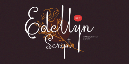 Introducing, Edellyn Script, a modern script typeface. This collection of scripts is perfect for personal branding. As you can see, this typeface has beutiful and modern look which is perfectly made to be applied especially in headline, logotype, apparel, invitation, branding, packaging, wedding card, advertising etc. Features : uppercase & lowercase numbers and punctuation multilingual alternates PUA encoded We highly recommend using a program that supports OpenType features and Glyphs panels like many of Adobe apps and Corel Draw, so you can see and access all Glyph variations. Thank you for purchase this font and Happy Creating !!!
 - Good Taste by Grummedia,
$24.00Inspired by early 20th century hand lettered display advertising, Good Taste is a traditional, elegant roman face best used at larger sizes where its well rounded character can be shown off to advantage. - Rocklay by Din Studio,
$29.00 Rocklay is a bold script font. With a classy and natural style, it brings beautiful typeface. Rocklay is best used for branding, logotype, and quotes. Features: - Multilingual Support - PUA Encoded - Numerals and Punctuation
 - Downtown by Aboutype,
$24.99Mono-weight extra condensed display face. Lowercase sits on a floating baseline. Downtown was designed for all media and works best at 24 point and above. Downtown requires subjective display kerning and compensation. - Goudy by Ascender,
$40.99 Goudy Forum is a revival and dramatic expansion by Tom Rickner, type designer at Ascender Corporation, of Frederic W. Goudy’s 20th typeface design, "Forum Title". The Pro font began twenty years ago while Tom Rickner was a student at the Rochester Institute of Technology (RIT). Tom printed a type specimen using the Forum Title foundry hot metal types. Then in 1993 Tom began to digitize the font from that specimen while working as an independent type designer. Fifteen years passed before Tom dusted off the digital data and began working in earnest on font with a full Latin 1 character set. Steve Matteson, type director at Ascender, encouraged Tom to take this font further still, and soon the glyph repertoire and feature set blossomed to a robust Pro font with a myriad of advanced typographic OpenType features.
 - CamingoDos Condensed by Jan Fromm,
$45.00 CamingoDos Condensed was designed to achieve a more powerful impact for the use in headlines. The compact appearance and the tight letter spacing makes it an ideal solution for display settings on a limited space. CamingoDos Condensed comes with a Pro version that offers a rich set of expert typographic features like small caps, ligatures, stylistic alternates, different figure sets, arrows, fractions and ordinals.
 - Tattletale PW by Patty Whack Fonts,
$29.98Tattletale PW is intended and suitable for Display use, titles, as well as paragraphs or pages for that quickly messy but endearingly handwritten look. This font contains uppercase and lowercase characters. The upper and lower case letters are interchangeable for different effects. It also contains numerals, punctuation, symbols, fractions and foreign characters. The opentype version quite a few alternates and ligatures to make the project at hand a little more fun and unpredictable. It breaks up the monotony and provides a more authenticly handwritten look. See the character map for all of the included characters. Tattletale PW is available in OpenType and TrueType formats. - Wildrace by Din Studio,
$29.00 Get ready to be bold and elegant at the same time. It’s time to see Wildrace, a display font created in capital letters with the racing theme. The font’s character is the thick letters formed similar to rectangles to give strong impressions. Therefore, it will be more noticeable and match the large-sized texts. Wildrace also provides interesting features to enjoy. Features: Multilingual Supports PUA Encoded Numerals and Punctuation Use Wildrace for any design projects such as posters, banners, logos, book covers, headings, printed products, merchandise, social media, etc. Find out more ways to use this font by taking a look at the font preview. Purchase now. Happy designing.
 - HU Flatwhite KR by Heummdesign,
$25.00 This is a headline typeface for titles with a retro sensibility. The concave first projection of the vowel and the dot shape further add to the retro feel. It is characterized by the dot shape seen in the initial consonants and the thin ending strokes of 'ㄱ', 'ㅅ', and 'ㅈ' to create a flowing curve. Although it is a full module, the inner space created by the large contrast of strokes gives a cool feeling. This font contains KOREAN
 - Neonstar by Mokatype Studio,
$24.00 Introducing the Neon Sci-fi Futuristic Font called Neonstat a unique font with a futuristic style that can make your futuristic logotype more interesting. Inspired by real-world neon light signs, this font is perfect for adding your own glowing light effects or can be used to actually design real-world neon signs. Neonstar font is suitable for your design and allows you to create beautiful designs, headlines, posters, logos, badges, and much more. It is also best used for posts, logos, posters, labels, and more. Works on PC & Mac, simple installations, accessible in Adobe Illustrator, Adobe Photoshop, Adobe InDesign, and even works on Microsoft Word. PUA Encoded Characters - Fully accessible without additional design software. Fonts include multilingual support Image used: All photographs/pictures/vectors used in the preview are not included, they are intended for illustration only. Thank You
 - Audrey by Fenotype,
$30.00 Audrey is an elegant monolinear Script and Sans font family. Audrey is great for designing headlines, packaging or as a logotype online or offline. Audrey has three weights of Script and Sans and a set of Ornaments. The weights go following: Regular is twice and Bold is three times as wide as Thin so if you want to have an Ornament example with same stroke width as Script you can set the Script in 36pt Regular and Ornament 72pt Thin -and they’ll have exactly the same width. Audrey Script is packed with OpenTtype features: Keep Standard Ligatures on for smooth connections and try Swash, Stylistic or Titling Alternas for more showier letters or seek for even more alternates from the Glyph Palette. Script also has Lining numerals as default and Old Style numerals as an OpenType alternates. Audrey is a close relative to widely popular Cosmopolitan released earlier by Fenotype. Compared to Cosmopolitan Audrey has more geometric forms and bigger lowercase characters with larger x-height.
 - Monto Grotesk by Lucas Tillian,
$28.00 Monto is a superfamily — this is the Grotesk + Grotesk Display part of it. Monto Grotesk is a modern sans serif typeface that combines the strengths of the neo-grotesque and geometric genres. While maintaining an established and trusted look, the design is influenced by a contemporary geometric aesthetic, making it a modern yet timeless companion. The Grotesk is split into two sub-families (Monto Grotesk and Monto Grotesk Display). While Grotesk is intended to be used in long paragraphs and copy text, Grotesk Display is perfect for striking headlines. To achieve maximum legibility, Grotesk emphasizes its characters vertical strokes, focusing on a coherent rhythm and having more open counters in contrast to Display which features a reduced tracking and more geometric and round forms. Furthermore, individual characters change their entire shape to best suit their areas of operation.