10,000 search results
(0.035 seconds)
- Fattty by Drawwwn,
$15.00 Fattty is a chunky fun font with plenty of wobbly bits. It's perfect for bold brands and funky projects. It's friendly curves are a great fit in kids books or on chubby posters. But remember, say it loud I'm fat and I'm proud!
 - Bomerch by Authentype,
$12.00 Bomerch Modern Display Font is a modern display font that includes Regular and Italic. This font is suitable for vibrant, energetic and bold designs such as sports poster designs, music posters, branding, t-shirts, prints, business cards, logos, posters, t-shirts, photography.
 - Sur by Horacio Lorente,
$20.00 Sur is a modern minimalist sans-serif typeface available in two weights (normal and bold), with a good shape for big editorial headlines and fashion publications. It was developed during 2009, trying to find a new way to express ideas in editorial projects.
 - Dance Routine by Jeff Levine,
$29.00 The hand lettered title on the cover of the 1932 sheet music for “I Wish We Could Dance Forever” was the inspiration for Dance Routine JNL. This bold Art Deco sans serif design is now available in both regular and oblique versions.
 - Cerellia by Illushvara,
$12.00 Cerellia is a bold script font, carefully handcrafted to become a true favorite. Its casual charm makes it appear wonderfully down-to-earth, readable and, ultimately, incredibly versatile. Fall in love with its incredibly versatile style and use it to create spectacular designs!
 - Looney by Bhubbiberry Studio,
$16.00 Looney, a handmade font! This bold, free-flowing and casual font is designed to be easily customisable. Looney is a font which you can use and enjoy, for anything from promotional material and handwritten quotes, to product packaging, merchandise and branding projects.
 - Radio Show JNL by Jeff Levine,
$29.00 The 1933 sheet music compilation entitled "Kate Smith Memories Song Book" had the singer's name hand lettered in a bold, spurred serif typeface. This lettering design became the basis for Radio Show JNL, which is available in both regular and oblique versions.
 - Koska Esko by Jehansyah,
$9.00 Koska Esko This is a font with a very bold and elegant look, perfect for designs with a modern look it's time for you to try a new style for a new design include : numeric latin ligatures alternate And Thank you very Much
 - Plantin Infant by Monotype,
$29.99Plantin is a family of text typefaces created by Monotype in 1913. Their namesake, Christophe Plantin (Christoffel Plantijn in Dutch), was born in France during the year 1520. In 1549, he moved to Antwerp, located in present-day Belgium. There he began printing in 1555. For a brief time, he also worked at the University of Leiden, in the Netherlands. Typefaces used in Christophe Plantin's books inspired future typographic developments. In 1913, the English Monotype Corporation's manager Frank Hinman Pierpont directed the Plantin revival. Based on 16th century specimens from the Plantin-Moretus Museum in Antwerp, specifically a type cut by Robert Granjon and a separate cursive Italic, the Plantin" typeface was conceived. Plantin was drawn for use in mechanical typesetting on the international publishing markets. Plantin, and the historical models that inspired it, are old-style typefaces in the French manner, but with x-height that are larger than those found in Claude Garamond's work. Plantin would go on to influence another Monotype design, Times New Roman. Stanley Morison and Victor Larent used Plantin as a reference during that typeface's cutting. Like Garamond, Plantin is exceptionally legible and makes a classic, elegant impression. Plantin is indeed a remarkably accommodating type face. The firm modelling of the strokes and the serifs in the letters make the mass appearance stronger than usual; the absence of thin elements ensures a good result on coated papers; and the compact structure of the letters, without loss of size makes Plantin one of the economical faces in use. In short, it is essentially an all-purpose face, excellent for periodical or jobbing work, and very effective in many sorts of book and magazine publishing. Plantin's Bold weight was especially optimized to provide ample contrast: bulkiness was avoided by introducing a slight sharpening to the serifs' forms." - Plantin Headline by Monotype,
$29.00Plantin is a family of text typefaces created by Monotype in 1913. Their namesake, Christophe Plantin (Christoffel Plantijn in Dutch), was born in France during the year 1520. In 1549, he moved to Antwerp, located in present-day Belgium. There he began printing in 1555. For a brief time, he also worked at the University of Leiden, in the Netherlands. Typefaces used in Christophe Plantin's books inspired future typographic developments. In 1913, the English Monotype Corporation's manager Frank Hinman Pierpont directed the Plantin revival. Based on 16th century specimens from the Plantin-Moretus Museum in Antwerp, specifically a type cut by Robert Granjon and a separate cursive Italic, the Plantin" typeface was conceived. Plantin was drawn for use in mechanical typesetting on the international publishing markets. Plantin, and the historical models that inspired it, are old-style typefaces in the French manner, but with x-height that are larger than those found in Claude Garamond's work. Plantin would go on to influence another Monotype design, Times New Roman. Stanley Morison and Victor Larent used Plantin as a reference during that typeface's cutting. Like Garamond, Plantin is exceptionally legible and makes a classic, elegant impression. Plantin is indeed a remarkably accommodating type face. The firm modelling of the strokes and the serifs in the letters make the mass appearance stronger than usual; the absence of thin elements ensures a good result on coated papers; and the compact structure of the letters, without loss of size makes Plantin one of the economical faces in use. In short, it is essentially an all-purpose face, excellent for periodical or jobbing work, and very effective in many sorts of book and magazine publishing. Plantin's Bold weight was especially optimized to provide ample contrast: bulkiness was avoided by introducing a slight sharpening to the serifs' forms." - Pantoufle by Kitchen Table Type Foundry,
$16.00 Pantoufle is French for slipper. Not the flipflop variety (or thongs if you’re from Australia), but the one you wear indoors when it’s cold. I have some too; Spanish ones, made from recycled PET bottles. Here in Holland, we call them ‘Pantoffels’ and you don’t have to be a language expert to see the resemblance between the French and the Dutch word. That is because the French are probably more savvy when it comes to keeping your feet warm and the Dutch just borrowed the word, pronunciation and all! Pantoufle is a font I made with a big fat marker pen. My kids had used it to decorate some gifts for Sinterklaas (if you want to know what Sinterklaas is, look it up). Pantoufle comes with extensive language support and a full set of alternates for the lower case glyphs. Enjoy!
 - Fragment Pro by (v) design,
$49.00 Fragment Pro is a part of a larger OpenType font family (see also Fragment Pro Inline). It is an elegant, soft and decorative typeface built on classical proportions. Its outlines have been carefuly crafted with a high attention to detail, so it could be used even at very large sizes. Fragment Pro is derived from the separately sold layered Fragment Pro Inline, however it has been significantly optimized for standalone use. Fragment has been conceived to be used as a display typeface in publications, titles, logotypes etc., but it is surprisingly legible even in smaller print sizes. Thanks to its strictly onefold oulines, Fragment can be also used as a stencil typeface. Fragment supports many OpenType features and offers great multilingual support for most of the Latin-based languages. Feel free to download the detailed PDF Specimen.
 - Mamute by PintassilgoPrints,
$18.00 Mamute is a block rockin' family with a cool letterpress look. Its upper- and lower-case slots hold glyphs with slightly different textures for a natural look. Numbers and punctuation marks also have alternate versions. Just trigger the Contextual Alternates feature to easily cycle the alternate glyphs, preventing double letters from displaying the same texture. Mamute is a highly decorative typeface available in 2 widths, regular and condensed, each also offered as a layered font, a handy and playful way for adding shades to your composition. There’s also a generous ornaments font and a catchwords one to spice up your designs. Mamute is based on Aldine wood type spirit (as there were many incarnations of it!), from circa 1870. Please note that this family has a limited character set and doesn't bring diacritics nor accented characters. But yet it does rock, you bet!
 - Blacker Pro by Zetafonts,
$39.00 Blacker Pro is the revised and extended version of the original wedge serif type family designed by Cosimo Lorenzo Pancini and Andrea Tartarelli in 2017. Blacker was developed as a take on the style that Jeremiah Shoaf has defined as the "evil serif" genre: typefaces with high contrast, oldstyle or modern serif proportions and sharp, blade-like triangular serifs. Due to the high contrast in the design - slightly reminescent of didone typefaces - Blacker has been developed in two optical subfamilies. The display version offers tighter tracking, higher contrast and sharper corners for maximum effect at big sizes, while the text variant offers better readability and screen rendering at smaller sizes, with lower contrast and looser spacing. In the pro version, two additional condensed variant families have been added (condensed display and condensed text) allowing for more freedom and versatility in typesetting where space constraints are present. Also, three titling uppercase-only variants have been added, with a slightly extended feel, and two decorative subfamilies (inline and diamond). Each of these seven variants has been developed in six weights from light to heavy, with matching italics, for a total of 69 styles covering a wide range of editorial and advertising uses. All Blacker Pro feature a revised and extended character set covering over two hundred languages using the latin, cyrillic and greek alphabets. Open type features include small caps, positional numerals, fractions, superior & inferior figures, alternate forms, and an extended set of standard and discretionary ligatures. With its bold personality, Blacker aims to be a modern classic used for bold statements and self-conscious brands, making your text look great both on paper and on the screens.
 - Aure Jane by Aure Font Design,
$23.00 Aure Jane defines grace under fire. These clean, sans-serif forms engage the reader with a subtext of trust. Jane’s excellent legibility will stand up under almost any typographic challenge, bringing confidence to text and titles, and clarity to astrological expressions and chartwheels. Jane is an original design developed by Aurora Isaac. After more than a decade in development, 2018 marks the first release of the CJ and KB glyphsets in regular, italic, bold, and bold-italic. The CJ glyphset is a full text font supporting a variety of European languages. A matching set of small-caps complements the extended lowercase and uppercase glyphsets. Supporting glyphs include standard ligatures, four variations of the ampersand, and check-mark and happy-face with their companions x-mark and grumpy-face. Numbers are available in lining, oldstyle, and small versions, with numerators and denominators for forming fractions. Companion glyphs include Roman numerals, specialized glyphs for indicating ordinals, and a variety of mathematical symbols and operators. The CJ glyphset also includes an extended set of glyphs for typesetting Western Astrology. These glyphs are also available separately in the KB glyphset: a symbol font re-coded to allow easy keyboard access for the most commonly used glyphs. In addition to Aure Jane’s versatility as a text font, Jane can enhance the message of other designs. Aure Jane pairs well as an innocuous foil to any decorative font; Aure Sable, for example, will shine all the more beside Jane’s sensible utility. The witty highlights of Aure Brash will sparkle against Jane’s practicality. Give Aure Jane a trial run! You may discover a permanent place for this font family in your typographic palette. AureFontDesign.com
 - Quad Light - 100% free

- fancyPens - Unknown license

- Quad Black - 100% free

- Crunchy Taco - Unknown license

- Susanna - Unknown license

- Aphrodite Pro by Typesenses,
$37.00 Aphrodite Pro is an amazing handmade font full of alternate and ligature forms designed by Sabrina Lopez and Maximiliano Sproviero. Check out the brochure in the Gallery section to see some examples of this OpenType font in use and the wide range of combinations possible.
 - Stonehouse by Scriptorium,
$12.00Stonehouse is based on samples of Art Nouveau title lettering, adapted and expanded into a complete titling font. It has a nice intermediate weight ideal for titles on the web or in print, especially for section or topical headers within a body of text. - Abwyn by Hackberry Font Foundry,
$24.95 Abwyn is a sparkly Art Deco construction. The little diamonds in the vertical strokes add a lightness that is very pleasing to the eye in display sizes: Lower case numbers, Euro, ballot box in the section slot. It was just designed for fun & celebration.
 - Victorian Typewriter JNL by Jeff Levine,
$29.00 The titles in various sections of an 1890 catalog for stencil manufacturing supplies were set in metal type that closely resembled the lettering found on a typewriter. These examples became the basis for Victorian Typewriter JNL, which is available in both regular and oblique versions.
 - The Brushentica by Almarkha Type,
$29.00 Introducing The Brushentica - Handbrush Script is a brush script that is written casually and quickly. Letters are made with brushes on paper. Then scanned and carefully drawn into vector format. That is why The Brushentica has charming, authentic and relaxed characteristic,has 2 styles of regular, slant, and swash with a more natural look to your text with a more natural look to your text. The Brushentica is perfect for homeware designs,branding projects, Logo, design, Quotes, Product packaging, Photography, Watermark.
 - Feel Good by Gassstype,
$25.00 Here comes a New font, Feel Good is Brush Sans Font that is written casually and quickly. Letters are made with brushes on Procreate. Then crafted carefully drawn into vector format. That is why Feel Good has Stylish and strong characteristic more natural look to your text with a more modern look to your text. Feel Good is perfect for homeware designs,branding projects, Logo design, Quotes product packagingprinted quotes, invitations, cards, product packaging, headers, Logotype, Letterhead, PosterLabel, cartoon, and comic etc.
 - King Sky by Graphicxell,
$19.00 inspired by the famous minimalist logo perfect for the purposes of designing templates, brochures, videos, advertising branding, logos, invitation, layout design, elegant crafting, beauty design and other What's Included : + Standard glyphs + International Accent + Works on PC & Mac + Simple installations Accessible in the Adobe Illustrator, Adobe Photoshop, Corel Draw. PUA Encoded Characters - Fully accessible without additional design software. Fonts include multilingual support Image used : All photographs/pictures/vector used in the preview are not included, they are intended for illustration purpose only. Thank You
 - Doggybag by Kustomtype,
$25.00 Doggybag is a font based on a text I found on a long-standing rock and roll record in a thrift store. Using several characters, I completed the font, vectorized and digitized it into a thoroughly modern font. The font is ideal to use as a display font, for rock bands, posters, T-shirts, postcards, etc. In short, Doggybag is an indispensable font for all your graphic works or projects. Lastly, it is a font for an eye-catching design. Enjoy Doggybag!
 - Messaline by Gatype,
$12.00 Messaline is a brush script written in a relaxed and fast way. Letters made with brush pen on paper. It is then carefully scanned and drawn into vector format. That's why Messaline has organic, authentic and relaxed characteristics. Suitable for use on title designs such as book titles, stationery designs, quotes, branding, logos, clothing, invitations, greeting cards, t-shirts, packaging designs, posters, and more. Messaline has a dry brush pen texture and Solid is a slightly cleaner version. Thank You!
 - Wakeup Today by Gassstype,
$23.00 Wakeup Today - Slab Rough Brush Font Club Strong Brush Font is a Authentic brush Font that is written casually and quickly. Every glyphs are made with Procreate. Then trace down into a vector format, and carefully crafted into a typeface. That is why Wakeup Today has rough, authentic and strong characteristic more natural look. You can activate Ligature OpenType panel. Wakeup Today Perfect for designs,branding projects, Logo design, Quotes product packaging and another Project thet require cool strong brush font.
 - Evers by Graphicxell,
$19.00 inspired by the famous minimalist logo perfect for the purposes of designing templates, brochures, videos, advertising branding, logos, invitation, layout design, elegant crafting, beauty design and other What's Included : + Standard glyphs + International Accent + Works on PC & Mac + Simple installations Accessible in the Adobe Illustrator, Adobe Photoshop, Corel Draw. PUA Encoded Characters - Fully accessible without additional design software. Fonts include multilingual support Image used : All photographs/pictures/vector used in the preview are not included, they are intended for illustration purpose only. Thank You
 - Vippa Willette by NJ Studio,
$19.00 Hi...Thank for your visit :) Vippa Willette a sytlish signature Fonts are font designs that are made for various vector designs, printing such as digital wedding invitations, blogs, online shops, social media, while printing can be used in the field of product clothing, accessories, bags, pins, logos, business cards, watermarks and many others ... Vippa Willette is equipped with complete alternates and very beautiful ligature, so it can make your product look elegant and attractive, and also Multilingual support!!! Happy design ...
 - Insigne Splats! by insigne,
$14.99 Insigne Splats! is a series of vectorized ink splatters that can be quickly and easily used in your artwork. There are 64 unique and useful ink splatters. These individual splats can be combined, decomposed and organized to accent your designs. Splats! works well in conjunction with some of insigne's grungier faces such as Valfieris Aged, Arendahl, Majidah or Blue Goblet. Please see the printable sample .pdf for a full preview of all the splats available and the keys they map to.
 - Butter Press by Gassstype,
$22.00 Introducing Butter Press - Grungy cartoon font brush that written casually and quickly. Letters are made with brushes on Procreate. Then crafted carefully drawn into a vector format. That is why Butter Press has authentic and relaxed characteristics and a more natural look to your text with a more natural look. You can activate Ligature OpenType panel to make these two styles.ligatures that make your text and design more interesting. Butterpress is perfect for homeware designs, branding projects, Logo design, Quotes product packaging
 - Never by Graphicxell,
$19.00 inspired by the famous minimalist logo perfect for the purposes of designing templates, brochures, videos, advertising branding, logos, invitation, layout design, elegant crafting, beauty design and other What's Included : + Standard glyphs + International Accent + Works on PC & Mac + Simple installations Accessible in the Adobe Illustrator, Adobe Photoshop, Corel Draw. PUA Encoded Characters - Fully accessible without additional design software. Fonts include multilingual support Image used : All photographs/pictures/vector used in the preview are not included, they are intended for illustration purpose only. Thank You
 - Hey Butterfly by NJ Studio,
$19.00 Hi...Thank for your visit :) Hey butterfly a beautyful Script Fonts are font designs that are made for various vector designs, printing such as digital wedding invitations, blogs, online shops, social media, while printing can be used in the field of product clothing, accessories, bags, pins, logos, business cards, watermarks and many others ... hey butterfly is equipped with complete alternates and very beautiful ligature, so it can make your product look elegant and attractive, and also Multilingual support!!! Happy design ...
 - Just Hopes by Maulana Creative,
$12.00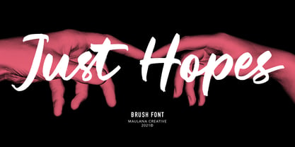 Just Hopes is an script font. With natural feel brush stroke, slanted and fun character with a bit of ligatures and vector version. To give you an extra creative work. Just Hopes font support multilingual more than 100+ language. This font is good for logo design, Social media, Movie Titles, Books Titles, a short text even a long text letter and good for your secondary text font with sans or serif. Make a stunning work with Just Hopes font. Cheers, MaulanaCreative
 - Vault by Graphicxell,
$19.00 inspired by the famous minimalist logo perfect for the purposes of designing templates, brochures, videos, advertising branding, logos, invitation, layout design, elegant crafting, beauty design and other What's Included : + Standard glyphs + International Accent + Works on PC & Mac + Simple installations Accessible in the Adobe Illustrator, Adobe Photoshop, Corel Draw. PUA Encoded Characters - Fully accessible without additional design software. Fonts include multilingual support Image used : All photographs/pictures/vector used in the preview are not included, they are intended for illustration purpose only. Thank You
 - Ohitashi by Typodermic,
$11.95 Attention all design enthusiasts! Are you tired of the same dull typefaces dominating the design world? Look no further than Ohitashi, the daring and unconventional creation by Typodermic principal Raymond Larabie. In a world where twentieth-century sans-serif typefaces reign supreme, Ohitashi breaks the mold and blazes its own trail. Larabie has masterfully infused this typeface with a unique blend of humanistic stroke contrast, spontaneous licks and curls, and incised detail, resulting in a one-of-a-kind design that defies convention. But don’t let the unconventional nature of Ohitashi fool you. This typeface offers a practical range of three weights—standard, semi-bold, and bold—making it an incredibly versatile option for any design project. Whether you’re looking to add a touch of personality to a marketing campaign, or looking to revamp your brand identity with something fresh and new, Ohitashi has got you covered. So why settle for the same boring old typefaces when you can break free from the rut favored by reductive competitors? Embrace the unconventional with Ohitashi and see your designs come to life like never before. Trust us, your audience will thank you. Most Latin-based European writing systems are supported, including the following languages. Afaan Oromo, Afar, Afrikaans, Albanian, Alsatian, Aromanian, Aymara, Bashkir (Latin), Basque, Belarusian (Latin), Bemba, Bikol, Bosnian, Breton, Cape Verdean, Creole, Catalan, Cebuano, Chamorro, Chavacano, Chichewa, Crimean Tatar (Latin), Croatian, Czech, Danish, Dawan, Dholuo, Dutch, English, Estonian, Faroese, Fijian, Filipino, Finnish, French, Frisian, Friulian, Gagauz (Latin), Galician, Ganda, Genoese, German, Greenlandic, Guadeloupean Creole, Haitian Creole, Hawaiian, Hiligaynon, Hungarian, Icelandic, Ilocano, Indonesian, Irish, Italian, Jamaican, Kaqchikel, Karakalpak (Latin), Kashubian, Kikongo, Kinyarwanda, Kirundi, Kurdish (Latin), Latvian, Lithuanian, Lombard, Low Saxon, Luxembourgish, Maasai, Makhuwa, Malay, Maltese, Māori, Moldovan, Montenegrin, Ndebele, Neapolitan, Norwegian, Novial, Occitan, Ossetian (Latin), Papiamento, Piedmontese, Polish, Portuguese, Quechua, Rarotongan, Romanian, Romansh, Sami, Sango, Saramaccan, Sardinian, Scottish Gaelic, Serbian (Latin), Shona, Sicilian, Silesian, Slovak, Slovenian, Somali, Sorbian, Sotho, Spanish, Swahili, Swazi, Swedish, Tagalog, Tahitian, Tetum, Tongan, Tshiluba, Tsonga, Tswana, Tumbuka, Turkish, Turkmen (Latin), Tuvaluan, Uzbek (Latin), Venetian, Vepsian, Võro, Walloon, Waray-Waray, Wayuu, Welsh, Wolof, Xhosa, Yapese, Zapotec Zulu and Zuni.
 - ATF Garamond by ATF Collection,
$59.00 The Garamond family tree has many branches. There are probably more different typefaces bearing the name Garamond than the name of any other type designer. Not only did the punchcutter Claude Garamond set a standard for elegance and excellence in type founding in 16th-century Paris, but a successor, Jean Jannon, some eighty years later, cut typefaces inspired by Garamond that later came to bear Garamond’s name. Revivals of both designs have been popular and various over the course of the last 100 years. When ATF Garamond was designed in 1917, it was one of the first revivals of a truly classic typeface. Based on Jannon’s types, which had been preserved in the French Imprimerie Nationale as the “caractères de l’Université,” ATF Garamond brought distinctive elegance and liveliness to text type for books and display type for advertising. It was both the inspiration and the model for many of the later “Garamond” revivals, notably Linotype’s very popular Garamond No. 3. ATF Garamond was released ca. 1918, first in Roman and Italic, drawn by Morris Fuller Benton, the head of the American Type Founders design department. In 1922, Thomas M. Cleland designed a set of swash italics and ornaments for the typeface. The Bold and Bold Italic were released in 1920 and 1923, respectively. The new digital ATF Garamond expands upon this legacy, while bringing back some of the robustness of metal type and letterpress printing that is sometimes lost in digital adaptations. The graceful, almost lacy form of some of the letters is complemented by a solid, sturdy outline that holds up in text even at small sizes. The 18 fonts comprise three optical sizes (Subhead, Text, Micro) and three weights, including a new Medium weight that did not exist in metal. ATF Garamond also includes unusual alternates and swash characters from the original metal typeface. The character of ATF Garamond is lively, reflecting the spirit of the French Renaissance as interpreted in the 1920s. Its Roman has more verve than later old-style faces like Caslon, and its Italic is outright sprightly, yet remarkably readable.


