10,000 search results
(0.041 seconds)
- Steamy Miracles by Din Studio,
$29.00 Steamy Miracles is a handwritten script font which is a mixture of incredible drama and gracefulness to clearly express a modern design. Each letter’s details show some curvy, sharp strokes on the edges. Due to its great legibility, you may apply this font for either bigger- or smaller-sized texts. Features: Ligatures Stylistic Sets Swashes Multilingual Supports PUA Encoded Numerals and Punctuations Sreamy Miracles fits best for various designs, such as posters, banners, logos, book covers, headings, printed products, merchandise, social media, and more. Find out more ways to use this font by taking a look at the font preview. Thank you for purchasing our font and happy designing.
 - FF Celeste Sans by FontFont,
$65.99 British type designer Chris Burke created this sans FontFont between 1994 and 2004. The family has 8 weights, ranging from Regular to Black (including italics) and is ideally suited for book text, editorial and publishing as well as logo, branding and creative industries. FF Celeste Sans provides advanced typographical support with features such as ligatures, small capitals, alternate characters, case-sensitive forms, fractions, and super- and subscript characters. It comes with a complete range of figure set options – oldstyle and lining figures, each in tabular and proportional widths. This FontFont is a member of the FF Celeste super family, which also includes FF Celeste and FF Celeste Small Text.
 - FF Eureka Sans by FontFont,
$68.99 Slovak type designer Peter Biľak created this sans FontFont between 2000 and 2001. The family has 20 weights, ranging from Light to Black in Condensed and Normal (including italics) and is ideally suited for book text and editorial and publishing. FF Eureka Sans provides advanced typographical support with features such as ligatures, small capitals, alternate characters, case-sensitive forms, fractions, and super- and subscript characters. It comes with a complete range of figure set options – oldstyle and lining figures, each in tabular and proportional widths. This FontFont is a member of the FF Eureka super family, which also includes FF Eureka and FF Eureka Mono.
 - Bike Power by PizzaDude.dk,
$19.00 I love my bike, and I couldn't dream of not using it on a daily basis - I use my bike in rain, sun, snow, and windy days...all year, in other words! This font is dedicated to my bike, and is the first in a series of handmade fonts! Play around with the three layers and your favourite colours, for awesome effects. All versions comes with Contextual Alternates, which means several versions of each letter. In this case, every letter has 5 different versions that automatically cycles as you type! A quite awesome thing, because it makes your text more lively and natural looking!
 - Browess Sovar by Ronny Studio,
$19.00 Hundreds of handwritten custom letter combinations make this font look like it was scrawled with a pen, not typed with a computer. These characters belong next to each other... that's how the natural flow and messy style is achieved. You won't see many duplicate letter styles here. Add it with confidence to your projects, and you'll love the results. This typeface is perfect for logos, branding, promotions, book covers, magazine layouts, or simply as a stylish text overlay onto any background image. Features : Lowercase & Uppercase ( All Caps ) numbers and punctuation multilingual alternates PUA encoded Please contact us if you have any questions. Enjoy Crafting and thanks for supporting us! :) Thank you
 - Bike Jam by PizzaDude.dk,
$17.00 I love my bike, and I couldn't dream of not using it on a daily basis - I use my bike in rain, sun, snow, and windy days...all year, in other words! This font is dedicated to my bike, and is the second in a series of handmade fonts! Play around with the 5 layers and your favourite colours, for awesome effects. All versions comes with Contextual Alternates, which means several versions of each letter. In this case, every letter has 7 different versions that automatically cycles as you type! A quite awesome thing, because it makes your text more lively and natural looking!
 - FF Page Sans by FontFont,
$47.99 French type designer Albert Boton created this sans FontFont in 2003. The family has 8 weights, ranging from Light to Bold (including italics) and is ideally suited for advertising and packaging, book text, editorial and publishing as well as logo, branding and creative industries. FF Page Sans provides advanced typographical support with features such as ligatures, small capitals, alternate characters, case-sensitive forms, fractions, and super- and subscript characters. It comes with a complete range of figure set options – oldstyle and lining figures, each in tabular and proportional widths. This FontFont is a member of the FF Page super family, which also includes FF Page Serif.
 - Hazim by Arabetics,
$39.00 Hazim is a display font designed with isolated letters. It uses thin white slits positioned within extra bold black space glyphs emphasizing the main visual characteristics of the Arabetic letters in two positions: initial/medial and final/isolated. The spacing widths between glyphs match that of the slits to give a virtual cursive look and feel. The name Hazim was chosen to honor a friend of the designer, Hazim al-Khafaji. Hazim supports all Arabetic scripts covered by Unicode 6.1, and the latest Arabic Supplement and Extended-A Unicode blocks, including support for Quranic texts. It comes with one weight and a left-slanted “italic”. The script design of this font family follows the Arabetics Mutamathil Taqlidi style and utilizes varying x-heights. The Mutamathil Taqlidi type style uses one glyph per every basic Arabic Unicode character or letter, as defined by the Unicode Standards, and one additional final form glyph, for each freely-connecting letter in an Arabic text. Hazim includes the required Lam-Alif ligatures in addition to all vowel diacritic ligatures. Hazims’s soft-vowel diacritic marks (harakat) are only selectively positioned with most of them appearing on similar lower or upper positions to make sure they do not interfere with the letters. Kashida is enabled.
 - Core Escher by S-Core,
$30.00 Core Escher is an optical illusion type family which has two sub-families: Core Escher A and B. Core Escher A has impossible shapes inspired by the optical illusion works of artist M.C. Escher. The letterforms in this type family are structurally twisted and complicated but it looks simple because of its simple strokes. And for easy color variations, it split into two fonts, Core Escher A Left and Right. Core Escher B has a different kind of optical illusion. The letters of Core Escher B look like three dimentions by just putting thin lines on bold letters. Also B has two sub-families that have different viewpoints. Core Escher Family supports complete Basic Latin, Cyrillic, Central European, Turkish, Baltic character sets. Each font includes proportional figures, tabular figures, numerators, denominators, superscript, scientific inferiors, subscript, fractions and case features. This family is really nice for book titles, headlines, logotypes and any artworks.
 - Bremenoff by Designova,
$15.00 Bremenoff is a timeless sans-serif typeface family of 14 fonts, made with simplicity in every aspect of design. Created with a special focus on readability and the finest visual capabilities, this typeface can turn your design projects into something extraordinary. Handcrafted and designed with powerful OpenType features in mind, each weight includes extended language support including Western European & Central European sets. A total of 289 glyphs are included. Bremenoff is a perfect choice for graphic design, text presentation, web design, print and display use. The typeface can be an amazing option for beautiful branding, logo / logotype design projects, marketing graphics, banners, posters, signage, corporate identities as well as editorial design. Adding extra letter-spacing for the Caps will make this font perfect for minimal headlines and logotypes as shown in promo images here. Bremenoff typeface family comes with a total of 14 fonts having 7 weights (Thin / Light / Book / Regular / SemiBold / Bold / Heavy) as well as Italic versions of all weights.
 - Love Story by Latinotype,
$29.00 Love story is a display hairline typeface for use in big sizes and short texts. It’s inspired by different kinds of love and specially designed for Valentine’s day. Its soft curves and sweet style give it a lovely personality. Designed by Luciano Vergara and his wife Guisela Mendoza who has been studying ornaments since 2007 and has done her best for each project. You can see in her dingbats specially Printa and Abel designed for generate patterns. Now she integrated her passion to the ornament in a clean set which includes dingbats, ornaments and patterns. Luciano Vergara has designed very strong fonts with a particular work in the lines study and close to the geometry since 2005, getting a structure style, you can see in his fonts specially Regia and Kahlo. Now he integrated his study of lines, in a hairline font delicate, continuous and beautiful. In this story both designers have been merged their worlds creating a gorgeous product. This is a romantic type story, a love story.
 - Ahoura by Naghi Naghachian,
$58.00 The Ahoura font family, designed by Naghi Naghashian, was developed considering specific research and analysis on Arabic characters and definition of their structure. The Ahoura innovation is a contribution to modernisation of Arabic typography; gives the Arabic font letters real typographic arrangement and provides for more typographic flexibility. This step was necessary after more than two hundred years of relative stagnation in Arabic font design. Ahoura supports Arabic, Persian, and Urdu and includes proportional and tabular numerals for the supported languages. The Ahoura Font family is available in three weights; Light, Regular and Bold. Each has two different styles-- normal and italic. Ahoura is the first real italic Arabic typeface known until now and its intuitive design arrangement fulfils the following needs: - It is precisely crafted for use in electronic media and it fulfils the demands of electronic communication. Ahoura is not based on any pre-digital typefaces and it is not a revival. Rather, its forms were created with today’s ever-changing technology in mind. - Ahoura is suitable for multiple applications, and gives the widest potential for acceptability. - It is extremely legible not only in its small sizes, but also when the type is filtered or skewed, e.g., in Photoshop or Illustrator. Ahoura's simplified forms may be artificially obliqued with In Design or Illustrator, without any degradation of its quality for the effected text. - Ahoura is an eye-catching and classy typographic image that developed for multiple languages and writing conventions. - Ahoura uses the very highest degree of geometric clarity along with the necessary amount of calligraphic references. The Ahoura typeface is of a high vibration that is finely balance between calligraphic tradition and the contemporary sans serif aesthetic commonly seen in Latin typography.
 - Paradise Point by Swell Type,
$20.00 Surf's up! Take an unforgettable adventure to the sparkling shores of Paradise Point. Ride our 25 majestic weights, from tranquil tall & thin to thunderous wide & heavy. Expand your horizons with the versatile Variable font to select any spot between. One-of-a-kind activities: Drop in a thrilling Inline weight for stylistic flair. Overlay with the matching Heavy for striking color effects. Discover hidden wonders! Stylistic Alternates will take you to the scenic heights of uppercase in a friendly lowercase style. Or immerse your text in interlocking Discretionary Ligatures for an authentic Tiki Type island experience. Enchanting views: Two versions of each letter and number automatically rotate for a natural, hand-drawn appearance. The Light weights have round ends to simulate a single pen stroke, which matches the center of the Inline weights for a perfect pairing. Explore! If you venture into unknown territory, each weight of Paradise Point contains 775 glyphs for stress-free support of over 200 languages. An all-inclusive getaway: Each weight of Paradise Point includes the features above, and can set readable body text as well as create striking logos and headlines. Use it for restaurant menus, surf and skate brands, or any design project where you want to convey lively, friendly, stress-free fun.
 - Clearface Gothic by Linotype,
$29.99 Clearface Gothic first appeared in 1910, designed by Morris Fuller Benton, the world-famously prolific typeface artist. In addition to Clearface Gothic, Benton also designed classics like Franklin Gothic, Century Expanded, and many other types. Clearface Gothic is a sans serif face with light forms displaying the Zeitgeist of the turn of the 20th century. Distinguishing characteristics are the open forms of the a" and "c," the arched "k," and the upward-tilting horizontal stroke of the "e." The relatively narrow typeface, with its open inner white spaces, is extremely legible even in small point sizes. There is no accompanying italic. This digital version of Clearface Gothic was made in 1984 by the Linotype Design Studio."
 - Clio by LeType,
$75.00 Clio, Clio XS and Clio Condensed —each available separately— is a big family of 72 fonts. They were designed by Gabriel de Souza in 2012. They are simple and stylish and they have the ideal appearance to your work. Furthermore, features such as italics, obliques, great language support and flexibility. They can be applied in many different forms but their primary use is indicated to display use and luxurious trade mark creation and also available for Clio Icons.
 - Cedora by Lafontype,
$19.00 Cedora is a humanist sans serif designed with a playful appearance. Cedora comes in 14 styles with 7 weights ranging from thin to black each of which represents multiple languages allowing you to do editorial activities. In the terminal section the size is made a little thinner so that the shape doesn't look so sharp and the x-height and open counter have been taken into account so that it is good enough for a small text size.
 - Salacious by PizzaDude.dk,
$18.00 Salacious is my soft/rough all-caps font, inspired by both comics and grafitti. The weight and width of the letters varies a bit. Not in a disturbing way, but more in a lively and organic way. I've added 5 (slightly) different versions of each letter (which automatically cycles as you type!) The letter shapes are a bit rough, due to the fact that they are handmade, and all corners are rounded, which gives a nice soft look!
 - Mosler by Carmel Type Co.,
$19.00 Inspired by the interior of a now defunct Mosler Safe Company bank vault door located inside of what is now an Irish Pub in Stroudsburg, Pennsylvania, Mosler is a typeface that is impenetrability incarnate. This all uppercase, slab-serif brawny beauty comes in four weights - Safe, Strongbox, Vault, and Fortress, and each one is more powerful than the last. Each weight has 450 glyphs included, making for a whopping 1800 glyphs for the full family, complete with small capitals, total support for nearly 80 different languages, decorative word glyphs, and a handful of select alternates. Ranging from the low contrast of the "Safe" weight to the extreme contrast of the "Fortress" weight, Mosler is effective in a wide array of applications but serves best as a titling, headlining, or display face that need to make a mammoth statement. Features Include: 4 Weights Uppercase Only with Small Capitals Numerals, Punctuation & Symbols 450 Characters per Style Stylistic Alternates and Word Glyphs Supports 75+ Latin Languages OTF files Designed and Developed by Jason Carne
 - Invincible Duo Script by Prestige Artsy Studio,
$19.00 Introducing Invincible Duo, a sleek, modern, and clean font package designed to elevate your creative projects. This dynamic duo consists of two fonts that perfectly complement each other, offering endless possibilities for your designs. The first font, a beautiful script, exudes elegance and charm. With an abundance of ligatures — over 170 ligatures, with every word becomes a work of art. Its flowing strokes and intricate details add a touch of sophistication, making it ideal for invitations, logos, branding, and other projects where a touch of beauty is desired. The second font, a bold sans, brings a contemporary edge to the table. With its clean lines and strong presence, it grabs attention and exudes confidence. Perfect for headlines, titles, and bold statements, this font adds a bold and modern touch to your designs, creating impact and visual appeal. Invincible Duo is carefully crafted to ensure seamless harmony between the script and sans font. When used together, they create a stunning visual contrast that captivates the audience. Whether combined or used individually, these fonts make a lasting impression and deliver a powerful, cohesive message.
 - TT Bluescreens by TypeType,
$35.00 TT Bluescreens useful links: Specimen PDF | Customization options Please note! If you need OTF versions of the fonts, just email us at commercial@typetype.org Meet the upgraded TT Bluescreens! TT Bluescreens is a geometric sans serif with narrow proportions. The font has a memorable character, while remaining neutral, so it can be used in various design projects. The range of possibilities of the updated TT Bluescreens has become much wider! Condensed styles with narrowed proportions have been added. The classic styles of TT Bluescreens are universal and suitable for setting both in headings and in text arrays. Condensed styles are intended for non-standard design solutions. In small sizes, they are perceived as if having a texture, thanks to which they can become part of packaging or poster design. In large size they look extraordinary, but they are highly readable and convey information well. Variable font now changes along 3 axes: weight, width and slant. Even more options for those who love variety. The character set of TT Bluescreens was expanded, and additional extended Cyrillic and Latin characters were added. Expanded character set. Each style has 874 characters. This is 253 characters more than it there were in the previous version. New currency signs, arrows, punctuation and fractions were added. Number of OpenType features increased from 18 to 31! The font has become even more functional and convenient thanks to a large number of ligatures, stylistic alternatives and localizations. The quality of the contours has become even higher, diacritics were improved. The updated TT Bluescreens is suitable for the design of covers and posters, it will look aesthetically pleasing in packaging design. It can be used in the design of titles and disclaimers. Condensed styles are preferably used in large size. The TT Bluescreens font has 37 styles: 9 upright and 9 italics of standard width, 9 upright and 9 italics in Condensed, 1 variable style. Each style contains 874 characters. The font has 31 OpenType features, including ligatures, stylistic sets, and localizations.
 - ZT Gatha by Khaiuns,
$14.00 ZT Gatha is a continuation of the "Gatha Duo font family", which focuses only on more complete variations of sans serif, this font has two variants, one of which is a normal sans font and the other is unique in that it minimizes edges. of each letter produces a unique character with a smoothly curved groove. ZT Gatha features 10 styles covering a complete set of beautiful upper and lower case letters, numbers, and various punctuation marks, providing a clean and realistic sans serif style with great versatility. With a lot of weight, this typeface can be used successfully in Magazines, Posters, Branding, Websites, etc. I hope you have fun using ZT Gatha. Thanks for using this font ~ Khaiuns X zelowtype
 - FWD Egyptian Tower by Fontwright Design,
$39.99 FWD Egyptian Tower is a designers stack-able Display family best purchased as one package. The four versions can be manipulated in your favorite graphics or sign making application to achieve the different effects as shown in the font family ad designs. All fonts are tightly spaced and are very often intentionally overlapped creating a balance for each very unique wider bottomed character. Being stack-able, the designer can duplicate the original text layer and by changing the font on the lower of the two layers to another of the family can then add another available effect. This can be repeated to add other of the available effects. Then by converting the text of the lower text layers to curves or outlines and welding the characters of the words together, the overlaps can be eliminated. This process is fairly common practice for a graphic designer and quite easy once done a few times.
 - Therok by Twinletter,
$12.00 Introducing our newest font named Therok. We design this san serif family font with attention to the combination of each letter to create an elegant impression and appearance so that it makes it easy for you to use it according to what you need, both formal and non-formal needs. This font is powerful for your very extraordinary project. This font is perfect for games, sporting events, branding, banners, posters, movie titles, food and beverage, technology, quotes, clothing, logo types and more. of course, your various design projects will be perfect and extraordinary if you use this font because this font is equipped with a font family, both for titles and subtitles and sentence text, start using our fonts for your extraordinary projects.
 - Dollan by Twinletter,
$14.00 Dollan, our newest whimsical typeface, is now available. This font is worth implementing in your remarkable projects since it is a distinctive and eye-catching display font that is dynamically crafted to bring out the originality in each letter. This typeface has a cheerful, unique, energetic, and unique vibe to it, and it will give your creative work a unique look as well. This font is perfect for games, sporting events, branding, banners, posters, movie titles, book titles, quotes, logotypes, and more. of course, your various design projects will be perfect and extraordinary if you use this font because this font is equipped with a complimentary font family, both for titles and subtitles and sentence text, start using our fonts for your amazing projects.
 - Giroji by Twinletter,
$12.00 Introducing our newest font called Giroji, this font is designed with a bold, strong, and unique handwriting theme, so that when used it can create a relaxed, elegant and charming impression when applied to your design project so that it can give the viewer a distinctive impression. Start using this font to create an ideal and balanced design for each of your projects. In addition, this font is designed with a natural handwritten touch that is refined to create portions and compositions to suit your needs. So this font is perfect for crafts, children’s writing, adventure posters, food banner titles, wedding invitations, product packaging logos, quotes, social media page covers, furniture banner headlines, book covers, and much more.
 - Entog by Twinletter,
$12.00 This font offers beautiful abstract typographic harmony for a wide variety of design projects, including natural handwriting in digital form for designs, quote designs, for social media business designs, advertisements, trademarks, promotional banners, posts, posters, signatures, and all. the design requires handwriting or whatever design you want. This font is equipped with uppercase, lowercase, numbers, punctuation marks, swhases and several variations on each character including multi-language. This font is best suited for open type friendly applications. How to get alternative glyphs from open type fonts: http://adobe.ly/1m1fn4Y PUA Character Code - Fully accessible without additional design software. We hope you enjoy this font. Feel free to send whatever message you want to convey. Thank you Regards Twinletter
 - Angombe by Twinletter,
$15.00 Angombe is a graffiti font that we created by stressing harmony in each letter to create a decent and unique combination of phrases. When you apply this typeface, your project will look to be more appealing, high-quality, classy, and exquisite. Assume that everyone who views your project is astonished and enthralled and that your objectives are readily met. This graffiti font is great for product logos, poster titles, headlines, packaging, film titles, logotypes, gorgeous writing, and trendy graffiti designs, among other things. Of course, if you utilize this font in your numerous creative projects, they will be perfect and outstanding. Use this typeface right away for your one-of-a-kind and remarkable projects.
 - Standard CT by CastleType,
$59.00 CastleType was commissioned in 1991 by San Francisco Focus magazine to digitize three members of the Standard family. This is a Continental lineale that was popular in Switzerland in the 1950s and later in the United States. A cousin to the classic sans serifs, Standard is an alternative that is considerably warmer and a bit more idiosyncratic. In 2008, CastleType released additional members of the Standard CT family to make it a complete typographic solution with three widths (normal, condensed, extended) of four weights each (Regular, Medium, Bold, and Extra Bold). Some of the original Standard fonts, particularly Standard Regular, appear to have been hastily designed (or perhaps too closely imitated Helvetica); these have been greatly improved in the CastleType versions with more harmonious proportions and other refinements. The three lighter weights of the Extended subfamily were designed from scratch based on the new Standard CT Regular and Standard CT Extended Extra Bold. More recently, four light weights (Light, Extra Light, Ultra Light, and Hairline) have been added to each of the three widths. The entire Standard CT family includes support for most European languages, OpenType features, arbitrary fractions, and a collection of geometrics, dingbats & fleurons.
 - Credit Crunch by Comicraft,
$29.00 Here in the heart of Santa Monica, in the disused 1940s aircraft hangar we like to call the Comicraft Studios, we know that times are tough. As we were driving to “work” in the back of our chauffeur driven Humvee limo, sipping martinis out of the navels of Playboy bunnies and wondering what font we should release next, we decided it was time to reach out to the poor people. Yes, we felt it was time to create a font for the huddled masses yearning to breathe free, for the wretched refuse of our teeming shores. A font, if you will, for the tempest-tossed. It’s a little skinny and might be described as pinched and starved, but it’s guaranteed to see you through this current economic crisis as only the 26 letters of the alphabet can. It was a tall order, but Jazzy JG Roshell created this one while he was in line at the bank, waiting for his personal bailout. Meticulously crafted using one of those ballpoint pens attached to the cashier’s station by elastic, Credit Crunch is the Hamburger Helper of comic book fonts. It’s kind of a hybrid -- just like the Priuses our trophy wives drive to their personal plastic surgeons -- and it’s solar powered and also comes with a tank full of good old fashioned Biro ink. The Recession, Climate Change AND Global Hunger will probably end mere minutes after you crack open your life’s savings to buy this font. How can you afford NOT to...? See the families related to Credit Crunch: Credit Extension.
 - P22 Tyndale by IHOF,
$24.95Quill-formed roman/gothic with an olde-worlde flavor. Some background in the designer's own words: "A series of fonts came to mind which would be rooted in the medieval era -for me, a period of intense interest. Prior to Gutenberg's development of commercial printing with type on paper in the mid-1400s, books were still being written out by hand, on vellum. At that time, a Bible cost more than a common workman could hope to earn in his entire lifetime. Men like William Tyndale devoted their energies to translating the Scriptures for the benefit of ordinary people in their own language, and were burned to death at the stake for doing so. Those in authority correctly recognized a terminal threat to the fabric of feudal society, which revolved around the church. "This religious metamorphosis was reflected in letterforms: which, like buildings, reflect the mood of the period in which they take shape. The medieval era produced the Gothic cathedrals; their strong vertical emphasis was expressive of the vertical relationship then existing between man and God. The rich tracery to be seen in the interstices and vaulted ceilings typified the complex social dynamics of feudalism. Parallels could be clearly seen in Gothic type, with its vertical strokes and decorated capitals. Taken as a whole, Gothicism represented a mystical approach to life, filled with symbolism and imagery. To the common man, letters and words were like other sacred icons: too high for his own understanding, but belonging to God, and worthy of respect. "Roman type, soon adopted in preference to Gothic by contemporary printer-publishers (whose primary market was the scholarly class) represented a more democratic, urbane approach to life, where the words were merely the vehicle for the idea, and letters merely a necessary convenience for making words. The common man could read, consider and debate what was printed, without having the least reverence for the image. In fact, the less the medium interfered with the message, the better. The most successful typefaces were like the Roman legions of old; machine-like in their ordered functionality and anonymity. Meanwhile, Gutenberg's Gothic letterform, in which the greatest technological revolution of history had first been clothed, soon became relegated to a Germanic anachronism, limited to a declining sphere of influence. "An interesting Bible in my possession dating from 1610 perfectly illustrates this duality of function and form. The text is set in Gothic black-letter type, while the side-notes appear in Roman. Thus the complex pattern of the text retains the mystical, sacred quality of the hand-scripted manuscript (often rendered in Latin, which a cleric would read aloud to others), while the clear, open side-notes are designed to supplement a personal Bible study. "Tyndale is one of a series of fonts in process which explore the transition between Gothic and Roman forms. The hybrid letters have more of the idiosyncrasies of the pen (and thus, the human hand) about them, rather than the anonymity imbued by the engraving machine. They are an attempt to achieve the mystery and wonder of the Gothic era while retaining the legibility and clarity best revealed in the Roman form. "Reformers such as Tyndale were consumed with a passion to make the gospel available and understood to the masses of pilgrims who, in search of a religious experience, thronged into the soaring, gilded cathedrals. Centuries later, our need for communion with God remains the same, in spite of all our technology and sophistication. How can our finite minds, our human logic, comprehend the transcendent mystery of God's great sacrifice, his love beyond understanding? Tyndale suffered martyrdom that the Bible, through the medium of printing, might be brought to our hands, our hearts and our minds. It is a privilege for me to dedicate my typeface in his memory." - Salden by Canada Type,
$40.00 The Salden fonts are our tribute to the man who was dubbed the face of the Dutch book, and whose work is considered essential in 20th century Dutch design history. Helmut Salden’s exquisite book cover designs were the gold standard in the Netherlands for more than four decades. His influence over Dutch lettering artists and book designers ranges far and wide, and his work continues to be used commercially and exhibited to this very day. At the root of Salden’s design work was a unique eye for counter space and incredible lettering skills that never failed to awe, regardless of category or genre. This made our attention to his lettering all the more focused within our appreciation to his overall aesthetic. Though Salden never designed alphabets to be turned into typefaces (he drew sets of letters which he sometimes recycled and modified to fit various projects), we thought there was enough there to deduce what a few different typefaces by Salden would have looked like. The man was prolific, so there were certainly enough forms to guide us, and enough variation in style to push our excitement even further. And so we contacted the right people, obtained access to the relevant material, and had a lot of fun from there. This set covers the gamut of Salden’s lettering talents. Included are his famous caps, his untamed, chunky flare sans serif in two widths, his unique Roman letters and an italic companion and, most recognizable of all, his one-of-a-kind scripty upright italic lowercase shapes, which he used alongside Roman caps drawn specifically for that kind of combination titling. All the fonts in this set include Pan-European glyph sets. They’re also loaded with extras. Salden Roman (908 glyphs) and Salden Italic (976 glyphs) each come with built-in small caps (and caps-to-small-caps), quite a few ligatures, and two different sets of alternates. Salden Black and Salden Black Condensed (636 glyphs each) come with a set of alternates, and both lining and oldstyle figures. Salden Caps (597 glyphs) comes with a set of alternates, and Salden Titling (886 glyphs) comes with a quite a lot of swashed forms and alternates (including as many six variants for some forms), a few discretionary ligatures, and two sets of figures. There are also some form alternates for the Cyrillic and Greek sets included in all six fonts. These alphabets were enjoyably studied and meticulously developed over the past ten years or so. We consider ourselves very fortunate to be the ones bringing them to the world as our contribution to maintaining the legacy of a legendary talent and a great designer. The majority of the work was based on Salden’s original drawings, access to which was graciously provided by Museum Meermanno in The Hague. The Salden fonts were done in agreement with Stichting 1940-1945, and their sale will in part benefit Museum Meermanno.
 - Univers Next by Linotype,
$53.99 Linotype Univers is a completely reworked version of the original Univers typeface family designed by Adrian Frutiger in 1957. After a long process of painstakingly detailed revision, Frutiger and the design staff at Linotype completed this large joint project in 1997. The result: a brilliant and cohesive font family of 63 weights and styles including the 4 monospaced typewriter weights. All the existing weights were completely redrawn, with careful attention paid to making the proportions more consistent with each other and improving fine details such as curves and thick-to-thin stroke ratios. The family was expanded from 27 to 63 weights, providing a much larger framework to graphic designers for choosing just the right style. The bold and condensed weights were reworked for improved legibility and on-screen application. The stroke weights were revised for consistency within each face as well as in relationship to the other weights. By following Frutiger's original designs, the humanist character of the sans serif Univers now comes through more distinctly. T he systemized numbering system has also been updated. With its sturdy, clean forms Univers can facilitate an expression of cool elegance and rational competence. In fact, the strong familial relationships between all the styles and weights make it a serviceable choice for large graphic design projects that require versatility with consistency. Frutiger was successful in staying true to his initial aims; the new Linotype Univers does indeed work in longer texts as well as for display settings. In 2010 the typeface family was extended and renamed into a more logical naming of "Univers Next" to fit better in the Platinum Collection naming. Univers Next Variable are font files which are featuring two axis and have a preset instance from Light to Heavy and Condensed to Extended. Univers® Next font field guide including best practices, font pairings and alternatives.
 - Staylucky by Nathatype,
$29.00 It can be a tough challenge to find a perfect font for your aesthetic projects to create an everlasting nuance. Handwriting fonts have prominent displays and nuances, but they often rely on old-fashioned script fonts. Therefore, Staylucky is here to give you the best. Staylucky is a script font created to be a visually attractive handwriting which is perfect to express modern, elegant nuances with personalized designs to amaze readers and to protrude your messages. It is made in cursive styles in which the letters are interconnected. Details on each letter show high contrast and curvy wipes on each edge. Its complicated forms made it more suitable to apply for big, short texts. You can also enjoy the available features here as well. Features: Ligatures Stylistic Sets Multilingual Supports PUA Encoded Numerals and Punctuations Staylucky fits best for various design projects, such as brandings, invitations, greeting cards, name cards, quotes, printed products, merchandise, social media, etc. Find out more ways to use this font by taking a look at the font preview. Thanks for purchasing our fonts. Hopefully, you have a great time using our font. Feel free to contact us anytime for further information or when you have trouble with the font. Thanks a lot and happy designing.
 - Calarosta by Chunlettering,
$10.00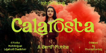 Calarosta - is a versatile unique, beautiful and clean serif font family, created with precision in each glyphs character. This font is perfect for logo branding, product designs, quotes, posters, display, website, invitation card, greeting card, headline, website, magazine, and your various other design projects with an outstanding style. Calarosta includes 4 weight styles which each include 225 glyphs. Features: 4 Font Weight Uppercase & Lowercase Multilingual Support Number & Punctuation Alternatives & Ligatures Thank you, for supporting us.
 - SK Paragrapher by Shriftovik,
$10.00 SK Paragrapher™ is a monumental geometric typeface whose structure was inspired by the paragraph glyph. The entire typeface is built on a rhythmic composition and a black-to-white balance. Each character corresponds to a grid, and all its characters are monospaced, so the typeface looks harmonious and complete, despite the complexity of perception of its appearance. This typeface has both uppercase and lowercase letters, as well as a capital! The typeface supports a multilingual layout that includes: extended Latin and Cyrillic characters, additional characters, and Hebrew. This typeface also includes more than 10 currency symbols, as well as 4 fonts: Solid, Outline, Rounded, Sharp! As a result, SK Paragrapher is a multilingual, monospaced geometric monumental typeface that contains almost 1000 glyphs for your any design work, be it a poster or a website!
 - Technica by Monotype,
$25.00 Do you remember a typeface called Meccanica? I didn’t think so. Well, it was pretty unique – too unique for most people’s tastes it seems. Anyway, this is Technica, Meccanica’s more conservative little brother. Essentially, this typeface is a geometric sans that retains the structure of Meccanica, but tones down most of the hexagonal elements. The chamfered terminals are retained, but sharpened, and a more technical approach is instilled with each glyph being fine-tuned for optimal performance and aesthetics. The result is a refined sans serif that has enough personality to differentiate itself from the myriad of others available – undoubtedly, Technica will deliver a distinctive tone to your own typographic designs. Key features: • 9 weights in Roman and Italic • Western European character set (Adobe Latin 1) • 250+ glyphs per font.
 - Christmas Blink by Jolicia Type,
$25.00 Introducing Christmas Blink, the perfect festive font to add a touch of holiday magic to your designs! This whimsical and joyful typeface is specially crafted to bring the spirit of Christmas to life in your creative projects. "Christmas Blink" is more than just a font, it's a journey into a playful wonderland of letters adorned with festive charm. Each character sparkles with a unique personality, making your text come alive with the joyful spirit of the season. The font's playful elegance ensures that it's perfect for a wide range of Christmas-themed designs. This font comes equipped with charming variations for select characters, allowing you to customize your text and add a personal touch to your designs. Experiment with alternate styles to create truly unique and eye-catching compositions.
 - HWT Star Ornaments by Hamilton Wood Type Collection,
$24.95 Star Ornaments are seen as a long standing companion to many wood type poster layouts. Various manufacturers managed to derive many variations of the five pointed star motif and offered them as a ubiquitous ornament option in almost all of their catalogs. Manufacturers such as Wm. H Page, Morgans & Wilcox, Tubbs Mfg. Co. and of course, Hamilton Wood Type each had their own slight variations. This digital font features almost 100 glyphs of mostly stars, but it also features a unique star border that can create boxes just like the modular offerings of the 19th century. The twist on this digital version is the inclusion of additional connection options that become a unique lettering 'kit' that can create typography or maze-like connections using a limited set of component parts.
 - Christmas Notes by PhoenixXWay,
$17.99 Each character in this font is thoughtfully crafted using delightful musical notes, creating a visually captivating representation of the Christmas season. Functional As far as we know, this font includes basically everything you would want to write sheet music. Holiday Greeting Cards: Create heartwarming and visually appealing Christmas cards that resonate with the holiday spirit, featuring messages that sing with festive joy. Decorations: Craft eye-catching decorations for your home, office, or holiday party that capture the magic of Christmas in a unique and musical way. Gift Wrapping: Design personalized gift tags and wrapping paper that showcase the beauty of music, making your presents even more special. Digital Media: Elevate your online presence with Christmas-themed social media posts, banners, and website elements that spread the holiday spirit to your virtual audience.
 - Endless Sixties JNL by Jeff Levine,
$29.00 Sunny summer days, white sand beaches and radical waves come to mind with Endless Sixties JNL, inspired by a poster for a surfing movie entitled "Planet Aura". The image of the poster was provided by Gene Gable, who has on many occasions supplied Jeff Levine with many interesting font inspirations.