10,000 search results
(0.086 seconds)
- De Gozaru by Bejeletter,
$14.00 De Gozaru, is a classic calligraphy font with a beautiful arch. This font is available in several modern swirls that can make your work look elegant, sweet and perfect. This font also has several alternatives that can allow you to improvise your writing.
 - Couple Valentine by Selvia Design,
$15.00 "Couple Valentine" is a very unique and beautiful display font. This font has a heart shape on each letter. It is suitable for romantic moments, Valentine's Day, weddings, and more. This font is equipped with uppercase, lowercase, numerals, punctuations, and multilingual support.
 - Palisade by profonts,
$51.99 Palisade Pro is a new, very elegant script family developed and manufactured in OpenType Pro format by profonts studio. Each of the eight weights contains approximately 1250 characters! The character range includes the complete Latin layout for Western and Eastern Europe, including the Baltic states, Romania and Turkey. Moreover, the character set contains a large selection of handcrafted ligatures (about 450 per font!), character combinations and alternative characters, which make this attractive script perfect for OTF-enabled applications such as InDesign and Quark Xpress version 7and later.
 - Rufina Stencil by TipoType,
$14.00 Simplicity, delicacy and elegance are the words that best characterize Rufina. Based on an idea that was conceived long before its “birth”, Rufina was created from dark-text on light-background combinations. Refined and at the same time distant, Rufina seduces the viewer in a subtle and elegant manner. Blending of contrasty, Bodoni-influenced forms with the emotive touch of the calligraphers pen. This family consists of two weights, their italic counterparts, plus a set of alternate cuts — each containing a selection of illustrative ornaments.
 - Dr066 by 066.FONT,
$9.99 Dr066 is a display font that simulates the appearance of typewritten text. Each letter in Dr066 has been carefully designed to resemble the effect you get with a typewriter. This effect adds a sense of nostalgia to the text, as if it were from a bygone era, adding an authentic charm to the designs. Dr066 retains its varied and extravagant style, giving the text a lightness and a certain nonchalance. Its distinctive and daring letters make it ideal for projects that strive for a unique look.
 - Space Deco JNL by Jeff Levine,
$29.00 Hand lettering used on the packaging of a space-themed rubber stamp toy set is the basis for Space Deco JNL. Blending the classic thick-and-thin line weights of the Art Deco style with sharply angled cross strokes evoked a sense of movement and "future" in this unique lettering design.
 - Mafins by Nathatype,
$29.00 Mafins is a combination font of thick display and serif fonts which is simply designed in formal, modern, elegant impressions like other serif fonts. The differences between the thick and thin lines on each character is dramatic and the letters' edges have small hooks for a legibility reason. Due to the great legibility, you can use this font for any text sizes. Make your every design perfect with Mafins font to create the best impressions on your designs. Features: Stylistic Sets Ligatures Multilingual Supports PUA Encoded Numerals and Punctuations Mafins fits for various design projects, such as posters, banners, logos, magazine covers, quotes, name cards, invitations, headings, printed products, merchandise, social media, etc. Find out more ways to use this font by taking a look at the font preview. Thanks for purchasing our fonts. Hopefully, you have a great experience using our font. Feel free to contact us if you require more information when you are dealing with a problem. Thank you. Happy designing.
 - Fisterra by TipoType,
$39.00 Fisterra Morte and Fisterra Fora: one typeface, two perspectives. The duality between the calm and the intensity with which we can face with each situation. Informal, serif and display in two flavors: Morte has the softness and the humanism of its voluptuous curves; Fora, the precision and accuracy of its sharp angles. They share a single skeleton of condensed uppercase letters, with expanded nuances in some alternate characters and ligatures.
 - Gans Antigua Manuscrito by Intellecta Design,
$14.95Gans Antigua Manuscrito is a revival font by Intellecta Design. researched at the rare catalogue from the extinct Fundicion Richard Gans, from Madrid. See also other font families inspired by Gans' original typefaces: Gans Tipo Adorno , Gans Lath Modern , Gans Titular Adornada , Gans Ibarra , Gans Antigua , Gans Fulgor and Gans Radio Lumina . - Astaneh by Si47ash Fonts,
$24.00 Super clean, yet sophisticated! Astaneh with its 2 weights brings a modern and clean sans serif Arabic/Persian typeface to life! Shahab Siavash, the designer has done more than 30 fonts and got featured on Behance, Microsoft, McGill University research website, Hackernoon, Fontself, FontsInUse,... Astaneh text and headline font which is one of his latest designs, already got professional typographers, lay-out and book designers' attention as well as some of the most recognizable publications in Arabic/Persian communities.
 - Hezareh by Si47ash Fonts,
$24.00 Familiar, yet eye-catching! Hezareh with its 2 weights brings a modern and clean serif Arabic/Persian typeface to life! Shahab Siavash, the designer has done more than 30 fonts and got featured on Behance, Microsoft, McGill University research website, Hackernoon, Fontself, FontsInUse,... Hezareh text and headline font which is one of his latest designs, already got professional typographers, lay-out and book designers' attention as well as some of the most recognizable publications in Arabic/Persian communities.
 - VLNL DBXLZX by VetteLetters,
$9.00 DBXLZX was inspired by the logo of the ZX Spectrum home computer, released in 1982 by Sinclair Research. For many designers the 8-bit pixel grid of the ZX Spectrum was one of the first steps into the realm of digital design. DBXLZX was initially developed by DBXL into a three weight family for use on the Armind record label of world famous trance deejay Armin van Buuren.
 - Excited Alphabets by Harald Geisler,
$50.00 Excited-Alphabets is a lowercase display font. The letterform is sans-serif with a few appendages to give the letters a life-like and cheerful form. Also, each Letter has two poses (i.e. s and S) which makes it easy to design the perfect headline, characters can also be chosen individually from the glyphs menu to get a unique look. Its dynamic or ‘dancing’ look makes it perfect for (short) editorial headlines, celebratory lines, fun branding, social media posts, website headers, posters, ads, products, stationery designs and more. Excited alphabets was born in Frankfurt (Germany) when two ‘almost-neighbours’ met at a coffee shop. Inspired by the illustration of Sumbo Pinheiro, Excited was designed by Harald Geisler and Sumbo Pinheiro. From quirky illustration to font, this was a fun project to work on because each alphabet comes with its own sassy character.
 - Play It Cool by PizzaDude.dk,
$17.00 Play it cool with your designs - especially if you do something handcrafted! This font has 4 different versions of each letter - enough to make it look random and handcrafted!
 - Rahere Slab by ULGA Type,
$18.98 Part of the extended Rahere typeface family, Rahere Slab is a humanist slab serif (or Egyptian) in six weights from light to extra bold with corresponding italics. Rahere Slab – like its sibling Rahere Sans – features subtle detailing, giving the typeface a distinctive, warm appearance without distracting the reader. Legible at large and small sizes, Rahere Slab is a versatile, workhorse typeface that is suitable for a wide range of applications such as information signage, packaging, annual reports, advertising, brochures, catalogues, screen text and visual identities. Slab serifs are ideal for projects that need to convey a sense of authority tempered with diplomacy or messages that just need some serious oomph – and Rahere is a great slab for the job. The italic lowercase is more cursive and expressive than the roman and when they’re used together it displays enough character to create emphasis without looking out of place while harmonising admirably. Set on its own (for example, pull-out quotes), the italic exudes a charm that draws attention to the text. The character set covers most European languages plus Vietnamese. Each weight contains lining & non-aligning numerals in both proportional & tabular spacing. The tabular numerals share the same width across all weights and styles (matching Rahere Sans too) – indispensable for financial tables in annual reports. If a companion sans serif is needed, Rahere Sans is the perfect partner. They are both part of the extended Rahere typeface family and have been designed to complement each other beautifully. The typeface is named after Rahere, a 12th-century Anglo-Norman priest, who founded the Priory of the Hospital of St Bartholomew, London in 1123. In 2007 I was successfully treated at Barts for relapsed testicular cancer so I’m indebted to all the doctors, nurses and support staff who work there. A special shout out to Orchid Cancer – a UK charity that helps men affected by cancer – who funded the research for my treatment.
 - FF Kievit by FontFont,
$99.99American type designer Michael Abbink created this sans FontFont in 2001. The family has 9 weights, ranging from Thin to Black (including italics) and is ideally suited for advertising and packaging, book text, logo, branding and creative industries, small text, wayfinding and signage as well as web and screen design. FF Kievit provides advanced typographical support with features such as ligatures, small capitals, alternate characters, case-sensitive forms, fractions, and super—and subscript characters. It comes with a complete range of figure set options—oldstyle and lining figures, each in tabular and proportional widths. As well as Latin-based languages, the typeface family also supports the Cyrillic and Greek writing systems. FF Kievit received several awards: the Bukva:raz award in 2001 and the ISTD award in 2001. - Winden by Latinotype,
$26.00 Winden is a geometric slab serif typeface based on the bestselling font Isidora https://www.myfonts.com/fonts/latinotype/isidora/ and inspired by early 20th century famous classic slab-serif typefaces. Characteristic features such as trapezoid shape serifs give Winden a modern, contemporary touch and the rounded edges of the Alt version make it look unique and special. This font consists of two subfamilies: Winden —classic, simple and functional— and Winden Alt (playful and contemporary), ideal for display use. Each version comes in 7 weights, ranging from Thin to Black, and includes matching italics— 28 fonts in all. Winden is the perfect choice for headlines, logos, branding, packaging, publications and websites. The full set contains 615 characters that support over 200 Latin-based languages.
 - Hemingway's Shotgun by Burghal Design,
$29.00Once upon a time (a.ka. 1984), there was a Goth band who called themselves "Hemingway's Shotgun." As a symbol of his commitment to this band, the bass player acquired a tattoo of a shotgun on his forearm. Unfortunately, this tattoo wasn't very well drawn: the barrel was much too short, and was much thinner at one end than the other. The tattoo rather resembled a small, cordless, rechargeable hand-held vacuum cleaner. Thus, the band "Hemingway's Dustbuster" was born. - Rumbles Arena by Hanzel Space,
$25.00 Rumble sans serif. Combines elegant in letters, making this font look exclusive and elegant. With high letters display and thin in the anatomy of each letter. Rumble is a gorgeous sans-serif typeface that is both classically elegant and inherently modern. Create beautiful wedding invitations, use it as an elegant solution for your next magazine layout, or choose Rumble for any graphics that require a Elegant look with a vintage flair.. Rumble is based on classic letterforms for publishing and display graphics, so you can give your text a classic, elegant feel with Rumble clean.
 - FF Kava by FontFont,
$68.99 German type designer Yanone created this sans FontFont between 2009 and 2010. The family has 10 weights, ranging from Thin to Black (including italics) and is ideally suited for advertising and packaging, festive occasions, editorial and publishing, logo, branding and creative industries as well as poster and billboards. FF Kava provides advanced typographical support with features such as ligatures, small capitals, alternate characters, case-sensitive forms, fractions, and super- and subscript characters. It comes with a complete range of figure set options – oldstyle and lining figures, each in tabular and proportional widths.
 - Rohn Rounded by Nine Font,
$29.00 Rohn Rounded is a rounded version of Rohn. This family is a modern squarish typefamily with a large x-height and soft feeling. Its letterforms are based on the shape of square with rounded corners. With particular details and large x- height, it is more legible at small sizes both on screen and paper. It has seven weights from Thin to Black with corresponding oblique styles and each weight includes ligatures, fractions, old style numbers, case-sensitive forms and more. Rohn Rounded is ideally suited for branding, logo, packaging, magazine, poster and editorial design.
 - Anicon Slab by NREY,
$79.00 Anicon Slab font consist of 18 weight: from Thin to Black with each weight paired by italic. Also including Latin & Cyrillic language support with more than 35 languages. Anicon is a fonts superfamily, semicondensed sans serif and slab serif with humanistic forms of characters. This font was crafted with the intention to present a clean, legible, multipurpose font family that is easy to read wether it's on screen or print. Fit for all purposes; text, display, headline, print, corporate identity, logo, branding, product, infographic, photography and other application and medium.
 - Knocked Around - Unknown license

- Generis Slab by Linotype,
$29.00The idea for the Generis type system came to Erik Faulhaber while he was traveling in the USA. Seeing typefaces mixed together in a business district motivated him to create a new type system with interrelated forms. The first design scheme came about in 1997, following the space saving model of these American Gothics. Faulhaber then examined the demands of legibility and various communications media before finally developing the plan behind this type system. Generis’s design includes two individually designed styles; each of with is available with and without serifs, giving the type system four separate families. Each includes at least four basic weights: Light, Regular, Medium, and Bold. Further weights, small caps, old style figures, and true italics were added to each family where needed. The Generis type system is designed to meet both optical criteria and the highest possible measure of technical precision. Harmony, rhythm, legibility, and formal restraint make up the foreground. Generis combines aesthetic, technical, and economic advantages, which purposefully and efficiently cover the whole range of corporate communication needs. The unified basic form and the individual peculiarity of the styles lead to Generis’ systematic, total-package concept. The clear formal language of the Generis type system resides beneath the information, bringing appropriate typographic expression to high-level corporate identity systems, both in print and on screen. The condensed and aspiring nature of the letterforms allows for the efficient setting of body copy, and the economic use of the page. A range of accented characters allows text to be set in 48 Latin-based languages, offering maximal typographic free range. This previously unknown level of technical and design execution helps create higher quality typography in all areas of corporate communication. Optimal combinations within the type system: Generis Serif or Generis Slab with Generis Sans or Generis Simple. - Generis Serif by Linotype,
$29.00The idea for the Generis type system came to Erik Faulhaber while he was traveling in the USA. Seeing typefaces mixed together in a business district motivated him to create a new type system with interrelated forms. The first design scheme came about in 1997, following the space saving model of these American Gothics. Faulhaber then examined the demands of legibility and various communications media before finally developing the plan behind this type system. Generis’s design includes two individually designed styles; each of with is available with and without serifs, giving the type system four separate families. Each includes at least four basic weights: Light, Regular, Medium, and Bold. Further weights, small caps, old style figures, and true italics were added to each family where needed. The Generis type system is designed to meet both optical criteria and the highest possible measure of technical precision. Harmony, rhythm, legibility, and formal restraint make up the foreground. Generis combines aesthetic, technical, and economic advantages, which purposefully and efficiently cover the whole range of corporate communication needs. The unified basic form and the individual peculiarity of the styles lead to Generis’ systematic, total-package concept. The clear formal language of the Generis type system resides beneath the information, bringing appropriate typographic expression to high-level corporate identity systems, both in print and on screen. The condensed and aspiring nature of the letterforms allows for the efficient setting of body copy, and the economic use of the page. A range of accented characters allows text to be set in 48 Latin-based languages, offering maximal typographic free range. This previously unknown level of technical and design execution helps create higher quality typography in all areas of corporate communication. Optimal combinations within the type system: Generis Serif or Generis Slab with Generis Sans or Generis Simple. - Generis Simple by Linotype,
$39.00The idea for the Generis type system came to Erik Faulhaber while he was traveling in the USA. Seeing typefaces mixed together in a business district motivated him to create a new type system with interrelated forms. The first design scheme came about in 1997, following the space saving model of these American Gothics. Faulhaber then examined the demands of legibility and various communications media before finally developing the plan behind this type system. Generis’s design includes two individually designed styles; each of with is available with and without serifs, giving the type system four separate families. Each includes at least four basic weights: Light, Regular, Medium, and Bold. Further weights, small caps, old style figures, and true italics were added to each family where needed. The Generis type system is designed to meet both optical criteria and the highest possible measure of technical precision. Harmony, rhythm, legibility, and formal restraint make up the foreground. Generis combines aesthetic, technical, and economic advantages, which purposefully and efficiently cover the whole range of corporate communication needs. The unified basic form and the individual peculiarity of the styles lead to Generis’ systematic, total-package concept. The clear formal language of the Generis type system resides beneath the information, bringing appropriate typographic expression to high-level corporate identity systems, both in print and on screen. The condensed and aspiring nature of the letterforms allows for the efficient setting of body copy, and the economic use of the page. A range of accented characters allows text to be set in 48 Latin-based languages, offering maximal typographic free range. This previously unknown level of technical and design execution helps create higher quality typography in all areas of corporate communication. Optimal combinations within the type system: Generis Serif or Generis Slab with Generis Sans or Generis Simple. - Generis Sans by Linotype,
$29.00The idea for the Generis type system came to Erik Faulhaber while he was traveling in the USA. Seeing typefaces mixed together in a business district motivated him to create a new type system with interrelated forms. The first design scheme came about in 1997, following the space saving model of these American Gothics. Faulhaber then examined the demands of legibility and various communications media before finally developing the plan behind this type system. Generis’s design includes two individually designed styles; each of with is available with and without serifs, giving the type system four separate families. Each includes at least four basic weights: Light, Regular, Medium, and Bold. Further weights, small caps, old style figures, and true italics were added to each family where needed. The Generis type system is designed to meet both optical criteria and the highest possible measure of technical precision. Harmony, rhythm, legibility, and formal restraint make up the foreground. Generis combines aesthetic, technical, and economic advantages, which purposefully and efficiently cover the whole range of corporate communication needs. The unified basic form and the individual peculiarity of the styles lead to Generis’ systematic, total-package concept. The clear formal language of the Generis type system resides beneath the information, bringing appropriate typographic expression to high-level corporate identity systems, both in print and on screen. The condensed and aspiring nature of the letterforms allows for the efficient setting of body copy, and the economic use of the page. A range of accented characters allows text to be set in 48 Latin-based languages, offering maximal typographic free range. This previously unknown level of technical and design execution helps create higher quality typography in all areas of corporate communication. Optimal combinations within the type system: Generis Serif or Generis Slab with Generis Sans or Generis Simple. - Calligraphica by Monotype,
$49.00Calligraphica was designed because there are very few inline fonts, and even fewer inline calligraphic fonts. The original forms were written with a split pen in a single stroke. The minuscules have a rougher look and the capitals have a smoother shape to imitate hand written calligraphy with more formal, decorative initial caps. The Calligraphica family contains 6 fonts: Calligraphica Regular and Italic are the regular upright roman true italic version of the font. The ascenders on this font are a bit higher than the capital letters--this is standard for most fonts. Calligraphica LX Regular and Italic are similar to the first 2 fonts except their ascenders are longer and reach high above the capital letters--giving these fonts a taller appearance. Calligraphica SX Regular and Italic are similar to the first 2 fonts except their ascenders are shorter and are the same height as the capital letters--giving these fonts a shorter appearance. - Homelike by Creativework Studio,
$12.00 Homelike is a bold display font, carefully handcrafted to become a true favorite. Its casual charm makes it appear wonderfully down-to-earth, readable and, ultimately, incredibly versatile. This font will look outstanding in any context, whether it’s being used on busy backgrounds or as a standalone.
 - Jelly Boots by Awan Senja,
$14.00 Jelly Boots is a cute display font, carefully created to become a true favorite. Its casual charm makes it appear wonderfully down-to-earth, readable and, ultimately, incredibly versatile. This versatility will appeal to a wide range of crafty ideas, from letterheads and titles, to stationery.
 - Amazing Sweety by Almarkha Type,
$33.00 Amazing Sweety font with a Stylish Script perfect for any creative design. This handmade font will make your design has a beautiful natural touch for each details. It is perfect for any design project as Invitation,logo, book cover, craft or any design purposes. This font is PUA encoded which means you can access all of the magical glyphs and swashes with ease! It also features a wealth of special features including alternate glyphs and ligatures.
 - Morning Sweety by Almarkha Type,
$27.00 Morning Sweety Beautiful Script font with a natural handwritten feel, perfect for any creative design. This handmade font will make your design has a beautiful natural touch for each details. It is perfect for any design project as Invitation,logo, book cover, craft or any design purposes. This font is PUA encoded which means you can access all of the magical glyphs and swashes with ease! It also features a wealth of special features including alternate glyphs and ligatures.
 - Clarins by Larin Type Co,
$14.00 Clarins This is a beautiful font duo that includes a Serif and a Script font. These fonts are written by hand and perfectly match each other, serif leaves streaks from an uneven stroke and looks a little careless and attracts attention, It will fit perfectly into a project where this inaccuracy is necessary. The script written with a brush is perfect for any project and will decorate it, as well as it includes alternates for lowercase. Enjoy using!
 - Bellamona by Almarkha Type,
$25.00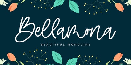 Bellamona is Beautiful Monoline font with a natural handwritten feel. perfect for any creative design. This handmade font will make your design has a beautiful natural touch for each details. It is perfect for any design project as Invitation,logo, book cover, craft or any design purposes. This font is PUA encoded which means you can access all of the magical glyphs and swashes with ease! It also features a wealth of special features including alternate glyphs and ligatures.
 - Bellachia by Almarkha Type,
$23.00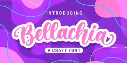 Bellachia font with a natural Script feel , perfect for any creative design. This handmade font will make your design has a beautiful natural touch for each details. It is perfect for any design project as Invitation,logo, book cover, craft or any design purposes. This font is PUA encoded which means you can access all of the magical glyphs and swashes with ease! It also features a wealth of special features including alternate glyphs and ligatures.
 - Sweetie Banana by Almarkha Type,
$23.00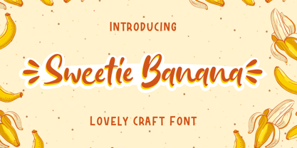 Sweetie Banana - is a Cute & Lovely Craft font with a natural handwritten feel. This handmade font will make your design has a beautiful natural touch for each details. It is perfect for any design project as Invitation,logo, book cover, craft or any design purposes. This font is PUA encoded which means you can access all of the magical glyphs and swashes with ease! It also features a wealth of special features including alternate glyphs and ligatures.
 - Lovely Sweetie by Almarkha Type,
$25.00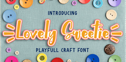 Lovely Sweetie - is a Playful Craft font with a natural handwritten feel. This handmade font will make your design has a beautiful natural touch for each details. It is perfect for any design project as Invitation,logo, book cover, craft or any design purposes. This font is PUA encoded which means you can access all of the magical glyphs and swashes with ease! It also features a wealth of special features including alternate glyphs and ligatures.
 - Milkalotta by Almarkha Type,
$23.00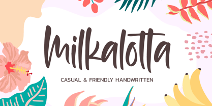 Milkalotta – is a Cute & Authentic Script font with a natural handwritten feel. This handmade font will make your design has a beautiful natural touch for each details. It is perfect for any design project as Invitation,logo, book cover, craft or any design purposes. This font is PUA encoded which means you can access all of the magical glyphs and swashes with ease! It also features a wealth of special features including alternate glyphs and ligatures.
 - Lundoon by Mazkicibe,
$11.00 Description Hello gaes! How are you guys ? I'm sure it's very good. Introducing, this is our newest product, we call this produc Lundoon Font.. Lundoon Font is Handwritten and modern font combined with a sweet touch and beautifully curved each letter. using a touch of soft curves so that it is pleasing to the eye Lundoon Font Spirit is great for: Wedding invitations, fashion magazines, logos, signatures, and suitable for watermark photography. Features: -Uppercase, -Lowercase, -Numeral, -Punctuation,
 - Hedone by Jehoo Creative,
$19.00 Blending minimalist and elegant styles makes Hedone typeface have a classy character. Hedone is a condensed sans typeface but in some glyphs it has a complete circle shape, and the ink trap on each glyph makes a strong elegant impression on Hedone typeface. it's perfect for a striking vintage and elegant minimalist theme design. Stunning details and versatile possibilities for this font make it an essential addition to any type magazines, posters, album covers, brochures, social media posts, web UI and so on. 4 weights with more than 475 glyphs each, have the Opentype Alternate feature, ligature, and discretionary ligature. Support Western Europe, Central / Eastern Europe, Baltic, Turkish, Romanian, Cyrillic making it very flexible when combined with other typefaces.
