10,000 search results
(0.033 seconds)
- Ongunkan Radloff Anglosaxon by Runic World Tamgacı,
$100.00 Vasili Vasilyevich Radlof or Wilhelm Radloff (Russian: Василий Васильевич Радлов; German: Wilhelm Radloff; 17 January 1837 - 12 May 1918) was a German-born Russian orientalist and founder of Turcology. Radloff is a German-born Russian Turcologist who researches the Turkish world from different perspectives, opens a new era in the history of Turkology by bringing them to light, and devoted 60 years of his 81-year life to these studies. He published his work known as Radloff's Atlas with a runic font specially developed for the Old Turkish Runic Alphabet. I made the Turkish Runic Font using Radloff's Atlas. I developed this Anglo Saxon Futhark font based on this font and adapted it to Anglo Saxon script.
 - Area51 by Comicraft,
$29.00 The characters in this font are the key players in a global conspiracy reaching down into the lives of every man, woman and child on the planet. The Information Agency known as "Active Images" has been shut down. The availability of this font is now restricted to comicbookfonts.com operatives only. Information Agents have been instructed to deny the existence of any UFO* activity in the pages of CABLE, GEAR STATION or LEGION LOST. Trust no one. *Unauthorized Font Operation
 - ALS Scripticus by Art. Lebedev Studio,
$63.00 There are many script typefaces but there is only one Scripticus. Scripticus is like a chameleon: In whatever surroundings you put it, it adapts itself and looks like it couldn't be anywhere else. Be it a sales advertisement, a music Website, a comic strip or a journal with complex chemical formula – Scripticus always solves the problem in a natural and leisurely way. And it never makes compromises concerning clarity. But where does Scripticus come from? … From the good old high school blackboard! Blackboards have become almost obsolete in teaching, but be it a black or white background – clear, strong characters placed on the board while the facts are explained are still one of the best ways to make and keep things understandable. Scripticus is dedicated to my high school chemistry teacher who was an expert in just this. While the letterforms come from different inspirations, its aim is the same as the pedagogical aim of my teacher: Combining clarity with a strong personality. Scripticus has a special trick to give it its natural look: Four alternates for each letter and each number plus rotation coding make the glyphs appear in lively melodic flow. In this way even mathematic equations look nice! Scripticus has a lot of OT-features that help it do its job. They are: capital spacing, localized forms, subscript, scientific inferiors, superscript, numerators, denominators, fractions, ordinals, tabular figures, historical forms, ligatures, stylistic alternates, stylistic set and ornaments. Finally, as is my general goal in type design – Scripticus supports close to one hundred languages from Latin extended to Cyrillic extended.
 - YT Deal Latin by Yangtype,
$9.00The concept of this letter is calmness. I created a variety of sans-serif fonts, and when I listed the fonts I had created, I was surprised that their shapes were not very different from each other. Among them, this font calmly caught my eye. The power of quiet progress is felt in this unremarkable form. - Awax by Arkilion,
$19.90 This font is the result of many years of research between full and empty. The combination of capital letters is very powerful while remaining in the traditional art of an ancestral Zen style. AWAX is perfect for your titles and logos and can also be used in paragraphs. You have to go very very closely to admire the detail work done while scrupulously respecting legibility and balance.
 - Outdoors Photographer by Adita Fonts,
$16.00 Introducing Outdoors Photographer ! Discover the charm of this elegant Marker Font, Meticulously crafted, this font seamlessly blends each character to perfection, allowing you to create captivating combinations through Mix & Match. The result is a truly original look that caters to all your project requirements.
 - Classica Pro by URW Type Foundry,
$35.99 Classica Pro by Bernd Möllenstädt A real alternative for letterpress printing A masterpiece It was only after many years, shortly before the end of his life, Bernd Möllenstädt brought out these early drafts of his Classica Light and Light Italic from his drawer, and asked me to produce for him on the computer a Bold and Bold Italic, from which we later wanted to interpolate further cuts like Regular and so on. The boldening of letters with an oblique axis and with hairlines which should not grow to the same extent as the general line widths, is hard to cope with perfectly, even for the smartest computer program, and even more so, when it concerns an as complicated set of data as those conceived by Bernd. The automatically generated result could therefore only be a first step that had to be improved manually later. This was about the stage that we had reached when Bernd died in March 2013, leaving me behind with comprehensive corrections on proofs of this automatically generated Bold. Although I was aware that it would mean a lot of work to complete the project, I did not want to leave it unfinished and decided to finalize and publish the Classica, also in Bernd‘s honor. In the course of the two years that I worked on this font family it somewhat naturally became also my own. New details were added and some of the existing changed. A book typeface requires the supreme and forgives rarely, it represents a true masterpiece. My intention and my ambition were to create a real alternative for letterpress printing, with a font family that contains all the typographic options for an excellent typesetting, and is better readable and has a better appearance than other existing typefaces. Whether this was achieved, the reader may decide. Volker Schnebel, Hamburg, december 2014
 - 2009 Handymade by GLC,
$38.00 This font is not a historical one. Although to make it was quite time-consuming (each glyph was hand-drawn separately, except for the ligatures), this cartoon or comics style font is just made for fun.
 - Loophole by ArtyType,
$23.00 Loophole is a visually striking display typeface in 3 weights (Light, Regular & Bold), its DNA firmly rooted in the Cyclic Sans family which makes the perfect foil to this somewhat decorative font styling. The Loophole name is quite simply based on the ubiquitous hole motif, which is strategically deployed on each character across the 3 font styles. Each font contains an extended Latin character set covering Western & Central Europe, the Baltic States & Turkey.
 - Quigglesmith by Comicraft,
$19.00 It's just downed a Cortado in one gulp, it's shaved the sides of its head and its grown a magnificent beard groomed with the very best beard oils. Turn around and you'll find that it has illustrated today's specials in chalk on the wall sized blackboard behind the espresso machines it's Quigglesmith! Penned by Comicraft's very own Chattanooga Barista, Sarah Hedrick, with a foam art finale by Swell John Roshell, it's sure to dye its hair purple by the weekend. Quigglesmith is as variable in its weights as your soy/almond/oat/hazelnut milk choices at the coffee bar, and is sure to bring customers back for more. Have a Biscotti on us. Quigglesmith contains an alternate version of each upper and lowercase letter which automatically cycle for a natural, hand-drawn appearance. Each weight contains 538 glyphs and supports 220 languages.
 - Snare by In-House International,
$5.00 A typeface that celebrates marching to the beat of your own drum. Snare is a jazzy little display type that presents like a stencil but behaves in its own way.Featuring angled section breaks and variable heights, Snare keeps each character’s footprint steady as as its heights change, revealing unique crossbars, periscoping capitals and deep-sinking descenders. Because each character follows its own rules, the more each word grows, the more it shows the beautiful rhythm of variety. Or stretch individual characters to shape the contours of your words. Beyond just being playful, fun to dress in colors, and delightfully useful for tight spaces,Snare’s lanky verticals and nervous energy reflect the time it was created. In this second pandemic spring, Snare brings up the drumroll-expectant heartbeat of our uncertainty, and the wish that when we can all meet again, our newfound weirdnesses will find a home in the world. The Snare font family includes one uppercase alphabet with two lowercase variants and comes in ten standard weights-which-are-just-really-heights (.otf) and as a variable type(.ttf) for designers using compatible platforms. Snare was designed by Alexander Wright and In-House International and developed byRodrigo Fuenzalida at FragType. In-House International’s foundry was launched in the summer of 2020 to offer bold, experimental, display typefaces that tell a story. Our previous releases have been featured on Design Milk, DesignBoom, Slanted and all sorts of exciting places.
 - Tropical Tourist JNL by Jeff Levine,
$29.00 A 1934 advertisement for the Roney Plaza Hotel at 23rd Street and Collins Avenue on Miami Beach yielded the inspiration for Tropical Tourist JNL. While this wonderful example of Art Deco lettering survived, sadly the original Roney was torn down around 1969 and replaced with a modern apartment house/condos bearing the same name.
 - Staufer Gotisch by RMU,
$35.00 Thannhaeuser’s mid-1930s display blacklettr font as a fresh and extended redesign called Staufer Gotisch. This font contains a bunch of useful ligatures, and it is recommended to activate both Standard and Discretionary Ligatures. To reach the numero sign, type the combination N-o-period und activate the OT feature Ordinals. The # key is occupied by the round s.
 - Narrow Way by Ingrimayne Type,
$9.00 NarrowWay is a family of 18 condensed and ultra-condensed sans-serif typefaces. The family started with the ultra-condensed widths, then the condensed and regular widths (the regular is still quite condensed) were added. All widths have three weights and each weight has an italics style. These 18 styles lack a true lowercase but rather have a set of alternative characters, some based on lower-case forms, on the lower-case keys. Some alternative letters can be reached with the OpenType feature of stylistic sets. The character spacing in most of the styles is quite loose and it can be tightened with an application's character spacing if needed. These typefaces are display faces that can be useful for squeezing tall lettering into tight spaces. They are not readable at small point sizes.
 - Pride Signature by Letteralle,
$23.00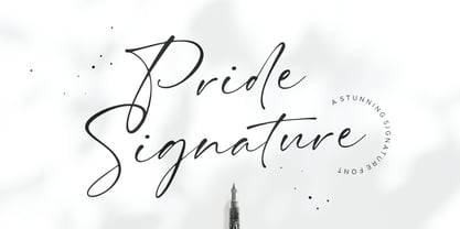 I'd like to introduce you Pride Signature! an elegant signature font. Font with natural flow and feminine style. Each letter is deliberately imperfect to make it look more natural and charming. Pride Signature comes with multilingual support, long range ligature, and ending swash from a-z. Pride Signature is perfect for many design needs such as merch, T-shirts, titles, book covers, social media posts, websites, events, and many more. Enjoy the font, Thanks!
 - Coppint by Ridtype,
$25.00 Coppint is a font formed with serenity and imagery in patterns that refer to warmth and harmony. Even so, this font also gives each letter an elegant and semi-modern impression. When this font was created, Ridwan Fadilah, the designer, said that this font must race in a contextual and basic fundamental hierarchy. Thus, this font also provides stylistic weight, from smallest to largest. So that it can become a unit that can be used in optical text.
 - Little Witch by Brithos Type,
$11.00 Little Witch is a cute and incredibly unique display font. Masterfully designed to become a true favorite, this font has the potential to bring each of your creative ideas to the highest level!
 - June by Schriftlabor,
$26.99 June is a contemporary neo-grotesque sans-serif typeface designed to be highly legible, readable, and usable. The clarity and mathematics were inspired by the research into type form by Adrian Frutiger. June was designed by developing a modern and unique approach to his findings. June's legible features include a near uniform stroke width, open apertures and counters, angular cut stems, and a large x-height. Italics are angled at eight degrees and have been redesigned to provide a stylistic difference without reducing legibility. June comes in seven weights, from Thin to Bold, each equipped with OpenType features. June can be used for all print sizes, and has characteristics that are more visible at larger sizes. June was inspired by a close family member of the designer. A part of all sales will be donated to Alzheimer's Society. Free Variable Font: If you buy the full family, you will also receive the Variable Font version of June, without extra charge.
 - Merengue Script by Sudtipos,
$59.00 Merengue Script is the second typeface designed by Panco, once again together with Ale Paul, who supervised the whole development. In this opportunity, the process of shape research and the systematization of signs led him to dive into new waters. The objective was to generate a system of signs in which the construction of such was not directly bound to traditional calligraphy, nor to texts typography. Instead, the point was to create signs inspired in “Brush pen” calligraphy but with their main features drawn or literally illustrated. The result was a font with personality, authenticity and uncommon formal aspects that make Merengue Script an interesting, highly attractive and rather unusual font. From the very beginning, the search was based on creating a font with weight and good presence in big formats, but, at the same time, efficient for brief texts of small formats. The aim was to make it usable mainly in candy, sweets and chocolate packaging. The predominance of round shapes, harmonious modulations and funny and friendly-looking visual rhythms spark a special effect in the usage of Merengue Script. Texts are enhanced with an interesting visual charm, capable of transforming a very simple text into a virtual illustration that semantically reinforces the messages in a simple way, without putting legibility at risk. With a basic set of stylistic alternatives full of frills and flounces for initials, ornamental and final letters, plus a set of disconnected signs, Merengue Script offers a wide and versatile range of options for graphic designers in the process of packaging design.
 - Birthy by ZetDesign,
$20.00 Birthy is a serif font that comes with an alternate style for each letter unit, this allows you to choose the shape you want. This font is made to be used in every situation, both formal and informal and is available in 2 regular and italic styles with over 300 glyphs in each style. Make your creations more awesome with BIRTHY font ... have fun creating ...
 - Sommerwerk Ink by Sommerwerk,
$29.00 This font is inspired by typography found on old German shop windows. It is a script font, but instead of imitating human handwriting and the gestures connected to it, the goal was to come up with a new writing flow and stroke order. As opposed to handwriting Latin script letters, which normally means drawing each character and then connecting it to the next one, the strokes of this font run across multiple glyphs. Intentionally, the design aims to achieve a flowing transition between each glyph without making use of contextual alternates, taking the limitations of classic machine lettering as a challenge.
 - Aldo Manuzio by RMU,
$30.00 This 1897 Schelter & Giesecke in-house design was carefully redrawn, extended and redesigned for modern usage. It is a remarkable font for book covers, film and video titles, ads and much more. This font contains a 'long s' and its ligatures which can be reached by the OTF historical feature and ligatures.
 - PAG Demokratie by Prop-a-ganda,
$19.99Prop-a-ganda offers retro-flavored fonts inspired by lettering on retro propaganda posters, retro advertising posters, retro packages all the world over. This is perfect font for your retrospective project. When you type in this font, the typography looks like that small guards are marching in the street. This retro font is pretty, but it also has a punctual impression. PAG Demokratie is a perfect font for posters, magazines, product packages and all of your creations. - Leidener by Talavera,
$40.00 This font family is inspired by printed work made by the Elzevir family back in the XVIIth century at Leiden (NL). They worked with material from several type designers, but further investigations sends us to the tracks of one in particular: Robert Granjon. Granjon italics were way ahead of his time, making some really beautiful signs like swashy ampersands and minuscule v letters. This font also contains old style figures in the same fashion as they were printed, like the flipped number 8 and open forms in 6 and 9. This is as much a revival as an original design, because of their weights bold and heavy (both with italics) that were inspired on some titles. In this font you can also find a lot of ligatures, small caps, diacritics and even a fleuron for each weight and variation. Leidener came up from two books: Constantini Imperiatoris (1611) and Exercitationum Mathematicarum (1657), printed by Louis and John Elzevir on their Leiden Workshop, back in the day.
 - Spaceship Bullet - Personal use only

- Fette Kanzlei by RMU,
$30.00 Fette Kanzlei is a beautiful mid-19th century blackletter font with a touch of calligraphy which has been brought back into life again. The long s can be reached by typing alt plus b or by activating the OT feature historical forms. This font also contains oldstyle numerals.
 - Fishmonger by Suitcase Type Foundry,
$39.00Fishmonger originated from a commission of two fonts for the corporate identity of a fishmonger shop. When sketching the elementary principles for the lettering, the idea for a modern, extensive font family with a large number of styles was born. The first step consisted of defining the range of widths and weights. Then the master design Medium Regular was completed. The next step was adjusting the Extra Condensed Thin, the Extra Condensed Bold, The Extra Extended Thin and the Extra Extended Bold weights, as they are the vertices of an imaginary square map of the face. This meant that, in order to achieve a harmonious result, the x and y axis needed to be defined. From top to bottom, from the widest to the most condensed cut, the proportions are linear. However, from light to black, the line curves gently, allowing lesser difference between the light cuts, and a dramatic one between the heavier cuts. To ensure the original parameters were respected each position on the vertex was checked against the Medium Regular. After sorting out the ideal set-up, the remaining characters of each of the weights were drawn, and the remaining cuts were interpolated according to the principles above. Fishmonger is a functional, clean design, free of any buoyant, ornamental shapes, almost minimalist. Maybe this is what lends the type family its unique appearance. - Hand Printing Press by Fontscafe,
$39.00 Hand printing typography revolutionized the way books were published. The earliest printing presses made it possible for newspapers to reach the doorstep every morning, for information to freely be shared among the masses for the first time on a large scale…and the fonts that were used in those classic times are forever embedded within the collective memories of societies across the planet. It is to this collective memory that we give a visual form with our new Hand Printing Press Pack. Up for grabs are a set of 10 Hand Printing fonts plus one "Stamps" elements font. The fonts are: the Normal, the Stencil, the Eroded, the Meshed and the Scraped in REGULAR and BOLD versions; each of them displaying a simplistic yet classic printing style and as often happens lately, we are also offering you an "elements" pack, the "Stamps" font, to go with these to create your customized stamp giving to your creations a touch of "official documentation".
 - Angoli by Mashiu,
$12.99ANGOLI is characterized by line geometric and simple. This font is ideal for titles and text in large sizes. The font has two uppercase versions. To realize this character I was inspired by angular shapes of the buildings. Each character has the characteristic of being formed by a single continuous line. - Fulcanelli by Illuminaut Designs,
$10.00 A clean and balanced humanist grotesque. Like many an alchemical process, this font had to be designed and redesigned from the ground up many times. Each time it blew up in the designer's face until finally the conditions and process were in perfect alignment and this new font was born.
 - Peitago Goulya by Herry92,
$13.00 I like the letters on the Peitago goulya because each letter is curved and rounded at the edges, it looks unique and has characteristics. Peitago goulya is handwritten, intentionally made with indentations. This font looks very pleasant.. !
 - Probeta by deFharo,
$11.00 Probeta is an exclusive Sans Serif typeface family, condensed in proportion into three styles: Regular, Italic & Small Caps. Each family consists of 7 weights (Extra Light, Light, Regular, Medium, Semi Bold, Bold and Extra Bold). Plus three bonus fonts: Circle, Cube & arrows • Includes a bonnus font with the purchase of each style! After defining all the proportions of the new typeface, and starting from the drawing of the lowercase letter «o», in an exercise of minimalist construction, I have built all the characters, contributing with this technique, morphological coherence and a balanced reading. I have put special interest in defining the width of each character, depending on the relationship with others, then the configuration of the metrics and the exhaustive definition of Kerning, provide maximum readability in paragraph texts and titles. The use in graphic design, editorial or advertising guarantees originality and difference. Very versatile fonts for billboards, video games, movie titles, logos, publications, etc. They include the symbol of Bitcoin and other Cryptocurrencies.
 - Breakdance Reborn by Trustha,
$15.00 Breakdance is inspired by dance moves, the first font created with this concept is sans serif with a curved shape in one direction. Curves are made not too extreme, so that they maintain the shape balance. And now Breakdance comes in several styles and is divided into three typesface, namely script, sans and serif. Each typeface has several different styles and the total is 18 fonts.
 - Dirty Bakers Dozen by Typodermic,
$- Dirty Baker’s Dozen, was released in 1998 and has since become the gold standard in raunchy stencil fonts. This version of Dirty Baker’s Dozen is pants-full of handy symbols, fractions, accents and what not. Need numeric ordinals? Probably not, but if you do, Dirty Baker’s Dozen will be there with boots on and numeric ordinals a-blazing. Two new styles were introduced in 2009: Scorch & Spraypaint. When you're using Scorch or Spraypaint styles in an OpenType savvy application, common letter pairs will be automatically replaced by custom pairs for a more realistic, filthy effect.
 - Palmer Lake by Jen Wagner Co.,
$13.00 Features: Palmer Lake Print: Uppercase letters, numbers, & extended punctuation Palmer Lake Script: Lowercase letters, numbers, & extended punctuation Non-English support for the international designer Same stroke thickness with each font, so you don't need to make any time-consuming adjustments to get it looking right! Palmer Lake Print (uppercase font) letters are the same height as the Script lowercase letters, so making quotes is super easy! This is such a fun new duo, perfect for creating quotes, logos, or just adding a hand-written touch to any project! While other fonts usually take some size adjusting to look just right, Palmer Lake duo has the same stroke thickness for both fonts, so you can set each font to the same size and you're done! Plus, the uppercase letters of the Print font are the same height as the lowercase letters of the Script font (see the samples), so lining them up with one another is a breeze! Each font also has alternates for each letter, so when you type uppercase or lowercase for each font, the letters will change slightly. For example, tying in all caps with the Script font will connect each letter, whereas typing all lowercase will disconnect each letter. Test it out for yourself in the box above!
 - Mages by Graphicfresh,
$12.00 Magès is a modern and elegant font. This font is made with a shape that sticks out more to the classics. So you'll find this font emphasizes an artist's feelings for his work. Masculin and feminine flavors are contained in this font. We created a different character for each letter so that it is easy to stick to the mind. Modern and minimalist character! it's perfect for logos, name card, magazine layouts, invitations, headers, or even large-scale artwork.
 - Divine Instinct by AkaliDz,
$10.00 Divine Instinct is a cool, bold and authentic blackletter font. Masterfully designed to become a true favorite, this font has the potential to bring each of your creative ideas to the highest level! this font contains : custom upper cases custom lower cases custom numbers default poncuation marks
 - Poniard by Hackberry Font Foundry,
$24.95 Cutlass was just for fun. Poniard is the working version. Sleek, slender, sharp, to the point! A bit of decorative fun. This is the first font used in teaching Fontographer in my new Practical Font Design Book. I thought I better release it for those who enjoyed the journey. It's just an 8-bit font for fun. Enjoy!
 - Taguro by Twinletter,
$18.00 Taguro Groovy is a geometric font and the curved lines in each anatomy with high contrast and bold characters make this a powerful font for your projects. This font has an elegant and distinct style that makes it visually different from many other fonts. It makes your design stand out from the rest. This delightful font has precisely defined Curves and the subtle strokes of the typeface make this font very pleasing to the eye.
 - BIFASER by Twinletter,
$17.00 Get to know Bifaser, the classic Victorian font that will bring the era’s mesmerizing beauty to your design projects! With an elegant and classy classic Victorian theme, this font is the perfect choice to bring a strong and alluring black letter feel to each creation. Biphaser perfectly describes the elegance and splendor of the classic Victorian typography style. Each letter has exquisite detailing and well-proportioned composition, creating a sophisticated and classy impression. In every project, Bifaser is able to exude the enchanting power and charm of black letters. Not only that but Bifaser is also equipped with great features such as ligatures and alternative characters that provide flexibility in creating unique and interesting letter combinations. With ease, you can explore creative and attractive design variations. Bifaser also supports multilingualism, allowing you to easily and broadly reach an international audience. Whatever language you use, Bifaser will be a loyal partner who is ready to give beauty and excellence to each of your designs. With Bifaser, you can create works that reflect the power and luxury of black letters. Show a strong, classy, and stunning style in every touch of your design. Don’t miss the chance to own this eye-catching classic Victorian font. Biphaser will be the right choice to give beauty and charm to your design project. What’s Included : File font All glyphs Iso Latin 1 Alternate, Ligature Simple installations We highly recommend using a program that supports OpenType features and Glyphs panels like many Adobe apps and Corel Draw so that you can see and access all Glyph variations. PUA Encoded Characters – Fully accessible without additional design software. Fonts include Multilingual support
