10,000 search results
(0.046 seconds)
- Ringlings by Yanky Goldman,
$29.00 Ringlings stems from Yanky Goldman’s quest for a fresh and innovative display font that subtly attracts. Thus, this lively, dancing-in-the-sun typeface was created. Ringlings is ideal for logo design, package design, headlines and more. This single-stroke, semi-serif font family includes over 1,100 glyphs including uppercase, lowercase, stylistic sets, titling, petite caps, deco caps, ligatures, borders & ornaments and more. It supports most Latin and European languages. Ringlings is airy, light and quite versatile.
 - Our Infinity Love by Putracetol,
$28.00 Our Infinity Love - Monoline Wedding Font. Our Infinity Love wedding script fresh & modern script with handmade calligraphy style. This font is inspired by monoline the character's style which shows the romance of a relationship through hand strokes with the added "love" symbol at the end of the line. This font is perfect for a professional touch making this font more elegant and suitable for all types of projects you are working on, especially for romantic-themed work. But this font is also suitable for logos, branding, greeting cards, invitation cards, advertisements, titles, healines, book titles, stickers, packaging, quotes, posters, t-shirts/apparel, billboards and others. The alternative characters were divided into several Open Type features such as Swash, Stylistic Sets, Stylistic Alternates, Contextual Alternates, and Ligature. The Open Type features can be accessed by using Open Type savvy programs such as Adobe Illustrator, Adobe InDesign, Adobe Photoshop Corel Draw X version, And Microsoft Word. This font is also support multi language.
 - Mottion by Haksen,
$15.00 Introducing the lovely new Mottion Fashionable Calligraphy Font! Mottion was built with OpenType features and includes beginning and ending swashes, numbers, punctuation, alternates, ligatures and it also supports other languages :) Installing Your New Font: This font can be installed in all software that can read standard fonts. Accessing the swashes / opentype features / glyphs: In order to access the alternate characters in this font, you need a program that supports OpenType features such as Adobe Indesign, Adobe Illustrator CS, or Adobe Photoshop CC. More Questions? Here are some (potential) answers! Fonts are allowed to be used in templates for sale through separate servers such as Templeet, Corjl, etc. with the purchase of the CORPORATE license. Any time the end-user (your customer) edits a product for sale with this font, the corporate license needs to be purchased. Commercial use for this font is allowed for unlimited projects! You are not permitted to resell this font in any way.
 - Katz Pajamas JNL by Jeff Levine,
$29.00 According to Wiktionary, "the cat's pajamas" was a slang phrase coined by Thomas A. Dorgan, the well-known journalist, cartoonist and sportswriter of that era. The phrase became popular in the U.S. in the 1920s, as the word "cat" was used as a term to describe the unconventional flappers from the jazz era. This was combined with the word pyjamas (a relatively new women's fashion during that time) to form a phrase used to describe something that is the best at what it does, thus making it highly sought and desirable. Wikipedia adds that Dorgan was the first to use the terms "twenty-three, skidoo", and "yes, we have no bananas", "apple sauce" and "solid ivory", which also became part of the slang of the "Roaring Twenties". Katz Pajamas JNL is a condensed slab serif typeface based on the title lettering for the 1944 sheet music "Pretty Kitty Blue Eyes", hence the pun-laden font name paying homage to this bit of verbal Americana as well as making the pajamas a pair owned by Mr. Katz instead of the fashionable feline. Available in both regular and oblique versions.
 - TT Geekette by TypeTrends,
$27.00 TT Geekette is an experimental variable* serif with friendly and flexible character of shapes. In this project, we wanted to get away from simplifications and dry geometry and to experiment with the smoothness, softness and plasticity of forms. And in order to make the project a little more stylish and serious, we decided to make the font monospaced. When creating TT Geekette, we did not rely on traditional writing techniques or on the influence of pen movement on the font pattern. Despite the fact that judging by certain characters TT Geekette is a serif, the font is specifically “built” and “drawn”. There are several systemic techniques in font design, such as “loops” which set the plastic rhythm for the entire typeface. Variability in TT Geekette is influenced by contrast buildup in the font—moving the slider to adjust the variability axis, you gradually move from a completely non-contrast monolinear serif font to a font with a pronounced reverse contrast. In addition, with the help of the variability slider, you can remove serifs from the monolinear essence of the font. The TT Geekette family consists of 3 styles: the TT Geekette Bones—monolinear font, the TT Geekette Muscles—reverse contrast serif, and the TT Geekette Variable font. Each style contains over 450 glyphs. And yes, technically the typeface can be used in programming, at least you are guaranteed to get your share of bright emotions. *An important clarification regarding variable fonts. At the moment, not all graphic editors, programs and browsers support variable fonts. You can check the status of support for the variability of your software here: v-fonts.com/support/
 - Juni july by Sulthan Studio,
$12.00 Juni july - I made this lovely font full of love for my work with heart balloons tied with a ribbon The swashes are attachable and perfect for any craft needs as well as logos, stickers, wedding invitations, greeting cards and more.
 - Invitation Script by Intellecta Design,
$69.00 Iza W and Intellecta Design are proud to announce Invitation Script, a modern and clean revival of the classic work of the Portuguese master penman Manuel de Andrade de Figueiredo, whose work can be seen in “Nova Escola para aprender a ler, escrever, e contar (...)'' (1722). Invitation Script is the third script superfamily published by Intellecta Design, after Penabico and Van den Velde Script. Invitation Script has original letters designed by Iza W. Creative direction and core programming were provided by Paulo W. Chyrllene K assisted with some work on unusual and archaic styles, resulting in a special font - Invitation Script Archaic (soon available). Invitation started out from Andrade’s script style and evolved into a voluptuous script font family. The result is a typeface ideal for beautiful headings, signatures, art work typography, titles and short pieces of hand-lettered text. Invitation family includes two multi-table Opentype fonts, three supplementary fonts for ornaments and fleurons, and the Archaic font with some of the Andrade’s original characters. Embedded in the regular fonts are additional sets of letters. Over 40 variations are available for certain letters via the Special Sets Opentype table. The two regular versions of Invitation Script contains the following: (i) An extensive set of ligatures providing letterform variations that make eye-popping designs or simulate real handwriting. These are accessible via contextual alternates and other open-type features. (ii) Many stylistic alternates for each letter (upper and lowercase, accessed via the glyph palette, encoded in the ranges of the Special Set Opentype feature). Since there are over 1100 glyphs in each font, we suggest using the glyph palette. (iii) A set of ornaments and fleurons accessed with the glyph palette or using the Ornaments feature. Additional ornaments can be found in the two Invitation Script Ornaments fonts. (iv) Initial and final letters with artistic variations accessible using the initial and final form open-type features. (v) Major kerning work: over 6000 kerning pairs, hand-set to avoid collisions and to create intricate combinations of letters, using swashes and other resources. These powerful features are all accessible in InDesign, Illustrator, QuarkXpress and similar software. We recommend exploring the magic of this font using the glyph palette. Our sample illustrations and PDF brochures showcase the power and pizzazz of this calligraphic script. Let your imagination go wild and use Invitation Script in ways that Andrade could not have foreseen. In non-OpenType-savvy applications, Invitation Script is still an exceptionally beautiful calligraphic typeface that stands up to the competition. The regular fonts contains the complete Latin alphabet, including Central European, Vietnamese, Baltic and Turkish, with a full set of diacritics and punctuation marks. --- 1 FIGUEIREDO, Manuel de Andrade de, 1670-1735 Nova Escola para aprender a ler, escrever, e contar. Offerecida á Augusta Magestade do Senhor Dom Joaõ V. Rey de Portugal. Primeira parte / por Manoel de Andrade de Figueiredo, Mestre desta Arte nas cidades de Lisboa Occidental, e Oriental. - Lisboa Occidental: na Officina de Bernardo da Costa de Carvalho, Impressor do Serenissimo Senhor Infante, 1722. - [18], 156 p., 44 f. grav. a buril : il., ; 2º (31 cm)Engraved royal coat of arms supported by angels over the city of Lisbon, engraved portrait of the author (both of the foregoing by Bernard Picart), (12)ff., 156pp., engraved calligraphic section title, 44 engraved plates. Wood-engraved culs-de-lampe and lettrines. Sm. folio. “Andrade de Figueiredo was born in Espirito Santo, where his father was Governor of the ‘Capitania.’ The fine portrait is dated 1721 and is showing Figueiredo at the age of 48. He was an eminent calligrapher and a creator of the Portuguese handwriting until the reign of Don José I (ca. 1755). His work follows the style of the great Italian masters in its use of clubbed ascenders and descenders, and of Diaz Morante, the famous Spanish writing master, in its very elaborate show of command of hand. By his contemporaries, he was known as the ‘Morante portugues’” (Ekström). “Ce livre est un manuel, composé de quatre parties, destiné à apprendre à lire, à écrire, à conter ainsi que l’orthographe. Les planches comportent des examples d’écritures, d’alphabets et de textes ornés de remarquables traits de plume exécutés d’une main sûre et enjouée” (Jammes).
 - Mercado by MADType,
$24.00 Mercado is a versatile stencil font family with 3 styles and 3 weights of each style. I was inspired by local boutique supermarkets to create a stencil font family with both upper and lowercase as well as a large international characterset. Mercado Regular can be used at small point sizes without the stencil gaps filling in. It also makes a bold statement when used large. Mercado Display with it's precision slices is best used large, or in any design solution where the tight gaps will not become filled in. Mercado Sans is a quirky and strong sans serif based on the bones of the stencil version.
 - Bricked by Cristian Mielu,
$9.00 Bricked is a font family, containing 3 weights: Bolt, Regular and Light, plus their Italic versions, results in a total of 6 styles, 375 glyphs each one of them. The shapes of Bricked font, are borowed from the straight lines of the bricks, as the name says. Bricked is created to suit perfectly as a logo font for a construction company, ingineering company, auto garage, and many other activities with a relative profile, but not only, Bricked can be versatile and can be a perfect choice for other type of businesses to. Bricked supports a wide variety of Latin from Latin0 to Latin10, Windows Latin and Macintosh Latin.
 - Francker by Linotype,
$29.99 Francker is a sans-serif, based on clean and simple design principles that betray its Danish origin. Its curves are based on the “super ellipse”, a mathematical shape about half-way between an ellipse and a rectangle. Francker’s lowercase lettershapes a, b, n, and u, have no spurs, emphasizing the simplicity of their construction. The Francker family is available in two widths, normal and condensed, each in nine weights, from extra light to extra black. Use Francker for signage, posters, magazines, advertisements, or corporate identity projects—wherever an industrial, contemporary look is needed. The Francker type was developed and designed by Anders Francker, an engineer and designer living in Denmark.
 - Zing Script Rust by Fontfabric,
$29.00 Zing Script Rust is created to add extra vitalness in your designs, highlighting it’s unique charm. It is being fully programmed with OpenType features—including the smart Contextual Alternatives, Swashes and Standard Ligatures — in order to visualize the characteristics of a true script. Zing Goodies As a dessert we serve you Zing GoodiesTM that tops off the whole package, making it the extraordinary delicacy! It has 4 basic forms—Bakery, BBQ, Banners and Words —with two style each, which contain plenty of adorable icons for any food and taste, elaborated banners, ribbons and ornaments, and even beautiful selection of useful words accentuating your design.
 - Saugatuck by Alex Jacque,
$20.00 Saugatuck is a cap-height only display typeface inspired by nature. With it’s roots based on a few hand-drawn characters from nearly a century ago by the pen artist W.E. Dennis, Saugatuck now exists as a two-variant typeface. It contains all of the usual characters and accents, most of the math, plus some of the more esoteric characters. Each letter A-Z has a alternate in it’s associated lowercase character to allow you to have even more varied, natural-looking text. Works great for display purposes, seasonal designs, and times when you need to invoke a little bit of a less-structured, environmental feeling.
 - PictiFont by PictiFont,
$100.00 PictiFont is an exciting new hybrid typeface that provides both graphic and written communication at a glance. Simply drop your graphic file - logo, symbol, photograph, drawing, whatever - into the open spaces integrated into the font characters themselves and you have created a unique visual. The sans serif font includes both open and closed typefaces. Alternative characters are reversed, allowing your graphic to “lock” them together. Each Buying Choice includes PictiFont - Plain , which features a complete character set (including lower case) for use with the decorative elements or on its own. PictiFont is easy to use and limitless in its versatility: Inventors: Howard & Melinda Boyle. US Patents No. D643,872 & D643,873
 - Burned Duck by Mightyfire,
$15.00 Introducing Burned Duck, the playful handwritten font. With each character meticulously shaped as if inked by a playful hand, Burned Duck exudes a sense of spontaneity and creativity. The irregular lines and slightly varying sizes contribute to the font's organic and dynamic appearance, making it a perfect choice for those seeking to infuse their designs with a dash of personality and humor. Whether you're designing comic strips, graphic novels, greeting cards, or any other creative endeavor, Burned Duck lends an air of authenticity to your text. Its playful imperfections add character and liveliness, making your words dance across the page as if penned by a skilled cartoonist.
 - Downhill Dive by Hanoded,
$15.00 I used to live in the English Lake District, where I worked in an outdoor gear store. I bought a bright red mountain bike and each day, after work, I cycled up the mountain and hurtled down - heavy metal blasting from my MP3 player. Of course, the bike was a regular MTB, so it got some serious damage after a while, but the adrenaline rush was great! Downhill Dive is a great brush font (made with actual brushes and ink on paper - no tablets involved here!). It is an ode to that wonderful time spent in England. Downhill Dive comes with some really nice ligatures.
 - Morandi by Monotype,
$50.99 Morandi is the first commercial sans serif font created by Jovica Veljović – a much-awarded designer who's been creating typefaces for over thirty years. The product of years of crafting letterforms, Morandi is supremely graceful. Each detail has been carefully refined for legibility, with open counters and generous apertures, and the bottom of round strokes slightly flattened. Not just elegant in appearance, Morandi is an efficient design, versatile enough to work in print and digital environments, including on-screen applications. The family offers three weight ranges and includes a large multi-national character set – making it a practical choice, as well as an aesthetic one.
 - Oyster by PintassilgoPrints,
$19.00 The Oyster family is a useful toolkit for hand-draw moods. It's a super casual and somewhat messy font that comes in two flavors: regular and outline, or rather, truly-hand-drawn-outline. Both styles have two choices for each upper- and lower-case letter, for that additional handmade feel. The OpenType contextual alternates feature instantly get these alternate glyphs to dance. The regular style also brings a set of glyphs with filled counters in a stylistic alternates pack, for a little twist now and then. And finally, the family has also a picture font with useful icons and ornaments. Handmadify your message and give Oyster a try!
 - Ginchiest by 38-lineart,
$15.00 We introduce our new font named Ginchiest. According to its name, the word ‘Ginchiest’ is slang for something interesting, the coolest, the hippest, the prettiest, the smartest, the most fun to be around. You’re the ginchiest! Maybe this is slang you have heard about; it represents Ginchiest font perfectly. The Ginchiest is a bold script font with retro vintage style. This font is perfect for you lettering lovers because we prepared lots of alternates and ligatures that are very eye-catching. And of course we also designate this font for branding; it's great in logos and logotypes. Bold style make your product look very confident to appear in the public market. For shadow effect, just relax, we have prepared it for free for you, so you don’t need waste time making shadow effects. For the tutorial how to make shadow effect please see this link: https://youtu.be/Bt_DqE0TQjc No doubt - its great choice for lettering and logotype. You’re the Ginchiest!
 - Alpha One by Wiescher Design,
$18.00 »AlphaOne« is my newest addition to the experimental Alpha-font-collection. I just had to do this one! It is based on Paul Renners fonts, but has got nothing to do with them, I just took the widths and some basic forms. No – or hardly no – optical corrections were made to the glyphs. I wanted the pure geometric forms to come to life. This was a lot of fun to design, I especially like the »Q« with the negative tail. I did make four weights, but nothing is normal with this font, so weight doesn’t really mean anything. Have fun!
 - Calle 26 by Christian Gamba Pardo,
$9.90 This group of icons has graffiti as central theme, based on the most representative images and styles of the artists; Guache, Toxicomano and DjLu. In addition, the 26th Street corridor (also known as El Dorado Avenue) was taken as the main reference because it brings together the work of many important exponents in this type of art; at least locally and nationally. Some icons are characterized by have a similar appearance with the Stencil technique or by have a loose stroke with high contrast. This font can be used in projects and works related to street art.
 - Symbolum by Type Fleet,
$9.00 Symbolum Croatian heritage awakened. Symbolum is the first ever contemporary interpretation of Glagolitic script. This rediscovered Croatian gemstone gleams again with its unique and glorious letter shapes that give this typeface an exceptional value and meaning. The letters of this contemporary slab serif are inspired with Glagolitic script, but it is not the revival. Some letters originally don’t exist, but are invented, so the font can cover the central European character set. It is suitable for branding, game design, art and conceptual projects, but also for longer texts and more complex designs. The italics are designed at an 10° angle.
 - Beckan by Valentino Vergan,
$16.00 Beckan is a retro inspired typeface, which leans towards the Art Nouveau style. The Beckan typeface has a high-contrast and a thin hairline, this gives the typeface a bold and modern retro look. The Beckan typeface comes in two styles, Regular and Oblique. The Beckan typeface can be paired with a minimal sans serif or light script font, this combination will give your next project a unique look. The Beckan typeface is very versatile and can cover a wide range of project such as: branding, mastheads, magazines, logos, facebook banners, Instagram posts, websites, blog posts, pull quotes, product packaging, advertisements and much more. If you are looking for something bold and retro for you next project, Beckan is the font for you. WHAT YOU GET: Beckan Regular Beckan Oblique BECKAN INCLUDES A FULL SET OF: Uppercase and lowercase letters. Numbers. Punctuation. Multilingual symbols. We hope you enjoy using the Beckan typeface.
 - Amorra Script by Zane Studio,
$15.00 Amorra Script is a classic thin font with italics style. Here you will get a beautiful classic font. This font is available in several modern rounds that can make your work look elegant, sweet and perfect. With this style, this font will be suitable for logos, branding projects, household designs equipment, product packaging, mugs, quotes, posters, shopping bags, logos, t-shirts, book covers, business cards, invitation cards, greetings card, and all the other beautiful projects. Amorra Script, including various language support. You can use this font for your work easily. Because there are many features in it. Contains complete set upper and lower case letters, punctuation, numbers, and multilingual support. This font also includes several ligaments and alternatives Style Set Style For those of you who have good software OpenType function (Corel Draw / Photoshop / Illustrator / InDesign). If you don't have a program that supports the OpenType feature like Adobe Illustrator and the CorelDraw X version, you can access all alternatives glyphs use Font Book (Mac) or Character Map (Windows): How to access all alternative characters using Adobe Illustrator: https://www.youtube.com/watch?v=XzwjMkbB-wQ How to access all alternative characters, using Windows Character Map with Photoshop: https://www.youtube.com/watch?v=Go9vacoYmBw Thank you & Congratulations on the Design
 - Azorath by Sryga,
$22.00 Introducing Azorath, a groundbreaking typeface that marries the bold, unyielding lines of brutalist architecture with graceful fluidity and gentle curves. Azorath's unique design defies convention, capturing attention with its juxtaposition of strength and elegance. Each glyph, meticulously crafted, tells a story of innovation and versatility, making it perfect for both powerful headlines and delicate text. Azorath is your canvas for creating captivating narratives that leave a lasting impression. Elevate your projects with Azorath, where raw power meets graceful finesse in the world of typography.
 - Paul Grotesk Stencil by artill,
$29.00 Paul Grotesk Stencil is a new Version of the modern, clean, minimalist grotesque typeface Paul Grotesk, with delicious detail. Created and published in collaboration by Fargus Meiser and Lukas Bischoff. It comes in 8 stylish weights and 3 are free to try. Designed with powerful opentype features in mind. Each weight includes extended language support, fractions, arrows, special numbers and more. It fits perfect for graphic design, editorial, corporate and any display use. Also check the webfont to create a nice responsive interface design!
 - Boys on mopeds by PizzaDude.dk,
$20.00 Sometimes you just want to have fun, and "Boys on mopeds" will take you there! Boys on mopeds are a simple-minded serif font with a fun and loose twist. I've added several versions of each lowercase letter: you have 4 different versions to choose from. Enough to make your invitations, diary, posters, postcards, novels, stickers ... ahhh ... the list is long - and the use of Boys on mopeds is almost endless! Comes with a bunch of international letters, so fun is available in many languages! :)
 - Whisky by Corradine Fonts,
$24.95 Whisky is a blackletter font family with a casual touch that makes it look friendly and current. The stroke varies its thickness and angle endings making it form very dynamic bodies of text. The family includes seven weights, each with a fill and a inline version that allow you to develope more colorful applications overlaping them as layers. Also by using Open Type features you can access to an extended set of characters wich contains swashes and alternative endings to make more playful compositions.
 - Piccata by Illunatic,
$8.50 Piccata is a hand-drawn font family consisting of 2 weights with 4 styles each. Piccata has been built up from straight brush strokes arranged in a geometric grid. It is intended to work best in small and medium sized texts, but will also make a perfect logo for your next beer label, coffee packaging or shirt design. Combine the 8 styles to create interesting contrasts and rhythms. Piccata will spice up your artworks and is a new fresh approach to the handmade look in type design.
 - Framework Mono by High Peak,
$21.00 Framework Mono is a modern monospaced typeface. A close relative of the original Mittelhorn font family, with whom it shares some letter and number design features, the two fonts are ideal companions. It comes in 3 weights, 3 uprights and matching italics. Designed with opentype features, each weight includes extended language support, fractions, arrows, ligatures and more. Perfectly suited for graphic design and for any display use. It could nicely work with code editors, web, editorial design, as well as corporate tabular data sheets and more. Enjoy!
 - Accio by Jehoo Creative,
$19.00Accio is a modern and versatile sans serif font that effortlessly combines legibility with a touch of unique character. With its clean lines and distinctive curved terminals in the bold variant, Accio offers a refreshing and friendly appearance that sets it apart from traditional sans serif typefaces. Designed to meet the needs of a wide range of design projects, Accio boasts a total of nine meticulously crafted weights, each complemented by a corresponding italic style, providing designers with a comprehensive toolbox for all their typographic needs. - Revaux by Wahyu and Sani Co.,
$18.00 Revaux is elegant display serif designed with ball terminals and back-slanted counters which is uncommon in type design. Modern, Stylish and Elegant were the main keywords to keep when designing the typeface. Revaux is a family of 14 fonts, consisting of 7 weights from Extra Light to Extra Bold for both upright and italic styles. Each font has 230+ glyphs including alternates & ligatures which support Major Western European languages - 61 languages supported! Revaux is unique, different, and a must have item to complete your font arsenal!
 - Slasher Horror by Mvmet,
$12.00 Slasher Horror is a very cool horror display font, there are 2 font versions in the package that you can combine each version to make your design more interesting. It will be perfect for your horror and Halloween-themed needs! You can use it for anything ranging from t-shirts and clothing, to your scary book designs, Halloween party needs, greeting cards, stickers, posters, banners, or anything that needs a horror touch. Try it to create fabulous designs and feel the horror and Halloween vibes with it!
 - Foundry Dit by The Foundry,
$50.00 Foundry Dit is created with a common horizontal dash grid structure for accurate layering when characters are superimposed. Foundry Dit functions as a legible correspondence font, with a ‘typewriter’ feel. Foundry Dit’s companion family Foundry Dat has an integrated background grid. Each family contains: light, regular, medium and bold weights. Foundry Dat comes with a series of dashes to extend the grid. Characters can also be offset to make different patterns – in the process becoming images – a graphic language with total integration of form and function.
 - Gigabot by Grontype,
$12.00 Gigabot is a decorative based font with unique shape inspired from robot-made that will make your design looks hi-tech and modern. You can use this font for any purpose, especially to make logotype and sci-fi movie poster. You can mix and match the uppercase and lowercase to make your logo more stand out. This font also support multi language. Gigabot Features: Uppercase glyphs Lowercase glyphs Numeral and Punctuations Currencies Standard Ligatures Stylistic Alternates Thankyou for choosing this font, Enjoy
 - Strapwork by 2D Typo,
$36.00 The Strapwork is a symbolic font with the ornaments from the 16th century Mannerism era. These type of ornaments are called Strapwork and are combined with the Moreske ornament. Together they create a rich and refine style. As a prototype for this font I took the tables of ornament examples by etcher Balthasar Bos (1554). The font contains high quality vector graphics with a special attention paid to details. This collection consists of many friezes (borders). There are more than ten basic motifs and a great number of combinations. The ribbon elements are easily laid out by typing the combination of letters. The four typefaces help to combine ornaments in various tones and colors. By overlaying plants elements with ribbon elements you can get a multicolor richness and combinations variety. The font comes with a detail documentation and examples in PDF format. The Strapwork ornaments will ideally suit your needs in graphic design, textile industry or various decorations. The Strapwork font can be easily used not only in traditional approach but also in grunge stylistics, which will enrich your compositions.
 - Sailor by Canada Type,
$25.00Sailor is the digital rendition of a film type that was popular in the early- to late-1970s. The type was called West Futura Casual at Photo-Lettering by David West. Some of the letter shapes of the original were replaced with more contemporary versions, but the originals remain accessible as alternates from different cells within the font, along with some other alternates and letter combinations. Just as the name implied, this sort of lettering is what happens when someone tries to apply Futura’s geometrical principles with a casual hand brush. This style has been popular for over three decades now, and is still going on strong. Posters with casual attempts at geometry are seen everywhere these days. Sailor’s brush style is now the standard visual expression of fun, cool, and happy atmosphere. It has the kind of versatility that can excite the eyes of children in cinemas, brand a product as happy and hip, turn a sign or banner into a cheerful invitation, or just make a poster or book cover that much more appealing to the eye. - Coffee First by Epiclinez,
$18.00 Coffee First is a bold handwritten font, carefully handcrafted to become a true favorite. Its casual charm makes it appear wonderfully down-to-earth, readable, and ultimately, incredibly versatile. Coffee First will look outstanding in any context, whether it’s being used on busy backgrounds or as a standalone headline!
 - Createland by Awan Senja,
$14.00 Createland is a bold display font, carefully handcrafted to become a true favorite. Its casual charm makes it appear wonderfully down-to-earth, readable and, ultimately, incredibly versatile. Createland will look outstanding in any context, whether it�s being used on busy backgrounds or as a standalone headline!
 - Beloved Sandra by Lunas Type,
$19.00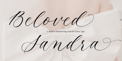 Introducing, Beloved Sandra! Beloved Sandra is a modern and luxury calligraphy font. Beloved Sandra will add charm and impression for your design. Beloved Sandra is perfect for many design needs such as merch, T-shirts, signature logo, wedding, book covers, social media posts, websites, events, and many more.
 - De Rotterdam by Roland Hüse Design,
$20.00 This font is a clean, modern sans serif bold. Named after “De Rotterdam”* this huge and super cool building (read the story below). Great for headlines, Posters, Flyers but also well legible at small size in large texts. Contains All European language accents and characters. --- The Story --- *This complex is located in the Kop Van Zuid district of Rotterdam, on Wilhelminapier. I was lucky to see this building from the beginning (2009) growing up (2013) That time when I was working and living here. I was always amazed by the design and how huge it is every time I took a look at it while driving or walking on the Erasmus Bridge. When I was going to work or just hiking around the city. It has a special meaning and message for me: I started creating fonts in my free time in 2010 when I came to this city to work. I was factory worker, dishwasher etc. I grew together with this amazing construction from brick to brick, step by step. By the time its construction finished, I was able to quit my day job and become a full time freelance designer.