10,000 search results
(0.042 seconds)
- Eastgood by Wacaksara co,
$12.00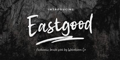 Eastgood Font is a hand brush script font and dramatic movement. This font is great for your next creative project such as Logotype, printed quotes, invitations, cards, product packaging, headers, Letterhead, Poster, Apparel Design, Label, and etc. Eastgood comes with uppercase, lowercase, numerals, punctuations and so many variations on each character include OpenType alternates, and common ligatures to let you customize your designs.
 - Marlyn by madeDeduk,
$14.00 Really excited to introducing Marlyn is a luxury serif family with flowers in each type so you can safe more time to design and comes with much version! Comes with 72 font file, 3 weight and flourish ornament. A lot of stylish will makes this font suitable for your any project design. Feature Uppercase Lowercase Number & Symbol International Glyphs Ligatures
 - Gio by Fenotype,
$20.00 Gio is a wedge serif with robust geometric features and subtle details. Available in two widths and seven styles each, Gio boasts a generous x-height and straight endings, maintaining generally consistent proportions. This creates an elegant ensemble, ideal for captivating display purposes. Gio excels in magazine layouts, headlines, as a logotype, or in any display use, imparting a sophisticated modern feel.
 - Baby Angella by Violatype,
$14.00 Baby Angella is a cute and charming handwritten font. It will add an incredibly joyful touch to your designs. Add this beautiful handwritten font to each of your creative ideas and notice how it makes them stand out! Baby Angella font is perfect for logos, wedding invitations, clothes, souvenirs, magazines, quotes, crafts, and more, please try it yourself and perfect your design.
 - Alexer Pro by NicolassFonts,
$35.00 Alexer Pro is a modern font family based on Alexer font family. Language support: Latin (including Vietnamese), Cyrillic, and Greek. It comes in 12 weights, 6 uprights, and matching italics. Each weight includes 1300 glyphs, alternates (G,I,t), and OpenType features. This family is ideally suited for packaging, headlines, advertising, and corporate identities. Perfectly for web, signage, and editorial design.
 - Hundred Ligature by Patria Ari,
$17.00 Introducing - Hundred Ligatture, a modern sans logo font with more than 300 discretionary ligatures ready to be combined. Hundred Ligatture is suitable for headlines of all sizes, editorial design, branding, packaging, web and broadcast use, etc. This font designed with modern forms, so each individual character is quickly and easily recognized. Such distinctness makes it good for signage and display work.
 - Funky Flamingo by Hanoded,
$15.00 I really can’t tell you why I called this font Funky Flamingo. Normally I name fonts after something I see or do, but I don’t have a special thing for flamingoes, nor do I keep them in my backyard. Funky Flamingo is a happy handmade serif with a retro look. It comes in regular and bold styles, each style with its own Italic.
 - Natasha Walker by Hadiftype,
$16.00 Natasha Walker is Thin sans serif that gives it a high class appeal. Comes in 2 weights, Regular and Bold. The inspiration for this typeface comes from the Art Deco era, feels modern and contemporary. Thick and thin branches are done daintily. Giving this entire font a highly polished look. Perfectly in luxury designs. Also contains 150 discretionary ligatures uppercase characters, giving you a variety of layout options. It’s perfect for fashion and lifestyle themes and even for branding purposes.
 - WizarMagi Script by Ililion,
$12.00 WizarMagi Script is a font design with a variety of fantasy and magic styles. The font features a unique customization for each uppercase letter, and a magical glitter style for the lowercase letters. It has accentuation in both uppercase and lowercase. Can be used for a variety of designs, limited only by your creativity.
 - Arcle by The Northern Block,
$12.80 A modern geometric typeface with precise radius detailing. Each character has it’s own unique subtleties and style variations, with careful adjustment you can create dynamic page layouts. The elegant curves are best demonstrated using the lighter weight at large scale. Details include 5 weights, a complete character set, manually edited kerning and Euro symbol.
 - Simple Mints by PizzaDude.dk,
$16.00 You may already found out that "Simple Mints" is a wordplay. The font itself is playful as well - the 5 different versions of each letter makes sure that your text is lively and playful! Inspiration comes from both grafitti and comics...and my usual kind of sloppy handwriting - a mix that makes a great impression! :)
 - Public Beat by PizzaDude.dk,
$15.00 Public Beat is full of fun and party! Look how the letters jumps and bounces while you type your text - well, that's the Contextual Alternates that are having a party! Each lower-case letter has 4 different versions, that automatically cycles when you type. A great trick to make your text look scrambled and realistic
 - Gangrena by Stolat Studio,
$19.00 Gangrena is a display font family, based on a old lettersets and style of UK punk posters from 80’s. It is characterized by a huge amount of automatic alternates, cycling in a random way trough the text. Each letter has three versions. To complement the font Gangrena has a set of six different brushes.
 - Allrounder Antiqua by Identity Letters,
$40.00 Timeless Renaissance looks, gently updated. For novels and billboards alike. Allrounder Antiqua is an old-style serif member of the Allrounder superfamily. A timeless typeface based on classical proportions, Allrounder Antiqua is perfectly suitable for advanced book and editorial design well as packaging and branding. True: its main purpose is to set flawless body copy and to generate an evenly textured page—but its refined shapes work fantastically in display applications, too. Some details, such as the small and sharp bowl of the lowercase a, are fully appreciated in large sizes only. If you need a sophisticated serif typeface for packaging, food, fashion, consumer goods, or lifestyle branding, Allrounder Antiqua is up for it. It's also apt as an outstanding corporate typeface, be it for a more conservative venture or the latest hipster start-up. This classy serif typeface comes in four weights with corresponding true italics. Just like its sans-serif counterpart, Allrounder Grotesk, Allrounder Antiqua is equipped with plenty of Opentype Features like small caps, six sets of figures, case-sensitive forms, superiors, fractions and many ligatures. You will find alternate letters with swashes within this extended character set, as well as all the accented glyphs necessary to support more than 200 Latin-based languages. Historical Background The (French) Renaissance-influenced typeface started as Moritz Kleinsorge's graduation project within the "Expert Class Type design" course of the Plantin Institute for Typography, located in the famous Museum Plantin-Moretus in Antwerp, Belgium. There, Moritz Kleinsorge decided to create a revival of Robert Granjon's "Ascendonica Romain", described as "a beautiful face; typical of Granjon's mature style" in the inventory list of available material. "To touch punches and matrices cut by Robert Granjon back in 1567 was an invaluable inspiration", Moritz explains. Over time, the typeface moved away from being a true revival. Rather, it evolved into a Granjon-inspired typeface. That typeface is now available as Allrounder Antiqua. Perfect Pairing: Allrounder Antiqua + Allrounder Grotesk Allrounder Grotesk is the ideal complement to Allrounder Antiqua. They both share common vertical metrics and a common color. This allows you to pair both typefaces within the same layout—even within the same paragraph—without creating visual disruption. Head over to the Family Page of Allrounder Grotesk to get more information about this typeface. Design Trick: Bilingual Design With the Allrounder Superfamily Combining Allrounder Grotesk with Allrounder Antiqua is an ideal approach for bilingual designs, wherein both languages get the same emphasis yet are distinguished with two different typefaces. It's also best practice to set headlines in a different typeface than the body text if they harmonize with each other. Allrounder Grotesk and Allrounder Antiqua provide you with the perfect pair for this purpose.
 - Gingham by SilkType,
$47.50 Gingham is a modern sans serif typeface. The unaltered version of the font is clean and classic. However, the font has multiple different options for alteration. Each letter has up to 8 different versions, which the user can choose from to make connections between letters and words, creating a completely new shape. The font also includes two stylistic sets, nr. 01 gives the overall feel of the text a more modern look and nr. 02 a more traditional one.
 - Periodical JNL by Jeff Levine,
$29.00 Periodical JNL is based on one the many stylized titles from the cover of the 1920s Spanish magazine "Nuevo Mundo" (New World). Each cover displayed a beautiful piece of period artwork along with the magazine's name in different lettering styles of the time (Art Nouveau and early Art Deco). The original design features an "engraved" look and now has an oblique counterpart. Also available are solid versions (without the inside lines) in both regular and oblique styles.
 - Overbeat by PizzaDude.dk,
$20.00 Grunge is not dead! Neither is punk! The proof is the Overbeat font! It has got both grunge and punk in the one and same. The letters are grungy, and punked up with a sort of halftone slime effect. It's hard, it's tough and perhaps even scary! Play around with the font and you'll quickly notice the variety of the font. Each lowercase letter has 4 different versions and there is ligature substitution for most common uppercase double letters!
 - Fredericksburg by Nick's Fonts,
$10.00In his book of 100 Wood Type Alphabets, Rob Roy Kelly called this face "Teutonic". This version adds lowercase letters, missing in the original, plus a few woodcut dingbats in the brackets, bar, section and florin positions. Named for a charming town in the Texas Hill Country, founded by German settlers in the mid-1850s. Both versions of the font include 1252 Latin, 1250 CE (with localization for Romanian and Moldovan). - Barbra by Nurrontype,
$17.00 Barbra is a display font family with unique letterforms and harmonization. It's bold, brutalist, gorgeus and emotional. While I developed Barbra, my mom passed away. It's broken my heart. So I tried to represent my mixed feeling in Barbra with the expressive curve in each letterform. Up and down, right to the left. The uppercase will make your headline stand out, fresh, and organic, even when you use it for your next logo project. While the lowercase is designed to make a harmonization when you put in words or sentences. FEATURES — Total glyph set: 246 — 4 Families (Regular, Italic, SemiCondensed Regular, Semicondensed Italic) — OpenType Features: — Lowercase — Uppercase — Ligatures — Numbers — Symbols — Diacritics — Stylistic Alternates
 - GoGipsy by Latinotype,
$32.00 GoGipsy is a script font based on Coto Mendoza's modern calligraphy works created with the technical assistance of Luciano Vergara. GoGipsy is inspired by a magical journey—full of love, art and nature—through the Mexican Caribbean. GoGipsy tries to capture such incredible blend through gestures and calligraphy strokes, conveying freedom, expressiveness, strength and spontaneity. The family consists of four versions: regular, italic, drop and italic drop plus a set of ornaments based on the visual appealing Mexican textile art and embroidery full of colour and beauty. GoGipsy's baseline emphasises movement and rhythm. Have fun with OpenType features, swashes, ligatures and a wide array of initials. Go Gipsy! Each journey, new inspiration...
 - Monroe by Latinotype,
$39.00 Monroe was designed in 2010, but in 2013 the font’s designer stopped selling it. Eight years after its initial release, Monroe returns in a new and upgraded version—with improved drawing and spacing—which includes more weights as well as alternate glyphs. Each font style has 819 glyphs and the whole set contains 394 characters which support 207 Latin-based languages. Monroe also includes 5 stylistic sets that offer a wide range of signs, swashes and discretionary ligatures, all specially made to add aesthetic value to your designs. The family comes in 5 weights: Thin, Ultra Light, Light, Regular and Bold. Monroe was designed by Daniel Hernández with the collaboration of Alfonso García.
 - Musty Scoot by Bogstav,
$15.00 Got a pair of jeans that goes well with both party and casual living? A shirt that would fit well to a Hollywood movie premiere and would be suitable to pick up the kids from the kindergarten? If so, you know exactly what I mean, when I say that the Musty Scoot font is suitable for anything! Well, almost anything...maybe not that highway sign, or that security sign at the airport!!! But suitable for anything for children, toys, adventures, handcraft, invitation, restaurants, playgrounds, libraries...etc etc Each letter has 7 slightly different versions, which automatically cycles as you type. There is even a version of right/left sided arrow to choose from!
 - Rather Both by PintassilgoPrints,
$24.00 Rather Jazzy, Rather Loud: a family of two quite distinct fonts that perform together handsomely well. Both fonts include 2 versions for each letter, easily reachable through keyboard upper and lower keys. They also come packed with Contextual Alternates functionality to instantly cycle the alternates, providing a realistic handcrafted feel: just turn on the feature in any OpenType savvy application and let the music sound. Rather Loud brings yet another cool feature: lots of interlocking pairs that will add that nice extra twist your projects sometimes ask for. Trigger the discretionary ligatures feature button (OpenType savvy applications needed!) or pick up your choices through a glyphs palette or character map. Jazzy? Loud? I'd Rather Both, for sure!
 - TT Tsars by TypeType,
$39.00 TT Tsars useful links: Specimen | Graphic presentation | Customization options The TT Tsars font family is a collection of serif display titling fonts that are stylized to resemble the fonts of the beginning, the middle and the end of the XVIII century. The project is based on title fonts, that is, the fonts that were used to design book title pages. The idea for the project TT Tsars was born after a small study of the historical development of the Cyrillic type and is also based on Abram Shchitsgal’s book "Russian Civil Type". At the very beginning of the project, we had developed a basic universal skeleton for the forms of all characters in all subfamilies of the family, and later on, we added styles, visual features, artifacts and other nuances typical of the given period onto the skeleton. Yes, from the historical accuracy point of view it might be that such an approach is not always justified, but we have achieved our goal and as a result, we have created perfectly combinable serifs that can be used to style an inscription for a certain time period. The TT Tsars font family consists of 20 fonts: 5 separate subfamilies, each of which consists of 4 fonts. Each font contains 580 glyphs, except for the TT Tsars E subfamily, in which each font consists of 464 characters. Instead of lowercase characters in the typeface, small capitals are used, which also suggests that the typeface is rather a display than text one. In TT Tsars you can find a large number of ligatures (for Latin and Cyrillic alphabets), arrows and many useful OpenType features, such as: frac, ordn, sinf, sups, numr, dnom, case, onum, tnum, pnum, lnum, salt (ss01), dlig. Time-related characteristics of the subfamilies are distributed as follows: • TT Tsars A—the beginning of the 18th century (Latin and Cyrillic) • TT Tsars B—the beginning of the 18th century (Latin and Cyrillic) • TT Tsars C—the middle of the 18th century (Latin and Cyrillic) • TT Tsars D—the end of the 18th century (Latin and Cyrillic) • TT Tsars E—conditionally the beginning of the 18th century (only Latin) TT Tsars A and TT Tsars B families (both the beginning of the 18th century) have different starting points: for TT Tsars A it is Latin, for TT Tsars B it is Cyrillic. The development of the TT Tsars A family began in Latin, the font is based on the royal serif Romain du Roi. The Cyrillic alphabet is harmoniously matched to the Latin. The development of the TT Tsars B family began in Cyrillic, which is based on a Russian civil type. Characteristic elements are the curved one-sided serifs of triangular characters (A, X, Y), drops appear in the letter ?, the middle strokes ? and P are adjacent to the main stroke. Latin was drawn to pair with Cyrillic. It is still based on the royal serif, but somewhat changed: the letters B and P are closed and the upper bar of the letter A rose. This was done for the visual combination of Cyrillic and Latin and at the same time to make a distinction between TT Tsars A and TT Tsars B. TT Tsars C is now the middle of the 18th century. Cyrillic alphabet itself did not stand still and evolved, and by the middle of the 18th century, its forms have changed and become to look the way they are shown in this font family. Latin forms are following the Cyrillic. The figures are also slightly modified and adapted to the type design. In TT Tsars C, Cyrillic and Latin characters are created in parallel. A distinctive feature of the Cyrillic alphabet in TT Tsars C is the residual influence of the flat pen. This is noticeable in such signs as ?, ?, K. The shape of the letters ?, ?, ?, ? is very characteristic of the period. In the Latin alphabet, a characteristic leg appears at the letter R. For both languages, there is a typical C characterized by an upper serif and the appearance of large, even somewhat bolding serifs on horizontals (T, E, ?, L). TT Tsars D is already the end of the 18th century when with the development of printing, the forms of some Cyrillic characters had changed and turned into new skeletons of letters that we transposed into Latin. The figures were also stylized. In this font, both Cyrillic and Latin are stylistically executed with different serifs and are thus logically separated. The end of the century is characterized by the reduction of decorative elements. Straight, blueprint-like legs of the letters ?, R, K, ?. Serifs are very pronounced and triangular. E and ? are one-sided on the middle horizontal line. A very characteristic C with two serifs appears in the Latin alphabet. TT Tsars E is a steampunk fantasy typeface, its theme is a Latinized Russian ?ivil type (also referred to as Grazhdansky type which emerged after Peter the Great’s language reform), which includes only the Latin alphabet. There is no historical analog to this typeface, it is exclusively our reflections on the topic of what would have happened if the civil font had developed further and received a Latin counterpart. We imagined such a situation in which the civil type was exported to Europe and began to live its own life.
 - Penabico by Intellecta Design,
$23.90 After 13 months of hard work, Iza W and Intellecta Design are proud to announce Penabico. This is a free interpretation of the copperplate script styles to be found in the Universal Penman . London, 1741 , the monumental publication of engraved work by George Bickham (along with collaborators Joseph Champion, Wellington Clark, Nathaniel Dove, Gabriel Brooks, William Leckey and many others). This enhanced OpenType version is a complete solution for producing documents and artworks which need this kind of calligraphic script: 100s of stylistic alternates for each letter (upper- and lowercase), accessed with the glyph palette; 250 ornaments and fleurons (mostly in the copperplate roundhand renaissance style) encoded in the dingbats range and accessed with the glyph palette (plus a special set with over 50 of these ornaments accessed with the ornaments feature); an extensive set of ligatures (100s of stylistic and contextual alternates plus discretionary ligatures) providing letterform variations that make your designs really special, resembling real handwriting on the page; complete, intricate, ready-made calligraphic words; abbreviations (in many languages). The principal font contains the complete Latin alphabet, including Central European, Vietnamese, Baltic and Turkish with all diacritic signs, punctuation marks (including interrobang ). The German ‘ß’ (germandbls, eszett, sharp s) even has over six different alternate forms. And we don't forget to add the unconventional germandbls uppercase. In non-OpenType-savvy applications it works well as an English commercial script style font. Because of its high number of alternate letters and combinations (over 1500 glyphs), we suggest the use of the glyph palette to find ideal solutions to specific designs. The sample illustrations will give you an idea of the possibilities. You have full access to this amazing stuff using InDesign, Illustrator, QuarkXpress and similar software. However, we still recommend exploring what this font has to offer using the glyphs palette. Two last things — we have placed some of the ornaments, catch-words and other material in supplementary fonts, for easier access in non-OpenType-savvy programs. They are: Penabico Words (see the pdf user guide in “Gallery”), Penabico Abbreviations (free font), and Penabico Extras (free font). And, when buying Penabico you get the 'Penabico EPS Bonus Set", a gift pack containing various highly intrincated frames in EPS format, easy and ready to work with your preferred vector design software like Corel or Illustrator (see the pdf in the Gallery). Know too our other superscript font : Van den Velde Script at http://new.myfonts.com/fonts/intellecta/van-den-velde-script/
 - Beauty Dina by Aldedesign,
$19.00 Beauty Dina // Playful Script Font is a stunning font with a stylish and lovely font that features a varying baseline, smooth line, modern, and with a depth of love. For those of you who need a touch of love and modernity for your designs or branding, it can be used for various purposes such as headings, weddings, invitations, signatures, logos, branding, t-shirt, letterhead, signage, labels, news, posters, badges, etc. We have a special font namely "Beauty Dina // Playful Script Font ". The font design looks simple without losing its elegance and warmness. The function of the font is to show that you have a modern spirit to serve high-quality products and services. We design this font with Open Type features to give an artistic touch to it. This font is also applicable for numbers, punctuation, and other languages. It is also a multi-functions font where you can use for a business logo, branding, wedding invitation, and anything you want. We have more great and artistic fonts. Just check my font collection by visiting Our Profile. Then, pick your most favorite font and use it to reach your goals.
 - Wakcaho by Twinletter,
$17.00 Wakcaho is a traditional serif typeface that is ideal for classic or retro modernist projects. With an exquisite and outstanding personality, this font will provide a memorable traditional touch to your designs. Wakcaho’s particular characteristics, like ligatures and alternatives, provide you the freedom to create unique text display variations. These typographic components can be simply combined to create distinctive and eye-catching compositions. Furthermore, Wakcaho is bilingual, allowing you to display your messages in a variety of languages all across the world. This allows you to reach an international audience while maintaining consistency in your designs regardless of language barriers. By using Wakcaho as the main font for your project, you will achieve an attractive style with a traditional vibe. Use Wakcaho right away to give your ideas a remarkable appeal and a unique visual experience. What’s Included : - File font - All glyphs Iso Latin 1 - Alternate, Ligature - Simple installations - We highly recommend using a program that supports OpenType features and Glyphs panels like many Adobe apps and Corel Draw so that you can see and access all Glyph variations. - PUA Encoded Characters – Fully accessible without additional design software. - Fonts include Multilingual support
 - Kimilove by Aldedesign,
$17.00 Kimilove // Monogram Script font is a stunning font with a stylish and lovely font that features a varying baseline, smooth line, modern, and with a depth love. For those of you who need a touch of love and modernity for your designs or branding, it can be used for various purposes such as headings, wedding, invitation, signature, logos, branding, t-shirt, letterhead, signage, labels, news, posters, badges, etc. We have a special font namely "Kimilove // Monogram Script font". The font design looks simple without losing its elegance and warmness. The function of the font is to show that you have a modern spirit to serve high-quality products and services. We design this font with Open Type features to give an artistic touch on it. This font is also applicable for numbers, punctuation, and other languages. It is also a multi-functions font where you can use for a business logo, branding, wedding invitation, and anything you want. We have more great and artistic fonts. Just check my font collection by visiting Our Profile. Then, pick your most favorite font and use it to reach your goals.
 - FS Split Sans by Fontsmith,
$80.00 Quirky and irregular FS Split is no ordinary typeface. Its irregular proportions make it unique, with round letters appearing wide, and straight letters narrow. Other quirks include its eclectic crossbars – the uppercase ‘A’ has an unusually low bar, while the bar on ‘G’ is particularly long. The uppercase has many interesting features in fact, including large counters, closed terminals on certain letters like ‘J’, and a cap-height that lines up with ascenders. The lowercase also holds surprises – the dots on ‘i’ and ‘j’ are unusually large, and some characters, such as ‘g’, feature double-storey counters. An extreme but stylish italic The italic versions of FS Split Sans and Serif are particularly striking. While similar in style to their upright, Roman versions, they take on a larger-than-usual 18-degree angle, making the forward-slant more dramatic. Although the main purpose of any italic is to help words and phrases stand out, this unique execution helps to make the italic variants of FS Split stylish fonts in their own right – they would work brilliantly on magazine covers, in titles and headlines, pull quotes, and even used commercially in logos and corporate branding. Serif and sans: a split personality FS Split Sans and Serif have their differences but also their similarities, contrasting and complementing each other perfectly. This ‘love hate’ relationship inspired the name of the typeface family, and means the two variants provide a versatile, typographic palette for use in graphics and branding. While its proportions are similar to the sans, the serif has a bigger contrast between its weights of bold, regular and light, bracketed serifs, and different styles of terminals, some being straight and others ball-shaped. FS Split Sans has more subtlety and simplicity, with a smaller weight contrast, less flamboyant terminals, and more consistent counter sizes. The two variants are distinct yet alike, so can be used successfully either in isolation or together.
 - FS Split Serif by Fontsmith,
$80.00 Quirky and irregular FS Split is no ordinary typeface. Its irregular proportions make it unique, with round letters appearing wide, and straight letters narrow. Other quirks include its eclectic crossbars – the uppercase ‘A’ has an unusually low bar, while the bar on ‘G’ is particularly long. The uppercase has many interesting features in fact, including large counters, closed terminals on certain letters like ‘J’, and a cap-height that lines up with ascenders. The lowercase also holds surprises – the dots on ‘i’ and ‘j’ are unusually large, and some characters, such as ‘g’, feature double-storey counters. An extreme but stylish italic The italic versions of FS Split Sans and Serif are particularly striking. While similar in style to their upright, Roman versions, they take on a larger-than-usual 18-degree angle, making the forward-slant more dramatic. Although the main purpose of any italic is to help words and phrases stand out, this unique execution helps to make the italic variants of FS Split stylish fonts in their own right – they would work brilliantly on magazine covers, in titles and headlines, pull quotes, and even used commercially in logos and corporate branding. Serif and sans: a split personality FS Split Sans and Serif have their differences but also their similarities, contrasting and complementing each other perfectly. This ‘love hate’ relationship inspired the name of the typeface family, and means the two variants provide a versatile, typographic palette for use in graphics and branding. While its proportions are similar to the sans, the serif has a bigger contrast between its weights of bold, regular and light, bracketed serifs, and different styles of terminals, some being straight and others ball-shaped. FS Split Sans has more subtlety and simplicity, with a smaller weight contrast, less flamboyant terminals, and more consistent counter sizes. The two variants are distinct yet alike, so can be used successfully either in isolation or together.
 - Hernández Niu by Latinotype,
$29.00 In the typedesign industry the terms ‘nova’, ‘neue’, ‘next’, ‘new’ are often used to refer to a typeface that has been modified in different ways: redesign, technical readjustments, greater number of characters, etc. At Latinotype we are now starting to use the word ‘niu’ to refer to these kinds of typefaces. Niu is an adaptation of the original word ‘new’, i.e., we have adapted this English word to the phonology and spelling of our own language but keeping the original meaning. Race mixing, diversity, change and adaptation are part of the essence of Latin American culture and, at Latinotype, we are all constantly expressing these elements in everything we do. Latin Power! Hernández Niu was designed by César Araya and Daniel Hernández. The font is based on the design of Hernández Bold: the thickest weight has been adapted to fit small text better. Five new styles have been added, ranging from neutral to more expressive fonts. Hernández Niu is a display slab serif font of thickened serifs, functional expressive ink-traps and true italics. Detailed forms and counterforms allow this typeface to be used in very large sizes. Hernández Niu is well-suited for publishing, small text and headlines. A wide variety of weights make the font a perfect choice for hierarchical type-setting, branding, logotypes, magazines, etc. This font consists of 6 weights, ranging from Extra Light to Heavy, each with matching true italics. Hernández Niu comes with a set of 397 characters, making it possible to use the font in 212 different languages.
 - Cadmium by AVP,
$- Cadmium has a comprehensive latin character set and many Opentype features to enhance text, including small capitals, case-sensitive forms, superscript and subscript. Plenty of numeral variants include old-style figures, lining figures and fractions. Default numerals are proportionally spaced. Alternative styles for a handful of key characters provide some useful variations where stylistic sets can be implemented. The fonts are presented as four width-based sub-families: Expanded, Normal, Condensed and Compressed. Each width has a matching range of six weights and italics (obliques). Regular and Bold weights are style-linked, together with their respective oblique forms. Each width differs in its basic construction but all fonts share the same vertical metrics and may be used in combination with each other. Letter spacing is optimised for text sizes but is tolerant of significant tracking changes. Cadmium is good for signage, publicity and packaging, screen credits and titling, general print and publication, as well as web and screen applications.
 - Normatica by CarnokyType,
$42.00 Normatica is a neutral typeface inspired by advertising letters used as letterings on shop windows during period of Normalization (the 60s–90s) in former Czechoslovakia. The complete font family consist of 24 styles in 6 weights (Thin–Black) with matching Italics where every style is followed by his Display counterpart. The difference between default and display styles is tighter spacing in Display fonts and different design of punctuation and diacritics accents. Beside the complete set of Latin, Normatica includes Cyrillic characters as well. Each font contains of alternative variation of some characters (j, t, y, Q) and includes a wide range of the Opentype features (for more details see pdf Specimen in Gallery section). Mixture of Normatica and Normatica Display can be effectively used for both text and display usage. It can be used in advertising, signage, corporate identities and various situations of editorial design. You can try two Demo styles in Medium weight fully for free.
 - Runista by Struvictory.art,
$14.00 We would like to introduce our new Thin Line Geometric Font Runista. Runista is a linear font in folk style, lowercase is decorated with geometric elements. The typeface includes a Decorative and a Symbol version. Letters and symbols are perfectly combined with each other. The font is easy to use in various design programs or without any program. Runista Typeface is suitable for lettering posters, music albums, tattoos and photo overlays in hipster style. The font works great for both printing clothes and craft products branding and packaging. Also use individual letters and symbols to create logos and monograms. Runista Decorative contains stylistic alternates for letters O, Q, C, D, G and the most popular ligatures: bb, cc, dd, ee, ff, gg, ll, mm, nn, oo, pp, rr, ss, tt, zz, ty, ly, ct, sp, st, in, ch, ck, sh, ou, qu, th, ph, ge, ng, gn, gh, au QU. The font has extensive language support.
 - Catalpa by TypeTogether,
$35.00 The Catalpa font family is José Scaglione and Veronika Burian’s wood type inspired design for an overwhelming headline presence. It has no regular weights, only four slender and four hulking weights. Catalpa wasn’t made to be normal; it was made to overwhelm, to stand out, to bellow. Catalpa is the first font family within a trilogy that will be released through 2020. Each of the three have a distinct purpose and their own look, but they serve a common goal: to act as a complete family covering an editorial’s wide array of needs. As the first of the three, Catalpa is the bookend font family with a headlining purpose. What requirements are there for a great headline typeface? Distinction, weight, and cohesiveness are a good start. Its distinctiveness must catch attention, it must have a range of weights applicable to its purpose, and its internal consistency and external look must create a cohesive family. Catalpa is a distinct and unified family whose weights are attuned to its single-minded purpose — headlines and large text. Catalpa has only eight styles that are divided into two ranges of weights — four very light weights (Hairline, Thin, Extralight, and Light ) and four very bold ones (Extrabold, Heavy, Black, and Extrablack). The thin and heavy ends of the spectrum also have their own variable fonts, each with one axis of weight so designers can fine-tune their work. The geometric influence of the design is more obvious in the light range, with their line thickness increasing in the classical manner. The bold weights increase more in width and substance to serve well in websites, mobile apps, posters, advertisements, and magazines that aim for impact more than spreading information. As a family, Catalpa gels in big headlines, short sentences, and isolated words. The family has many recognizable features, in the bolder weights especially, like the reversed contrast ‘S, s’ or the angular design of ‘Q, M, W, w, a, f, 2, 3’. Catalpa’s headlining mixture of geometry and quirkiness leaves an impression that is so characteristic of wood type, but designed for substrates and screens.
 - Beardstown by Swell Type,
$15.00 Beardstown is solid, hardworking & no-nonsense. It may be a little gritty & rough around the edges, but it can also be open, warm and welcoming. Beardstown is a little Midwestern town on a river with a town square where you can buy comic books from a spinner rack at the front of the drugstore and read 'em with a root beer float from the soda counter in the back. The Beardstown font is perfect for t-shirts, sports graphics, beer cans, trading cards, carnival posters and record albums. But that’s it. I mean, you could use it on foofy hipster stuff like organic produce, vegan meat substitutes, electric car accessories or mountain bike parts, but you risk Beardstown coming over there to kick your butt. Features: three versions of each letter and two versions of each number automatically rotate for authentic print texture thirteen catchwords (like "and" "of" "for" & "the") accessible in Discretionary Ligatures support for 223 languages including Western & Central Europe, Vietnamese & Cyrillic
 - BUNK by AdultHumanMale,
$20.00 BUNK is an 11 font system that can be layered in different ways to create various classic titling effects, think Old Timey signage 'COME IN WE'RE OPEN'. It's a display font that produces the different results by mixing and matching the various fonts together. Bunk's layer combos give you the control to create brilliant bevel, convex and 3-D styles. Each font contains the same metrics, so when your title is set, copy and paste-in-place to create layers of different weights/styles to build out your desired effect. Unlike other Layered Fonts out there, BUNK has upper case and lower case as well as currency symbols and lots of foreign characters too. Over 180 glyphs!. Five of the fonts (Shades 1,2,3,4,5) are clearly dependent on each other to create a complete font, so theses are only available in the Full family pack (11 fonts) or in the Layer Kit Family pack (7 fonts).
 - Silver Sale by Azetype,
$12.00 Presenting Silver Sale! A SIgn Painting Font with a set of alternate and 28 swashes. This font is made with the perfect combination of each character. You can type by Mix & Match with an alternate version to get a unique combination. It looks original and can be used for all your project needs. Each glyph has its own uniqueness and when meeting with others will provide dynamic and pleasing proximity. This font can be used at any time and on any project. You can see in the presentation picture above, Silver Sale looks casual and clean on design projects. So, Silver Sale can't wait to give its touch to all your design projects such as sign painting, quotes, poster design, personal branding, promotional materials, website, logotype, product packaging, etc. WHAT'S INCLUDED? 1. Silver Sale Basic • The first version comes with uppercase, lowercase, numeral, punctuation, symbols, and Standard Latin Multilingual Support (Afrikaans, Albanian, Catalan, Danish, Dutch, English, French, German, Icelandic, Indonesian, Italian, Malay, Norwegian, Portuguese, Spanisch, Swedish, Zulu, and More). You can also access alternate and swash by Opentype Features or typing c_1 until c_28 to feature swash. 2. Silver Sale Alternate • The second version comes with uppercase, lowercase, numeral, punctuation, symbols, and Standard Latin Multilingual Support (Afrikaans, Albanian, Catalan, Danish, Dutch, English, French, German, Icelandic, Indonesian, Italian, Malay, Norwegian, Portuguese, Spanisch, Swedish, Zulu, and More). You can also access swash by Opentype Features or typing c_1 until c_28 to feature swash. 3. Silver Sale Swash • The first version comes with 28 swashes. Simply access just type all alphabet, period (.) and comma (,). Thank You Azetype Studio www.azetypestudios.com
 - Black Manta Brush by Creaditive Design,
$12.00 Black Manta is a strong charactered, brushed display font. It looks fierce and urban and it will most certainly make each of your designs stand out. Add it confidently to your favorite creations and let yourself be amazed by the outcome generated.
 - Sugar Junk by Bogstav,
$17.00 Sugar Junk is my all-caps brush font with soft edges and rough lines. Use it when you need something stated with clear legible and organic looking letters! I've added 5 different versions of each letter, and they automatically cycles as you type!