10,000 search results
(0.078 seconds)
- Botanical Scribe by Three Islands Press,
$39.00 The Raphael of Flowers is what they called Pierre-Joseph Redouté a couple hundred years ago. The Belgian native became famous in France, where he painted floral watercolors for both Marie Antoinnette and Empress Josephine. But what cemented his legacy was his perfection of a stipple engraving technique that brought his art to the masses. Botanical Scribe is modeled after the neat, cursive hand-inscribed legends on these antique prints. Because it simulates handlettering, the font retains a warm, organic quality not seen in fancy modern scripts while remaining both elegant and legible. (Its many ligatures lends to this authenticity.) Good for formal invitations or historical simulations.
 - Ozzi Modo NF by Nick's Fonts,
$10.00This double-wide wonder is based on Oswald Cooper’s original drawings for the typeface Cooper Fullface. ATF rejected this offering because they felt that several of the letterforms, and particularly the numbers, were a little too wacky for the mainstream. By now, you know that such an accusation is a "Please don't throw me in the briar patch" plea to yours truly. So, here, proudly and true to their designer’s original intent, are two versions of a really fun font. Both versions of this font include the complete Unicode 1252 Latin and Unicode 1250 Central European character sets. - Virtuose by Ckhans Fonts,
$34.00 Virtuose family consists of 18 styles (9 weights, 9 Italics), in each of which there are more than 543+ glyphs. In the typeface, each weight includes extended language support, fractions, tabular figures, ligatures, arrows and more. Perfectly suited for graphic design and any display use. Support for 28 languages: Afrikaans Albanian Catalan Croatian Czech Danish Dutch English Estonian Finnish French German Hungarian Icelandic Italian Latvian Lithuanian Maltese Norwegian Polish Portugese Romanian Slovak Slovenian Spanisch Swedish Turkish Zulu
 - Gravitica Compressed by Ckhans Fonts,
$34.00 Gravitica Compressed family consists of 18 styles (9 weights, 9 Italics), in each of which there are more than 543+ glyphs. In the typeface, each weight includes extended language support, fractions, tabular figures, ligatures, arrows and more. Perfectly suited for graphic design and any display use. Support for 28 languages: Afrikaans Albanian Catalan Croatian Czech Danish Dutch English Estonian Finnish French German Hungarian Icelandic Italian Latvian Lithuanian Maltese Norwegian Polish Portugese Romanian Slovak Slovenian Spanisch Swedish Turkish Zulu
 - Brans by Ckhans Fonts,
$34.00 Brans family consists of 18 styles (9 weights, 9 Italics), in each of which there are more than 543+ glyphs. In the typeface, each weight includes extended language support, fractions, tabular figures, ligatures, arrows and more. Perfectly suited for graphic design and any display use. Support for 28 languages: Afrikaans Albanian Catalan Croatian Czech Danish Dutch English Estonian Finnish French German Hungarian Icelandic Italian Latvian Lithuanian Maltese Norwegian Polish Portugese Romanian Slovak Slovenian Spanisch Swedish Turkish Zulu
 - Hunitek by Gatype,
$15.00 The Hunitek Display is stylish with extreme cuts, sharp corners and interactive straps. Characters that seem solid are spread across each replacement letter, with different styles and maximum personality. Bold character separation and considered binding standards create a type that is sturdy, modern and attractive. suitable for logos, emblems, magazines, quotes etc. Hunitek is a modern Display font, each letter is carefully crafted to make your text look unique. Feel free to message me if you have any questions!
 - Graficz by MAC Rhino Fonts,
$36.00 The origin of this typeface is a Polish catalog cover dated 1936, made by I. Rubin. The word ”Graficz” (included in the poster copy) seemed appropriate as a name for this typeface with its typical ”Central European look”. The original letters are more ”thin” (light weight) than the MRF interpretation and only consists of capital letters. Lower cases and almost all standard character signs have been added, in order to make it more functional.
 - Sightseeing Tour JNL by Jeff Levine,
$29.00 Samuel Welo was a sign painter who had published in the 1920s and again in 1960 his “Studio Handbook – Letter and Design for Artists and Advertisers”, prolifically hand lettering all of the type style examples within the pages of the publication. In 1930 Welo also published “Lettering - Practical and Foreign”. From this book comes a thick-and-thin hand lettered Art Deco alphabet – now available digitally as Sightseeing Tour JNL in both regular and oblique versions.
 - Couturier by Latinotype,
$29.00 Couturier font is all about haute couture: classy ready-to-use characters for each project, perfectly drawn curved shapes and well-balanced counterforms. Elegantly embroidered ligatures, alternative glyphs and beautiful swashes give the font an extremely elegant look. Couturier comes in 4 weights, ranging from Regular to Black, with matching italics, resulting in a total of 8 fonts that help you achieve a strong composition in your publishing projects. Its true italics with a humanist feel give each design a chic personality. The font contains a set of more than 1,200 characters that support over 200 languages.
 - Lontare by RGB Studio,
$17.00 Lontare script typeface works really well for Logos and Apparel Design. It's also great for creating Prints or Merchandise, as you can use the illustrative qualities of the shapes to create an art piece. Lontare script typeface includes many different alternates for each lowercase letter. It's extremely fun to use as each word can be transformed to your liking. Files Include : Basic Latin A-Z and a-z Numbers Symbols PUA Encode Multilanguage Support Thanks and have a wonderful day, If you have any questions, please get in touch with us Don't forget to check out our other products.
 - Really No 2 W2G by Linotype,
$124.99Really No. 2 is a redesign and update of Linotype Really, a typeface that Gary Munch first designed in 1999. The new Really No. 2 offers seven weights (Light to Extra Bold), each with an Italic companion. Additionally, Really No. 2 offers significantly expanded language support possibilities. Customers may choose the Really No. 2 W1G fonts, which support a character set that will cover Greek and Cyrillic in addition to virtually all European languages. These are true pan-European fonts, capable of setting texts that will travel between Ireland and Russia, and from Norway to Turkey. Customers who do not require this level of language support may choose from the Really No. 2 Pro fonts (just the Latin script), the Really No. 2 Greek Pro fonts (which include both Latin and Greek), or the Really No. 2 Cyrillic Pro fonts (Latin and Cyrillic). Each weight in the Really No. 2 family includes small capitals and optional oldstyle figures, as well as several other OpenType features. Really No. 2's vertical measurements are slightly different than the old Linotype Really's; customers should not mix fonts from the two families together. As to the design of Really No. 2's letters, like Linotype Really, the characters' moderate-to-strong contrast of its strokes recalls the Transitional and Modern styles of Baskerville and Bodoni. A subtly oblique axis recalls the old-style faces of Caslon. Finally, sturdy serifs complete the typeface's realist sensibility: a clear, readable, no-nonsense text face, whose clean details offer the designer a high-impact selection. - Really No 2 Paneuropean by Linotype,
$103.99Really No. 2 is a redesign and update of Linotype Really, a typeface that Gary Munch first designed in 1999. The new Really No. 2 offers seven weights (Light to Extra Bold), each with an Italic companion. Additionally, Really No. 2 offers significantly expanded language support possibilities. Customers may choose the Really No. 2 W1G fonts, which support a character set that will cover Greek and Cyrillic in addition to virtually all European languages. These are true pan-European fonts, capable of setting texts that will travel between Ireland and Russia, and from Norway to Turkey. Customers who do not require this level of language support may choose from the Really No. 2 Pro fonts (just the Latin script), the Really No. 2 Greek Pro fonts (which include both Latin and Greek), or the Really No. 2 Cyrillic Pro fonts (Latin and Cyrillic). Each weight in the Really No. 2 family includes small capitals and optional oldstyle figures, as well as several other OpenType features. Really No. 2's vertical measurements are slightly different than the old Linotype Really's; customers should not mix fonts from the two families together. As to the design of Really No. 2's letters, like Linotype Really, the characters' moderate-to-strong contrast of its strokes recalls the Transitional and Modern styles of Baskerville and Bodoni. A subtly oblique axis recalls the old-style faces of Caslon. Finally, sturdy serifs complete the typeface's realist sensibility: a clear, readable, no-nonsense text face, whose clean details offer the designer a high-impact selection. - Really No 2 by Linotype,
$29.99 Really No. 2 is a redesign and update of Linotype Really, a typeface that Gary Munch first designed in 1999. The new Really No. 2 offers seven weights (Light to Extra Bold), each with an Italic companion. Additionally, Really No. 2 offers significantly expanded language support possibilities. Customers may choose the Really No. 2 W1G fonts, which support a character set that will cover Greek and Cyrillic in addition to virtually all European languages. These are true pan-European fonts, capable of setting texts that will travel between Ireland and Russia, and from Norway to Turkey. Customers who do not require this level of language support may choose from the Really No. 2 Pro fonts (just the Latin script), the Really No. 2 Greek Pro fonts (which include both Latin and Greek), or the Really No. 2 Cyrillic Pro fonts (Latin and Cyrillic). Each weight in the Really No. 2 family includes small capitals and optional oldstyle figures, as well as several other OpenType features. Really No. 2's vertical measurements are slightly different than the old Linotype Really's; customers should not mix fonts from the two families together. As to the design of Really No. 2's letters, like Linotype Really, the characters' moderate-to-strong contrast of its strokes recalls the Transitional and Modern styles of Baskerville and Bodoni. A subtly oblique axis recalls the old-style faces of Caslon. Finally, sturdy serifs complete the typeface's realist sensibility: a clear, readable, no-nonsense text face, whose clean details offer the designer a high-impact selection.
 - Hysteria Rollers by Din Studio,
$20.00 Hi, Everyone! Looking for a font that will make your branding stand out? Do you sometimes have an appetite for a bit more wholesome typography? Looking for a fabulous, stylish, and adventure font? We've got what you want. Hysteria Rollers - A Sans Script Font Duo Hysteria Rollers is a fantastic font duo. An uppercase sans serif font is accompanied by a gorgeous handcrafted script brush font that works together in perfect harmony. Designed primarily as a captivating font to add the right amount of modernity and style, This font duo is an excellent choice to ensure a great font match for your designs and projects! Our font always includes Multilingual Support to make your branding reach a global audience. Features: Ligatures Alternates Stylistic Set Swashes PUA Encoded Numerals and Punctuation Thank you for downloading premium fonts from Din Studio
 - Camy by Scholtz Fonts,
$9.50 I wanted to create a "handwriting" font which could be used professionally. I have often needed such a font with a variety of weights and styles for a particular project and have had to resort to mixing fonts, creating a rather messy, amateur job. Camy is named for a little village in South West France where I did much of the initial work on this font. Camy is ideal for contemporary display work, comes in ten styles, and has a contemporary appeal with its casual, easy to read letters. Camy was designed as a total professional package for designers looking for a handwritten font suitable for all kinds of contemporary display work: the idea being that once you have the Camy Professional Pack you don't have to waste time searching for other handwritten fonts. The Family: LIGHT -- NARROW - light weight, condensed width, delicate line -- MEDIUM - light weight, delicate line -- WIDE - light weight, expanded width, delicate line NORMAL WEIGHT -- NARROW - of medium weight and condensed width - perfect for limited space -- MEDIUM - of medium weight -- WIDE - of medium weight and expanded width BLACK - for best readability -- NARROW - condensed width for bolder statements in small areas without losing legibility -- MEDIUM - for bolder statements -- WIDE - expanded width for bolder statements FAT -- WIDE - for maximum impact Use a combination of styles for product branding, book covers, invitations, greeting cards. The Camy combination works well for both headings and body text. Camy contains over 250 characters - (upper and lower case characters, punctuation, numerals, symbols and accented characters are present). It has all the accented characters used in the major European languages.
 - Evanston Tavern by Kimmy Design,
$10.00 Evanston Tavern is a square typeface and the sans-serif version to Evanston Alehouse. Inspired by the years that prefaced the ratification of the American Prohibition, this typeface mimics the signage commonly seen outside of saloons, taverns and alehouses during that time. Back to the modern era, Evanston Tavern is more than just a vintage inspired typeface. It works in modern and futuristic settings with multiple styles, opentype alternatives and ornamentation. The family provides a robust 61 total fonts, within it's 3 styles of regular, stencil and inline. Each sub family includes 4 weights and 5 widths. It has special features that add depth to the typeface, with discretionary ligatures and stylistic alternatives. It also includes a complimentary set of ornaments, including a vintage graphic set from the era, as well as modern frames, borders and icons. This typeface works great at logos, packaging, and other display settings. Pair this font with Evanston Alehouse and have a great combination of serif and sans-serif square letterforms and a large array of ornaments! Here’s a snapshot of what you get with Evanston Tavern: - 3 Styles: Regular, Stencil and Inline - 4 Weights: Light, Regular, Medium and Black - 5 Widths: 1826 (condensed), 1846 ( narrow) 1858 (regular), 1893 (wide) and 1919 (expanded) - 2 capital Heights: Capitals and small caps - 2 Alternatives: Discretionary Ligatures and Stylistic Alternatives - 1 Ornaments font with over 100 graphic extras
 - Nubian by G-Type,
$39.00 Nubian was one of the first typefaces ever designed by G-Type and is an elegantly proportioned, crisply modern sans serif family. Comprising five weights from Thin to Bold with true matching italics, each font also includes two sets of figures (lining and old-style numerals) and an extended European character set. Nubian has a noticeably open, semi extended appearance providing very even 'colour' and excellent legibility when set as text. The contemporary letterforms work well at all sizes in print and on screen making Nubian a great choice across all media. The family has been updated to OpenType with extended language coverage.
 - Gezart by Ani Dimitrova,
$30.00 Gezart is a modern sans serif with geometric touch in 32 weights - 16 uprights and its matching italics. The weights are ranging from Hair to Heavy, with one of them (Extra Thin) is for free of charge. Each weight of Gezart contains more than 700 glyphs. The family is equipped for complex, professional typography with Open Type Features including — small caps, localized forms, old-style figures, standard ligatures, subscripts, superscripts, numerators, denominators, numbers in circles arrows, currency symbols and fractions. The Gezart font family is ideally suited for branding & layout design, posters, body text, web, editorial design, and more.
 - Atomette by Device,
$39.00 Atomette is a bouncy sans that is friendly without being flippant, warm yet still stylish. The upper case and lower case options provide letters with less or more animation. Five weights plus an inline provide a neat mini-family to cover all your requirements. Suitable for snack packaging, comic books, toys, celebratory banners, book covers and games. Contains two or three options for each letter, including automatically-substituting letter-pairs to prevent repetition, plus an alternate set of numbers in circles. These can be chosen from the Glyphs palette or toggled on and off in the Opentype panel.
 - Vinice by Illuminaut Designs,
$15.00 This typeface was created as a personal project. Inspired by places like Chattanooga and Berkley, I wanted to create a bespoke typeface family for the US Virgin Islands. I noticed that the typeface Berlin Sans was in use all over the islands, in signs, logos, even on the side of police cars. So I built this typeface from the ground up with the goal of updating an old tried-and-true font into a family with versatile potential.
 - Typex by Device,
$39.00 Based on the lettering used on Alan Turing’s famous code-breaking machine at Bletchley Park, the “Bombe”, and the subsequent British answer to the German Enigma machine, the Typex. Research done at Bletchley Park on their restored and antique machines provided the inspiration. The unusual shapes for the capitals have all been retained - the square O, the monospaced characters and other eccentricities that make it unique. This reference material was then extended to the numerals (which did not exist in the original) and a full international character complement. The initial design of the bombe was produced in 1939 at the UK Government Code and Cypher School (GC&CS) at Bletchley Park by Alan Turing, with an important refinement devised in 1940 by Gordon Welchman. It was based on a device that had been designed in 1938 in Poland at the Biuro Szyfrów (Cipher Bureau) by cryptologist Marian Rejewski, and known as the "cryptologic bomb" (Polish: bomba kryptologiczna). The Bombe was used to break the German Enigma code on a daily basis, and was a vital part of the Allied war effort. The British “Typex" (alternatively, Type X or TypeX) machines were an adaptation of the commercial German Enigma with a number of enhancements that greatly increased its security. It was used from 1937 until the mid-1950s, when other more modern military encryption systems came into use.
 - Abelina by Sudtipos,
$69.00 «Abelina» is a typeface that can be used in display sizes for titles where part of the central premise is to emulate certain features of gestural handwriting. Concepts like spontaneity, speed and fluidity, associated with the use of certain calligraphic tools – in this case the pointed brush – led to a typographic result based on the pattern-like structure coming from the chancery and italic calligraphic models. «Abelina» - initially designed by Yanina Arabena (Calligrapher, Graphic Designer and Typographer) - is reborn to make way for “Abelina Pro” through the solid work of Guillermo Vizzari working together with Ale Paul from Sudtipos. Throughout its use, “Abelina Pro” maintains the structure of a firm style, integrating a dynamic rhythm in the composition of short texts and offering personality to each of the words it builds. It has over a thousand glyphs, including several alternates, ligatures combination, initials and miscellaneous to reinforce the idea of the author of merging a calligraphic project in the typographic world; allowing new ways to capture this great universe of italic faces. «Abelina» project was initially born as a typographic project developed by Yanina Arabena – tutored by Ale Paul and Ana Sanfelippo – under completion of the Specialization in Typography Design at University of Buenos Aires, Argentina, during the years 2011 and 2012.
 - Krul by Re-Type,
$99.00 ‘Krul’ is a typographic interpretation of the lettering style created by Dutch letter painter Jan Willem Joseph Visser at the end of the 1940s, which decorated the traditional brown bars of Amsterdam. In the beginning, these letters were strongly associated with the pubs connected to the Amstel brewery, given that Visser was the company’s official painter. As the years passed, the style became increasingly popular, and various business owners in Amsterdam and other Dutch and Belgian cities also commissioned its use. In the 1970s and 1980s, Leo Beukeboom, another talented letter painter, continued and expanded this lettering tradition while employed under the Heineken brand. Much of his work can still be found in the Jordaan and De Pijp neighborhoods in Amsterdam. The Amsterdamse Krulletter, or Amsterdam’s curly letter, is strongly inspired by the calligraphic works of the 17th century Dutch writing masters, of which Jan van den Velde was a central figure. However, distinct characteristics of this style, for example, its unusual and beautiful ‘g’, originate from a model that was published by Johannes Heuvelman in 1659, which J. W. J. Visser referenced. Typographic circles have somehow overlooked the Amsterdamse Krulletter and its heritage. The Dutch calligraphic hands preceded and influenced the formal English penmanship which has inspired numerous typefaces in the Copperplate style. In contrast, the models from van den Velde, Heuvelman, and Jean de la Chambre, among others, are a missing chapter in Dutch typographic history, and had never been turned into typefaces until now. Conscious of the cultural and identity issues that arise in reviving a unique style, and concerned about the speed with which the lettering style was disappearing, Ramiro Espinoza focused the project of designing ‘Krul’ on digitally recreating the calligraphic complexity of these beautiful letters. Created through several years of research, ‘Krul’ is not a direct digitization of the Amsterdamse Krulletter, but instead, an interpretation that incorporates numerous alternative characters absent in the original model, and improves upon details where necessary, resulting in an optimal performance on the printed page. The typeface is presented in Open Type format, with an abundance of intricate ligatures, fleurons, and swashes, which permit the creation of numerous calligraphic effects. The very high contrast and rhythm of the strokes in this typeface make it especially suited for media applications conveying a sense of elegance and sophistication. Designers of feminine magazines, advertisements, and corporate identities within the fragrance and fashion industries will find in this typeface to be an extremely useful and appropriate resource.The great Amsterdamse Krulletter is finally back, and we are proud to make it available to you.
 - Osande by XdCreative,
$20.00 Osande is a modern sans serif font with neo-Grotesque touch, more homogenous forms with minimal stroke contrast. Osande the font family contains 3 basic forms: italics, obliques, and upright. Each of which has 7 different weights ( Thin, Extra Light, Light, Regular, Medium, Semibold, and Bold ). Osande can easily be matched to an incredibly large set of projects, so add it to your creative ideas and notice how it makes them stand out! Thank you.
 - Stupid Questions by Bogstav,
$15.00 First of all: there is no such thing as a stupid question! But now there is a font called Stupid Questions! :) A classic handmade sans font - super legible and somewhat clean. Use your favourite of the 5 different versions, mix them in layers with your favourite colours. I've added 4 different versions of each lowercase letter, and they automatically cycle as you type - a great way to make your text look more natural and organic!
 - Mithella by Lafontype,
$19.00 Mithella is a sans serif family with a pleasant touch. Some letters, especially linear ones, look normative like other rounded sans serifs, but the difference can be seen clearly in curved letters so that it gives a pleasant impression for each series of words. Mithella comes with eight weights ranging from thin to black to complement your design needs be it branding, blogging, logos, advertising, games, cooking, packaging, editorial and publishing, web and screen design.
 - Mode by Daggertypo,
$24.00 Mode is a typographic experiment exploring how same sans serif form adapts to different circumstances and what are the possibilities in variations of Thin / Black, Contrast / Negative contrast. Two main groups are Mode 0 (with rounded shapes) and Mode 1 (with angular shapes). Each of them varies from Thin to Black in six cuts, in the same manner it varies from contrast shapes to negative contrast. Mode comes in total of 72 cuts regular and italic, it speaks majority of Latin based languages and is equipped with smcp, c2sc, Old style and all caps numerals. Mode is made by DAGGERtypo during a period of 2019/2020
 - Ma Braille by Echopraxium,
$5.00 The "Ma" in "Ma Braille" is used as a minimalist way to say "Negative Space". "Ma" in japanese arts is an "esthetical usage of emptiness". Thus this font explicits the negative space around visible braille dots in each glyph. A. Font user guide a.1. Lowercase glyphs { A..Z } In these glyphs, dots are represented as "black squares" while the negative space is displayed as 1 or 2 white filled polygons. a.2. Uppercase glyphs { a..z } In these glyphs, dots are represented as "white squares" while the negative space is displayed as 1 or 2 black filled polygons. a.3. Digits: they are just the same than a..j, but the "North US version" is also provided in ascii codes 0xE0..0xE4 (1..5) and 0xE7..0xEB (6..0). a.5. "Dashed Border": a.5.1. "Black dashed" border glyphs; { £, ¥, µ, Â, Ä, Ê, Ë, Î, Ï, Ô } a.5.2. "White dashed" border glyphs; { Ö, Õ, °, ô, ö, î, ï, û, u, õ } B. Posters Poster 1: "Font Logo" version 1, it displays "Ma Braille" text surrounded by the "black dashed border" glyphs. Poster 2: "Font Logo" version 2, it displays "MA" glyphs in big size and smaller "Braille" glyphs within "M" and within "A" as well. Poster 3: the classical pangram to test a font "The Quick Brown Fox jumps over the Lazy dog". Poster 4: Article 1 of the Human Rights: All human beings are born free and equal in dignity and rights. They are endowed with reason and conscience and should act towards one another in a spirit of brotherhood. Poster 5: the "Glyph set" (Border glyphs not included) with A..Z, a..z, digits and special characters.
 - Thawed by Larin Type Co,
$13.00 Thawed This is a display font of a narrow specialization, its letters seem to have melted and flowed, but at the same time it retains the shape of the letters and is well read. It is perfect for branding, logos, labels, short display inscriptions and advertising materials from flyers to billboards. This font includes drops of style, they make it possible to make the font more voluminous and give detail.
 - Morro by Great Scott,
$16.00 Morro is based on simple geometric shapes – circles, triangles and rectangles. Imagine cutting circles, triangels and rectangles from paper and arranging them into letters where the outer edges form a filled figure. Arranging figures like this to form letters is nothing unique. You can find several beautiful examples of alphabets that inspired the creation of Morro. Everywhere from a 1936 booklet by Draughtsman called ”Modern lettering for all branches of commercial arts” to obvious examples is from the paragon of the design industry - Milton Glaser - with his typeface Baby Teeth. What sets Morro apart from other digitized versions of Glasers' ”Baby teeth”, or other similar designed fonts, is that Morro is expanded into lower case and also supports Basic latin, Western European, Central European, south Eastern European and Pinyin. There are also stylistic alternatives to some of the glyphs. Morro Regular works like a stencil and is accompanied by a block shadow style and an outline. The Morro family of fonts are layered and can be superimposed on each other to create several types of text effects.
 - Heydista Notes by Colllab Studio,
$19.00 "Hi there, thank you for passing by. Colllab Studio is here. We crafted best collection of typefaces in a variety of styles to keep you covered for any project that comes your way! Heydista Notes is a traditional hand-written monoline signature font with clean, geometric outlines. This makes it the perfect choice for high-end branding or marketing materials. The font is modeled after the calligraphy of ancient Rome and Greece. It has a classic and timeless feel, but the clean lines give it a modern edge. Heydista Notes has been designed with attention to detail and with very high quality standards in mind. It includes over 200 glyphs, stylistic alternates with beginning and ending swashes that you can use with your designs, and alternate letters for each letter of the alphabet so you can create unique-looking words and phrases with ease. Whether you're looking for a classic feel or something more modern, Heydista Notes will elevate your designs to the next level. A Million Thanks www.colllabstudio.com
 - Parity by Shinntype,
$39.00 There is no bicameral Parity. It has been designed from scratch to be an exceptional unicase typeface, uncompromised by the priorities of mixed case or all-cap setting. Each glyph is shaped, proportioned and detailed for one purpose only: to optimize text set in the lining unicase format.
 - Chevayo by Lafitte 58,
$14.00 Chevayo is a modern look without the fonts. Made for professional project branding. Each letter has a unique and beautiful touch. the files you will get are: • Works on PC & Mac • Simple installation • Can be accessed in Adobe Illustrator, Adobe Photoshop. • Long-term support, free features and bug fixes
 - Niblick by Prioritype,
$23.00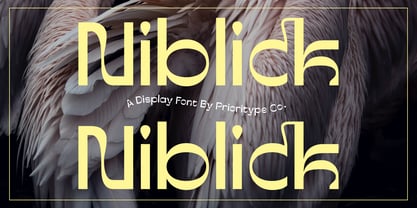 "Niblick" is a modern and classic styled display typeface. The unique touches on each character add to the visual impression that is more impressive. Useful if your project requires strong, memorable visuals. Great for branding designs, posters and logos. Features: Uppercase, Lowercase, Numeral, Punctuation, Multilingual, Ligatures & PUA Encoded. Thanks!
 - Galexica Mono by Ingrimayne Type,
$6.00 GalexicaMono is an attempt to create a futuristic typewriter font, which may be an oxymoron. Unlike most typewriter fonts, it is sans-serif. The family has two weights, plain and bold, each with an oblique style. For a variant of the design that is not monospaced, see Galexica.
 - SK 1980 Unicase by Salih Kizilkaya,
$2.50 SK 1980 Unicase is a font that emerged with a modern interpretation of the 80's design concept. It was specially designed to create structural forms. Each character is the same size, so you can create structural designs without any difficulty. Includes 7 different versions and 2464 glyphs.
 - Mozaic by TipoType,
$24.00 The value and individual beauty contribute to the group. Each with their own, but all together with a new identity enriched by exchange, perfected by diversity. Mozaic is sum. Mozaic is strength. It includes a very thorough coverage for a wide variety of Latin alphabet-based language families.
 - RoundCut by Fábio Mansos,
$23.00 RoundCut Bold is a geometric grotesque typeface, ideal for large sizes (display proposals and headlines). Its structure is modern, strong and bold, noticeable in its minimal and geometrically forms. Although visually simple, the construction of each letter form is complex allowing some expression and uniqueness to the typeface.
 - Jennerik by Ingrimayne Type,
$9.95 Jennerik is a plain, serifed face in which the strokes are uniform or monolinear. It has four weights and each weight has both upright and italics styles. Its name reflects its plain, simple design. It is slightly condensed and the regular style was originally designed for printing rough drafts.
 - Fadista by Alex Beck,
$19.99 Fadista is an eccentric experimental typeface, inspired by the Portuguese fado music and letterings by the artist Stuart Carvalhais (1887–1961), created throughout the 1920ies and 1930ies. A strong and clean presence with a touch of quirky gives the typeface its overall character. Fadista includes various OpenType features that allow tailoring the type to custom needs, encouraging graphical exploration. Fadista is the result of meticulous research, graphic reinterpretation and systematization of the glyph palette, taking into account modern font standards. Balancing between a historic heritage and „hipster“ contemporary looks, Fadista represents a discourse about aesthetics, trends and currentness in graphic design. The stylistic variations of the glyphs in fadista work in an additive fashion, rather than completely altering the look of the typeface. This means that a basic framework of glyphs remains unaltered, while certain subgroups of characters are affected by the style choices. Through this behavior, stylesets in fadista work as a switch for the type of contrast you’d like entwined in the overall look of the typeface. Other unique features include stylistic alternates for specific glyph combinations, ligatures that allow internal character spacing and tiny diacritics that flow within cap height along normal height glyphs. Please note the lowercase characters within Fadista are uppercase alternates. Math operators are fully supported, as well as a wide range of symbols and punctuation. Supported Languages: Albanian, Danish, Dutch, English, Finnish, French, German, Icelandic, Italian, Malagasy, Norwegian, Portuguese, Romansh, Spanish, Swedish and Turkish. For further language support don‘t hesitate to get in touch. Fadista was awarded the Art Directors Club Bronze in the junior competition 2014 and the DDC Award 2014 in the category "Future“.