10,000 search results
(0.04 seconds)
- TB StarsAndStripes by TrueBlue,
$18.00This font is dedicated to the glorious flag of the U.S.A., "Old Glory". The family consists of two versions: a base and one called "composable" composed from a set of glyph (characters) that they can be inserted to pairs. One of blue color and one red for to obtain one glyph to two colors. As an example inserting "Aa" with a red 'A' and the a blue 'a' will produce a single letter 'A' colored to white stars in a blue field and white stipes in a red field, thus producing the most impact. - Rockmore by Almarkha Type,
$29.00 Rockmore is a bold script font with a clear style and dramatic movements. This font is great for logos, printed quotes, invitations, cards, product packaging, headers, Logotype, Letterhead, Poster, Apparel Design, and much more! Rockmore comes with uppercase, lowercase, numerals, accents (Multilingual characters), punctuations and a lot of gorgeous variations on each character!
 - Frelline Script by Soft Creative,
$14.00 Frelline looks beautiful on wedding invitations, thank you cards, quotes, greeting cards, logos, business cards and more. Perfect for use in ink or watercolors. Including beginning and end letters, alternative support and many languages. I made this font very carefully so that each letter looked very unique and had various beautiful alternatives.
 - Sportlight by Kaer,
$19.00 Sportlight is a font, each letter connects with near one by middle-high line. This font is inspired by classic car emblems. You can use it in magazine headlines, badges, and posters. Font features: All-caps, numbers, punctuation, and multilanguage support. Please feel free to request to add characters you need: kaer.pro@gmail.com
 - Miamour by Tigade Std,
$35.00 Miamour is a cartoon-like and quirky display font. Get creative with its childlike style, and use it to brighten up any project. It will add an incredibly joyful touch to your designs. Add this beautiful display font to each of your creative ideas and notice how it makes them stand out!
 - Jason Barry by Insan Perkasya,
$12.00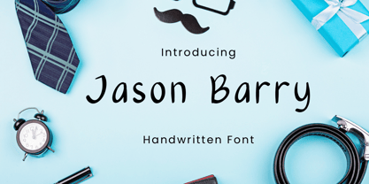 Jason Barry is a handwritten font with a simple and minimalist character. Crafted with sincerity, each letter reflects a friendly and full-of-character personality. This font is perfect for various designs, from greeting cards to branding projects that seek a minimalistic and appealing touch. If you have any question, please contact us.
 - Qwatick by Ingrimayne Type,
$7.95 Qwatick is a decorative serifed family with three weights, each with an italic style. It is squarish and has small serifs. The bold style has high contrast and the regular style remains readable even at small point sizes. The family originated as a reworking of the odd display font Quidic, moving it toward normality and greater legibility.
 - P22 Akebono by IHOF,
$24.95 Akebono means dawn in Japanese. It expresses the pleasure of imbalance. Stems and strokes are mixed--straight and round with slender terminals and arches. Akebono is available in three styles; Regular, Alternate, Italic. Akebono Alternate resembles the Regular but features some of the hooked tails found on the Italic. P22 Akebono is licensed exclusively to P22/IHOF
 - Semiramis by Scriptorium,
$18.00Semiramis is based on lettering from the Roycroft movement, but has a Science Fiction/Fantasy feel to it, drawing on elements from antique scripts and the Art Nouveau period to produce a result which is modern and ancient at the same time. There are two different shapes for each character, accessed with the upper and lower case keys. - Kiddie Love by Sipanji21,
$15.00 Kiddie Love is a lovely display font that radiates charm. It features gorgeous hearts in each letter which give it an incredibly romantic feel. this font suitable for valentine day poster, logo, t shirt, event banner and etc. you can use this font for any design, apparel, kids logo, logo type, with many swash for make your design awesome. feature : Kiddie Love Uppercase Kiddie Love Number and Punctuation Kiddie Love Multilingual Kiddie Love Swash
 - Raittens by Gassstype,
$22.00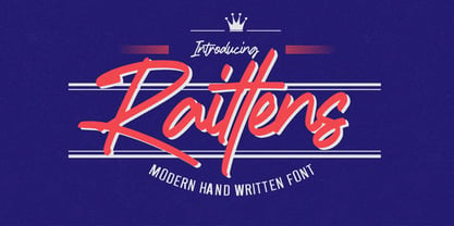 Introducing Raittens is Modern Handwritten Font is a Authentic Style and classy style, Raittens a natural handwritten feel. This handmade font will make your design has a beautiful natural touch for each details. It is perfect for any design project as Invitation,logo, book cover, craft or any design purposes,photography overlays, signs, window art, scrapbooking, tags and so much more! This font is PUA encoded which means you can access all of ligatures.
 - Cyberend by Alit Design,
$19.00 Introducing "Cyberend" – a font that seamlessly marries the raw, edgy aesthetic of cyberpunk with the precision of square pixels and the sleek modernity of italic serifs. As the digital world converges with futuristic design, Cyberend emerges as the quintessential typeface for those seeking a cyberpunk-inspired typographic experience. Dystopian Elegance: Cyberend encapsulates the essence of cyberpunk, embodying a dystopian elegance that effortlessly blends chaos and sophistication. The font's italic serifs add a touch of rebellion and forward momentum to every character. Pixelated Precision: Immerse yourself in the pixelated precision of Cyberend, where each character is meticulously designed with square pixels. The result is a sharp, high-tech appearance that resonates with the digital landscapes of cyberpunk aesthetics. Versatile Impact: From gaming interfaces to film titles, Cyberend makes a bold statement in any digital or print medium. Its versatility allows you to infuse cyberpunk vibes into logos, posters, websites, and more, giving your projects a distinctive and immersive feel. Futuristic Legibility: Despite its cyberpunk flair, Cyberend prioritizes legibility. Each character is crafted to ensure readability, maintaining a perfect balance between avant-garde design and practical functionality. Unleash the power of Cyberend to transport your audience into a cyberpunk-inspired future. Whether you're designing for tech enthusiasts, gamers, or cyberpunk aficionados, this font is your gateway to a digital realm where style meets rebellion. Upgrade your typographic game with Cyberend and let your creations transcend the boundaries of conventional design.
 - Rosvard by Bombastype,
$35.00 Rosvard is our new old fashioned typeface. Inspired by vintage signages and brewery emblems. You could feel the vintage vibe on our preview images. Although you could use it to modern design as well. Since our last font just single font. We decide to make another layered font like we did in the past. This one in particular contains Stripe, Outline, Regular, Extrude and Shadow. You could combined all of them of just use two or three of them as you like. We also give you the separate ornaments we used for the preview image as an icon/dingbat font. You could mix and match each part to make your own badge / emblem. Because we believe you could do it.
 - Crofelo Delight by Nathatype,
$29.00 What really suits your design? The answer is here. It’s the ultimate way to be you. Crofello Delight-with the combination between cute script and gorgeous display font style you can mix, match, and call your own. This harmonious font duo supporting and advocating each other to make awesome result in your design. Features: Ligatures Stylistic Sets Swashes Lower and uppercases Numerals and Punctuations It is perfectly used for many design projects, such as poster, logo, book cover, branding, heading, printed product, merchandise, quotes, social media campaign, etc. Get more inspiration about how to use it by seeing the font preview. Thank you for purchasing our fonts. Please don’t hesitate to contact us, if you have any further question or issues. We’re happy to help. Happy Designing.
 - Sensa by Fontfabric,
$47.00 Sensa is a handmade font family consisting of 21 fonts. It is divided into 6 subfamilies, each contributing to its wide range of visual power – Sensa Brush, Sensa Pen, Sensa Wild, Sensa Sans, Sensa Serif and Sensa Goodies. Only your imagination is the limit. Pick any of the font as a leading one and the rest of the fonts can accompany it with ease. To work together in all possible combinations, all fonts in this package were created with that simple idea in mind. Sensa is applicable for almost every design project - from advertising, packaging, editorial and branding, to web and screen projects. For a beauty and tender sensation or for more male and strong communication – you have a wide selection.
 - Estella Gardens by Timurtype,
$14.00 Introduced by Timurtype Studio! Estella Gardens is a Handbrushed Script Font This font showcases the timeless elegance of handbrush script fonts, where each stroke tells a story and adds a twist to your design. With organic lines and graceful curves, these fonts effortlessly blend modern sophistication with a touch of artisanal craftsmanship, creating a harmonious balance that elevates any project to a level of refined beauty and individuality. Let the art of hand-brushed script fonts transform your words into visual poetry, capturing the essence of your message with a touch of bespoke charm. Estella Gardens Font also supports multilingualism. Enhance your designs with our original fonts, feel free to comment or provide feedback, Enjoy the fonts 😊 Thank You
 - Orittish by Hanzel Space,
$25.00 Orittish - Lettering Brand Font Introducing our font Orittish, we have finished the font project we made for your company's branding needs. The character of this font is that it has characters that are not connected to each other, we deliberately made it that way so that it is more flexible when it will be paired in a product branding for your business. Orittish comes with upper and lowercase characters, punctuation, numerals,supports international languages and OpenType features with Stylistic Alternates,watshot type is very best choice fonts for : ,quotes, Posters, Logos, Print Ads, Digital Ads, Promotion Product, video bumper, etc. Stylistic alternates for key lower case characters are also available, accessible in the Adobe Illustrator Glyphs panel, or under Stylistic Alternates in the Adobe Photoshop OpenType menu.
 - Decoral by Totem,
$30.00 Decoral has developed its character from the Art Deco period typography and is reinterpreting it with a modern approach. This typeface is a friendly and flexible family that is fun to use. It’s consisted of 3 weights with over 650 glyphs each. Decoral also comes with special stylistic sets and swash characters that allows the user to be even more creative and playful with the type. These open up many different possibilities that certainly will spice up your design. Decoral will satisfy all your typographic needs, from book jackets to monograms, from packaging to logos, and even wedding invitations—timelessly elegant, with a distinctive flair that exudes Art Deco typography in a fresh, modern way. The wide selection of titling alternates and ligatures make copyfitting a delight.
 - Undulated by Ingrimayne Type,
$10.00 Undulated is another typeface family from IngrimayneType that explores the possibilities of alternating letters sets. Undulated is similar to the typeface Undulate. Both alternate two sets of characters to form a wavy line of text. This alternating is done automatically in applications that support the OpenType feature contextual alternatives (calt). However, the peaks and valleys of the wave are in the middle of the characters in Undulate while in Undulated the peaks and valleys are at the right and left edges of each character. The waves in Undulated seem more chaotic and less soothing than the waves in Undulate. Undulated has monospaced and monoline letters. The letter spacing is tight to accentuate the ripple pattern. The family includes an outline style that can be used in a layer above the regular style to add color. The unusual patterns that Undulated gives are eye-catching and may be useful for advertising or signage and in other places where one wants attention-grabbing lettering.
 - Malambo by Sudtipos,
$59.00 The master of the dancing brush, Angel Koziupa, and the node-obsessed perfectionist, Alejandro Paul, offer up another bucket of fun with Malambo. This time Koziupa allows his brush to jitter one whole millimeter, and Paul digitizes with two eyes instead of his usual three. Follow your heart, but consume an ounce of peroxide first. Full of energy and cheeky mischief, Malambo tells the eye amusing stories of mirrorless shaving accidents, wine mistakenly poured over the morning cereal, and someone who trips over his own shadow on the dance floor, yet keeps on dancing. And dancing is what this typeface is all about. Malambo is a traditional Argentine dance performed by the gauchos (the Argentine equivalent of 19th century North American cowboys?). The gauchos are still around in the less than touristic areas of Argentina. And although they dance quite passionately and make the heartiest parrillas, most of them probably don't know what a font is. But you know, and we know. And that's something. Malambo was selected as the Best in show display font at the Biennial Letras Latinas.
 - Testify by Epiclinez,
$19.00 Testify is a cool and fun typeface, carefully handcrafted to become a true favorite. Its old school charm makes it appear wonderfully down-to-earth, readable, and ultimately, incredibly versatile. Testify will look outstanding in any context, whether it’s being used on busy backgrounds or as a standalone headline! This font is supporting Multi-Languages, which includes: Afrikaans Albanian Catalan Danish Dutch English Estonian Finnish French German Italian Norwegian Portuguese Spanish Swedish Zulu.
 - Baby Dastheg by IRF Lab Studio,
$10.00 Baby Dastheg is a feminine modern handwritten font, carefully handcrafted to become a true favorite. Its casual charm makes it appear wonderfully down-to-earth, readable and, ultimately, incredibly versatile. Baby Dastheg will look outstanding in any context, whether it’s being used on busy backgrounds or as a standalone headline. Equipped with alternative letters for beginning and ending. and also "stylistic alternates" which makes this letter very beautiful and attractive. Thank you
 - White Lotus by Mans Greback,
$59.00 White Lotus is a beautifully wild handwriting typeface. This thin script font will give any project the attention it deserves. Use it for a vivid logotype or cute headline to give your work that extravagant look. Use underscore _ to make an underline swash. Example: Love_letter Use asterisk * to make a flower. Example: White*Lotus Use multiple underscores and asterisks to make different underlines and flowers. Hand______writer*** The White Lotus family consists of the styles Regular as well as two Alternate styles. It comes in the weights Regular and Black, and each font as Italic. Together making up a package of 12 high-quality fonts. The font is built with advanced OpenType functionality and has a guaranteed top-notch quality, containing stylistic and contextual alternates, ligatures and more features; all to give you full control and customizability. It has extensive lingual support, covering all Latin-based languages, from Northern Europe to South Africa, from America to South-East Asia. It contains all characters and symbols you'll ever need, including all punctuation and numbers.
 - Meridiana Pro by Unio Creative Solutions,
$3.00 The concept behind Meridiana Pro was to create an amalgamation between a rounded sans and a monospaced font in order to obtain an extensive and usable variable type-system. This typeface encapsulates a symmetrical and balanced rhythm due to the unique blend of different sources of inspiration. Proportions are precisely adjusted with smooth contours and subtle contrasts. These forms give the font an eye-catching look without compromising elegance and minimalism, ensuring that each glyph will work well in any graphic design purpose. The focus was to create a versatile type family with range of alternates, ligatures, and symbols, including the extensive language support of most European languages. Meridiana Pro design space includes two axes, weight and italic and is available as a variable font or as a separate OpenType family, including weights from Thin to Heavy plus their obliques. Specifications: - Version included: Meridiana Pro Variable, Meridiana Pro Static - 8 weights with matching obliques - Multi-language support (Central, Eastern, Western European languages) - OpenType Features (Superscript and Subscript Numerals, Fractions, Ligatures, Alternates) Thanks for reading, Unio.
 - Technical Rounded VP by VP Type,
$24.00 The initial inspiration for the typeface came from examining precisely machined labels on tools of various kinds, from cameras to cars, which need to be perfectly legible at all sizes. Such processes create a distinctly streamlined, clean look that feels both robust and stylish - universal and unique. Technical Rounded VP includes ten diverse styles, offering great versatility. All styles in this family include an extensive Latin character set, the Greek alphabet, multiple sets of numerals, a large set of punctuation marks, and other symbols. With 1120 glyphs in each style, it guarantees full support for all Latin languages. To make the family even more powerful, twenty OpenType features are included, such as multiple vertical positions, diagonal fractional forms, optional slashed zeros, separate old-style and lining figures, small capitals, and contextual alternates. If you are looking for similar typefaces, note that Technical Rounded VP is the soft counterpart of Technical Standard VP. A stenciled version is also available. They can be used either on their own or together seamlessly.
 - Core Sans DS by S-Core,
$20.00 Core Sans DS is a rounded version of Core Sans D and a modern interpretation of condensed sans-serif typeface designed by S-Core and the whole family consists of 2 widths (Condensed, Normal), 7 weights (Thin, Light, Regular, Medium, Bold, Heavy, Black) with their corresponding italics. Core Sans DS features a condensed geometric construction and has a large x-height which enhances legibility. The family is ideal for signage, headline as well as body text. Core Sans DS is a part of the Core Sans Series such as Core Sans N SC, Core Sans N, Core Sans NR, Core Sans M, Core Sans G,Core Sans A, Core Sans GS and Core Sans ES. Letterform in this type family is simple, clean and highly readable. The spaces between individual letter forms are precisely adjusted to create the perfect typesetting. Core Sans DS supports complete Basic Latin, Cyrillic, Central European, Turkish, Baltic character sets. Each font includes proportional figures, tabular figures, numerators, denominators, superscript, scientific inferiors, subscript, fractions and case features.
 - Align Vertical Mono by Mom,
$89.00 Align Vertical Mono has an innovator construction which gives to the designer the ability to align the letters creating beautiful patterns on the page. It was design by the Tyner (typography Designer) Pedro Mascarenhas to fill a gap in type design. With Align Mono Family type will be the leading role of the design. The final result of the art work depends of the choices designer makes for each glyph.
 - Mojacalo AH - Unknown license

- Bodoni Highlight by Image Club,
$29.99Giambattista Bodoni (1740-1813) was called the King of Printers; he was a prolific type designer, a masterful engraver of punches and the most widely admired printer of his time. His books and typefaces were created during the 45 years he was the director of the fine press and publishing house of the Duke of Parma in Italy. He produced the best of what are known as modern" style types, basing them on the finest writing of his time. Modern types represented the ultimate typographic development of the late eighteenth and early nineteenth centuries. They have characteristics quite different from the types that preceded them; such as extreme vertical stress, fine hairlines contrasted by bold main strokes, and very subtle, almost non-existent bracketing of sharply defined hairline serifs. Bodoni saw this style as beautiful and harmonious-the natural result of writing done with a well-cut pen, and the look was fashionable and admired. Other punchcutters, such as the Didot family (1689-1853) in France, and J. E. Walbaum (1768-1839) in Germany made their own versions of the modern faces. Even though some nineteenth century critics turned up their noses and called such types shattering and chilly, today the Bodoni moderns are seen in much the same light as they were in his own time. When used with care, the Bodoni types are both romantic and elegant, with a presence that adds tasteful sparkle to headlines and advertising. This version of Bodoni was done by Morris Fuller Benton for American Typefounders between 1907 and 1911. Although some of the finer details of the original Bodoni types are missing, this family has the high contrast and vertical stress typical of modern types. It works well for headlines, logos, advertising, and text." - Winsel by insigne,
$29.00 You stand, poised at the brink. If you do not choose the right, the best typeface, this may be one of the greatest disasters in your history. The whole root and core and brain on which and around which your project is built seems about to perish into an ignominious end. But I do not for a moment fail to believe that Winsel shall prevail for you. This bold new face, founded from the tested mind of insigne design, will in the moment of need wield for you the full might of its ancestors. The entire strength of the British Empire’s vernacular poster lettering spanning the 1920’s to the 1950’s drives the very heart of every feature and weight this font has to offer. Winsel’s expanded design is sharp and angular, based on pointed brush strokes. Its thick, sturdy appearance will draw and direct your reader’s mind to the weight and importance of your messages and titling. Within the font’s full forces work a range of styles to achieve victory in the contest ahead: thick weights that are compact and muscular for carrying a heavier load and lighter, finer weights to lead you through your more sensitive operations. It stands equipped with OpenType features, ready to support most European Latin-based languages and providing features such as Small Caps and Titling Caps in all nine of its weights. Well-honed for the task ahead, Winsel has been crafted to ride out the storm of mediocrity and to outlive the merits of inconsequence, if necessary for years, if necessary alone. There has never been in all the world such an opportunity for you. With Winsel, you shall go on till the end. You shall write on the beaches. You shall write on the landing grounds. You shall write with growing confidence and growing strength in print or on the air. Every morn has brought forth a noble chance. Your chance this day is Winsel.
 - Indie by Lián Types,
$37.00 A FEW THOUGHTS Indie is a trendy script, result of the wide range of possibilities that can be achieved using a pointed brush. (1) “You Only Live Once” say The Strokes, (to me, symbols of indie music) so, what would represent that sensation of volatility better than a brush? As you may already know, this time inspiration came from hipsters and indies around us: We may sometimes criticise them, we may sometimes want to be like them, but the truth is that the universo gráfico they generated these past years is gigantic, full of colour and variations. (2) Brush lettering and Sign painting are fields I've been fond of since I started as a designer. Nowadays, these styles are getting a lot of attention and maybe it’s due to the undeniable mark of life that is materialised when using a brush. This tool is so expressive that shows the passions and fears of the artist, and materialises that idea of “living the present”, so popular in this era. When you see Indie, you think of skaters, rollers, surfers, hiphop dancers, street artists, summer, and why not? California beaches. So if you feel life is only one, it’s high time you got Indie into your fonts' collection! STYLES Indie comes in 4 styles plus another one which consists only in capitals. Indie; Indie Shade; Indie Shade Solo; Indie Inline are all open-type programmed and have exactly the same glyphs and metrics, so you can combine them without probem. (I.E. You may use Indie Inline, then write the same word using Indie Shade Solo, and finally put them together). In applications such as Adobe Illustrator, the font has nice results when fi ligatures is activated. However, if you want a more casual look, activate the contextual and the decorative ligatures. NOTES 1. After several years of practicing calligraphy I can say that to me, there’s nothing more satisfying than being able to create fonts out of your own handlettering. I owe a lot of this brush-style to Carl Rohrs. He was the very first calligrapher who taught it to me. His style is unique and what he can do with a brush is truly marvelous. I'm serious. 2. In spite of some particular cases, I can say I'm happy to live in a present in which Typography is living a kind of Renaissance along with Lettering. Like it happened with W. Morris a hundred years ago, handcrafts are being revalued/reborn, and some of this may be happening thanks to these indie designers that, trying to be unique, gave new/fresh air to different areas of graphic design.
 - Core Sans AR by S-Core,
$19.00 Core Sans AR Family is a rounded version of Core Sans A that is clean, simple and highly readable. It is a part of the Core Sans Series such as Core Sans N, Core Sans M, Core Sans E, Core Sans A, Core Sans D, Core Sans G, Core Sans R and Core Sans B. Letters in this type family are designed with genuine neo-grotesque and neutral shapes without any decorative distractions. The spaces between individual letter forms are precisely adjusted to create the perfect typesetting. Core Sans AR family consists of 8 weights (Thin, Extra Light, Light, Regular, Medium, Bold, Extra Bold, Heavy) with their corresponding italics. Core Sans AR contains complete Basic Latin, Cyrillic, Central European, Turkish, Baltic character sets. Each font includes proportional figures, tabular figures, numerators, denominators, superscript, scientific inferiors, subscript, fractions and case features. We highly recommend it for use in books, web pages, screen displays, and so on.
 - Valiety by Din Studio,
$25.00 Valiety is a serif font family to better charm your designing experiences. It consists of eight different levels to add elegant, modern touches to your designs. Valiety has a continuity aspect produced from each small stroke in order to help the eyes smoothly move from one letter to another. Besides, the thickness differences are unnoticeable so that it leaves stable, legible impressions. With such flexibility, you can use it in either bigger- or smaller-sized texts. Include 8 different weight fonts : Valiety Hairline Valiety Thin Valiety Extra Light Valiety Light Valiety Regular Valiety Medium Valiety Semi Bold Valiety Bold Features: Multilingual Supports PUA Encoded Numerals and Punctuation Valiety is best for any design projects, such as posters, banners, logos, book covers, invitations, quotes, headings, printed products, merchandise, social media, etc. Find out more ways to use this font by taking a look at the font preview. Thank you for purchasing our font and happy designing.
 - Saviko Sans by Luhop Creative,
$12.00 Saviko Sans is a geometric sans font family who dares the modernism and the harmony. with very open terminals that makes this font family elegant, friendly and contemporary. Saviko Sans has been designed with a higher a-height than other fonts in its class to make tiny readability more obvious in any use situation. It will be ideal for use in small sizes such as business cards or mobile applications. The family contains 23 weights from Thin to Extra Black and is ideally suited for film and TV, advertising and packaging, editorial and publishing, logo, branding, music and nightlife, software and gaming, sports as well as web and screen design. Saviko Sans provides advanced typographical support with features such as ligatures, alternate characters, case-sensitive forms, fractions, super- and subscript characters, and stylistic alternates. It comes with a complete range of figure set options – oldstyle and lining figures, each in tabular and proportional widths.
 - Rallocate by Nathatype,
$29.00 Need help with your design? Expect nothing but brilliance for your design. It's a perfect way to maximize your productivity and enjoy the comfort of designing process at its best. Meet Rallocate, a wonderful script font that looks like signature, with beautifully contrasting thick and thin strokes. Each letter looks neat and carries some elegance. This font will look equally good in the header or smaller text. In addition, it has more fascinating features to create your amazing design. Features: Stylistic Sets Ligatures Multilingual Supports Numerals and Punctuations PUA Encoded It is perfect to be used for many design projects, such as poster, logo, book cover, branding, heading, printed product, merchandise, quotes, social media campaign, etc. Learn more about how to use it by seeing the font preview. Thank you for purchasing our fonts. Please don’t hesitate to contact us, if you have any further question or issues. We’re happy to help. Happy Designing.
 - Ornaments of Paris by Outside the Line,
$19.00 The Ornaments of Paris were inspired by a recent trip to Paris. Each tiny Paris icon is distilled from a church, a fence, a doorway, a railing, the Louvre, graphics in a store window, a feeling, a rainy day, a glass of wine... For more of the similar see Fleurons of Paris.
 - P22 Phantasmagoria by IHOF,
$39.95 P22 Phantasmagoria is a stylized Celtic-meets-Futurist font has multiple variations as a geometric majuscule. The heads of beasts that cap each large Uppercase letter complement the thinner, lowercase letters that can function on their own as an effective and flexible titling font. The Pro version features all basic variations plus more.
 - Glimpse by MJType,
$19.00 The Glimpse Font Family, with its reverse contrast approach, provides a fresh take on display fonts. It allows designers to play with visual hierarchy in an innovative way, using the variable weights to enhance different textual elements. Despite their distinctive weights, each font in the family maintains a cohesive look and feel.
 - Groovy Boss by Eu Iturria Morante,
$36.00 Groovy Boss is a decorative type, inspired by the playful aesthetics from the 60s and 70s. Groovy and Boss were words used in those decades to refer to something as cool or trendy. Great for titles or short phrases, the curves and psychedelic forms of each letter will contribute to creating amazing compositions.
 - Classic Grotesque by Monotype,
$40.99 Classic Grotesque by Rod McDonald: a traditional font with a modern face. The growing popularity of grotesque typefaces meant that many new sans serif analogues were published in the early 20th century. Setting machines were not compatible with each other but all foundries wanted to offer up-to-date fonts, and as a result numerous different typeface families appeared that seem almost identical at first glance and yet go their separate ways with regard to details. One of the first fonts created with automatic typesetting in mind was Monotype Grotesque®. Although this typeface that was designed and published by Frank Hinman Pierpont in 1926 has since been digitalised, it has never achieved the status of other grotesque fonts of this period. But Monotype Grotesque was always one of designer Rod McDonald’s favourites, and he was overjoyed when he finally got the go-ahead from Monotype in 2008 to update this “hidden treasure”. The design process lasted four years, with regular interruptions due to the need to complete projects for other clients. In retrospect, McDonald admits that he had no idea at the beginning of just how challenging and complex a task it would be to create Classic Grotesque™. It took him considerable time before he found the right approach. In his initial drafts, he tried to develop Monotype Grotesque only to find that the result was almost identical with Arial®, a typeface that is also derived in many respects from Monotype Grotesque. It was only when he went back a stage, and incorporated elements of Bauer Font’s Venus™ and Ideal Grotesk by the Julius Klinkhardt foundry into the design process, that he found the way forward. Both these typefaces had served as the original inspiration for Monotype Grotesque. The name says it all: Classic Grotesque has all the attributes of the early grotesque fonts of the 20th century: The slightly artificial nature gives the characters a formal appearance. There are very few and only minor variations in line width. The tittles of the ‘i’ and ‘j’, the umlaut diacritic and other diacritic marks are rectangular. Interestingly, it is among the uppercase letters that certain variations from the standard pattern can be found, and it is these that enliven the typeface. Hence the horizontal bars of the “E”, “F” and “L” have bevelled terminals. The chamfered terminal of the bow of the “J” has a particular flamboyance, while the slightly curved descender of the “Q” provides for additional dynamism. The character alternatives available through the OpenType option provide the designer with a wealth of opportunities. These include a closed “a”, a double-counter “g” and an “e” in which the transverse bar deviates slightly from the horizontal. The seven different weights also extend the scope of uses of Classic Grotesque. These range from the delicate Light to the super thick Extrabold. There are genuine italic versions of each weight; these are not only slightly narrower than their counterparts, but also have variant shapes. The “a” is closed, the “f” has a semi-descender while the “e” is rounded. Its neutral appearance and excellent features mean that Classic Grotesque is suitable for use in nearly all imaginable applications. Even during the design phase, McDonald used his new font to set books and in promotional projects. However, he would be pleased to learn of possible applications that he himself has not yet considered. Classic Grotesque, which has its own individual character despite its neutral and restrained appearance, is the ideal partner for your print and web project.
