9,746 search results
(0.022 seconds)
- Alander by Letteralle,
$23.00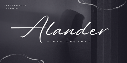 I'd like to introduce you Alander! a wonderful signature font. Alander comes with a stylish style and a masculine impression. A little chic and classy, Alander is a worthy addition to your collection of handwritten script fonts. Alander is perfect for many design needs such as merch, T-shirts, titles, book covers, social media posts, websites, events, and many more. Enjoy the font, Thanks!
 - Hello Youthen by Nathatype,
$29.00 Hello Youthen is a script font that comes with exquisite character changes, a kind of classic decorative copper script with a modern twist, designed with high detail for a fun style. Our font always includes Multilingual Support to make your branding reach a global audience. Features: Ligatures Alternates Stylistic Set PUA Encoded Numerals and Punctuation Thank you for downloading premium fonts from Natha Studio
 - ITC Bauhaus by ITC,
$40.99 ITC Bauhaus was designed by Edward Benguiat and Victor Caruso in 1975. They based it on a prototype face drawn by Herbert Bayer in 1925 while he was teaching at the Bauhaus School in Dessau, Germany. ITC Bauhaus has simple geometric shapes and monotone stroke weights. The rounded, open forms and quirky geometric gyrations of ITC Bauhaus will make contemporary graphic designs look both fun and stylish.
 - Rolling Beat by Letterara,
$16.00 Rolling Beat is a bold script font, carefully handcrafted to become a true favorite. Its casual charm makes it appear wonderfully down-to-earth, readable, and, ultimately, incredibly versatile. This font will look outstanding in any context, whether it’s being used on busy backgrounds or as a standalone headline! This font is PUA encoded which means you can access all of the glyphs and swashes with ease!
 - Jawbox by Chank,
$49.00In 1995, when indie rock hipness was just reaching its pique, Chank was really into Jawbox, a post-punk band from DC. It was their music he was listening to when he made this font for the Space Ghost web site. The band broke up in 1997, but the font named in their honor lives on. This font family includes Jawbox, Jawbox Chanky, and Jawbreaker. - Schreibmeister by RMU,
$30.00 Schreibmeister is my interpretation of Arno Drescher’s design for Ludwig Wagner, Leipzig, completed in 1958. The letters X and x were improved as well as some ligatures. The letter E has an alternative, and the small d comes with two alternatives, of which one form can be reached by typing the partial different key. Generally it is recommended to activate both Standard and Discretionary ligatures.
 - Roxton by Surplus Type Co,
$16.00 Roxton is a feature-filled elegant display serif that you'll be reaching for over & over again! This typeface includes a massive selection of ligatures, making it perfect for a variety of creative projects such as logo design, content creation, packaging designs, stationery & so much more. Add Roxton to your font library today! Feel free to try out the basic version of this font in personal projects only.
 - Murisa Ulyana by Murisa Studio,
$10.00 we would like to introduce one new font which we have released in this march. Murisa Ulyana is our newest font. Still inspired by the oval shape, this font is very cute and eye-catching. It is very fitting if you use it for designs that are cheerful and happy. You can also use it for baby and children's product names. Get it right now.
 - ArTarumianTeodik by Tarumian,
$30.00 The font is named after the Armenian writer Theodoros Grigor Lapchinchian (Armenian Թեոդորոս Գրիգորի Լափչինճյան: March 5, 1873, Constantinople — May 24, 1928), who in 1912 published book "Type and Letter" (Armenian: Տիպ ու տառ), dedicated to 1500th anniversary of the creation of the Armenian alphabet and the 400th anniversary of Armenian printing. The letter shapes are influenced by some Armenian fonts of the 18th and 19th centuries.
 - Agharti by That That Creative,
$15.00 Agharti is a bold condensed display font perfect for headlines with a punch. The lowercase glyphs reach as high as the capitals so even if you are not typing in all caps you will have a solid impactful block of text. These extra tall lowercase letters will be sure to catch attention from any viewer and add some playful delight to any design project.
 - Summer Monogram by Yoga Letter,
$16.00 "Summer Monogram" is a combination of script and monogram fonts with coconut tree and beach decorations in the monogram letters. This font is very unique and beautiful, so it is perfect for summer moments. This font is equipped with monograms, basic characters, swash, titling, alternates, multilingual support, numerals and punctuations. Very suitable for summer, spring, autumn, mother's day, christmas, holiday, winter, wedding and other moments.
 - Morton by Deltatype,
$59.00 Morton, another modern grotesque typeface which deliver a extraordinary unique within typeface with the style of condensed let you create more impact with your design. Morton Type Family available in nine weights, the Thin weight deliver you a simple hair line stem until you reach the bold weight, you will get more dynamic with three stem weights which give you a modern, old school look and feel.
 - Cambalache by JVB Fonts,
$35.00 The idea for Cambalache was conceived back in 2008 and was to create a geometrical font based on tangential modules into structure. The serif would be arranged, looking to approach to the lettering shapes. The creative concept has a feel from the mid-30s of last century, reaching a taste of retro and vintage style. Includes oldstyle numbers, slashed zero, standard and discretional ligatures.
 - Black Blocker by Sign Studio,
$10.00 This is Black Blocker, a font that can make contrast to the text. Having a corner of the box on the inside that becomes unique. It is suitable for posters, titles,banding, tags, quotes and more. Developed from the sans-syerif family makes it easy to apply to designs. Reach many languages with Adobe CE standards (over 331 characters). Take it to make your design be different.
 - Bylander by Mans Greback,
$59.00 Bylander is a stateful serif typeface. With robust, heavy letterforms reminiscent of a foundry's hammer hitting molten metal, and an unpaired weight, Bylander's characters seem forged from the core of the Earth. Its rounded corners whisper tales of smoothened river stones, and its gentle curves combined with its industrial mass makes Bylander a paradox; both intimidating in its boldness and welcoming in its approach.
 - DF Zzzz by Dutchfonts,
$33.00 This typeface, in fact a bitmap font 'avant la lettre' is an interpretation of the Old Face condensed type. It is being used where space is scarce. Its skeleton is projected on the chain structure of a fly screen. Eventually your text lines fill the space as wide as hypothetical doors can be. In small sizes the text appears to be drawn with a pencil.
 - Matita Geometric by Trine Rask,
$30.00 Matita Geometric is part of a larger type family developed from 2005-2019 with handwriting and teaching in mind. A humanistic geometric sans serif in five weights containing mathematical symbols, roman numerals, fractions, superior-& inferior numerals, tabular & proportional figures. The family share proportions and weights to ensure all fonts (family members) work together well. Matita Geometric is also a very basic typeface suitable for many purposes.
 - Cut Sans Serif by Aksharasarovara,
$25.00The thought behind this font was not to join vertical, horizontal and diagonal stems. Each stem is designed separately and arranged in a good manner to create glyphs. Something different from tradition; liberal, but in the limit. - Ordinary Guy by PizzaDude.dk,
$15.00 Just another ordinary brushfont? No! There is more to the picture than meets the eye! Ordinary Guy has 8 different versions of each letter! Just like magic, they cycle as you type! Included is multiple language support!
 - Hero by Roman Polishchuk,
$20.00 Hero is an eccentric, handwritten font. It features high detail and natural forms. Support for ligatures allows you to create a truly unique typography that resembles lettering. Each designer should have a hero who inspires him. Enjoy!
 - Old Landmark by HRDR,
$17.00 Old Landmark is a monoline script typeface, that inspired by the old advertising posters. Old Landmark comes with uppercase, lowercase, numerals, punctuation and many variations on each character, including OpenType alternates to let you customize your designs.
 - Antiqua Roman by Yuanchen Jiang,
$30.00 This typeface is called Antiqua Roman. The biggest feature of this typeface is each letter contains a very thin stroke. Design based on the original handwriting letters made by Fritz Helmuth Ehmcke in 1907. Redesigned in 2015.
 - Choir by Linecreative,
$16.00 Choir is a modern sans serif font. Each letter consists of three combined lines that connect together like a maze. This font is suitable for logos, business cards, magazines header, Flyer Titles, or large-scale oven artworks.
 - Wenykidos by Stringlabs Creative Studio,
$29.00 Wenykidos is a cute and quirky display font. It will add an incredibly joyful touch to your designs. Add this beautiful display font to each of your creative ideas and notice how it makes them stand out!
 - Stylette JNL by Jeff Levine,
$29.00Stylette JNL is a new treatment for Jeff Levine's popular Stylor JNL. In this instance, a heavier stroke was applied to the left side of each character, giving an Art Deco touch to the original monoline design. - Nord by Letterwerk,
$25.00 Nord is a capital letter font made for display use. The 4 styles can either stand alone or be used for effects by adding different colors to each stackable style. Check the PDF-FILE for more informations.
 - Peitago Goulya by Herry92,
$13.00 I like the letters on the Peitago goulya because each letter is curved and rounded at the edges, it looks unique and has characteristics. Peitago goulya is handwritten, intentionally made with indentations. This font looks very pleasant.. !
 - Quickly by Green Adventure Studio,
$20.00 Quickly is a cute and quirky display font. It will add an incredibly joyful touch to your designs. Add this beautiful display font to each of your creative ideas and notice how it makes them stand out!
 - Adobe Handwriting by Adobe,
$29.00A trio of fonts based on the handwriting of some of Adobe?s own designers. The three eponymous styles of the family ? Ernie, Frank, and Tiffany ? each have a unique flavor with its own rhythm and character. - Mooneyes by ErlosDesign,
$19.00 Mooneyes is an elegant and thin, lettered serif font. Trendy and stylish, this font will elevate each of your creations. Coquet is PUA encoded, which means you can access all of the glyphs and swashes with ease!
 - Spatchers by PizzaDude.dk,
$16.00 Spatchers is obviously a comic font - very useful when you need a fresh and legible look to whatever you design. I've made 4 slightly different versions of each lowercase letter - and they automatically cycle as you type.
 - Sun Summer by Sakha Design,
$12.00 Sun Summer is a cute and casual display font. It will add an incredibly joyful touch to your designs. Add this beautiful font to each of your creative ideas and notice how it makes them stand out!
 - Foodpacker by Awan Senja,
$14.00 Foodpacker is a cute and quirky display font. It will add an incredibly joyful touch to your designs. Add this beautiful display font to each of your creative ideas and notice how it makes them stand out!
 - Ginger Mate MS by Redcollegiya,
$8.00 Ginger Mate is a handwritten funny font duo which makes it great for Christmas cards or advertising, as well as for any children's design. Each of these fonts include latin and cyrillic characters, diacritics, numbers and punctuation.
 - Espinosa Nova by Estudio CH,
$- Espinosa Nova is a revival based on the types used by Antonio de Espinosa, the most important Mexican printer of the sixteenth century and very probably the first punchcutter anywhere in the American continent (1551). In 2010, its main fonts were awarded two certificates of excellence: one by TDC2 (Type Directors Club Typeface Design Competition), one by Tipos Latinos (Biennial of Latin American Typography). According to Robert Bringhurst, it is “an unusually intelligent family of type, reaching back to one of the most exciting moments in typographic history and reaching forward to the typographic future”. All of the fonts intended for setting text include small caps, five sets of figures (oldstyle and lining, both proportional and tabular, plus tabular small caps), many f and long s ligatures, and capital sharp S (U+1E9E). In addition, the Capitular fonts allow to create interesting effects by overlapping layers. This family feels very comfortable in books, but it can be used everywhere a touch of classic & elegance is required.
 - Norwich Aldine ML by HiH,
$12.00 Norwich Aldine ML is a all-cap typeface with enlarged serifs, designed and produced in wood by William Hamilton Page of Norwich, Connecticut in 1872. Norwich Aldine ML is a fine example of the strength of decorative wood types: large, simple type forms that provide the visual boldness sought by advertisers of the Victorian period. While our marketing has gotten so very sophisticated, there is always a place for a simple, visually strong typeface. Although about 14 miles inland, Norwich, Connecticut lies at the head of the Thames River. The river is both wide and deep, and therefore was not bridged in the early 20th century. Until then, if you wanted to get from Groton on the west bank to the whaling port of New London on the east bank by land, you had to go by way of Norwich. Because of its size, the Thames is navigable all the way from Norwich to New London. Docks were built in Norwich around 1685 and the city became Connecticut’s 2nd largest port by 1800. With the construction of the Norwich & Worcester Railroad in 1835, Page could easily ship his wood type north by rail or south by coastal schooner. Included with our font, Norwich Aldine ML, are two 19th century printer’s ornaments of sailing ships similar to those that sailed up the Thames to Norwich. Reference: Moon’s Handbooks, Connecticut 2nd Edition (Emeryville CA 2004) The family has expanded from one to four fonts: 1. Norwich Aldine ML: the concept font, computer-sharp corners and smooth curves, as we imagine it was designed. 336 Glyphs including some reduced-width alternatives for better letter spacing. 2. Norwich Aldine Worn ML: the way actual wooden type would look after have been used for a while. 332 Glyphs 3. Norwich Aldine Distressed ML: the way the wooden type would look after it had really been used, perhaps abused. Alternatives to the more popular letters reflect the damage that typically occurs on a well-wormn font, with nicks, cuts and scratches and the overall wear that reduces the overall height and leads to uneven inking due to varying heights in the chase. A couple of bullets look like bullet holes. 345 glyphs. 4. Norwich Aldine Cyrillic: Cyrillic includes alll English and Cyrillic letters for MS Windows Code Page 1251, ISO 8859-5 and MacOS Cyrillic. 235 glyphs. We did Cyrillic because is was fun and we felt the basic design cried out for Cyrillic. While obviously subjective, we hope you will agree.
 - Paneuropa 1931 by ROHH,
$19.00 Paneuropa 1931™ is a faithful recreation of XX-century Polish classic, made by Idzikowski foundry in Warsaw, 1931. Original Paneuropa was a renowned and highly popular typeface in XX-century Poland, and was widely used in all kinds of design, editorial use and printed materials for decades. Paneuropa is a geometric, clean and versatile font family inspired by Paul Renner's famous Futura - it is a bit narrower, with different proportions and details in drawing, completely different figures and punctuation shapes than Futura. It is an interesting and refreshing alternative to Futura with its own distinct personality and a subtle authentic vintage flavour. Paneuropa 1931 contains separate styles for display and large sizes as well as styles for small text sizes - differing in spacing and the softness of letterforms. The family features an original Paneuropa Double font - a beautiful inline style for headlines and display use. The whole family is completed with added missing inbetween styles as well as italics. The original subfamily set is available for purchase and it contains solely the original Paneuropa styles (Thin, Regular, Bold, Text Regular, Text Italic, Double). Paneuropa 1931 characteristics: letter shapes and proportions are very faithful to the original, keeping its idiosycrasies and inconsistencies spacing and kerning are carefully adjusted in order to achieve the colour of the original fonts, keeping maximum possible consistency - a compromise between authentic vintage feel and legible consistent text colour (for hardcore users: just turn off the kerning) weights precisely matching the original (Thin, Regular, Bold, Text Regular, Text Italic, Double), inbetween weights were added (Light, Demi Bold, as well as missing italic styles) italic angle faithful to the original (8 degrees) softened corners help achieving the character of old imprecise printed display styles for big sizes are sharper and have tight spacing, text styles have softer shapes (recreating small print imperfect print) and broader spacing for use in paragraph text (spacing in both display and text styles matches the original as well) original style names in Polish for devices with Polish set as their primary language The family is very versatile. The Inline style as well as bold and thin weights are perfect for headlines and display use, other styles works wonderfully as paragraph text. Paneuropa 1931 consists of 18 fonts - 5 display weights with corresponding italics + 3 text weights with corresponding italics + 2 inline styles (for big and small print sizes). It has extended support for latin languages, as well as broad number of OpenType features, such as case sensitive forms, fractions, superscript and subscript, ordinals, currencies and symbols.
 - Breathe by Lián Types,
$20.00 ATTENTION COSTUMERS! A new version of this font was released in 2019. Take a look: Breathe Neue Reaching a total of more than 1000 glyphs, Breathe Pro is Maximiliano R. Sproviero’s gift of the year. The aim of the designer was once more to give the user the chance to play and travel from very formal and conservative letterforms to the amazing world of swashes and flourishes. Possibilities of alternating and ligating characters in this font are absolutely fantastic. After his last creation, Parfait Script, Lián wanted to make a more universal font. Delighted by typographic works of Didot and his followers of the beginnings of 1800, Maximiliano R. Sproviero started what became another obsessive project, which is now named Breathe, “cuando las letras respiran...” what could be translated as “when letters breathe”, due to the feeling that you are reading letters that are alive. Breathe comes in two styles which have a significant difference as regards to the quantity of glyphs available inside. If you want to get the most complete style, with over 1000 glyphs, (including contextual alternates, stylistic alternates, swashes, terminal forms, titling alternates, historical forms, stylistic sets, standard ligatures, stylistic ligatures, decorative ligatures and frames) then your choice should be Breathe Pro. On the other hand, if you are interested in having a less decorative font with the nice touch of Lián’s style, then your choice should be Breathe Standard, a more limited version of Breathe, including terminal forms (leaves) and frames. With Breathe Pro you will surely have fun at the same time you are designing and that is not an unimportant thing. The world of type-designers is growing each year, and the features of Open-Type are letting them think their creations as if they were truly pieces of art. At least, Breathe Pro is inspired in the Art of our predecessors, those who with a pen loaded of ink would decorate each letter, each page in such a lovely way. Yes, -lovely- is the word. We would not have the amazing lettering artists, calligraphers, typographers of nowadays if that -love for letters- had not traveled from generation to generation. Breathe Pro is an example of this love. An example of what Maximiliano R. Sproviero feels about typography and letters. Pssst... Look for more images and the User’s Guide at the gallery section to see it in use! http://origin.myfonts.com/s/aw/original/89/0/46067.pdf
 - Fresh Anemone by Seemly Fonts,
$14.00 Fresh Anemone is a cute and quirky display font. It will add an incredibly joyful touch to your designs. Add this beautiful display font to each of your creative ideas and notice how it makes them stand out!
 - Guideline by PizzaDude.dk,
$16.00 Here is a Guideline for you: Use this font if you want fun, unpredictable, legible and handmade text with influences from both comics and graffiti. Each letter has 5 different versions, and they automatically cycles as you type!