10,000 search results
(0.091 seconds)
- P22 Amelia Jayne by IHOF,
$39.95Amelia Jayne is Ted Staunton's updated revision and expansion of his own Amelia decorative cap font. Amelia Jayne started as a Roman font to accompany the Amelia initials but has taken on a new life as a Pro Roman font with small caps and several variations of new matching initial companion fonts. (The initials are not included in the pro font but come bundled with the set.) - Sutro Initials by Parkinson,
$20.00 A two-font chromatic (or layered) set. The Primary font, which is the old Sutro Inlined Initials. Salvaged from the wreckage of my Type1 font library, the inlined initials have been in the shop for some repairs and detailing. I just added the fill font to support the inlined version. Each font works on it’s own but they work very well together. Caps only. Open Type.
 - Areplos by Storm Type Foundry,
$53.00To design a text typeface "at the top with, at the bottom without" serifs was an idea which crossed my mind at the end of the sixties. I started from the fact that what one reads in the Latin alphabet is mainly the upper half of the letters, where good distinguishableness of the individual signs, and therefore, also good legibility, is aided by serifs. The first tests of the design, by which I checked up whether the basic principle could be used also for the then current technology of setting - for double-sign matrices -, were carried out in 1970. During the first half of the seventies I created first the basic design, then also the slanted Roman and the medium types. These drawings were not very successful. My greatest concern during this initial phase was the upper case A. I had to design it in such a way that the basic principle should be adhered to and the new alphabet, at the same time, should not look too complicated. The necessary prerequisite for a design of a new alphabet for double-sign matrices, i.e. to draw each letter of all the three fonts to the same width, did not agree with this typeface. What came to the greatest harm were the two styles used for emphasis: the italics even more than the medium type. That is why I fundamentally remodelled the basic design in 1980. In the course of this work I tried to forget about the previous technological limitations and to respect only the requirements then placed on typefaces intended for photosetting. As a matter of fact, this was not very difficult; this typeface was from the very beginning conceived in such a way as to have a large x-height of lower-case letters and upper serifs that could be joined without any problems in condensed setting. I gave much more thought to the proportional relations of the individual letters, the continuity of their outer and inner silhouettes, than to the requirements of their production. The greatest number of problems arose in the colour balancing of the individual signs, as it was necessary to achieve that the upper half of each letter should have a visual counterbalance in its lower, simpler half. Specifically, this meant to find the correct shape and degree of thickening of the lower parts of the letters. These had to counterbalance the upper parts of the letters emphasized by serifs, yet they should not look too romantic or decorative, for otherwise the typeface might lose its sober character. Also the shape, length and thickness of the upper serifs had to be resolved differently than in the previous design. In the seventies and at the beginning of the eighties a typeface conceived in this way, let alone one intended for setting of common texts in magazines and books, was to all intents and purposes an experiment with an uncertain end. At this time, before typographic postmodernism, it was not the custom to abandon in such typefaces the clear-cut formal categories, let alone to attempt to combine the serif and sans serif principles in a single design. I had already designed the basic, starting, alphabets of lower case and upper case letters with the intention to derive further styles from them, differing in colour and proportions. These fonts were not to serve merely for emphasis in the context of the basic design, but were to function, especially the bold versions, also as independent display alphabets. At this stage of my work it was, for a change, the upper case L that presented the greatest problem. Its lower left part had to counterbalance the symmetrical two-sided serif in the upper half of the letter. The ITC Company submitted this design to text tests, which, in their view, were successful. The director of this company Aaron Burns then invited me to add further styles, in order to create an entire, extensive typeface family. At that time, without the possibility to use a computer and given my other considerable workload, this was a task I could not manage. I tried to come back to this, by then already very large project, several times, but every time some other, at the moment very urgent, work diverted me from it. At the beginning of the nineties several alphabets appeared which were based on the same principle. It seemed to me that to continue working on my semi-finished designs was pointless. They were, therefore, abandoned until the spring of 2005, when František Štorm digitalized the basic design. František gave the typeface the working title Areplos and this name stuck. Then he made me add small capitals and the entire bold type, inducing me at the same time to consider what to do with the italics in order that they might be at least a little italic in character, and not merely slanted Roman alphabets, as was my original intention. In the course of the subsequent summer holidays, when the weather was bad, we met in his little cottage in South Bohemia, between two ponds, and resuscitated this more than twenty-five-years-old typeface. It was like this: We were drinking good tea, František worked on the computer, added accents and some remaining signs, inclined and interpolated, while I was looking over his shoulder. There is hardly any typeface that originated in a more harmonious setting. Solpera, summer 2005 I first encountered this typeface at the exhibition of Contemporary Czech Type Design in 1982. It was there, in the Portheim Summer Palace in Prague, that I, at the age of sixteen, decided to become a typographer. Having no knowledge about the technologies, the rules of construction of an alphabet or about cultural connections, I perceived Jan Solpera's typeface as the acme of excellence. Now, many years after, replete with experience of revitalization of typefaces of both living and deceased Czech type designers, I am able to compare their differing approaches. Jan Solpera put up a fight against the digital technology and exerted creative pressure to counteract my rather loose approach. Jan prepared dozens of fresh pencil drawings on thin sketching paper in which he elaborated in detail all the style-creating elements of the alphabet. I can say with full responsibility that I have never worked on anything as meticulous as the design of the Areplos typeface. I did not invent this name; it is the name of Jan Solpera's miniature publishing house, in which he issued for example an enchanting series of memoirs of a certain shopkeeper of Jindrichuv Hradec. The idea that the publishing house and the typeface might have the same name crossed my mind instinctively as a symbol of the original designation of Areplos - to serve for text setting. What you can see here originated in Trebon and in a cottage outside the village of Domanín - I even wanted to rename my firm to The Trebon Type Foundry. When mists enfold the pond and gloom pervades one's soul, the so-called typographic weather sets in - the time to sit, peer at the monitor and click the mouse, as also our students who were present would attest. Areplos is reminiscent of the essential inspirational period of a whole generation of Czech type designers - of the seventies and eighties, which were, however, at the same time the incubation period of my generation. I believe that this typeface will be received favourably, for it represents the better aspect of the eighties. Today, at the time when the infection by ITC typefaces has not been quite cured yet, it does absolutely no harm to remind ourselves of the high quality and timeless typefaces designed then in this country.In technical terms, this family consists of two times four OpenType designs, with five types of figures, ligatures and small capitals as well as an extensive assortment of both eastern and western diacritics. I can see as a basic text typeface of smaller periodicals and informative job-prints, a typeface usable for posters and programmes of various events, but also for corporate identity. Štorm, summer 2005 - Night Empty by Ahmad Jamaludin,
$17.00 We're presenting our new italic seventies retro font, Night Empty! Night Empty - A Italic Seventies Retro that has both retro and soft bold italic. This font has smooth curves and clean lines to make your project more nostalgic feels. This font will make your project looks retro, chic, and presentable. Night Empty - Have 37 beautiful alternates and ligatures which consist of 4 stylistic sets. Comes with alternatives and ligatures, and helps to create stunning logos, quotes, posts, blog posts, branding projects, magazine imagery, wedding invitations, and much more. Super-versatile, have a scroll through all the previews to see how wide the range of uses that can be with Night Empty, it's so limitless! What you get : Letters, numbers, symbols, and punctuation Has 37 beautiful alternates and ligatures Use in many programs even in Canva Multilingual Support Language Support: Danish, English, Estonian, Filipino, Finnish, French, Friulian, Galician, German, Gusii, Indonesian, Irish, Italian, Luxembourgish, Norwegian Bokmål, Norwegian Nynorsk, Nyankole, Oromo, Portuguese, Romansh, Rombo, Spanish, Swedish, Swiss-German, Uzbek (Latin) Come and say hello over on Instagram! https://www.instagram.com/dharmas.studio/ Dharmas Studio
 - Brugty by Prioritype,
$19.00 Brugty - Thick and funny fonts with 100+ alternative characters make this font very interesting. In addition, this font also looks unique and classic for a design project. You can apply it to covers, logos, merchandise, quotes, branding, posters, landing pages, social media posts or anything else it will impress with this great item. So, ready to go! Features: -Uppercase -Lowercase -Numeral -Punctuation -Multilingual -Opentype Features & PUA Encoded Multilingual contained: Afrikaans, Albanian, Asu, Basque, Bemba, Bena, Breton, Catalan, Chiga, Cornish, Danish, Dutch, English, Estonian, Filipino, Finnish, French, Friulian, Galician, German, Gusii, Indonesian, Irish, Italian, Kabuverdianu, Kalenjin, Kinyarwanda, Luo, Luxembourgish, Luyia, Machame, Makhuwa-Meetto, Makonde, Malagasy, Manx, Morisyen, North Ndebele, Norwegian Bokmål, Norwegian Nynorsk, Nyankole, Oromo, Portuguese, Quechua, Romansh, Rombo, Rundi, Rwa, Samburu, Sango, Sangu, Scottish Gaelic, Sena, Shambala, Shona, Soga, Somali, Spanish, Swahili, Swedish, Swiss German, Taita, Teso, Uzbek (Latin), Volapük, Vunjo, Zulu. Note: Use a program that supports the Opentype features and the glyph panel is available, so you can see the various alternative characters available. Examples of programs such as Adobe Illustrator, Corel Draw or Affinity Designer.
 - Nyata by Marsnev,
$14.80 Nyata™ — Clearly Visible, No Matter What. I love London for its finest visual branding, especially its Johnston typeface spreading all over the city. It inspired me to create this new font family: Nyata™. Nyata means clearly visible in Indonesian. The typeface is designed to be clean, unique, and legible. It is a great combination for any display requiring high legibility, such as city’s way finder. Long ascenders help some characters more obvious. You will never confuse wether it is an h or an n. Moreover, I tried to create all the letters are distinguishable. Of course, no time for people to doubt between Uppercase “I” and lowercase “l” when seeing a way finder. Last but not least, it is equipped with tons of OpenType features such as slashed zero to help the words more obvious, or stylistic sets if you don’t fancy the serifed uppercase I. Nyata™ is also delivered in Variable Font format. Enjoy all the styles and everything in between in one variable font only sized less than 150kb.
 - Rakochuk by Twinletter,
$17.00 Rakochuk is the ideal font for your project if you want a typeface that has a classic, retro, and vintage vibe in a condensed form. This typeface has a unique shape that will bring a classic touch to your project and was designed with attention and detail in mind. Not only that, but Rakochuk includes ligature and alternate characteristics, providing you greater freedom in its application, especially when you need a more personal touch in your design. This typeface is appropriate for international projects due to its linguistic support. If you want to bring an elegant classic, retro, or vintage feel to your project, consider Rakochuk. Get it now and set your project out from the crowd! What’s Included : - File font - All glyphs Iso Latin 1 - Alternate, Ligature - Simple installations - We highly recommend using a program that supports OpenType features and Glyphs panels like many Adobe apps and Corel Draw so that you can see and access all Glyph variations. - PUA Encoded Characters – Fully accessible without additional design software. - Fonts include Multilingual support
 - Swipe by Ahmad Jamaludin,
$15.00 Say hello to our new retro bold font, Swipe! Swipe - An seventies font that has both a retro and fun look. It comes with a smooth curve and soft bold with a regular and oblique style that will make your project more stunning with nostalgic feels. Swipe - Have 105 beautiful alternates and ligatures which consist of 4 stylistic sets. Contains 2 styles regular and italic, this font is best used for headings, logotype, quotes, apparel design, posters, flyers, packaging, book cover, and many more. Super-versatile, have a scroll through all the previews to see how wide the range of uses that can be with Swipe, it's so limitless! What you get Letters, numbers, symbols, and punctuation Has 105 beautiful alternates and ligatures Use in many programs even in Canva Multilingual Support Language Support: Danish, English, Estonian, Filipino, Finnish, French, Friulian, Galician, German, Gusii, Indonesian, Irish, Italian, Luxembourgish, Norwegian Bokmål, Norwegian Nynorsk, Nyankole, Oromo, Portuguese, Romansh, Rombo, Spanish, Swedish, Swiss-German, Uzbek (Latin) Come and say hello over on Instagram! https://www.instagram.com/dharmas.studio/ Dharmas Studio
 - Flirt Script by Positype,
$50.00 Young, playful, loopy, flirty. Flirt Script® carves out a niche for itself by concentrating on natural writing tendencies and not the simplified mechanics of script-to-font type design. A free-flowing monoline, the two weight typeface exploits the common letter-to-letter transitions of the typical cursive hand by utilizing three variable-height strike points controlled within the machinations of OpenType Contextual Alternates. The ease of writing (and the decisions made from letter to letter) is reflected as the structure and cadence of the writing evolves as the user types. To see it in action, click here USE CONTEXTUAL ALTS Flirt Script® is equipped for complex, conscientious, professional typography. As an exclusively OpenType release, these fonts feature over 2700 glyphs and an extended character set to support Central and Eastern European as well as Western European languages. So, to really let the font perform for you, be sure to have Contextual Alternates activated. Flirt Script® received the “Certificate of Excellence in Type Design” at the TDC2 (2014).
 - Organic Peach by Prioritype,
$19.00 Introducing: Organic Peach - Blurred Handwritten Fonts. Is a natural handwritten font with a blur effect making this font look smooth and simple. Suitable for use in design projects such as quotes, social media posts, branding, merchandise, posters, cover and much more which you can make with this great item for any design. Features: -Uppercase -Lowercase -Numeral -Punctuation -Multilingual -Opentype Features & PUA Encoded Multilingual contained: Afrikaans, Albanian, Asu, Basque, Bemba, Bena, Breton, Catalan, Chiga, Cornish, Danish, Dutch, English, Estonian, Filipino, Finnish, French, Friulian, Galician, German, Gusii, Indonesian, Irish, Italian, Kabuverdianu, Kalenjin, Kinyarwanda, Luo, Luxembourgish, Luyia, Machame, Makhuwa-Meetto, Makonde, Malagasy, Manx, Morisyen, North Ndebele, Norwegian Bokmål, Norwegian Nynorsk, Nyankole, Oromo, Portuguese, Quechua, Romansh, Rombo, Rundi, Rwa, Samburu, Sango, Sangu, Scottish Gaelic, Sena, Shambala, Shona, Soga, Somali, Spanish, Swahili, Swedish, Swiss German, Taita, Teso, Uzbek (Latin), Volapük, Vunjo, Zulu. Note: Use a program that supports the Opentype features and the glyph panel is available, so you can see the various alternative characters available. Examples of programs such as Adobe Illustrator, Corel Draw or Affinity Designer.
 - Heallington by Ditatype,
$29.00 Heallington is a handwritten brush font. With a natural handwritten style, it brings a classy and beautiful typeface. Heallington is best used for branding, logotype, and quotes. Includes: - Heallington (OTF) Features: - Multilingual Support - Stylistics Set - PUA Encoded - Numerals and Punctuation Thank you for downloading premium fonts from Dita Type
 - The Signer by Ably Creative,
$9.00 The signer is an organic handwritten font that is suitable for branding, signature, wedding invitation, promotion, product packaging, and other needs. This font is modern, simple, but still authentic. You will get full set of lowercase and uppercase letters, numerals and punctuation, multilingual symbols,ligatures and alternates lowercase.
 - Gusset by Pesotsky Victor,
$10.00 Gusset is a simple modular font. It was created for headlines and posters. It creates a dense and interesting texture in the text set. Simple rounded curves contrast with "wedges". Gusset supportsBasic Latin, Cyrillic and more than 100 languages all together. The font was designed by Viktor Pesotsky.
 - The Fashionist by Mas Anis Studio,
$16.00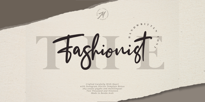 The Fashionist is a natural handwritten font, this font Is perfect for logo, invitation, stationery, wedding designs, social media posts, advertisements, product packaging, product designs, label, photography, watermark, special events or anything. Comes with full set of uppercase and lowercase letters, lowercase beginning & ending swashes , multilingual symbols, numerals, punctuation.
 - Vrinda by Microsoft Corporation,
$49.00Vrinda™ is an OpenType font for the Indic script Bengali. It is based on Unicode™, contains TrueType outlines and was designed by Raghunath Joshi (Type Director) Vinay Saynekar for use as a UI font. Copyright ™ 2004 Microsoft Corporation. All Rights Reserved. Character Set: Latin-1, Bengali - Bettylavia by eyetype,
$16.00 Bettylavia is a script font that has a distinctive handwriting, it is perfect for making certain labels and business events and you can use them for unique works. Alternate characters in the Bettylavia font are divided into OpenType features such as Stylistic Alternate, Stylistic Sets, Swash and Ligature.
 - Mafia Hometown by Hatftype,
$15.00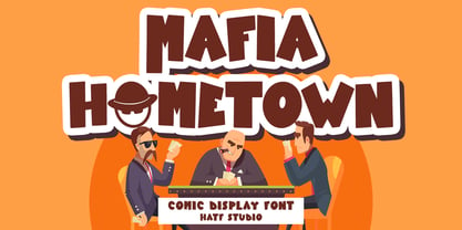 Is a Comic Display Font font with distinctive handwritten characters perfect for branding projects, logos, wedding designs, media posts, advertisements, product packaging, product designs, labels, photography, watermarks, invitations, stationery, and any project who need handwritten dishes. Features : • Character Set A-Z • Numerals & Punctuations (OpenType Standard) • Accents (Multilingual characters) • Ligature.
 - Mistook by Arendxstudio,
$15.00 Mistook - Street Art Graffiti Font is a free style font that has the characteristics of street art that shows freedom and is filled with unique characters Features : • Character Set A-Z • Numerals & Punctuations (OpenType Standard) • Accents (Multilingual characters) • Ligature • Alternate There it is! I really hope you enjoy it !
 - Latansa by SimpleType Studios,
$15.00 Latansa is a script font with a bold, minimalist style, elegant and stylish.This font is great for a wide variety of projects such as branding, invitations, logos, t shirts and anything that requires a handwritten style. Features ligature styistic set 01 stylistic se02 stylistic alternate swash contextual alternate
 - P22 Allyson by IHOF,
$39.95 P22 Allyson is based on an old metal font by Barnhart Bros. & Spindler named Hazel Script. This font is perfect for elegant invitations and certificates and has been expanded to meet the needs of today's computer user to include a full character set. Allyson Pro contains OpenType features.
 - Palmilla by RodrigoTypo,
$25.00 Palmilla is a very gestural Sans font that contains 7 fonts (Thin, Light, Regular, Medium, Bold, Black as well as a set of dingbats, it is perfect for informal or children's titles, it contains many Alternatives such as Ligatures, to have more options at the time of writing.
 - Parkour King by Hatftype,
$15.00 Parkour King - Graffiti Font is a free style font that has the characteristics of street art that shows freedom and is filled with unique characters. Features : • Character Set A-Z • Numerals & Punctuations (OpenType Standard) • Accents (Multilingual characters) • Ligature • Alternate There it is. I really hope you enjoy it.
 - Tunga by Microsoft Corporation,
$49.00Tunga™ is an OpenType font for the Indic script Kannada. It is based on Unicode, contains TrueType outlines and was designed by Raghunath Joshi (Type Director) and Vinay Saynekar for use as a UI font. Copyright ™ 2001 Microsoft Corporation. All rights reserved. Character Set: Latin-1, Kannada - Galexica Mono by Ingrimayne Type,
$6.00 GalexicaMono is an attempt to create a futuristic typewriter font, which may be an oxymoron. Unlike most typewriter fonts, it is sans-serif. The family has two weights, plain and bold, each with an oblique style. For a variant of the design that is not monospaced, see Galexica.
 - Kinghood by Rockboys Studio,
$19.00 Kinghood is a delicate and elegant serif font. You can use this modern serif font with ligature & stylistic set for fashion, magazines, cooking websites, quotes, social media posts, labels, and many more! Add it confidently to your favorite creations and let yourself be amazed by the outcome generated.
 - Odyssea 632 by Thinkdust,
$10.00 Odyssea 632 is the follow up to a http://www.hypefortype.com exclusive font called Odyssea which was originally designed by Pablo Alfieri. Odyssea 632 contains all of the features of the original font and also supports 42 languages. Check out the gallery for a full character set, and other imagery!
 - VP Pixel by VP Type,
$19.00 VP Pixel is a font family of eight fonts. Eight modern takes on the classic grid, that feel both retro and futurist. The family includes diverse and versatile styles of an extensive character set, with support for advanced OpenType features; making VP Pixel a smart typeface of unique personality.
 - Constaller by Namara Creative Studio,
$18.00 Modern calligraphy font with casual-chic flair. Magical pressure makes this font perfect for creating signature logos and watermarks for photography studios or wedding invitations. Constaller includes the full set of uppercase and lowercase letters, multilingual symbols, numerals, punctuation, alternates, swash and ligatures. Thanks and have a wonderful day.
 - Modern Art NF by Nick's Fonts,
$10.00A font with a strong graphical appeal, based on the logotype lettering for the comic magazine of the same name, designed by Dutch illustrator Joost Swarte. Both versions of this font contain the Unicode 1252 Latin and Unicode 1250 Central European character sets, with localization for Romanian and Moldovan. - Astro Jack by FHFont,
$19.00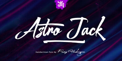 Astro Jack is script font with a hand-lettering, brush style and OpenType features. It is suitable for design, element design, weddings, events, t-shirts, logos, badges, stickers, and awesome work. Features Of The Font: - All Standard Character, Symbol, Multi-lingual Support, Ligature, Stylistic Set, and Swashes. - PUA Encode
 - Monosketch by GRIN3 (Nowak),
$20.00 Monosketch is a hand-drawn font inspired by monospaced fonts like Andale Mono. Monosketch Layer and Monosketch Black can be used together by layering Monosketch Layer above a differently colored Monosketch Black. Language support includes Western, Central and Eastern European character sets, as well as Baltic and Turkish languages.
 - Cadaques by Supfonts,
$18.00 Cadaques is a bold, condensed font inspired by the nostalgia and aesthetics of the early 90s. Ideal for advertising, headlines, editorial design, branding, and posters. Cadaques Font Features: - Full Set of standard alphabet and punctuation - PUA Encoded - no special software needed to access extra characters - Multilingual Characters AÁĂÂÄÀĀĄÅÃÆBCĆČÇĊDÐĎĐEÉĚÊËĖÈĒĘẼFGĞĢĠḠHĦIIJÍÎÏİÌĪĮĨJKĶLĹĽĻŁMNŃŇŅÑ OÓÔÖÒŐŌØÕŒPÞQRŔŘŖSŚŠŞȘẞTŤŢȚUÚÛÜÙŰŪŲŮŨVWẂŴẄẀXYÝŶŸỲỸZŹŽŻ
 - Pixel_Block by fontkingz,
$19.00The Pixel_Block font-family is specially designed for use with Flash so that it doesn't blur or fill. In contrast to most other pixelfonts Pixel_Block also works well in dynamic and input text fields. Pixel_Block fonts include a full character set and also contain outlines for any print application. - Giecella Kids by Sipanji21,
$8.00 Say hello to Giecella Kids font. Made with love and joy. Comic look, so it will make your design more beautiful, cute, fun, and colorful Includes: Giecella Kids (OTF, TTF, WOFF) Bonus (Cute Background) Features: Character Set Numerals and Punctuation (OpenType Standard) I hope you can enjoy the font :)
 - Shruti by Microsoft Corporation,
$49.00Shruti™ is an OpenType font for the Indic script Gujarati. It is based on Unicode, contains TrueType outlines and was designed by Raghunath Joshi (Type Director) Santosh Kshirsagar for use as a UI font. Copyright ™ 2001 Microsoft Corporation. All rights reserved. Character Set: Latin-1, Gujarati - Bingo Player JNL by Jeff Levine,
$29.00Bingo Player JNL is a thorough reworking of Jeff Levine's old freeware font - cleanly redrawn with fresh glyphs and a set of "alphabet balls" for creating short headlines. To match the fonts in these dingbats for other text applications, use Shopkeeper JNL, Trade Journal Wide JNL and Market JNL. - Sugar Smile by Prioritype,
$12.00 Introducing. Sugar Smile - All Caps Display Font Sweet font with hand strokes. Simple and eye catching. You can apply it to craft designs, promotions, creative posts, apparel, quotes, merchandise, posters etc. See some of the previews above for reference. Features: • Uppercase • Lowercase • Numeral • Punctuation • Multilingual • PUA Encoded Thanks.
 - Roundabout NF by Nick's Fonts,
$10.00The movable letters used on temporary road signs in the U.K. inspired this utilitarian typeface. Also included in the font are numerous other carriageway symbols and emblems. This font contains the complete Latin language character set (Unicode 1252) plus support for Central European (Unicode 1250) languages as well. - Maritha by MJB Letters,
$17.00 Maritha is a classy handwritten script, it has beautiful beginning and ending swashes, this font is perfect for branding design, packaging, logo design, watermark, fashion design, wedding invites, and more. this font includes the full set of lowercase and uppercase letters, numeral, punctuation, multilanguage support, titling, and ending swashes.
 - freeble - Unknown license

