10,000 search results
(0.012 seconds)
- ComixHeavy - Unknown license
- Dogwood - Unknown license
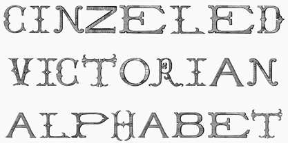
- Cinzeled Victorian Alphabet by Intellecta Design,
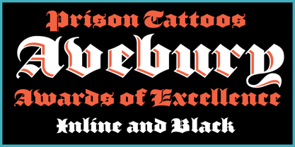
$28.90 - Avebury by Parkinson,
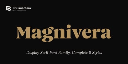
$25.00 - Magnivera by Eko Bimantara,
$24.00 - Churchward Ta Tiki by BluHead Studio,
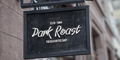
$20.00Churchward Ta Tiki is a new font release by BluHead Studio, LLC from the exciting and unique typefaces of New Zealand designer Joseph Churchward. We will be releasing fonts from his extensive library in OpenType format on a regular basis. - Coffee by Abedavera,
$20.00 - Tramp Steamer JNL by Jeff Levine,
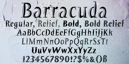
$29.00Tramp Steamer JNL is a re-interpretation of an old metal typeface that's been around for years. This is a bit different from many of Jeff Levine's other stencil revival fonts, which are modeled from actual paper and metal stencil guides. - Barracuda by Wiescher Design,
$39.50 - Frisco Bay JNL by Jeff Levine,
$29.00Frisco Bay JNL is an entirely original design from Jeff Levine with strong Art Deco influences. A medium weight letter form, this design finds itself at home in any application where a touch of elegance from the past is needed. - Gashouse Gang by Solotype,
$19.95This font was adapted from an old lettering book, circa 1900. The book got away from us many years ago, but we had made stats of all the potentially useful fonts. Original had no lowercase or numerals, so we designed them. - Sennit by AType,
$29.95It is not simple sennit. You know that such Russian lapti? It is footwear plaited of stripes a bark of a linden. My font too all is made from stripes. From the first up to last letter. Funny isn't it? - BLT Portage by Black Lab Type,
$12.00 - D-block A by AType,
$19.95The history of this font is those. Once I assorted the old children's books which have stayed from times of my childhood. On one of them I have seen a trade mark of a printing house consisting of two Russian letters "L" and "B". From they were begun also with my font. And though finally from these letters a little that remained, elements of these letters can be seen in font D-block B. - Vtg Stencil UK No. 76 by astype,
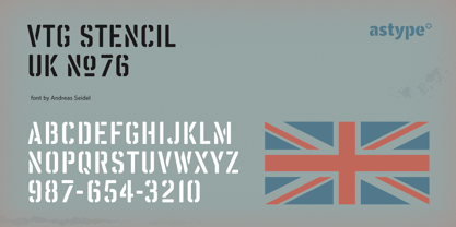
$34.00The Vtg Stencil series of fonts from astype are based on real world stencils. The UK No. 76 design was derived from authentic stencil plates from Great Britain. UK No.76 comes in four flavours – the Regular style and the Alt style with alternate and shorter forms of the letters M, W and the figure eight. Since summer 2015 both styles are now available in a Rough version with an extended glyph randomizer. PDF Specimen - Breda by Eurotypo,
$18.00Breda is a Geometric Sans-serif; it is constructed from simple geometric shapes such as the circle and rectangle. This family of fonts starts from a very thin single-line face to a strong heavyweight, called Black Face. The Breda font is austere style, functional and clear, emerged from straight lines, primary shapes, which is now jumping into the typographic and graphic design scene. They are presented in six wights with their corresponding italics. - Old Style 7 by Linotype,
$29.00The name Old Style No. 7 comes from a time when foundries released a variety of typefaces under one name. Linotype produced Old Style No. 7, which was based on an early 1870s typeface from the Bruce Typefoundry, which had based its design on a type from the Scottish foundry Miller and Richards. Old Style No. 7 is a reliable text type that is serviceable for both books and shorter copy demands, such as magazines. - Hawkins by Fenotype,
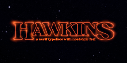
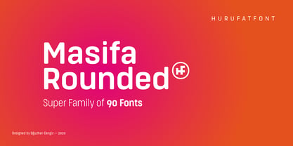
$25.00Hawkins is a rounded serif combined with small hints of Art Nouveau influence and remarkably high x-height. Hawkins takes a lot of space and is a well suited display typeface for any use from print to online and from advertising to book cover or from product design to digital posters. Hawkins is packed with a few OpenType features -Standard Ligatures and plenty of Swash Alternates, as well as few Titling and Stylistic Alternates. - Masifa Rounded by Hurufatfont,
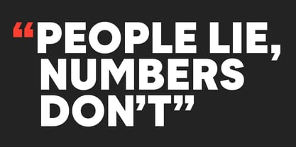
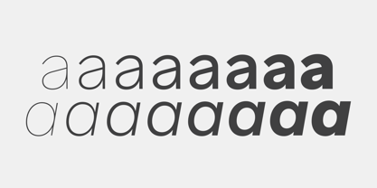
$19.00Masifa Rounded has compact, simple, functional and neutral body structure. It has 5 widths from Normal to Ultra Condensed. Each width includes 9 weights from Hairline to Black and their matching italics. Also, every weight includes rich OpenType Features like Small Caps and custom number styles. Due to its large family, it is ideal for a wide range of usage from large-scale designs to small product labels. Masifa Rounded updated on September 25, 2021. - Majorant by Emtype Foundry,
$69.00Majorant is a geometric sans serif interpreted from a contemporary point of view. Its wide range of weights makes it a multipurpose family. The extreme weights work as a display typeface, from the mathematical rigour of the UltraThin to the expressive refinement of the Black. Thanks to the several alternates included, the font offers multiple personalities. From sharp and audacious in the default version, to the soft and classic in the stylistic sets. Majorant PDF. - Aribau Grotesk by Emtype Foundry,
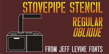
$69.00Born from the intersection of the geometric and grotesque typefaces. Aribau Grotesk combines low contrast and generous width proportions with typical traits of american gothics from the early 20th century, like the counters aperture and a double story ‘g’. Driven by the process, some details that come from the geometric style arose, like the clean-shaped figures and the circular dots that convey a more affable and contemporary look. Aribau Grotesk PDF. - Stovepipe Stencil JNL by Jeff Levine,
$29.00Stovepipe Stencil JNL was not directly designed from a vintage source, but it does draw its influences from classic sans serif lettering of the past. Even its name borrows (somewhat gratuitously) from the "stovepipe" lettering so popular with sign painters. True stovepipe letters tend to be squarer with rounded corners, but the name has also been loosely associated with some tall, condensed type styles. The typeface is available in both regular and oblique versions. - Clarified JNL by Jeff Levine,
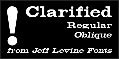
$29.00Based on William H. Page’s Clarendon Extended wood type from the 1800s, Clarified JNL is digitally available in both regular and oblique versions. In the days of wood and metal type, foundries often made changes to an existing design to make their font more unique and different from their competitors. Clarified JNL is different from Clarenwood JNL (which is partially based on another wood type Clarendon and features many alternate letter forms). - Ornata B by Wiescher Design,
$39.50Ornata B is the second of a series of old ornaments that I am trying to save from oblivion. I am not just scanning these, I am completely redesigning the ornaments from scratch, thereby eliminating imperfections. These ornaments have been first designed by the Elzevier printer family from the Netherlands. The designs date back til the 17th century and I think they just had to be saved. Your digitizing type-designing savior, Gert Wiescher - Ballroom by Hazztype,
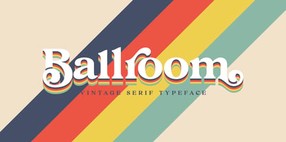
$17.00Ballroom is a modern vintage-style serif, drawing inspiration from the 70s era. It is equipped with Swash, Stylistic, and Titling alternates as well as with Standard and Discretionary Ligatures. All these features can be accessed by OpenType controls or straight from character or Glyphs window. Ballroom is a very versatile font, covering a wide range of project types, from bold magazine imagery to wedding invitations, to branding, poster design, logo, and so much more. - Articulat CF by Connary Fagen,
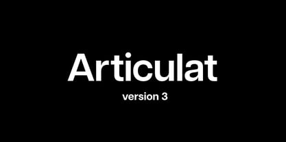
$25.00Articulat® CF is a streamlined, updated take on midcentury type design. Strong, sharp, and well-spoken, Articulat was built from scratch to be bold, clean, and clear. Articulat® CF pairs well with itself, as it has many weights to choose from. It also works well with fonts that contrast strongly, such as Wayfinder® CF and Olivette CF. All typefaces from Connary Fagen include free updates, including new features, and free technical support. - ITC Deli by ITC,
$29.99Jim Spiece has a taste and a talent for reviving type styles from earlier in this century. ITC Deli Supreme is a “futuristic retro” face that would be at home as a logo on a car or a roadside diner from the 1940s or '50s; the lowercase nearly joins, in script style, thanks to the long extenders stretching out from the bottom-right corner of most letters, while the caps have beginning strokes leading in from the top left. ITC Deli Supreme, like ITC Deli Deluxe, features slightly rounded corners on all the letters, for a soft, streamlined look despite the squareness of the letterforms. - Sabana by fragTYPE,
$20.00Sabana is my first step in font design. A font that is born from the organic, from a creative process that starts from improvisation as a result of my training as an artist. To design Sabana I asked myself the question, why not make a font that emulates my own writing? as I found it fun to see my handwriting on a computer. This font can be used in a wide range of projects such as editorial design, motion graphics, web, advertising and branding where emulating handwriting is a necessity. The font has coverage for more than 200 languages ??derived of the latin alphabet in addition to Cyrillic. Sabana is where I come from, where I am from, a constant on the horizon that is occasionally interrupted by vertical lines and that together make a perfect visual symphony. - Harri by Blancoletters,
$39.00Harri –“stone” in Basque language– is a display font based on the peculiar letter forms used in signs and fascias all over the Basque Country. This idiosyncratic lettering style, very often used as an identity signifier, evolved from ancient inscriptions carved on gravestones which can still be found in the French part of the Basque Country (Behe Nafarroa, Lapurdi and Zuberoa).Harri takes some of its more significant features from those engraved letter forms, but also from the current overemphasized shapes derived from them, while keeping in sight their antecessors: the Romanesque inscriptions and ultimately the Roman Capitals. Gerard Unger once said “the black version of a font is a caricature of the regular”. This may explain how the odd heavy shapes in use in the Basque Country today might have evolved from their engraved roots, which are already an interpretation of Romanesque and Roman letter forms. This evolution is echoed in Harri through its weights, from the clean formal Roman-inspired light to the extreme expressive Basque-style extra bold. - Squire - Unknown license
- Contouration by Intellecta Design,
$19.90inspired by and advertise lettering publishing from 1920's - Century Schoolbook DT by DTP Types,
$49.00From M.F. Benton 1917 and DTP types Limited 1992. - Gyant by Typotheticals,
$8.00Developed from an earlier sans serif font called Mechanihan. - Fiorenza by Scriptorium,
$18.00Fiorenza is based on cursive calligraphy from Renaissance Italy. - Anymals by FaceType,
$10.00 - Woodball by Intellecta Design,
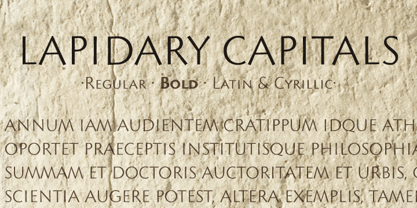
$25.90a vintage remastered typeface, from the olds penmancraft booklets - Lapidary Capitals by Kostic,
$20.00 - Action Jackson - Unknown license
- Hydrogen - Unknown license
- Zinc Boomerang - Unknown license


