1,142 search results
(0.015 seconds)
- OldFriends - 100% free

- KR Be Mine - Unknown license

- KR Silly Art Holiday - Unknown license

- Silent Hill Nightmares - Unknown license

- Square Ornaments - Unknown license

- Wilderness and Home Collection by Outside the Line,
$19.00 - Ann’s Valentines by Dingbatcave,
$15.00 - La chata - 100% free

- Cluster by PintassilgoPrints,
$24.00 - Blocke by RicardoLetters,
$9.00
- FloraDings - Unknown license

- Montezuma by Intellecta Design,
$9.00 - Briefcase by Stephen Synnott,
$39.00 - Kawaii Food Font - Personal use only

- Fenotype dings - Unknown license

- Vehicular - Unknown license

- WILD AFRICA - Personal use only

- Datura - Unknown license

- Volume by Cubo Fonts,
$29.00
- Gasa Script Reg by Gasarian,
$19.00
- Quirkies by Fonthead Design,
$19.00 - Fine New Bonbons by Tour De Force,
$25.00
- Ad Astra by Scriptorium,
$12.00 - Eclectic Medley by Altered Ego,
$65.00 - Tipo Movin CDMX by Ixipcalli,
$-
- Cowboy Stories by Open Window,
$19.95
- FarHat-Quintas - Unknown license

- FarHat-Acordes b y # - Unknown license

- Teaster by PizzaDude.dk,
$20.00 - KG Christmas Trees by Kimberly Geswein,
$5.00
- Tipo Metro CDMX by Ixipcalli,
$-
- Mordings JNL by Jeff Levine,
$29.00 - Golden Times by Intellecta Design,
$9.00 - Pixa Circle by Ayi Studio,
$10.00
- Pixa Square by Ayi Studio,
$10.00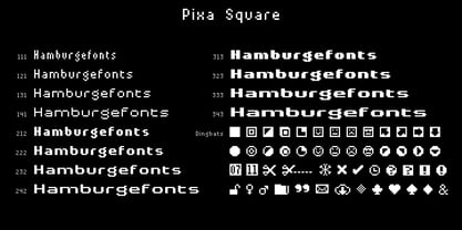
- Pirates De Luxe by Intellecta Design,
$22.90
- Piscis by Susana Simplício,
$35.00
- FT Funghi by Fenotype,
$29.95
- Rough Fleurons Calligraphic by Intellecta Design,
$21.90
- Travelog JNL by Jeff Levine,
$29.00


