10,000 search results
(0.31 seconds)
- Decima Mono Pro by TipografiaRamis,
$39.00 Decima Mono Pro is an upgrade of the well received Decima Mono typeface, released back in 2009 and quite successful ever since. This is a modern monospaced condensed sans serif family with classic geometric design, built in three weights and six styles. The letterforms in roman style are techno (engineered) in appearance, while italics remind one of elegant handwriting balanced with Roman geometry.\ The typeface is released in OpenType format with extended support for most Latin languages, as well as Greek and Cyrillic.
 - Cala by Hoftype,
$49.00 Cala is a reflection of Venetian Renaissance types but with a contemporary look. It has an energetic profile, achieved through soft outlines and a flowing rhythm. It is lively, remains stable in small sizes and is beautiful in display sizes. Cala comes in eight styles, in OpenType format and with extended language support. All weights contain standard and discretional ligatures, small caps, proportional lining figures, tabular lining figures, proportional old style figures, lining old style figures, matching currency symbols, fraction- and scientific numerals.
 - Foro Sans by Hoftype,
$49.00 Foro Sans is the matching friend of the popular Foro family (Foro and Foro Rounded). It comes with the same number of styles and the form displays the same characteristic features. Foro Sans consists of 16 styles and is well suited for ambitious typography. It comes in OpenType format with extended language support. All weights contain ligatures, superior characters, proportional lining figures, tabular lining figures, proportional old style figures, lining old style figures, matching currency symbols, fraction- and scientific numerals and matching arrows.
 - Mangan Nova by Hoftype,
$49.00 Mangan Nova is the semi-condensed version of Mangan. Designed for strong headlines but with slender and economical proportions, it fosters space saving text applications while permitting very pleasant reading. Mangan Nova, as does also Mangan, comprises 14 styles and is well suited for ambitious typography. It comes in OpenType format with extended language support. All weights contain small caps, ordinals, ligatures, proportional lining figures, tabular lining figures, proportional old style figures, lining old style figures, matching currency symbols, fraction- and scientific numerals.
 - Hasan Hiba by Hiba Studio,
$59.00 Hasan Hiba is an Arabic display typeface. It is useful for titles and graphic projects The font is based on the simple lines of Fatemic Kufi calligraphy. Hasan Hiba won the 5th place in Linotype’s first Arabic Type Design Competition. It supported Arabic, Persian and Urdu. In November, 2008, Hasan Hiba was upgraded by working with Mirjam Somers an award-winning Arabic type designer to the DecoType font format for use in WinSoft Tasmeem which is now bundled with InDesign CS4.
 - Six Sided Monogram by MonogramBros,
$12.00 Six Sided Monogram Font is a perfect shaped monogram font consisting of 78 letters and 1 basic frame. With just a single font file you will be able to create beautiful monograms in just a matter of minutes after the purchase! Six Sided Monogram Font comes with font file in OTF format. It features all the modern advanced font features such as Contextual Alternates, effectively eliminating the need to use multiple separate font files for left, center and right letters.
 - Mysterio by PandAE86,
$10.00 Hello, Mysterio fun font is sans serif font. It brings joyful and happiness to all of us. Inspired by handlettering with marker pen with bold and strong style. This font is ideal for display, text, print, branding, birthday, birthday invitation, with a set of optimal characters for your design in any layout. Happy Design What will you get ? OTF and TTF file formats Uppercase Lowercase Numeral Punctuation Ligatures Multilingual characters support Thank you and have a nice day ! Dedi T A
 - Andalucia by Pista Mova,
$15.00 Andalucia is a calligraphic script font that comes with beautiful alternate characters. copper plate calligraphy mix with handlettering style. Designed to convey stylish elegance. Andalucia is attractive because it is subtle, clean, feminine, sensual, glamorous, simple and very easy to read. The classic style is very suitable to be applied in all types of formal work such as invitations, labels, menus, logos, fashion, make up, stationery, letterpress, romantic novels, magazines, books, greeting/wedding cards, packaging, labels. Andalucia features a glyph and alternate characters. including multiple language support. It features OpenType with styling, binding, and character strokes, allowing you to mix and match letter pairs to match your design. Files include: To enable the OpenType Stylistic alternative, you need a program that supports OpenType features such as Adobe Illustrator CS, Adobe Indesign & CorelDraw X6-X7, Microsoft Word 2010 or a later version. (Windows), Font Book (Mac) or a software program such as PopChar (for Windows and Mac). How to access all alternative characters using Adobe Illustrator: https://www.youtube.com/watch?v=XzwjMkbB-wQ How to use the font style set in Microsoft Word 2010 or later: https://www.youtube.com/watch?v=NVJlZQ3EZU0 There are additional ways to access the alternative/swash, using Character Maps (Windows), Nexus Fonts (Windows) Font Book (Mac) or a software program such as PopChar (for Windows and Mac). How to access all alternative characters, using the Windows Character Map with Photoshop: https://www.youtube.com/watch?v=Go9vacoYmBw If you need help or advice, please contact me. Thank you for your purchase!
 - Massif by Monotype,
$57.99 “Designers can’t help but be inspired by the things that surround them,” says Massif’s designer Steve Matteson. An avid mountain climber, Matteson found his inspiration for his text face family in the dramatic granite formations of North America’s Sierra Nevada Mountains. Most of Matteson’s type designs are custom projects designed with an end use or customer in mind. Massif, which had no customer or specific purpose, was probably his most personal typeface to date. “My goal was to embody, in Massif’s two-dimensional letterforms, the angular tension and smooth curvature characteristic of the rugged terrain of Yosemite National Park’s Half Dome, which was formed by eons of glacial and tectonic activity,” Matteson explains. The typeface’s striking design echoes the faults and fissures that define a massif formation, resulting in a rich texture when used for body text and revealing distinctive shapes and proportions at display sizes. The Massif family comes in six weights, from Light to ExtraBold, each with an italic companion. The OpenType Pro suite contains small caps, ligatures and old style figures, and offers a small set of decorative ornaments. Pro fonts also include an extended character set supporting most Central European and many Eastern European languages.
 - "**Walshes**" is a distinctive font crafted by the renowned font designer Ray Larabie, known for his prolific and diverse typeface creations. Walshes stands out in the typographic crowd for its uniqu...
- Leidener by Talavera,
$40.00 This font family is inspired by printed work made by the Elzevir family back in the XVIIth century at Leiden (NL). They worked with material from several type designers, but further investigations sends us to the tracks of one in particular: Robert Granjon. Granjon italics were way ahead of his time, making some really beautiful signs like swashy ampersands and minuscule v letters. This font also contains old style figures in the same fashion as they were printed, like the flipped number 8 and open forms in 6 and 9. This is as much a revival as an original design, because of their weights bold and heavy (both with italics) that were inspired on some titles. In this font you can also find a lot of ligatures, small caps, diacritics and even a fleuron for each weight and variation. Leidener came up from two books: Constantini Imperiatoris (1611) and Exercitationum Mathematicarum (1657), printed by Louis and John Elzevir on their Leiden Workshop, back in the day.
 - Adagio Serif by Borutta Group,
$25.00 The Adagio Family is a part of Mateusz Machalski’s, Warsaw Academy of fine arts Master Degree Diploma in multimedia studio, conducted by Professor Stanisław Wieczorek and his brave PHD Jakub Wróblewski. Adagio is a modern type family. It consists of 3 main varieties: sans, serif and slab. Each one of them has its own “true italic” set. All of the styles together have over 400 characters in 9 different thicknesses. The Adagio family was created mostly for company identities. The idea was to create a wide range of different varieties which are stylistically consistent. Adagio Serif - Characterises with strong contrast and high detail in calligraphic character cuts, what gives it a light feeling. Unlike the Slab version, serif variety has asymmetrical serifs. Thanks to large X length, and highly stretched descenders, it also works correct in longer text, while its strong detail is good for headlines. The Serif version is a great complement for Adagio Sans and Adagio Slab.
 - Adagio Sans by Borutta Group,
$25.00 The Adagio Family is a part of Mateusz Machalski's, Warsaw Academy of fine arts Master Degree Diploma in multimedia studio, conducted by Professor Stanisław Wieczorek and his brave PHD Jakub Wróblewski. Adagio is a modern type family. It consists of 3 main varieties: sans, serif and slab. Each one of them has it's own “true italic” set. All of the styles together have over 400 characters in 9 different thicknesses. The Adagio family was created mostly for company identities. The idea was to create a wide range of different varieties which are stylistically consistent. Adagio Sans - In its character, inspired by classical English typefaces. Sharp chamfers add a strong character. Thanks to delicate contrast and proportions of capitals, this variety has features of humanist grotesque. Thanks to large x length, and highly stretched descenders, it also works correct in longer text, while it’s strong detail is good for headlines. The Sans version is a great complement for Adagio Serif and Adagio Slab.
 - Adagio Slab by Borutta Group,
$25.00 The Adagio Family is a part of Mateusz Machalski’s, Warsaw Academy of fine arts Master Degree Diploma in multimedia studio, conducted by Professor Stanisław Wieczorek and his brave PhD student Jakub Wróblewski. Adagio is a modern type family. It consists of 3 main varieties: sans, serif and slab. Each has its own “true italic” set. All of the styles together have over 400 characters in 9 different thicknesses. The Adagio family was created mostly for company identities. The idea was to create a wide range of different varieties that are stylistically consistent. Adagio Slab - Slab variety combines qualities of the Sans and Serif varieties. It has the same contrast as Sans. As distinct from Serif, Adagio Slab contains strong, beamy and symmetrical serifs in the form of pillows. Thanks to large X height, and highly stretched descenders, it also works correctly in longer text, while its strong detail is good for headlines. Slab version is a great complement for Adagio Serif and Adagio Sans.
 - Cinema Moderne by The Rivertown Inkery,
$5.00 Cinema Moderne is created to pay homage to he fabulous small town theaters from 1930's and 40's America. This unique font plays off of the Art Moderne and art deco style of the day. Art Moderne some times called Streamline Moderne design architecture emphasized curving forms, long horizontal lines, and sometimes nautical elements. Many of these masterpiece buildings have been lost forever. Some have managed to find new life with a new function. Cinema Moderne was created to preserve a small piece of that history forever. This font is to encourage the appreciation of the neighborhood theater culture as well as the grand style of the buildings. Comes in 9 different weights for one low price, or as individual fonts. Perfect for logo creation, or any art deco style project. Previous projects have included event flyers, Gatsby themed party invites and digital marketing content. Give your images a unique effect with this one of a kind font.
 - Sales Pitch JNL by Jeff Levine,
$29.00 Have you ever wanted to set a headline within a burst, but found the drawing of all of those angles was a bit too tedious? Sales Pitch JNL solves that problem by setting letters, numbers and punctuation inside individual sections which, when typed out, generates an extended burst pattern. For a flat sided pair of end caps, use the left or right bracket keys. For burst ends, use the left or right brace keys. A blank space is located on the equal sign keystroke, and a wider blank space is on the plus sign. Keep in mind the optical illusion in some program that shows line gaps between characters on the screen. All characters have equal sidebar settings, and are flush with each other. Sales Pitch JNL contains the basic A-Z and 0-9 characters as well as numerous punctuation. For a companion font with a more complete character set, use Prankster JNL, the same type design, but without the burst pattern.
 - Vida Pro by Storm Type Foundry,
$55.00 The new typeface family Vida was specifically designed for Czech Television in the framework of a competition for a new logo in summer 2006. The drawing of each letter form differs finely in its logic, which is a feature invisible at first. It is constructed on a puristic base, but it doesn't reject the natural anomalies already known from ages of experience with latin alphabet. That's why e. g. upper left section of 'n' is constructed differently from that of 'r', similarly as 'd' doesn't repeat right-bottom ending after 'u', '9' is not inverted '6'. Such details improve reading in continuous text. The behavior of all weights is consistent on CRT, plasma or LCD screens due to monolinear design; the lightest weight doesn't fade, the darkest isn't blurred, all is legible and clear in smallest sizes. Stem connections and endings were adjusted to avoid undesirable optical darkening. The goal we desired was to achieve balance appearance in both electronic and printed form.
 - Groove Inktrap Display by Godbless Studio,
$30.00 BLANC GROOVE INKTRAP, a font with a futuristic and experimental concept created with a strong and charismatic character. following the current trend design style. BLANC GROOVE INKTRAP is made experimentally following a futuristic style recipe with alternate characters made with outstanding INKTRAP and display that makes this font more stylish and varied. BLANC GROOVE INKTRAP is a variable font that has 18 Font, 9 weights with 2 Variable from thin to black & Italic. also includes alternates that are more varied with variables. BLANC GROOVE INKTRAP is a versatile font system, designed primarily for display uses with a need of visual impact. What's Include : Thin & Italic Light & Italic ExtraLight & Italic Regular & Italic Medium & Italic SemiBold & Italic Bold & Italic ExtraBold & Italic Black & Italic Feature : Alternate Character Ligature Discretionary Ligature Multilingual Support Numeral & Punctuation Symbol etc Wish you enjoy our font and if you have a question, don't hesitate to drop message & I'm happy to help.
 - Sassoon Infant Pro by Sassoon-Williams,
$66.00 An upright typeface family developed to meet the demand for letters to produce pupil material for handwriting as well as for reading. Upright letters with extended ascenders and descenders are ideal on screen. They facilitate word recognition. The exit strokes link words together visually, and in handwriting they lead to spontaneous joins along the baseline leading logically to a joined-up hand. Teachers can print desk strips, charts of letter families and alphabet friezes, as well as consistent material across the curriculum. Together these typefaces provide a valuable resource for special needs teachers. Typefaces developed to meet demand for letters that can be used to produce pupil material for reading as well as handwriting. Regular and Bold typefaces covering pan-European languages: 9 Latin, 6 Cyrillic, Greek, Turkish, 13 Baltic, 8 Rusyn, 6 Nordic, Vietnamese. How to access Stylistic Sets of alternative letters in these fonts Cyrillic Stylistic Sets examples Greek Stylistic Sets examples Vietnamese Stylistic Sets examples
 - Modica Pro by Monotype,
$30.00 Modica Pro is here to expand upon the success and versatility of the original Modica typeface (2019). Modica has been compressed, condensed, narrowed, widened, and extended to a mega-family of 108 fonts that now includes small caps as well as additional language coverage. Modica Pro is a nimble typeface that can handle a multitude of applications – everything from body copy to retail fashion to corporate identities... why not put Modica Pro to task today? There are 108 fonts in this family, ranging from Hairline to Ultra weights across six widths in both roman and italic. A single variable font (included with the full family) covers all weights, widths, and italic angle with every increment in between to suit whatever style you prefer. Modica Pro has a character set that covers all Latin European languages. Key features: 1 Variable Font 9 Weights in Roman and Italic 6 Widths Small Caps Full European character set (Latin only) 650+ glyphs per font.
 - Creo by Wahyu and Sani Co.,
$25.00 Creo is a low contrast, classic proportioned sans serif family, consisting of 18 fonts, 9 weights from thin to black; with uprights and italics. The word "Creo" was taken from the Latin language and means "I create, make, produce" (verb), which also stands for 'Classic Ratio'. The uppercase letters are highly influenced by Roman Inscriptional Capital letterform, and the lowercase letterform and their proportions were influenced by oldstyle serif typefaces. Creo font family is equipped with some OpenType features, such as fractions, alternates, ordinals, numerator, denominator, superscript, scientific inferior, proportional lining, etc. The alternate style letters are separated for individual usage of alternate style. Each font file has 500+ glyphs which covers major Western and Eastern Europe languages. Creo typeface with its classic letter proportions will give a different touch to your typographic work and will be a great choice for branding project, display poster, website, packaging, and a broad range of graphic design projects.
 - Versus by Latinotype,
$29.00 A unicase typeface inspired by Latin American wrestling. Versus is a type system designed for use with short and block text. The font, based on well-known typefaces found on boxing posters, combines Latin American elements and wrestling; it is this mixture of widths and weights and different styles which helps give your designs a unique flavour and personality. Versus is a unicase sans serif font well-suited for display use; its orthogonal terminals and short ascenders and descenders make it ideal for block of texts. By mixing different weights, you can have a wide range of design options—short text, isolated words, logos, titles, branding design, posters, etc. The Versus family comes in 9 weights—from a lightweight and condensed Extra Light to an expanded and heavy Ultra. Its character set supports over 200 different languages. The font also includes a large number of stylistic alternates and a complete ligature set which give your compositions a strong identity and personality.
 - Ceciliany by Brenners Template,
$19.00 Ceciliany is a classy font family that adds calligraphic touches to the basic structure of the display serif. Italic styles share a language set and OpenType Features compared to static styles, but have a completely different metrics In addition, an elaborate and detailed kerning system is also operated separately. 9 weights and 18 unique styles offer designers the amazing creativity of the serif font family. It offers a variety of options for editorial design as well as typography work for various channels. Features 9weights, 18styles Optimized Kernings Stylistic Set Fractions Oldstyle Figures Discretionary Ligatures : AM, AR, BA, BR, CA, CH, CR, DE, EA, El, FR, GA, GH, HR, IL, IM, JA, KA, KR, Ki, LA, LE, LO, MA, Ma, Me, NA, NE, NT, Nu, PS, RA, RE, RO, Ro, SA, ST, TH, UB, Ze, Zo, ft, li. Standard Ligatures : ff, fi, fl. * In particular, ligatures displayed in preview images can be easily applied to Adobe apps. Check out the ligature features of the software you are using.
 - Interzone by MYSTERIAN,
$9.00 This type crept up the sense that it was made in Eastern Europe by poorly trained urbanites from a crippled nation, or that it is the remains of a contemporary gothic (like Eckmann) stencil. The choice of what this type signifies is up to the public. Lately I like the idea of 'putting on' (in McLuhan's sense) a genre of idea that is somewhat different from my tradition's beliefs, and fitting a core category of that toward a teleological/eschatological advantage. Therefore postmodernist/apocalyptic carelessness (which I may 'put on' by using this type) is how I abstain from the cravings of immortality, or more so that wanting it is pointless. It’s stands as memento morí; that I will have to die someday. I have to become less, He must become more. Of course, Interzone may signify a classic Joy Division track from Unknown Pleasures as well as the Cold Warish ongoings of conflicted eastern European life. I considered naming this Lunik 9.
 - Drystick Geo Grotesk by deFharo,
$14.00 Drystick is a Sans Serif typographic family of Geo-Grotesque style with 8 pesos plus the italic versions all include small capital letters the symbol of Bitcoin (b #) and other cryptocurrency symbols. It is a geometric typography, minimalist, with neo-grotesque modulations. The typeface has alternative letters and numbers, small caps and advanced OpenType functions. The Italic versions have some of their own characters (&, @, Q, a, g, y), these versions have many optical corrections to balance the deformations created in many curves by the mere inclination of the letters, which in the case of This typography is 9 °. The drawn of the vectors is careful to obtain smooth curves and elegant appearance, the thicker versions have ink traps in the joints of the joints to use in small sizes. The Metric and the Kerning of all the versions I have reviewed individually to obtain maximum readability in any type of text and size.
 - Ponta Text by Outras Fontes,
$25.00 Ponta Text is an incise semi-serif type family designed for editorial purposes. It includes 18 fonts – 9 weights and their respective italics – providing you with versatility and flexibility for many of your typographic needs. Designed for legibility and readability, Ponta Text is specifically intended for long-form texts such as in books and magazines, in both print or digital media. Its letterforms and fine-tuned spacing ensures comfortable reading experiences, while its subtle details and elegant sharp corners add a touch of sophistication to your designs. These features allow you to fine-tune your typographic settings and create stunning layouts with ease. All the fonts include an array of typographic features such as ligatures, contextual alternates, lining, oldstyle, and tabular figures, as well as superscript / subscript numerals and fractions. The entire family can be used both as static instances or variable fonts. All of them come together in the Complete Family package.
 - Cy Grotesk by Kobuzan,
$25.00 Cy Grotesk is the result of combining the clear forms of mid 20th-century European neo-grotesks and the expressiveness of the 19th-century grotesques. It is display typeface with an eccentric character and a special rhythm. Symbols have sharp long angled spurs and large wedge incision between the bowl and the stem, diluting it with smooth curves and the tight aperture. Built like a multifunctional workhorse that has a wide range of font uses. This type family consists of 27 styles that are adjustable in weight and width. Or one variable font with 2 axes. From pure thin to radically black. From roomy key to catchy grand. All styles include an extended set of Latin characters and a basic Cyrillic. Features: – Total glyph set: 676 glyphs; – 27 styles (3 widths x 9 weights) + variable; – Support 210+ languages; – Latin Extended; – Cyrillic Basic. OpenType features: – Uppercase, lowercase; – Proportional, circled, tabular numerals, superiors, inferiors, fractions; – Punctuations and symbols; – Arrows; – Stylistic sets (ss01-ss10); – Ligatures; – Case-sensitive forms.
 - Hello Monday by Fenotype,
$25.00 Hello Monday is a bold and wide vintage style serif font with a friendly charm and a reminiscence of a warm nostalgic feeling. Hello Monday is a great typeface for contemporary graphic design with that certain feeling of familiarity. It works well on logos, packaging, restaurant graphics, or any display use, as well as in headlines or shorter texts. Try Hello Monday with reduced tracking for tighter word images, or if you want to use it in really small sizes add some tracking. Hello Monday is equipped with Contextual, Swash, Stylistic and Titling alternates as well as Discretionary Ligatures and even more extra alternates. All these features can be accessed by OpenType controls or straight from Character or Glyphs window. Swash Alternates are the most exaggerating ones while Stylistic Alternates do smaller changes. In addition Hello Monday has 15 ornaments that can be accessed from 0-9 and punctuation by clicking on Titling Alternates.
 - Aspira by Durotype,
$49.00 Aspira: the legible geometric typeface. Aspira is a multi-purpose typeface. It is suitable for both text and display use — for graphic design, corporate identity design, magazines, newspapers, books, reports, advertising, signage, etc. Aspira is a versatile typeface. It offers 112 styles consisting of 8 weights and 7 widths. It offers 56 upright fonts and 56 italic fonts. It offers lining and oldstyle figures (proportional and tabular). It offers small caps, ligatures, arbitrary fractions, and extensive language support. Aspira is a geometric typeface. It offers a fresh geometric personality which is pleasant and not too conspicuous. Aspira is a multi-width typeface. It offers 7 widths — much more than what is currently usual. Aspira is a legible typeface. Many of its details, like its open apertures and subtle variations in stroke width, are designed to enhance its legibility. Free demo font available. Aspira in use: 1 2 3 4 5 6 7 8 9 10. For more information about Aspira, download the PDF Specimen Manual.
 - 1557 Italique by GLC,
$38.00 Italic type was invented by Aldus Manutius in 1499 or 1501, first, before to be a style name, it was a plain font familly name. This Italique style font was inspired from these who was used by Jean de Tournes in Lyon (France) to print La mÈtamorphose d'Ovide figurÈe, a splendid book with numerous gothic style wood carved pictures. The original font contains almost all modern usual characters except accented ones, no longer in use on that time. They have been added, with some others, with respect for the original design. . A render sheet, enclosed in file, help to identify various others unusual letters on keyboard. It is used as successfuly as web-site titles, posters and fliers design, editing ancien texts or greeting cards, invitations, gastronomic menus... and much more, as a very decorative and elegant font... It supports easily as enlargement as small size, remaining clear and easy to read from 8 or 9 points to 72 and more, particularly on prints.
 - Otherslide by IbeyDesign,
$17.00 Otherslide Handwritten Script Font is a beautiful and stylish handwritten font. It looks stunning on a variety of designs that need a natural touch.
 - So love by Sulthan Studio,
$12.00 So Love is a cute and adorable handwritten script font. It’s perfect for branding, logos, wedding invitations, diaries, cups, mugs, greeting cards, and more.
 - Coastland by Epiclinez,
$19.00 Coastland is a pretty handwritten script font. It’s simple and friendly style makes this font incredibly versatile, fitting a wide variety of creative ideas.
 - JH Mars by JH Fonts,
$50.00 JH Mars is a modern style typeface; it is designed based on old Koufi, Maghribi & Diwani scripts, typical for corporate identity, headlines, branding & signage...
 - Ashby by Corien’s Handwritingfonts,
$24.00 Ashby is a Spencerian based handwritten script, with elegant capital letters. Written with a flexible nib, which results in some beautiful line width variation.
 - Strongloves by FHFont,
$17.00 Strongloves is dry brush, hand-lettered script. It is suitable for design, element design, weddings, events, t-shirt, logos, badges, sticker, and awesome work.
 - Barokah Ramadhan by Gartype Studio,
$17.00 Barokah Ramadhan is script font inspired by arabic alphabet / calligraphy,come with alternate and multilingual features.This font very suitable for your arabic stylish design.
 - Moonlight In Tokyo by Epiclinez,
$18.00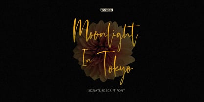 Moonlight In Tokyo is an authentic signature script font. This handwritten beauty is suitable from high-end sophisticated branding to simple memorable Instagram quotes.
 - Purify Signature by Aestherica Studio,
$9.00 Purify Signature is a modern and simple handwritten script font. Contemporary and fashionable, this font will look great for a wide variety of projects.
 - Jack Smith by Epiclinez,
$18.00 Jack Smith is a signature script font with a natural handwritten feel. This font is a good choice for branding and logotype design projects.