10,000 search results
(0.118 seconds)
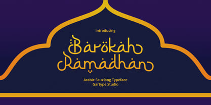
- Barokah Ramadhan by Gartype Studio,
$17.00 - Biotech by Arendxstudio,
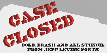
$20.00 - Case Closed JNL by Jeff Levine,
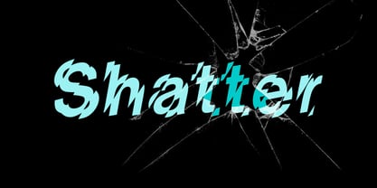
$29.00 - Shatter by ITC,
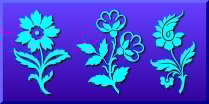
$40.99 - Fancy Flowers by Gerald Gallo,
$20.00 - Corinthian by ITC,
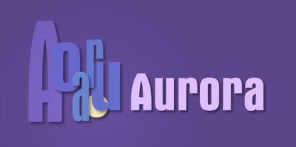
$29.99 - Aurora by Bitstream,
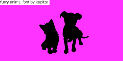
$29.99 - Furry by kapitza,
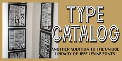
$49.00 - Type Catalog JNL by Jeff Levine,
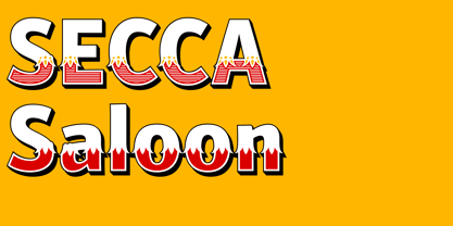
$29.00 - Secca Saloon Std by astype,
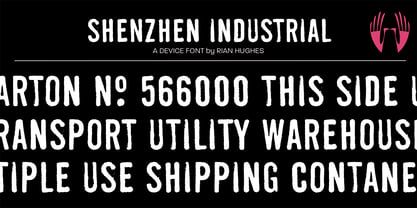
$27.00 - Shenzhen Industrial by Device,
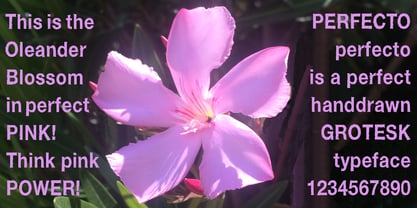
$29.00 - Perfecto by Autographis,
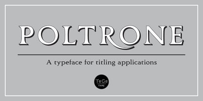
$39.50 - Poltrone by TeGeType,
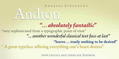
$29.00 - Andron Freefont by SIAS,
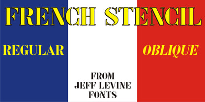
$- - French Stencil JNL by Jeff Levine,
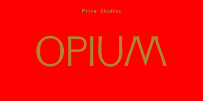
$29.00 - Opium by Max Prive,
$39.00 - Bludgeon by Monotype,
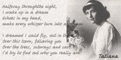
$29.99 - Tatiana by ParaType,
$30.00 - Ramshackle JNL by Jeff Levine,
$29.00 - Fleuron Ornaments by Gerald Gallo,
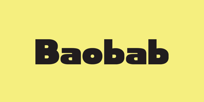
$20.00 - Baobab by Artcity,
$8.00 - Laughin by GroupType,
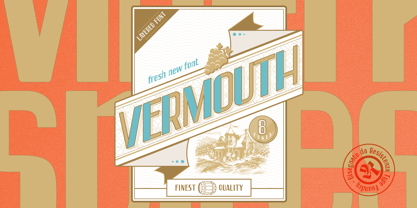
$19.00 - Vermouth by Resistenza,
$39.00 - Elegant Ornaments by Gerald Gallo,
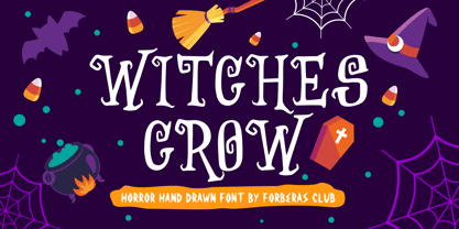
$20.00 - Witches Crow by Forberas Club,
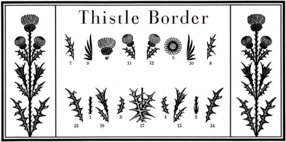
$16.00 - Thistle Borders by Wiescher Design,
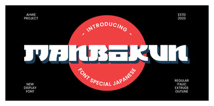
$19.50 - Manbokun by ahweproject,
$10.00 - PIXymbols ADA Signs by Page Studio Graphics,
$40.00 - Plant Assortment by Gerald Gallo,
$20.00 - Blippo by Bitstream,
$29.99 - Ritmo by Monotype,
$29.99 - Modest Ornaments by Gerald Gallo,
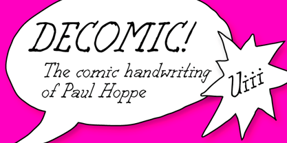
$20.00 - Decomic Oblique by Volcano Type,
$19.00 - Rody by Discourse Type,
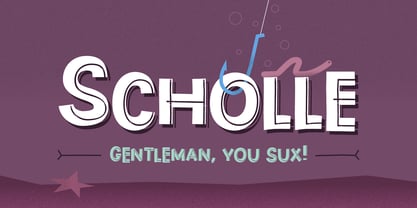
$5.00 - Scholle by Tour De Force,
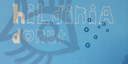
$25.00 - HildiniaDonut by JOEBOB graphics,
$- - AringtonDemo - Personal use only
- Ronduit Capitals Light - Personal use only
- Syntha - Personal use only
- Syntha - Personal use only
