10,000 search results
(0.048 seconds)
- Tide by Suomi,
$35.00 A surprisingly readable script based on flow of water.
 - Annabelle JF by Jukebox Collection,
$32.99 A flowing script font named after the designer's mother.
 - Fine New Bonbons by Tour De Force,
$25.00 High contrasted script family with a pack of dingbats.
 - Nuptial by Bitstream,
$29.99An informal script designed at Intertype for wedding invitations. - Harlekin by SoftMaker,
$9.99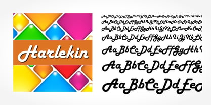 Herlekin is a decorative script typeface published by SoftMaker.
 - Purple Line by JBFoundry,
$14.00 Purple Line is a simple script in five weights.
 - LazyBird by Autographis,
$39.50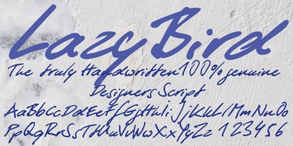 LazyBird is a script with a slick, lazy character.
 - Hudson by SoftMaker,
$9.99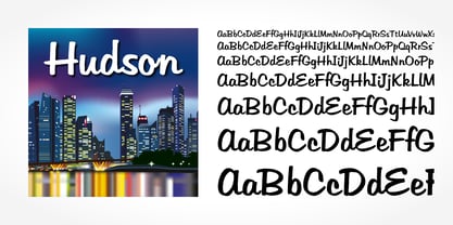 Hudson is a brush script typeface published by SoftMaker.
 - SeriousSally by JOEBOB graphics,
$33.00 A handwritten script font with a lot of ligatures.
 - Hand of Hannah by TypoGraphicDesign,
$19.00 The typeface Hand of Hannah is designed from 2021 for the font foundry Typo Graphic Design by Hannah Englisch & Manuel Viergutz. The character of the handwritten script typeface is rough, ruggend and raw. With state-of-the-art OpenType-Feature (like Contextual Alternates (calt) and Stylistic Alternates (salt)). Each uppercase and each lowercase letter has automatically alternated two variations to bring humanly-random characteristics of handwriting to life. 4 font-styles (Regular, Bold, Heavy & Icons) with 732 glyphs (Latin 3) incl. 100+ decorative extras like icons, arrows, catch words, dingbats, emojis, symbols, geometric shapes (type the word #LOVE for ♥︎ or #SMILE for ☺ as OpenType-Feature dlig) and stylistic alternates. For use in logos, magazines, posters, advertisement plus as webfont for decorative headlines. The font works best for display size. Have fun with this font & use the DEMO-FONT (with reduced glyph-set) FOR FREE! ■ Font Name: Hand of Hannah ■ Font Styles: 4 font-styles (Regular, Bold, Heavy, Icon) + DEMO (with reduced glyph-set) ■ Font Category: Display Script for headline size ■ Font Format:.otf (Mac + Win, for Print) + .woff (for Web) ■ Glyph Set: 732 glyphs (Latin 3 incl. decorative extras like icons) ■ Language Support: 80 languages: Afrikaans Albanian Asu Basque Bemba Bena Breton Catalan Chiga Colognian Cornish Croatian Czech Danish Dutch English Estonian Faroese Filipino Finnish French Friulian Galician German Gusii Hungarian Indonesian Irish Italian Kabuverdianu Kalenjin Kinyarwanda Latvian Lithuanian Lower Sorbian Luo Luxembourgish Luyia Machame Makhuwa-Meetto Makonde Malagasy Manx Morisyen North Ndebele Norwegian Bokmål Norwegian Nynorsk Nyankole Oromo Polish Portuguese Quechua Romanian Romansh Rombo Rundi Rwa Samburu Sango Sangu Scottish Gaelic Sena Serbian Shambala Shona Slovak Soga Somali Spanish Swahili Swedish Swiss German Taita Teso Turkish Upper Sorbian Uzbek (Latin) Volapük Vunjo Zulu ■ Design Date: 2021 ■ Type Designer: Hannah Englisch, Manuel Viergutz
 - Barrista by Typodermic,
$11.95 Welcome to our cozy coffee shop! Come on in, take a seat and savor the aroma of freshly brewed coffee. Speaking of coffee, have you seen our new font? Meet Barrista! Its relaxed, curly script perfectly captures the whirling curls of steam rising from a hot cup of Joe. Barrista is not just any font. Thanks to OpenType ligatures, certain letter combinations will automatically be substituted with customer pairings. This creates a natural, relaxed look that’s perfect for our laid-back atmosphere. Imagine jotting down your order in Barrista, watching as our talented baristas create your perfect cup of coffee. As you wait for your order, you can admire the intricate details of Barrista’s flowing script, which is inspired by the art of coffee-making itself. So, come on down to our coffee shop and experience Barrista for yourself. Most Latin-based European writing systems are supported, including the following languages. Afaan Oromo, Afar, Afrikaans, Albanian, Alsatian, Aromanian, Aymara, Bashkir (Latin), Basque, Belarusian (Latin), Bemba, Bikol, Bosnian, Breton, Cape Verdean, Creole, Catalan, Cebuano, Chamorro, Chavacano, Chichewa, Crimean Tatar (Latin), Croatian, Czech, Danish, Dawan, Dholuo, Dutch, English, Estonian, Faroese, Fijian, Filipino, Finnish, French, Frisian, Friulian, Gagauz (Latin), Galician, Ganda, Genoese, German, Greenlandic, Guadeloupean Creole, Haitian Creole, Hawaiian, Hiligaynon, Hungarian, Icelandic, Ilocano, Indonesian, Irish, Italian, Jamaican, Kaqchikel, Karakalpak (Latin), Kashubian, Kikongo, Kinyarwanda, Kirundi, Kurdish (Latin), Latvian, Lithuanian, Lombard, Low Saxon, Luxembourgish, Maasai, Makhuwa, Malay, Maltese, Māori, Moldovan, Montenegrin, Ndebele, Neapolitan, Norwegian, Novial, Occitan, Ossetian (Latin), Papiamento, Piedmontese, Polish, Portuguese, Quechua, Rarotongan, Romanian, Romansh, Sami, Sango, Saramaccan, Sardinian, Scottish Gaelic, Serbian (Latin), Shona, Sicilian, Silesian, Slovak, Slovenian, Somali, Sorbian, Sotho, Spanish, Swahili, Swazi, Swedish, Tagalog, Tahitian, Tetum, Tongan, Tshiluba, Tsonga, Tswana, Tumbuka, Turkish, Turkmen (Latin), Tuvaluan, Uzbek (Latin), Venetian, Vepsian, Võro, Walloon, Waray-Waray, Wayuu, Welsh, Wolof, Xhosa, Yapese, Zapotec Zulu and Zuni.
 - Whillys by Maulana Creative,
$15.00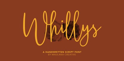 Whillys Handwritten Script Font Give your designs an authentic handcrafted feel. Whillys Handwritten Script Font is perfectly suited to logo, stationery, branding, typography quotes, magazine or book cover, website header, clothing, branding, packaging design, restaurant and more. Thanks for use this font ~ Maulana
 - Banana by Dharma Type,
$19.99 This font is a modern urban script. Very impressive because of its heavy and rounded shape. Upright stems and wide width of their shape gives easy and slow impression. There is one more script designed by in the same concept. -Nothing -Banana
 - Jattestor by Sabrcreative,
$25.00 Elevate your creative projects with the enchanting allure of the Jattestor Script Font. This typeface seamlessly melds the fluidity of handwritten script with a touch of artistic charm, making it an excellent choice for designs seeking a blend of authenticity and creativity.
 - Winola by Typefactory,
$14.00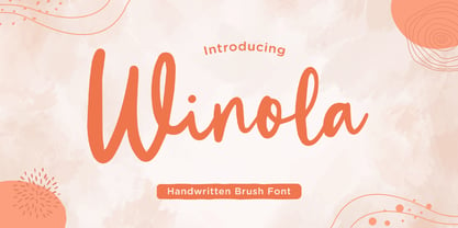 Winola is a brush script font. It has an authentic modern brush script look making it perfect for branding and digital designs. Use this font for logos, wedding decor, invitations, home decor, websites, blogs, instagram, business cards, branding, social media, and more!
 - Leelawadee by Microsoft Corporation,
$49.00Leelawadee is a Thai font licensed from Microsoft Corporation. The Leelawadee font is a legible sans serif that is good for User Interface design and on-screen applications. Leelawadee is a Thai script font and requires an application program that supports Thai scripts. - Prestly Signature by Letterhend,
$14.00 Signature Script, Monoline Script, Monoline Signature, Wedding Font, Ballpoint Font, Wedding Font, Wedding Invitation, Romantic Font, Feminine Font, Signature Font, Beautiful Font, Pretty Font, Stylish Font, Modern Font, Chic Font, Feminine Font, Wedding Font, Romantic Font, Romance Font, Handwriting Font, Hand Written Font,
 - AngloAngkor by Parquillian Design,
$39.00 AngloAngkor is a display face of Western characters inspired by the elegant “round script” style of the Khmer alphabet of Cambodia. It is the first of a projected series inspired by some of the beautiful lesser-known native scripts of Southeast Asia.
 - Mandalykha by TSA Creative,
$12.00 Mandalykha is a very unique script font, inspired by a tourist spot located in Central Lombok Regency. Mandalykha a stylish script which is guaranteed to add an eye-catching appeal to your logo designs, brand imagery, quotes, product packaging, merchandise & social media posts
 - Kanaggawa by Letterara,
$10.00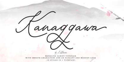 Kanaggawa font is Monoline script typeface with smooth characters and an elegant and modern look. Kanaggawa is suitable for logos, signatures, taglines, T-shirts, handwritten quotes, product packaging, posters, and much more! Add Kanaggawa, a beautiful script font, to your collection today.
 - Belle Amour by Craft Supply Co,
$15.00 Belle Amour – Modern Calligraphy is an handwritten script font based on the expression of real handwriting. Cattus – Modern Casual Script will work perfectly for fashion, e-commerce brands, trend blogs, wedding boutiques or any business that wants to appear upscale and chic.
 - Backline by Subectype,
$13.00 Backline is a monoline script font with an cute style. It has good readability and is perfect for logos, invitations, wedding, signatures, and much more! What's Included : - Kind Heart Font Script - Multilingual Support - Alternates I hope you enjoy this font. Thank You, Subectype
 - After Death by Fauzistudio,
$20.00 After Death is a script typeface. It is inspired by brush lettering and has a soft and welcoming look. After Death can be used for branding, packaging, and anywhere else you need a script font that is easy to read and smooth.
 - Akira Rosty by Gatype,
$10.00 Akira Rosty is a very unique handwriting, the shape is modern but pleasing to the eye and the style is very natural. This modern calligraphy font includes a modern Love font which can be varied with the Normal font, This font is designed to have the potential to take your every creative idea to the highest level! These designs are used for branding, web and editorial design, print, crafts, quotes, It's great for logos, wedding invitations, romantic cards, labels, packaging, name spelling and more. Akira Rosty includes OpenType style alternatives, ligatures, and International support for most Western Languages. To enable the OpenType Stylistic alternative,you need a program that supports Adobe Illustrator CS, Adobe Indesign & CorelDraw X6-X7, Microsoft Word 2010 or a later version. How to access all alternative characters using Adobe Illustrator: https://www.youtube.com/watch?v=XzwjMkbB-wQ Akira Rosty is coded with PUA Unicode, which allows full access to all additional characters without having to design any special software. Mac users can use Font Book, and Windows users can use Character Map to view and copy any additional characters for pasting into your favorite text editor / application. How to access all alternative characters, using the Windows Character Map with Photoshop: https://www.youtube.com/watch?v=Go9vacoYmBw
 - Linotype Ergo Paneuropean by Linotype,
$103.99Linotype Ergo was designed by American Gary Munch, and was a winner in Linotype's Second International Digital Design Contest in 1997. Conceived as a blend of traditional and modern type concepts, it works as a legible text family as well as a lively display or headline font. The word ergo means consequently," but it also comes from the Greek word "ergon" for "work." Consequently, Munch sees this family as full of energy -- an ideal font for working hard to make a point, and able to get it across with friendly vigor. The strokes of the characters are carefully designed to accommodate the tendency of the eye to enlarge horizontals and perceive verticals as lighter. The lowercase forms have open, friendly counters and are enhanced by small quirks, such as the slightly leaning s and the wide t. The deep branching of curves from main strokes helps this humanist sans to be very readable at smaller sizes. Linotype Ergo has four normal-width weights, five condensed weights, and two compressed weights - all with companion Italics! The family also includes a clever "Sketch" font for use in headlines, bringing the total number of font styles to 23. Ergo is available with Greek and Cyrillic and as W2G fonts with Hebrew." - Freundschafts-Antiqua AR by ARTypes,
$35.00Freundschafts-Antiqua AR is based on a 20th-century German type design. Freundschafts-Antiqua (which was also called Chinesische Antiqua) was designed by the Chinese calligrapher Yü Bing-nan when he was a student at the Hochschule für Grafik und Buchkunst at Leipzig in 1960. It was cast in 1964 by VEB Typoart, Dresden, in 9-pt and 28-pt (Didot). The design combines the best German traditions with the Chinese bamboo pen. It is a unique, wholly modern, yet quiet and dignified typeface which is well suited for text-setting in many sizes. The original design was carefully crafted with all non-kerning letters (none of the letters overhangs its side-bearings); the lower-case f was designed so that no ligatures were needed. The AR fonts include the type's ch and ck logotypes, monetary signs and all the standard accents. The letterfit of the original design is retained and, as can be seen in the attached printable .pdf, text composed at normal sizes is very agreeable indeed. Freundschafts-Kursiv AR A features old-style (non-lining) figures and 'kerning' letters; Freundschafts-Kursiv AR B contains lining (cap-height) figures and all non-kerning letters following the original design of the face. - Linotype Ergo W2G by Linotype,
$124.99Linotype Ergo was designed by American Gary Munch, and was a winner in Linotype's Second International Digital Design Contest in 1997. Conceived as a blend of traditional and modern type concepts, it works as a legible text family as well as a lively display or headline font. The word ergo means consequently," but it also comes from the Greek word "ergon" for "work." Consequently, Munch sees this family as full of energy -- an ideal font for working hard to make a point, and able to get it across with friendly vigor. The strokes of the characters are carefully designed to accommodate the tendency of the eye to enlarge horizontals and perceive verticals as lighter. The lowercase forms have open, friendly counters and are enhanced by small quirks, such as the slightly leaning s and the wide t. The deep branching of curves from main strokes helps this humanist sans to be very readable at smaller sizes. Linotype Ergo has four normal-width weights, five condensed weights, and two compressed weights - all with companion Italics! The family also includes a clever "Sketch" font for use in headlines, bringing the total number of font styles to 23. Ergo is available with Greek and Cyrillic and as W2G fonts with Hebrew." - Seriguela by Latinotype,
$29.00 Seriguela is an ultra condensed sans serif typeface with a unique personality. It comes in normal and display versions, each with 9 weights, as well as italics and reverse italics totaling 54 fonts. Seriguela is flavor in motion and each part of its system works together to captivate you, combining emotion and usability, allowing you to create attractive and unique designs. Seriguela followed a very distinctive recipe to design its alphabet: it started with a grotesque base and applied movement and joy in a very original way. The blacker and more contrasted, the tastier. The contrast in its display version is one of the most important features of Seriguela: the unconventional relationship between thick and thin lines, as it does not strictly follow any historical model of contrast construction and makes it noticeable. Its high contrast is not present in every single character and it is often in the “wrong” places. The original charm of Seriguela is maintained throughout all its styles. With peculiar details: the verticality and its proportions, as well as terminals that resemble hooks in some curves, a characteristic that breaks with the vertical modular rhythm. Seriguela is a versatile font system, designed primarily for display uses with a need of visual impact.
 - Aukim by AukimVisuel,
$20.00 Aukim is an exceptional, unique and ligature-rich font that gives a new look to your texts. It is a more text-oriented font and thanks to its OpenType features, it becomes versatile. It is available in 3 sub-families (condensed, normal and extended) for a total of 54 fonts. There are 9 weights with their real italics. It has 886 glyphs, 107 uppercase and 65 lowercase ligatures per font. It also offers a wide range of languages, from Latin to Cyrillic, as well as powerful OpenType features such as meticulously and professionally maintained kerning, stylistic variations, swashes, highly distinctive ligatures, old-fashioned tabular figures, fractions, denominators, superscripts, unlimited subscripts, arrows and much more to satisfy the most demanding professionals. On the one hand, it has rounded curves with very open endings that make this font family noble, friendly and contemporary and on the other hand very useful for writing titles on any medium. Perfectly suitable for graphic design and any display use. It could easily work for web, signage, corporate design as well as editorial design. Aukim is a cool, wonderful, elegant, bold and fun display font. It can easily be paired with an incredibly wide range of projects, so add it to your creative ideas and notice how it makes them stand out!
 - Spaza by Scholtz Fonts,
$15.00In parts of Africa, in the poorer, rural and peri-urban areas there are many small shops or convenience stores which are called "Spaza" shops. The owners of these shops often don't have access to commercial signwriting and write their signs themselves. The font "Spaza" is based on these hand-lettered signs. This lettering has a refreshing simplicity and spontaneity, yet retains great legibility. In the font "Spaza", there are three styles: - Spaza Regular - with normal upper and lower case; - Spaza Small Caps - in which the lower case is a true "small caps" and not a shrunken version of the upper case (generated by the operating system); - Spaza Double Caps - in which the lower case characters have been replaced by an alternate set of capital letters. The font thus contains two sets of differing upper case characters. You can use characters from both these sets to give a true feeling of randomness because if the same character occurs twice in a word, different versions of the character can be used. Spaza can be used with great effect in a great variety of applications such as advertisements, flyers, posters and in magazine pages. Spaza contains a full character set and has been carefully spaced and kerned. - Baka Expert by Positype,
$25.00 Why Baka Expert? There’s actually a simple answer. The original Baka was done as an experiment of sorts. I wanted to quickly capture a rough, frenetic handwriting style that broke normal conventions. Commercially, it was successful, received some accolades ... but I wasn’t completely satisfied, so I went back to the master art and the lettering explorations and produced Baka Too. This addressed some of the line items I wanted to refine in Baka. I liked it. Each font has been out for a few years now, and I have seen them in use. I’m very critical of my work, and I could still see things—modulations of strokes, angle of the nib, ink swell, and so on—that I wanted to change, refine, and reorder. For me, it is typographic indulgence, but I wanted to take this handwriting ‘font’ and turn it into a robust ‘typeface.’ So I did just that and a bit more by adding back more of my initial flourish concepts; attaining tighter, consistent control of the modulation; optimizing points; adding titling options; and expanding the character language set. Baka and Baka Too had to exist to produce this entirely new re-envisioning of an old friend ... and they all play well together :)
 - APF Lagoon Regular by Pomegranate,
$30.00 In 2007-8, Carolyn Puzzovio developed this OpenType typeface: Lagoon which is based on an Armenian model from the Mechitarist monastery, Venice, 1810. This project was supported by a grant from the AHRC (Arts & Humanities Research Council, UK) and won a first prize in the Granshan 08 type design competition. Oſten, Armenian digital types are designed to match the forms of Latin type characters and ‘Latinized’, by uprighting the forms; truncating ascenders and descenders and raising the x-height – but in this case the Latin characters in the OpenType font have been designed to blend in with the traditional Armenian proportions which are based on cursive forms – also incorporating some of the quirky shapes from the original model. Faithfully following the original created difficulties of ‘clashing’ characters, particularly those with long descenders, so the font contains over 100 alternative characters in the Armenian part, which will normally substitute automatically where necessary. The sloping lower case characters and upright capitals are traditional in Armenian – capitals are used less in the Armenian language. Three new characters for the Armenian unicode range are included: the Armenian dram (currency) symbol; the eternity symbol; and the index number symbol. This font which will be one of the first OpenType fonts to incorporate these newly unicoded characters.
 - Funtrude by Colllab Studio,
$9.00 "Hi there, thank you for passing by. Colllab Studio is here. We crafted best collection of typefaces in a variety of styles to keep you covered for any project that comes your way! When you have a project that needs a fun, unique font to make it pop, you can’t go wrong with Funtrude. Funtrude comes in three styles: Basic, Extrude, and Hole. Each style has more than 350 of the most beautiful glyphs you could ever dream of seeing. The Extrude style is great for titles, headings, and any other text where you want to use a bold font but don’t want it to be overly bold; the Basic style will work great for things like product names or subheadings; and the Hole style is perfect for anything else! Each individual style comes with its own swashes—so your fonts can look just as beautiful when they’re all capitalized as they do when they’re in normal text. What makes us so excited about this product is how much we love to use it ourselves. When we saw Funtrude for the first time, we couldn’t believe our eyes—it was everything we had ever wanted in a font, plus it was super affordable. GET IT NOW....!!! A Million Thanks Colllab Studio www.colllabstudio.com
 - Senlot Didone by insigne,
$35.00 Senlot Didone enchants with this fresh and cutting-edge sequel. It’s a modern interpretation of Senlot that says glamor and seduction. The typeface adds to the original high contrast sans serif with it’s modern high contrast shape, and features a new beauty with the distinctive sinuosity of contrasting forms. Senlot Didone is the sleek, serifed, high contrast follow-up to Senlot, and it's low contrast sequel, Senlot Sans. A serif typeface suitable for text and display work joined in 2019. Senlot Didone includes a wide range of OpenType features, including titling capitals, superscripts and subscripts, and oldstyle figures. Senlot Didone is composed of 3 widths: Condensed, Normal, and Extended, with 9 weights and their italics for a total of 54 fonts with more than 800 glyphs. Senlot Didone is a great display typeface for logos, branding, packaging, and advertising. With its broad palate of options, the font covers over 72 Latin-based languages. Dress your text in any of nine separate styles from Thin to Bold. With Senlot Didone, there's no need to compromise on another font with fewer features. Simple, elegant, and versatile, Senlot Didone now makes perfect more possible. Take the show by storm with this high contrast serif. The seductive figure of Senlot Didone is here to entice your viewer.
 - Colonial Press by Simeon out West,
$25.00 Colonial Press is a font based on serif typefaces designed by William Caslon I (1692-1766) and various revivals thereof. Caslon is cited to be the first original typeface of English origin, but some type historians point out the close similarity of Caslon's design to the Dutch Fell types, presumed to be the work of Dutch punchcutter Dirck Voskens. Colonial Press harkens to the look and feel of newspapers in Colonial North America around the mid 1700s without the rough edges commonly associated with colonial printing and many reconstructions. The rough quality of the American typeface is believed to be the result of oxidation from the exposure to seawater during the long voyage from England to the Americas. Colonial Press is a heavy font that retains some of the handcut quality of these fonts while smoothing out the irregularities that make many of these fonts so visually distracting at larger point sizes. For the italic version of this font, I chose to emulate the more ornate letterforms that I have encountered, giving the italic characters a more ornamental feel. Colonial Press comes with full punctuation and a 362 glyph character set for most Western European-based Latin alphabet languages. It is a font that is designed both for normal typing and for larger, decorative display.
 - FF Meta by FontFont,
$108.99 German type designer Erik Spiekermann, created this sans FontFont between 1991 and 2010. The family has 28 weights, ranging from Hairline to Black in Condensed and Normal (including italics) and is ideally suited for advertising and packaging, book text, editorial and publishing, logo, branding and creative industries, small text as well as web and screen design. FF Meta provides advanced typographical support with features such as ligatures, small capitals, alternate characters, case-sensitive forms, fractions, and super- and subscript characters. It comes with a complete range of figure set options—oldstyle and lining figures, each in tabular and proportional widths. As well as Latin-based languages, the typeface family also supports the Cyrillic, Greek, and Hebrew writing systems. FF Meta Variable are font files which are featuring two axis and have a preset instance from Hairline to Black and Condensed to Roman In 2011, FF Meta was added to the MoMA Architecture and Design Collection in New York. This FontFont is a member of the FF Meta super family, which also includes FF Meta Correspondence , FF Meta Headline , and FF Meta Serif . FF Meta® font field guide including best practices, font pairings and alternatives. Featured in: Best Fonts for Resumes
 - Axeo Sans by Asritype,
$15.00 As mentioned on previous released font Axeo (freeform serif), now, the original sanserif font is released with similar name, Axeo Sans. Axeo was release first when Axeo sans is still in minimal glyphs and font weights. However, Axeo sans is released with more fonts, 7 font in roman and 7 in italic/oblique versions, instead of semi condensed. 7 fonts is in roman form of weight: Light, Regular, Medium, Semi Bold, Bold, Extra Bold and Black; and 7 fonts in italic/oblique versions of its weight, respectively. This font weight offers the user to use the best fit to the usage. Axeo sans is neutral typeface, designed for general use. This font has also more glyphs variations and OpenType features. More than 700 glyphs for each cut. While the OpenType is equipped with: Large unmarked Basic Latin caps (ss02-ss05); normal character variation for some letters (ss01); Small caps (c2sc and smcp); superscript for 1, 2, and 3; ordinals for a and o; 5 basic fractions; standard and discretionary ligature; kerning; case sensitive and ornaments. Large Caps is unique setting, additional letters for font variations lover/user, applicable for first letter of paragraph, sentences, for design mean, just for fun or other usage.
 - Isbit Pro by CheapProFonts,
$10.00 Inspired by the shape of melting icecubes (“isbit” is the norwegian word for “ice cube”), this small superelliptical font family is perfect for logos and headlines. An alternate lowercase a and n is available as stylistic alternates - and a straight lowercase j (which also will be automatically substituted when the normal j would collide with the preceding glyph). ALL fonts from CheapProFonts have very extensive language support: They contain some unusual diacritic letters (some of which are contained in the Latin Extended-B Unicode block) supporting: Cornish, Filipino (Tagalog), Guarani, Luxembourgian, Malagasy, Romanian, Ulithian and Welsh. They also contain all glyphs in the Latin Extended-A Unicode block (which among others cover the Central European and Baltic areas) supporting: Afrikaans, Belarusian (Lacinka), Bosnian, Catalan, Chichewa, Croatian, Czech, Dutch, Esperanto, Greenlandic, Hungarian, Kashubian, Kurdish (Kurmanji), Latvian, Lithuanian, Maltese, Maori, Polish, Saami (Inari), Saami (North), Serbian (latin), Slovak(ian), Slovene, Sorbian (Lower), Sorbian (Upper), Turkish and Turkmen. And they of course contain all the usual “western” glyphs supporting: Albanian, Basque, Breton, Chamorro, Danish, Estonian, Faroese, Finnish, French, Frisian, Galican, German, Icelandic, Indonesian, Irish (Gaelic), Italian, Northern Sotho, Norwegian, Occitan, Portuguese, Rhaeto-Romance, Sami (Lule), Sami (South), Scots (Gaelic), Spanish, Swedish, Tswana, Walloon and Yapese.
 - 360 by Wilton Foundry,
$29.00Distorted fonts are great but are mostly not very practical - 360 is an attempt to create a simple distorted font that can be used far beyond a few logos or headlines. Each 360 character averages roughly half the number of sharp angles of a regular sans serif. This gives it an unusually fresh and timeless appeal and creates a dynamic presence across body text that is very legible and compact without looking overly condensed. 360 was chosen as a name because it can be used as an everyday font, all year round, and because 360 has so many unusual angles that don't conform to normal font conventions. 360 also happens to be a cool number: 360 makes a highly composite number. 360 is also a superior highly composite number and a colossally abundant number. A circle is divided into 360 degrees for the purpose of angular measurement. 360° is also called round angle. 360 is a convenient standard since, 360 being highly composite, it allows a circle to be divided into equal segments with each segment measured in integer degrees rather than fractional degrees. 360 is the sum of a twin prime (179 + 181). A year is roughly calculated as 360 days. - Lopsickles by Ingrimayne Type,
$7.00 Lopsickles is a family in which the letters are based on lopsided, distorted ellipses. The family has four sets of letters that are combined in six different ways, yielding six fonts. Four of these fonts (styles AB, Ad, Bc, and cd) use the OpenType feature Contextual Alternatives (calt) to alternate letter sets so that top-heavy characters alternate with bottom-heavy characters. The spacing in these fonts is designed for alternating characters and will result in overlap if the characters do not alternate. The other two styles (Ac and Bd) are spaced normally. Style Ac contains the two character sets that are top heavy and style Bd has the two character sets that are bottom heavy. The Ac and Bd fonts have italics and backslanted styles that may be useful to suggest speed. Each of these ten fonts has an inset style designed to be used in a layer above the base font. This layering can be used to give the effect of hollow letters or to add a colored interior. Lopsickles joins several other alternating-characters families in the IngrimayneType library including Snuggels, CloseTogether, and Caltic, but is visually very different from them. It is a strange, unusual family that will get noticed.