10,000 search results
(0.055 seconds)
- Moon Corps by Vic Fieger,
$13.99Moon Corps was designed as a simplistic approach to the Japanese katakana script. Though the look of the font is supposed to evoke futurism, the primary intent was always to put legibility first. - Hello Signature by Romie Creative,
$15.00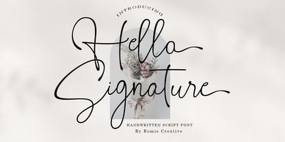 Hello Signature is a handwritten script font, this font is perfect for logos, invitations, stationery, wedding designs, social media posts, advertisements, product packaging, product design, labels, photography, watermarks, special events, or anything else.
 - Carla Pro by RMU,
$35.00 Carla Pro is a lively, legible, and partly joining broad-nib script font. I named it after a favourite colleague, in my hot-metal time, who set on the Linotype next to mine.
 - Wascer by Maulana Creative,
$12.00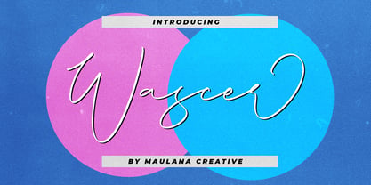 Give your designs an authentic handcrafted feel. "Wascer Modern Script Brush Font" is perfectly suited to signature, stationery, logo, typography quotes, magazine or book cover, website header, clothing, branding, packaging design and more.
 - Building by HafisHidayat,
$20.00 Building Script is a modern calligraphy design, including Regular. Can be used for various purposes. such as logos, product packaging, wedding invitations, branding, headlines, signage, labels, signatures, book covers, posters, quotes, and more.
 - Magnefida by Adante Creative,
$23.00 Introducing by Adante.Creative Magnefida A Handwritten Script Font Magnefida is perfect for product packaging, branding project, megazine, social media, wedding, or just used to express words above the background. Magnefida also multilingual support.
 - Hittany by ahweproject,
$14.00 Hittany is a lovely script font featuring charming, playful characters that seem to dance along the baseline. Add this font to your most creative ideas, and notice how it makes them stand out!
 - The Magistica Bright by Letterena Studios,
$9.00 The Magistica Bright is a magical script font carefully created with a touch of elegance. This font is PUA encoded which means you can access all of the glyphs and swashes with ease!
 - Novata by Eurotypo,
$34.00 Novata is a new script font, casual, organic and with strong character. Novata includes 529 glyphs, with stylistic and contextual sets, swashes, many ligatures to combine and make your texts original and authentic.
 - Xerochasy by Ali Hamidi,
$15.00 Xerochasy is a bold script with classic touch and very readable at glance. Really perfect for you who needs a typeface for especially logotype, apparel, invitation, branding, sticker, social media, packaging, advertising etc.
 - Dartie by Sakha Design,
$12.00 Dartie is a lovely script font featuring charming, playful characters that seem to dance along the baseline. Add this font to your most creative ideas, and notice how it makes them stand out!
 - Biloxi Calligraphy by Roland Hüse Design,
$15.00 Biloxi Calligraphy is heavier weight version with calligraphic strokes of a handwritten font of mine called "Biloxi Script". Casual handwritten style with a calligraphy feel, ideal for blog headers, menus, headlines and logotypes.
 - Rocklay by Din Studio,
$29.00 Rocklay is a bold script font. With a classy and natural style, it brings beautiful typeface. Rocklay is best used for branding, logotype, and quotes. Features: - Multilingual Support - PUA Encoded - Numerals and Punctuation
 - Oyange by Stringlabs Creative Studio,
$29.00 Oyange results out of a stunning pairing of a brush pen that makes it look incredibly endearing and authentic. Use this gorgeous and unique script font to bring any DIY project to life!
 - Comic Candy by Beast Designer,
$15.99 Comic Candy is a fun script font. It will elevate a wide range of design projects to the highest level, be it wedding designs, branding, headings, invitations, signatures, logos, labels, and much more!
 - Kayane by Differentialtype,
$10.00 Kayane is a splendid script font that can be used for branding, greeting cards, wedding invitations, and many other projects. It will add luxury to any design project that you wish to create.
 - Safiya by ARToni,
$19.00 Safiya is a lovely script font featuring charming, playful characters that seem to dance along the baseline. Add this font to your most creative ideas, and notice how it makes them stand out!
 - Best Forest by Rhd Studio,
$17.00 Best forest is a modern handwritten script font. This font is perfect for svg designs, shirts, crafts, websites, farmhouse décor, branding, blogs, logos, invitations, and more! Most accent characters are included. Thank you!
 - Amerliosa by Rockboys Studio,
$23.00 Amerliosa is a lovely script font featuring charming, playful characters that seem to dance along the baseline. Add this font to your most creative ideas, and notice how it makes them stand out!
 - Nana by Autographis,
$39.50 Nana is a classic joining script with long ascenders and descenders, that is based on a set of unique but forgotten initials that were designed in the roaring 20s and 30s in Paris.
 - Heatwave by Maulana Creative,
$15.00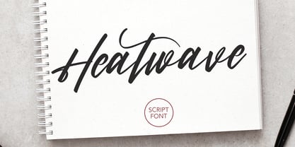 Give your designs an authentic handcrafted feel. Heatwave is a handmade, brush script font and is perfectly suited to stationery, logos and much more. It also includes multi-lingual support. Many Thanks, MaulanaCreative
 - Silkplum by Ardian Nuvianto,
$18.00 Silkplum is a lovely script font featuring charming, playful characters that seem to dance along the baseline. Add this font to your most creative ideas, and notice how it makes them stand out!
 - Avengeline by Rockboys Studio,
$22.00 Avengeline is a beautiful and refined script font. It has a classy, elegant and modern look that can be used for logos, branding, invitations, stationery, wedding designs, social media posts, and much more!
 - Gardenisa by Balpirick,
$15.00 Gardenisa is a stylish and incredibly distinct script font. It looks stunning on wedding invitations, thank you cards, quotes, greeting cards, logos, business cards and every other design which needs a handwritten touch.
 - Graby by IbeyDesign,
$16.00 Graby Bold Script Font feels equally charming and elegant. It looks stunning on wedding invitations, thank you cards, quotes, greeting cards, logos, business cards, and every other design which needs a handwritten touch.
 - Black Bass by Sabrcreative,
$15.00 Introducing Black Bass Display, a captivating and unique sans serif font that combines modern aesthetics with a touch of brush script elegance. With its bold and distinctive letterforms, this font is perfect for making a statement in your designs, whether it's for logos, headlines, posters, or branding projects. The combination of uppercase and lowercase letters in Black Bass Display allows for versatile typography exploration, giving you the freedom to create eye-catching compositions and play with different design elements. Its unique style adds a sense of personality and creativity to your work, making it stand out from the crowd. Black Bass Display doesn't just look great, it also offers functionality. It supports numbers and punctuations, ensuring seamless integration of these elements into your designs. Additionally, its multilingual support enables you to communicate your message in various languages, expanding your reach to a global audience. With PUA encoding, Black Bass Display provides easy access to additional characters and glyphs, allowing you to add flourishes and embellishments to your designs effortlessly. This feature enhances the versatility of the font, giving you endless possibilities for customization. Get ready to elevate your designs with the unique blend of brush script and sans serif aesthetics offered by Black Bass Display. Make a bold impression, express your creativity, and create designs that leave a lasting impact.
 - Sebastian Bobby by Set Sail Studios,
$16.00 Sebastian Bobby is an authentic & organic hand-drawn script font, crafted using a real fountain pen. This font has been carefully designed to re-create natural handwritten text, and includes 78 custom ligatures to achieve those free flowing pen strokes. Sebastian Bobby lends itself perfectly to handwritten quotes, signature-style logos, stylish branding projects, and hand-crafted product & stationery designs. This product includes 4 fonts; Sebastian Bobby • A handwritten script font containing upper & lowercase characters, numerals, and a large range of punctuation. Sebastian Bobby Alt • This is a second version of Sebastian Bobby, with a completely new set of both upper and lowercase characters. If you wanted to avoid letters looking the same each time to recreate a custom-made style, or try a different word shape, simply switch to this font for an additional layout option. Regular & Alt Slanted Versions • These can be used for a more italicised, fast-hand flow to your text. FAQs; Accessing Ligatures • Ligatures are supported by most desktop graphics & text software (not just the fancy ones!), including Photoshop, Illustrator, InDesign, Word, Pages & Keynote. Many programs will automatically have this feature switched on for you. Language Support • Sebastian Bobby supports the following languages; English, French, Italian, Spanish, Portuguese, German, Swedish, Norwegian, Danish, Dutch, Finnish, Indonesian, Malay, Hungarian, Polish, Croatian, Turkish, Romanian, Czech, Latvian, Lithuanian, Slovak, Slovenian
 - Hops And Barley by Fenotype,
$25.00 Hops And Barley - a Vintage Font Collection. Hops And Barley includes following: • 6 fonts - a textured and clean version of each • Catchwords, textured and clean version • Ornaments, textured and clean version Hops And Barleys’ core is four font styles. Fonts are designed in the same proportions and they have the same soft edges so that they work great together. Here’s a short introduction to the fonts • Hops And Barley 1 -A Connected Script with Contextual, Swash, Stylistic and Titling Alternates • Hops And Barley 1b -A Bold version of Script • Hops And Barley 2 -A Serif vernacular Swash, Stylistic and Titling Alternates • Hops And Barley 3 -A sturdy Sans Serif with a wide character. • Hops And Barley 3b -A Bold version of Sans Serif • Hops And Barley 4 -A Condensed Sans Serif • Hops And Barley 5 -A set of 61 Catchwords • Hops And Barley 6 -A set of 71 Pictograms Hops and Barley fonts have rugged outline and eroded texture inside the letters. Hops And Barley C stands for Clean - they are an identical set of the styles but they come with straight and clean outlines and softened edges. Hops and Barley fonts work great together or on their own. They’re a fantastic choice for any display use and when paired they can cover the whole display part in any project from website to packaging and from poster to logo.
 - Fushar by Mikołaj Grabowski,
$19.00 Fushar is a bold comic color font family which comes in 5 layer-styles easy to compose in a multicolor manner and 3 OpenType-SVG color styles to make the work faster and easier. Character set covers Latin alphabet of European languages, Vietnamese and Pinyin with standard ligatures, digits, punctuation, currencies and other symbols - the total of 555 glyphs. The idea came from a custom logotype I made several years ago for a local charity organisation that helps children. The logotype was based on bold letters with light that make the "balloon" effect visible in "Holes" style. Later I expanded the family with "Cuts" and all the derivative fonts that make the whole color family. The purpose was to create a funny, friendly and playful script that would embrace the beauty of the Arabic script which is available in Fushar Arabic. The Latin character set is a useful addition and is available in multilingual bundles. Solid, Cuts and Holes are classic one-color styles which can be used separately to compose a simple text. With Shadows and Lights they can produce a multicolour design, as shown on the images above. To save the time, there are three already prepared combinations in the new OpenType-SVG color format. The features include contextual alternates, standard ligatures, fractions, ordinals, case-sensitive forms, proper mark attachment, superscript (1, 2, 3) & localizations.
 - Jackalope LP by LetterPerfect,
$39.00 Jackalope is a new original script font from LetterPerfect Fonts. The design is a hybrid of pressure-pen calligraphy infused with whimsy and curlicue terminals. Letterforms are free-spirited and edges are rough, simulating spontaneous writing on rough paper. In addition to the full ANSI western character set, Jackalope includes a full set of small capitals, both lining and old-style numbers, and swash lowercase alternate characters that can be used as terminal letters at the ends of words for additional flourish. The genesis and realization of Jackalope was also a hybrid process. In 1996, LetterPerfect commissioned type designer Kathy Schinhofen to provide pen-written source material based on her commercial handwriting style and specifically on a logo she had designed for its "Viva la Fonts" line of script fonts. This work was digitized by LetterPerfect’s Garrett Boge and later fonticized by former Hallmark Cards type maven Myron McVay who unified the design and contributed additional characters. The design sat unfinished for over 12 years until Garrett Boge revived the project in 2010 filling out the extended character set. Jackalope is released in two versions: Jackalope LP Regular, which is the base font for continuous text setting; and Jackalope LP Expert, which includes swash variants, small capitals, and old-style numerals which can be swapped into text for extra flourish and effect.
 - PG Grotesque Variable by Paulo Goode,
$300.00 IMPORTANT: This is the VARIABLE VERSION of PG GROTESQUE This is my interpretation of Edel Grotesk – a “lost typeface” from circa 1914 produced by Johannes Wagner GmbH of Ingolstadt, Germany. PG Grotesque is definitely not a revival, or even a faithful reproduction of that typeface as I was unable to source enough accurate references. What I have done is take the essence and unique characteristics of that typeface and brought this forgotten gem right into the 21st century. This variable version includes 99 instances spread across 9 weights and 6 widths with the ability fine tune the width, weight, and italic angle to your exact preference. Distinctive features include high-waisted capitals, a straight-legged capital ‘R’, and flattened arches in the ‘a’ and ‘g’ glyphs. Using PG Grotesque will give your typography a distinctly retro feel with its vintage heritage inherent in every character. You will find this is an incredibly versatile typeface with added value from its extensive language coverage along with small caps availability at the click of a button. PG Grotesque will prove to be a valuable asset in your type arsenal. See full details and hi-res images at https://paulogoode.com/pg-grotesque
 - ITC Avant Garde Gothic Paneuropean by ITC,
$49.00ITC Avant Garde Gothic¿ was designed by Herb Lubalin and Tom Carnase in 1970. They based it on Lubalin¿s logo for Avant Garde Magazine - an exciting construction of overlapping and tightly-set geometric capitals. ITC Avant Garde is a geometric sans serif; meaning the basic shapes are constructed from circles and straight lines, much like the work from the 1920s German Bauhaus movement. The early versions of ITC Avant Garde became well-known for their many unique alternates and ligatures that still conjure up the typographic aura of the 1970s. These fonts contain the basic alphabets (without the old unusual ligatures). Still strong and modern looking, ITC Avant Garde has become a solid staple in the repertoire of today's graphic designer. The large, open counters and tall x-heights seem friendly, and help to make this family work well for short texts and headlines. The condensed weights were drawn by Ed Benguiat in 1974, and the obliques were designed by Andr¿ G¿rtler, Erich Gschwind and Christian Mengelt in 1977. ITC Avant Garde¿ Mono is a monospaced version done by Ned Bunnel in 1983. - Weekly by Los Andes,
$29.00 Weekly: a slab serif that wants to be a sans. The font was created under the premise that it can be used as a sans: a fresh design without that retro feel typical of slab fonts. As a result, we developed an Egyptienne font—more simple compared to others of its kind, a feature that gives it its unique personality. Weekly was based on fonts with humanist proportions, such as ‘Oficina’ and ‘Caecilia’, both created in the ’90s. Typefaces like these give designers the possibility to use them in books or magazines, in contrast to geometric slab fonts or early 20th century fat faces, which are mainly used for advertising or display text. Another feature that reminds us of humanist sans fonts is the small difference between x-height and cap-height. Some characters in Weekly like ‘a’ or ‘g’ lack serifs and some like ‘c’ or ’s’ have short serifs, giving it a semi-serif air. Weekly comes in both light and heavy weights. The heavier ones bear resemblance to Egyptienne slab serif typefaces with strong personality. These variants are ideal for use in posters and big, powerful headings.
 - Fixture by Sudtipos,
$39.00 Fixture is our massive 72-font take on plentiful offerings of the late 19th century’s typefaces, posters and wood letterpress sundry done in the Grotesk genre. Four widths ranging from Ultra Compressed to Expanded each come in nine weights and accompanying italics. Some common sans-serif alternates, such as the a and g, are included in all the fonts. The idea with this design was to put together a workhorse font family with enough functional flexibility to work in multiple environments, from the subtlety of magazine layout or film credits to the visual drama of billboards or packaging. Aesthetically speaking, it is quite interesting — though in retrospect quite unintentional — that each different width and/or weight of this face ended up pulling a different dominant trait from the melting-pot origins of the entire family. It’s almost like a tribute album to some famous band’s covers of older songs. It may also be a good conversation piece on our tools shaping the very things for which they’re used. Can’t really get any more post-Grotesk than this. In the 21st century, this is the one genre to rule them all.
 - Rondana by Sudtipos,
$39.00 Crafted in the best tradition of the geometric sans-serif, Rondana is a typographic tribute to the the retro-futuristic aesthetics of the 1960s and 70s, as well as an exercise in purity of line. However, its spirit is decidedly non-bauhausian, since its strokes intentionally deviate from the dull, obvious, ruler-and-compass construction; its arcs and curves being much more complex, tending towards a slightly square shape, imbued with subtle modulations. This sums up to a more organic, flowing, extroverted personality than the one just expected from the use of plain, simple geometry. Another feature is the conscious use of non-standard shapes for many signs, that are quite legible but somewhat unexpected, such as the E, the g and the ampersand; making Rondana an excellent display face and also giving a particular flavor to the text composed in it, especially in its italic variants —which are, by the way, designer italics in their own right and not just an oblique version of the roman. Rondana comes in twelve variants comprising a wide spectrum of weights, allowing for an extremely diverse range of expression.
 - Rodia by Monotype,
$25.00 Rodia is an Oddball Geometric Sans Typeface consisting of nine weights in both roman and oblique. It’s a geometric sans with a twist that’s perfect for branding and identity projects – it will also give your body text a unique voice. Inspiration came from the iconic “RADIO” signage that was once in place at 5041, Pico Boulevard, Los Angeles in 1985 (documented at https://tinyurl.com/y2krt2ox). With its distinctive leg, the /R/ provides a personality trait to define the style of the character set. You can clearly see how this characteristic separates Rodia from other geometric sans families – the /k/v/w/x/y/K/R/V/W/X/Y/ glyphs all display the distinctive ‘feet’ and ‘hands’ as terminals to legs and arms. Then there is the /A/ with its triangular crossbar – this triangular motif has been used to embellish alternates in Stylistic Set 1 for /A/E/F/G/H/Q/S/ glyphs. These will add another layer of versatility for your typographic projects. Rodia features an extensive character set covering all Latin European languages. Key features: 9 weights in Roman and Oblique Full European character set (Latin only) 400+ glyphs per font.
 - Bank Sans EF by Elsner+Flake,
$35.00 With its extended complement, this comprehensive redesign of Bank Gothic by Elsner+Flake offers a wide spectrum for usage. After 80 years, the typeface Bank Gothic, designed by Morris Fuller Benton in 1930, is still as desirable for all areas of graphic design as it has ever been. Its usage spans the design of headlines to exterior design. Game manufacturers adopt this spry typeface, so reminiscent of the Bauhaus and its geometric forms, as often as do architects and web designers. The creative path of the Bank Gothic from hot metal type via phototypesetting to digital variations created by desktop designers has by now taken on great breadth. The number of cuts has increased. The original Roman weight has been augmented by Oblique and Italic variants. The original versions came with just a complement of Small Caps. Now, they are, however, enlarged by often quite individualized lower case letters. In order to do justice to the form changes and in order to differentiate between the various versions, the Bank Gothic, since 2007 a US trademark of the Grosse Pointe Group (Trademark FontHaus, USA), is nowadays available under a variety of different names. Some of these variations remain close to the original concept, others strive for greater individualism in their designs. The typeface family which was cut by the American typefoundry ATF (American Type Founders) in the early 1930’s consisted of a normal and a narrow type family, each one in the weights Light, Medium and Bold. In addition to its basic ornamental structure which has its origin in square or rectangular geometric forms, there is another unique feature of the Bank Gothic: the normally round upper case letters such as B, C, G, O, P, Q, R and U are also rectangular. The one exception is the upper case letter D, which remains round, most likely for legibility reasons (there is the danger of mistaking it for the letter O.) Because of the huge success of this type design, which follows the design principles of the more square and the more contemporary adaption of the already existing Copperplate, it was soon adopted by all of the major type and typesetting manufacturers. Thus, the Bank Gothic appeared at Linotype; as Commerce Gothic it was brought out by Ludlow; and as Deluxe Gothic on Intertype typesetters. Among others, it was also available from Monotype and sold under the name Stationer’s Gothic. In 1936, Linotype introduced 6pt and 12pt weights of the condensed version as Card Gothic. Lateron, Linotype came out with Bank Gothic Medium Condensed in larger sizes and a more narrow set width and named it Poster Gothic. With the advent of photoypesetters and CRT technologies, the Bank Gothic experienced an even wider acceptance. The first digital versions, designed according to present computing technologies, was created by Bitstream whose PostScript fonts in Regular and Medium weights have been available through FontShop since 1991. These were followed by digital redesigns by FontHaus, USA, and, in 1996, by Elsner+Flake who were also the first company to add cursive cuts. In 2009, they extended the family to 16 weights in both Roman and Oblique designs. In addition, they created the long-awaited Cyrillic complement. In 2010, Elsner+Flake completed the set with lowercase letters and small caps. Since its redesign the type family has been available from Elsner+Flake under the name Bank Sans®. The character set of the Bank Sans® Caps and the Bank Sans® covers almost all latin-based languages (Europe Plus) as well as the Cyrillic character set MAC OS Cyrillic and MS Windows 1251. Both families are available in Normal, Condensed and Compressed weights in 4 stroke widths each (Light, Regular, Medium and Bold). The basic stroke widths of the different weights have been kept even which allows the mixing of, for instance, normal upper case letters and the more narrow small caps. This gives the family an even wider and more interactive range of use. There are, furthermore, extensive sets of numerals which can be accessed via OpenType-Features. The Bank Sans® type family, as opposed to the Bank Sans® Caps family, contains, instead of the optically reduced upper case letters, newly designed lower case letters and the matching small caps. Bank Sans® fonts are available in the formats OpenType and TrueType.
 - ITC Chivalry by ITC,
$29.99ITC Chivalry is a calligraphic hybrid that honors the tradition of combining Roman capitals with italic lowercase letters. Drawn by Missouri lettering artist Rob Leuschke, who used a flat-nib pen on textured watercolor stock and then converted the drawings into a digital font, the design combines an old world" feel with "new world" legibility. A companion set of black letter caps completes the suite of characters. "I've loved drawing letters for as long as I can remember," says Leuschke. "Even in kindergarten, I tried to draw letters like my teacher." After graduating from college, Leuschke worked for a short time at a sign company in St. Louis, and in the early 1980s began working at Hallmark Cards in Kansas City. His talent as a calligrapher and lettering artist eventually brought him back to St. Louis to begin a freelance career. Since then Leuschke has created over 250 fonts, primarily for the greeting card industry, that are now being used on work for his clients all over the world. Leuschke first conceived of the face as just the black letter caps; he later added the Roman letters to give the design more versatility. The Roman caps of ITC Chivalry combined with the lowercase are well suited to blocks of copy, while the more decorative black letter caps are ideal for showcasing short text of just a few words. Both sets of capitals also make great initial letters." - Super Retro by RagamKata,
$14.00 Super Retro is a font that offers a classic groovy retro style with a unique hand-drawn sketch touch. It draws inspiration from the retro era, filled with vibrant colors and a sense of fun. Each uppercase letter has its own distinctiveness compared to the lowercase letters, providing an interesting visual variation. Super Retro features chubby and rounded letterforms, creating an impression that embodies cheerful and joyful characters. Each capital letter is written with winding and wavy lines, adding an artistic effect reminiscent of trendy hand-drawn art. The font showcases a style inspired by the energetic music scene of the retro era, characterized by freedom of expression. The letters appear to sway and move dynamically, as if they are dancing on stage. Rough lines and details add an authentic touch, capturing a strong vintage aura. Super Retro highlights each letter with its unique qualities and characteristics. Every uppercase letter has a special touch that sets it apart from the lowercase letters. Some letters may have extra extensions at the top or bottom, providing distinctive decorative elements. There are also letters written in a more eccentric style, with slightly elongated or condensed proportions, creating intriguing and refreshing differences. This font is ideal for designing posters, logos, titles, and various designs that require a strong retro impression. With its ability to adapt to different letter characteristics, Super Retro offers limitless variations in your design creativity.
 - Persimmon by Typadelic,
$19.00 Persimmon is elegant and semi-formal with some very unusual letter shapes. Calligraphic in nature, Persimmon can be used where you want a distinctive and unique lettering style.