10,000 search results
(0.043 seconds)
- Makutha by Keristyper Studio,
$14.00 Makutha Script Font is an elegant script typeface. Designed primarily as a captivating handcrafted with style. This typeface is easy on an eyes font that excels at captivating headlines, or branding. Makutha Script Font multilingual support: Afrikaans, Albanian, Catalan, Danish, Dutch, English, Estonian, French, Finnish, German, Icelandic, Indonesian, Italian, Malay, Norwegian, Portuguese, Spanish, Swedish, Zulu, and many more. What’s Included : Web Fonts Standard & Multilingual glyphs Ligature Works on PC & Mac Simple installations Accessible in Adobe Illustrator, Adobe Photoshop, Adobe InDesign, and even work on Microsoft Word. Hope you enjoy our font!
 - Leuthikline by Lettertype Studio,
$23.00 Leuthikline Script is a beautiful monoline font, perfect for logo design, branding, clothing design, signage, posters, wedding invitations and so much more! My goal in creating this font was to be an easy-to-read script font that would serve a variety of purposes and help your project to be more perfect and beautiful. Do not miss! Don't Miss Out! Leuthikline Script comes with: Lowercase and Uppercase Stylistic Alternates Numerals & Punctuation Accented characters Format File: OTF Multiple Languages Supported I Hope You Enjoy! Diki Pradipta Tri Atmojo ^ Pradipta Creative & Lettertype Studio
 - Staylight by Ardian Nuvianto,
$18.00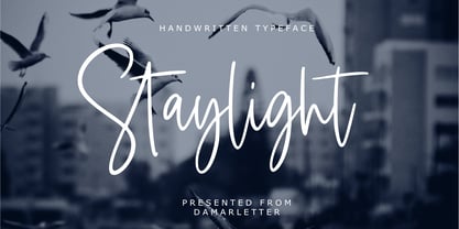 Staylight is a chic, refined script font. Its stylish ligatures make this font the perfect match for any project. Staylight is consisting of a fashionable style script make looks classy and touch of stylish. This font was created to look as close to a natural handwritten script as possible. Staylight is perfect for branding projects, logos, wedding designs, social media posts, advertisements, product packaging, product designs, label, photography, watermark, invitation, stationery and anything that you want. This font is PUA encoded which means you can access all of the amazing glyphs and ligatures with ease!
 - Blonde Fraktur by ParaType,
$30.00 Blonde Fraktur is a free interpretation of the Gothic theme in Cyrillic. The font is neither Fraktur nor any other Gothic script from the formal point of view, but it makes text look like Gothic script, no matter which language is used. Blonde Fraktur was written with a quill by Alexandra Korolkova and prepared in digital form by Alexandra Pushkova. The font contains a set of alternatives and swashed variations. It suits well for advertising of beer, sausages, pubs and other places where Gothic scripts are commonly used.
 - Romes by PeachCreme,
$16.00 Hi, peaches! Glad to introduce to you our latest “Romes” font duo that combines classy serif and cute script fonts. The exquisite curves of the serif font and natural beautiful flow of the script font can give your projects a voguish and elegant touch! Romes Script is a lovely and at the same time clear and easy-to-read handwriting font. Romes is a moderately bold font that blends traditional influences into a contemporary aesthetic. This font duo works well for branding, weddings, social media, product design, stationery, advertising, and many more.
 - Pinala by Typomancer,
$24.00 'Pinala', a playful script & sans fonts, contains light to bold weights for various designs.
 - Sonica Brush by Resistenza,
$39.00 Sonica brush is our first script designed with a pentel brush on watercolor paper
 - Summer Nights by BA Graphics,
$45.00 A very readable script, simple yet elegant. Works great in a multitude of applications.
 - Saga YOFF by YOFF,
$9.00 Saga is a gorgeous bold script, strong and special. Perfect for highlights like headers.
 - Mochary by Mans Greback,
$59.00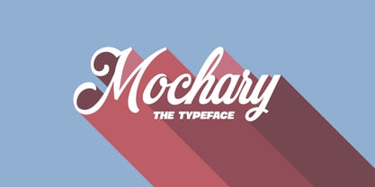 A beautiful and high-quality script font with contextual and stylistic alternates and ligatures.
 - Drop by Hubert Jocham Type,
$29.90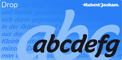 Drop is a brush script headline typeface. Ideal for food packaging and product branding.
 - Rusted Brushpen by Gleb Guralnyk,
$13.00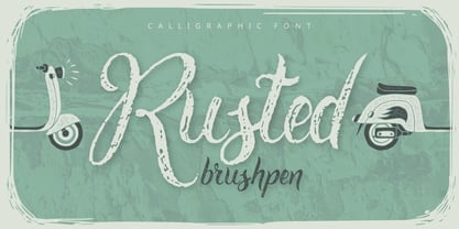 Introducing handcrafted "Rusted brushpen" font. It's a fancy brushpen script with rough grungy effect.
 - Milk by Hubert Jocham Type,
$29.90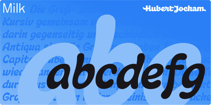 Milk is a brush script headline typeface. Ideal for food packaging and product branding.
 - Jaipur by Vic Fieger,
$7.99This font was designed to resemble the Indo-Aryan scripts of the Indian subcontinent. - Dom by Bitstream,
$29.99 The most familiar of brush scripts designed by Pete Dombrezian for ATF in 1951.
 - FG Jennifer by YOFF,
$13.95FG Jennifer is a neat elderly script style of font. It's neatly held together. - Pieslay by Nissa Nana,
$29.00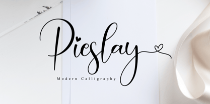 Pieslay is a beautiful script font that has a classy, elegant, and modern look.
 - Billock by Alit Design,
$19.00 Presenting the Billock Script font by alitdesign. The Billock script font is inspired by the strokes of a highlighter marker that has a bold square character combined with a dynamic signature script style. Combined with the concept of bright and neon colors, the design of the Billock font becomes more sporty and modern. This Billock script font is very suitable to be the latest collection of your font library, because it has many and very unique swashes and alternatives that make the designs you will make look different and cool. The Billock Script font is perfect for magazine cover designs, brochures, flyers. Instagram ads, Canva Design and so on with unique and modern concepts. besides that this font is very easy to use both in design and non-design programs because everything changes and glyphs are supported by Unicode (PUA). The Billock Script contains 887 glyphs with many unique and interesting alternative options. Language Support : Latin, Basic, Western European, Central European, South European,Vietnamese. In order to use the beautiful swashes, you need a program that supports OpenType features such as Adobe Illustrator CS, Adobe Photoshop CC, Adobe Indesign and Corel Draw. but if your software doesn't have Glyphs panel, you can install additional swashes font files.
 - Lovato by Philatype,
$35.00 Lovato is a family of five fonts, perfect for branding applications, books, or poster designs that require a clear, sharp, stylish tone. The styles range from an elegant, delicate light weight up to a brazen, commanding black weight. This original Latin-serif family, designed by Kosal Sen, has primarily a geometric construction, with hints of details inspired by inscriptional lettering, all coalescing to fit a contemporary palette.
 - Furius by Typogama,
$29.00 Furius is a display typeface inspired by the split serif style of woodcut or chiseled letters found in roman inscriptions and later popularized by the western genre in the United States. Created as a display typeface, Furius combines a host of Opentype features and equally incoporates a full extended latin and cyrillic character set to provide a versatile and complete design solution for titles or display settings.
 - Penabico by Intellecta Design,
$23.90 After 13 months of hard work, Iza W and Intellecta Design are proud to announce Penabico. This is a free interpretation of the copperplate script styles to be found in the Universal Penman . London, 1741 , the monumental publication of engraved work by George Bickham (along with collaborators Joseph Champion, Wellington Clark, Nathaniel Dove, Gabriel Brooks, William Leckey and many others). This enhanced OpenType version is a complete solution for producing documents and artworks which need this kind of calligraphic script: 100s of stylistic alternates for each letter (upper- and lowercase), accessed with the glyph palette; 250 ornaments and fleurons (mostly in the copperplate roundhand renaissance style) encoded in the dingbats range and accessed with the glyph palette (plus a special set with over 50 of these ornaments accessed with the ornaments feature); an extensive set of ligatures (100s of stylistic and contextual alternates plus discretionary ligatures) providing letterform variations that make your designs really special, resembling real handwriting on the page; complete, intricate, ready-made calligraphic words; abbreviations (in many languages). The principal font contains the complete Latin alphabet, including Central European, Vietnamese, Baltic and Turkish with all diacritic signs, punctuation marks (including interrobang ). The German ‘ß’ (germandbls, eszett, sharp s) even has over six different alternate forms. And we don't forget to add the unconventional germandbls uppercase. In non-OpenType-savvy applications it works well as an English commercial script style font. Because of its high number of alternate letters and combinations (over 1500 glyphs), we suggest the use of the glyph palette to find ideal solutions to specific designs. The sample illustrations will give you an idea of the possibilities. You have full access to this amazing stuff using InDesign, Illustrator, QuarkXpress and similar software. However, we still recommend exploring what this font has to offer using the glyphs palette. Two last things — we have placed some of the ornaments, catch-words and other material in supplementary fonts, for easier access in non-OpenType-savvy programs. They are: Penabico Words (see the pdf user guide in “Gallery”), Penabico Abbreviations (free font), and Penabico Extras (free font). And, when buying Penabico you get the 'Penabico EPS Bonus Set", a gift pack containing various highly intrincated frames in EPS format, easy and ready to work with your preferred vector design software like Corel or Illustrator (see the pdf in the Gallery). Know too our other superscript font : Van den Velde Script at http://new.myfonts.com/fonts/intellecta/van-den-velde-script/
 - ITC Motter Corpus by ITC,
$40.99ITC Motter Corpus was designed by the Austrian type designer Othmar Motter in 1993 to combine the display advantages of a sans serif extra bold design with the legibility of a roman weight. The Motter Corpus is available in the weights regular and condensed regular. The capitals with their strong strokes display slight irregularities and natural looking outlines. When used in very large point sizes the tiny serifs become noticeable. Distinguishing characteristics of this typeface are the unusual design of the g with its upward reaching ear and that of the capital C, whose curve ends in an angular stroke in its upper third. Almost, but not quite, a sans serif, the typeface has diminutive serifs which, along with its modulated weight contrasts, make ITC Motter Corpus remarkable legible in display applications and will give text a nostalgic feel. A similar typeface is Linotype Bariton. - Irpin Type by Aronetiv,
$- Irpin Type is an original font dedicated to the city of Irpin. Intended for everyday use, for books, logos, corporate style. It can also be used in posters and presentations where a confident character is needed. This font suits a large size, but it has good readability even in a small one. This is a modern slab serif with geometric shapes, inspired by the Ukrainian avant-garde of the 20th century. It has characteristic alternates for "G", "a", "u", and "&". Irpin is a city of Ukraine in the suburbs of Kyiv. On March 24, 2022, by the Decree of the President of Ukraine in order to celebrate the feat, mass heroism and resilience of citizens, shown in the defense of their cities during the repulsion of the armed aggression of the Russian Federation against Ukraine, the city was awarded the honorary title "Hero City of Ukraine"
 - Absentia Serif by DR Fonts,
$19.00 The Absentia collection welcomes this modern serif option to broaden its typographic horizons and offer designers greater versatility. The new member shares the traits and proportions that sets this family apart, such as the truncated capital ‘A’ apex, the calligraphic ‘l’ and the distinctive ‘g’. Yet Absentia Serif adds its own personality to the mix, integrating forward-looking attributes into traditional letterforms. Laid out as bilateral or one-sided configurations, the transitional serifs help maintain a tight, orderly baseline. The balanced stroke contrast increases in the bolder weights and exudes an elegant appearance. This finely crafted typeface promotes legibility at the smallest sizes and makes it the ideal solution for body text. Available in ten weights with matching italics and two variable fonts, Absentia Serif is loaded with OpenType features such as stylistic alternates, fractions, superscript, subscript, as well as standard and discretionary ligatures.
 - Nami by Linotype,
$29.99Nami, the Japanese word for wave," is the latest collaboration between Adrian Frutiger and Linotype's Type Director, Akira Kobayashi. This typeface family is the most humanistic sans serif design ever to come from Adrian Frutiger, and it has an interesting twist: lapidar alternates that may be surfed through with the help of OpenType-savy applications. Adrian Frutiger began the design that would blossom into Nami during the 1980s. Although it would not be produced during the 20th century, it was quite forward thinking. The typeface included several seemingly avant garde alternates; these were "lapidary" versions of common letterforms. Revisiting the project in 2006, Akira Kobayashi reworked the concept into a working family of three typefaces. Each font contains 483 glyphs, including 11 alternates-two extra forms of the lowercase g, as well as new forms for a, e, h, l, m, n, r, t, and u." - Capraia by CAST,
$45.00 Capraia is a book typeface, with a heavily quirky look when shown at big sizes, and with an irregular but attractive rhythm at text sizes. Capraia Book and Regular are designed specifically for continuous texts: Book meets a current preference of Italian publishers for lighter faces, while the slightly heavier Regular is intended for the wider international market. True to its vocation for publishing, Capraia has a big x-height, medium contrast and wide bracketed serifs. Furthermore, its slightly flattened curves, some unconventional roman letterforms (a, G, Q) and the 'slanted roman' italics, along with design details such as ball terminals, give to the whole family a very contemporary appeal. Originally the design was intended as a tribute to Caslon's Great Primer but at a certain point the designer was enthralled by Baskerville. Capraia is the unpredicted and original result of that intense experience.
 - Blythe by Scholtz Fonts,
$19.92 Blythe is a stylish and contemporary handwriting font that captures the elegant hand of the 50s with the immediacy of handwriting fonts such as Affable. There are many handwriting fonts out there, many of which border on being grungy and irregular. This font combines beauty with individuality and panache. Blythe is characterized by dramatic ascenders and descenders (found on characters such as f, g, h, j etc) and it may be necessary to increase the line-spacing a little in some applications to accommodate these features. Suggestions for use: -- wedding stationery -- greeting cards -- valentines day mediaa -- beauty product media -- lingerie tags -- women's magazine pages -- classical music media -- award certificates The font is fully professional: carefully letterspaced and kerned. It contains over 235 characters - (upper and lower case characters, punctuation, numerals, symbols and accented characters are present). (It has all the accented characters used in the major European languages).
 - Ardoise Std by Typofonderie,
$59.00 A straightforward sanserif in 20 fonts, 4 widths Ardoise met the needs of publications. By extension, it met the needs of a newpapers typeface featuring a low contrast, straightforward forms, as Franklin Gothic. The verticals metrics and proportions of Ardoise are calibrated to match perfectly others Typofonderie families. Four widths to answer all situations Ardoise, inspired by the needs of today’s fine newspapers offers simple and tense shapes designed to renew and revitalize. Ardoise could be considered as an homage to Antique Olive, but quite indirectly and as an organic result of the designer’s longstanding admiration of the work of Roger Excoffon. Ardoise shares a purity and dynamics with Excoffon’s designs giving it a unique elegance and excellent readability. Its sturdiness means it is virtually immune it to distortion. In addition, a few alternates glyphs (a, c, g) can be used to alter the overall tone of a text setting.
 - Dharma Gothic by Dharma Type,
$19.99 Dharma Gothic is an antiqued sans serif designed inspired by 1800s-style wood type. All glyphs had been designed carefully to be retro-looking of the old time and to fill all with nostalgia. There is new rounded verision - Dharma Gothic Rounded Family This condensed font family with 42 styles will be the best solution for posters, titles and anywhere you need impact. To complete your work perfectly, Gothic Extras family is ready for free. They include borders, ornaments and frames designed using vintage catalog of Hamilton in 1800s as a model. Incidentally, g, r and y have alternative glyphs that are available with the OpenType salt feature and tabular figures are available with tnum feature. Be sure to check out the slab serif style of this Dharma series named Dharma Slab and Distress version Dharma Gothic P. When you need more modern gothic, please try our Kaneda Gothic and Fairweather.
 - Dharma Gothic Rounded by Dharma Type,
$19.99 Dharma Gothic Rounded is an antiqued sans serif designed inspired by 1800s-style wood type. All glyphs had been designed carefully to be retro-looking of the old time and to fill all with nostalgia. There is Dharma Gothic Family that is not rounded. This condensed font family with 42 styles will be the best solution for posters, titles and anywhere you need impact. To complete your work perfectly, Gothic Extras Family is ready for free. They include borders, ornaments and frames designed using vintage catalog of Hamilton in 1800s as a model. g, r and y have alternative glyphs that are available with the OpenType salt feature and tabular figures are available with tnum feature. Be sure to check out the slab serif style of this Dharma series named Dharma Slab and Distress version Dharma Gothic P. When you need more modern gothic, please try our Kaneda Gothic and Fairweather.
 - Regulator Nova by Device,
$39.00 A high lower-case x-height geometric sans with open counters, Regulator Nova is extremely legible at text sizes and in extended settings while the range of weights also make it suitable for headlines. The stoke terminals are all cut at close to 90 degrees, lending a sharp precision to the characters. Alternate versions of the g, j, r, w, K, R, W, # and ampersand are available in both upright and italic, and can be toggled on and off in the Opentype panel or the Glyphs palette. Clean, elegant and legible, Regulator Nova has a classical proportions based on a circumscribed circle and square, and shares structural similarities to early sans serifs such as Rudolf Koch’s Kabel, while adopting more British forms for the M and R. Regulator Nova is an extension and reworking of Regulator, now with extra weights, reweighed italics, Opentype-savvy alternates and a full European character set.
 - Quercus 10 by Storm Type Foundry,
$69.00 Quercus is characterised by open, yet a little bit condensed drawing with sufficient spacing so that the neighbouring letters never touch. It has eight interpolated weights with respective italics. Their fine gradation allows to find an exact valeur for any kind of design, especially on the web. Quercus serif styles took inspiration from classicistic typefaces with vertical shadows, ball terminals and thin serifs. The italics have the same width proportion as upright styles. This “modern” attitude is applied to both families and calls for use on the same page, e g in dictionaries and cultural programmes. Serif styles marked by “10” are dedicated to textual point sizes and long reading. The sans-serif principle is rather minimalistic, with subtle shadows and thinned joints between curved shapes and stems. Quercus family comprises of the usual functionality such as Small Caps, Cyrillics, diacritics, ligatures, scientific and aesthetic variants, swashes, and other bells & whistles. It excels in informational and magazine design, corporate identity and branding, but it’s very well suited for book covers, catalogues and posters as well. When choosing a name for this typeface I've been staring out from my studio window, thinking helplessly without any idea in sight. Suddenly I realised that all I can see is a spectacular alley of oaks (Quercus in Latin) surrounding my house. These oaks were planted by the builders of local ponds under the leadership of Jakub Krčín in the fifteenth century.
 - Quercus Whiteline by Storm Type Foundry,
$69.00 Quercus is characterised by open, yet a little bit condensed drawing with sufficient spacing so that the neighbouring letters never touch. It has eight interpolated weights with respective italics. Their fine gradation allows to find an exact valeur for any kind of design, especially on the web. Quercus serif styles took inspiration from classicistic typefaces with vertical shadows, ball terminals and thin serifs. The italics have the same width proportion as upright styles. This “modern” attitude is applied to both families and calls for use on the same page, e g in dictionaries and cultural programmes. Serif styles marked by “10” are dedicated to textual point sizes and long reading. The sans-serif principle is rather minimalistic, with subtle shadows and thinned joints between curved shapes and stems. Quercus family comprises of the usual functionality such as Small Caps, Cyrillics, diacritics, ligatures, scientific and aesthetic variants, swashes, and other bells & whistles. It excels in informational and magazine design, corporate identity and branding, but it’s very well suited for book covers, catalogues and posters as well. When choosing a name for this typeface I've been staring out from my studio window, thinking helplessly without any idea in sight. Suddenly I realised that all I can see is a spectacular alley of oaks (Quercus in Latin) surrounding my house. These oaks were planted by the builders of local ponds under the leadership of Jakub Krčín in the fifteenth century.
 - Quercus Serif by Storm Type Foundry,
$69.00 Quercus is characterised by open, yet a little bit condensed drawing with sufficient spacing so that the neighbouring letters never touch. It has eight interpolated weights with respective italics. Their fine gradation allows to find an exact valeur for any kind of design, especially on the web. Quercus serif styles took inspiration from classicistic typefaces with vertical shadows, ball terminals and thin serifs. The italics have the same width proportion as upright styles. This “modern” attitude is applied to both families and calls for use on the same page, e g in dictionaries and cultural programmes. Serif styles marked by “10” are dedicated to textual point sizes and long reading. The sans-serif principle is rather minimalistic, with subtle shadows and thinned joints between curved shapes and stems. Quercus family comprises of the usual functionality such as Small Caps, Cyrillics, diacritics, ligatures, scientific and aesthetic variants, swashes, and other bells & whistles. It excels in informational and magazine design, corporate identity and branding, but it’s very well suited for book covers, catalogues and posters as well. When choosing a name for this typeface I've been staring out from my studio window, thinking helplessly without any idea in sight. Suddenly I realised that all I can see is a spectacular alley of oaks (Quercus in Latin) surrounding my house. These oaks were planted by the builders of local ponds under the leadership of Jakub Krčín in the fifteenth century.
 - Quercus Sans by Storm Type Foundry,
$69.00 “Quercus” is characterised by open, yet a little bit condensed drawing with sufficient spacing so that the neighbouring letters never touch. It has eight interpolated weights with respective italics. Their fine gradation allows to find an exact valeur for any kind of design, especially on the web. Quercus serif styles took inspiration from classicistic typefaces with vertical shadows, ball terminals and thin serifs. The italics have the same width proportion as upright styles. This “modern” attitude is applied to both families and calls for use on the same page, e g in dictionaries and cultural programmes. Serif styles marked by “10” are dedicated to textual point sizes and long reading. The sans-serif principle is rather minimalistic, with subtle shadows and thinned joints between curved shapes and stems. Quercus family comprises of the usual functionality such as Small Caps, Cyrillics, diacritics, ligatures, scientific and aesthetic variants, swashes, and other bells & whistles. It excels in informational and magazine design, corporate identity and branding, but it’s very well suited for book covers, catalogues and posters as well. When choosing a name for this typeface I've been staring out from my studio window, thinking helplessly without any idea in sight. Suddenly I realised that all I can see is a spectacular alley of oaks (Quercus in Latin) surrounding my house. These oaks were planted by the builders of local ponds under the leadership of Jakub Krčín in the fifteenth century.
 - Fantastic ML by HiH,
$12.00 Fantastic ML is an exuberant Art Nouveau font. It was originally released as “Modern Style” by Fonderie G. Peignot & Fils, Paris, France sometime before 1903. Since “Le style moderne” was the generic French name for Art Nouveau, it is possible that someone decided a less generic name was needed. The typeface became known as Fantastic. Compared to conventional text letters, it is just that. Fantastic has a whimsical, architectural feel. The typeface reminds me of a cross between Hoffmann’s Palais Stoclet in Brussels and Gaudi’s Sagrada Familia church in Barcelona. The letterforms themselves are similar to those by Ludwig von Zumbusch on the cover of “Jugend” in March, 1896, but with the addition of serifs. Fantastic ML is a decorative, all-cap font intended for display use and functions best at 18 points or larger. There are a total of 306 glyphs. In addition to the standard 1252 Western Europe Code Page with character slots up to decimal position 255, there are glyphs for the 1250 Central Europe, the 1252 Turkish and the 1257 Baltic Code Pages. However, some older applications may only be able to access the Western Europe character set (1252). The zip package includes two versions of the font at no extra charge. There is an OTF version which is in Open PS format and a TTF version which is in Open TT format. Use whichever works best for your applications.
 - Slurm by Nikola Klimova,
$15.00 Slurm is a hand-drawn fun font that is ideal for use in headlines, descriptions and logotypes used in product design and similar applications. In longer texts it works well as a complementary font for comics and illustrations. Various sizes and weights for individual characters are derived from the hand-drawn font. Each glyph is an original; no shapes are repeated. Ligatures have been created for double letters and the typeface includes diacritics for languages that use Latin letters. The typeface features two basic styles, Regular and Bold, which can be used separately just as well as combined. Each style also includes pictures that can be used for various occasions.
 - Cadmus Pro by Canada Type,
$39.95 Cadmus Pro is the newly remastered and greatly expanded version of a Jim Rimmer design based on a type originally done by hand lettering artist Robert Foster. Foster’s type, named Pericles, was published by ATF in the 1930s, and used in lettering magazines and advertising headings. The design is based closely on early inscriptional Greek. Cadmus Pro comes with over 1130 glyphs, covering pretty much all Latin languages (including Vietnamese) as well as Cyrillic, Greek and Hebrew. OpenType features include stylistic alternates, automatic fractions, ordinals, and small figure ranges for superiors and inferiors. Proceeds from this font will be put towards a variety of Canadian typography education causes.
 - Sigillium by ave,
$9.00 Sigillium is a flare serif typefaces, which inspired by early XX centuries sign painting advertising. It has strong historical nature. Letters proportions are very closed to the Roman Capital Letters. Sharp flare serifs endings give special medieval style to the typeface. Sigillium includes: 4 types in Upper- and Lowercases Each style contains more than 250 glyphs which support Latin, Western European, Central European languages (Cyrillic is also included) Files description: regular, carved empty, - not filled 2 styles carved with shadow, - different "light" directions Hope you are enjoying using Sigillium. Please do not hesitate to ask me any questions about the product. (c) Photo credit - Unsplash
 - Osmane by Skiiller Studio,
$20.00 Osmane is a beautiful script type script designed with a neat concept, , even businesses, companies, clothing, and much more What's include: Stylistic alternate for lowercase PUA Encoded Characters - Fully accessible without additional design software. Basic Latin Language Support How to access alternate glyphs? you can see it on this link ( http://goo.gl/1vy2fv )