10,000 search results
(0.04 seconds)
- Hellowhiten by Rockboys Studio,
$17.00 Hellowhiten is a thin lettered and graceful script font. Fall for its ravishing style and use it to create gorgeous wedding invitations, beautiful stationary art, eye-catching social media posts, and much more!
 - Kayane by Differentialtype,
$10.00 Kayane is a splendid script font that can be used for branding, greeting cards, wedding invitations, and many other projects. It will add luxury to any design project that you wish to create.
 - Juliane by Just Lett,
$13.00 Juliane is a thin lettered and delicate script font. Fall for its ravishing style and use it to create gorgeous wedding invitations, beautiful stationary art, eye-catching social media posts, and much more!
 - Safiya by ARToni,
$19.00 Safiya is a lovely script font featuring charming, playful characters that seem to dance along the baseline. Add this font to your most creative ideas, and notice how it makes them stand out!
 - Best Forest by Rhd Studio,
$17.00 Best forest is a modern handwritten script font. This font is perfect for svg designs, shirts, crafts, websites, farmhouse décor, branding, blogs, logos, invitations, and more! Most accent characters are included. Thank you!
 - Amerliosa by Rockboys Studio,
$23.00 Amerliosa is a lovely script font featuring charming, playful characters that seem to dance along the baseline. Add this font to your most creative ideas, and notice how it makes them stand out!
 - Nana by Autographis,
$39.50 Nana is a classic joining script with long ascenders and descenders, that is based on a set of unique but forgotten initials that were designed in the roaring 20s and 30s in Paris.
 - Winter Beauty by Typestory,
$12.00 Winter Beauty is a sweet, fancy hand-lettered script. The playful rounded characters make it the perfect font for creating stunning calligraphy art. Add it to your designs and make them come alive!
 - Heatwave by Maulana Creative,
$15.00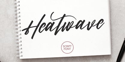 Give your designs an authentic handcrafted feel. Heatwave is a handmade, brush script font and is perfectly suited to stationery, logos and much more. It also includes multi-lingual support. Many Thanks, MaulanaCreative
 - Landscape by Rochart,
$10.00 Landscape is a modern hand writing script. It's great for logotype, Branding Design, Logo Design, Digital Lettering Arts, T-Shirt/Apparel, Poster, Magazine, Signs, Advertising Design, wedding invitation and any hand lettered needs.
 - Marijose by FHFont,
$19.00 Marijose is script font with handlettering brush style, inspired feminime signature style with opentype feature include of the font. Suitable for wedding, logo lettering with feminime style, apparel, card invitation, and awesome project.
 - Silkplum by Ardian Nuvianto,
$18.00 Silkplum is a lovely script font featuring charming, playful characters that seem to dance along the baseline. Add this font to your most creative ideas, and notice how it makes them stand out!
 - Avengeline by Rockboys Studio,
$22.00 Avengeline is a beautiful and refined script font. It has a classy, elegant and modern look that can be used for logos, branding, invitations, stationery, wedding designs, social media posts, and much more!
 - Gardenisa by Balpirick,
$15.00 Gardenisa is a stylish and incredibly distinct script font. It looks stunning on wedding invitations, thank you cards, quotes, greeting cards, logos, business cards and every other design which needs a handwritten touch.
 - Fionetta by ARToni,
$18.00 Fionetta is a thin lettered and graceful script font. Fall for its ravishing style and use it to create gorgeous wedding invitations, beautiful stationary art, eye-catching social media posts, and much more!
 - Graby by IbeyDesign,
$16.00 Graby Bold Script Font feels equally charming and elegant. It looks stunning on wedding invitations, thank you cards, quotes, greeting cards, logos, business cards, and every other design which needs a handwritten touch.
 - Hand Stamp Swiss Rough Sans by TypoGraphicDesign,
$19.00 The typeface Hand Stamp Swiss Rough Sans is designed for the Typo Graphic Design font foundry in 2015 by Manuel Viergutz. A display sans serif type for headlines with an authentic used stamped style by hand. It started analogous with 42 stamps. Vintage look plus state-of-the-art OpenType-features like contextual alternates (calt) for more hand-stamped feeling with the automatic generated stylisitc set loop. Decorative ligatures like CT, LL, LI, LU, MM, OO, TH, TT, TU, UH and Versal Eszett (German Capital Sharp S) type the word LOVE for ❤ and the word SMILE for ☺. Character Set: Latin Extended (Adobe Latin 3). 1086 glyphs with 4× A–Z, 4× a–z, 4× 0–9 and 100+ extra icons like arrows, dingbats, symbols, geomatric shapes, catchwords and many alternative letters. Have fun with this font & use the DEMO-FONT (with reduced glyph-set) FOR FREE! Example of use from the Font The font works best for headline size. Logo, Poster, Editorial Design (Magazine or Fanzine), Flyer, Music Covers or Webdesign (Headline Webfont for your website), Webbanner, Animations … ■ Font Name: Hand Stamp Swiss Rough Sans ■ Font Weights: Regular + Mix + Icons + DEMO (with reduced glyph-set) ■ Font Category: Display & Decorative ■ Font Format: .otf (OpenType Font for Mac + Win) + .ttf (TrueType Font) ■ Glyph Set: 1086 glyphs ■ Language Support: 28+ for Latin Extended (Adobe Latin 3). Afrikaans, Albanian, Catalan, Croatian, Czech, Danish, Dutch, English, Estonian, Finnish, French, German, Hungarian, Icelandic, Italian, Latvian, Lithuanian, Maltese, Norwegian, Polish, Portugese, Romanian, Slovak, Slovenian, Spanisch, Swedish, Turkish, Zulu ■ Specials: 100+ decorative extras like icons for arrows, dingbats, emojis, symbols, geometric shapes, catchwords + German Capital Eszett. Open Type Features: Kerning (kern), Access All Alternates (aalt), Stylistic Alternates (salt), Stylistic Set 1 (ss01) … Stylistic Set 6 (ss06), Localized Forms (locl), Subscript (subs) Superscript (sups), Ordinals (ordn), Proportional Figures (pnum), Oldstyle Figures (onum), Lining Figures (lnum), Tabular Figures (tnum), Slashed Zero (zero), Fractions (frac), Denominators (dnom), Numerators (numr), Standard Ligatures (liga), Contextual Alternates (calt) e. g. Stylistic Set-Loop and Decorative Ligatures (dlig) e. g. type the word “LOVE” for ❤ or “SMILE” for ☺ ■ Design Date: 2015 ■ Type Designer: Manuel Viergutz
 - Generis Slab by Linotype,
$29.00The idea for the Generis type system came to Erik Faulhaber while he was traveling in the USA. Seeing typefaces mixed together in a business district motivated him to create a new type system with interrelated forms. The first design scheme came about in 1997, following the space saving model of these American Gothics. Faulhaber then examined the demands of legibility and various communications media before finally developing the plan behind this type system. Generis’s design includes two individually designed styles; each of with is available with and without serifs, giving the type system four separate families. Each includes at least four basic weights: Light, Regular, Medium, and Bold. Further weights, small caps, old style figures, and true italics were added to each family where needed. The Generis type system is designed to meet both optical criteria and the highest possible measure of technical precision. Harmony, rhythm, legibility, and formal restraint make up the foreground. Generis combines aesthetic, technical, and economic advantages, which purposefully and efficiently cover the whole range of corporate communication needs. The unified basic form and the individual peculiarity of the styles lead to Generis’ systematic, total-package concept. The clear formal language of the Generis type system resides beneath the information, bringing appropriate typographic expression to high-level corporate identity systems, both in print and on screen. The condensed and aspiring nature of the letterforms allows for the efficient setting of body copy, and the economic use of the page. A range of accented characters allows text to be set in 48 Latin-based languages, offering maximal typographic free range. This previously unknown level of technical and design execution helps create higher quality typography in all areas of corporate communication. Optimal combinations within the type system: Generis Serif or Generis Slab with Generis Sans or Generis Simple. - Generis Serif by Linotype,
$29.00The idea for the Generis type system came to Erik Faulhaber while he was traveling in the USA. Seeing typefaces mixed together in a business district motivated him to create a new type system with interrelated forms. The first design scheme came about in 1997, following the space saving model of these American Gothics. Faulhaber then examined the demands of legibility and various communications media before finally developing the plan behind this type system. Generis’s design includes two individually designed styles; each of with is available with and without serifs, giving the type system four separate families. Each includes at least four basic weights: Light, Regular, Medium, and Bold. Further weights, small caps, old style figures, and true italics were added to each family where needed. The Generis type system is designed to meet both optical criteria and the highest possible measure of technical precision. Harmony, rhythm, legibility, and formal restraint make up the foreground. Generis combines aesthetic, technical, and economic advantages, which purposefully and efficiently cover the whole range of corporate communication needs. The unified basic form and the individual peculiarity of the styles lead to Generis’ systematic, total-package concept. The clear formal language of the Generis type system resides beneath the information, bringing appropriate typographic expression to high-level corporate identity systems, both in print and on screen. The condensed and aspiring nature of the letterforms allows for the efficient setting of body copy, and the economic use of the page. A range of accented characters allows text to be set in 48 Latin-based languages, offering maximal typographic free range. This previously unknown level of technical and design execution helps create higher quality typography in all areas of corporate communication. Optimal combinations within the type system: Generis Serif or Generis Slab with Generis Sans or Generis Simple. - Generis Simple by Linotype,
$39.00The idea for the Generis type system came to Erik Faulhaber while he was traveling in the USA. Seeing typefaces mixed together in a business district motivated him to create a new type system with interrelated forms. The first design scheme came about in 1997, following the space saving model of these American Gothics. Faulhaber then examined the demands of legibility and various communications media before finally developing the plan behind this type system. Generis’s design includes two individually designed styles; each of with is available with and without serifs, giving the type system four separate families. Each includes at least four basic weights: Light, Regular, Medium, and Bold. Further weights, small caps, old style figures, and true italics were added to each family where needed. The Generis type system is designed to meet both optical criteria and the highest possible measure of technical precision. Harmony, rhythm, legibility, and formal restraint make up the foreground. Generis combines aesthetic, technical, and economic advantages, which purposefully and efficiently cover the whole range of corporate communication needs. The unified basic form and the individual peculiarity of the styles lead to Generis’ systematic, total-package concept. The clear formal language of the Generis type system resides beneath the information, bringing appropriate typographic expression to high-level corporate identity systems, both in print and on screen. The condensed and aspiring nature of the letterforms allows for the efficient setting of body copy, and the economic use of the page. A range of accented characters allows text to be set in 48 Latin-based languages, offering maximal typographic free range. This previously unknown level of technical and design execution helps create higher quality typography in all areas of corporate communication. Optimal combinations within the type system: Generis Serif or Generis Slab with Generis Sans or Generis Simple. - Generis Sans by Linotype,
$29.00The idea for the Generis type system came to Erik Faulhaber while he was traveling in the USA. Seeing typefaces mixed together in a business district motivated him to create a new type system with interrelated forms. The first design scheme came about in 1997, following the space saving model of these American Gothics. Faulhaber then examined the demands of legibility and various communications media before finally developing the plan behind this type system. Generis’s design includes two individually designed styles; each of with is available with and without serifs, giving the type system four separate families. Each includes at least four basic weights: Light, Regular, Medium, and Bold. Further weights, small caps, old style figures, and true italics were added to each family where needed. The Generis type system is designed to meet both optical criteria and the highest possible measure of technical precision. Harmony, rhythm, legibility, and formal restraint make up the foreground. Generis combines aesthetic, technical, and economic advantages, which purposefully and efficiently cover the whole range of corporate communication needs. The unified basic form and the individual peculiarity of the styles lead to Generis’ systematic, total-package concept. The clear formal language of the Generis type system resides beneath the information, bringing appropriate typographic expression to high-level corporate identity systems, both in print and on screen. The condensed and aspiring nature of the letterforms allows for the efficient setting of body copy, and the economic use of the page. A range of accented characters allows text to be set in 48 Latin-based languages, offering maximal typographic free range. This previously unknown level of technical and design execution helps create higher quality typography in all areas of corporate communication. Optimal combinations within the type system: Generis Serif or Generis Slab with Generis Sans or Generis Simple. - Zimbara by Slex Studio,
$12.00 Zimbara script is calligraphy font with a classic style and a touch of elegance, inspired by the handwriting of ancient manuscripts. Carefully designed to work together in harmony that makes it very suitable for wedding media, book covers, greeting cards, logos, branding, business cards and certificates, even for any design work that requires a classic, formal or luxurious. Try Zimbara scrpit, enjoy the richness of OpenType features and let her fun and elegant excitement make you happy and enhance your creativity! You can use this font very easily. multilingual support and ligatures Your download will include OTF & TTF format files. If you do not have programs that support OpenType features like Adobe Illustrator and CorelDraw X Versions, you can access all alternative flying machines using Font Book (Mac) or Character Map (Windows): Do not forget to see, buy, like and share my other great products. Thank you for purchases.!
 - Proprietor by Sudtipos,
$59.00 The great value of something crafted thoroughly by hand has been observed for years by Guille Vizzari throughout a wide spectrum of clients and projects developed at «Yani & Guille» —the studio he runs cheek by jowl with Yani Arabena—, and they both noticed that recently it has been taking on a new meaning. From barbers at their shops, to a barista that passionately prepares coffee every morning, or a bartender that deeply enjoys diving towards unknown ingredients, and even Guille’s admiration for sign painters worldwide that keep spreading their passion for the perfectly constructed letter. This wide trades universe, where craftsmanship represents a huge difference, is where «Proprietor» lives, and it’s the reason why it exists. «Proprietor» was born in a Moleskine notebook —just pencil, paper and ink— as a tribute to those crafts, and to regain the art behind Type Design that involves the fusion between tools, materials and the action of the hand. Fed by these principles, every single glyph within the whole «Proprietor» Family has been fully designed and illustrated by hand by its author (including all the ornaments, frames and crafts icons that can be seen along this specimen), showcasing Vizzari’s solid formation in the drawing field. Proprietor can be described as a compact type family system illustrated by hand, intended and designed to be able to create solid —but beautifully ornamented— paragraphs, and elaborate compositions. For this purpose, Proprietor Roman and Open displays a notorious x-height which goes perfectly with plenty of ornaments that unfold along the ascenders and descenders, but always containing its swashes inside the text line. The icing on the cake, Proprietor Script, a copperplate-based font unbelievably flooded with ornamented capitals, flourishes and endings to break through the coarse feeling of the Proprietor non-script sets, with a huge load of delicate and warm letterforms. Proprietor Wide and Wide Open hand a complete font set to complement the family for composing extended words in uppercase, matching in style and adding a striking personality. And as being part of Sudtipos’ catalogue «Proprietor» comes packed with full Open Type support —thanks to Ale Paul, fearless to tame this hand–drawn beast, supported by his vast knowledge in programming and optimization—. 7 imperfectly elegant and completely handmade fonts join the «Proprietor» system, bringing life to designs that are meant to represent the spirit of the genuine and skilled craftsmen, showing respect for their trade, and at the same time being part of it.
 - Benjamin Franklin - Personal use only

- Quasaria by Linotype,
$29.99Linotype Quasaria is part of the Take Type Library, selected from contestants of Linotype’s International Digital Type Design Contests of 1994 and 1997. The font was designed by German artist Armin Retzko and the characters are composed of disjointed pieces. The eye tries to complete the symbols into the forms they are used to. Linotype Quasaria with its unique forms is intended exclusively for headlines and displays. - Antique Unique JNL by Jeff Levine,
$29.00 A page from an 1880s type specimen book presented a unique "Barnum"-like design with top horizontal lines much thinner than the bottom ones. Titled "Ten Line Antique Compressed No. 7", the design transcends the years; for it's not only an antique wood type font, but is also reminiscent of the 1960s hippie counterculture movement. Antique Unique JNL is available in both regular and oblique versions.
 - Linotype Cerny by Linotype,
$29.99Linotype Cerny is part of the Take Type Library, selected from the contestants of Linotype’s International Digital Type Design Contests of 1994 and 1997. Dutch artist Mark van Wageningen designed an alphabet consisting exclusively of capital letters. The font’s most distinguishing characteristic is its irregular outer contour, almost as though they were ripped out of paper. Linotype Cerny is intended exclusively for headlines in larger point sizes. - Nightlong by RagamKata,
$14.00 New retro display font, Nightlong! Nightlong is a strong and bold sans serif with a touch of vintage look and feel. This type of font perfectly made to be applied especially in logo, headline, signage and the other various formal forms such as invitations, labels, logos, magazines, books, greeting / wedding cards, packaging, fashion, make up, stationery, novels, labels or any type of advertising purpose.
 - Caslon Antique by Linotype,
$40.99 Caslon Antique was designed by Berne Nadall and brought out by the American type foundry Barnhart Bros & Spindler in 1896 to 1898. It doesn’t bear any resemblance to Caslon, but has the quaint crudeness of what people imagine type looked like in the eighteenth century. Use Caslon Antique for that “old-timey” effect in graphic designs. It looks best in large sizes for titles or initials.
 - Attention Getters JNL by Jeff Levine,
$29.00In the days of metal type or paper clip art, spot illustrations with stock phrases were used to embellish ads and fliers in order to grab the attention of potential customers. The convenience of digital type puts art like this at a designer's fingertips. Attention Getters JNL contains fifty-two such ad phrases, certain to add a nostalgic, yet functional appeal to your printed or online piece. - Fordier by Jehansyah,
$15.00 Fordier is a type of serif display font that is very charming, elegant and stylish, with alternate characters that are tailored to the user, very suitable for all types of designs, titles, book covers, invitations, movie titles, social media, stickers, old and classic looks combined in greetings, and this font is also encoded with PUA which means you can easily use all the letters on all glyphs,
 - Listing Packs by Jehansyah,
$9.00 Listing Packs family this is a font family with a bold and large appearance, this font is perfect for all types of displays that look unique and bold, there are several variants of the character you use, and make sure you don't miss it, very suitable for all types of design, crafts, social media , magazines, books, banners, and this design is very potential for you to have
 - Linotype Konflikt by Linotype,
$29.99Linotype Konflikt is part of the Take Type Library, which features winners of Linotype’s International Digital Type Design Contest from 1994 to 1997. Designer Stefan Pott was inspired by the conflict between the appearance of a typeface in print and on a computer screen. Out of this conflict came a font in which every character has aspects of both flowing handwriting and angular pixel-like strokes. - Deco Banner JNL by Jeff Levine,
$29.00 Deco Banner JNL is composed of reverse lettering on a black background with Art Deco end caps. To create a banner, first type the plus sign for the left end cap, then your text. To add a space between words, use the bar on the shift position of the backslash key then continue on. To add the right end cap, type the equal sign.
 - Commuters Sans by Dharma Type,
$19.99 Commuters Sans is a daily type. Classic but Modern. Very simple geometry and wide type with warm clearness. Useful for both body-text and titling by their minimal glyph shapes and slightly wide and eye-catching proportion. Consists of eight weights and their matching italics. Supporting almost all latin languages. All-caps text for one line or a few is as wonderful as normal mixed-case typesetting.
 - Ad Lib by Image Club,
$29.99Ad Lib designed by Freeman Craw for the American Type Founders (ATF) in 1961. A bold Grotesque with irregular rectangular counters in round characters. This type was designed by cutting the letter images out and thus has some wood-cut character. Some lower case characters have slight inclination. Initially numerous alternative characters were provided. Unusual shapes make this typeface useful for advertising and display work. - Mergansers by Tyler Jamieson Moulton,
$11.00 Merganser is a Typeface intended for text and copy and was inspired to serve the avid community of Birders. Birders and birding material historically have a lot to say. Merganser serves that tendency because its designed legible at small scales. The Natural world also inspires the slightly humanist strokes of Merganser. Merganser was created as part of the Type@Cooper winter certificate in Type Design.
 - Linotype Supatropic by Linotype,
$29.99Linotype Supatropic is part of the Take Type Library, chosen from the entries of the Linotype-sponsored International Digital Type Design Contests of 1994 and 1997. This fun font from German designer Isabell Laxa is generously decorated with delicate flower silhouettes which are reminiscent of Asian flower chains and subtropical flora. Linotype Supatropic is meant exclusively for headlines in point sizes of 18 or larger. - Crestview Six JNL by Jeff Levine,
$29.00The hand lettering found on a small catalog sheet for decorative decals from the 1930s-1940s era was the perfect source material for Crestview Six JNL. Handmade typefaces or signage from past decades offer a wonderfully humanistic change from the perfectly-crafted designs of printer's type (or digital type in the modern era). The font's name comes from the old alpha-numerical phone exchanges of the past. - Yukas by Alex Camacho Studio,
$25.00 Yukas is a funky and sexy typeface where the proportions are based on the optical balance between black strokes and white shapes. Ideal to enjoy on a large scale. It takes its references from the psychedelic movement, old-school western movie posters, and mid-19th century American wood type with those big, heavy capital letters. Includes several Open Type alternatives to customize your design however you want.
