10,000 search results
(0.026 seconds)
- Alingtone by Azetype,
$12.00 Presenting Alingtone Font Duo! A Display Font with 2 Versions, Alternates, and Extra. This font made with the perfect combination of each character. You can type by Mix & Match with an alternate version and extra swashes to get a unique combining. It looks original and can be used for all your project needs. Each glyph has its own uniqueness and when meeting with others will provide dynamic and pleasing proximity. This font can be used at any time and any project. You can see in the presentation picture above, Alingtone looks Versatile on design projects. So, Alingtone Font can't wait to give its touch to all your design projects such as quotes, poster design, retro design, vintage design, business, advertisment, personal branding, promotional materials, logotype, product packaging, etc. Besides that, Alingtone Script also has some ligature that gives a surprise when you type certain characters combining. The ligatures are ee, ll, oo, ii, nn, yy, ff, rr, tt, and ss. WHAT'S INCLUDED? 1. Alingtone Script • The First Version comes with uppercase, lowercase, ligatures, numeral, punctuation, symbols, and Standard Latin Multilingual Support (Afrikaans, Albanian, Catalan, Danish, Dutch, English, French, German, Icelandic, Indonesian, Italian, Malay, Norwegian, Portuguese, Spanisch, Swedish, Zulu, and More). 2. Alingtone San • The Second Version comes with ALLCAPS, numeral, punctuation, symbols, and Standard Latin Multilingual Support (Afrikaans, Albanian, Catalan, Danish, Dutch, English, French, German, Icelandic, Indonesian, Italian, Malay, Norwegian, Portuguese, Spanisch, Swedish, Zulu, and More). 3. Alingtone Script Alternate • It comes with uppercase, lowercase, numeral, punctuation, and symbols. 4. Alingtone Swash • It comes with 21 underline swashes. Just type c_1 until c_21 to feature all. Enjoy the Font and Happy Creating! Thank You Azetype Studio
 - La Luxes by Set Sail Studios,
$22.00 Indulge yourself in a luxurious typography pairing with La Luxes; a classic font duo consisting of an elegant Script & ligature-rich Serif. These fonts are designed to pair harmoniously, and lend themselves to high end branding, logo designs, product packaging & invitation designs. Here’s a run through the fonts in more detail; 1. La Luxes Script • A clean, elegant hand-drawn script font containing upper & lowercase characters, all punctuation and numerals. Also contains 30 ligatures to help the text flow naturally and add a custom-made feel. 2. La Luxes Serif • A stylish & modern all-caps serif containing upper & new lowercase characters, all punctuation & numerals. Also contains 38 ligatures and 11 special characters giving you a variety of layout options. Using Ligatures and Special Characters; Both fonts contain a large range of ligatures (unique double-letter pairings) to provide you with more customisation options; Most programs will automatically have Standard Ligatures switched on for you, if not you will need to enable this OpenType feature. The Serif font contains a number of raised ‘small caps’ (A, E, O, U, C) and characters with elongated tails (L, K, R,). These can be accessed by switching on ‘Stylistic Alternates’ in any OpenType capable software and typing these characters. The star icon can be accessed simply by typing the asterisk key (*) with the Serif font. All Ligatures and Special Characters can also be accessed via a Glyphs panel. This is available on most Adobe software & Affinity Designer. The stylised vertical ‘AND’ and ‘CO’ icons can only be accessed this way. Language Support; Both fonts support English, French, Italian, Spanish, Portuguese, German, Swedish, Norwegian, Danish, Dutch, Finnish, Indonesian, Malay, Hungarian, Polish, Turkish, Slovenian
 - Candyhouse by Set Sail Studios,
$12.00 Welcome to Candyhouse! It's bold, playful, loopy & the party never stops! This hand drawn font set is perfect for injecting some bubbly energy into your project. The great thing about Candyhouse is that it's not just a script font; it's crammed full of extra goodies such as a complete set of alternate lowercase characters, an additional all-caps font, and a bonus set of 30 hand-drawn elements including doodles, swashes & arrows. All of these combined provides you with a huge range of layout options and fun ideas to experiment with. Candyhouse consists of 4 fonts; 1. Candyhouse • A hand drawn script font containing upper & lowercase characters, numerals and a large range of punctuation. 2. Candyhouse Alt • This is a second version of Candyhouse, with a completely new set of lowercase characters. If you wanted to avoid letters looking the same each time to recreate a custom-made style, or try a different word shape, simply switch to this font for an additional layout option. 3. Candyhouse Caps • An all-caps font containing uppercase-only characters, perfect for supporting text to compliment the Candyhouse script font. Also includes numerals and a large range of punctuation. 4. Candyhouse Doodles • Need a bit more visual appeal to your text? This bonus font includes 30 hand-drawn doodles, swashes and arrows which are the perfect companion to Candyhouse when you need that extra personalised touch. Simply install the font and type any a-z (swashes) or A-Z (doodles) letter to generate a doodle. Fonts include multilingual support for the following languages; English, French, Italian, Spanish, Portuguese, German, Swedish, Norweigen, Danish, Dutch, Finnish, Polish, Indonesian, Filipino, Malay
 - Gimbal Grotesque by AVP,
$19.00 Gimbal Grotesque is a richly-featured font family providing many style options across a broad range of languages. It is twinned with Gimbal Egyptian, a slab-serif family with an identical range of weights and features. Originally conceived as a small webfont family, the letterforms have been revitalised to put a spring in their step and the family has been extended to create a versatile multi-script text face equally at home on the printed page. Carefully crafted at all weights, Gimbal also lends itself to headlines and display applications such as posters, exhibitions and signage while resolving well on-screen for general document creation and web-based applications. The letters are spaced for best readability on-screen and in the usual printed body text ranges but are tolerant of tracking adjustment to suit other uses. The styles are divided by width into four families (Compressed, Condensed, Normal, Extended), each family possessing six weights plus corresponding italics. Within each family, the 'regular' and 'bold' weights are style-linked, and all upright forms have an italic counterpart. The full opentype character set includes latin, greek and cyrillic scripts with appropriate local variants (also as stylistic sets) for Turkish, Polish and Romanian (latin) and Russian, Bulgarian and Serbian (cyrillic). All fonts contain small capitals for all scripts, superscript for latin and commonly used greek together with the usual numeral style, size and positioning options. The default numerals are 'proportional lining'. Other opentype features include case-sensitive marks, fractions, and some discretionary ligatures. A set of circled numerals and circled latin capitals is included, along with an unusual feature that composes 2-character country codes.
 - Gradl Zierschriften by HiH,
$10.00 Here is another design by jewelry designer Max Joseph Gradl. Zier is a verb, meaning to decorate, adorn or ornament; zierlich means decorative, elegant, fine, neat. Schrift means type. Zierschrift, therefore, means decorative type. Gradl Zierschriften is a decorative type in the Art Nouveau style, rather than the more ornate Victorian style. Very modern, very young, with an elegant simplicity of form. Maria Makela, in her book The Munich Secession (Princeton 1990) suggests that the frequent use of simple, flowing, organic forms that was so characteristic of Art Nouveau was a reaction against the growing complexity and rapid urbanization that resulted from 19th century industrialization. In keeping with that reaction is the hand-drawn quality that intentionally rejects a mechanistic mathematic precision of line rendering. Gradl Zierschriften preserves that hand-drawn quality. Designed with upper case only, this face was obviously intended for short headlines only and is best set at 18 points or larger. However, I don't think you really get to experience the grace of this design until you get to 36 points or more. In the larger sizes, it is simply stunning. Please note that while most of the uppercase letterforms are repeated in the lower case for convenience, the ‘F’,‘L’ and ‘T’ are rendered a little narrower than in the uppercase to provide for visual variety. The font also includes a generous supply of ligatures for just the right fit ... and just for the fun of using them. Three common ways of inserting a ligature, accented letter or other special character are: 1) Key in “ALT”+“0”+[ascii #]; for example ALT+0233 for the e-acute, 2) From within your application program, go to the INSERT menu and look for something like “Insert Symbol,” (this function is NOT available in all application programs) & 3) Cut & Paste from the CHARACTER MAP display that has been supplied by every generation of Windows Operating System that I can recall (All Programs>Accessories>System Tools). Isn't it amazing what you can do? Don't be afraid to experiment. If you back up your work, you have very little to lose and a lot to gain. Not only do you acquire a new tool, but by the very process you have learned how to continually expand your knowledge and skill base.
 - The ArabicNaskhSSK font is a distinctive typeface crafted within the classical realms of Arabic calligraphy, specifically aligning with the Naskh script. This script is one of the oldest and most pop...
- Minigame by Gienlee,
$15.00 Description Yo! Welcome to gienlee cartoon, design, and Other artwork Minigame is Modern Font. Commonly used to promote any tech and modern stuff kind of life. It's a futuristic text for the Generation Alpha lifestyle and higher. Item Description Standard Glyphs (Uppercase, Lowercase, Numeral & Punctions) Works on PC & Mac No Special Software is required Do enjoy your download
 - Silvergates by Gienlee,
$15.00 Yo! Welcome to gienlee cartoon, design, and other artworks Silvermoon is Medieval Font. Commonly used for middle ages those combined with the beauty of crystal and silver stone. Item Description Standard Glyphs (Uppercase, Lowercase, Numeral & Punctions) Works on PC & Mac No Special Software is required File Description Silvergates-Regular OTF file Silvergates-Line OTF file enjoy your download
 - MODERN Hand Fraktur by TypoGraphicDesign,
$19.00 KONZEPT/BESONDERHEITEN Der schludrige und raue handgeschriebene Fraktur Charakter, geben der Schrift eine hohe Wiedererkennung und eine gewisse Einzigartigkeit. Das Motto lautet handgemacht, rau, Fraktur & modern. EINSATZGEBIETE Das dreckige, dicke Aussehen der handgeschriebenen Schrift würde sich über folgende Gebiete sehr freuen und sich dort dreckig heimisch fühlen: Logos/Wortmarken aller Art, Flyer für fast jede Party, PlattenCover, Comic-Cover und Graphic Novel Lettering, Plakat Design, Movie-Font, als Headlineschrift für print und digitale Magazine, Bücher und Webseiten u.v.m. TECHNISCHE INFORMATIONEN Überschriften | Auszeichnungsschrift | Fraktur Handschrift »Modern Hand Fraktur«. OpenType Schrift mit 258 Glyphen & 1 Schriftschnitt (regular). Symbole und Ligaturen (mit diakritischen Zeichen & €)
 - Hawkes by Kimmy Design,
$15.00 Hawkes is an extensive handmade typeface family that comes with a bundle of weights, widths and styles, all designed to work cohesively. Here is a breakdown of the Hawkes family. Hawkes Sans: The primary subfamily is a sans-serif typeface that includes nine fonts: three weights (light, medium and bold) and three widths (narrow, regular and wide). Within this set are an array of stylistic features; including small capitals, character style alternatives, discretionary ligatures and contextual alternatives. See details below for more information on OpenType Features. Hawkes Variable Width Sans: The secondary subfamily is the same base sans-serif fonts but combined in variating widths. Essentially, it takes all three widths of each weight and randomly mixes them together. This creates a funky and creative alternative to the more traditional sans-serif set. The variations are for the uppercase, lowercase, small capitals, ligatures and numbers. Hawkes Script: The last subfamily is the script typeface. It’s a quirky script with variations of its own, including ligatures, swashes and contextual alternatives (again, see below for further details.) The script font works great as a complimentary style to the sans-serif, or on it’s own. FEATURES Alright, let’s get into all the extra goodies this typeface has to offer. Small Capitals: Small caps are short capital letters designed to blend with lowercase text. These aren’t just capital letters just scaled down but designed to fit with the weight of both the lowercase and capitals. With Hawkes, small caps can either sit on the baseline (in line with the base of the capital and lowercase) or to be lifted to match the height of the capital letters by applying the discretionary ligature setting in the OpenType panel. These small capitals have a dot underlining them that sit along the baseline. The feature offers a unique display affect that is great for logos, titles and other headline needs. Discretionary Ligatures: A discretionary ligature is more decorative and unique combination than a standard ligature and can be applied at the users discretion (as the name indicates.) The specific styling for these ligatures varies for different fonts. With Hawkes, they are used as an all capital styling feature, or to lift the small capitals to align with the height of the capitals. In the former setting, both lowercase and uppercase letters are first changed to all capitals, then a specialized set of letter combinations are transitioned so small characters are positioned within a main capital letter. These combinations only happen with main characters that include an applicable stem, such as C F K L R T Y. Some of these combinations include two or three characters. When Small Caps is turned ‘on’, this feature will lift the small caps to the height of the capital letter. For more information, please check out the user guide! Stylistic Alternatives: Stylistic alternates are a secondary form of a character, often used to enhance the look or style of a font. For Hawkes, these alternatives provide a slightly more handmade feel. A - the capital and small capital A will lose its pointed apex and become rounded. Think of it more as an upside-down U than an up-side-down V ;-) Oo, G, Ss, Cc- these characters’ topmost terminal becomes a loop. The O is applied automatically, the G S and C need to be turn on individually. Titling Alternatives: This feature does sort of the opposite of what it intends. Instead of being used for titling purposes, this feature makes the text look better in paragraph text settings. Kk Rr h n m - curved terminals on the are straightened e - the counter stroke also gets straightened from a more looping motion y - the shape of y is changed from a rounded character to a sharper apex (think more like a ‘v’ than ‘u’) Contextual Alternatives: Contextual alternates are glyphs designed to work within context of other adjacent glyphs. With Hawkes Sans, there are three slightly different variations per character. The feature rotates the application of each variation. This helps with organic authenticity, so if you have two e’s next to each other, they won’t look identical (reflecting the natural variations in handwriting and lettering.) With Hawkes Variable width fonts, I have created a contextual pattern that randomizes the widths of each character. So, when the feature is turned ‘on’ in the OpenType panel, the widths would alternate in a pattern such as: Narrow, Wide, Regular, Narrow, Regular Wide, Narrow, etc. It happens automatically so the user doesn’t have to think or worry about getting a random seed. With Hawkes Script, contextual alternates allow strokes to connect properly from one character to the next while maintaining a believable, natural flow. Connecting strokes are present for two letters next to each other but are replaced by a shorter stroke when located at the end of a word or sentence. Some characters have in-strokes when located at the start of a word. When a character is preceded by a capital letter that doesn’t connect, it too needs an in-stroke or altered spacing. This feature is complicated and messy, but luckily you don’t really have to think about it! I’ve done all the coding so all you have to do is turn ‘on’ the feature in the OpenType panel and you are off to the races! I’m just letting you know what’s happening behind the scenes. Swashes: These are just for Hawkes Script and provide tail swashes to the start and ends of letters. There are three different options. You can pick the basic option by turning ‘on’ the swash feature in the OpenType panel, or you can pick using the Glyph panel. Stylistic Sets: This feature work in new versions of Illustrator CC and InDesign CC. You can pick specific styling sets instead of turning on an entire feature. For example, let’s say you want to have a loopy S, but not a loopy C or O, you can just turn on the S in the Style Set. It also helps create the little drop box that pops up when you hover over a character, showing you the alternates associated with that character. This makes it easy to pick and choose specific styles you want in a word or headline. ---------- And there it is folks! That’s all the basic info on Hawkes, I know it’s been a lot and I appreciate you hanging on. If you are like me and need more of a visual reference to accessing all these goodies, I’ve made a user guide to help navigate Hawkes and everything it has to offer. Altogether this extensive family boasts 14 total fonts in a wide array of styles, weights and widths, making it a great addition to any handmade type collection. Enjoy!
 - Wasser - Unknown license

- Riddleprint - Unknown license

- Gelion by Halbfett,
$30.00 Gelion is a large family of geometric sans serif fonts. It ships both as two Variable Fonts or as 16 traditional fonts. Those static fonts span eight different weights, ranging from Extralight to Black. Each has an upright and an italic font on offer. The italics are carefully crafted, with an 8° slope. Gelion is inspired by 20th-century geometric sans serifs and classic neo-grotesque designs from the late 19th century and the middle of the 20th century. Its forms remain true to the gracefully geometric look of its classic predecessors, which will surely tick off any client’s long list of branding requirements. Letters in all of Gelion’s weights are drawn with virtually monolinear strokes. Its lowercase letters have a tall x-height. Yet, that still leaves enough room for the fonts’ diacritical marks. Gelion’s default “a” and “g” each have single-storey forms by default. The dots on the ‘i’, ‘j’, and diacritics are round, as are the punctuation marks. Gelion is an excellent choice for both corporate design and editorial design projects, thanks to its range of weights and its legibility in text. The fonts include a lot of ligatures, some monochromatic emoji, a set of arrows, lovely Roman Numerals, and more. Thanks to Gelion’s stylistic alternates, if a project comes up where you do not need a geometric vibe, you can activate Stylistic Set 1. That will replace many of the fonts’ letters with more humanistic-sans alternates, giving your text the feeling of a whole other type design with just one click. Last but not least, the descending “f” available in Gelion’s italics is a nice typographic trait.
 - Astrid Grotesk by Eclectotype,
$40.00 Astrid Grotesk is a normalized version of Schizotype Grotesk. Normalized; not neutralized. Where many neo-grotesks appear cold with their harsh neutrality, Astrid has a warmth, eminating from its (for want of a better word) clunkiness. With the latest update, it becomes a true workhorse, with a range of widths and italics for the normal widths. Astrid Grotesk, while being clearly a neo-grotesk in appearance, has a personality all of its own. Standout characters include the f and t, and the default binocular g, unusual in neo-grotesks. And the right angled terminals on c, e and s. Stylistic sets offer up alternate forms of a, g, y, I, @, dutch IJ, german eszett and l. A full complement of numerals is included: proportional and tabular, lining and oldstyle, plus fractions, subscript and superscript. Note also that the tabular figures are duplexed across weights - very useful when highlighting specific entries in tables. The tabular figures feature also substitutes in fixed width (across all weights) comma and period, so your decimals line up perfectly always. Lastly, case sensitive forms of certain glyphs are included for all-cap settings. This typeface will be useful for corporate identities and branding work. It’s spaced more for text settings in the normal width, and gets more display-optimized as the width decreases, but with careful tracking, all styles can sing at display sizes. Bored of those other Swiss style typefaces? Astrid Grotesk could be the face you need to breathe new life into your designs. Coupled with Schizotype Grotesk, its more eccentric cousin, you've got an unorthodox branding system ready to use straight out of the box.
 - Quinoa by Catharsis Fonts,
$29.00 Quinoa is display typeface by Catharsis Fonts that unites the seemingly opposed concepts of clean geometric architecture and organic humanist warmth. While it is designed for display and editorial purposes, its accessible forms make for comfortable reading even at small text sizes. Its exuberant adaptive "f", "j", "Q" and refreshing titling alternates bring display text to life. Quinoa covers multilingual Latin, Cyrillic, Greek, Hebrew, Arabic, and Armenian. The Quinoa family spans four stylistic cuts (Quinoa, Quinoa Titling, Quinoa Round, and Quinoa Text) with matching hand-slanted obliques, each of which comes in nine weights. The Titling cut offers a number of alternate capital letter designs with lowercase-inspired forms for a refreshing unicase look, and the Round cut additionally removes the spurs from arched letters like n. The text cut introduces true diagonals and a two-storey "a" for a more sober, reading-friendly look. A host of other OpenType features including ligatures, contextual alternates, small caps, figure sets, and character variants are built into all cuts. Furthermore, the small caps of Quinoa, Quinoa Titling, and Quinoa Text are available as dedicated font files under the names "Quinoa SC", "Quinoa Unicase" and "Quinoa Text SC" for ease of use. Acknowledgements: I am thankful to the TypeDrawers and the Typografie.info communities for great feedback and support. In particular, Thorsten Daum has been tremendously helpful with suggestions and quality control. Thanks to Craig Eliason and Jan Willem Wennekes for their help with the Latin, Alexander L. Stetsiuk for Cyrillic, Ofir Shavit and Jonathan N. Washington for Hebrew, Khaled Hosny for Arabic, and Hrant H. Papazian for Armenian.
 - Kingthings Willow Pro by CheapProFonts,
$10.00 These fonts just ooze Christmas and holiday spirit from every curve of every letter! If Kingthings Willowless Pro is a Christmas font, well... then Kingthings Willow Pro is a Christmas tree complete with decorations and lights! This font is sooooo ornamented - but still quite readable. I have cleaned up all the outlines, redesigned the F (which looked more like a J), tweaked some more letters and then expanded the font with the usual multilingual glyphs. I loved this font when I first saw it, but was very nervous that it would be difficult to design the accents - but it was a breeze! It has been one of the most enjoyable fonts to rework so far. Hope you will enjoy it, too. ALL fonts from CheapProFonts have very extensive language support: They contain some unusual diacritic letters (some of which are contained in the Latin Extended-B Unicode block) supporting: Cornish, Filipino (Tagalog), Guarani, Luxembourgian, Malagasy, Romanian, Ulithian and Welsh. They also contain all glyphs in the Latin Extended-A Unicode block (which among others cover the Central European and Baltic areas) supporting: Afrikaans, Belarusian (Lacinka), Bosnian, Catalan, Chichewa, Croatian, Czech, Dutch, Esperanto, Greenlandic, Hungarian, Kashubian, Kurdish (Kurmanji), Latvian, Lithuanian, Maltese, Maori, Polish, Saami (Inari), Saami (North), Serbian (latin), Slovak(ian), Slovene, Sorbian (Lower), Sorbian (Upper), Turkish and Turkmen. And they of course contain all the usual "western" glyphs supporting: Albanian, Basque, Breton, Chamorro, Danish, Estonian, Faroese, Finnish, French, Frisian, Galican, German, Icelandic, Indonesian, Irish (Gaelic), Italian, Northern Sotho, Norwegian, Occitan, Portuguese, Rhaeto-Romance, Sami (Lule), Sami (South), Scots (Gaelic), Spanish, Swedish, Tswana, Walloon and Yapese.
 - Mono Spec Stencil by Halbfett,
$30.00 Mono-Spec Stencil is a monospaced family of sans-serif type. At least in default settings, all characters across the typeface share a common width, which is immediately noticeable for its condensed nature. Mono-Spec Stencil is a sibling of a non-stencil family, simply named Mono-Spec. Characters in each are just as wide, allowing Mono-Spec Stencil to be used together with Mono-Spec, as a secondary typeface. As a typeface whose characters are stencil-shaped, this design channels the spirit of resistance and street culture. When you look at the family, remember that it ships in two different formats. Depending on your preference, you can install the typeface as a single Variable Font or use the family’s five static OpenType font files instead. Those weights run from Light through Bold. While the static-format fonts offer a good intermediary-step selection, users who install the Variable Font have vastly greater control over their text’s stroke width. The Mono-Spec Stencil Variable Font’s weight axis allows users to differentiate between almost 1,000 possible font weights. That enables you to fine-tune your text’s exact appearance on-screen or in print. Whatever format you choose, the Mono-Spec Stencil fonts are equipped with several OpenType features. The most striking of these can be activated via a Stylistic Set. That will replace several letters – like “B”, “E”, “F”, “H”, and “I” with double-width alternates. Those alternates take up as much space as two characters placed next to each other otherwise word. The effect of Mono-Spec Stencil’s double-width alternates is striking, and their use strikes a strong chord in any display typography applying them.
 - Cornhusker by Section Type,
$22.00 Standing tall as an Illinois cornfield in September, Cornhusker Regular is a strapping condensed sans designed by a champion cornhusker. Inspired by 1940s Midwestern signage, it's warm & charming characters are perfectly at home in logos, beverage bottles and food packaging, restaurant menus, travel advertisements, websites, stationery, handmade product packaging and so much more. If you're looking for a hand-crafted typeface with punch (who can fit into tight spaces!) then Cornhusker Regular is the font for you. This inspired revival excels in both retro & modern designs. Cornhusker Regular includes capital letters, small caps, and alternate cuts (with diacritics) of A, E, F, J, X, Y, ᴀ, ᴇ, ғ, ᴊ, x, ʏ, 0, 1, 2, 3, 4, 5, 7 and a sharp German double s in both cap and smallcap. This font is not affiliated with or endorsed by the University of Nebraska. WHAT'S INCLUDED Cornhusker Regular includes an installable digital Opentype Font file in a single weight. This file contains a basic Latin character set with a full set of uppercase and small caps, multilingual diacritics, numbers, international currency figures, punctuation and pagination symbols. The font also includes alternate cuts for select uppercase and smallcap letters (located in stylistic sets). It is compatible with Adobe CS and CC, Microsoft Word and other type editing apps. SUPPORTED LANGUAGES Afrikaans, Alsatian, Basque, Bislama, Breton, Catalan, Chamorro, Danish, Dutch, English, Faroese, Finnish, Flemish, Franco-Provencal, French, Frisian, Friulian, Galician, German, Greenlandic, Icelandic, Indonesian, Irish, Italian, Ladin, Latin, Luxembourgish, Malay, Manx Gaelic, Northern Sotho, Norwegian (Bokmål), Norwegian (Nynorsk), Occitan, Portuguese, Rhaeto-Romance, Romansh, Sami (Inari), Sami (Lule), Sami (Northern), Sami (Skolt), Sami (Southern), Scottish Gaelic, Spanish, Swahili, Swedish, Tagalog, Walloon and Welsh.
 - Mackay by René Bieder,
$39.00 Mackay is a powerful transitional serif in 6 weights plus matching italics, designed for screen and print. The eccentric serifs on uppercase letters like E, F, L and T are inspired by Alexander Kay’s “Ronaldson” from 1884, working as the starting point for the family. The lowercase letters follow the traditional Antiqua model with attributes tracing back to drawings from the early 20th century. The “grotesk” lowercase a, as well as the sharp lowercase s, derived from the closed shapes of uppercase letters like C, G or S, create a compact and bold appearance while a large x-height and small descenders add a modern look. In favor of a dynamic and elegant impression, the design of the italic cuts come with a strong calligraphic influence. This results in completely new shapes for letters like lowercase a or g, ensuring a smooth integration into their surrounding letters while maintaining a distinctive appearance when combining with romans. The family comes with a variety of opentype features like case sensitive shapes, old style figures, fractions, ordinals and many more. Additional attention was given to the standard and discretionary ligatures, extending the structure of the basic glyphs with elegantly designed letter combinations for g/i, i/t or s/t. According to their dynamic architecture, the italic weights are equipped with additional initial swash characters to subtle accentuate the calligraphic roots. As a result of a high stroke contrast the family works great in paragraphs with medium to large font sizes like headlines, short paragraphs or logos. With its 12 cuts, the family meets all requirements on high quality typography.
 - Offense by Reserves,
$49.00 Offense is an unyielding rectangular slab-serif face designed with consistently balanced letterforms and a refined finish. It’s extremely angular geometric form commands attention in display settings, yet is also legible in short text blocks. Numerous alternate character sets allow room for customization, while the expanded ligatures push letter combinations to the limit. Stylistically, Offense’s almost crude, sharp-cornered construction is balanced by it’s sophisticated finish and attention to detail, often unrealized in similar faces of this genre. The upright weights are complimented by pairings of true italics, completely rebuilt, slightly narrower in width with modified letterforms, increasing their contrast and flow. Features include: Precision kerning Standard Ligatures set including 'f' ligatures (fi, fl, ff, fh, fj, ffl, ffi, ffj) Discretionary Ligatures set including (ft, rt, ae, oe, st, ft, ct, oc, oo, ry, AE, OE, AL, TH, HE, AK, AN, TT, HD, AM, AP, AR, NF, NE, NH, NL, NB, FL, ND, FE, AB, OB, OD, OF, OG, OH, OK, OL, OM, ON, OO, OP, OQ, OR, OU, AH, UE, UF, UB, UD, UH, UK, UL, UM, UN, UP, UR, UU, MP, XY, YX, KY, WY, VY, AF, FF, FI) Alternate characters (O, o, S, s, a, h circumflex, @, ®, ¶, $, &, _, and various ligature alternates) Case forms (shifts various punctuation marks up to a position that works better with all-capital sequences) Capital Spacing (globally adjusts inter-glyph spacing for all-capital text) Slashed zero Full set of numerators/denominators Automatic fraction feature (supports any fraction combination) Extended language support (Latin-1 and Latin Extended-A) *Requires an application with OpenType and/or Unicode support.
 - Mundo Sans by Monotype,
$50.99 Mundo Sans, by Carl Crossgrove for the Monotype Studio, is distinctive, approachable – and ready to tackle jobs both big and small. Its open counters and large x-height, which give the design a straight-forward no-nonsense mien, are softened by inviting calligraphic undertones. With 10 weights and a complementary suite of cursive italics, there is little outside the range of the Mundo Sans family. The light weights are elegant in packaging and brochure design, the medium are easy readers in digital blogs and print periodicals and the bold command attention in banners and headlines. Mundo Sans is at home in a wide range of sizes, and comfortable in everything from wayfinding to mobile apps. Mundo Sans takes on complicated branding projects with efficient grace. The family enables companies and products to express their brand seamlessly in websites, advertising, corporate messaging, packaging – virtually everywhere visible engagement is possible. A large international character set, that includes support for most Central European and many Eastern European languages, ensures ease of localization. Mundo Sans was originally released with seven weights. The family was updated with three new roman weights and their italics in 2019 that extend and diversify its range of use: a fine hairline weight, a book weight, slightly lighter than regular, and a demi that is subtly lighter than the medium. The design is also is a good mixer. It easily pairs with everything from refined Didones to stalwart slab serif designs. And if you need a more harmonious palette, look no further than Mundo Sans’ relative, Mundo Serif. The two designs harmonize with each other perfectly in weight, typographic color and proportion. Mundo Sans’ italics are true cursive designs, with fluid strokes and obvious calligraphic overtones. The flick of the down-stroke in the ‘a,’ the descending stroke of the ‘f’ and baseline curve of the ‘z’ add grace to the design and distinguish it from more mechanistic styles. Mundo Sans is a design with deep roots. It was originally drawn to pair with classic Renaissance book typefaces like Bembo® and ITC Galliard®. With a hint of diagonal stroke contrast and gentle flaring of strokes, Mundo Sans complements these designs with warmth and grace. Crossgrove says that Mundo isn’t meant to be showy or distinctive. It is intended to follow the tradition of sans serif designs that have a wide range of uses, enabling comfortable reading and clear expression. Crossgrove has designed a variety of typefaces ranging from the futuristic and organic Biome™ to the text designs of Monotype’s elegant Walbaum™ revival. His work for Monotype also often takes Crossgrove into the realm of custom fronts for branding and non-Latin scripts.
 - ITC Cerigo by ITC,
$29.99ITC Cerigo is the result of a challenge which designer Jean-Renaud Cuaz set for himself: to create a typeface with the grace of Renaissance calligraphy but different from the numerous Chancery scripts. He calls Cerigo a 'vertical italic' and based it on 15th century calligraphic forms. The weights are carefully designed to complement each other and are made more flexible by a number of italic swash capitals. The flexible ITC Cerigo is suitable for both text and display. - Amazing Sweety by Almarkha Type,
$33.00 Amazing Sweety font with a Stylish Script perfect for any creative design. This handmade font will make your design has a beautiful natural touch for each details. It is perfect for any design project as Invitation,logo, book cover, craft or any design purposes. This font is PUA encoded which means you can access all of the magical glyphs and swashes with ease! It also features a wealth of special features including alternate glyphs and ligatures.
 - Rinstonia by Typia Nesia,
$20.00 Rinstonia is a signature style typeface. Rinstonia is a beautiful script font that is such a pleasure to work with! The perfect flow and easy signature style works perfectly on invitations, blog headers, branding, art quote, book / cover title, and so much more! Rinstonia typeface comes with upper and lowercase Standard Characters, Punctuation, Numerals. And other Glyphs variation of the OpenType features such as Standard Ligature, Stylistic Alternate and 5 Stylistic Set (ss01 - ss05). Typia Nesia Studio Malang - Indonesia
 - San Jose by Graffiti Fonts,
$19.99 The San Jose type family provides an array of variants representing a simplified, bay area slant on traditional Chicano American street scripts. The styles in this set can be used in all caps for the most authentic appearance or in a more typographically traditional small caps format. This set also includes latin supplement support and a robust character set in six styles. 3 Stroke variants: Regular, Rough & Bold each have a leaned back, traditional slant variant.
 - Hearthaliso by Maulana Creative,
$13.00 Hearthaliso is a fancy flourish script font. With thin high contrast stroke, fun character with a bit of ligatures and alternates. To give you an extra creative work. Hearthaliso font support multilingual more than 100+ language. This font is good for logo design, Social media, Movie Titles, Books Titles, a short text even a long text letter and good for your secondary text font with sans or serif. Make a stunning work with Hearthaliso font. Cheers, Maulana Creative
 - MC Rilego by Maulana Creative,
$17.00 Rilego is a semi monospaced with serif font. Regular stroke, fun character with a bit of ligatures and alternates. To give you an extra creative work. Rilego font support multilingual more than 100+ language. This font is good for logo design, Social media, Movie Titles, Books Titles, a short text even a long text letter and good for your secondary text font with script or serif. Make a stunning work with Rilego font. Cheers, Maulana Creative
 - Silta The Farming by Alcode,
$15.00 Silta The Farming come with Regular style, it will make this typeface can be used in all design projects and works perfectly for pairing with Display typeface or script fonts, Headlines, Posters, Packaging, T-shirts, Postcards, Invitation, Wedding Sign, Sign Painting, Signboard, and much more. Try Silta The Farming, enjoy the richness of OpenType features and let her fun and elegant excitement make you happy and enhance your creativity! You can use this font very easily.
 - Rocking the Kasbah NF by Nick's Fonts,
$10.00This lively script is based on a handlettered offering from The Hunt Brothers, which they called simply "Ornamental Italic". Ornamental, yes, but there’s also a lot of action and attitude in this typeface. Please note that, due to the extreme slant of the characters, spacing in the font has been optimized for upper- and lowercase use. Both versions of this font contain complete Unicode 1252 (Latin) and Unicode 1250 (Central European) character sets, with localization for Romanian and Moldovan. - Testimoney by Maulana Creative,
$11.00 Testimoney is a Fancy Signature script font. With Regular Contrast stroke, slanted and fun character with a bit of ligatures. To give you an extra creative work. Testimoney font support multilingual more than 100+ language. This font is good for logo design, Social media, Movie Titles, Books Titles, a short text even a long text letter and good for your secondary text font with sans or serif. Make a stunning work with Testimoney font. Cheers, MaulanaCreative
 - Hantlay by DYSA Studio,
$18.00 Hantlay is a handwritten brush font. This another collection of script is perfect for your next personal branding project, excellent for your business. Hantlay have a smooth edges, so this font gives an authentic handcrafted feel style. Hantlay is perfect choice for people looking for clean, modern, minimalist, elegant, beauty design styles. Suitable for almost any graphic designs such as logo, branding materials, business cards, gift cards, t-shirt, cover, thumbnail, print, poster, photography, quotes .etc
 - Madymory by Maulana Creative,
$15.00 Madymory is a beautiful modern handwritten script font. With rough stroke, fun character with a bit of ligatures and alternates. To give you an extra creative work. Madymory font support multilingual more than 100+ language. This font is good for logo design, Social media, Movie Titles, Books Titles, a short text even a long text letter and good for your secondary text font with sans or serif. Make a stunning work with Madymory font. Cheers, MaulanaCreative
 - Halgeta by AF Type,
$10.00 Meet the slick new calligraphy font - Halgeta. This beautiful script is for those who need elegance and style for their designs and is perfect for wedding invitations, storing date cards, feminine branding and other necessities. This font is modern, simple, but still authentic. Halgeta includes a full set of Basic Uppercase and Lowercase Characters, Numbers and Punctuation. It also contains binders and lots of style alternatives to perfectly recreate natural calligraphy (check the preview to see them all).
 - Rose Malow by Attype Studio,
$15.00 Introducing Rose Malow, a Modern Script Font. Rose Malow is a lovely font: it is perfect for branding, logos, invitations, stationery, wedding designs, social media posts, handwritten quotes, product packaging, merchandise, blog design, Book/Cover Title and more. What's Included : - Rose Malow (.otf/.ttf) - Multilingual Support - More than 50 ligatures - Works on PC & Mac - Simple installations - Accessible in the Adobe Illustrator, Adobe Photoshop, Adobe InDesign Thank you for your purchase! Hope you enjoy with our font!
 - Metch Bright by Zeenesia Studio,
$16.00 Bright Diamond - Handwritten Font Bright Diamond is a script and regular handwritten font with a simple and classy style, this font is great for your next creative projects such as watermark on photography, logo design, wedding, invitation, quotes, book cover, business card, and many other design project. From business cards to photo watermarks. We hope you enjoy the font, please feel free to comment if you have any thoughts or feedback. Thanks for purchasing and glad to help you!
 - Sueno by Mix Fonts,
$13.00 Looking for a font that's chic, stylish, and oh-so-slightly handwritten? Look no further than MIX SUENO! This monoline semi-script was crafted with care using an iPad Pro and Apple Pencil, and is the perfect addition to any design project. Whether you're creating invitations, social media graphics, or just sprucing up your website, MIX SUENO will bring a touch of sophistication and personality to your work. So don't hesitate - give MIX SUENO a try today!
 - Blowfisher by Maulana Creative,
$11.00 Blowfisher is a signature script font it's thin monoline and clean stroke with fun character. It has Opentype features ligature rich to give you an extra creative work. Blowfisher signature support multilingual more than 100+ language. This font is good for logo design, Social media, Movie Titles, Books Titles, a short text even a long text letter and good for your secondary text font with sans or serif. Make a stunning work with Blowfisher signature font. Cheers, MaulanaCreative
 - MC Gratika by Maulana Creative,
$16.00 Gratika is a Strong Sharp edges sans Display font. ExtraBold stroke, fun character with a bit of ligatures and alternates. To give you an extra creative work. Gratika font support multilingual more than 100+ language. This font is good for logo design, Social media, Movie Titles, Books Titles, a short text even a long text letter and good for your secondary text font with script or serif. Make a stunning work with Gratika font. Cheers, Maulana Creative
 - Morning Sweety by Almarkha Type,
$27.00 Morning Sweety Beautiful Script font with a natural handwritten feel, perfect for any creative design. This handmade font will make your design has a beautiful natural touch for each details. It is perfect for any design project as Invitation,logo, book cover, craft or any design purposes. This font is PUA encoded which means you can access all of the magical glyphs and swashes with ease! It also features a wealth of special features including alternate glyphs and ligatures.
 - Bleachys by Maulana Creative,
$12.00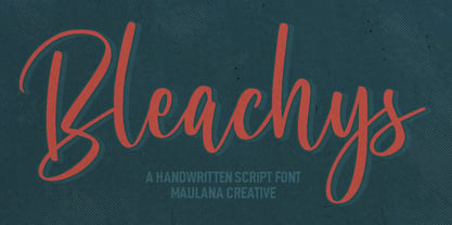 Bleachys is a modern casual script font. With high contrast stroke, fun character with a bit of ligatures and alternates. To give you an extra creative work. Bleachys font support multilingual more than 100+ language. This font is good for logo design, Social media, Movie Titles, Books Titles, a short text even a long text letter and good for your secondary text font with sans or serif. Make a stunning work with Bleachys font. Cheers, Maulana Creative

