10,000 search results
(0.129 seconds)
- ITC Modern No. 216 by ITC,
$40.99 Modern typefaces refer to designs that bear similarities to Bodoni and other Didone faces, which were first created during the late 1700s. Ed Benguiat developed ITC Modern No. 216 in 1982 for the International Typeface Corporation (ITC). Showing a high degree of contrast between thick and thin strokes, as well as a large x-height, this revival is more suited to advertising display purposes than the setting of long running text, or books. Many traits in Benguiat's design are worth further notice. The thick stems of the roman weights have a very stately, solid presence. Their thin serifs have been finely grafted on, a masterful solution to the challenge of bracketing presented by Modernist designs. The italic weights have a very flowing, script-like feel to them, and the letters take the form of true italics, not obliques. The ITC Modern No. 216 family contains the following font styles: Light, Light Italic, Medium, Medium Italic, Bold, Bold Italic, Heavy, and Heavy Italic.
 - Couture Facile by Nathatype,
$29.00 Adding some beauty touches and perfect, unique styles to your designs, without which your designs will be incomplete and ignored, may be tough work and time-consuming. Therefore, Couture Facile is here to help you. Couture Facile is a handwriting-like script font to add combinations of beauty and styles to your designs properly. Its dissimilar, more natural shapes looking spontaneously written are the font’s main characters. In addition, its letters’ details show high contrasts in curvy, sharp scratches on the letters’ edges. Couture Facile shows personal, elegant, creative impressions to the designs and is suitable to apply for either big or small text sizes due to its great legibility. You can also enjoy the available features here. Features: Stylistic Sets Ligatures Multilingual Supports PUA Encoded Numerals and Punctuations Couture Facile fits best for various design projects, such as brandings, headings, magazine covers, quotes, invitations, greeting cards, printed products, merchandise, social media, etc. Find out more ways to use this font by taking a look at the font preview. Thanks for purchasing our fonts. Hopefully, you have a great time using our font. Feel free to contact us anytime for further information or when you have trouble with the font. Thanks a lot and happy designing.
 - Kristall H MfD Pro by Elsner+Flake,
$99.00 The design of Kristall Grotesk is based on a cut by Wagner & Schmidt, Leipzig, from the 30s of the last century. The basis for the digital version of the Stiftung Werkstattmuseum für Druckkunst , Leipzig was the standard font (28p) of the manual cuts as offered by the font foundry Johannes Wagner, Ingolstadt. The implementation was deliberately created as a replica to create a faithful reproduction as a starting point for the design of other design sizes. The present Kristall Grotesk is therefore a headline design. The appearance of the typeface can be varied by a number of alternative forms of capitals, which, according to the taste of the time, contain either pointed or flat formations. Designer: Hausschnitt Johannes Wagner, Leipzig, Redesign Elsner+Flake, Hamburg Designdate: 1937, 2009 Publisher: Elsner+Flake Design Owner: Stiftung Werkstattmuseum für Druckkunst , Leipzig Original Foundry: Wagner & Schmidt, Leipzig
 - Madison Street by Studioways,
$40.00 Madison Street is a font family with 8 fabulously fun typefaces! Eliza Gwendalyn & Jim Lyles of Studioways have teamed up with Spencerian calligrapher Elaina DeBoard to create a classic pointed pen calligraphy font. From its ornamental monograms, to its variety of complimentary text styles, and to its Madison Street Pro, with its elegant stylistic swashes and OpenType goodies, there is a font for every designer. Enjoy the sleek Madison Street Sans, Serif or Script, paired with the Ornaments font, complete with ornate monograms, or use each typeface on its own! Madison Street Pro has all the OpenType bells and whistles. The Ligature feature automatically substitutes beginning and ending letterforms, as well as 100 ligatures. Turn on the Swash feature for elegantly sweeping swash lowercase forms. Enable Stylistic Alternates for even more variations. There are also 10 Style Sets to chose from. And many more OT features! Madison Street is a basic version of the Pro font, intended for users who do not have OpenType savvy applications. Madison Street Stylistic is also a basic version of the Pro font, intended for users who do not have OpenType savvy applications. It has stylistically different ascenders and descenders. Madison Street Swash is intended to be used with the basic fonts, Madison Street and Madison Street Stylistic. It has lowercase beginning and ending swash glyphs and cannot be used to set text by itself. Madison Street Sans, Serif, and Script are text fonts modeled after the handwriting of Elaina. They are intended to be complimentary to any of the script fonts. However, you'll need to set them at a smaller point size (about 1/3 the size) in order to get the preferred scale and weight. Finally, the hairline weight of the Madison Street script fonts is very thin, and at small sizes up to 40 pt, you may notice some breaking up when printing to desktop printers. To remedy this, we recommend outline stroking the text a small amount (.1 -.3 value). this should improve the output without adding to much weight overall.
 - Rosanthie by Anomali Creative,
$19.99 Greeting the new day! Start with a new handwriting, it will make your work more creative! Introducing Rosanthie - Signature Script Font by Anomali Creative! Rosanthie is Signature script is handmade signature style font with stunning characters. Ideal for logos, name tag, handwritten quotes, product packaging, merchandise, social media & greeting cards. It contains a full set of lower & uppercase letters, a large range of punctuation, numerals, and multilingual support. This font can be used with all software that can read standard fonts. ------------------------------------------------------ Check out my instagram: www.instagram.com/anomali_studio Thanks so much for checking out my shop! All the best, Krisna Teja
 - Rosie Brown by Letterhend,
$17.00 Rosie Brown is a pair of font that brings the modern and casual feel in the same time. The pretty high contrast serif combined with the natural hand writing script are the perfect match for you who needs a typeface for headline, logotype, apparel, invitation, branding, packaging, advertising etc. Features : 2 fonts (serif and script font) uppercase & lowercase numbers and punctuation multilingual alternates & ligatures PUA encoded We highly recommend using a program that supports OpenType features and Glyphs panels like many of Adobe apps and Corel Draw, so you can see and access all Glyph variations.
 - Broisther by Hanzel Space,
$25.00 Say hello Broisther, a handwritten script font inspired by handwriting with an aesthetic touch. Broisther is versatile enough for both web and print and can be used in a variety of projects such as stationery, packaging, apparel, wedding stationery, prints, quotes, social media graphics, planners, greeting cards, logos, branding, and much much more. The script includes a set of uppercase characters, numerals, symbols, two lowercase letter sets, and a total of 28 ligature. Full Set of standard alphabet and punctuation Extra set of ending swashed lowercase Handwritten ligatures Thanks so much for checking out my shop! Happy creating! Cheers!
 - House of Montague by IKIIKOWRK,
$17.00 Introducing House of Montague - Classic Font Duo, created by ikiiko. House of Montague is a traditional font for the classic serif type with the addition of a script type. A simple font, with a thin size, adds an elegant and classy impression. This typeface is perfect for an elegant logo, branding, travel promotion, layout magazine, beauty product, packaging product, quotes, or simply as a stylish text overlay to any background image. What's included? Regular & Script Uppercase & Lowercase Number & Punctuation Multilingual Support Enjoy our font and if you have any questions, you can contact us by email : ikiikowrk@gmail.com
 - Anggie Display by Gatype,
$18.00 Anggie Display is an elegant script with a creative mood and perfect form, inspired by today's beautiful serif Display. thick, balanced and varied, born for luxury and beauty. In my example I show how this script can be used. It's great for logotypes, branding, wedding invitations, romantic cards, alcohol labels, packaging, name spelling and more. Anggie Displaycomes with beautiful uppercase and lowercase letters, numbers, and punctuation. In addition to the main character set, there are many alternative characters, early and late sweeps. Available Fonts: . Multilingual. . Ligature. . Swash. . Stylistic Set. If you have any questions don't hesitate to contact me! Thank you,
 - Kevlar by Letterbox,
$50.00 Kevlar was initially inspired by an obscure logo discovered in a 1960s radio-fan magazine. Of immediate interest was that the upper half of the typeface appeared to be a sans while the lower half appeared as a curious blend of a slab serif imbued with a script-like quality. First came Kevlar Bold in 2003, closely followed by its text weight companion Kevlar Regular. The original source of the inspiration as then revisited to develop the third in the set, Kevlar Slab, a truly individual mix of script-like fluency with the heavy weight base of a slab serif.
 - Revolage by FallenGraphic,
$15.00 Revolage. Revolage is a vintage sans serif and script including Rough, & Clean versions as well as Oblique versions . Revolage is a versatile sans serif and script typeface that gives a vintage aesthetic. With it’s unique & distinct characteristics it sets itself apart, while also maintaining a strong timeless appeal overall. Textured versions allow Revolage to be a complete set without the need for 3rd party effects to create a printed look, eliminating a step in the process of finalizing your piece FEATURES : Character Set A-Z Numberal Accents (Multilingual characters) PUA encode Alternates Ligature MULTiLINGUAL ACCENT žŠŒšŸÀÁÂÃÄÅÆÇÈÉÊËÌÍÎÏÐÑÒÓÔÕÖØÙÚÛÜÝßàáâãäåæçèéêëìíîïðñòóôõöøùúûüýÿ
 - SHAPIRIT by ME Typography,
$59.00 The Shapirit family belongs to a category of geometric sans sherif fonts, that was created in 1920s. The main feature of this category is geometric architecture of shapes. Shapirit family is perfect for headlines, brief texts used on any screen, print materials as well as logos. The whole family includes 8 fonts from Thin to Black and contains full Hebrew and Latin script. Therefore, Shapirit is an ideal solution for any adaptation into Hebrew or any Latin script language. The word "Shapirt" (in Hebrew שפירית) means dragonfly. The font’s name was inspired by the dragonfly’s slim and elegant body.
 - Gingo by Mans Greback,
$29.00 Gingo is a wild brush script. The typeface was drawn and created by Måns Grebäck between 2018 and 2020. Its thick strokes are inspired by mid-century advertising, is full of spirit and progressiveness. The handwritten family consists of three weights: Gingo Thin, Gingo Medium and Gingo Bold. Its multiple alternate alphabets gives the font a true handwritten feeling. Use it for a logotype, a greeting card or as a headline. The font contains all characters you'll ever need, including all punctuation and numbers. It has an extensive lingual support, covering all European Latin-based scripts.
 - Halau Spooky by Vintage Voyage Design Supply,
$12.00 Introducing you a cartoon font family straight for your Halloween or other horror events. A wide range of variations completely satisfy the most sophisticated font gourmet. From Thin to Bold horror sans styles and a fancy horror script. Also, 62 Halloween graphic elements come as a Graphic Style! Each font has Normal and Roughen Styles. All sans serif's come as filled, inlined and inline separately. 33 typefaces total. • Halau Script has two uppercase letters sets and a lot of alternates included swashes. Halau Sans also has few alternate symbols and pair of ligatures (fj, fi). Trick or treat, folks. Enjoy!
 - Sunshine Valley by Letterhend,
$19.00 Introducing, Sunshine Valley Script - a romantic monoline script. A simple hand writing with natural signature style. This type of font perfectly made to be applied especially in logo, and the other various formal forms such as invitations, labels, logos, magazines, books, greeting / wedding cards, packaging, fashion, make up, stationery, novels, labels or any type of advertising purpose. Features : uppercase & lowercase numbers and punctuation multilingual alternates and ligatures swashes PUA encoded We highly recommend using a program that supports OpenType features and Glyphs panels like many of Adobe apps and Corel Draw, so you can see and access all Glyph variations.
 - Big Chuck by Proportional Lime,
$1.99 Charlemagne, one of the great rulers of the Middle Ages, was instrumental in the reestablishment of formal education in the West. This font was inspired by the notion that he felt the need to protect his communications from people with the ability to read; a rare skill then. Did he really command such a script to exist? He did instigate the development Carolingian minuscule script. Here are two different systems that are both attributed to him. Does it provide any real security? No, but it is fun to think about how such a system might have been used.
 - Rimeland by Letterhend,
$19.00 Introducing, Rimeland Script - A beautiful modern calligraphy script based on manual hand writing. The natural flow with the swashes make this font looks even more prettier. This type of font perfectly made to be applied especially in wedding invitation, labels, logos, magazines, books, greeting / wedding cards, packaging, fashion, make up, stationery, novels, labels or any type of advertising purpose. Features : uppercase & lowercase numbers and punctuation multilingual swash and ligature alternates PUA encoded We highly recommend using a program that supports OpenType features and Glyphs panels like many of Adobe apps and Corel Draw, so you can see and access all Glyph variations.
 - Hallie Thompson by Letterhend,
$17.00 Hallie Thompson is a pair of font that brings the modern and elegant feel in the same time. The serif combined with the natural hand writing script with signature style are the perfect match for you who needs a typeface for headline, logotype, apparel, invitation, branding, packaging, advertising etc. Features : 2 fonts (serif and script font) uppercase & lowercase numbers and punctuation multilingual alternates & ligatures PUA encoded We highly recommend using a program that supports OpenType features and Glyphs panels like many of Adobe apps and Corel Draw, so you can see and access all Glyph variations.
 - Nacinth by Mans Greback,
$29.00 Nacinth is a wild calligraphy script. The typeface was drawn and created by Måns Grebäck between 2018 and 2020. Its open shapes are inspired by mid-century advertising, is full of life and emits liberty and optimism. The handwritten family consists of three weights: Nacinth Thin, Nacinth Medium and Nacinth Bold. Its multiple alternate alphabets gives the font a true handwritten feeling. Use it for a logotype, a greeting card or as a headline. The font contains all characters you'll ever need, including all punctuation and numbers. It has an extensive lingual support, covering all European Latin-based scripts.
 - Captivate by Letterhend,
$19.00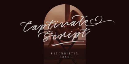 Introducing, Captivate Script - A beautiful modern calligraphy script based on manual hand writing. The natural flow with the swashes make this font looks even more prettier. This type of font perfectly made to be applied especially in wedding invitation, labels, logos, magazines, books, greeting / wedding cards, packaging, fashion, make up, stationery, novels, labels or any type of advertising purpose. Features : uppercase & lowercase numbers and punctuation multilingual swash and ligature alternates PUA encoded We highly recommend using a program that supports OpenType features and Glyphs panels like many of Adobe apps and Corel Draw, so you can see and access all Glyph variations.
 - Rachele by Resistenza,
$39.00 Rachele is a mono line based script thin font. Inspired on the cute “Italian Bella Scrittura” handwriting but influenced by Spencerian. Ornaments and ligatures make this hand more expressive offering round stroke endings and a flowing shape. Rachele is a big family, its stroke expand into extra light till medium and passing through a calligraphic/ribbon effect. At the same time the width varies, that’s make this script even more flexible, from Ultra Condensed to Super Extended. Enjoy it. Check out also Check out also ‘Mentha’ based on Rachele’s skeleton. We recommend to combine Rachele with: Turquoise
 - Baghadeer by Stephen Rapp,
$49.00 Baghadeer, from the hand of Stephen Rapp, is an upright connecting script brimming with personality. With its exuberant capitals, dashing crossover strokes, and rhythmic pulse; it retains the active spirit most associated with slanted scripts, but with the grounded presence of an upright. Baghadeer contains 780 glyphs featuring a plethora of swashes, ligatures, and alternate letters to individualize the look of your project. There is also a set of small caps and ornamental flourishes to add some finishing touches. It contains feature programming to make typesetting seamless and has all the language coverage you'd expect in a pro font.
 - Italix by Punch,
$45.00 Italix is an easygoing font family with mainly 4 script styles (Fineliner, Brushpen, Marker & Fatstick) and 7 supportive AllCaps fonts. Each script has its own unique personality, and come with optional ink splatters. These are attached to several ligatures, so don’t forget to activate the “OpenType Features” and the “World Ready Composer” in the application settings. The cool thing about Italix is that you can have a lot of creative fun with it, and its multiple features. Brushpen has a more classic look, Fineliner is a bit quirky, Marker is the chill one, and Fatstick is a total badass!
 - Livington by Skinny Type,
$12.00 Livington is a handwritten SVG font that has the look and feel of a true hand drawing. The handwritten Livington font requires Photoshop CC 2017 or Illustrator CC 2018 (or later) to work, but the OTF Livington Script doesn't require any special software and can be used on any computer and on any software. INCLUDING: Livington SVG handwriting font Livington All Caps font LANGUAGE SUPPORT: Please note that the Livington SVG Handwritten Font is English only, but Livington's script contains the following characters: aàáâÃäåcçdðeèéêëiìíîïnñoøòóôõöuùüúill, Danish, English, French, German, German (Switzerland), Norwegian Bokmål, Portuguese, Spanish, Swedish, Swiss German. Thank you!!
 - Corner Deli by Fenotype,
$25.00 Corner Deli is a layered script & sans pack inspired by American commercial sign culture. Corner Deli has three base fonts and four layer options for each + there is a set of extra end swashes for Corner Deli script and layers for them too. Corner Deli is easy to use, just write the same text with different layer-fonts and colors and stack them on top of each other: check the gallery for more detailed instructions. Corner Deli is a great family for any display use, especially for branding, packaging, menus & posters from print to online and it works stunning even without the layers.
 - Mimosa by Pelavin Fonts,
$25.00 The inspiration for Mimosa comes directly from the packaging for “Moulinard Jeune”, a line of French toiletries from the 1920s. I created the 240-odd glyphs needed to make up a complete font based upon the style of a handful of hand-lettered characters that were used on the original items. Mimosa is a mono-weight, connecting vertical script with a fairly regular set of lower case and slightly more decorative upper case glyphs. As with any decorative script, if you set copy in all caps, you will be tracked down and severely punished by the type police.
 - Lombriz by Sudtipos,
$79.00 Lombriz attempts to bridge the gap between different kinds of typography - including packaging, signage, and sporting. The result is a heavy, yet casual, 1950s-inspired semi-connected script. The freestyle Lombriz feels friendlier, more readable, and a touch more ‘real’ than most scripts of its kind. In certain settings, the thickness of the stroke in the capital letters accentuates, while the lowercase flows like casual, brush-drawn letters should. Lombriz comes equipped with more than 50 alternates and custom ligatures. These extras are conveniently tucked into the OpenType version for those programs that support such functionality.
 - Indenture English Penman by Intellecta Design,
$66.00 Indenture English Penman is based on research into original English and American indenture contracts from the eighteenth and nineteenth centuries, mostly with roundhand scripts, paragraph versals in Old English script and many, many flourishes. This font has a little of everything, with hundreds of glyphs: dozens of versals to each alphabet letter, some versals in Old English style, plus flourishes to use at beginnings of paragraphs or chapters, and many additional flourishes to create perfect ancient documents. To better use the resources of this font we suggest using the Glyphs resource in Illustrator and other software.
 - Vatella by Ws Studio,
$15.00 Vatella is a vintage-inspired calligraphy script font, perfect for the elegant touch needed for logos, wedding invitations, modern websites, greeting cards and more! Included is a full set of uppercase swash letters, as well as a final lowercase swash version, for a more custom branded look. Thank you so much for checking out my shop. Vatella Script Features Complete Set of standard alphabet and punctuation marks Additional set of washed initial capital letters Additional set of brushed lowercase endings Alternate extra styles and fasteners PUA Encoded - no special software required to access additional swashed characters Multilingual Characters (ÁÂÄÀÅÃÆÇÐÉÊËÈÍÎÏÌÑÓÔÖÒØÕŒÞÚÛÜÙẂŴẄẀÝŶŸỲ áâäàåãæçðéêëèíîïìñóôöòøõœþßúûüùẃŵẅẁýŷÿỳŠŽšž€£¥ªº)
 - Poster Brush by Fenotype,
$18.00Poster Brush is a hand drawn font pair with lots of character. Poster Brush is packed with OpenType features - Contextual Alternates changes prevents identical double letters from being next to each other. With Stylistic Alternates you can manually change the letters. When you turn on Discretionary Ligatures you’ll get interlocking ligatures when typing with caps. Poster Brush Script is equipped with Standard Ligatures and Contextual Alternates to keep the flow smooth. It also has Swash alternates for certain letters. Poster Brush & Poster Brush Script work great together or as themselves. For the best price purchase the whole family. - Rolling by Gatype,
$14.00 Introducing Rolling - a typeface inspired by classic style script. This font has many alternative styles, and ligatures, so you can play around with it using the OpenType feature and create letters with a natural touch. This type of font is perfectly made to be applied especially to logos, and various other formal forms such as invitations, labels, logos, magazines, books, greeting/wedding cards, packaging, fashion, make-up, stationery, novels, labels, or whatever. type of advertising objective. The script includes a set of uppercase characters, numbers, Alternates, etc. Thank you very much for viewing and Enjoying it.
 - Handelson by Melvastype,
$29.00 Handelson is a collection of 6 handmade typefaces with authentic and organic feel. It contains three scripts, one non-connected script and two all caps geometric sans serifs (Block letters). Textures and rough edges are simulating handwritten and printed looks. By combining these fonts you can make diverse typographic solutions and elements with unified style. All the non-connected fonts; Handelson Two, Handelson Four, Handelson Five and Handelson Six has two sets of characters. By enabling Contextual Alternates from the OpenType panel you can make these letters vary randomly to make your text look more like real handwriting.
 - Good Karma Smooth by Positype,
$15.00 Good Karma (its namesake) will be extended to you as you use this new relaxed script family. Originally, produced from hand and the sumi brush of Neil Summerour, Good Karma Smooth is a smooth digitization of the original exemplars in Good Karma. Good Karma Smooth is filled with a lot of heart, reliable and genuine movements, and a wide range of letter options to befit any project needing an honest hand-lettered look. And on top of that, proceeds form the sale of this typeface will be distributed to charities and organizations intent on combatting the Covid-19 global pandemic. Each typeface comes with an additional set of stylistic alternates (upper AND lowercase) that harmonize wonderfully when you have the Opentype Ligature feature active. Additionally, special double-letter ligatures have been produced for specific combinations in need of more expressive flair, as well as a few swashes that work with the economical strokes originally produced from the sumi brush. To further expand the usefulness of this peaceful script, a separate Caps/Small Caps font has been added that provides the simple contrast needed to bring the script fonts forward. Rather than limit the personality of this script, various styles have been produced to complement the original Regular—Upright, Wide, Wide Upright, and the aforementioned Caps fonts are included in hopes of helping you find the perfect variation needed for your composition.
 - Maiers Nr 21 Pro by Ingo,
$42.00 A handwritten ”font for technicians“ from ca. 1900. Very geometrical, rigid forms borrowed from the typical characteristics of Jugendstil / Art Nouveau. This script is found in a magazine from the Otto Maier publishing house, Ravensburg, which was issued sometime in the years shortly before WWI. The magazine is entitled ”Schriften-Sammlung für Techniker: Verkleinerte Schriften der wichtigsten Alphabete“ (Collection of scripts for technical specialists: reduced scripts of the most significant alphabets) and published by Karl O. Maier. The original copy, produced by means of a galvanized plate, is just 7 centimeters wide. It served as the model for technical professions in which, at that time, the captions of drawings were still done by hand. The characters have been scanned, digitized and greatly magnified. Special attention was given to ensure the ”uneven“ edges, typical of handwritten script, remained effectively noticeable even in the digitized form. As a result, this ”technical“ font retains a handmade touch. Especially worthy of note are the Jugendstil forms characteristic at the turn of the19th century. In comparison, many alleged ”ultramodern“ font types of today suddenly look quite old-fashioned. Maier’s Nr. 21 Pro is suitable for all European languages. It includes ”Latin Extended-A,“ for Central and Eastern Europe incl. Turkish, and even Cyrillic and Greek, too. The font includes several stylistic alternates as well as a number of ligatures.
 - Univers by Linotype,
$42.99 The font family Univers? is one of the greatest typographic achievements of the second half of the 20th century. The family has the advantage of having a variety of weights and styles, which, even when combined, give an impression of steadiness and homogeneity. The clear, objective forms of Univers make this a legible font suitable for almost any typographic need. In 1954 the French type foundry Deberny & Peignot wanted to add a linear sans serif type in several weights to the range of the Lumitype fonts. Adrian Frutiger, the foundry's art director, suggested refraining from adapting an existing alphabet. He wanted to instead make a new font that would, above all, be suitable for the typesetting of longer texts - quite an exciting challenge for a sans-serif font at that time. Starting with his old sketches from his student days at the School for the Applied Arts in Zurich, he created the Univers type family. In 1957, the family was released by Deberny & Piegnot, and afterwards, it was produced by Linotype. The Deberny & Peignot type library was acquired in 1972 by Haas, and the Haas'sche Schriftgiesserei (Haas Type Foundry) was folded into the D. Stempel AG/Linotype collection in 1985/1989. Adrian Frutiger continues to do design work with Linotype right up to the present day. In 1997, Frutiger and the design staff at Linotype completed a large joint project of completely re-designing and updating the Univers family. The result: Univers Next - available with 59 weights and 4 Linotype Univers Typewriter weights. With its sturdy, clean forms Univers can facilitate an expression of cool elegance and rational competence. Univers has the uncanny ability to combine well with fonts of many different styles and origins: Old style fonts such as: Janson Text, Meridien, Sabon, Wilke. Modern-stressed fonts such as: Linotype Centennial, Walbaum. Slab serif fonts such as Egyptienne F, Serifa. Script and brush fonts such as: Brush Script, Mistral, Ruling Script. Blackletter fonts such as: Duc De Berry, Grace, San Marco. Even fun fonts such as F2F OCRAlexczyk, Linotype Red Babe, Linotype Seven."
 - Evita by ITC,
$29.99Gérard Mariscalchi is a self-made designer. Born in Southern France of a Spanish mother and an Italian father, he has worked as a mechanic, salesman, pilot, college teacher – even a poet (with poetry being the worst-paying of these professions, he reports.) “Throughout all this, the backbone of my career has always been design,” Mariscalchi says. “I’ve been drawing since I was five, but it wasn’t until I was twenty-four that I learned that my hobby could also help me earn a living.” It was about this same time that Mariscalchi fell in love with type. He studied the designs of masters like Excoffon, Usherwood and Frutiger, as well as the work of calligraphers and type designers such as Plantin, Cochin and Dürer. With such an eclectic background, it’s no surprise that Mariscalchi’s typeface designs are inspired by many sources. Baylac and Evita reflect the style of the art nouveau and art deco periods, while Marnie was created as an homage to the great Lithuanian calligrapher Villu Toots. However, the touch of French elegance and distinction Mariscalchi brings to his work is all his own. Baylac Who says thirteen is an unlucky number? Three capitals and ten lowercase letters from a poster by L. Baylac, a relatively obscure Art Nouveau designer, served as the foundation for this typeface. The finished design has lush curves that give the face drama without diminishing its versatility. On the practical side, Baylac’s condensed proportions make it perfect for those situations where there’s a lot to say and not much room in which to say it Evita Mariscalchi based the design of Evita on hand lettering he found in a restaurant menu, and considers this typeface one of his most difficult design challenges. “The main problem was to render the big weight difference between the thin and the thick strokes without creating printing problems at small point sizes,” he says. Unlike most scripts, Evita is upright, with the design characteristics of a serif typeface. Mariscalchi named the face for a close friend. The end result is a charming design that is light, airy, and slightly sassy. Marnie Based on Art Nouveau calligraphic lettering, Marnie is elegant, inviting, and absolutely charming. Mariscalchi paid special attention to letter shapes and proportions to guarantee high levels of character legibility. He also kept weight transition in character strokes to modest levels, enabling the face to be used at relatively small sizes – an unusual asset for a formal script. Marnie’s capital letters are expansive designs with flowing swash strokes that wrap affectionately around adjoining lowercase letters. The design easily captures the spontaneous qualities of hand-rendered brush lettering. - Baylac by ITC,
$29.99Gérard Mariscalchi is a self-made designer. Born in Southern France of a Spanish mother and an Italian father, he has worked as a mechanic, salesman, pilot, college teacher – even a poet (with poetry being the worst-paying of these professions, he reports.) “Throughout all this, the backbone of my career has always been design,” Mariscalchi says. “I’ve been drawing since I was five, but it wasn’t until I was twenty-four that I learned that my hobby could also help me earn a living.” It was about this same time that Mariscalchi fell in love with type. He studied the designs of masters like Excoffon, Usherwood and Frutiger, as well as the work of calligraphers and type designers such as Plantin, Cochin and Dürer. With such an eclectic background, it’s no surprise that Mariscalchi’s typeface designs are inspired by many sources. Baylac and Evita reflect the style of the art nouveau and art deco periods, while Marnie was created as an homage to the great Lithuanian calligrapher Villu Toots. However, the touch of French elegance and distinction Mariscalchi brings to his work is all his own. Baylac Who says thirteen is an unlucky number? Three capitals and ten lowercase letters from a poster by L. Baylac, a relatively obscure Art Nouveau designer, served as the foundation for this typeface. The finished design has lush curves that give the face drama without diminishing its versatility. On the practical side, Baylac’s condensed proportions make it perfect for those situations where there’s a lot to say and not much room in which to say it Evita Mariscalchi based the design of Evita on hand lettering he found in a restaurant menu, and considers this typeface one of his most difficult design challenges. “The main problem was to render the big weight difference between the thin and the thick strokes without creating printing problems at small point sizes,” he says. Unlike most scripts, Evita is upright, with the design characteristics of a serif typeface. Mariscalchi named the face for a close friend. The end result is a charming design that is light, airy, and slightly sassy. Marnie Based on Art Nouveau calligraphic lettering, Marnie is elegant, inviting, and absolutely charming. Mariscalchi paid special attention to letter shapes and proportions to guarantee high levels of character legibility. He also kept weight transition in character strokes to modest levels, enabling the face to be used at relatively small sizes – an unusual asset for a formal script. Marnie’s capital letters are expansive designs with flowing swash strokes that wrap affectionately around adjoining lowercase letters. The design easily captures the spontaneous qualities of hand-rendered brush lettering. - Marnie by ITC,
$29.99Gérard Mariscalchi is a self-made designer. Born in Southern France of a Spanish mother and an Italian father, he has worked as a mechanic, salesman, pilot, college teacher – even a poet (with poetry being the worst-paying of these professions, he reports.) “Throughout all this, the backbone of my career has always been design,” Mariscalchi says. “I’ve been drawing since I was five, but it wasn’t until I was twenty-four that I learned that my hobby could also help me earn a living.” It was about this same time that Mariscalchi fell in love with type. He studied the designs of masters like Excoffon, Usherwood and Frutiger, as well as the work of calligraphers and type designers such as Plantin, Cochin and Dürer. With such an eclectic background, it’s no surprise that Mariscalchi’s typeface designs are inspired by many sources. Baylac and Evita reflect the style of the art nouveau and art deco periods, while Marnie was created as an homage to the great Lithuanian calligrapher Villu Toots. However, the touch of French elegance and distinction Mariscalchi brings to his work is all his own. Baylac Who says thirteen is an unlucky number? Three capitals and ten lowercase letters from a poster by L. Baylac, a relatively obscure Art Nouveau designer, served as the foundation for this typeface. The finished design has lush curves that give the face drama without diminishing its versatility. On the practical side, Baylac’s condensed proportions make it perfect for those situations where there’s a lot to say and not much room in which to say it Evita Mariscalchi based the design of Evita on hand lettering he found in a restaurant menu, and considers this typeface one of his most difficult design challenges. “The main problem was to render the big weight difference between the thin and the thick strokes without creating printing problems at small point sizes,” he says. Unlike most scripts, Evita is upright, with the design characteristics of a serif typeface. Mariscalchi named the face for a close friend. The end result is a charming design that is light, airy, and slightly sassy. Marnie Based on Art Nouveau calligraphic lettering, Marnie is elegant, inviting, and absolutely charming. Mariscalchi paid special attention to letter shapes and proportions to guarantee high levels of character legibility. He also kept weight transition in character strokes to modest levels, enabling the face to be used at relatively small sizes – an unusual asset for a formal script. Marnie’s capital letters are expansive designs with flowing swash strokes that wrap affectionately around adjoining lowercase letters. The design easily captures the spontaneous qualities of hand-rendered brush lettering. - Nouveau Thin JNL by Jeff Levine,
$29.00 A condensed, light face spurred serif alphabet was shown on an antique catalog page from Spon & Chamberlain Publishers as “French”. The catalog likely sold tools and dies to stonecutters for making inscriptions in marble, granite and so forth. This elegant design is available digitally as Nouveau Thin JNL in both regular and oblique versions.
 - WildSong by Scholtz Fonts,
$19.00 WildSong was inspired by the exuberant flight and beautiful song of birds. While most brush scripts take their cue from mid-twentieth century samples, WildSong is a fresh, contemporary alternative. WildSong reflects a dynamic interplay between dark and light, creating a sense of drama while hinting at a calligraphic background. Words suggest a baseline, yet are not bound by it. Letters interweave in a seemingly random dance, sometimes connecting smoothly, then breaking that connection as a calligraphic scribe does intuitively. Exuberant swash alternatives to uppercase letters, as well as ligatures can be accessed through both the type and glyph palettes. The font contains over 235 characters - (upper and lower case characters, punctuation, numerals, symbols and accented characters are present). It has all the accented characters used in the major European languages.