2,796 search results
(0.027 seconds)
- Scottish by Maulana Creative,
$14.00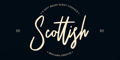 Give your designs an authentic handcrafted feel. "Scottish Brush Script Typeface" is perfectly suited to signature, stationery, logo, typography quotes, magazine or book cover, website header, clothing, branding, packaging design and more. Thanks for use this font. MaulanaCreative
 - Premier by ITC,
$29.99Premier font was designed by Colin Brignall. Premier Lightline displays all the elegance and sophistacation of the 1920s and 30s and consists of a refined lowercase with high ascenders and generous capitals which can also be used alone. Premier Shaded is an all caps typeface which provides a robust counterpart to the fine elegance of Premier Lightline. Premier Shaded should be used with close or ever overlapping letter spacing and is ideal for strong, eye-catching headlines. - Premier League with Lion Number - Personal use only

- Scottish Vignetes by Intellecta Design,
$19.95 - Scottish Opulent by Timurtype,
$14.00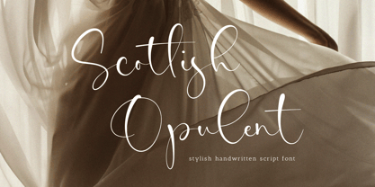 Introducing by Timur type Proudly Present, Scottish Opulent Scottish Opulent A Handwritten Font Scottish Opulent is perfect for product packaging, branding project, megazine, social media, wedding, or just used to express words above the background. Scottish Opulent also multilingual support. Enjoy the font.Thank you!
 - Kremlin Premier - Unknown license

- Premiere Christmas by Aldedesign,
$25.00 Premiere Christmas // Modern Calligraphy is a stylish script font that features a varying baseline, smooth line, modern, and depth of love. For those of you who need a touch of love and modernity for your designs or branding, it can be used for various purposes such as headings, weddings, invitations, signatures, logos, branding, t-shirt, letterhead, signage, labels, news, posters, badges, etc. Each Font Has: Stylish modern handwritten script Beautiful Swash (Ending tail) Beautiful Titling (Beginning tail) Special Ligatures Multilingual Support
 - Premiere California by Letterena Studios,
$9.00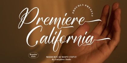 Premiere California is a lovely and timeless handwritten font. It is the best choice for creating eye catching logos, branding and quotes. This font is PUA encoded which means you can access all of the glyphs and swashes with ease!
 - Garamond Premier by Adobe,
$35.00Claude Garamond (ca. 1480-1561) cut types for the Parisian scholar-printer Robert Estienne in the first part of the sixteenth century, basing his romans on the types cut by Francesco Griffo for Venetian printer Aldus Manutius in 1495. Garamond refined his romans in later versions, adding his own concepts as he developed his skills as a punchcutter. After his death in 1561, the Garamond punches made their way to the printing office of Christoph Plantin in Antwerp, where they were used by Plantin for many decades, and still exist in the Plantin-Moretus museum. Other Garamond punches went to the Frankfurt foundry of Egenolff-Berner, who issued a specimen in 1592 that became an important source of information about the Garamond types for later scholars and designers. In 1621, sixty years after Garamond's death, the French printer Jean Jannon (1580-1635) issued a specimen of typefaces that had some characteristics similar to the Garamond designs, though his letters were more asymmetrical and irregular in slope and axis. Jannon's types disappeared from use for about two hundred years, but were re-discovered in the French national printing office in 1825, when they were wrongly attributed to Claude Garamond. Their true origin was not to be revealed until the 1927 research of Beatrice Warde. In the early 1900s, Jannon's types were used to print a history of printing in France, which brought new attention to French typography and the Garamond" types. This sparked the beginning of modern revivals; some based on the mistaken model from Jannon's types, and others on the original Garamond types. Italics for Garamond fonts have sometimes been based on those cut by Robert Granjon (1513-1589), who worked for Plantin and whose types are also on the Egenolff-Berner specimen. Linotype has several versions of the Garamond typefaces. Though they vary in design and model of origin, they are all considered to be distinctive representations of French Renaissance style; easily recognizable by their elegance and readability. Garamond Pemiere Pro was designed by Robert Slimbach, and released in 2005." - Scotty by T-26,
$49.00 - JUSTICE LEAGUE - Personal use only

- Alien League - Unknown license

- VTF League by VarsityType,
$15.00 "VTF League" is a fully-kerned, hard working, 14-font athletic block display family. Its letterforms feature a synthesis of heavy verticals and lighter horizontals that create a steady visual rhythm, and chiseled terminals to help establish a competitive personality. Although developed for sports branding and similar projects, "VTF League" was inspired by the harmonized mix of sturdy, industrialized, no-nonsense typefaces and the brand uniqueness of local distilleries around Eastern Tennessee during a week-long moonshine tour in February 2018. As of July 2019, "VTF League" has been redeveloped to include a complete alphabet of uppercase, lowercase, and small cap alternates with 7 weights and oblique style variants for each. Enjoy!
 - Super League by Arkitype,
$12.00 Super League is a display typeface created for the sports industry. The typeface itself doesn't lean too much in a particular sports category direction which makes it versatile in use across various sporting categories. Super League has loads of. options to make use of including; small caps, stylistic alternates, ligatures for vs, st, nd, rd and th that are very useful when handling typography for sports in particular. Use Super League in all your printed material or on screen. Create badges or print names and numbers sports kits. All weights come with an oblique version which makes the total number of 16 fonts in this typeface.
 - Brevier by CAST,
$45.00 Compact sans, ideal for setting long texts in small or very small type sizes: for packaging, instruction booklets, drug information leaflets and anything else that has to be legible at very small sizes. Lean and rhythmical, designed ideally to be used at less than 8 points (Brevier was the old typefounders’ name for 8-point type), Brevier holds up well even under adverse printing conditions. The apparently geometric letterforms hide Renaissance characteristics, the x-height and openings are very generous and the strokes slightly modulated. In order to offset ink spread – which is inevitable when printing very small sizes of type – Brevier has large white spaces between the letters. All internal angles have deep ink traps and many connections have been left open.
 - Presser by Konstantine Studio,
$9.00 80s. , 90s, y2k, sometimes we just wonder, "what year is it today?" everything looks like we're going backward (in a good way though, calm down). Since luck is a form of preparation that meets a chance, again, we came up prepared. Introducing PRESSER. A new sans-serif family with the diverse vibes of nostalgia and modernism in one shot. ps: it's WIDE, like seriously wide, extended. We warned you.
 - Primer by Scriptorium,
$12.00 - Smith-Premier Typewriter by Intellecta Design,
$20.90 Smith-Premier Typewriter is a typewriter font design, great for mimicking the sloppy ink effect of older machines.
 - Smith Premier NF by Nick's Fonts,
$10.00In ye olden days, nothing said “personalized business correspondence” like a typewritten letter, and several type foundries cast simulated typewriter fonts so authentic-looking “personal” letters could be mass-produced. This typeface is based on one such font from a href="/foundry/atf/">American Type Founders, which was patterned after the letters of the Smith Premier No. 3. Both versions of the font include 1252 Latin and 1250 CE (with localization for Romanian and Moldovan) character sets. - League of Ages - Personal use only

- KR Little League - Unknown license

- Pro League 2020 by Alphabet Agency,
$20.00 Pro League 2020 font family is a sleek modern sans serif font family that provides italic and weight options that balance well with each other and provide various options for the user. If you are looking to present a clean, sleek professional look that is easy on the eyes - then this is a font family for you. Pro League 2020 font family contains 6 fonts - Pro League 2020 Condensed Regular, Pro League 2020 Condensed Regular Italic, Pro League 2020 Condensed Light, Pro League 2020 Condensed Light Italic, Pro League 2020 Condensed Extra Light and Pro League 2020 Condensed Extra Light Italic.
 - Premis by Fenotype,
$20.00 Do you often find yourself looking for a font that is universal and neutral on the one hand, and distinctive and special on the other? Here's one for you. Premis is a fairly broad font family that is suitable for versatile use, but still has plenty of original details, such as straight endings in the letters r, t and f. Equally current and timeless, Premis is available in three different widths. In terms of features, Premis is sensibly designed to meet demanding use, including, for example, capital letters and several different number styles. Make Premis your premise.
 - Beautilina Premium by Letterena Studios,
$9.00 Beautilina Premium is a sweet and delicate handwritten font. Dainty and joyful, this font will be ideal for writing wedding invitations, cards or any other design that may need a romantic, personalized touch! Beautilina Premium is PUA encoded which means you can access all of the glyphs and swashes with ease!
 - Premium Sans by ZeeshanFoundry,
$40.00 Premium Sans is a professional typeface which is aspired to solve the major typographic challenges in editorial, print, Graphic design, Commercial designs and other form of templates and documents such as pdf or ms word. It has four weights light, regular, semi bold, bold. Each with an italic profile, so in total it has 8 typefaces. We created this typeface to have attention of reader in Graphic commercial designs and as well as on editorial designs. The X-height plays a great role in readability of a typeface, so we tried to give it a reasonably high x-height with accordance to ascenders and descenders. We've engineered it in such a way that it can easily be paired with script, slab serif and serif typefaces. Premium sans is made on minimum required character set which will be handy while typing currency symbols like cents, dollars or euro and also be very useful when typing the characters consisting of diacritic. We've designed it in such a way that either you write a long content for editorial purposes or you create a typographic or graphic/commercial design it will look nice and fine which is the uniqueness of this font.
 - Les Palmiers by Sarid Ezra,
$19.00 Introducing, Les Palmiers, an old handwritten script! Les Palmiers is a vintage and rough handwritten script. This font include alternates and swash that will make your project more attractive. With rough and imperfect side, this font will also make your design looks more vintage and old. Les Palmiers also support multi language!
 - Lagu Serif by Alessio Laiso Type,
$20.00 Lagu Serif blends a geometric inspiration with warm humanist elements, making it the perfect choice for when you need a fresh, contemporary serif typeface. Alessio Laiso has designed Lagu Serif in 18 styles: 9 weights ranging from Thin to Black, with matching, beautiful italics. The companion Lagu Sans makes the Lagu family a real workhorse for any use, including web, digital, print, branding and signage. Lagu Serif has a large x-height and open counterforms, making it easily readable. It comes with powerful OpenType features, including ligatures, alternative glyphs, small caps, fractions, tabular figures, old-style figures, and more. The Lagu family supports 219 languages, covering 100% of the Latin Plus character set.
 - Lagu Sans by Alessio Laiso Type,
$20.00 Lagu Sans is a contemporary typeface that blends a geometric inspiration with a charming contrast between thick and thin strokes. Alessio Laiso has designed Lagu Sans in 18 styles: 9 weights ranging from Thin to Black, with matching, beautiful italics. The companion Lagu Serif makes the Lagu family a real workhorse for any use, including web, digital, print, branding and signage. Lagu Sans has a large x-height and open counterforms, making it easily readable. It comes with powerful OpenType features, including ligatures, alternative glyphs, small caps, fractions, tabular figures, old-style figures, and more. The Lagu family supports 219 languages, covering 100% of the Latin Plus character set.
 - Primer Print - Unknown license

- Primer™ - Unknown license

- Primer Apples - Unknown license

- Primer Print - Unknown license

- Bremer Presse by Schraube,
$29.00 As most successful German private press, «Bremer Presse» has strongly influenced German book art. It was founded 1911 in Bremen to print and produce books in perfection. The role model of the press’ typeface was the english Doves Press. Willy Wiegand drew three versions of the «Bremer Presse» antiqua font, starting with the regular weight in 16 pt and adding later the regular weights in 11 and 12 pt. The revival of this beautiful font is based on the 12 pt weight. During the design process, the focus was laid on finding the elegance and strength of original prints. As it was designed to print books, the typeface is optimally used for texts. And with the revival’s new weights «medium» and «bold» and OpenType features like ligatures or old style figures, you can design sophisticatedly typographical compositions.
 - Christmas Preference by Seemly Fonts,
$12.00 Christmas Preference is a clean, simple, and natural handwritten font. Not too thin and not too thick, balanced and varied, this font was designed to enhance the beauty of your projects.
 - Scottie and Judy - Unknown license

- Goth Stencil Premium - Personal use only

- Fell Type Premium by MAC Rhino Fonts,
$59.00 A new take on the classic typeface used at Oxford University Press. Carefully crafted from original sources and updated for the modern times. Size specific weights and meant to act as a work horse for longer texts. A joint venture between Stefan Hattenbach and Johan Ström.
 - Heraldic Devices Premium by Intellecta Design,
$16.90 A collection of shields, crowns and heraldry designs. Represents heraldry devices, Spanish city seals, world nations seals, coats of arms, helms, crowns, crests etc.
 - Film Preview JNL by Jeff Levine,
$29.00 An Oct. 7, 1931 advertisement in a British trade paper for the film industry carried the unusual title “The Bioscope Peaks of National Approval”. Just as unusual was the hand lettering for this ad – a quirky, casual bit of novelty typography that inspired Film Preview JNL; available in both regular and oblique versions.
 - Preferred Shares JNL by Jeff Levine,
$29.00 A bold, condensed slab serif face A July 9, 1935 trade paper ad for Paramount Pictures’ 1st quarter film releases sported hand lettering with chamfered slab serifs. This condensed type design is now available as Preferred Shares JNL in both regular and oblique versions.


Page 1 of 70Next page