10,000 search results
(0.03 seconds)
- Wieldy by Type Fleet,
$12.00 Wieldy crafted character Wieldy is a prime quality typeface rooted in the tradition of good craftsmanship, full of character and reach in details. Extended serifs, connected with dots, are just some design features this artisanal font can offer. Wieldy is based on the ahistoric forms developed by Central European Arts and Crafts movement. It is suitable for visual identities, packaging or book headings. The typeface’s x-height is around 72% of its capitals. The font is endowed with details, ligatures and special characters.
 - Orange Leafy by Attype Studio,
$12.00 Orange Leafy is an Autumn font duo with maple leaf display, Fall in love with it and bring your projects to the highest levels! Orange Leafy is perfect for Autumn branding, logo, invitation, stationery, social media post, product packaging, merchandise, blog design, game titles, cute style design, Book/Cover Title and more. What's Included : - Ligatures - Multilingual Support (Afrikaans, Albanian, Catalan, Danish, Dutch, English, Estonian, Finnish, French, German, Icelandic, Italian, Norwegian, Portugese, Spanisch, Swedish, Zulu) Hope you enjoy with our font! Attype Studio
 - Prime Century by Letterhend,
$14.00 Prime Century is an organic hand drawn font duo consist of a script paired with a sans serif with a touch of classic look and feel. This type of font perfectly made to be applied especially in logo, headline, signage and the other various formal forms such as invitations, labels, logos, magazines, books, greeting / wedding cards, packaging, fashion, make up, stationery, novels, labels or any type of advertising purpose. Features : Uppercase & lowercase Numbers and punctuation Alternates & Ligatures Multilingual PUA encoded
 - Caltic by Ingrimayne Type,
$12.95 Caltic-Holiday, Caltic-Festival, and Caltic-Straight are three eye-catching, very bold typefaces that are suitable for posters and signage. Caltic-Holiday and Caltic-Festival base letter shapes on trapezoids with curved sides but with curves that are reversed going from one to the other. Caltic-Straight has letters based on trapezoids with straight sides. None are suited for text and with their built-in spacing will not work as all upper-case or all lower-case. All three come in two widths, regular and wide, giving the Caltic family six members. Caltic has nothing to do with Celts. The Calt refers to the calt or contextual alternative OpenType feature that makes this typeface work. When the letters on the upper-case keys alternate with the letters on the lower-case keys, they fit snuggly together. As long as the user has a word processor that supports the contextual alternatives feature, there is no need for the user to alternate letters; the calt feature does it automatically. Although the fonts seem similar to hand-drawn lettering that was done on posters and signs during the hippie era of the 1960s and 1970s, I can find nothing quite like them. My inspiration for them is older, in a newspaper from 1932 that led to the typeface family PoultySign. Caltic (and Lentzers) are the result of seeing what else I could do with the inspiration that sprang from that 1932 newspaper.
 - Righton by Letterhend,
$13.00 Introducing, Righton - a luxurious font duo that brings a classy and luxury look. It contains two fonts, script and serif, which perfectly pair. They work great if you need a typeface for headlines, logotypes, apparel, invitations, branding, packaging, advertising etc. This typeface is comes in uppercase, lowercase, punctuation, symbols, numerals, stylistic set alternate, ligatures, and also has Multi-Lingual support. We hope you enjoy the font, please feel free to comment if you have any thoughts or feedback. Or simply send me a PM or email me at letterhend@gmail.com
 - Butter Tropical by Allouse Studio,
$14.00 Proudly Presenting, Butter Tropical a Handwritten Font Duo Original and Script. Both Fonts come with Multi-Lingual Support to fulfill your need. We highly recommend using a program that supports OpenType features and Glyphs panels like many of Adobe apps and Corel Draw, so you can see and access all Glyph variations. Butter Tropical is perfect for any tittle, logo, product packaging, branding project, megazine, social media, wedding, or just used to express words above the background. Enjoy the font, feel free to comment or feedback, send me PM or email. Thank You!
 - Magzo by HansCo,
$12.00 Magzo is specially designed for food logo brand identity and packaging design projects. Some other industries that are very suitable for this font are beauty cosmetic and handmade projects. Magzo consists of 16 fonts including: 7 normal, 7 italic and 2 alternate (semi Bold) normal and italic versions too. As a note, alternate characters and ligature only available in Magzo Alt regular and italic . You can see an example of using the Magzo Alt font on covers 1 and 3. Tutorial how to Install & use Alternate / Special Character : https://hanscostudio.com/tutorial/ Enjoy!
 - Aluvemskrew by Ilhamtaro,
$99.00 ALUVEMSKREW is a fairly simple Blackletter font, not too many strokes or ornaments. The font is clean enough so that it has better legibility than other Blackletters. Even so, this font still has a vintage style so it is suitable for creating classic or retro designs, such as for liquor branding, studio tattoos or classic motorcycles. To enable the OpenType Stylistic alternates, you need a program that supports OpenType features such as Adobe Illustrator CS, Adobe Indesign & CorelDraw X6-X7. Guides to access all alternates glyphs : http://adobe.ly/1m1fn4Y Cheers!
 - Destructive Decisions by Chank,
$99.00 Destructive Decisions is a font based upon the inherent flaws of human nature—presented under the guise of complete legibility. At first impression this font is very readable, but upon closer examination you'll notice the edges are fuzzy and some of the lines are off-kilter. You can read it, but it is also a bit foggy. No matter how hard it strives for perfection. This font was originally designed for a cable tv show about substance abuse, but is now available for use in your web and print designs, too.
 - Dx Grove by Dirtyline Studio,
$20.00 introducing Dx Grove, a vintage-inspired font that seamlessly blends nostalgia with elegance, making it the perfect choice for your design projects. This timeless serif font comes in 4 Style regular and Condensed including the italic too. offering you versatility and style for your graphic design, branding, and packaging projects. Capture the essence of the past with Dx Grove free-spirited vintage charm, bringing a touch of yesteryear to your creations. Ideal for wedding invitations, branding, or projects that need nostalgic 90’s font aesthetics, this hand-drawn typeface is bold and versatile.
 - Momentic Yesterday by Flawlessandco,
$9.00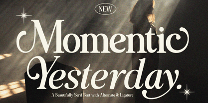 Momentic Yesterday is a Modern Font Duo that contains Serif and Italic Typeface also gives a feel of Elegant font type. There's some connected letters and some alternates that suitable for any graphic designs such as branding materials, t-shirt, print, business cards, logo, poster, t-shirt, photography, quotes .etc This font support for some multilingual. Also contains uppercase A-Z and lowercase a-z, alternate character, numbers 0-9, and some punctuation. If you need help, just write me! Thanks so much for checking out my shop!
 - Wezer by Putracetol,
$24.00 The Wezer - Display Bold Font Duo is a unique and bold typeface that breaks away from the conventional font styles. It offers two distinct versions: rounded and display, both designed to bring something entirely fresh to the table. The purpose behind creating this font was to introduce a one-of-a-kind typeface that stands out in the design world. Wezer is the ideal choice for projects that require a touch of quirkiness and originality, making it perfect for logos, branding, headlines, posters, titles, billboards, banners, and any design that dares to be different.
 - Huevo by Burghal Design,
$29.00Versatile egg-shaped Huevo, like all Burghal Design fonts, includes upper and lower case letters, as well as numbers, symbols, punctuation, and accented foreign characters. Huevo is the head of the household known as Los Huevos. Tequila-guzzling, cerveza-swilling Huevo Loco is the boldest of Los Huevos and includes cocktail glass, olive, and eight ball dingbats. Huevo Loco can drink any other font under the table. Like most red-blooded American fonts, the favorite pastimes of Huevo Gordo are eating and couch warming, and boy, does it show! - Schuss Sans CG Poster Extrabold by typic schuss,
$33.00 Schuss Sans CG Poster Extrabold 1 upright OTF Font Latin extended, Cyrillic and Greek. Specially developed for headline poster display sizes. A Sans Serif Extrabold Headline-Font in addition to the Schuss superfamily. The heights are optimized for big sizes, different to the text fonts of the Superfamily Schuss. The character set is slightly different to the non poster styles too, but comparable to Schuss Sans CG Poster Black. No italic, no additional figures, no tabular figures, no small Caps. But with maximum manual kerning. Ligatures: fi, fl, ff, ffi, ffl. No special OpenType features.
 - Cooper Black by URW Type Foundry,
$89.99Cooper Black The Cooper Black font should be used in display sizes only. Cooper Blacks serifs are rounded and the counters are small. Cooper Black was designed by Oswald B. Cooper for Barnhart Brothers & Spindler in 1921 for advertising and posters. The capital O and Q of the Cooper Black font are tilted back; in the lowercase, the dot on the I and j become elliptical. The extra bold Cooper Black font has a remarkable personality and reproduces well in sizes over 18 point in titles, subheadings and generally short sentences. - Blank Page by Ergibi Studio,
$21.00 Blank Page Font Duo, these fonts are of two types serif and script. Display Serif inspired by famous logo, This typeface has been made carefully to make sure its premium quality and luxury feel. The ligatures on serif makes this typeface unique and stands out rather than the regular serif font, perfectly for headlines, wedding, social media, logos, posters, packaging, T-shirts,coffee shops, restaurants, magazine’s headers, signs or gift/post cards,cafe’s and weddings or any type of advertising purpose. if you have any questions, don’t hesitate to contact us Ergibi Studio
 - Getih West by Twinletter,
$15.00 Getih West It’s a Halloween font, but there’s no need to fear. It’s not just for Halloween fans; You can use it to create cool designs and logos for everything from snowboarding gear to new products at work. Or, if you’re in a hurry, use it to make a fun invitation for your next party — because everyone loves an invitation that screams “Boo!” Of course with this font your various design projects will be perfect and amazing, get a beautiful title and start using our font for your special project.
 - !Disc Inferno® BASIC - Unknown license

- Bigfoot by Canada Type,
$24.95 Bigfoot is the fattest font ever made. It began as a simple exercise given to students in a design course: Most people don't appreciate type because they don't really know what it actually is. One way to understand it is looking at it like a combination of sculptures that have to work together to achieve a certain harmony, where each letter form is one of those sculptures. Most people understand and appreciate that a sculpture starts from a rock of an incomprehensible form, which is manipulated by someone into becoming the recognizable or abstract work of art it eventually is. Consider type design a kind of two-dimensional sculpting. You have a rectangle. Take away as a little as possible from it until it is recognizable as the letter A. Repeat to get the letter B, and so on. After all 26 minimal letters are made, do they actually function as an alphabet to build words and sentences that are recognizable to the human eye? This exercise can trigger thoughts and theories about the overall subjective nature of identifying abstract yet somewhat familiar shapes. It can go into the psyche of art in general. But one thing for certain, this exercise has so far helped a few people find a new appreciation for finely crafted typefaces. If you are a design educator, your students' typographical perspective and arguments would benefit from it. And if you are a designer, well, fat faces are all the rage these days, and this is as fat as it can get. Please note that that this typeface, due to its minimalistic nature, does not include accented characters. It does however support the full C0 Controls and Basic Latin Unicode set. All proceeds from this font go to support the Type Club of Toronto.
 - Charpentier Renaissance Pro by Ingo,
$42.00 A very legible Renaissance Antiqua This typeface is based on the desire to create an Antiqua like those which might have existed at the beginning of the »printing age« — the basic form oriented on the classical Roman and early Middle Ages models, the ductus defined completely by writing with a wide pen and much individual expression in detail. In the spring of 2005 I had the opportunity to closely examine a few pages in the famous book »Hypnerotomachia Poliphili« from 1499. The script used here from Aldus Manutius is exemplary. Most of the book, however, is not very carefully printed. The characters do not stay on the line; the print is at times too strong and at times much too weak. And on these imperfect pages the true character of the letters is recognizable; that is, that they are cut with lively detail which is a result of the patterns provided by full-time writers. After all, around 1499 script was written as a rule and the printed type was oriented on this pattern. I prefer the typeface on the lightly printed pages. The characters are not placed neatly on the line, but the distinct and emerging lively ductus of the individual characters automatically presents harmonious word formations in the eye of the beholder, with the non-perfect line stepping into the background. Also in Charpentier Renaissance, the strokes of the wide pen are still noticeable. The font has very defined softly bent serifs. The forms are powerful and stand solidly on the baseline. Charpentier Renaissance is very legible and yields a solid and yet still lively line formation. The accompanying italic, like its historical models, has almost no inclination. The lower case characters of Charpentier Renaissance Oblique have such idiosyncratic figures that they can also form a font of their own. Please visit www.ingofonts.com
 - Serpentine by Image Club,
$29.99Dick Jensen (USA) designed Serpentine, is a contemporary-looking display font, for the Visual Graphics Corporation in 1972. With the rise of digital typesetting and desktop publishing, this typeface quickly became both popular and ubiquitous. This dynamic, wide, boxy design is identifiable via tiny triangular swellings at the stroke endings - what might be called semi-serifs. Serpentine is available in six different font styles: Light, Light Oblique, Medium, Medium Oblique, Bold, and Bold Oblique. Serpentine" is a greenish rock that sometimes resembles a serpent's skin, and is often used as a decorative stone in architecture. Though this font doesn't seem at all snaky or sinuous, it does have an architectural, stone-like solidity. The subtle, almost non-existent curves and semi-serifs keep it from being too stern or cold. Although the underlying strokes of each weight are similar, the six members of the Serpentine font family all present their own individual personalities. Serpentine Light lends itself well to text for onscreen displays, for instance, while the numbers from typeface's heavier weights are seen around the world on soccer jerseys! Additionally, the oblique styles convey a streamlined sense of speed, furthermore lending Serpentine well to sport and athletic applications (especially the faster, high-speed varieties). Because of its 1970s pedigree, Serpentine has come to be known as a genuine "retro" face. This makes the typeface even more appropriate for display usage, in applications such as logo design, magazine headlines, and party flyers. If you like Serpentine, check out the following similar fonts in the Linotype portfolio: Copperplate Gothic (similar serifs) Eurostile (similar width) Princetown (another "athletic" font) Insignia (similar "techno" feeling)" - Serpentine by Linotype,
$29.00Dick Jensen (USA) designed Serpentine, is a contemporary-looking display font, for the Visual Graphics Corporation in 1972. With the rise of digital typesetting and desktop publishing, this typeface quickly became both popular and ubiquitous. This dynamic, wide, boxy design is identifiable via tiny triangular swellings at the stroke endings - what might be called semi-serifs. Serpentine is available in six different font styles: Light, Light Oblique, Medium, Medium Oblique, Bold, and Bold Oblique. Serpentine" is a greenish rock that sometimes resembles a serpent's skin, and is often used as a decorative stone in architecture. Though this font doesn't seem at all snaky or sinuous, it does have an architectural, stone-like solidity. The subtle, almost non-existent curves and semi-serifs keep it from being too stern or cold. Although the underlying strokes of each weight are similar, the six members of the Serpentine font family all present their own individual personalities. Serpentine Light lends itself well to text for onscreen displays, for instance, while the numbers from typeface's heavier weights are seen around the world on soccer jerseys! Additionally, the oblique styles convey a streamlined sense of speed, furthermore lending Serpentine well to sport and athletic applications (especially the faster, high-speed varieties). Because of its 1970s pedigree, Serpentine has come to be known as a genuine "retro" face. This makes the typeface even more appropriate for display usage, in applications such as logo design, magazine headlines, and party flyers. If you like Serpentine, check out the following similar fonts in the Linotype portfolio: Copperplate Gothic (similar serifs) Eurostile (similar width) Princetown (another "athletic" font) Insignia (similar "techno" feeling)" - Nerine by Studioways,
$33.00 Nerine is a modern brush lettering and handwritten font duo designed by hand lettering artist Eliza Gwendalyn. Both scripts were drawn completely by hand and digitally perfected to bring you these unique script fonts. Nerine is a bold, connecting brush script, with lots of swashes and loops, while Nerine Deux is a lighter, straight stroke semi-connecting script, with a little less flair. Both scripts are ideal for use in a wide range of projects, from branding & advertising to wedding stationery & birth announcements! They also pair well with sans serif and serif typefaces! Each font is packed with ligatures and some alternate letterforms that help text runs appear more natural. The OpenType ligature feature will automatically insert ligatures when certain glyph combinations are typed, and the swash feature in Nerine will replace some beginning and ending letters with nice gentle swash alternatives. Nerinet also boasts five Style Sets that let you swap out groups of letters with interesting alternatives. Both fonts support the extended European character set so language support is extensive. Pick up Nerine or Nerine Deux, or the Nerine Duo Family today, and watch your creativity blossom!
 - Hello Blushberry Script by Great Studio,
$14.00 Allow me to introduce Hello Blushberry - Font Duo is a playful script containing many choices of alternative characters to choose from as well as ligatures that look natural to add to the authenticity of letters. A collection of strange and initial swash tips is also included to add finishing touches or fill the design space in your type design. Hello Blushberry a modern handwriting fonts, loaded with awesome opentype features, and full alternative upper and lower case character sets. make custom letters a dream thanks to all the extra decorative choices you can enter for beautiful and unique customizations - swash, endings, alternative letters and ligatures all make it the prettiest little thing since tutus and tiara. Designed to work harmoniously, this duo font consists of super fine and casual signature scripts and a complete and clean set of all sans serif letters. Sans Serif fonts consist of two outline fonts of different weights, and a regular version. Layer them with different colors and turbidity to get a million different views. This font is perfect for branding, logos, web and editorial design, branding, prints, invitations, crafts, quotes, and more. Includes Files: • Hello Blushberry Script • Hello Blushberry Script Capitals Need help? If you need help or advice, please contact me by e-mail at Greatstudio92@gmail.com.
 - Victorian Orchid by Dharma Type,
$19.99 Victorian Orchid is a gorgeous vintage flower. Victorian Orchid is a beautiful, organic serif font family available for both text and display. Its bizarre serifs for A and other diagonal letterforms came from decorative types and letterings in old Victorian era. These unusual serifs support and enhance the horizontal flow of the eyes and vertical alignments. Very eye-catching lowercase g also came from the Victorian era and this is one of the most dramatic letterform of this font. Lowercase such like n and d also have horizontal serifs which designed in the same theory. Victorian Orchid is somewhat organic, humanistic and soft-impression font like Transitional Serif as typified by Times New Roman. But at the same time, this font has horizontal serif and vertical stressed letterform like Modern Serif. They make this font sharp, handsome and neat. In addition, Victorian Orchid has low contrast and the serifs are not too flat and not too coved. By them, Victorian Orchid create strong and casual impression like Slab Serif fonts. Victorian Orchid family consist of 5 weights from Light to Bold including about 500 glyphs, international accented letters, some OpenType features. Italics are "True" italics which designed very carefully to match Romans.
 - Yorkten Slab by insigne,
$- The Yorkten family of fonts is back with another satisfying addition to its clean style. The rhythmic, new Yorkten Slab expands Yorkten’s basic, contemporary form of geometric and simple lines and adds a level of self-confidence and elegance to your work. Slab's basic structure is compact. It’s more condensed than most slabs, so you can save space yet still have clear, consistent readability. The added serifs create a fresh text color, too, that syncs well with the new font’s inherited features. Like its predecessor, Yorkten Slab offers its natural, simple structure with more than fifty fonts in the family and three different widths - extended, normal or condensed. Each group has eight weights from a lean thin to tough looking black, giving Yorkten Slab plenty of bragging rights among its peers. And like Yorkten, too, Yorkten Slab’s greatest value is the ability of its members to work easily and well together and with a variety of other fonts. Yorkten Slab ensures that you have the necessary tools for any challenge. In combination with its superior functionality and excellent readability, this versatile font can be effectively used for many print and screen operations: e-books, applications, headlines, banners, posters and websites to name a few options. Don’t wait any longer. Start tapping the possibilities that Yorkten Slab offers your work.
 - Kingthings Spike - 100% free

- Linotype Xmas Pi by Linotype,
$40.99You need traditional christmas symbols to illustrate your text? How about using these historic designs that had been used in good old typography. xmas is not too far and always comes in winter time. Happy Xmas. - Shorthalt by Brittney Murphy Design,
$8.00 Shorthalt is a dashingly handsome upright script- all dressed up, but not too stuffy, with lots of ligatures and contextual alternates. Shorthalt works great for headlines or bylines paired with a nice simple sans or serif.
 - Heart on a string by PizzaDude.dk,
$15.00 "Heart on a string" is from a song by Paul McCartney, and is one of his romantic ones. I tried to do the same by creating a font that has the same romantic feeling.
 - Quo Vadis Quasimodo - Personal use only

- Technerd JNL by Jeff Levine,
$29.00 The quest for an identity in the 1980s world of personal computers is the best way to describe Technerd JNL, a retro-style monoline font with clinically mechanical letter structure and a personality only a dot matrix could love. Picture if you will columned reports, interoffice memos and other paper ephemera of the day with this perfect form-and-function typeface, simply reeking of early 80s know-how!
 - Tapas by Fenotype,
$20.00 Tapas is a delicious multi type family with a little something for everyone's tastes and needs. The family consists of four distinct members that share same traits but communicate different aspects. Together they’ll create a bold and effortless mix of various flavors and accents. Naturally, the fonts can be used individually too. Use the Tapas type family in packaging, branding or editorial – wherever some delicious flavors are needed.
 - Kelsy Fantastic by Great Studio,
$13.00 Kelsy Fantastic is a charming and cute new hand-lettered font duo - perfect for casual type in greeting cards, illustrations, quotes, quaint branding, book covers, children's books, packaging and so much more. Suitable for short and sweet quotes, as well as longer meaningful paragraphs. Designed and kerned with care and love to make using it a breeze. Please don't hesitate to contact me if you have any questions! Happy creating!
 - Radio Days NF by Nick's Fonts,
$10.00This Deco delight is based on logotype lettering for Crosley Radios from the 1930s. By aLtErNaTiNg upper and lowercase letters (brackets and braces, too), you can maintain the flow of the lightning bolts through the letters. Additionally, inline hyphens can be found at the ASCII circumflex and ASCII tilde positions. This font contains the complete Latin language character set (Unicode 1252) plus support for Central European (Unicode 1250) languages as well. - Zeebonk by Hanoded,
$15.00 Zeebonk (literally 'Sea Chunk') is Dutch for a sailor - in particular, a large, pickled and brined, seven-seas-been-there-done-that specimen. The font itself brings back memories of the outrageous tattoos those same 'zeebonken' used to have. Zeebonk comes with extensive language support, alternates for the upper case (and some lower case letters as well) and a healthy dose of good old fashioned sea dog humor!
 - TEMPER Wide by OGJ Type Design,
$35.00 Temper Wide is an extended neogrotesque slab with unbracketed serifs and square dots. Its hard-working letterforms and industrial heritage make for a no-nonsense look, well suited to editorial design and advertising. It provides an energetic backdrop for fashion and accessories, whether on-product, in campaigns, or branding. Horizon’s the limit! This sturdy font family will be by your side. A neutral, unembellished typeface, ready to make an impact.
 - Scruff by ITC,
$29.99Scruff was designed by Timothy Donaldson in 1995. This cheerful, laid-back font is made out of a variety of different fragments - stripes, dots, zigzags and more, giving each character its own identity. When brought together into words and sentences, the figures create a playful chaos like that of a patchwork quilt. To bring out its individual details, Scruff is best used in headlines in larger point sizes or as initials. - Billabong by Type Associates,
$32.95 Billabong has its origins in the handlettered 40s and 50s script headings that seem to have endured especially in signage when style doesn't matter too much. Unlike today’s scripts Billabong is tightly spaced and Opentype font features allow for a myriad of ligatures to improve fit and evenness of color. Users can select their choice of strokes, ornaments and ending flourishes for added emphasis and style. Download comprehensive User Guide here.
 - HardTimes Roman by Wiescher Design,
$39.50 HardTimes has been hard work, designing a handmade typeface must always have the right balance between rough and smooth, specially with this Times-like face. It has the big European glyph-set, so that it can be used all over the continent I come from. I gave this font extensive kerning. Times are too hard for boring typefaces, so try this one for a change. -Your hardworking type designer, Gert Wiescher


