10,000 search results
(0.028 seconds)
- Shopkeeper JNL by Jeff Levine,
$29.00Shopkeeper JNL derives its unusual letter forms from impressions made from a vintage rubber stamp sign and chart printing set. Originally an outline font, the letters are rendered solid in the digital version for more versatility. - Guzzo by Monotype,
$50.99 A playful caricature of a midcentury grotesque, Guzzo is a fresh addition to the Monotype Library. Somewhat eccentric and full of surprises, its unmistakable quirk can be found on closer inspection, stemming from details proudly borrowed from brush lettering and calligraphy. The wide range of weights and style can take you through any design space, from the condensed weights squeezing in larger headlines or dense blocks of text with the condensed range, to experimenting with small point sizes, labels or packaging with the extended cut. However, Guzzo’s real charm is probably best expressed through its wonderfully playful shapes, its unusual 'laid-back italics' feature cursive forms and a backslant. The different stylistic sets allow you to decide what you make of Guzzo, with several sets of alternate glyphs steering it in any direction you want. Guzzo is a happy-go-lucky character, and has a warm, humble and painterly quality that - at a glance - may be unrecognizable as a typeface. It can almost pass for hand-lettering. Guzzo pairs exceptionally well with scripts and slab typefaces, and feels most at home in situ with toys, packaging, menus, broadcasting, cartoons and merchandising! Guzzo encourages you to turn up the silliness and is for designers who want to emulate hand-painted and casual motifs. Taking its name from American artist Jeremy Pinc, aka the painter Guzzo Pinc, the typeface channels the quirky, funny and poignant qualities of his paintings - with wacky characters, loosely painted geometric forms and bright colors. For this mid century, authentic, nostalgic typeface - the story is really what you make of it.
 - Vernacular Sans by jpFonts,
$19.95 The Vernacular trilogy was designed by Swiss designer Hans-Jürg Hunziker, who had worked for Adrian Frutiger in Paris for many years. Based on the concept of a transitional Linear Antiqua, he has developed a colorful bouquet of typefaces that contain the entire spectrum of typefaces for book design and corporate identity. Thanks to his "Swiss school" and his outstanding skills, he has succeeded in giving the typefaces a particularly noble and sympathetic expression. In addition to the Sans family, there is a Serif family and a Clarendon family, each of which, including the separately drawn italics, is equipped with 12 font weights that are finely tuned to one another. Each of the 3 font styles develops its own character, but thanks to a concept that brings the different font styles closer together, they also work well together and complement each other perfectly. Sans and Clarendon have a vertical axis and similar endings in contrast to the Serif, which has a traditional diagonal axis and horizontal endings. The straight stems and the proportions are used as an element to stress the closeness of the typeface-trilogy. They thus share a comon feature. All fonts contain tabular and proportional figures as well as old style figures. Small caps and small cap figures are also available in all fonts. In addition, some fonts have alternative characters available via style set, such as «g», which can be used to further vary the typeface. Vernacular offers all the options for well-kept typesetting for print and web - for small and large orders.
 - Vernacular Serif by jpFonts,
$19.95 The Vernacular trilogy was designed by Swiss designer Hans-Jürg Hunziker, who had worked for Adrian Frutiger in Paris for many years. Based on the concept of a transitional Linear Antiqua, he has developed a colorful bouquet of typefaces that contain the entire spectrum of typefaces for book design and corporate identity. Thanks to his "Swiss school" and his outstanding skills, he has succeeded in giving the typefaces a particularly noble and sympathetic expression. In addition to the Sans family, there is a Serif family and a Clarendon family, each of which, including the separately drawn italics, is equipped with 12 font weights that are finely tuned to one another. Each of the 3 font styles develops its own character, but thanks to a concept that brings the different font styles closer together, they also work well together and complement each other perfectly. Sans and Clarendon have a vertical axis and similar endings in contrast to the Serif, which has a traditional diagonal axis and horizontal endings. The straight stems and the proportions are used as an element to stress the closeness of the typeface-trilogy. They thus share a comon feature. All fonts contain tabular and proportional figures as well as old style figures. Small caps and small cap figures are also available in all fonts. In addition, some fonts have alternative characters available via style set, such as «g», which can be used to further vary the typeface. Vernacular offers all the options for well-kept typesetting for print and web - for small and large orders.
 - Vernacular Clarendon by jpFonts,
$19.95 The Vernacular trilogy was designed by Swiss designer Hans-Jürg Hunziker, who had worked for Adrian Frutiger in Paris for many years. Based on the concept of a transitional Linear Antiqua, he has developed a colorful bouquet of typefaces that contain the entire spectrum of typefaces for book design and corporate identity. Thanks to his "Swiss school" and his outstanding skills, he has succeeded in giving the typefaces a particularly noble and sympathetic expression. In addition to the Sans family, there is a Serif family and a Clarendon family, each of which, including the separately drawn italics, is equipped with 12 font weights that are finely tuned to one another. Each of the 3 font styles develops its own character, but thanks to a concept that brings the different font styles closer together, they also work well together and complement each other perfectly. Sans and Clarendon have a vertical axis and similar endings in contrast to the Serif, which has a traditional diagonal axis and horizontal endings. The straight stems and the proportions are used as an element to stress the closeness of the typeface-trilogy. They thus share a comon feature. All fonts contain tabular and proportional figures as well as old style figures. Small caps and small cap figures are also available in all fonts. In addition, some fonts have alternative characters available via style set, such as «g», which can be used to further vary the typeface. Vernacular offers all the options for well-kept typesetting for print and web - for small and large orders.
 - Sassoon Patterns by Sassoon-Williams,
$48.00 Many children start school with their hands not ready and trained to produce the precise strokes required for forming letters and starting to write. Pattern is essential preparation. It is fun for children, building their confidence as well as training their muscles for the task. Each font has normal letters and pattern characters. Free to download resources: How to access Stylistic Sets of alternative letters in these fonts Purchasers of this font package may use their Order Number to receive a free Copybook PDF by Rosemary Sassoon recommended for effective teaching
 - Baker Half by Ingrimayne Type,
$9.00 One of the odder things I remember from high school (50+ years ago) is the tile floor of hexagons in the bathroom. There is something fascinating with the way hexagons fill the plane. BakerHalfDozen is made of white letters that fit on black, hexagonal tiles. BakerHalfWhite switches the letters to black on white tiles, and BakerHalfBare eliminates the tiles. There are no true lower-case letters, but some letters have alternate shapes. To make the tiles line up right, alternate lines must be indented half a space. Use the {} characters (brackets) to do this.
 - Slm by Antiochus,
$30.00 We produce original printing press letter fonts, for example from the journal Southern Literary Messenger (circa 1830 - 1870). The only one in the world. What makes our fonts so attractive to the eye, are the myriad imperfections. It's not an approximation to the printing-press letters--- these are the actual letters, complete with all their manifold differences. If you look closely you will notice that the letter 'e' say, each time it is printed, is slightly different. These differences arise from the mechanical action of the inked-wooden press on the paper, and cannot be faked by artificial means. The eye subconsciously picks up this text as the actual printing press letters. Edgar Allan Poe published many of his great works in the Southern Literary Messenger, as did many other great nineteenth century writers, ie. Henry Wadsworth Longfellow, Nathaniel Hawthorne &c.
 - Degdegan by Haksen,
$18.00 Degdegan is a futuristic classic bold script style with unique alternates feel nice balanced. Provide many variant ligatures style make the design letter looks incredible. Honestly it works perfectly for headlines, logos, posters, packaging, T-shirts and much more. Recommended to use in Adobe Illustrator or Adobe Photoshop with opentype feature. Ligatures feature is default setting in Adobe Illustrator or Adobe Photoshop in Uppercase character. So when you want not to use the ligatures. Open glyphs panel : In Adobe Photoshop choose tool Window Character and then please klick fi symbol In Adobe Illustrator choose tool Window Type Open Type and then please klick fi symbol How to access Alternates Character? Open glyphs panel : In Adobe Photoshop choose tool Window glyphs In Adobe Illustrator choose tool Type glyphs If you have questions, just send me a message and I’m glad to help. Have a great day, Haksen
 - Pearloop by Haksen,
$18.00 PEARLOOP is a elegant classic serif style with unique alternates feel nice balanced. Provide many variant ligatures style make the design letter looks incredible. Honestly it works perfectly for headlines, logos, posters, packaging, T-shirts and much more. Recommended to use in Adobe Illustrator or Adobe Photoshop with opentype feature. Ligatures feature is default setting in Adobe Illustrator or Adobe Photoshop in Uppercase character. So when you want not to use the ligatures. Open glyphs panel : In Adobe Photoshop choose tool Window Character and then please klick fi symbol In Adobe Illustrator choose tool Window Type Open Type and then please klick fi symbol How to access Alternates Character? Open glyphs panel : In Adobe Photoshop choose tool Window glyphs In Adobe Illustrator choose tool Type glyphs If you have questions, just send me a message and I'm glad to help. Have a great day, Haksen
 - Absolute Funboldies by Haksen,
$17.00 Absolute Funboldies is a fun display sans serif style with unique alternates feel nice balanced. Provide many variant ligatures style make the design letter looks incredible. Honestly it works perfectly for headlines, logos, posters, packaging, T-shirts and much more. Recommended to use in Adobe Illustrator or Adobe Photoshop with opentype feature. Ligatures feature is default setting in Adobe Illustrator or Adobe Photoshop in Uppercase character. So when you want not to use the ligatures. Open glyphs panel : In Adobe Photoshop choose tool Window Character and then please klick fi symbol In Adobe Illustrator choose tool Window Type Open Type and then please klick fi symbol How to access Alternates Character? Open glyphs panel : In Adobe Photoshop choose tool Window glyphs In Adobe Illustrator choose tool Type glyphs If you have questions, just send me a message and I'm glad to help. Have a great day, Haksen
 - Zebardon by Haksen,
$17.00 Zebardon is a modern sans serif style with unique ligatures lowercase feel nice balanced. Provide many variant ligatures style make the design letter looks incredible. Honestly it works perfectly for headlines, logos, posters, packaging, T-shirts and much more. Recommended to use in Adobe Illustrator or Adobe Photoshop with opentype feature. Ligatures feature is default setting in Adobe Illustrator or Adobe Photoshop in Uppercase character. So when you want not to use the ligatures. Open glyphs panel : In Adobe Photoshop choose tool Window Character and then please klick fi symbol In Adobe Illustrator choose tool Window Type Open Type and then please klick fi symbol How to access Alternates Character? Open glyphs panel : In Adobe Photoshop choose tool Window glyphs In Adobe Illustrator choose tool Type glyphs If you have questions, just send me a message and I'm glad to help. Have a great day, Haksen
 - Lovely Dream by Yumna Type,
$16.00 Lovely Dream is a beautiful script font with a natural and unique design will make your project more beautiful. The font is suitable for your branding project, printing, logos dan wedding. Features: Multilingual Support PUA encoded Set Stylistics Many Swashes Beautiful Ligatures
 - Honey Sky by Yumna Type,
$16.00 Honey Sky is a handwritten font with a natural and unique design will make your project more beautiful. The font is suitable for your branding project, printing, logos dan wedding. Features: Standard Ligatures Alternates Multilingual Support PUA encoded Numeral and Punctuation by Yumnatype
 - Renaissance Initial by Kaer,
$19.00 This is a new classic Renaissance Initial font. Renaissance Initial font is perfect for premium design labels, medieval print, antique posters, etc. The fonts are presented in usual and color versions. Only uppercase letters from A to Z and numbers set (36 characters)
 - Rooling Candy by Yumna Type,
$16.00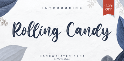 Rolling Candy is a beautiful handwritten font with a natural and unique design will make your project more beautiful. The font is suitable for your branding project, printing, logos dan wedding. Features: Beautiful Ligatures Multilingual Support PUA encoded Numeral and Punctuation by Yumnatype
 - Panopticum by Vladislav Ivanov,
$20.00 Panopticum is a Vladislav Ivanov font family with 3 styles- Panopticum,Panopticum Re and Panopticum Broken. Panopticum is a custom font which is applicable for any type of graphic design - web, print, motion graphics, etc. and perfect for t-shirts and logos.
 - Nünooska by Okaycat,
$29.00 Nünooska is a sans serif type designed by Luke Turvey in 2014. The minimalist charm of Nünooska offers a soft unique style while remaining legible and clean. This rounded geometric sans serif is designed to look excellent for display or printed publication.
 - Okay Marker by Okaycat,
$19.50 Okay Marker is a natural hand-printed font, designed to appear as if it was written by wide marker. A clean legible style yet friendly & fun. Okay Marker features extended characters, containing West European diacritics & ligatures, making it suitable for international environments & publications.
 - Old English by URW Type Foundry,
$35.00 Old English Old English is related to Black Letter styles from early printed books and have a distinguished, historic look. The Old English font is used in advertising, invitations, greeting cards, and wherever a formal hand-lettered or engraved look is desired.
 - Post Box by Great Scott,
$16.00 Written in a ballpoint pen style POST BOX is a neighborly sans serif is slightly condensed and slanted. Scribbled quickly but readable. Exact but still human. Perfect for print, package and display use. You can also use it in shorter paragraph text.
 - BD Aubergin by Typedifferent,
$15.00 The typeface with a slice: BD Aubergin is somehow reminiscent of the bauhaus era but with a modern twist, great for the use in titling and giving character to your print and screen work. The variable version morphs from filled (flat) to sliced.
 - Kyrial Sans Pro by Mostardesign,
$- Designed in 2011 by Olivier Gourvat, this font family has generous proportions with a range of weights make it a versatile family for print, text, signage, branding and web design work. Kyrial Sans Pro offers lots of OpenType goodness and broad language support.
 - Gaby Pro by RMU,
$35.00 Inspired by the 1947 Weber font Gabriele, Gaby Pro is a freshly designed versatile and everyday cursive font that can be used for a wide range of printed products and for web design as well. The font was carefully extended for multilingual use.
 - Josefov by Ingo,
$28.00 A narrow, modern Slab Serif. JOSEFOV is directly derived from the sans serif text font ”Hedwig“. Therefore, of course, it pairs best with “Hedwig”. The basic thought was to create a font with heavy rounded serifs in the style of ”Clarendon“ but which hardly reminds one of that particular font. The form principle of rounded serifs is applied whenever possible — for example at the points where the individual strokes of the characters join one another. JOSEFOV seems very technical, very constructed (and truly is). In order to soften up the rigid impression, the serifs are applied at some points contrary to the tradition handed down, as with the upper case A C G K M V W and the lower case a b d h i j k l s t. Historically there is no example of the laterally oriented serifs of capital and small s (S) and C G. On the other hand, the double-sided serifs on the stems of b d h k l appear at the beginning of modern times in the very first serif types from five hundred years ago. The double-sided serifs of A M V W were also customary in the first decades of printing. JOSEVOV is particularly suitable for topics such as nature, folklore, culture, music, nutrition.
 - Yorkten by insigne,
$- Clean and welcoming, the distinct look of Yorkten is remarkably satisfying to the eye. Straight to the point, Yorkton features a fashionable, geometric composition with angled main stems. There are no fewer than fifty-four fonts in the family, all of which are characterized by one of three widths – extended, normal or condensed. Each individual subfamily is equipped with eight weights from Thin to Black with respective Italics, giving Yorkten a breathtaking range of fonts to boast. The greater value for you, though, is its members’ ability to work well together. With a deep toolbox of weights and widths to choose from, this family provides you with significant value and a broad number of design solutions, making sure you have the tools you need for each challenge. So where should you use the font? Jeremy Dooley designed Yorkten’s underpinning structure to be compact. Combined with its superior features and terrific legibility, this versatile font can be used effectively for many jobs, whether in print or on screen. Use it freely for e-books and apps. Yorkten is particularly great for headlines, banners, posters, and websites. As with all insigne fonts, fonts that are well received by the market are expanded into future variants such as rounded or slab serif types. Yorkten’s later expansions will increase the versatility and functionality of the family. There’s no need to wait for these future releases, though. This new face already complements a number of other insigne faces, such as Grayfel, Look, or the Cabrito Superfamily. So what are you waiting for? Get Yorkten today and bask in the rich potential it offers! Get Yorkten and luxuriate in its straightforward multifunctionality!
 - Ruth Pro by David Engelby Foundry,
$25.00 Ruth Pro is a creative work horse primarily designed to be used for typographic design of magazines, posters and books. Though roughly inspired by fonts like Mendoza and Stone Serif, it has its own distinctive look, carefully crafted following all the classic ideals of typography. If you are also looking for that special display font, you will be surprised by all the great details of Ruth Pro, including dingbats, arrows, alternative characters, special designed ligatures and small caps characters—and much more! Ruth Pro also includes a vast selection of Slavic and Scandinavian characters.
 - Pittsbrook by Fontdation,
$15.00 Pittsbrook Family, a pack of classic typefaces that inspired by the letters used in old advertisement and packagings. Its rigid shape gives you strong, sharp and blocky feelings, no curves were harmed in the making of these typefaces. Comes in three styles; Sans, Serif and Outline, all of them are consistently mouse-crafted characters, we spent a lot of attention to every details. Suits best for any classic/vintage design project, such as E-Sport logo, liquor/food label, packaging, headline, space-filler, logotype, typographic quote writings, etc.
 - Kurdis by That That Creative,
$32.00 Kurdis Varibel Font Family is a modern sans serif family with six widths and five Weights Making 30 Set Styles and of course 10,000 more combinations when considering the Variable options. This Typeface is a real work horse for titles. At its condensed Width it is sophisticated and professional with well considered ink traps that help it really stand out at Large Sizes. the Regular width works well for longer bodies of text on websites or posters and the Wide Styles give an elevated look to your average wide sans serif.
 - Acantha by Solotype,
$19.95Originally made in seven sizes, 6 to 48 point. Our font was digitized from the 24 point which we found in 1947 in a Sparks, Nevada, newspaper shop. Typical of the late nineteenth century types for job printers, where the rule was “never start a line with a font used in the line above”. - Ongunkan Byzantine Empires by Runic World Tamgacı,
$100.00 For this Byzantine Empire calligraphy font, I had to work for 2 weeks and 3-4 hours a day and search the internet. It made me very tired, but I finally finished it, and it was good. This font can use both latin keyboard and greek keyboard. I also added Greek unicode characters. I will adapt this font to the latin alphabet, I will make the full character set font, this will take less time. I wish you good work.
 - Funny Toons by Indian Summer Studio,
$20.00 Soft, funny round cartoon display font containing 500+ glyphs, Diacritics, Ligatures, Fractions in Latin, Cyrillic and Greek. Made entirely after Ekke Wolf's Greek 'rho' letter's idea in Runde Wien: — Damn, it's funnier than every [cartoon] mouse, duck and everything. — The source letter for a whole special typeface — with own funny happy mood. — As I see, it's the decent respected well-mannered sans. And this 'rho' is the source for the completely different Funny Toons display type. Just found it around this brilliant oval.
 - POLIGRA by Borutta Group,
$39.00 POLIGRA is an experimental typefamily and a homage to traditional printing of the pre-war era in Poland. Most of the typefaces based on traditional printing are either clean, geometric typefaces or completely distressed lettering. The POLIGRA project explored everything in between. The letters, cleaned up, redesigned where necessary, and defined in their entirety, have a friendly and warm character, as if taken out of the press. The selection of typefaces was based on theater and sports posters. All of them have blocky and geometric character, each of them is an all-caps typeface. The POLIGRA family includes 13 typefaces.
 - Syabil by Eko Bimantara,
$16.00 Syabil is a sans serif font family designed by Eko Bimantara. This font crafted with the intention to present a clean, legible, multipurpose that easy to read wether it on screen or print. Fit for all purposes; Text, display, headline, print, corporate identity, logo, branding, product, infographic, photography and other application and medium. This font consist of 9 weight; Thin, Light, Book, Regular, Medium, SemiBold, Bold, ExtraBold and Heavy with each weight paired by italic. Also including Latin Plus language support with more than 11.700 glyphs in all weight which make this font contain broad language support.
 - Death Markers by Figuree Studio,
$25.00 Everyone who lives will surely die Death Markers is a natural brush font, inspired by a vintage aesthetic sign painting. Made in combination with hand lettering, it comes with dramatic movement and it’s great for any next creative project that needs a retro vibe and horror touch. It comes with 2 styles: Clean and Drip effect. Ideal for logos, handwritten quotes, product packaging, header, poster, merchandise, social media & greeting cards. With your purchase you get: - All Caps - Numbers and Punctuation Marks - Support for MAC or PC - Simple installation for Adobe Illustrator, Corel Draw, Photoshop, or Procreate (New Updated) - Support Multilanguage I hope you make something cool with it. If you have any questions don't hesitate to ask!
 - Plinc Beaux Arts Didot by House Industries,
$33.00 Firmin Didot is credited with establishing the Modern genre of serif typefaces, of which Beaux Arts Didots stands as an exemplary model. Like the French neoclassical architecture of its namesake, Beaux Arts has all the hallmarks of the early nineteenth-century style: a clear and confident construction consisting of simple yet strong lines. Use it for elegant and formal settings, or when a direct typographic tone is desired. Mix it with styles of similar sensibilities such as Plinc Hanover and Davison Spencerian. Digitized from the original Photo-Lettering film matrix in 2014 by Jean-Baptiste Levée. BEAUX ARTS DIDOT CREDITS: Typeface Design: Photo-Lettering Staff Typeface Digitization: Jean-Baptiste Levée Typeface Production: Ben Kiel Typeface Direction: Ken Barber Like all good subversives, House Industries hides in plain sight while amplifying the look, feel and style of the world’s most interesting brands, products and people. Based in Delaware, visually influencing the world.
 - Plinc Kerpow by House Industries,
$33.00 Inspired by the hand-lettered sound effects found in comic books, Dave West takes a three-dimensional deep dive into the genre with his extensive onomatopoeic alphabet originally designed for Photo-Lettering, Inc. The sonorous voice of Kerpow’s caps captures “cartoon” brilliantly, while the accompanying lowercase provides options for broader applications. Turn to Kerpow for eye-catching children’s book covers, fast casual restaurant marketing, or family fun centers, and…BAM!…all eyes will be on your design. Originally drawn in the late 1960s, Kerpow was digitized by Allen Mercer in 2011. Please note that the shaded version of the typeface is composed by layering the Regular font and a separate Drop Shadow font. Some assembly required. Like all good subversives, House Industries hides in plain sight while amplifying the look, feel and style of the world’s most interesting brands, products and people. Based in Delaware, visually influencing the world.
 - Neutraface Slab Text by House Industries,
$33.00 From fine print and red ink in corporate annual reports to huge three dimensional signage, Neutraface has become the definitive designers’ workhorse. Now this geometric juggernaut boasts even more font firepower with the addition of the Neutraface Slab family. Neutraface Slab features five display weights, four text weights with italics plus a unique stencil style that work together like a typographic symphony or can stand alone like accomplished soloists. Just like its sans-serif counterparts, Neutra Slab Text includes small caps, seven figure styles and a host of other sophisticated OpenType features that have been integrated in a single seamless package. The complementary display weights afford an uncompromising statement that can range from thin and delicate to bold and bombastic. FEATURES: MORE ALTS: Neutraface Slab comes with several alternate characters, accessed through either OpenType stylistic sets or through the Stylistic Alternates feature. TITLING ALTERNATES: The distinctive lower crossbars of the original Neutraface are included in Neutraface Slab as the Titling Alternates OpenType feature. TEXT FIGURES: All variations of Neutraface Slab Text feature seven figure styles. Included are text figures for use in running text, lining figures for use with uppercase forms and small caps figures. Each of these styles is supplemented with tabular figures for use in columnar settings. Plus, superscript and subscript figures are included for use in fractions, footnotes, etc. NEUTRAFACE SLAB CREDITS: Typeface Design: Christian Schwartz, Kai Bernau, Susana Carvalho Typeface Production: Ben Kiel, Hannes Famira Typeface Direction: Christian Schwartz, Andy Cruz, Ken Barber Like all good subversives, House Industries hides in plain sight while amplifying the look, feel and style of the world’s most interesting brands, products and people. Based in Delaware, visually influencing the world.
 - Neutraface Slab Display by House Industries,
$33.00 From fine print and red ink in corporate annual reports to huge three dimensional signage, Neutraface has become the definitive designers’ workhorse. Now this geometric juggernaut boasts even more font firepower with the addition of the Neutraface Slab family. Neutraface Slab features five display weights, four text weights with italics plus a unique stencil style that work together like a typographic symphony or can stand alone like accomplished soloists. Just like its sans-serif counterparts, Neutra Slab Text includes small caps, seven figure styles and a host of other sophisticated OpenType features that have been integrated in a single seamless package. The complementary display weights afford an uncompromising statement that can range from thin and delicate to bold and bombastic. FEATURES: MORE ALTS: Neutraface Slab comes with several alternate characters, accessed through either OpenType stylistic sets or through the Stylistic Alternates feature. TITLING ALTERNATES: The distinctive lower crossbars of the original Neutraface are included in Neutraface Slab as the Titling Alternates OpenType feature. TEXT FIGURES: All variations of Neutraface Slab Text feature seven figure styles. Included are text figures for use in running text, lining figures for use with uppercase forms and small caps figures. Each of these styles is supplemented with tabular figures for use in columnar settings. Plus, superscript and subscript figures are included for use in fractions, footnotes, etc. NEUTRAFACE SLAB CREDITS: Typeface Design: Christian Schwartz, Kai Bernau, Susana Carvalho Typeface Production: Ben Kiel, Hannes Famira Typeface Direction: Christian Schwartz, Andy Cruz, Ken Barber Like all good subversives, House Industries hides in plain sight while amplifying the look, feel and style of the world’s most interesting brands, products and people. Based in Delaware, visually influencing the world.
 - CA Postal by Cape Arcona Type Foundry,
$39.00 CA Postal is a cute and clever little stamp-font. It was originally intended for a record-cover only, but when the artist wanted all lyrics printed in the booklet, it was time for a font. The initial inspiration was a moveable-stamp printing-set, which had a nice Futura-like style, being very pleasant to read, especially in small sizes. But of course it’s the loose and irregular outlines that give the font its special charms. CA Postal features two sets of characters and the "Contextual Alternates" feature will make sure that never two identical characters will stand next to each other, so that the stamp-look becomes even more authentic.