10,000 search results
(0.096 seconds)
- Long Night by Roland Hüse Design,
$18.00 LONG NIGHT is a a handwriting/signature script with open type ligatures and stylistic alternates. Perfect for titles, headings and logotypes, products packaging or photography watermarks. It includes Western European accented characters. For additional customisations (for logotypes for example) or if you have any further questions, request pleas contact me. Thank you I hope you like this font & good luck with your project! Roland Instagram: @rolandhusedesign Cool background image that inspired the name by my good friend Joshua Guandique https://www.instagram.com/josh_g_art/
 - Siegra by Arterfak Project,
$22.00 Siegra is a cool combination of powerful, sporty, automotive, elegant, and futuristic. One of kind techno font that versatile to apply in various design styles. Wide, sharp, and curvy of the letterforms that speed up your energy and get more confidently design. Siegra is suitable for posters, branding, campaign, logo, keychains, stickers, t-shirts, automotive, and many more! Completed with a lot of stylish ligatures to gives your design more power! Multilingual support and PUA encoded. Get yours! Thank you.
 - Glendale by Sarid Ezra,
$15.00 Introducing, Glendale - an extreme expanded sans family! Glendale is a basic sans font with unique lowercase form. With expanded lowercase, this font will standout and make a great choice for your next project! The important things is, you can access the special features with any software. You can use this font for any designs. Cool for logos and powerful for posters! With light, regular, and bold version, you can make your headline text more standout! This font also support Multi Language.
 - Tailgates by Ditatype,
$29.00 Introducing Tailgates, a script font that exudes a robust and inviting charm. This typeface showcases a substantial weight, offering your text a bold and captivating presence. Tailgates is characterized by its rounded letterforms, contributing to a friendly and approachable aesthetic. With consistent proportions and a relatively high contrast, it achieves a dynamic and eye-catching design. What sets Tailgates apart are the captivating swinging ends that adorn select letters. These elegant flourishes add a sense of whimsy and grace to your text, creating a visual experience that is both lively and engaging. The combination of round shapes and these decorative elements adds a unique touch to your designs. In addition, enjoy the features here. Features: Ligatures Stylistic Sets Swashes Multilingual Supports PUA Encoded Numerals and Punctuations Tailgates fits in headlines, logos, posters, flyers, branding materials, print media, editorial layouts, and many more designs. Find out more ways to use this font by taking a look at the font preview. Thanks for purchasing our fonts. Hopefully, you have a great time using our font. Feel free to contact us anytime for further information or when you have trouble with the font. Thanks a lot and happy designing.
 - Spiraltwists by Aah Yes,
$0.75Spiraltwists is a family of 2 fonts giving assorted spiral shapes. In each font they're grouped in fours - the same basic spiral in 4 different orientations (N S E W almost), and Spiraltwists has solid lines making up the spirals, Spiraltwists Antique has dotted lines making up the spirals, giving them an antique or rustic appearance. Spiraltwists has heavier spirals on Upper Case, lighter spirals on lower case; plus a group of spirals with a straightened outer end and connecting lines so you get two spiral scrolls joined together by a long line at the top or bottom. (inputting UVWXYZ into the text-box on this webpage will show it). The big example on the webpage shows it all more clearly than any explanation. A fuller description, plus the above example, are included in the zipfile. Please note: for the avoidance of doubt, the font does not contain any letters, the text in these 2 examples is not Spiraltwists but Luzaine. - Mother VP by VP Creative Shop,
$20.00 Introducing Mother Serif Typeface - 5 fonts Mother is named after all the moms and children left behind. This typeface is feminine, fragile typeface with 5 fonts loaded with ligature glyphs, alternates and multilingual support to enchant your next project. Very versatile fonts that works great in large and small sizes. Mother is perfect for branding projects, home-ware designs, product packaging, magazine headers - or simply as a stylish text overlay to any background image. Uppercase, lowercase, numeral, punctuation & Symbol Light Regular Medium Bold Black ligature glyphs ab ac ad ae ag ai al am an ap ar as at au ba be bi bl bo br ca cc ce ch ci cl co cr cs ct cu da de di do dr ea ec ed ee ei el em en eo ep er es et eu fa fb ffb fh ffh fj fk ffk ft fft ga gi gl gn go gr ha he hi ho hy ic id ie il im in io ip ir is it iv ka ke la le li ll lo lu ma me mi mo mp na nc nd ni no nt oc od ol om op or os ot ou pa pe pi po ra rc rd re ri ro sh si sm sp su ta te th ti to tr ts tt ul um un ur us ut ff fi fl ffi ffl st alternates Multilingual support How to access alternate glyphs? To access alternate glyphs in Adobe InDesign or Illustrator, choose Window Type & Tables Glyphs In Photoshop, choose Window Glyphs. In the panel that opens, click the Show menu and choose Alternates for Selection. Double-click an alternate's thumbnail to swap them out. Feel free to contact me if you have any questions! Mock ups and backgrounds used are not included. Thank you! Enjoy!
 - Dissident by Ronny Studio,
$25.00 Dissident Font is a cool alternative for you to easily create your Underground band logo or whatever. Using alternative fonts and ornaments will liven up the font and will look cooler and fiercer. It comes with a basic character set and a small group of symbols and signs frequently used in the extreme music sector - Death- and Blackmetal classics such as pentagram drops, roots, wings and more. Features : - All Caps - numbers & punctuation - Multilingual - PUA encoded Please contact us if you have any questions. Enjoy Crafting and thanks for supporting us! :) Thank you
 - Milky Cream by Keristyper Studio,
$14.00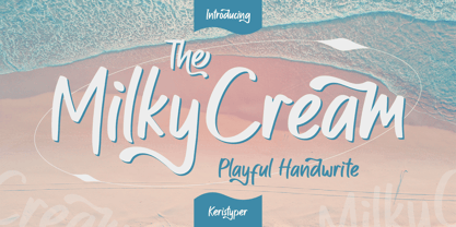 Milky Cream is a cool and playful handmade marker font. This font is good for logo design, Social media, Movie Titles, Books Titles, short text even long text letters, and good for your secondary text font with sans or serif. Featured: Standard Uppercase & Lowercase Numeral & Punctuation Multilingual : ä ö ü Ä Ö Ü ß ¿ ¡ Alternate & Ligature PUA encoded We recommend programs that support the OpenType feature and the Glyphs panel such as Adobe applications or Corel Draw. so you can use all the variations of the glyphs. Hope you enjoy our fonts!
 - Luckystrikes by Kustomtype,
$25.00 Introducing Luckystrikes, a handwritten script-font inspired by a poor amount of characters in the 1950-style advertising of the well-known American cigarettes. Kustomtype redrew this font with a very clear and cool old-script style. This font is great for all your creative projects. Luckystrikes comes with uppercase, lowercase, numerals, punctuations in script so you can use it to customize all your designs. Perfect to use for Logos, Letterhead, Poster, Apparel Design, Package design, Label design etc. Luckystrikes is designed by Coert De Decker in 2018 and published by Kustomtype Font Foundry.
 - Cloud Bread by Orenari,
$15.00 Cloud Bread is a sweet and friendly display font. This font has bold and cute shape. It's unique style makes it incredibly fitting to a large pool of designs. Be inspired by Cloud Bread and create something fun and memorable! Language Support: Afrikaans, Albanian, Catalan, Danish, Dutch, English, French, German, Icelandic, Italian, Norwegian, Portugese, Spanisch, Swedish, Zulu I really hope your projects will be cool with this font, and please don't hesitate to drop me a message if you have any questions or you wanna share some jokes! :)
 - Terrified AOE by Astigmatic,
$19.00 Terrified AOE was inspired by vintage horror movie poster titling from the 1960's. It is a Capitals and smallcaps typeface, that really feels like a mix of three typefaces in one. While the Capitals and Smallcaps typesetting works to the effect of the original inspirations, each case also works well amongst itself independently, and having very different vibes. I've always been a huge fan of horror movies, and some of the lettering from vintage horror movie posters are so cool and alive, I only wish there were more of them recreated as display fonts.
 - Silver Shark by Epiclinez,
$18.00 Silver Shark is a cool and authentic brush display font. It has a bold, rough texture and as a result, it makes each of your creative designs stand out. Carefully handcrafted to grab the attention of the viewers, this font is ideal for logos, posters, headlines, branding, apparel and so much more. Silver Shark contains 199 glyphs. Supporting more than 66 languages, from English to Zulu. Accessible in Adobe Illustrator, Adobe Photoshop, Adobe InDesign, even works on Microsoft Word PUA Encoded and fully accessible without additional design software,
 - Executive Boss by Letterara,
$14.00 Executive Boss is a cool and versatile duo font (serif and script). The beautiful signature monoline-style font perfectly complements the elegant serif font. Combining these two fonts in your next design will give a modern and sophisticated feel, and it makes it a perfect addition to your font collection. Fall for its ravishing style and use it to create gorgeous wedding invitations, beautiful stationary art, eye-catching social media posts, logos, packaging, advertising, and much more! This font is PUA encoded which means you can access all the glyphs and swashes easily!
 - Afolkalips by Arterfak Project,
$15.00 Introducing 'Afolkalips' a tribal display font. Inspired by hinterland culture in the world, especially Papua Tribe, Indonesia. The Papuan Culture has many native tribes based on their location, culture and different ancestors. The equation is, they have a culture of decorating the body with paint from plants. The motives are also diverse, but with the characteristics of firm lines. In addition to various line motifs, Papuan hinterland people also explore colors that distinguish one tribe from another. You can see it on face decoration, as well as their body parts. The tools they used to paint their faces were usually with wood or leaves. Clear lines are etched, producing a natural, rough and authoritative form. It is this form that inspires us in designing the 'Afolkalips' typeface. All-capitals font with strong strokes that very recommended for headline or display on a traditional theme. Complete with 50+ custom ligatures that give you more variations. Also featured with 28 accents. This font also has ornament swashes to give your design more tribal looks, you can use the swashes as a frame or decoration. Suitable for your design such as poster, flyer, t-shirt design, logo, magazine, signage, or billboard. Afolkalips is a minimalist-joyful font which is flexible to apply in bright theme or elegant style. What you'll get : - Uppercase - Lowercase - Numbers - Punctuations - Symbols - Stylistic alternates - Ligatures - Accents Hope you like it! Thank you for your support and happy designing!
 - Coco Gothic Pro by Zetafonts,
$39.00 Inspired by a biography of Coco Chanel and trying to capture the quintessential mood of classical fashion elegance, Cosimo Lorenzo Pancini designed Coco Gothic looking for the effect that the first geometric sans typefaces (like Futura, Kabel or the italian eponyms like Semplicità) had when printed on paper. The crisp modernist shapes acquired in printing charme and warmth through a slight rounding of the corners that is translated digitally in the design of Coco Gothic. This signature touch is enhanced by the inclusion of light humanist touches to the proportions of the letters, resulting in the unique mix that makes Coco Gothic one of our best sellers, with a look that is both contemporary and vintage. After six years from the original project (that has spawned in the meanwhile successful families like Cocogoose and Coco Sharp), we went back to the design to completely redraw and expand the original family, creating with a Pro version that has better on-screen readability, a wider weight range, variable type versions and more language coverage (with Coco Gothic Arabic adding a new script to the latin, greek and Cyrillic of the original). Coco Gothic Pro comes in three subfamilies, each with seven weights with matching italics and featuring an extended character set with open type support for small caps, ligatures, alternates, European languages, Greek and Cyrillic alphabets. The original, body-text optimised Coco Gothic and Coco Gothic Alternate subfamilies have been kept for compatibility with the previous version, while a new Coco Gothic Display subfamily has been developed with a complete redesign aimed at display usage, featuring tighter spacing and optimised letterforms. A distinguishing feature of Coco Gothic Pro is the inclusion of ten alternate historical sets that allow you to use the typeface as a true “typographic time machine”, selecting period letterforms that range from art deco and nouveau, to modernism and to eighties’ minimalism. Equipped with such an array of historical variants, Coco Gothic Pro becomes an encyclopedia of styles from the last century, ready to transform itself and adapt to the mood of your text.
 - Vendetta by Emigre,
$69.00 The famous roman type cut in Venice by Nicolas Jenson, and used in 1470 for his printing of the tract, De Evangelica Praeparatione, Eusebius, has usually been declared the seminal and definitive representative of a class of types known as Venetian Old Style. The Jenson type is thought to have been the primary model for types that immediately followed. Subsequent 15th-century Venetian Old Style types, cut by other punchcutters in Venice and elsewhere in Italy, are also worthy of study, but have been largely neglected by 20th-century type designers. There were many versions of Venetian Old Style types produced in the final quarter of the quattrocento. The exact number is unknown, but numerous printed examples survive, though the actual types, matrices, and punches are long gone. All these types are not, however, conspicuously Jensonian in character. Each shows a liberal amount of individuality, inconsistency, and eccentricity. My fascination with these historical types began in the 1970s and eventually led to the production of my first text typeface, Iowan Old Style (Bitstream, 1991). Sometime in the early 1990s, I started doodling letters for another Venetian typeface. The letters were pieced together from sections of circles and squares. The n, a standard lowercase control character in a text typeface, came first. Its most unusual feature was its head serif, a bisected quadrant of a circle. My aim was to see if its sharp beak would work with blunt, rectangular, foot serifs. Next, I wanted to see if I could construct a set of capital letters by following a similar design system. Rectangular serifs, or what we today call "slab serifs," were common in early roman printing types, particularly text types cut in Italy before 1500. Slab serifs are evident on both lowercase and uppercase characters in roman types of the Incunabula period, but they are seen mainly at the feet of the lowercase letters. The head serifs on lowercase letters of early roman types were usually angled. They were not arched, like mine. Oddly, there seems to be no actual historical precedent for my approach. Another characteristic of my arched serif is that the side opposite the arch is flat, not concave. Arched, concave serifs were used extensively in early italic types, a genre which first appeared more than a quarter century after roman types. Their forms followed humanistic cursive writing, common in Italy since before movable type was used there. Initially, italic characters were all lowercase, set with upright capitals (a practice I much admire and would like to see revived). Sloped italic capitals were not introduced until the middle of the sixteenth century, and they have very little to do with the evolution of humanist scripts. In contrast to the cursive writing on which italic types were based, formal book hands used by humanist scholars to transcribe classical texts served as a source of inspiration for the lowercase letters of the first roman types cut in Italy. While book hands were not as informal as cursive scripts, they still had features which could be said to be more calligraphic than geometric in detail. Over time, though, the copied vestiges of calligraphy virtually disappeared from roman fonts, and type became more rational. This profound change in the way type developed was also due in part to popular interest in the classical inscriptions of Roman antiquity. Imperial Roman letters, or majuscules, became models for the capital letters in nearly all early roman printing types. So it was, that the first letters in my typeface arose from pondering how shapes of lowercase letters and capital letters relate to one another in terms of classical ideals and geometric proportions, two pinnacles in a range of artistic notions which emerged during the Italian Renaissance. Indeed, such ideas are interesting to explore, but in the field of type design they often lead to dead ends. It is generally acknowledged, for instance, that pure geometry, as a strict approach to type design, has limitations. No roman alphabet, based solely on the circle and square, has ever been ideal for continuous reading. This much, I knew from the start. In the course of developing my typeface for text, innumerable compromises were made. Even though the finished letterforms retain a measure of geometric structure, they were modified again and again to improve their performance en masse. Each modification caused further deviation from my original scheme, and gave every font a slightly different direction. In the lower case letters especially, I made countless variations, and diverged significantly from my original plan. For example, not all the arcs remained radial, and they were designed to vary from font to font. Such variety added to the individuality of each style. The counters of many letters are described by intersecting arcs or angled facets, and the bowls are not round. In the capitals, angular bracketing was used practically everywhere stems and serifs meet, accentuating the terseness of the characters. As a result of all my tinkering, the entire family took on a kind of rich, familiar, coarseness - akin to roman types of the late 1400s. In his book, Printing Types D. B. Updike wrote: "Almost all Italian roman fonts in the last half of the fifteenth century had an air of "security" and generous ease extremely agreeable to the eye. Indeed, there is nothing better than fine Italian roman type in the whole history of typography." It does seem a shame that only in the 20th century have revivals of these beautiful types found acceptance in the English language. For four centuries (circa 1500 - circa 1900) Venetian Old Style faces were definitely not in favor in any living language. Recently, though, reinterpretations of early Italian printing types have been returning with a vengeance. The name Vendetta, which as an Italian sound I like, struck me as being a word that could be taken to signifiy a comeback of types designed in the Venetian style. In closing, I should add that a large measure of Vendetta's overall character comes from a synthesis of ideas, old and new. Hallmarks of roman type design from the Incunabula period are blended with contemporary concerns for the optimal display of letterforms on computer screens. Vendetta is thus not a historical revival. It is instead an indirect but personal digital homage to the roman types of punchcutters whose work was influenced by the example Jenson set in 1470. John Downer.
 - Tecna Dark Up Triangle BNF by Descarflex,
$30.00 The Tecn@ Dark&Light Triangle Background Nomenclature Font family is differentiated by the direction of the triangle tip in the 4 cardinal points. The family were designed to head, enumerate, indicate or highlight writings or design plans, for this reason, the characters are available only in capital letters and some signs or symbols that can serve such purposes. A triangle or empty character is included so that the user can use it overlaying any character of his choice or to be used alone. What is Lorem Ipsum? Lorem Ipsum is simply dummy text of the printing and typesetting industry. Lorem Ipsum has been the industry's standard dummy text ever since the 1500s, when an unknown printer took a galley of type and scrambled it to make a type specimen book. It has survived not only five centuries, but also the leap into electronic typesetting, remaining essentially unchanged. It was popularised in the 1960s with the release of Letraset sheets containing Lorem Ipsum passages, and more recently with desktop publishing software like Aldus PageMaker including versions of Lorem Ipsum. Why do we use it? It is a long established fact that a reader will be distracted by the readable content of a page when looking at its layout. The point of using Lorem Ipsum is that it has a more-or-less normal distribution of letters, as opposed to using 'Content here, content here', making it look like readable English. Many desktop publishing packages and web page editors now use Lorem Ipsum as their default model text, and a search for 'lorem ipsum' will uncover many web sites still in their infancy. Various versions have evolved over the years, sometimes by accident, sometimes on purpose (injected humour and the like). Where does it come from? Contrary to popular belief, Lorem Ipsum is not simply random text. It has roots in a piece of classical Latin literature from 45 BC, making it over 2000 years old. Richard McClintock, a Latin professor at Hampden-Sydney College in Virginia, looked up one of the more obscure Latin words, consectetur, from a Lorem Ipsum passage, and going through the cites of the word in classical literature, discovered the undoubtable source. Lorem Ipsum comes from sections 1.10.32 and 1.10.33 of "de Finibus Bonorum et Malorum" (The Extremes of Good and Evil) by Cicero, written in 45 BC. This book is a treatise on the theory of ethics, very popular during the Renaissance. The first line of Lorem Ipsum, "Lorem ipsum dolor sit amet..", comes from a line in section 1.10.32. The standard chunk of Lorem Ipsum used since the 1500s is reproduced below for those interested. Sections 1.10.32 and 1.10.33 from "de Finibus Bonorum et Malorum" by Cicero are also reproduced in their exact original form, accompanied by English versions from the 1914 translation by H. Rackham. Where can I get some? There are many variations of passages of Lorem Ipsum available, but the majority have suffered alteration in some form, by injected humour, or randomised words which don't look even slightly believable. If you are going to use a passage of Lorem Ipsum, you need to be sure there isn't anything embarrassing hidden in the middle of text. All the Lorem Ipsum generators on the Internet tend to repeat predefined chunks as necessary, making this the first true generator on the Internet. It uses a dictionary of over 200 Latin words, combined with a handful of model sentence structures, to generate Lorem Ipsum which looks reasonable. The generated Lorem Ipsum is therefore always free from repetition, injected humour, or non-characteristic words etc.
 - Squaripeg by Andy Peat,
$9.00 About this font family Squaripeg is a funky square typeface with geometric shapes to create impactful headlines and web banners. This typeface was designed so that it takes up less horizontal space but still has a lot of prominence on the page. Some letters have been combined into one unit to save further space. Features 8 weights (from thin to black) Multi language Ligatures To be able to access alternative fonts, make sure the software you use can support opentype features such as Microsoft Word, Paint, Adobe, Corel draw, Cricut and other applications. Designed and published by Andy Peat. Released April 2022
 - Randolph by Jukebox Collection,
$32.99 Randolph is a popular font family from Jukebox done in an old fashioned copperplate etching style that harkens back to the days of old leather-bound shop ledgers and hand painted window signs. The large and wide letterforms of Randolph make a bold statement that will add solidity and impact to any design. Jukebox fonts are available in OpenType format and downloadable packages contain both .otf and .ttf versions of the font. They are compatible on both Mac and Windows. All fonts contain basic OpenType features as well as support for Latin-based and most Eastern European languages.
 - DEADman by Volcano Type,
$29.00The font family "DEADman" is mostly inspired by the weird style of the British illustrator Ralph Steadman. He had a long partnership with the American journalist Hunter S. Thompson, drawing pictures for several of his articles and books e.g. "Fear and Loathing in Las Vegas." Like Steadman's artwork all the letters are painted with ink. The best ones were selected out of hundreds of variations to get the whole character set complete and look uniform. By combining the regular weight with one (or both) of the additional weights "Blotting" and "Squirting" you can achieve a more freaky and psychadelic look. - Glamwords by Mostardesign,
$9.00 If you love outrageous clothes, makeup, hairstyles, platform-soled boots, flamboyant costumes, so Glamwords is what you need for your design creations. Glamwords typeface is new font with a nostalgic reference to the Glitter style developed in 1970s. This font has been especially designed for Mostardesign Studio by Olivier Gourvat. Created in 2009, this font family can be used for very short texts however it is particularly effective for headlines in larger point sizes so that its details are emphasized. Glamwords is a very geometric face best used in experimental designs (i.e., logos, web sites, flyers, and expressive headlines).
 - Linotype Dropink by Linotype,
$29.99Linotype Dropink, from German designer Christine Voigts, is part of the TakeType Library, chosen from the entries of the Linotype-sponsored International Digital Type Design Contest 1999 for inclusion on the TakeType 3 CD. A spirited font, Linotype Dropink may remind you of your first attempts with a broad-tipped pen or of schoolwork in days of yore. However, the blots of ink are in this case done on purpose, are indeed the highlight of the font, large and small, round and irregularly sheped. Linotype Dropink is intended exclusively for headlines/display and should be used in point sizes of 18 or larger. - Neiva Flowers by Niznaztype,
$15.00 Thanks for checking my font’s work, Neiva Flowers typeface. It’s postmodern script font. Neiva Flowers have a feminism styles and ethnic curves. Very perfect for adding unique and slegant character to your branding project. Also, Neiva Flowers font is suitable for wedding lettering, beautiful touch in your all graphic design. This font have two styles, regular and italic. It contains a full set of lowercase, uppercase, punctuation, numeral and multilingual support. Neiva Flowers typeface also can support your design to be more better. You can use it in lettering, wall painting, cover, advertising, invitation, card, feminism design, script lettering design and more.
 - Linotype Irish Text by Linotype,
$29.99Linotype Irish Text is part of the Take Type Library, chosen from the contestants of Linotype’s International Digital Type Design Contests of 1994 and 1997. German artist Torsten Weisheit designed this font based on Irish scripts of the 5th century. Characteristic of this style is the mixture of upper case letters in the mostly lower case alphabet and vice versa. The letters look as though written with a broad tipped pen and have triangular serifs, displaying a decorative tendency akin to that of Irish calligraphy. Linotype Irish Text is intended exclusivley for headlines in large point sizes. - LoveYaHoney by Typadelic,
$14.95 Aw, aren't they sweet? This lettering is based on a 1950s note a husband wrote to his wife shortly after they were married. His beautifully controlled and strong handwriting knows no lowercase characters; he gets his point across in uppercase only. In today's world of email and internet writings, we know that uppercase means shouting and is considered quite rude, but he didn't know that when he wrote this letter to his lovely wife! Love Ya Honey is very legible and looks beautiful when used for headlines, titling or even long expanses of body copy. Perfect for scrapbooking too!
 - Monotype Clearface Gothic by Monotype,
$29.99Clearface Gothic first appeared in 1910, designed by Morris Fuller Benton, the world-famously prolific typeface artist. In addition to Clearface Gothic, Benton also designed classics like Franklin Gothic, Century Expanded, and many other types. Clearface Gothic is a sans serif face with light forms displaying the Zeitgeist of the turn of the 20th century. Distinguishing characteristics are the open forms of the a" and "c," the arched "k," and the upward-tilting horizontal stroke of the "e." The relatively narrow typeface, with its open inner white spaces, is extremely legible even in small point sizes. There is no accompanying italic." - M Comic HK by Monotype HK,
$523.99 M Comic is a humanistic script design characterised by its modern, stiff, free and blocky construction. M Comic incorporates free and irregular characteristics of M Cute. Crossbars (橫) and stems (豎) are straight and slightly slanted. Entry and finial points of strokes are squarish and parallel without flare. Contrast of stroke is low, together with its bold stems (豎), making it suitable for large display text to catch attention. The result is a loosely coupled line of text of free, stiff and blocky glyphs. It is best for casual and humanistic display, illustrations, set upright, non-condensed.
 - M Comic PRC by Monotype HK,
$523.99 M Comic is a humanistic script design characterised by its modern, stiff, free and blocky construction. M Comic incorporates free and irregular characteristics of M Cute. Crossbars (橫) and stems (豎) are straight and slightly slanted. Entry and finial points of strokes are squarish and parallel without flare. Contrast of stroke is low, together with its bold stems (豎), making it suitable for large display text to catch attention. The result is a loosely coupled line of text of free, stiff and blocky glyphs. It is best for casual and humanistic display, illustrations, set upright, non-condensed.
 - SK Merih by Salih Kizilkaya,
$9.99 SK Merih is a geometric sans serif and semi-condensed font family. Produced with a clean and modern design approach, SK Merih can be easily used in titles, body texts and many points you may need in design. SK Merih takes its name from Mars. Although Merih is not used today, it is the Turkish equivalent of Mars. SK Merih consists of 12 fonts and 5244 glyphs in total and has multilingual support. In this way, it contains all the typographic elements you will need in your designs. You can visit my Behance account to examine the project images in more detail.
 - Better Kamp by Ingrimayne Type,
$6.00 BetterKamp was originally constructed in 1995-6. It was not constructed to meet any specific purpose but out of curiosity, to see what the result would be if two quite different faces were blended. KampIngriana is the offspring of BetterTypeRight, which has characteristics of a typewriter face without the monospacing, and KampFriendship, which mimics a serifed face drawn by hand. The original blending had many oddities that I did not clean up until 2020 when I also added the semi-bold weights. BetterKamp lacks polish and elegance, but it is very readable at small point sizes.
 - Eixample Glaces by Type-Ø-Tones,
$55.00 The Eixample project is inspired by modernist signage of various examples found in the Eixample neighbourhood in Barcelona. The name of each subfamily is related to its location or to specific elements of the original sign. In 2003 we photographed a sign with the word GLACES painted on a refrigerator, on which, over the years, we have speculated on how to manage the concept of double vertical modulation. This model has been expanded and the original idea has been developed in three variants that oscillate between monolinear and high contrast. In order to increase its versatility, the character set includes small caps.
 - Pani Sans by Alessio Laiso Type,
$19.99 Pani Sans is a contemporary type family in 18 styles designed by Alessio Laiso. It takes inspiration from Italian rationalist and art deco typefaces, bringing them into the present with the mix of its reliable geometric structure and distinctive warm personality. The italics add to the unique character of the family by featuring distinguishing calligraphic touches. Pani Sans is fully equipped for intense professional use for both print and digital applications. It supports 219 languages, covering 100% of the Latin Plus character set, and it ships with powerful OpenType features including beautiful small caps, ligatures, stylistic alternates, fractions, tabular figures, old-style figures, and more. The variable fonts included in the family package allow you to pick the perfect weight, for unlimited design freedom.
 - Sans Skript by Felitasari Rekso,
$25.00 Sans-Skript is a display typeface that is inspired by Javanese Script (or Sanskerta in Bahasa Indonesia). Javanese script is one of Indonesia’s many traditional scripts that were commonly used by Javanese people from mid-15th CE to mid-20th CE. Though not commonly used anymore, it is still taught and used in cities across East and Central Java. Sans-Skript translates the high-contrast, modular and organic features of the Javanese Script into the Latin alphabet. (Hence the not-script naming) The typeface is aimed to be used for large format prints, above 100 pt, and can be used alongside Javanese script. Typefaces that pair nicely mimic features of Javanese script, and Hatton by Pangram Pangram Foundry is an example.
 - Nexa Script by Fontfabric,
$40.00 Nexa Script is a clean version of the famous multifaceted font system Nexa Rust . All fonts from the family was successfully designed to match perfect to the other two members of this huge font system - Nexa and Nexa Slab . You can be sure that Nexa Script is equipped with the most advanced typographic Open Type features such as extended sets of ligatures, fractions, alternate characters, superscripts and subscripts, etc. The font family is most suitable for headlines of all sizes, as well as for text blocks that come in both maximum and minimum variations. Nexa Script font styles are applicable for any type of graphic design in web, print, motion graphics etc and perfect for t-shirts and other items like posters and logos.
 - Calsera by Ironbird Creative,
$15.00 Calsera is a vintage display font duo. Inspired by 50s-60s signages, this font made to bring back the good ol' days. This type of font perfectly made to be applied especially in logo, headline, signage and the other various formal forms such as invitations, labels, logos, magazines, books, greeting cards, packaging, fashion, make up, stationery, novels, labels or any type of advertising purpose. ADDITIONAL INFORMATION : For upgrading license please contact me. Upgraded licenses are required for apps, books, television, commercial exhibition, film, gaming, print on demand products, etc. simply email me to : ironbirdcreative@gmail.com We hope you enjoy the font, please feel free to comment if you have any thoughts or feedback. Thanks for purchasing and have fun! Regards, Ironbird Creative
 - Orittish by Hanzel Space,
$25.00 Orittish - Lettering Brand Font Introducing our font Orittish, we have finished the font project we made for your company's branding needs. The character of this font is that it has characters that are not connected to each other, we deliberately made it that way so that it is more flexible when it will be paired in a product branding for your business. Orittish comes with upper and lowercase characters, punctuation, numerals,supports international languages and OpenType features with Stylistic Alternates,watshot type is very best choice fonts for : ,quotes, Posters, Logos, Print Ads, Digital Ads, Promotion Product, video bumper, etc. Stylistic alternates for key lower case characters are also available, accessible in the Adobe Illustrator Glyphs panel, or under Stylistic Alternates in the Adobe Photoshop OpenType menu.
 - Lotus Arabic by Linotype,
$179.00Lotus is a traditional-style Arabic text face derived from foundry types cut earlier in the 20th Century, based on the calligraphic models in the Ottoman Naskh style (the traditional style of Arabic script for use in printing). Its graceful finials and elegant logotypes contribute to the classic look of the face making it particularly suitable for serious book and journal work. The conversion of the PostScript versions of these fonts to OpenType format has taken full advantage of the latest digital technology, allowing accurate positioning of diacriticals and kerning refinements. The Lotus typeface is available in two weights: Lotus Light and Lotus Bold. These two fonts incorporate the Arabic codepage (CP 1256), and support Arabic and Persian. They also include both tabular Arabic and Persian numerals. - Phlebodium by Fat Hamster,
$20.00 Phlebodium - geometric sans serif typeface, 16 fonts Phlebodium is a modern geometric sans serif font family. Nostalgic, soft and playful font in 80s 90s 2000s techno rave style. BONUS: vector cannabis / hemp leaf, sunflower, mushroom / fungus, meat, unicorn, heart, pizza, hot dog, sun, phlebodium, clover, dog, cat, bear, sun character mascot illustrations and t-shirt designs Phlebodium type family available in 16 styles. 8 Italics 4 weights: Thin, Regular, Medium and Bold 2 widths: Normal and Condensed This bold typeface is ideal for use in display sizes. Perfect for headlines and logos, text blocks, any type of graphic design, printing, t-shirts, posters, branding, web and applications, social media and many more Phlebodium typeface contains 4 weights, normal, condensed and italic styles
 - Hurson Clean by Garisman Studio,
$20.00 Hurson consists of two font styles, Hurson Rough (previous version) and Hurson Clean (latest version) This font gives a feel of vintage, classic, old, handmade looked like. Already PUA Encoded and I think this font is perfect for people looking for vintage aesthetic or handdrawn logo. Suitable for any graphic designs such as branding materials, t-shirt, print, business cards, logo, poster, t-shirt, photography, quotes .etc. What the Advantages? - Simple installation - Support for MAC and PC - Opentype feature (support untuk Adobe Illustrator, Photoshop, Indesign, Corel Draw X6-X8, and other software support opentype) - Support for 22 Language: Afrikaans, Albanian, Catalan, Croatian, Czech, Danish, Dutch, English, Estonian, Finnish, French, Hungarian, Icelandic, Italian, Norwegian, Polish, Portuguese, Slovak, Slovenian, Spanish, Swedish and Zulu.
 - Wood Nouveau JNL by Jeff Levine,
$29.00 The hand cut wood type which was the inspiration for Wood Nouveau JNL conjures up images of the artistic period between the Victorian Era and 1920s Moderne, as well as the hippie counterculture active in the later part of the 20th Century. During the late 1960s and early 1970s, rock posters, fliers, store signs and other printed ephemera of "the love generation" borrowed heavily from the Art Noveau style in both art and typography. An Alphonse Mucha-inspired flower girl could adorn a concert poster that also combined both vintage wood type and hand-lettered elements. Although this particular type design might well have preceded the actual start of the Nouveau period, the softer, rounder lines of each character lent themselves well to this emerging style.