10,000 search results
(0.041 seconds)
- F2F Madame Butterfly by Linotype,
$29.99The techno sound of the 1990s, a personal computer, font creation software, and some inspiration all came together to inspire the F2F (Face2Face) font series. Alessio Leonardi and his friends had the demand to create new unusual typefaces, which would be used in the leading German techno magazine of the day, Frontpage. Even typeset as small as 6-points, in nearly undecipherable layouts, it was a pleasure for the kids to read and try to decrypt the messages. F2F Madame Butterfly is a font with a heavy, or dark, appearance. The darkness is brought about by the overlapping bits of glyph forms that make up each letter in the typeface. - Stripes by profonts,
$41.99 Stripes is a caps only font and does not contain additional ligatures, because there is an easy way to create as many of them as you like. To form a ligature, convert your word or word string into vectors. Activate the corner points of the straight lines (not the round ones) of a letter and drag them over the next or the previous letter. This way you can create any ligature of your own. Beware of overkilling, it could decrease the legibility of your text. Besides the normal J, Stripes contains a stylistic alternate which should be used to avoid ugly gaps between critical letter pairs (see pdf document).
 - Button by Scholtz Fonts,
$21.00Button is a solid, chunky, font, with a bold symmetry that makes it a must for products aimed at the younger set. Its unusual letter shapes all point to “NEW TREND!” It is the perfect choice for marketing companies targeting: ⁃ web-design and the creation of stylish buttons and menus ⁃ the music scene: CD covers, posters, music videos ⁃ the movie scene: posters, ads, movie titles ⁃ the theatre scene: posters, programs, ads, promotions ⁃ the fashion scene: swingtags, posters, brochures, signage, ads It has been carefully letterspaced and kerned. It contains a full character set: all upper and lower case characters, punctuation, numerals and accented characters are present. - F2F Tagliatelle Sugo by Linotype,
$29.99The techno sound of the 1990s, a personal computer, font creation software, and some inspiration all came together to inspire the F2F (Face2Face) font series. Alessio Leonardi and his friends had the demand to create new unusual typefaces, which would be used in the leading German techno magazine of the day, Frontpage. Even typeset as small as 6-points, in nearly undecipherable layouts, it was a pleasure for the kids to read and try to decrypt the messages. Bubbly black letterforms dancing across the line: this is F2F Tagliatelle Sugo, a funky font from Alessio Leonardi. Try it out in a big headline today! - Vallocka by Keristyper Studio,
$14.00 Introducing of our new font Vallocka, digitised from hand painted characters with brush markers. This font is good for logo design, social media, movie titles, book titles, short text (and even long) text, letters, and a good choice when combined with other script, sans, or serif fonts as secondary text font. Featured: Standard Uppercase & Lowercase Numeral & Punctuation Multilingual : ä ö ü Ä Ö Ü ß ¿ ¡ Alternate & Ligature PUA encoded We recommend programs that fully support OpenType features and have a Glyphs panel such as Adobe applications or Corel Draw for you Ito make use of all the variations of the glyphs. Hope you enjoy our fonts!
 - Ames' Text by Greater Albion Typefounders,
$16.00 Ames’ text is designed for use in its own right and also as a complement to our Ames’ Roman family. Ames’ text is a ‘New-Style’ Didone family offered in three weights and three widths. It is designed to embody clarity combined with contrast between horizontal and vertical strokes, but with sufficient stroke width in both directions to display well at small point sizes. All typefaces include small capital forms, new and old style numerals (and ‘small capital’ numerals for consistency). Ames’ text is distinctive enough for use in headings and titles, but comes into it own as a text face. Keep a lookout for our forthcoming Ames Display faces…
 - Flamme by ITC,
$29.00 Flamme was designed by Alan Meeks and appeared with ITC in 1993. It is a strong brush script with each stroke doubled and has a nostalgic, retro style. The 1930s and 40s saw an increase in the production of modern script typefaces in foundries all over the world. Expanding markets and their advertisements demanded more and more new typefaces, which then also appeared in newspapers and magazines. A distinguishing characteristic of these typefaces is their informal hastiness and calligraphic roots, a combination which was to embody progress and modernity. Flamme is best used for headlines and short texts in point sizes of 14 and larger.
 - Macha by Positype,
$16.00 Macha shares the same DNA as its sibling Anago, but is a completely different species than the former or any of my other sans serifs (Aaux Next, Air, Akagi Pro or Wasabi). It's no-nonsense construction bears many influences from Gill Sans and Frutiger while stubbornly blending my own humanist touch. The focus on developing Macha was just to get to the point with each letterform and discard the rest. Macha takes a little but gives a lot. A fully-loaded character set includes: Small Caps, Proportional Lining and Oldstyle Numerals, Tabular Lining and Oldstyle Numerals, Fractions, Ordinals, Inferiors, Superiors, Stylistic Alternates, Ligatures, Case-sensitive, and more.
 - Xcetera by Typogama,
$19.00 Work for the Xcetera typeface started with the desire to create a classical serif design but using the less contrasted stroke thickness found in a host of sans serif designs. My aim was to retain some of the clarity found in modern strokes yet use the serifs to aid in letter recognition and legibility. The result is a form of hybrid design that is surprising clear in small point sizes yet offer a lot of personality in larger formats. Suited for both display and text settings, Xcetera aims to be both functional and fun while looking to explore new possibilities for the classical typeface style.
 - Sassafras by Monotype,
$49.00Arthur Baker's display script Sassafras, designed in 1995, is based on the natural inline effect created when writing with a split-metal nibbed pen. Black and white are nicely balanced, giving this calligraphic face a remarkably smooth appearance. The regular and italic versions of Sassafras include two alternate faces: one with long, tall ascenders and regular-length descenders, and one with shortened ascenders and descenders that allow it to fit where its companion might not. In both, the ascenders increase in width as they move upward, while the descenders taper to a fine point. This variety of form makes Sassafras a very flexible choice for display work. - Cirkus Fantastiko by PizzaDude.dk,
$17.00 The other day I was at a market with my kids and they had this really retro kind of circus thing. The signs and posters there, were designed in a really sloppy and poor manner - but they all had a lot of naive charm! I was really fascinated by all these uneven letters and I was immediately inspired to do a font like that! And out of the magic hat comes...ta-da-da-da...Cirkus Fantastiko! Planning on throwing a party with a circus theme? Then Cirkus Fantastiko is ready to play the juggling clown while riding the elephant! Play around with the 3 different layers to create that low budget hand painted cirkus posters! :)
 - Cartes by insigne,
$39.00 Cartes has a bit of a strange origin story, as far as fonts go. It’s a combination of ideas from 1920’s advertising and hand-painted letters from the 1500s. The typeface was designed to flow with elegance and speed yet retain a sense of the handmade. The serifs flow with indentations implying movement and terminate with inky globules that lend your copy a sense of gravitas. This typeface can be used for headlines, short texts, posters, logos, headlines, headlines in big sizes or just as easily for ad text. At large sizes, pen strokes can be seen that give the typeface a touch of humanity and vigor. At smaller sizes the type is still unique, but readable.
 - Nauman by The Northern Block,
$- A modern humanist sans serif made for the screen. Broad open letter forms are combined with precise geometry to create a functional and legible font that’s ideally suited to the web and on-screen applications. To reinforce readability and create more distinction at small point sizes serif like details have been drawn into uppercase ‘I’, ‘J’ and lowercase ‘i’ and ‘j’. Other characters of distinction include a serifed number 1 and a crossed out zero. Nauman is a highly legible font family aimed at large interface based projects. Details include over 800 characters with alternative lowercase a, e, I and M. 7 variations of numerals, true small caps with accents, manually edited kerning and Opentype features.
 - ITC Hornpype by ITC,
$29.99ITC Hornpype is the work of California freelance designer Mott Jordan, a cheerful display face inspired in part by the cartoons of the 1920s and 30s. According to Jordan, the typeface's name and three-dimensional quality can be traced to an early cartoon in which a cat blows on a horn with such force that the instrument bulges out. For the three-dimensional look, Jordan added highlights to the thicker strokes to create letters that look as though they were, in his words, squeezed from a toothpaste tube". Jordan suggests his eye-catching font for shorter words in larger point sizes. ITC Hornpype is a lively font perfect for anything needing a "fun, goofy" look." - Brillo by Alessandro Pivetta Type,
$15.00 Brillo Typeface stems from the effort of combining the modern look of a grotesque sans serif font with the elegance of the calligraphic copperplate's swashes. The result is a typeface that is perfectly suitable for modern graphic applications, such as publishing, branding and web, but which has some ornamental features that differentiate it from all the other grotesque families. Brillo doesn't want to be a neutral typeface. It's a font with a strong personality, which can give outstanding aesthetic and conceptual relevance to the graphic projects which will be used in. Brillo is a typeface thought for titling rather than for texts. For this reason it works better with character sizes bigger than 16 points.
 - Flax by Wilton Foundry,
$29.00Flax Regular lives in a somewhat unusual space... it is not a normal “handwriting” font, nor is it a formal script, or a rounded italic. Flax is a slightly more formal handwriting script that is extremely legible and useful- it can stretch from invitations to packaging, to menus, to brochures to ads. The rough hand-drawn finish gives Flax some of its unique character. This is almost unnoticeable in smaller point sizes while clearly visible in display sizes. While Flax is slightly formal, it has a very friendly presence - mainly from the unpretentious rounded characters and rough finish. Flax is available in Postscript, Truetype and Opentype for Mac and Windows. You will enjoy putting Flax to work! - Momentum by Baseline Fonts,
$29.00The Momentum family of typefaces is not for the faint of heart. Although difficult to spot at small point sizes, the glyphs are nothing but dot-to-dot letterforms raggedly, haphazardly placed for a chunky appearance. Brazen and bold in its appearance, Momentum may be EXACTLY WHAT YOU ARE NOT LOOKING FOR in a font family, unless you desire a chiseled, flat, cut-out look. Originally developed for package design requiring a grunge appearance, the Momentum family of fonts creates controversy and speculation wherever it is utilized. Momentum is a modern, chiseled typeface designed with a sense of humor. Perfect for large and small display alike, the extended character set allows flexibility on the fly. - Poeta Color by Tarallo Design,
$14.99 Poeta Color is an ornamental font for making patterns and decorating text. It contains floral and nature motifs. The symbols are versatile enough for simple decoration or thematic seasonal and holiday moods. Designers can use Poeta to make unique lines, fields, borders, or ornamentation within or around text. Try replacing a basic straight line with repeated symbols. Make a background to add visual interest to a design. Use the forms to decorate a chapter title or to mark the end of a magazine article. Replace a letter in a word with a symbol to create a memorable statement. This font began with sketches of patterns seen in ceramic tiles around Sicily. It is named Poeta because Sicily is an island rich in poetry traditions. Below is some helpful technical information. Using this font is simple. Install it and type. Symbols will appear instead of letters. Choose the precise symbols through a software’s glyph palette. Use the type/character menu controls to vary the spacing and density of patterns. All fonts are vector-based, OpenType, and fully scalable. Six of the fonts have different color or grey combinations. One of the fonts (solid) is a standard font. The font previews on this website will only display the font in black. See the slides to get an idea of the colors. Be assured that the colors are present in the files and will appear when loaded on the computer. The colors that are in each font: Primary: red, yellow, blue Secondary: orange, green, purple Tertiary: red-orange, yellow-orange, yellow-green, blue-green, blue-violet, red-violet Diverse: many different warm and cool colors Grey: three different greys from light to dark Gradient: a greyscale gradient Solid: standard font and can be colored normally Software that supports color SVG fonts: Photoshop, since 2017 llustrator, since 2018 InDesign, since 2019 QuarkXPress, since 2018 Pixelmator Sketch
 - Really No 2 W2G by Linotype,
$124.99Really No. 2 is a redesign and update of Linotype Really, a typeface that Gary Munch first designed in 1999. The new Really No. 2 offers seven weights (Light to Extra Bold), each with an Italic companion. Additionally, Really No. 2 offers significantly expanded language support possibilities. Customers may choose the Really No. 2 W1G fonts, which support a character set that will cover Greek and Cyrillic in addition to virtually all European languages. These are true pan-European fonts, capable of setting texts that will travel between Ireland and Russia, and from Norway to Turkey. Customers who do not require this level of language support may choose from the Really No. 2 Pro fonts (just the Latin script), the Really No. 2 Greek Pro fonts (which include both Latin and Greek), or the Really No. 2 Cyrillic Pro fonts (Latin and Cyrillic). Each weight in the Really No. 2 family includes small capitals and optional oldstyle figures, as well as several other OpenType features. Really No. 2's vertical measurements are slightly different than the old Linotype Really's; customers should not mix fonts from the two families together. As to the design of Really No. 2's letters, like Linotype Really, the characters' moderate-to-strong contrast of its strokes recalls the Transitional and Modern styles of Baskerville and Bodoni. A subtly oblique axis recalls the old-style faces of Caslon. Finally, sturdy serifs complete the typeface's realist sensibility: a clear, readable, no-nonsense text face, whose clean details offer the designer a high-impact selection. - Really No 2 Paneuropean by Linotype,
$103.99Really No. 2 is a redesign and update of Linotype Really, a typeface that Gary Munch first designed in 1999. The new Really No. 2 offers seven weights (Light to Extra Bold), each with an Italic companion. Additionally, Really No. 2 offers significantly expanded language support possibilities. Customers may choose the Really No. 2 W1G fonts, which support a character set that will cover Greek and Cyrillic in addition to virtually all European languages. These are true pan-European fonts, capable of setting texts that will travel between Ireland and Russia, and from Norway to Turkey. Customers who do not require this level of language support may choose from the Really No. 2 Pro fonts (just the Latin script), the Really No. 2 Greek Pro fonts (which include both Latin and Greek), or the Really No. 2 Cyrillic Pro fonts (Latin and Cyrillic). Each weight in the Really No. 2 family includes small capitals and optional oldstyle figures, as well as several other OpenType features. Really No. 2's vertical measurements are slightly different than the old Linotype Really's; customers should not mix fonts from the two families together. As to the design of Really No. 2's letters, like Linotype Really, the characters' moderate-to-strong contrast of its strokes recalls the Transitional and Modern styles of Baskerville and Bodoni. A subtly oblique axis recalls the old-style faces of Caslon. Finally, sturdy serifs complete the typeface's realist sensibility: a clear, readable, no-nonsense text face, whose clean details offer the designer a high-impact selection. - Really No 2 by Linotype,
$29.99 Really No. 2 is a redesign and update of Linotype Really, a typeface that Gary Munch first designed in 1999. The new Really No. 2 offers seven weights (Light to Extra Bold), each with an Italic companion. Additionally, Really No. 2 offers significantly expanded language support possibilities. Customers may choose the Really No. 2 W1G fonts, which support a character set that will cover Greek and Cyrillic in addition to virtually all European languages. These are true pan-European fonts, capable of setting texts that will travel between Ireland and Russia, and from Norway to Turkey. Customers who do not require this level of language support may choose from the Really No. 2 Pro fonts (just the Latin script), the Really No. 2 Greek Pro fonts (which include both Latin and Greek), or the Really No. 2 Cyrillic Pro fonts (Latin and Cyrillic). Each weight in the Really No. 2 family includes small capitals and optional oldstyle figures, as well as several other OpenType features. Really No. 2's vertical measurements are slightly different than the old Linotype Really's; customers should not mix fonts from the two families together. As to the design of Really No. 2's letters, like Linotype Really, the characters' moderate-to-strong contrast of its strokes recalls the Transitional and Modern styles of Baskerville and Bodoni. A subtly oblique axis recalls the old-style faces of Caslon. Finally, sturdy serifs complete the typeface's realist sensibility: a clear, readable, no-nonsense text face, whose clean details offer the designer a high-impact selection.
 - Vocaloid Oblique - Personal use only

- Burford by Kimmy Design,
$10.00 Burford is a font family that I sketched while traveling through Europe. I was mesmerized by all the unique typography that was showcased throughout the five countries I visited. Inspired by all that I had seen, I found myself spending 4-5 hours per day in Amsterdam’s Vondel Park drawing characters. Once back in the states I digitalized Burford, deciding it would make for a beautiful layer-based font. Burford Pro package comes with all 18 layering fonts including 5 base layers, 3 top layers, 5 bottom layers and 2 sets of graphic elements. They are strategically made to build on top of each other, creating a cohesive and easy to use layer-based family. Each font also comes with a set of Stylistic Alternatives for letters A C E F G H P Q R. Burford Basic package is created for users who don’t have access to premiere design programs (such as Illustrator, InDesign, Photoshop, etc) and are unable to use the layering effect. Burford can still be a powerful tool as each font can also be used on its own. It includes every font file not needed for the layering effect. (Include 13 fonts - Burford Basic, Dots, DropShadow, Extras Set A, Extras Set B, Extrude B, Extrude C, Inline, Line, Marquee, Outline, Stripes A and Stripes B). The Burford Extras set uses all basic keyboard characters - around 100 total elements per set. They are designed to go specifically with Burford and complement its varying styles perfectly. The set includes: banners, borders, corners, arrows, line breaks, catchwords, anchors and many more!
 - Ah, Clementine Sketch by TheBlueJoker - imagine if a lemonade stand in mid-July decided it wanted a career change and became a font. This is that font. It's as if each letter, in its whimsical noncha...
- Chalk Hand Lettering by Fontscafe,
$39.00 If you are into the vintage feel, you will love this one. This is as vintage as it probably gets. There are probably only a handful of places in the world where schools still use blackboards and chalk – they’ve given way to their white board and marker counterparts for decades now. White boards are definitely more practical and less messy when compared to chalk, but then if you are creatively inclined you will agree that a little bit of mess is worth it if you are going to get the effects that you desired! Well, we can give you the effects minus the mess with our chalk hand lettering fonts! As the name suggests, this font gives you that distinctly unique chalk on slate feel, and if you are wondering what’s distinct about it; writing on slate or blackboard was a slow process which required deliberated and concentrated efforts resulting in a handwriting which was usually quite different to a person’s handwriting on paper. Typography of chalk on slate was an everyday event in the classrooms of yesterday, and today we hardly ever get to see one of these if it all. Writing on a black board with chalk was quite an interesting achievement in its own right, if you ended up with anything legible and if your writing remained focused and ‘in-line’! But of course like everything else, his took time to master and when you did get it right, chalk hand lettering was quite an enjoyable experience! For semi-permanent designs, say for example an eventful day at school; students of the day would create beautiful typography on the boards, and add a solidarity to it sometimes by shading one side of the lettering – usual y the right side towards which the lettering leaned. This is the effect our chalk hands lettering shaded variation gives you. You could get this font individually, but we strongly advise you check out the “chalk hand lettering pack” font. It includes the simple “chalk hand lettering” (minus the shading effect) and also a “chalk hand elements” bag of tricks. The elements is a collection of graphic art which resemble shapes and designs that used to be added to chalk art, to beautify the typography. If you enjoyed seeing the effects of our Chalk Hands font, and the shaded variant – you are simply going to go gaga over Chalk Hand Elements! The chalk hand font of course enables you to make typographic art similar to the effect of chalks on slates and black boards. This was quite the art form in the days gone by! The shaded variation added a bit of solidarity and the technique was commonly used to make semi-permanent designs say for example a welcome note when somebody important was to visit. Classic chalk hand designs, especially the semi permanent ones often had little pieces of art to help beautify the creation as a whole. It could simply be symmetrical graphics appearing before and after the title and headings, maybe just an interesting shape to fill in an empty area on the board, and such…our Chalk Hand Elements offers you a ton of such graphics. The two chalk hand variations and the elements are all included in the Chalk Hand Family, and this is strongly recommended if you want to make designs that are truly reminiscent of the days of chalk on slate.
 - Killer Ants Trial Version - Unknown license

- TXT Menu Item by Illustration Ink,
$3.00Add some personality to scrapbooks, greeting cards, invitations, announcements, signs, menus, restaurant themes, and more. The thick, brush-stroked lines of Menu Item lend unique character to the letters of this cool font. - Monogram Holder by Edignwn Type,
$19.00 The font is called "Monogram Holder", it is a slab serif display with monogram themes. The font comes with 450+ combined of two letters, you just type uppercase letters with lowercase letters. For example you type "M" combined with "h" then it will become a ligature monogram of "M" and "h". This font includes different widths of alternate glyphs. The Monogram Holder matches apply in some designs such as the logotype, poster, label, badge, packaging, branding, and more custom design. Monogram Holder includes : 450+ ligature monograms All-caps, numeral, symbol and punctuation Alternates Multilingual PUA Encoded Thank you for your support and choosing us.
 - Bejita by Twinletter,
$15.00 Do you require a distinctive and eye-catching font for your company’s logo, social media posts, or other purposes? You’ll love the Bejita San Serif font family. It has been designed to assist and make it simple for you to create stunning graphic design projects of any kind: logos, posters, signs, packaging, font art, and so on, with 18 different styles to choose from. of course, your various design projects will be perfect and extraordinary if you use this font because this font is equipped with a font family, both for titles and subtitles and sentence text, start using our fonts for your extraordinary projects.
 - Katoria Sans by Dora Typefoundry,
$15.00 Introducing Katoria is a luxury font duo with elegant combinations. You can use it as an addition or main. In this font, all letters are Uppercase, you will find various ligatures and alternatives that will help you create a unique design for your project, try changing the ligatures and alternatives and you will see how many options you can choose which are perfect for logos, magazines, social media, and more. This font is easy to use and has OpenType features. This type of family has become the work of true love, making it as easy and fun as possible. I really hope you enjoy it!
 - Sigmatone by Keristyper Studio,
$12.00 Introduce Sigmatone Inspired by old skool graffiti tagging, and street art, we created this Typeface, drawn in Procreate app, then vectorized and crafted carefully. This font is good for logo design, Social media, Movie Titles, Books Titles, short text even long text letters, and good for your secondary text font with sans or serif. Featured: Standard Uppercase & Lowercase Numeral & Punctuation Multilingual : ä ö ü Ä Ö Ü ß ¿ ¡ Alternate & Ligature PUA encoded We recommend programs that support the OpenType feature and the Glyphs panel such as Adobe applications or Corel Draw. so you can use all the variations of the glyphs. Hope you enjoy our fonts!
 - Competition by sportsfonts,
$15.00 Competition is a state of the art sports typeface. A large width range, slant angles from –12 to 12, and an adjustable inline make it extremely versatile. It’s devided into 5 subfamilies, from the sizes S, M, L & XL with decreasing inline weights to Solid without an inline at all. (By the way: S doesn’t mean it doesn’t look good in large sizes!) Choose from 105 predefined styles, or 1 variable font with axes for width, slant and inline weight (which is included in the family package). Competition embraces the Latin S character set and therefore supports 400+ Latin-based languages. Go for Gold!
 - Ascent Pro by Fontop,
$17.00 Ascent Pro – a modern geometric sans serif with an engaging character. Inviting and versatile, with ton of stylistic alternates and ligatures to choose AscentPro works perfectly for logos, headlines, posters, packaging, business cards and many more! Thinner fonts look great in text copy. All in all 18 fonts including obliques provide you with a huge number of design options. HOW TO ACCESS ALTERNATE CHARACTERS Open glyphs panel: In Adobe Photoshop go to Window - glyphs In Adobe Illustrator go to Type – Glyphs / or Window – Type - OpenType FEATURES: 18 weights and obliques Stylistic Alternates & Contextual Alternates Standard Ligatures & Discretionary Ligatures Numerals & Punctuation Fractions, Superscript & Subscript Multiple Latin Languages Supported
 - Berta by Eurotypo,
$60.00 This font is versatile and expressive, it can create appealing atmosphere and attract attention, conveying a gamut of message and emotions. It is well suited in the jobbing areas like packaging, logotypes, magazines, web pages and advertising, etc. Berta has all the advantages of OpenType features that allow a variety of combinations: You may choose to set types in connected or unconnected ways, being used as body text or headlines for its good legibility, visual impact and accurate kerning. It has swashes, standard and discretional ligatures, contextual alternates, word ending and tails. It has also an extended character set to support Central and Eastern European as well as Western European languages.
 - Merodine by Letterhend,
$19.00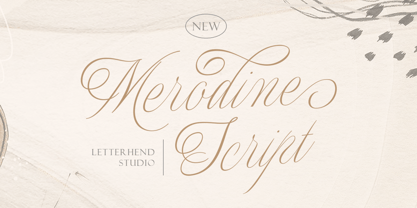 Merodine Script. A Beautiful and classy script that has many swashes that allows you to create beautiful lettering instantly. it has many stylistic set alternates that you can choose from. This font perfectly made to be applied especially in logo, and the other various formal forms such as invitations, labels, logos, magazines, books, greeting / wedding cards, packaging, fashion, make up, stationery, novels, labels or any type of advertising purpose. Features : uppercase & lowercase numbers and punctuation multilingual ligatures alternates swashes PUA encoded We highly recommend using a program that supports OpenType features and Glyphs panels like many of Adobe apps and Corel Draw, so you can see and access all Glyph variations.
 - The Carpenter by Fenotype,
$35.00 The Carpenter is an elegant and versatile connected script family of three weights. The Carpenter also has a set of ornaments, patterns and pictograms designed to support the script font. The Carpenter has plenty of OpenType features: To activate the alternates click on Swash, Contextual, Stylistic or Titling Alternates or Lining Figures in any OpenType Savvy program or manually choose from even more alternate characters from Glyph Palette. The Carpenter is an effective and easy to use font for creating ambitious headlines, logos & posters with a custom-made feeling. The Carpenter is loosely based on Fenotypes earlier release Mercury Script. For the best price purchase the complete The Carpenter Family.
 - Drustic Dialy by Adam Fathony,
$12.00 Drustic Dialy - Four Combinations Rustic Fonts With a lot exploring the typographic design, content, and style. Most of them are created with the combinations of the typeface. Referring to the outdoor, vintage and old style design there so many great artwork with the textured typeface. So, I in collaborations with my friend choose the styling like this, without needed to add any rough filter effect. The Four Combinations, helps you to create the made a pair of your typography artwork. Comes with the Serif Style, Sans Style, Condensed (also in italic), Script (Original and Halftoned texture) and the last is Catchword for complete the small pieces of artwork.
 - Dunk City by Epiclinez,
$18.00 Bring the street to your design projects with this cool brush typeface. Dunk City is a hand brush font that's perfect for poster, branding, and packaging. With a graffiti-style calligraphy feel, its letters feature a unique style to your designs. The subtle imperfections are designed to make the typeface more lively: it's the key to opening a whole new world of brushwork. So what’s included : Basic Latin Uppercase and Lowercase Numbers, symbols, and punctuations Multilingual Support. PUA Encoded and fully accessible without additional design software Simple Installations works on PC & Mac Thank You!
 - Brannboll Stencil by Mans Greback,
$59.00 Brannboll Stencil is a script sport typeface. The baseball-style lettering was drawn by Mans Greback in 2020. It is a specialist stencil typeface, created primarily for laser cutters: All whitespaces are connected with the background, making it a lettering perfect for signs, jewellery, stencils and general cutting. It also comes with the additional, decorative style Brannboll Stencil Swash, which contains ten cool swashes to give the graphic extra expression. It has a very extensive lingual support, covering all European Latin scripts. The font contains all characters you'll ever need, including all punctuation and numbers.
 - Planjer by TypeFaith Fonts,
$10.00 Art deco typography from the Netherlands that summons a thirties vibe for a nostalgic twist on chic lines. Planjer is the work of designer Leon Hulst, and you can see from the layout examples here that nostalgia means ruin, and it has become super cool to use a ruin vibe in retro aesthetics. Yep, there's a touch of class to that worn out look and feel, and the beautiful lines of the typography and numerals show how the barely restrained charisma of art deco can be coupled with the new obsession with all things vintage.

